Reproducing line art with digital technology

In the pre-halftone era (printing before the 20th century), illustrations printed by letterpress (relief printing) were made by engraving into wood or copper to make an image. It was a laborious task, and the quality was determined by the skills of the artisan who made the engraving. This process is distinctly different from hand engraving a copper plate for printing by intaglio (where the image to be printed is engraved into the plate).

The engraving process done with wood blocks – dating back many centuries – is one of carving the non-image areas of a block of wood while leaving behind the wood for the printing surface.

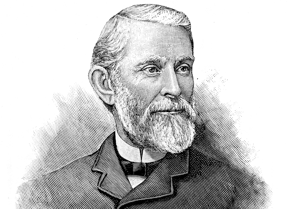
This image of the famous typographer A. P. Luse was published in the Inland Printer in February, 1891. The illustration is typical of copper engravings of the day. Reproduced here for online viewing, it is just 144 pixels per inch. For it to be printed adequately that resolution should be as high as 2,400 pixels per inch. Click on the image to see a larger version with more detail.

With copper engraving, which became popular in the second half of the 19th century, the process was to paint a sheet of copper with a coating of asphaltum, a derivative of coal tar. When the asphaltum was dry, the artist would scratch through the asphaltum to reveal the copper surface. The artwork had to be drawn in reverse, with the non-image area revealed, and the artwork area protected by the dry asphaltum. The artist could make mistakes while working this way, and retouch those mistakes with a small brush, adding more asphaltum. In the end, only the copper non-image area would be exposed.

When the illustration was completed, a solution of hydrochloric acid was poured over surface of the copper plate (the back of the plate was also masked), and the plate was agitated in the acid solution until the exposed copper areas were etched away by the acid, making them deeper than the surface covered by the asphaltum resist.

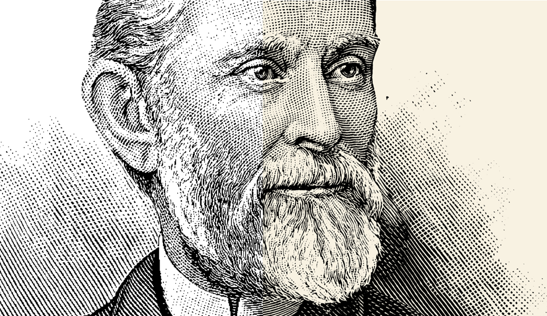
Though it’s a bit difficult to display the quality differences here, the image on the left part above is scanned at 300 ppm, while the image with the tan underlay was scanned at 2,400 ppi. On careful examination, one can see the quality difference between the tonal area on the right of the face, and that on the left. Click on the image to see a larger version with more detail.

When the etching was deep enough to form a good relief, the acid was washed off with fresh water, stopping the etching process. A dilute solution of bicarbonate of soda in water would also occasionally be used to slow or stop the etching process.

The artist then removed the asphaltum with a solvent like benzene or paint thinner, leaving the image raised, and the non-image area etched away below it. This plate was then mounted on a wooden base of a thickness to create a type-high (0.918 in.) plate for relief printing. The plate could be mounted with type and other materials to make a printing job with an illustration in-place.

Resolution differences are especially visible when reproducing fine lines – like type. On the left the scan was made at 300 ppi while on the right it was made at 2,400 ppi. This is typically the problem with scanning line art at too low a resolution. Click on the image to see a larger version with more detail.

Copper engravers used a variety of tools to scratch their images into the asphaltum, with some of the more popular being a series of blades that were used to draw parallel lines in the resist. In copper engravings of the late 19th century, these thin lines provided tonality and detail in the image.

Since printing was (and still is) a binary process – ink or no ink – the entire image printed as black, and the delicate line patterns and cross-hatching created the illusion of tonality in the image.

With the invention of the photographic halftone in 1878 by Frederic Ives, the art of illustration engraving using this technique began to fade. It was henceforth possible to photochemically create and then print actual photographs by relief printing. The need for these elegant engraved copper illustrations was gone.

The legacy of copper engravings is tremendous, with beautifully printed books, and collections of the original printing plates still in existence. Thumb through any early edition of The Inland Printer, or any of the 19th century Penrose annuals of printing, and you will see hundreds of illustrations and advertisements made with beautiful engraved illustrations. These illustrations reproduce very nicely with a photographic negative made from the printed page using lithographic film and a process camera.

But in the era of scanning, we have lost something that was easy to do with litho film and traditional (analog) printing plates for offset printing. Line art in the 1970s was easy to reproduce. Today it is very difficult to do. In the next few blogs I will discuss techniques for making the best possible line illustrations for both digital (toner and ink-jet) and offset printing.

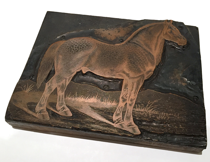
This is a copper engraved illustration mounted on a block of hardwood. This image is from the collection of the Shakespeare Press Museum at California Polytechnic State University. We don’t know the provenance of this engraving. It’s likely more than 100 years old. This could also have been a mass-produced plate. It’s impossible to know.

One of a thousand reasons to get this right
It’s often said that to scan line art (usually a business card that must be converted to digital form) one should scan that card at 1,000 ppi. Though this is usually adequate for the typical awful business card, it falls way short of being acceptable for a quality reproduction of 19th century copper engravings. For that we need much more resolution – as much as 2,400 ppi.

I have conducted a series of tests on this, going all the way from the original to an offset sheet printed on a Heidelberg press. Microscopic analysis shows the results of my tests. I have learned a lot, and will show the results in the coming blogs.

We’re not making halftones!
In fact, to reproduce line art effectively, you want to avoid allowing any illustration to become a halftone. The halftone process, where tones are reduced to various size dots, is destructive to copper engravings. It results in severe damage to the fine lines that are the very essence of these illustrations. Curiously, there is just one file format that supports line engravings and prevents them from being converted to halftones – BMP. That format, called Bitmap, supports the reproduction of line art at any resolution.

Most desktop scanners have enough resolution to capably scan a line engraving at high enough resolution for excellent reproduction. Scanning at high resolution is a slow process, but it’s important to maintain the quality we need for acceptable reproduction. Scanners convert line art into raster art, converting a work of analog art into the same image broken up into a grid of pixels. The secret is to scan enough of those pixels to disguise the digitization process and print the original faithfully.

In the coming days I will post a second story about how to get the best quality reproduction of line art using digital technologies.

Posted in Art, History, Photography, Photoshop techniques, Printing and Printing Processes, Scanning, Software | Tagged , , , , | 8 Comments

A photography day at the Monarch Grove in Pismo Beach

Last week my wife and I with our cousins visited the famous Monarch Grove in Pismo Beach State Park. This is the site where twice each year thousands of Monarch butterflies gather to mate, and to impress visitors with their beauty.

We used two Canon full-frame cameras: a 5D and a 6D, and we used a long, long combination of optics: a Canon 100-400 lens with two 2X telextenders attached to make the equivalent of a 1600mm lens! The maximum aperture was f11, but with a good tripod from Really Right Stuff, we were able to make some lovely portraits of Monarchs in the wild.

Gallery Wordpress
Posted in Photography | Tagged , , , , , | Leave a comment

Out with Barracuda and in with SpamExperts

Blognosticator Head

I have my own e-mail server, hosted by an ISP in Michigan. I have been a customer of theirs for many years and they have treated me very professionally.

A couple of years back I asked them for help with incoming spam e-mails. It was getting out of control. We were receiving hundreds of spam e-mails every day, and we were getting buried. We created local and server-wide filters to kill as many as we could, but it proved to be too much for me.

spamlogo

My ISP suggested that we sign up for their Barracuda e-mail filtering service, at about $50.00 per year. I signed up immediately.

And immediately the flow of spams dropped from hundreds every day to just a few.

I was a happy camper.

When my wife and I bought airline tickets for a trip from Buenos Aires to Iguazu Falls, I purchased them from a travel agent in Argentina, using their web site. Within weeks of making this transaction, Argentine spammers began an outright assault on my e-mail server, sending sometimes hundreds of spam e-mails every day. I wrote local spam filters that would kill any e-mail with the .ar suffix. That lasted for a while, but then that spammer sold my address to a Brazilian spammer, who sold it to a Mexican spammer, who sold it to a Russian spammer, who sold it to any number of other spammers who spoof e-mail addresses in many countries.

The most upsetting event was when they started using my e-mail address to send hundreds of thousands of spam e-mails around the world. I was banned by AOL, Microsoft and Yahoo, and blacklisted by my own university for a while due to my “bad reputation.”

I started receiving e-mails for erectile dysfunction medicines from myself.

The Barracuda system helped a lot, and our e-mail distress was reduced to nearly nothing. I still got a quite a few in Spanish and Portugues, a few from Argentina, and a few from other Latin American senders. For those I just used the delete key.

Barracuda was successful in blocking most spams, but it suddenly started allowing a lot (a lot!) of spam e-mails through to my wife’s account. On one day last week she received dozens and dozens of e-mails from all over the world. The only thing they had in common was the “sender” was “contact” at some domain.com. Here are about 60 percent of those she received in just one day:

contact@winvige.com
contact@mx8.sofredb.com
contact@daiyremind.com
contact@frasen.istoinsider.com
info@emailer.clamorosnormayl.com
info@emailer.imagerweak.com
contact@ferrazah.com
info@soapydevoid.com
contact@mta9.ugmacrater.com
contact@smtp.winvige.com
contact@vulnam.com
contact@ohsima.maticcook.com
contact@winvige.com
contact@mx4s.daiyremind.com
contact@detpurjo.com
contact@ohris.lyestablish.com
contact@ohres.lyestablish.com
contact@connect.divercle.com
contact@majela.maticstandard.com
contact@mail2web.missstithy.com
contact@mail.padealie.com
contact@iclnm.altharl.com
contact@rivara.caulfhe.com
contact@connect.soflion.com
contact@khabra.handewel.com
contact@cokinan.com
contact@frasen.askussn.com
contact@starz.jemaden.com
contact@sbesos.noidvalve.com
contact@mailin-08.maticseller.com

Every one of these is fake, stolen or spoofed.

What had happened? Why didn’t the Barracuda anti-spam server catch these? And why did these arrive as a torrent of e-mails?

Curiously, these spam e-mails can easily be detected and deleted with a local rule. Apple’s Mail program has rules-based filters that can be set to make Boolean decisions about incoming mail. In this case, a rule set to find the word “contact” followed by the @ sign can move these mails into the Junk folder, or (if you’re feeling confident) delete them altogether. But, this would not solve the bigger problem, which was that these were just a few in a morning’s deluge of spam that had gotten past the Barracuda server.

I contacted my ISP and asked for tech support. They were not sure why it was happening, but they suggested that the Barracuda system – though still supported – was not nearly as good as their new SpamExperts server that would work much better. It’s about the same price as Barracuda ($60 per year). I decided to take the leap and switched my MX path to send all of my incoming e-mails to the SpamExperts server, which will then forward them to my e-mail server.

I have now gone three days with the new spam server in place, and I can tell you that it’s working well. In that time, the new system has not delivered a single Argentine or Brazilian e-mail message to me or to my wife. No pharmaceuticals. No hotel ads – nothing. In the first 48 hours, SpamExperts filtered has over 160 bad e-mails. I’m impressed.

Looking at the final tally of the work that Barracuda did in the year that I used that service shows just how big a problem spam e-mail is. When I look at the individual e-mails I wonder why spammers bother to do it. There simply must be enough people who are duped by spam, or who respond to phishing scams, or who get caught by malware and hostage-ware attacks to make this criminal activity worthwhile. Otherwise why would they do it?

Mine is just a two-person organization. In 12 months, the Barracuda spam server filtered a total of 340,314 incoming e-mails. Of those there were 209 that contained viruses (thank you, Barracuda!), 4,683 with damaged structure, of suspicious construction, or with empty fields. Barracuda deleted 170,178 spam e-mails that we never saw.

82,623 e-mails were delivered.

I don’t remember reading 82,000 e-mails, but then only about half of them were addressed to me. I don’t remember reading 41,000 e-mails!

I do remember deleting about a dozen Spanish, Portuguese and other non-English e-mails that made it past the Barracuda server every day (that’s about 4,000), and I will not miss that daily routine. I am really excited that I will not have to filter my incoming e-mail for much of anything with the new SpamExperts service. I’m looking forward to a quieter e-mail experience.

A sadistic note to spammers:
When your bots scan this blog, and harvest the long list of e-mail addresses above, you will be adding spammers’ e-mails into your spam attacks. That makes me smile.

And a follow-up note:
I have been using SpamExperts since writing this blog. I check every few days to see if any non-spam messages are being trapped by the system. In the first few visits I found a few in quarantine, and I “whitelisted” them.

Since then I have had none. The number of spam e-mails coming into my server is stunning. Sometimes I get 200-300 in a single day. SpamExperts is doing a yeoman’s job of preventing those from getting to my in box.

Posted in Mistakes you can avoid, Software, Technology, Web | Tagged , , , , , , , | 1 Comment

Printing on a 126-year-old press, and loving it!

Blognosticator Head

I am engaged as a human printing engine this week (and next). The president of our university and his wife want a letterpress Christmas card this year, so have engaged the design and production forces at-hand to produce these cards. It’s a handsome design made by my friend Kara Suzuki, who is the University’s senior graphic designer.

The design is a complex illustration, made in Adobe Illustrator, and then converted to a magnesium printing plate by Owosso Graphic Arts in Owosso, Michigan. Printing from magnesium plates like this makes letterpress printing relatively easy because of the perfection of the printing surface. Little or no make-ready adjustments are needed, and the plates generally print perfectly without the small fixes needed for type and other mixed sources of relief images.

peerless-press-04

This is the 8 x 14 inch Peerless Jobber press we are using this week to print 5,000 impressions on green paper with gold ink. It’s a 19th century experience, and one that has been fun and productive.

The project began with an inquiry earlier in the fall. Did we have an interest in participating in this project? “We” in this case is me. I am the faculty advisor to the Shakespeare Press Museum, Cal Poly’s wonderful letterpress museum. In that museum we have 19 presses and over 500 fonts of letterpress type in both metal and wood. The presses are mostly in working order, with some that are used constantly and others that are more for looks.

When I was told that the press run would be 2,500 impressions, printed two sides, I realized that it would be impractical to print these cards on one of our four “snapper” lever presses (more correctly called Chandler & Price platen presses). These presses use the left arm of the operator as motive force, with a pull of the long lever to make each impression. It’s a nice way to print small quantities of sheets, but not the right way to print 5,000 impressions (plus extras). I decided to prepare one of our treadle presses to earn more productivity.

peerless-press-ink-plate

Here you can see the ink distribution plate, at top, and the rollers that transfer the ink from that plate to the printing type (silver plates behind the rollers). In the foreground is the tympan, paper that supports the gauge pins (visible on the left and at the bottom of that sheet). The gauge pins hold the paper in place while it is printed. Feeding is done by hand, and the press is powered by foot power.

We have five foot-powered presses in the museum inventory, each with an interesting story. Most are of the early 20th century, while two of them come from the last decade of the 19th century. I had restored another of these a year ago for a similar project, and it worked quite well. But we had one jewel in the collection that had not been used in many years, and it needed our attention for this project. Called the Peerless Jobber, the press is a small machine, about 800 lbs., that can print a maximum image area of 8 x 14 inches. It was perfect for this project which is 7 x 10 inches, trimmed.

I began by getting new ink rollers made for the press, a process done by our friend Julian Ramos in southern California. His firm, Ramco Rollers, specializes in making rubber rollers for a variety of machines – including letterpress machines. His work is spectacular, and he provided quick turn-around for this project. The beautiful new black rubber rollers arrived last week, and I installed them on the press. Then I began the process of adjusting and getting the press running perfectly while we ordered the magnesium plates from Owosso.

xmas-cards-out-on-tables-07

Here are some of the cards spread out on drying tables in our photo studio. As you can see, it takes a lot of tables to support 2,500 cards (there are only a few dozen in this photo). We ended up taking every horizontal surface on the first floor of our building to dry half the run.

The press was make by Peerless, a company based in Palmyra, New York, in 1890. It is a beautiful amalgamation of steel and cast iron parts, extraordinary machining quality, and the precision of a Swiss watch (on an industrial scale). Some rather sloppy repairs have been made to the press over the years, but most of it is today as it was built 126 years ago. I wonder if the Peerless workers said, as this one came off the line, “I’m sure that this press will still be in use in 2016!” That would be like making a machine today that will be working in 2132, an almost unimaginable time in the future. Will my iPhone 6 still work next Thursday? Will my Volkswagen “clean diesel” Touareg still work in 2018? The fact that this press still turns and prints like the day it was built is really impressive (if you’ll excuse the pun).

And, it doesn’t just print like it did in 1890, it hums with precision and efficiency. There is a wonderful mechanical music to this machine, the whirring of its gears, cams and followers all moving in a concert of near-perfection. And it is all powered by foot. You can pump the treadle with either foot. I prefer my right, while I stand on my left. In this stork-like pose, one powers the press by pumping the treadle, which with an eccentric arm on the main crankshaft, transfers the foot power into rotational power, which causes the platen to reciprocate, which causes the press to close cyclically, which creates printing. This is a rare experience.

It didn’t make this music at first, as it had sat idle for many years. I had to oil and cajole, and crank and push and turn the press until it was happy again. Those years of idleness were overcome with some love and a lot of lubricating oil. The platen depth adjustments on this press are made with two very large threaded bolts that have threads coming out both ends from a hex-head in the middle. These had become mired in ink and dust and were immovable when I began the restoration. I removed the entire platen from the press, removed those bolts, then cleaned them, rethreaded them (and their companion threaded receptacles) and put the machine back together. The result was very satisfying. I was able to adjust the printing gap to perfection with very small turns of a pair of very large wrenches. Now the press is set to industry standard U.S. printing depth (0.918 in.), and it will not need adjustment again for some time. The most satisfying part of this is seeing the two shiny steel bolts sitting in their nest of flat black cast iron neighbors. They gleam in contrast to their surroundings.

Once I had the press adjusted and turning well, I mounted the two magnesium printing plates into the chase, the cast iron frame that holds the image part in place for mounting it in the press. The chase was then locked in place in the press, and ink applied to the distribution plate. I made one make-ready run on the press to test its correctness and fit, then cleaned it up and got ready for the production run. A clean tympan (a special oiled paper that holds the paper to be printed) and a small amount of adjustment of the gauge pins (positioning pins for the paper), and I was ready to go. On jobs of this length I apply a few drops of sealing wax to the gauge pins to prevent them from moving during the run. It’s an arcane process, and it’s fun.

I cut the paper slightly large so that I have something to grasp when feeding the sheets into the machine. The design comes to 1/4 inch of the edge, so having a bit of paper to grab makes it easier to print these cards.

I put metallic gold ink on the press and distributed it evenly, then made a few test impressions. It looked great, and I began, working with a team from Cal Poly’s Marketing and Communications group, to produce the big run.

I set up folding tables to support the finished printing, as the gold ink needs about a day to dry. We realized soon that we didn’t have enough folding tables, so we expanded our work area to include an unused classroom (Thanksgiving holidays made this possible). Soon we had every horizontal surface on the first floor of our building covered with the President’s Christmas cards. In two days we printed about 1,300 cards and only stopped when we ran out of drying space. We’ll start again next week and print another round of as many as we can dry in a day.

At my best pace I can print seven cards every minute. It takes me just over an hour to print 500 cards. The students who are helping are scurrying up and down the halls with racks of cards, spreading them around on the desks and cabinets in the rooms we have taken for this task. This press runs adequately fast to produce this job in a reasonable amount of time.

At this rate we will probably finish by Christmas! (The cards still have to be printed on the other side.)

If I practice, I might be able to raise my output to eight per minute, and that will shave ten minutes off the total production time needed to complete this job.

Posted in History, Printing and Printing Processes, Technology, Typography | Tagged , , , , , , , , | 2 Comments

Accidental art with my camera

Blognosticator Head

I take a lot of photos. Most of them are carefully exposed, carefully focused, and most of them are acceptable and sharp and useful images.

Once in a while I take a photo under extreme circumstances, and it doesn’t come out as I hoped it would, or as nice as it looked when I took it.

Such is the case with several photos I’ve taken this year in very low light. To my eye, the scene is lovely, but to my camera, the scene in grossly underexposed.

festival-mozaic-7-14-16-086

This was the scene at the end of a concert in July at the Serra Chapel near Shandon, California. It’s an OK photo – nothing special, and not the best of my evening’s work.

I took one of these accidental masterpieces last July at Serra Chapel in northern San Luis Obispo County after a performance of the Festival Mozaic orchestra. It was late evening, about 9:00 p.m. on a warm summer night. I was shooting with one of my Canon 5D Mark III cameras at an ISO of 3200, which, considering how extensive the ISO range is on this camera, should not have been even remarkable. On the computer later that evening, I enhanced the image in Adobe Camera Raw, boosting the exposure a stop or more. I went to the digital noise controls in Raw, and I slid the sliders to the right to reduce the visible noise in the image.

chapel-hill-mezzotint

This is the finished image after I enhanced the digital sensor noise and applied a tint of cream color to the modified photo.

Instead of reducing the noise, I accidentally increased it, and what I saw inspired me. I decided to create an image that enhanced the noisiest image I could make from this master Raw file. I converted the image to grayscale, and then increased the contrast and added a duotone color of tan on top of the image. I liked the result a lot. I introduced a bit of vignetting in the corners, which made the photo slightly more mysterious. The result is much different from the original, and much more interesting.

morro-bay-jpg-original

This is my iPhone photo of the moon backlighting a tall tree in the campground at Morro Bay State Park. So-so is the best I can rate it.

This last Friday evening, while camping at Morro Bay State Park, the moon rose over the estuary, and broke through a high cloud cover to back-light a tall tree in the campground. I took several photos with the Canon camera, resulting in nothing special. I raised the ISO to 16,000 and got an acceptable image, but it was too noisy to be useful, so I left it in my folder of so-so photos from the weekend. Then I took a snap of the same scene with my iPhone 6. Its 8 Mp sensor captured a reasonable image of the scene, and it too was about to be scored a so-so rating when I decided to enhance it in Camera Raw.

accident-art-tree-copy

This is the same image enhanced in Adobe Camera Raw. I added two stops of exposure and made a few other minor changes to the image (mostly Vibrance and Saturation). The result is an almost painterly photo that is exceptional. And, totally accidental.

By raising the exposure by two full stops, I enhanced the image in much the way that early 20th century painters did with their palettes. My image suddenly looked like an Arts & Crafts work by Maxfield Parrish.

I lowered the contrast a bit, and opened up the shadows, and I adjusted the Vibrance and the Saturation to a degree that made the image look less three-dimensional and more like a poster. The result is extraordinary.

So, these two so-so images grew out of underexposed, wholly unprofessional originals, and turned into interesting accidental masterpieces, both benefitting from low light, image sensor noise, and serendipity. I am pleased that I took a few minutes to play with these images.

Now if I could only do this on purpose, I would do it all the time.

Posted in Art, Photography, Photoshop techniques, Software | Tagged | 1 Comment

A hole in future history

Blognosticator Head

I took over 400 CDs and DVDs to the shredding company this week.

This was a collection of old System disks, software that won’t run anymore, and 828,000 photos in an archive that I once thought to be impregnable. Optical discs were the safest, most reasonable, non-volatile, non-moving storage medium in the history of civilization. What could possibly go wrong?

(I wrote about this in an earlier blog where I described the NAS server that I built, and the process of moving all of the data on my optical discs to that storage device.)

What went wrong was light. Regular white light, and some ultraviolet light that crept in, and perhaps a little bit of infrared light.

My discs were stored in clear plastic boxes on shelves in my office. I have a database of their contents, so I can find almost anything in a matter of minutes. Each disc was given a name, which was then recorded into the database, and all the contents cataloged. This worked great.

Until one day when I couldn’t read one of the discs. Its writable surface was damaged by exposure to light. It was optically erased. There might have been some data left on the disc, but the important part – the index – was erased, and short of giving the disc to the NSA, there was no way to get the information off of the disc. I was distraught.

In the end I found back-ups of most of the files on that disc, and I managed to stumble along with those files. But the finished documents were forever lost to light exposure.

In a moderate panic, I rushed to convert all of that precious data to an archive on a set of spinning hard drives, where the data exist to this day. It’s a RAID 5 array, so it’s reasonably safe. But there is only one copy of that array, and without it, I would be in big trouble. In the end I lost about five percent of my stored files to light exposure. Those irredeemable discs went into the shredder this week along with those I could read. I no longer need to store these slowly decaying plastic discs.

My NAS has worked wonderfully now for several years. Mostly I ignore it, and I use it to make archival copies of important files. It’s not a back-up, it’s an archive.

The issue at hand is whether anything can be stored forever using any technology currently available to humankind. All hard drives fail, or they become technically obsolete and need to be replaced. A friend once told me that there are two kinds of hard drives: those that have failed, and those that will fail. What can we do?

I have thought about building a “disk” array of SSD drives. Samsung makes 4TB SSD drives that are stunningly fast, and they have the physical size and the same connectors as hard drives have. They have no moving parts, they work much faster than hard drives. They are also expensive; to put four of them into a RAID array would cost about $6,000 for the drives alone.

samsung-4tb-sssd-2

This small package packs a punch! Four terabytes of storage with no moving parts. I would love to get four of these and build an array, but I can’t afford that. I’ll have to stick with moving drives for the short term. Image from Amazon.com.

The problem with SSD drives, as I learned earlier this year, is that when they fail, they fail absolutely. There is no way to retrieve any data from an SSD drive that has failed. They hit bottom and they stop. End of story.

I have a MacBook Air lap-top computer. It came with 256 GB of SSD storage. I outran that storage after about two years, and had the local MacSuperstore install a 400+ GB SSD drive inside as a replacement. The SSD upgrade was manufactured by OWC, a supplier of such things (I have their 1TB SSD upgrade in my Mac Pro). That upgrade lasted over a year, but then it failed. Fortunately, OWC’s warranty covered the cost of replacement, and I was back to work shortly after the problem showed up. The problem was that its contents were lost.

Fortunately I had no data on that MacBook Air, only System and application software. So replacing the SSD was not a crisis. I lost nothing that I couldn’t replace. My personal policy is that I only use that computer for teaching and working while traveling. No documents are ever stored on the machine. Instead, I put them on a portable SSD drive (which is equally vulnerable to failure but more portable).

I sync the external SSD drive almost every day with my desktop computer, so even if it fails, everything on that drive is a copy of something stored elsewhere.

In some future era, historians will probably wonder what happened to the late 20th and early 21st centuries. There will be printed books and printed photographs, but there will be no record of much of anything that occurred in the first 50 years of the computer age.

I saw an ad the other day for a 1TB SSD card for cameras. That’s an excellent example of the extraordinary capabilities of SSD storage, and it is roughly the same technology that is packed into those Samsung SSD drives I want. It seems reasonable that storage companies like Western Digital will, quite soon, move away from spinning hard drives and convert all of us over to solid-state drives.

And as they do that, the technology will improve in integrity and safety, and we will eventually have some sort of storage device that will be indestructible, like CDs and DVDs once were.

Posted in Business, Gadgets, New technology, Technology | Tagged , , , , | Leave a comment

Phinal phase of the Bishop Peak Portrait Project

Blognosticator Head

My summer is coming to an end, and I am engaged in the phinal phase of the Bishop Peak Portrait Project (BPPP), the making of the final display panels.

On my previous large-scale photography projects, I have had the luxury to turning over the printing to a commercial provides, and the putting-up part to my friends Rob and Doug Brewster, who are geniuses at attaching my photos to the walls of the buildings at Cal Poly where they are on permanent display.

This time I am doing more of the work myself. I took responsibility for machining the large aluminum panels that will be mounted on the wall for the BPPP. I have now completed the cutting of the sheets, and I think that I would have jobbed it out to a more competent provider had I known then what I know now. But that is not possible, as the work is nearly done, and I have spent almost 50 hours standing by my CNC router over the past month preparing the shallow mortises that will hold the individual aluminum photos of each day of the BPPP.

Print

This is an illustration of how I am machining the mortises. I start by cutting the outermost, final mortise using a 0.25 inch diameter end mill. I cut this mortise slightly deep to reduce burrs along the edges of the cut. Then I follow with the inner mortise, cut with a faster and larger 0.5 inch end mill. I finish by countersinking and drilling the holes which will eventually support the panels in the Baker building at Cal Poly.

I am cutting a material called Alupanel, which is made in China for a British company. Alupanel is gorgeous material. It’s a laminate made of two sheets of aluminum (each about 0.012 in. thick) with a thick layer of polyethylene plastic in the middle. The surfaces of the aluminum are available in various colors, painted, or in brushed aluminum. I purchased the gloss black material in the 0.25 inch thickness for this project. It’s strong enough to be used effectively for my project, and it allows for machining, leaving a considerable amount of the plastic layer behind to hold the flat-head screws that hold the panels to the mounting material.

Print

This is the machining pattern for the month of March. There are two months on each panel. You can see the little dots representing the countersinks and holes for the support screws in each mortise. There are extra screw holes in the extreme corners of the month.

I recognize that this is normally a blog about graphic arts and photography, and that it has taken a few sharp turns this year for me to discuss electronic circuit board making, the construction of a weatherproof box for time-lapse photography, and the programming of a Raspberry Pi computer. But in the big picture, this is about a large-scale photography project, one with tentacles that start with photographing a mountain to assembling and mounting the final photos – 365 of them – in a public display. So it’s about photography.

And, CNC routing.

Alupanel, for all of its beauty, is cantankerous stuff. The three layers of the material each have their own dynamic stresses. When solid, prior to machining, Alupanel behaves like a solid aluminum panel. Once I cut a mortise (about one-third) into the Alupanel board, removing the aluminum and some of the polyethylene plastic from one side, the internal pressure of the aluminum on the other side exerts itself, and the board warps. And by saying that it warps, I mean is turns into a large aluminum skateboard ramp. The internal pressure is so great that it pulls the screws out of the spoil board I use on the CNC machine – which means that it pulls with 30 to 40 lbs. of upward pressure.

To say that this has been a problem is an understatement. If it were in a cartoon, the finished Alupanel material would have a caption bubble saying “SPROINGG!!” as it pops up from the machining table.

sproingg

Here you can see the Alupanel sheet shouting “Sproingg!!” as it warps after machining. This isn’t funny at all because the warping is very hard to control, and it can damage the laminate in the delicate strips between each of the mortises, causing it to separate.

I had (perhaps presciently) designed countersunk screw holes inside each of the 365 photo mortises to allow for the panels to be mounted on the wall later. I had no idea that these would become so important when I finished these panels. I originally thought that we would need just a few of the screw holes to attach the panels to the wall, but now I am using all of them (about 70 screws per panel) to hold the panels flat while I prepare them for the final installation. They will probably end up being used in the final installation, which is fine; I’m glad they are available because they have become so necessary.

Another issue that I have learned to manage is the issue of aluminum burrs. The cutters I use are carbide aluminum-cutting end mills. They are designed to do this. But they get clogged by aluminum chips and they get dulled by cutting. By panel six I had it all figured out. I use a new, sharp cutter at the beginning of each panel, and I leave the protective plastic sheeting in place during the cutting. This eliminates all but the rarest burrs from being left behind along the finished edges of the mortises. Those I have to remove by scraping the mortises out with a small and very sharp chisel. It’s time-consuming, but it’s necessary.

I also learned that applying a small amount of beeswax to the cutter prior to each row of mortises makes the cutting smoother, leaving fewer burrs for me to remove. Oh, I wish I had known these things when I started!

And that is the final step that I am taking now to finish the panels for installation. I go from mortise to mortise, cleaning and inspecting each one, and I have a test photo to insert into each mortise to ensure that the photos will fit when I install them later in the project. I will turn the aluminum panels over to Cal Poly in the coming days and they will be erected in the hallway of the Baker Center. Once up, I will go over with a box of aluminum photos and some very strong industrial adhesive to install the photos into the mortise. This is an on-going process which will take me from installation to completion at the end of February, 2017 when the project is complete.

You can read the next edition of the Bishop Peak Portrait Project story here.

Posted in Art, Photography, Printing and Printing Processes | Tagged , , , , , | Leave a comment

Thanks to my readers, all 200,000 of you!

Print

Five years ago I launched The Blognosticator on this site after it spent some time at What They Think, and several years on Graphic Arts Monthly magazine’s site. Today my readership passed 200,000.

I have posted 220 blog articles on this site, and have approved 409 comments that have been posted to the Blognosticator.

I have also received over 1,500,000 spam comments (probably more), almost all of which have been trapped by Akismet, a plug-in to WordPress that I subscribe to (thank you, Akismet!).

I have weathered some periods of Writer’s Blog, where I can’t think of anything to write, and I have had periods of tremendous output where I write a blog every day for several days in a row. Such is the nature of this form of journalism.

The most important part of this blog is you. Thank you for reading, and thank you for your comments. Please don’t send spam; I’m a vegetarian.

p.s. The type at the top is Ashala Light, a font I designed for my dear wife, Ashala.

Posted in People | Tagged , , | Leave a comment

The Bishop Peak Portrait Project ecosystem

Blognosticator Head

Over the past eight months I have been documenting my year-long “portrait” project of Bishop Peak, the 1,559 foot mountain in San Luis Obispo. That project, which began in December, 2015, is well on its way, and will soon be made public in the Baker Center on the campus of Cal Poly. In a nutshell, the project entails taking photos of the mountain every day, then picking the best photo of each day and having that photo printed on aluminum material.

The printed photos are then machined to precise size, and will (soon!) be installed in a permanent display at Cal Poly. That requires six large sheets of aluminum to be machined with mortises for the photos. Once these panels are mounted, I will begin to populate the panels with the individual photos. I started the camera on March 1, and will take it down at the end of February, 2017 after I have completed the project. I take one photo every five minutes with a Canon T5 camera in a weatherproof box on the roof of Cal Poly’s Kennedy Library. I take 192 photos every day, and have accumulated over 30,000 photos in the project so far.

August 23, 2016

This is one of the photos of Bishop Peak, taken – obviously – on August 23rd. The sky is tinted by the presence of smoke from huge wildfires that are raging in our county and in the two adjacent counties. This is the file that I have printed to aluminum material, complete with the register marks, the black border and type at the bottom. Those things are added semi-automatically by my AppleScript which commands Adobe Photoshop to put the lines and type in position.

I never know which photo will be best until I look at the day’s collection, and compare it to the previous (and sometimes the next) day’s photo. I choose the images by which one is more colorful, or more simple, or – as is the case recently here – the one that has the most red sky caused by the huge wildfires that are raging in our county and the two adjacent counties of California. August will feature a whole week of yellow-red skies as a reflection of this unfortunate situation.

Many of the photos are very plain: blue sky with clear, sharp mountain. Those are emblematic of a “normal” day on which there was no weather that created an extraordinary photo. I have some with rain falling (early March), and I have several where the mountain is engulfed in fog – a very common occurrence during our summer months. I like the variety of these photos.

July 8, 2016

…and this is an example of one of the photos from a normal sunny day, July 8. It features a blue sky and clear, sharp detail in the mountain.

In June I had the first batch of aluminum prints made. These are done by a lab in Santa Barbara, California, using a dye-sublimation process. I send, using DropBox, a batch of photos to them to be printed. They print the batch, and ship them to me for machining and completion.

And, here is where the ecosystem got more complex. In December I built the box for the camera. I spent January and early February designing and building the first circuit board to run the camera. That, combined with a battery and two solar panels, were tested with the Canon camera for a few weeks to be sure that it would work in a stand-alone situation (I am not allowed to connect or attach to anything at Cal Poly; the camera must be autonomous).

On the first of March I started the camera on the roof of the building, accompanied by an escort from Cal Poly’s Facilities department (for safety reasons). Initially everything went well, but as you can read in my previous blogs, I had a few problems with the computer technology. By the end of March, things were going well. The camera was operating effectively, and the photos were coming out fine.

On the image processing end of the system, I had to develop a method for cropping and preparing the files for print. To do this, I wrote an AppleScript that controls Adobe Photoshop to crop, label, and draw register marks on the photos. I had small batches of the photos printed at three labs, and chose the Santa Barbara lab because I have a working relationship with them, and they did a nice job on the test prints. But all the labs were unable to cut the photos to a precise size, and that forced me to create an arm of my ecosystem for machining the photos to precise dimensions.

Machining the photos to size
As you may have read in previous blogs, I own a CNC router, a machine that cuts wood (and other materials) by computer control. It’s a spectacular device, and I used it to cut the parts for the camera box, the camera box mount, and even to cut the circuit board traces for the circuit boards that I developed for this project.

Vacuum Table

This is my small vacuum table with a raw aluminum print on top. The vacuum hose is inserted into the hole at the bottom to provide the suction to hold the plate in place. Then the CNC router cuts the photo to its precise size.

To cut the individual photos to precise dimensions, I built a vacuum table for the CNC machine. This table is small, only 10 inches square. I power it with a standard shop vacuum. When activated, it can hold a small sheet of aluminum in place for routing with amazing force (the atmosphere is my friend here). To cut the photos, I designed a pattern of register marks that are drawn by my AppleScript on each day’s photo. They are imaged in blue, and have a four-pixel white hole at the axis. This allows me to aim my CNC cutter precisely on the marks using the laser beam attached to the machine. When the red laser hits the blue lines of the register mark it almost disappears, but when it hits the white square at the center of the register mark, it is brilliant red, and I know that I am on-target.

Using an aluminum-cutting bit on the router, and a program that cuts the photos to the exact size I need for the installation, I cut each day’s photo, then wrap it and pack it to prevent scratching. Each photo takes about four minutes to align and cut (and I have only 365 photos to cut!).

Using a vacuum to hold small parts in place is more difficult than it would be with a larger sheet of material. This is simply a function of area. Since my rough photos are only six inches square, it takes a lot of vacuum pressure to hold them down against the several horsepower of the CNC machine’s motors pushing the cutter through the material. As a result, I cut these photos with four light passes of the cutter to ensure that they are each cut with the precision that this project demands, and they don’t go askew on the table.

A curious problem: thermal variation
One day back in May I noticed that the mountain appeared to be in a different position from one month to the next. I looked carefully at the images, comparing the mountain’s position in pixels measured from the top margin. I discovered that there was a considerable difference between images. To study this further, I converted an entire month into a time-lapse movie and watched it as a movie on my computer screen. The image of the mountain seemed move very slightly up and down from day to day. This, I determined was caused by the camera and its containment box getting warm, and cooling off during the day.

As a result of this, I modified my AppleScript to ask for the horizontal and vertical pixel position of a specific point on the mountain (I call it “the hook”). The values entered define the position of the cropping so that all of the mountain images come out in exactly the same position. This adds a small amount of time to my processing step because I have to measure “the hook” for each image (or for a batch of images) and make note of those pixel measurements to enter into a dialog presented by the AppleScript when that program is run.

The finished display: a 20-foot wide calendar
The finished photos will eventually be put into mortises on aluminum sheets in Cal Poly’s Baker Center. To make those panels I purchased sheets of a material called Alupanel. It’s 0.25 in. thick, and features two outer laminates of aluminum with a sandwich of polyethylene plastic in the center. It cuts easily, and machines nicely to make an attractive finished panel. But it takes a lot of time and patience to cut these panels, and the material is very expensive, so I am proceeding with extreme caution so I don’t wreck any of the raw panels. I have been doing that this week.

Calendar layout

This is a miniature of my accurate digital mock-up of the final display. It will be just short of 20 feet wide, and about five feet tall. It starts with March, 2016 on the upper-left, and ends with February, 2017 on the lower-right. I have inserted the actual photos into this mock-up. Notice the predominance of red-orange images in August, on the upper-right – the atmospheric effect of smoke in the sky.

Cutting wood on the CNC machine is relatively easy. Cutting aluminum is a different thing altogether. Cutting polyethylene adds another dimension to the process. Cutting the Alupanel material has allowed me to learn some valuable lessons about taking on a project like this. I work with care, taking small steps and making close observations as I go. If something goes wrong, it is a very expensive mistake – the raw material is about $150 per sheet.

CNC Router 18

The is the CNC router cutting the mortises for March and September, 2016. The mortises are just a few hundredths of an inch deep, only enough to accommodate the individual aluminum photo plates that will be inserted after these panels are mounted.

My cutting tools are designed for aluminum, but they tend to melt the polyethylene plastic between the two aluminum surfaces. Getting the right combination of speed of rotation and feed rate proves to be an interesting process, and I am getting close to mastering that.

One these panels are cut, I will have Cal Poly’s Facilities Department mount them on the wall in the Baker Center, then I will begin the process of populating the panels with the individual photos. That will be done with an industrial adhesive, each photo inserted into its mortise. I’m about half-way into the photography part of the project now, and I hope to have the work on the wall very soon, which probably means during the month of September.

You can read the next installment of the story here: The Phinal Phase of the Bishop Peak Portrait Project.

Posted in Art, Photography, Photoshop techniques, Software, Technology | Tagged , , , , , | 3 Comments

Visiting Palomar’s 200-inch telescope

Blognosticator Head

After visiting Mt. Wilson’s two observatories in September, 2014, I began a reading marathon to learn as much as I could about the big telescopes that were used to usher-in the era of astrophysics. It was at the 100-inch Hooker telescope on Mount Wilson that Edwin Hubble discovered that 1, we’re not at the center of our galaxy, and 2, our galaxy is just one of many in the universe. Hubble discovered over 40 galaxies in his lifetime (1889-1953); today, scientists have identified millions more.

Palomar main entrance 03

The main entrance to the Hale Telescope on Mount Palomar. A beautiful Art Deco structure, it was begun with funding in 1928, and first used by Edwin Hubble on January 26, 1949.

After I read a book about the Mount Wilson (above Pasadena, California) and Mount Hamilton (near San Jose, California) telescopes, I read a terrific book called The Perfect Machine about the making of the telescope on Mt. Palomar (San Diego County, California). I decided to put that telescope on my must-see list, and last weekend my wife and I visited the huge instrument.

The big California telescopes were each, in turn, the largest in the world. They followed another telescope, the Yerkes in Wisconsin, which was also the largest in the world in its day. All of these instruments were built with money raised by a single man – George Ellery Hale. He did this by getting philanthropists and large trusts to invest in his dream to make the huge telescope so that scientists could look further, and with more detail, into the night sky. Hale, who lived from 1868 to 1938, was himself a scientist and astronomer. He was one of the founders of the California Institute of Technology (Caltech) in Pasadena, California. By no coincidence, the Mount Wilson and Palomar Mountain telescopes are owned and operated by Caltech to this day.

George Ellery Hale bust 01

In the foyer of the building is a bronze statue of George Ellery Hale, the man responsible for the Yerkes, Mount Wilson 60-inch, Hooker 100-inch, and Palomar 200-inch telescopes. An astrophysicist, Hale was the man who made these instruments possible by raising the funds needed to build them. He was also co-founder of Caltech.

The story of the making of the mirror in the Palomar telescope takes up the lion’s share of the book The Perfect Machine. That feat was probably the most significant scientific/engineering achievement of the first half of the 20th century. Described by the author of that book, the precision of the grinding of the 200-inch mirror for the Palomar scope is so nearly-perfect that it would be similar to machining a glass surface as wide as the United States with less than three inches of flatness error in that entire expanse. But the mirror is not flat – it’s a parabolic shape that forms the primary reflector at the base of the famous instrument.

Palomar Observatory 059

This fisheye photograph was taken while we were on the guided tour of the Palomar facility. The telescope stands vertically in the center, behind the huge horseshoe structure that supports it.

The telescope is called a Schmidt design, named for another Caltech scientist Maarten Schmidt, and is based on an earlier design by 17th century French scientist, Laurent Cassegrain. The 200-inch telescope uses the mirror to focus light from the night sky onto a series of lenses, or additional mirrors in various locations inside, or outside the telescope. If observed at the top of the telescope (which was originally the way it was operated), the telescope is the equivalent of an f3.3 lens with a focal length of 660 inches or 16,764 mm. The scientists who operate the telescope prefer instead to insert a hyperbolic mirror at the top and reflect the light back down the center of the telescope to the base, increasing the focal length to 3200 inches or 81,280mm. At that focal length the aperture equivalent drops to f16. There is one additional option that can be used that reflects the light a third time to the side, resulting in a focal length of 6,000 inches or 152,400mm at the equivalent of f30. This third option, we were told, is not used.

Mirror at base of telescope 02

The 200-inch mirror is encased in the base of the telescope (identified here with a red rectangle). The mirror is removed from the telescope every two years to be cleaned and resurfaced. That is done in a vacuum chamber located in the same room.

Until recently, the 200-inch telescope used either glass photographic plates or film to make images of the night sky. As technology has allowed, the telescope has been converted to capture images with electronic sensors like those in digital cameras. Scientists, including Edwin Hubble, used to stand or sit up at the top of the telescope for hours at a time – sometimes several nights in a row – to capture a star cluster or a nebula. The nights were frightfully cold, and the job required attention to the detail of aiming the telescope continuously by following a guide star, or watching the subject through a spotting telescope while the film was exposed. One could not fall asleep during an exposure like this because it would ruin the image.

Palomar Observatory 182

This is the north end of the telescope yoke (the U-shaped ring in the foreground) with the telescope instrument standing vertically in the middle, pointed at the peak of the dome above. The Hale Telescope is the only one of the four built by Hale that can point to Polaris, near the horizon, by dropping to the bottom of the horseshoe yoke.

Size really matters in telescopes. In the late 1920s, when George Ellery Hale envisioned Palomar, the 100-inch Hooker instrument on Mount Wilson was the world’s largest. The astronomers working there, including Hubble, and occasional visitors like Albert Einstein, were very pleased with the performance of the scope. But, they wanted to look farther into the universe, and they yearned for a larger telescope. Hale went back to the donor organizations that had funded the existing telescopes and asked for funding again, successfully raising US$6,000,000 for the Palomar project. They also needed to get away from the light pollution of Los Angeles, whose population and industry were growing at an astonishing pace. The Mount Palomar location was selected from a number of candidates due to its remoteness and freedom from the light of then-distant cities. Today it fights with light pollution from Riverside, San Diego, and the colossal Los Angeles “metro area.” (I hate those terms!)

Today, the Palomar telescope is the 19th largest reflector in the world, and the 13th largest single-piece reflector telescope on Earth. The largest, Gran Telescopio Canarias (in the Canary Islands), is 409 inches in diameter, but it is not a single mirror, it is an array of smaller mirrors that make-up the primary optic on that telescope. I had the privilege of seeing one of the segments of Hale 2 (Mauna Kea, Hawai’i) being machined on an ion milling machine in Rochester back in the 1990s. Those lens segments, measuring one meter (39.37 inches), each were cast, then water-jet cut, and finished at various Kodak labs, then assembled into an array 394 inches (10 meters) in diameter on the peak of Mauna Kea. Segmented mirrors are considered superior because 1, they can be made, and 2, they can be dynamically adjusted by computer controls to compensate for atmospheric aberrations, making the “seeing” of the telescope significantly better.

Ashala photographs the dome 04

My wife photographs the dome of the Hale Telescope on Mount Palomar. It is both beautiful and functional; astronomers and scientists use the telescope about 300 nights each year.

Palomar has a similar dynamic-viewing device which is often placed in the sensor cage at the Cassegrain focus of the telescope (at the bottom). That device adjusts for aberrations using optics within a camera/optic system rather than modifying the shape of the mirror.

My must-see list is now one item shorter than it was, and I am now a proud visitor to the Hale Telescope, one of the great scientific instruments of the 20th century. Caltech opens the observatory to the public daily (weather permitting) and has two tours each weekend day where visitors can walk inside the dome and visit the instrument a bit closer than through the gallery windows. For the scientists who use the telescope – it is used about 300 nights each year – it’s an unparalleled experience because 1, they don’t have to go up to the top and freeze for hours at a time (the instrument is now operated from an air-conditioned control room) and 2, they now use electronic sensors (CCDs and CMOS sensors) to make their exposures. I was told that a typical exposure now is 15 minutes or less. That’s a lot fewer minutes than the 30-hour exposures that Edwin Hubble endured in his time on the scope.

The Hale observatory’s list of accomplishments reads like a Who’s Who of stars, nebulae and gas giants (among other astrological phenomena). I recommend 1, read the book, and 2, visit the observatory if you can.

Posted in Adventures, History, People, Photography, Technology | Tagged , , , , , , , , | Leave a comment