Building a building is a complicated and lengthy process. I have been experiencing this experience full-time for the past half year. And, before that I was experiencing the experience of getting a building permit, and before that I was experiencing the experience of hiring structural engineers and civil engineers and soils engineers to get the drawings necessary to get the aforementioned building permits.
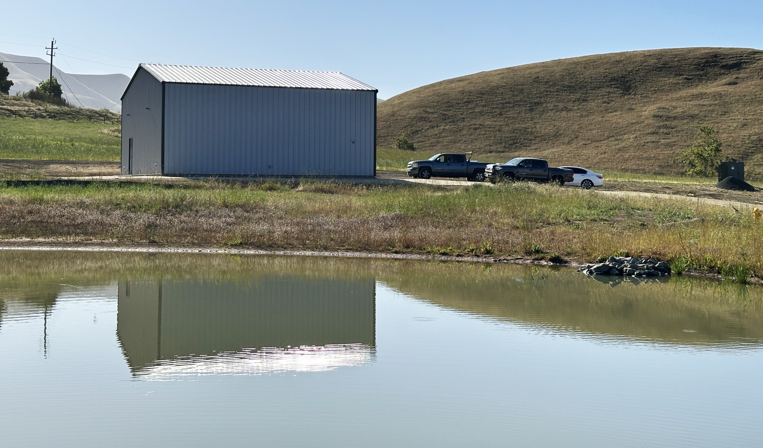
This is my finished shop building, located on the shores of Burro Lake.
I did a lot of the drawings myself, which saved me a lot on overall costs. The structural and civil engineering was done by licensed engineers. I was able to do the electrical and some of the site plan work myself. I learned a lot about how buildings are engineered and built.
I also learned about how local building departments work, which is to say I learned to be very patient. It took about two years to get the building permits I needed to begin construction. Then I was forced to move the building, so I had to return to the building department and apply for a modification to the permit. That was a short but painful process.
Once all those were in-hand, I hired a contractor, who hired a grading man, and that man delivered a tractor to the site, and within minutes was pushing soil around. In the following days, he moved 150 cubic yards of soil out of a hole he made in the hillside. Then, into that hole he put 150 cubic yards of non-exapansive soil. He followed that with some sand and some top soil and about 600 back-and-forth trips with a sheep’s foot machine to compact it. A soils engineer stood by, watching, and occasionally pounding a radioactive probe into the soil to measure the density.
When it reached a certain density – measured in pounds per cubic foot – she shouted “OK!” and they stopped.
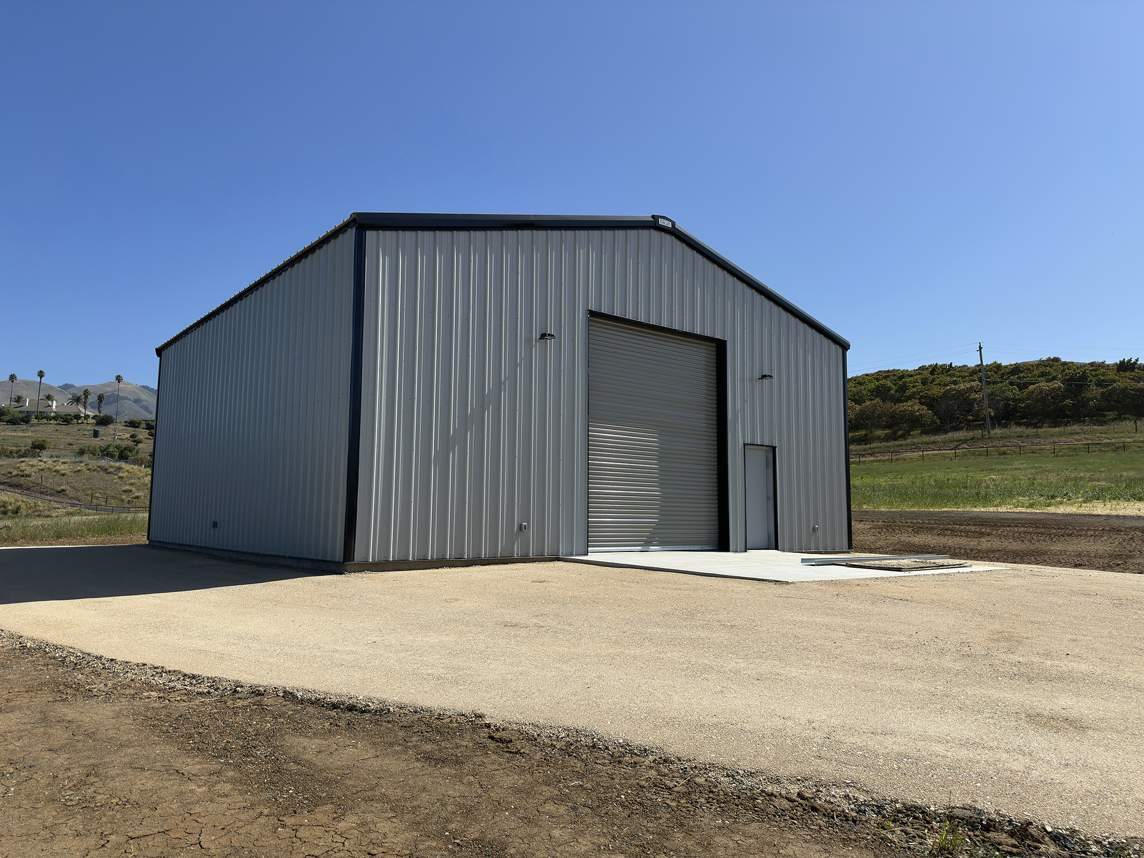
This is the front of the shop showing the 14-foot roll-up door. It will allow me to fly a Zeppelin through the door and into the shop.
In the weeks that followed, they covered the site with a sheet of waterproof plastic, and added sand on top of that, and compacted it again. Somewhere in there, the grading contractor dug trenches for the pipes that would eventually deliver electricity and compressed air, and take away sawdust. It was quite fascinating. Also expensive.
In January, nine cement trucks drove to the site and unloaded thair contents into a concrete pump, which pushed the liquid into a crane, and out into the forms that had been laid on the site. There was also about a million yards of re-bar in the forms. In less than five hours the pad was finished. I posted a time-lapse video of this here. You can watch a time-lapse video of the cement delivery and form-filling here.
In the weeks that followed, various teams of builders arrived to do their part of the work: erecting the steel building, installing insulation, pulling wire through conduits, installing lighting, plugs and fire sprinklers. We ran a large high-pressure water main from the tank on the hill above to provide firefighting water to the building. And, eventually, it took shape.
A week ago Wednesday, an inspector from the Building Department arrived to make the final inspection. Which we passed. So the building is now complete. But it’s empty.
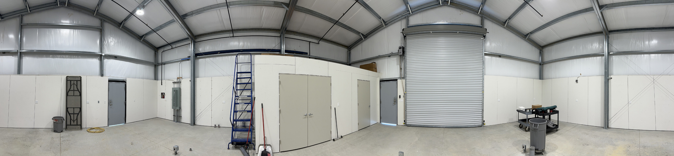
This is the interior of the shop building. I emptied it so that I can coat the floors with polyurea resin. That involves a lot of cleaning and preparation. Left-of-center is my new rolling ladder, which gives me access to the mezzanine where I will store lumber and supplies.
The entire process took six months and five days. It was costly. But with the millions I have made from this blog (I’ve never made a dime on this blog), cost is meaningless. It’s just pocket change!
This morning my contractor and I removed everything from the interior of the shop in preparation for my applying a floor coating. That is several days of work, starting with soap and water, followed by an acid wash, a primer and a final coat of polyurea. It will take me about a week to finish that.
And, then, after it dries for a few days, I’ll move my tools into their new home.
Introduction: The photos in this post were all taken by my wife, Ashala, on 70mm Ektachrome 64 film with a Hasselblad ELM camera. Those photos were stored away in my “archive” in a binder from 1981 until recently when I began the process of digitizing my film. I “found” these photos last week when digitizing them. To learn more about my digitizing project, please click here.
I may have mentioned in these blogs that I am a commercial pilot.
According to my pilot’s certificate, I am limited to flying lighter-than-air craft with an airborne heater (hot-air balloons). I received my pilot’s license in 1974 after training under the famous pilot Deke Sonnichsen of Menlo Park, California.
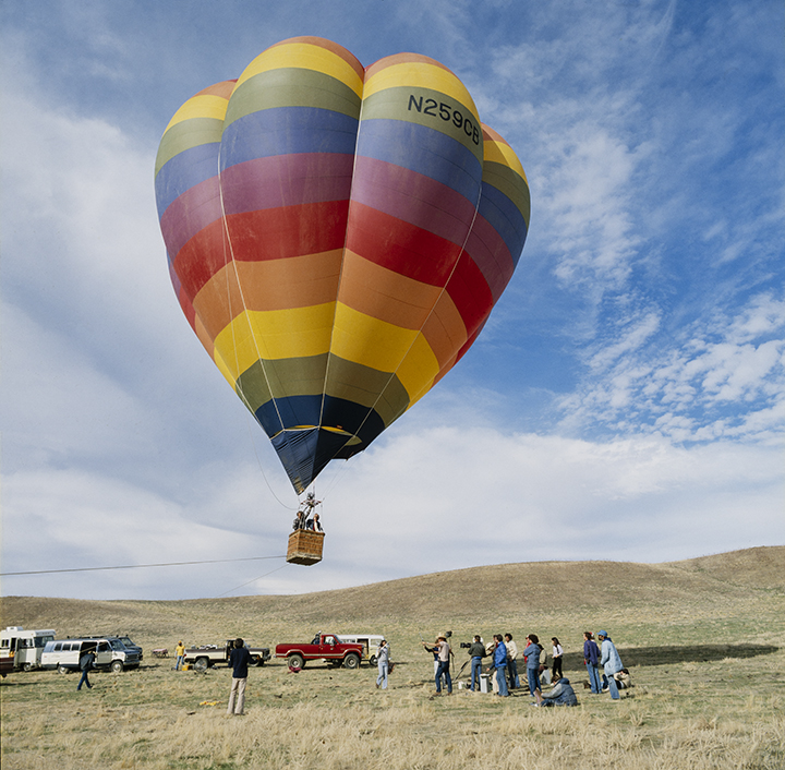
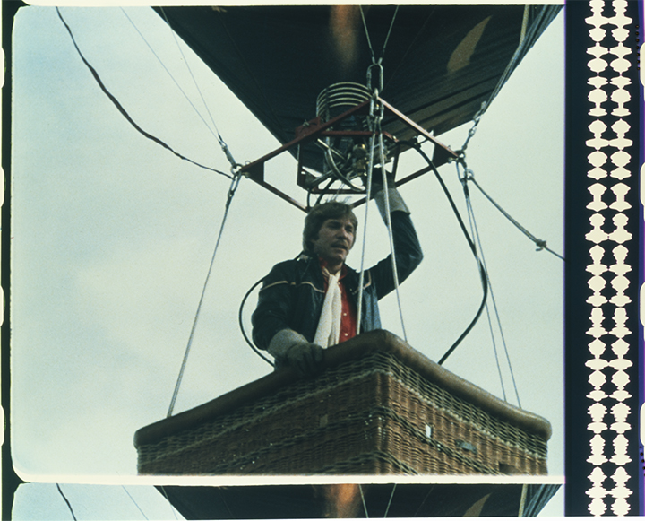
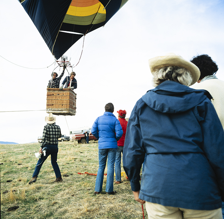
This is a photo from the site of shooting a commercial for Lowenbrau in central California in 1981. I am the licensed pilot. In the basket is actor Christopher Stone, who was “piloting” the balloon in the commercial. Judging from the tether line attached to the basket and the angle of the balloon, I was being pulled upwind by my ground crew in this image. On the ground are the camera crew, sound recordist, director, et al.
I have owned and operated a number of balloons, and have had the privilege of flying in the U.S., Mexico, Germany, France, the Netherlands, and Russia (the subject of another blog soon). I have over 500 hours as pilot-in-command, and have enjoyed many years of flying in beautiful locations with wonderful passengers.
I retired as a pilot a few years ago when I decided that there are old pilots, and bold pilots, but very few old, bold pilots. I had about 45 years of experience and it was time to become a balloon ground crew member.
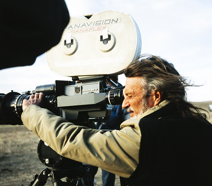
Cinematographer Conrad Hall at the camera, shooting 35mm film for the commercial.
From 1979 through 1984 I was Editor in Chief of Ballooning magazine, an international journal for balloonists. We had thousands of subscribers in many countries. In that role I traveled the U.S. and Europe, photographing and participating in ballooning events. It was a colorful and exciting experience. We received an Award of Merit from Communication Arts Magazine for Ballooning; I count that as one of my greatest design and publishing achievements.
In 1981 I was contacted by a Hollywood producer about flying a balloon for a television commercial for Lowenbrau beer. I would pilot the balloon while a helicopter flew a camera adjacent to me, and that footage would be the start of the commercial that ended with the well-known “Here’s to good friends…” song, and a group of balloonists and their pilot in an aprés-flight toast. Simple, right?
This is a still frame from the 35mm motion picture film (optical sound track on the right). Actor Christopher Stone was delivering his one line for the camera while holding on to the burner with his hand. I was crouched down in the basket, flying the balloon with the liquid propane valve on one of the fuel tanks.
The balloon would be “piloted” in the aerial scenes by an actor, Christopher Stone (The Howling) who would act as the pilot, while I was hidden below him in the basket, actually operating the balloon, while looking out the side of the wicker basket through a two-inch hole where a leather strap passes to hold the propane tanks in place (you can see the small holes in the photo above). Simple, right?
Mr. Stone was a seasoned actor, and a handsome guy who fit the role perfectly. He had a single line to deliver on-camera from the balloon basket. He shouted to his crew on the ground: “I’ll be landing this thing in about five minutes, and I expect a suitable reception!!” Simple, right?
The problem was that he blew his line about a dozen times. He just couldn’t get it right.
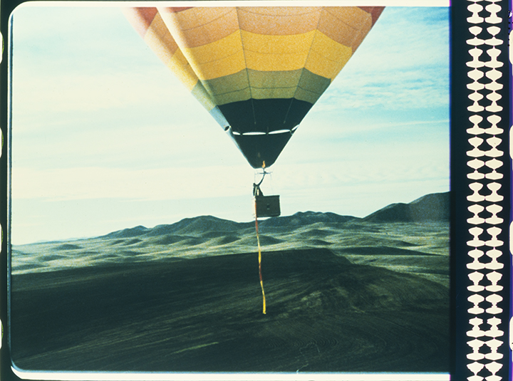
Another still frame from the 35mm film. We shot over an hour of air-to-air ballooning footage with the helicopter and the balloon in free flight (no tether). There is some beautiful material in the raw footage. The helicopter was flying about 150 feet away from me for the entire time; interestingly there was no turbulence caused by his presence.
And, the simple problem of re-taking a shot like that was that the balloon, weighing several tons (including the hot air inside), had to be pulled back upwind to start each new take. I had a small crew of helpers on the ground to do this. They would all get on a ground line and pull the balloon upwind several hundred yards, while I kept it buoyant. After about ten of those upwind hikes, my crew was ready to mutiny.
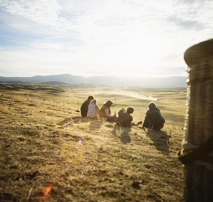
This is the closing scene with friends enjoying Lowenbrau while sitting next to the balloon basket. It was a very pretty shot.
The helicopter, a Bell 206 Jet Ranger, hovered nearby. Onboard was Academy Award-winning cinematographer Conrad Hall (Butch Cassidy and the Sundance Kid), using a Panavision camera shooting 35mm film on a Tyler vibration-canceling camera mount. The helicopter pilot was Rick Holley.
Actor Christopher Stone was overheard later saying that flying a hot-air balloon is easy.
Flying one while crouched below the rim of the basket, and operating the burner by turning the liquid propane valve on one of the cylinders while looking out of a two-inch hole was not very easy. Normal operation is with a blast valve on the burner frame. Operating it with eight feet of hose between the tank valve and the burner introduced considerable latency to the process. I had to anticipate more, and stop sooner. I also had a vent line, a small rope that opens a vent in the balloon to let hot air out, and allow the balloon to descend. Those are the only controls in a hot-air balloon.
This is a closer image of our many shots of the balloon passing over the camera. I am standing here, keeping the balloon buoyant while my ground crew pulled the balloon upwind for another take. The balloon was a Cameron V-84, built in Bristol, England, by Cameron Balloons UK.
The filming went well, and at the end of the second day we had all the shots needed to complete the project. I went back being the editor of Ballooning magazine, and all the production people went on to make more Lowenbrau commercials.
I have scoured the Web, and have not been able to find the commercial we made. There are many “Here’s to good friends…” commercials out there, but this one didn’t make the cut, so to speak, for inclusion in the historical record.
This is a tale of making unruly film behave ruly so it can be digitized. It started last November when I built a camera stand for digitizing my archive of actual film. I have written seven posts (To read them, you can start here) about this, so far, and I have nearly perfected my process for making digital copies of thousands of images so that I can use them, know that they are safe (?), and consolidate my film collection into a smaller space so that it takes up less room in my garage.
It also opens up a huge base of images for storytelling. I am remembering some of the greatest adventures of my life, and I have the film as evidence that it was real!
I started – but did not finish – digitizing my 35mm film, and that went well. Then I moved on to work on the larger film types, 120 and 70mm. In these cases I am digitizing from color transparencies, not negatives. I was always a transparency guy, so I have thousands of frames of medium-format film ready for the process.
My system for digitizing the 70mm film is to remove the film from those clear binder pages of vinyl or PET plastic that have held these films for decades. This process is more trouble than you would imagine. I absolutely hate those sheets, and celebrate each binder I have converted by making a toast to my progress. And, it turns out that the binder sheets are recyclable!
After I remove the film, I put the loose frames or strips into a carton to be digitized. Then I set up my copy stand, prepare the light, check focus and begin. This was working pretty well, but I had a lot of trouble with individual frames, and strips of two frames. I had purchased the film transports from Negative Supply to hold 120 and 35mm films, but those presume that you have longer strips. It was very difficult to digitize ones and twos.
So I decided to design and produce my own film holders for onesy-twosey digitization.
I love the Negative Supply light source, so I decided to work with that as a base. I was looking at a binder with over 500 frames of 70mm film, so I decided to make a base to hold that size film first.
I have never used 3D printing before, but my friend Bryn has a nice Bambu 3D printer, and he offered to print whatever I needed to make this project happen. So, I turned my moderately-mediocre knowledge of Autodesk Fusion to designing a 70mm film holder. The terms: it had to be able to hold a single frame; it had to hold a strip of three or four frames, and allow those strips to be moved under the camera for digitization. It could not scratch the film as it goes by.
The design was relatively easy, and I managed to get Fusion to do it with only a few exasperated moments. When I was finished with the design, I exported an STL file, and Bryn printed it – in about an hour. The 70mm film didn’t quite fit, so I modified the design a tiny bit and tried again. Once again, the film didn’t fit, so I made version 3, and that one works perfectly! Hurrah!
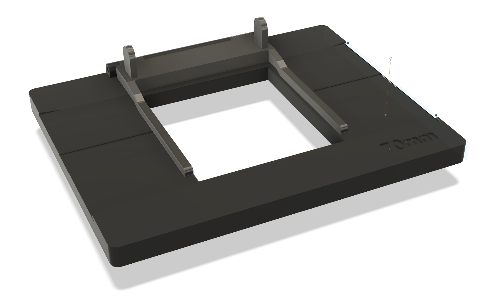
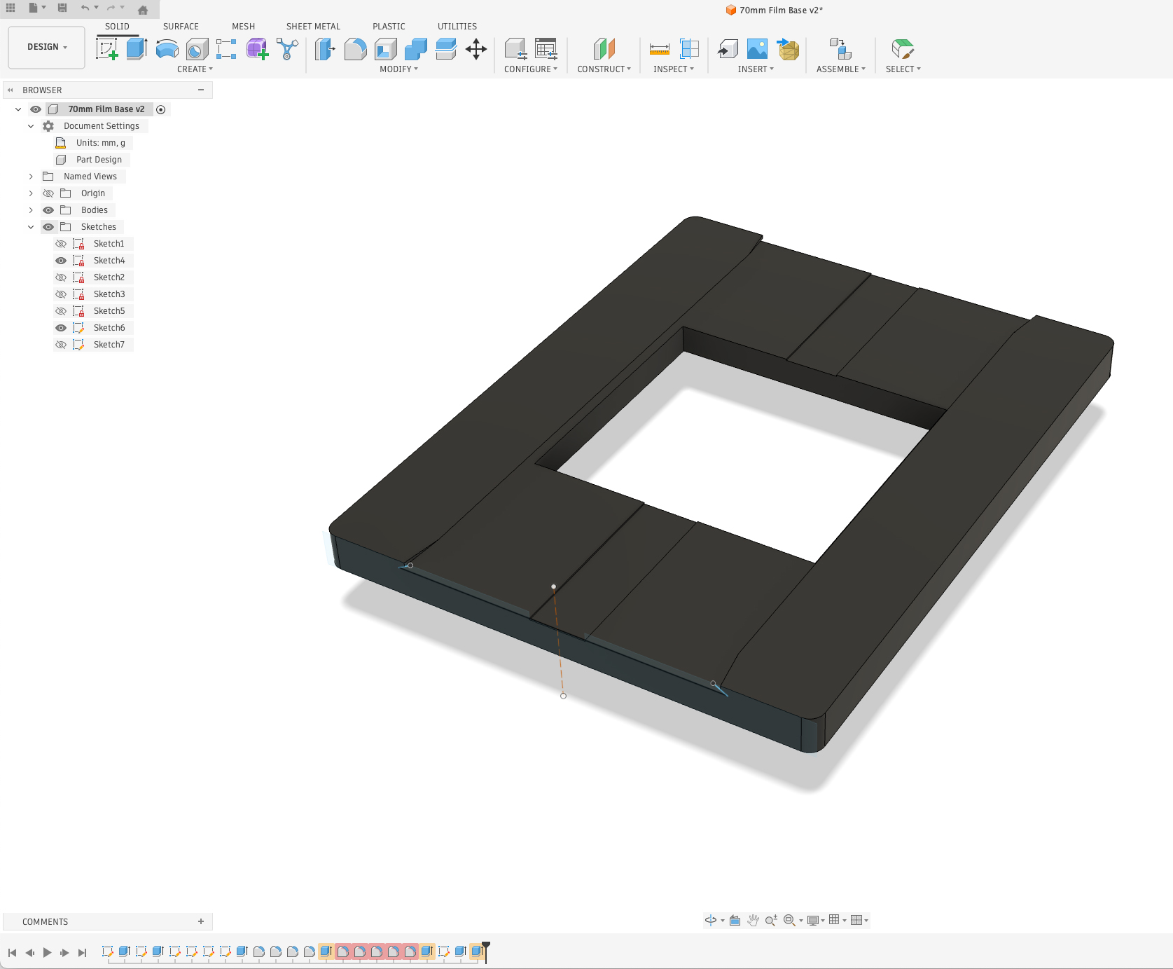
This is my 70mm short-strip film holder in Autodesk Fusion. It allows me to put a strip of 70mm film into the holder, or a single frame. The dovetails along the edges hold the film in position during digitizing. After I designed this in Fusion, I exported the file as an STL file, and sent it to be 3D printed.
So I digitized about 450 frames of 70mm film from a hot-air ballooning trip to Russia in 1990. In the process, I discovered a weakness in my system: 70mm film does not sit flat. It wants to bow upward, sometimes significantly, making it necessary to – somehow – hold the edges down. And, the 70mm Ektachrome film I used is 0.0065 in. (0.1716 mm) thick. This, compared to the thinner 120-size film at 0.0052 in. (0.1372 mm), makes it more resistant to flattening.
That flattening required three hands and both feet, and it was frustrating. So, it was back to Fusion where I designed an accessory to my film holder – an accessory I dubbed der Fingerpokenspieler!
This is version 2 of my 70mm film holder, with der Fingerpokenspieler affixed to the top. This device holds the film flat while I am making the images with my digital camera and light source. It works splendidly!
This device is essentially a two-tine fork that comes down over the film, holding the left and right edges of each 70mm frame flat to the base. It requires only one finger to activate (left or right!), and does not require continuous pressure, though pressure is sometimes helpful). It also does not scratch the film. It only touches the space between frames, and never inside the image area, so it’s a very safe device to use in this situation.
I modified my base design to add hinge brackets, and then designed the forks to hold my film in place. On the top edge of der Fingerpokenspieler I designed two interlocking hinge brackets. All these brackets have a 2.0mm hole that passes through them. These holes receive a hinge-pin that makes the fork rotate up and down. It all works very well.
So I have now expanded my digitizing tool kit to include both 70mm and 120-size film bases complete with zwei Fingerpokenspieleren. This is working out pretty well!
This is another in a chain of posts related to my effort to digitize my film library. Please click here to read the first in this series.
In the RF-series lens collection made by Canon, there is only one true macro lens: the 100mm f2.8. That lens is capable of 1.4:1, meaning that it goes beyond 1:1.
The Canon lens is an extraordinary device, with stunningly sharp optics and corner-to-corner sharpness and transparency (no vignetting).
I have one of these lenses, and I use it primarily for fine art reproduction. But I have found that it’s not a good fit for digitizing my film, because it’s too long (focal length). It works wonderfully for 35mm film, but is inappropriate for 120, 70mm and 4×5 films because it has to be too far from the subject to be effective. For 4×5 it doesn’t work at all because my camera stand is not tall enough to accommodate the lens at 4×5 inch magnification.
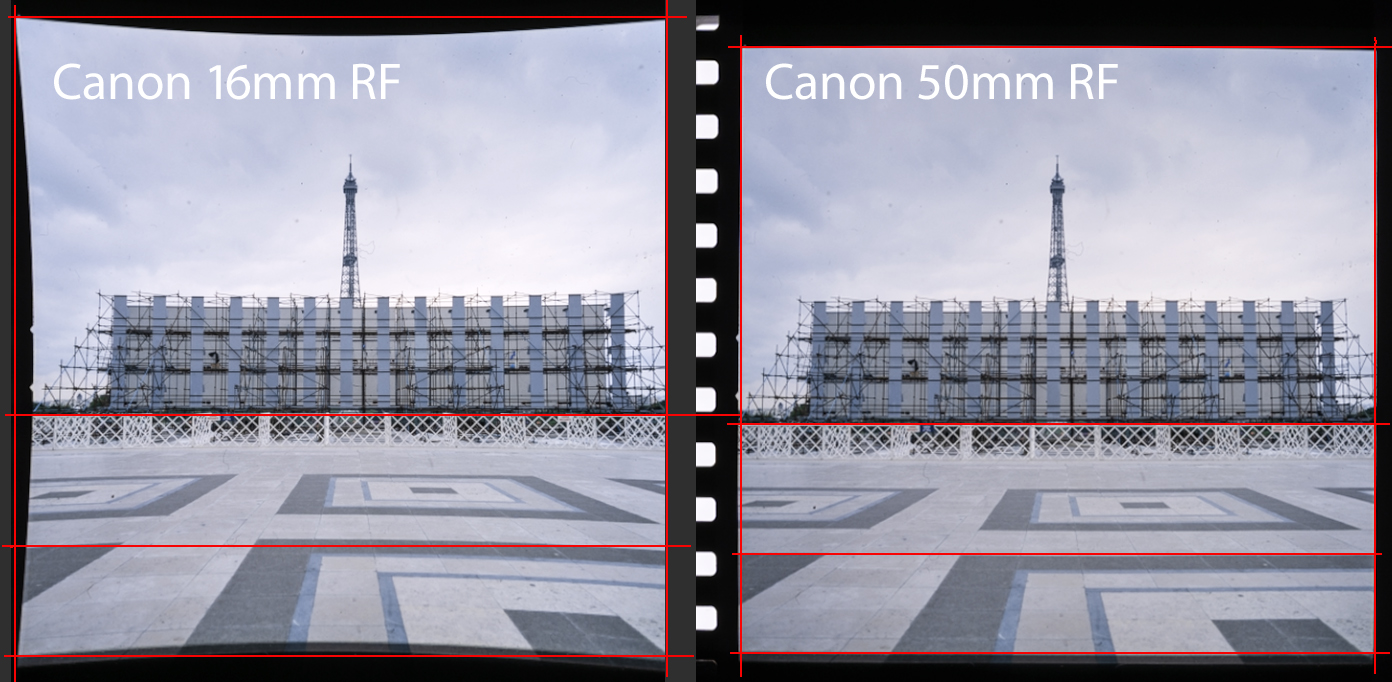
On the left is an image I scanned from a strip of 70mm film. The pincushion distortion is there because Adobe Camera Raw did not find the lens, nor the profile of the lens in its folder of lens profiles. ACR chose a Canon RF 16mm lens instead, and that resulted in extreme pincushion distortion. This is a mismatch between the actual lens and a wild guess that ACR made. On the right is the same image with a Canon 50mm RF lens profile applied. Notice that the pincushion distortion is (mostly) gone using that lens profile.
One problem is ambient light sneaking into the shot when the camera and lens are so far away from the subject. I have tested this in diffuse daylight and nighttime settings, and it is obvious that ambient light is part of the exposure in daylight hours. Negative Supply sells a couple of cylindrical shields for closing the path between the film and the lens, but I don’t want to hassle with these.
I realized shortly after I began this digitizing adventure that I would need a shorter lens. Nikon makes a fabulous 55mm macro lens that has been heralded for decades as the sharpest lens on Earth. I don’t shoot with Nikon, so that won’t help me (I even have one of those lenses out in the garage!).
Canon makes an 85mm “macro” lens that won’t focus at 1:1. In fact its closest focus is over 10 inches. That won’t work for this digitizing project. I bought a Laowa 100mm macro lens last summer that has greater magnification than the Canon 100mm lens, but it suffers the same problem of being too long.
I found a different Laowa lens that might do the job, but then chose a 7Artisans 60mm f2.8 lens that will work. It gets excellent reviews from photographers. It arrived, and I immediately found that it works for all sizes of film that I want to digitize. It’s very sharp, and it appears not to have any vignetting.
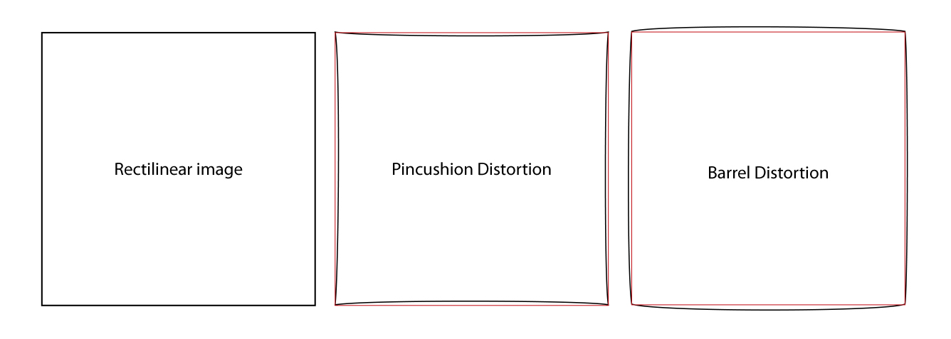
But images I take with it suffer from some pincushion distortion. This type of distortion is where the sides of the image bow inward very slightly. It’s the opposite of barrel distortion, which shows outward-bowing of straight edges.
Though it is a very small amount of distortion, it’s too much. I don’t want to introduce any distortion to my film digitization. And, the reason there is distortion with this lens is that there is no lens profile in Adobe Camera Raw for the lens. The pincushion distortion is not in the lens, it’s in the post-processing – Adobe Camera Raw. In other words, the distortion is a software problem, not an optics problem.
Adobe has corrective profiles for hundreds of lenses, including most offerings from Canon, Nikon and Sony (and many others). These profiles are automatically introduced to images when those lenses are used for digital photography. The 7Artisans lens is not among the lenses acknowledged by Adobe in Camera Raw and Lightroom (both use the same profiles). In addition to a lengthy list of lenses that are supported by the Adobe software, one can make a custom profile if there is not one available.
Once I discovered the distortion in my images, I was determined to make, and use a profile to correct for this distortion, and any vignetting and color aberration that may be present in this lens.
So, I looked up the Adobe Lens Profile Maker software, which, of course, is incompatible with my Mac’s operating system. I guess Adobe doesn’t want to support a software product that is used so seldom by so few people.
To the right of my main computer (a Mac Studio M1) I have an older MacBook Air with an M1 processor. It is running OS14, which Adobe claims in their documentation as being supported. I downloaded the application to that machine, and learned that it is in fact not supported. Right behind that MacBook is an older MacBook Air, this one with an Intel processor. It is running OS 12-something, which is still supported for this software. I downloaded and installed it on that computer, and it appears to work fine there.
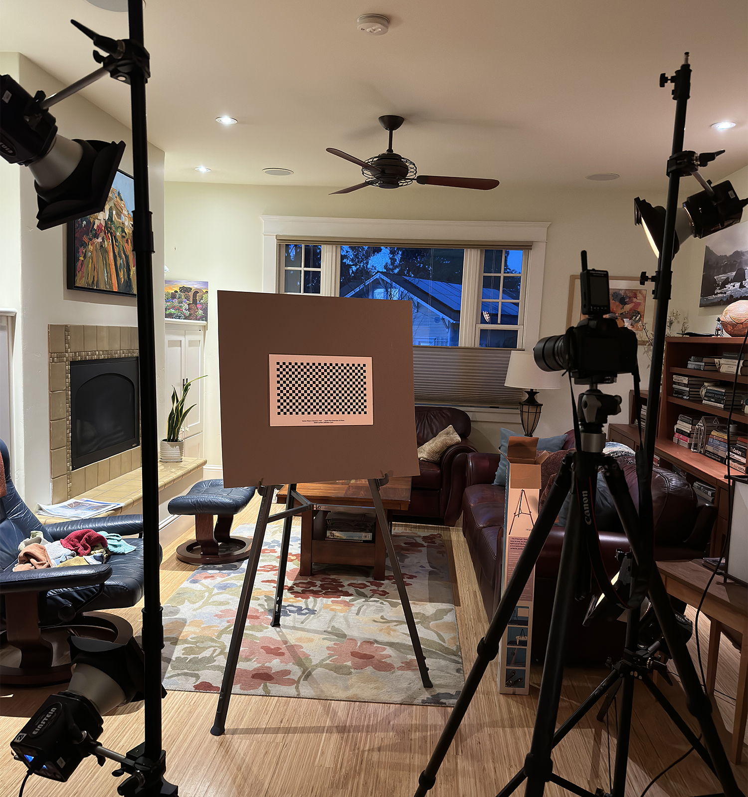
The process of making a lens profile is to print-out one or more checkerboard patterns to paper, then mount those to foam core board and photograph them under proper lighting. The manual explains that I should take a minimum of 9 photos of each pattern. You start in the middle, with the target dead-center in about the middle of a frame, then you turn the camera about 30 degrees left and take a photo, then turn the camera 30 degrees to the right, and repeat the shot. Then, I am instructed to tilt the camera up about 30 degrees and repeat that process, then tilt it down 30 degrees and take a final three images.
Above is one of many targets provided by the Adobe Lens Profile Creator software. You print this target, then photograph it with the camera and lens you are profiling, and then the software creates a lens profile for that combination.
Those nine (or more) photos are supposed to be made with manual exposure that is locked for all the frames. They must be imported or converted to DNG images, which I make using Adobe’s (odd-but-powerful) Photo Downloader software (part of Adobe Bridge).
With those nine images ingested, the Lens Profile Maker software will make a custom lens profile that will work in Bridge and Lightroom to correct for measured aberrations and distortions in any tested lens.
This is my chosen test pattern, printed on 11 x 17 inch paper, then mounted on a gray card, and illuminated by four Paul C. Buff Einstein strobe flash units in my living room. I made the photos at night so that there was no ambient light in the equation.
Or at least that’s what the manual says it will do.
After several attempts to photograph the lens profiling targets as described in the Adobe software manual, I was finally able to get the software to make a lens profile. It prompted me to name my profile with the words Canon R5. I added 7Artisans 60mm Macro to that, and saved it to the correct folder:
Macintosh HD/Library/Application Support/Adobe/Camera Raw/Lens Profiles/1.0/
Inside that folder I put the new profile into the Canon sub-folder.
I also made a new folder, aside the Canon, Leica, Hasselblad, Nikon folders entitled Seven Artisans, and I put a copy of the lens profile into that folder also. I know that Adobe Camera Raw is very fussy about the camera and lens being the correct ones for some operations.
But my new profile did not show up in the list of available profiles. My new Seven Artisans folder was also not acknowledged by Camera Raw. I restarted the computer, then tried again, and got nowhere.
While snooping around the available lens profiles, I tried one that was provided by Adobe: Canon 50mm f1.8 RF. Interestingly, that profile corrected my pincushion distortion almost perfectly!
I have searched high and low, but I have found no information that explains why a profile generated by Adobe’s software, and stored in the location Adobe shows in the software manual, is not found by Adobe’s Camera Raw and Lightroom software.
Meanwhile, I plan to use the Canon 50mm lens profile I found that makes the images look the best.
Update (next day) Friday, February 27: I tried processing the same photos in the Adobe Lens Profile Creator software, and this time I saved the resulting profile in the Canon folder, but with the name Seven Artisans, instead of 7Artisans. I had a nagging thought that Adobe Camera Raw (and its lens profile window) might not like a name that starts with a numeral. Voilá! That worked, and now I am able to use the profile for the specific lens I have. So, my problem is solved, and I have a good profile made with the actual lens that I am using for film digitization.
I have now digitized over 2,000 photos from film, mostly 35mm color slides. It has been fun, and relatively easy.
My system is holding up well. The archiving envelopes are working well enough, and the small corrugated boxes that I bought for 35mm slide storage are great. I can fit just under 200 slides in a single box, and each box takes up a lot less space than a binder with plastic divider sheets carrying the same number of slides. That part is working well.
Digitizing color negatives hasn’t been much of my work load, as I was never much of a color negative user when I was shooting film. That’s not to say I don’t have color negatives, I do. But I haven’t found any binders in the cabinets yet that hold negative film. I have thousands of snapshots, accompanied by 35mm color negative film strips, but I am leaving those for later.
Digitizing 120 size film is not as easy as digitizing slides, as feeding the film strips into the Negative Supply Basic 120 film transport is imperfect. It’s very easy to slide the film below the tiny slot opening that is intended to be the place where the film goes. This could be much better engineered. Also, the 120 size film doesn’t fit into a No. 10 envelope in strips of four frames (most of my 120 film is in these strips, as these were fit into plastic binder sheets designed for four frames-per-strip). I found another corrugated carton that can hold my 120 x 4 and 70mm x 4 strips. These should do the job. With these cartons I will have two standard storage boxes for film: one for slides and one for strips of 120 and 70mm film.
I did not purchase the 70mm film transport accessories made by Negative Supply. I’m doing my first full album of 120 size film first.
One thing is for certain: feeding fewer than three frames of 120 film into the Negative Supply holder is a mistake. Short strips (2 or fewer) get lost in there, and there is no easy way to get them out. Negative Supply does not make a film holder for individual unmounted 120 size frames. I need to digitize short strips of 120 and 70mm film, often just single frames that were cut from longer rolls.
So (of course) I decided to make my own film holder! This would be an opportunity to test my growing skills as an Autodesk Fusion practitioner, and would allow me to ask my friend Bryn to manufacture it for me on his 3D printer! I could have machined it out of aluminum on my CNC machine, but that machine is in storage while my building is being completed – and it will be a few months before that is back up and running.
Progress! This is my new shop taking shape. It’s still a couple of months from completion, so not ready for me to be building things yet.
My plan was to make a plate that will fit precisely inside the Negative Supply light source, and allow me to slide four-frame strips of film through it by hand. I decided to start with a holder for 70mm film, as I have thousands of frames of that size to digitize. If it works well, then I will ask Bryn to print one for 120 size. I suppose I could even make a similar holder for 35mm film. We’ll see.
70mm film is exactly 70mm wide, and has sprockets along both edges (the sprockets are the same as those on 35mm film). This is the film size that is used to make IMAX movies. I wrote about my affair with 70mm film in another post. I shot this film for years using my Hasselblad 500 ELM camera with a 70mm film back on it. That allowed me to shoot about 70 frames per roll, and I loved that.
Screenshot
This is my Autodesk Fusion screen with the 70mm film carrier shown. It’s a very simple device that allows me to digitize short strips – or individual frames – with my copy stand system.
The image area of my 70mm frames is exactly the same as a Hasselblad 120 size film frame: 56mm square. And, a telltale: all Hasselblad cameras expose two tiny triangles along the left edge of every frame. These are helpful in orienting the film, and knowing which side is up. 120 size film is just under 62mm wide. I looked it up on Wikipedia to learn that 120 film is not precisely made. The size varies from between 60.7 mm and 61.7mm (that’s really dumb!).
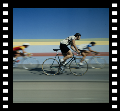
This is a typical frame of 70mm film from the Hasselblad. The film itself is 70mm wide, and the image is the same size as a 120 or 220 size frame: 56mm.
My new film bracket is 8mm tall, which will put its top edge above the recess on the light source. I designed a dovetail into the horizontal track to retain the film and to keep it flat. The aperture for the image is exactly 56mm square. I designed my lateral opening to be a little larger, 63mm, so that I will photograph about one-third of the sprocket holes along both edges.
I will be able to feed a single frame, or strips of 70mm film into the bracket and slide them along under the dovetail edges as I digitize the images. I incorporated a shallow channel down the center to allow a fingernail to push a frame of film through the plate.
Fusion has taken me months to learn, and I am barelyliterate with that software now. I am awed by its capabilities, but have brought only one other project to completion in that application (I’ll tell you about that project when the finished part arrives in my mailbox in a few weeks).
I have focused my Fusion training so far on CNC machining, so this project opened my eyes to another technique – 3D printing, and that has different requirements. Fortunately, my friend Bryn has tutored me on those requirements to the degree that I can be successful with this part. The only worry I had was the dovetails, which create an unsupported edge in the bracket. With 3D printing, unsupported surfaces can collapse because the machine is injecting molten plastic into space with nothing under it to keep it from collapsing. Bryn and I think that these dovetails are so small as to pass the unsupported test without failing, but again, we’ll see.
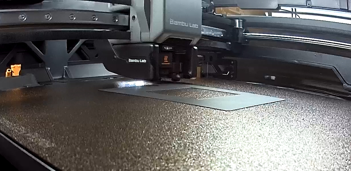
This is my 70mm film bracket being made inside the Bambu 3D printer. There is a built-in progress camera in that machine that automatically makes time-lapse movies of your creations.
It took the Bambu 3D printer just under an hour to print the part, using 14 grams of filament. It turned out that our concerns about the unsupported edges were unsupported. The 3D printer filament was adequately supported, and didn’t collapse.
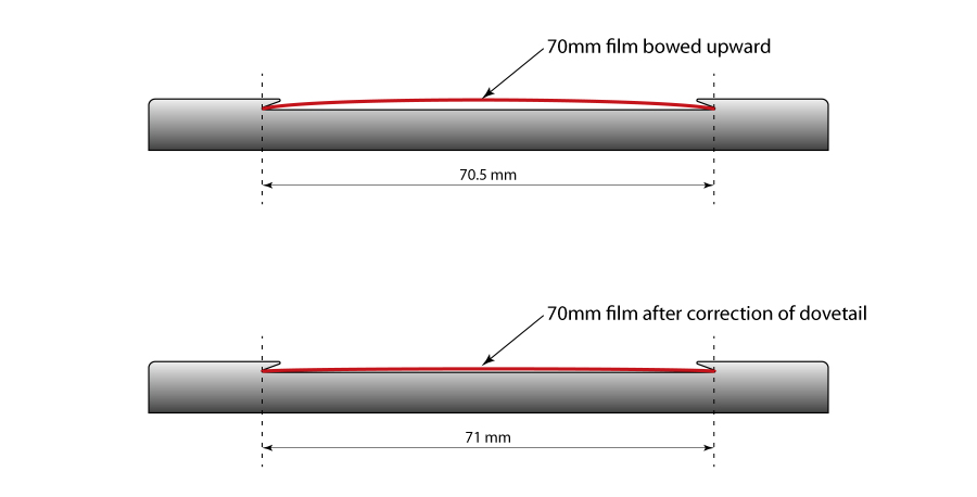
I brought the plate home and put a strip of 70mm film into the opening. It didn’t sit perfectly flat, instead bowing upward, indicating that the width of my dovetail tunnel was slightly too narrow.
I went back into Fusion, chose the sketch for that element in my design, added 0.75mm to the dovetail, then exported a new version in .STL format and e-mailed that to Bryn. Just an hour later he told me it was printed!
Version 2.0 was dramatically better, but still a teensy bit (a scientific term, similar to a scosh) too narrow. So, again, I added 0.5mm width to the opening for the film and exported another .STL file. I am very close. I feel as though I should have been able to measure and correct the error by measuring the vertical bow in the film, then adding that value to the width of the dovetail. That bow is over 1mm, and I am skeptical that adding 1mm to the width of the dovetail would be correct – the film would probably flop around inside if I added that much.
This diagram shows how adding just 0.5mm to the width of the channel that holds the film made the difference between an unacceptable bow in the film and getting the film in place for accurate digitization. Click on the image to enlarge.
The addition of 0.5mm turned out to be the perfect amount to make the film travel smoothly, yet firmly through the gate, while still remaining flat enough to photograph without going out of focus. Success!
Now I am going to digitize a batch of images and see how it behaves in production.
This is the fourth in a series about how I am digitizing film from my past, and making it part of my digital archive. The start at the beginning, please click here.
I knew that once I started digitizing my film I would run into several challenges:
• Storage • Indexing • Searching • Consolidating
After setting up my system for digitizing film, including making the stand, buying the macro lens (I’ve bought another that is on the way!), and then purchasing the necessary film transport mechanisms to hold various sizes of film, I had to solve the dust problem (dust never sleeps!).
This is my complete digitizing set-up: stand, camera, lens, light source, film transport, iPad for previewing, and the associated software – NegativeLab Pro for converting negatives into positives, and an app on my iPad that allows me to see a live view on that device.
I purchased a static-eliminating brush – which works OK, and film cleaner and special lint-free pads – that work quite well. So now my “scans” of film are usually free of dust, though it still remains a problem.
In this post I am going to refer to the process of re-photographing or digitizing film as “scanning.” I am also going to refer to the process as “digitizing.” Scanning is not the correct term for the process, but please bear with me.
I scanned two of my long rolls of 35mm negative film, and converted the resulting images – about 340 total – using Negative Lab Pro software – which works really well – and then for fun, I created a time-lapse movie from the resulting still photos – which didn’t work very well at all. The problem there is that the individual frames were made at 19-minute intervals, and the lighting in the hangar changed dramatically depending on the position of work lights, sunlight incursion, and occasionally the hangar door being opened.
I decided to put the long-roll time-lapse work on a back burner and concentrate on digitizing my still photos, starting with whatever box I find next in my garage.
I needed a method for storing the actual film after digitizing. I looked around at B&H and other suppliers and discovered that storing film in “archival” containers is stunningly expensive. I apologize to archivists when I say this, but that’s too expensive for me!
Instead, I have chosen to put strips of film, after scanning into regular paper envelopes. Regular – white – paper is bleached in manufacture, and acids that might damage film are removed in the process. I see the risk of acid incursion on negatives and transparencies to be very small, and I am willing to risk it. For the storage of 35mm mounted slides, I am going to use corrugated boxes that fit about 200 slides per carton. Kraft paper, from which corrugated boxes are made, is definitely not archival. But, the slides are protected from direct contact with the corrugated material by their paper or plastic mounts, and that’s OK with me.
This is the Adobe InDesign document to print the serial-numbered #10 envelopes for putting the film after it is digitized.
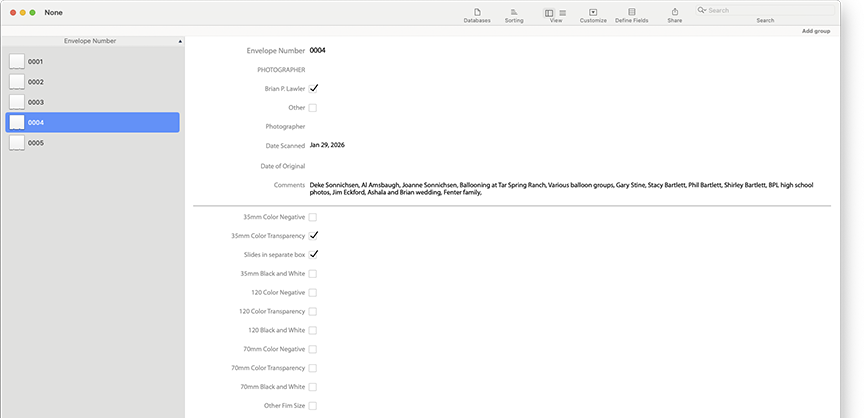
I had my students at Cal Poly print 500 plain white envelopes for film storage. I put information on the front of those envelopes, and put serial numbers on each envelope using the variable-data functions in Adobe InDesign. Those numbers form the storage key to my archive, and will provide an index number that gets entered into my…
Database – I wanted to renew my subscription to FileMaker Pro, but decided that it’s too sophisticated and way too expensive for this project. It also requires an on-going monthly payment, and I am not willing to commit myself and my descendants to that. So, instead, I bought a Mac database called iDatabase for $40.00. It is good; it gets reasonable ratings. And, after using it for two days, I can attest to its ease of use, simple design procedures, and basic functionality. iDatabase allows me to copy the information on the front of my storage envelopes, and then enter all the information that I have about the photos into the database, which I can later search and find a photo by its description, date, or content, as long as I enter that information into the database.
This is my custom iDatabase form for these envelopes. All of the information from the face of each envelope is entered here, and is thus searchable. I added a checkbox to indicate when the contents of an envelope have been stored in a corrugated carton.
After scanning a few hundred mounted 35mm slides, I decided to enter the information on the face of one of the numbered envelopes, but then put a sticker on the envelope indicating that the actual slides are stored in a corrugated carton with the same number on the front of the box. When the database refers a user to a specific envelope, that envelope will direct that person to get the slides from a carton with the same number. It should work, and will take up much less space than the many hundreds of binders I have with clear plastic slide holders in them.
These are the Corrugated cartons I bought to hold mounted 35mm slides. Each one can hold about 150 slides. The stickers indicate that they contain slides, and the Envelope number, that refers back to the archiving envelopes. The same data from the envelopes is entered into the database.
So, the system is in place. I have the process working, and I am now entering information on Envelope 0004. I have scanned 35mm color negative film, color transparencies and mounted color transparencies (slides). I have entered information into the database and tested it for searching. It seems to work perfectly well. Long-term use will tell, of course.
I bought a pack of small stickers on which I printed “SLIDES” to put on the face of envelopes whose contents are in the storage cartons.
Now I will begin in earnest to scan images from film, store the film strips in serial-numbered envelopes, enter the information about them into the database, and then put the material into banker’s boxes in my garage. It’s far from perfect, but it’s a system, and I think it will work pretty well. If it needs adjustment, I can change my process without much trouble.
By doing this, not only will I have very high quality digital reproductions of my film, but I will have reduced overall storage volume by consolidation, and will have a searchable database of the images in storage. With these elements in place, I should be able to save space, save time, and save the images as digital images of what was only available as film before. Film that I could never find. I am confident that it will give me access to tens of thousands of photos I took between 1967, when I became a serious photographer, and today.
This is the third in a series of posts about digitizing film. To start at the beginning, please click here.
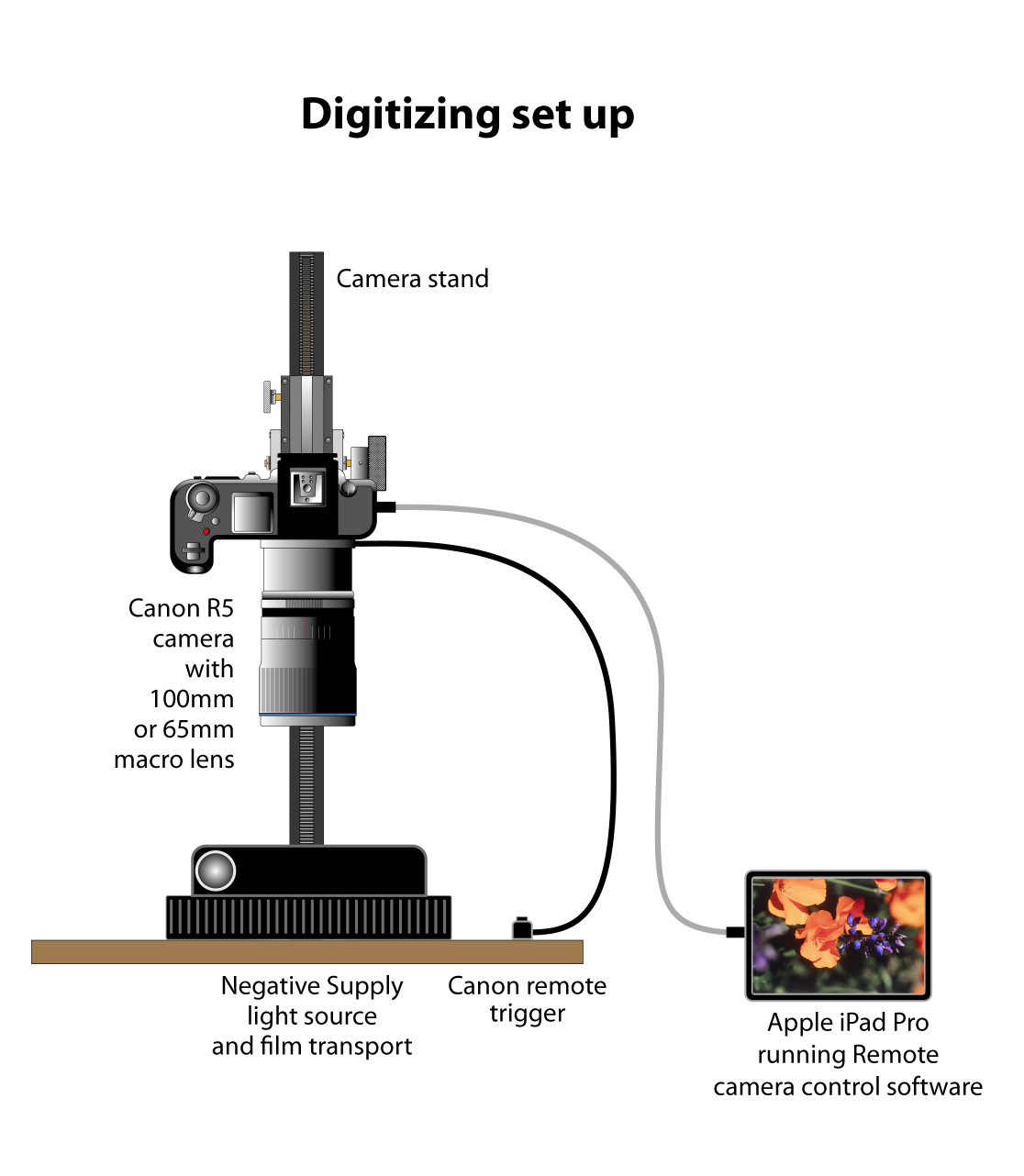
My camera stand project is now set up and running. I am using my Canon R5 camera and my Laowa 100mm Macro x2 lens for making the photos, and I have outfitted my workspace with a host of Negative Supply devices that hold and feed 35mm and 120 film.
This is my digitizing system. At the back is my camera stand, the subject of two of my previous posts (you can read about it here and here). The camera is a Canon R5. The lens is a 100mm Laowa 2X macro lens. On the table are two devices from Negative Supply: a light source and the 35mm film transport. At the lower-right is my Canon remote shutter button.
The quality is extraordinary. After cropping, I have images 90 MB in size, which translates to a printable image of about 16 x 22 inches at 300 ppi. Not bad for a scan of 35mm film! (At some point after about 20 MB, more resolution is akin to gilding a digital lily.)
My biggest problems so far have been dust and crud on the film. I have “fixed” the dust problem with an anti-static brush, and I purchased some film cleaning solution and lint-free pads from Climax Photo. These are helpful, but they do not solve the problem completely.
This is my Negative Supply light source, which the maker claims has a 97% CRI. Atop the light source is the 35mm film transport from the same company. It is well made and it holds film very flat when digitizing it.
Overall, I’m very happy with my camera mount. It is stable, reasonably solid and has almost no mechanical vibration. I’m using a wired remote trigger to take the photos, as touching the camera in any way will cause the camera (and the mount) to move, and it doesn’t have to move much to ruin an image. I focus, then I take my hands off the camera, take a breath, then push the remote button to make an exposure.
I have numerous long rolls of Kodak negative film, each one about 18 feet in length. These contain 250 photos per roll. I’m feeding them through the Negative Supply 35mm Mark II transport (above), which works flawlessly (unless you put a strip of 4 or fewer frames into it, which makes it necessary to fish the film out with a toothpick). I’m sure that there is another product from Negative Supply that will handle those short strips better.
The camera’s squareness is effectively perfect. I have carefully adjusted the camera’s position using a front-surface mirror to accomplish that task.
Exposure is easy: I did a custom white balance on the Negative Supply light source; I set the ISO at 100, the aperture at 8.0, and let the shutter speed land wherever it wants for “correct” exposure.
This is one frame from one of my two time-lapse movies of the making of the Global Flyer, a carbon-fiber airplane made at Scaled Composites in Mojave, California. This plane would eventually carry its pilot, Steve Fossett, around the world to set the longest flight world record. The plane now hangs in the Udvar-Hazy collection of the Smithsonian National Air and Space Museum near Dulles airport. I have over 900 feet of 35mm film from this project to digitize!
I purchased the full-frame mask from Negative Supply, which allows me to photograph the sprocket holes and the film identification along the edges with each image. Negative Lab Pro software allows me to evaluate images and simultaneously ignore the sprocket holes and film rebate (you can see the sprocket holes in the image above).
I purchased two film reel winders from Climax Photo. These are the small ones that allow me to load a 3.5-inch plastic reel of film, and then turn the cranks to take-up the film after exposure. This is better than having 18 feet of film lying on top of my work table, making it possible to scratch, and to catch as much dust as possible while it’s exposed. I mounted those winders to blocks of plywood to give them mass. These are also removable, so I can put them away when I am not feeding these long rolls of 35mm film.
I installed Negative Lab Pro, and got it running as a plug-in with Lightroom Classic. I’m not a habitual Lightroom user, but I will be developing that habit in the coming weeks as I get further embedded in the process of converting my many thousands of film negatives and positives into digital images. My initial impression of Negative Lab Pro is that it is an excellent solution to converting color negatives into color positives.
One thing my camera stand does not have is a measurement index so that the camera mount can be returned to the same vertical position time and time again. I have a couple of stainless steel rulers at my desk, and have been using one of these to measure and set the position of the horizontal arm holding the camera.
Version two of my camera mount will have a metric scale built-in. That scale will make it easier to get the camera to the same position each time I need to photograph the same size of film. And, for my many thousands of color negatives from the Global Flyer project, returning to the same vertical location is critical. When making time-lapse movies, any change in camera position, exposure or focal length – even a microscopic change – is visible in the final movie.
I purchased a 35 mm slide holder from Negative Supply, and I photographed a box of slides with it. The results are excellent. One of the recent additions to Negative Lab Pro is that it now converts positive images – slides – into usable digital files. I haven’t tried that yet.
My next problem is that my Laowa 100mm lens is too long. It is a stunningly sharp lens, and it works perfectly for 35mm film photography. But, it (and my camera stand) cannot support the camera far enough away from the subject to photograph 120 film (6×6 cm.). This week I ordered a 60mm 2X macro lens from a Chinese manufacturer called 7Artisans. When that arrives, I will be able to photograph 120 film on the existing camera stand. Version 2 will be taller, and that will make it even easier. I want to photograph 4×5 inch film eventually, as I have quite a bit of that size film that needs to be digitized.
The process has been interesting and fun. I’m enjoying digitizing my film images, and also reliving the times in which those images were made. It’s emotionally satisfying and technologically challenging, a good formula for success.
Yesterday at sunrise a huge concrete pumping truck showed up at my shop construction site. It was about 6:30 in the morning. I had set up my time-lapse camera on a tripod overlooking the site, and the shutter was activated every five seconds.
This is the construction site of my new shop. The form had been built in recent days, and it was ready for cement. The huge pumping machine on the left made short work of the contents of eight cement mixer trucks.
I put my battery base on the camera (a Canon R5 Mark II) because it holds two batteries. I have never used the R5 for time-lapse before, so I was unsure how many photos it would take before the batteries died.
Eight workers showed up at about the same time. They were fitting their cement boots and taping the boot-tops around their blue jeans to keep the material out.
The pump truck moved once to position itself better for the “pour.”
I asked the team leader when we could expect the first cement mixer truck to arrive. Seven! he said, and then added, “concrete waits for no man!”
At 6:58 a.m. the first of eight mixer trucks rolled up the road to the shop, made a three-point turn, and backed up to the pump. Four minutes later, that mixer was dispensing cement into the hopper of the pump, and the eight workers started their dance with the outflow of that machine – a long rubber hose that dispenses wet cement at an amazing rate.
This is the crane part of the concrete pumping machine. It can reach about 100 feet from the source of the material. I spent the morning dazzled by the weight of that material, and the ability of the machine to do its job so easily without falling over.
What transpired next was a fleet of trucks arriving on ten minute intervals, sometimes one, sometimes two at a time, unloading into the pumper, and dispensing their supply of cement.
After seven truckloads, and 66.5 cubic yards of material had been poured into the form, they ran out. I was told that this was normal. The contractor calculated for, and ordered seven truckloads, then had the men on the site do another calculation for how much more they needed to finish.
They did the math to determine that one more truckload – 9.5 yards – was needed. The cement company is reasonably close, only about 8 miles from the site. They mix on-demand, so they mixed up another nine yards and dispatched the last truck to the site. It took about 30 minutes. While waiting, the concrete workers were using wooden and metal screeds to smooth the material, and smaller hand trowels to smooth around pipes and bolts. Others were loosening vertical wooden braces and removing them. I asked the pump operator if he ever gets nervous. He said he does, but this was a cool day, and the risk to the already-poured cement was small.
As the men approached the final corner of the form, the supply ran low and the pump started spitting rather than pouring its contents into the pad. I asked the contractor what happens if we run just a little short. He told me that they order as much as needed and the company dispatches another truck to deliver it. But, surprisingly, the men didn’t run out. In fact, there were about two cubic feet of unused cement left over when they reached the corner of the form. I was amazed.
These are the talented workers who converted 76 cubic yards of cement into a perfectly level concrete pad for my new building. They exhibited extraordinary professionalism and real teamwork in doing the job (and they shared their lunch with me!).
For the time-lapse, I used my Canon, and a radio-controlled remote trigger that can be operated from a distance. I set that trigger to take an infinite number of photos at 5-second intervals, and I walked away. I had about 512 GB of storage available, so there was no risk of filling the cards.
I have considerable experience with time-lapse movies, but I had never made one that started in darkness and continued into right sunlight (except my 365-day time-study project at Cal Poly, but that’s another story). I set the camera to shoot and store in JPEG large format (I usually shoot Raw, but that would be ridiculous for this application). I cleared both memory cards. Then I set the ISO to “auto” and the exposure to “aperture priority” and I let it run.
In the first shots, which began just before sunrise, the exposures were 3 seconds, the ISO at 12500, and the aperture at the fixed f5.6. As the sun came up, the exposures changed automatically to lower ISO, and faster shutter speeds.
After about four hours, the camera batteries died, and the camera stopped taking photos. That was OK, because the work was mostly complete by then, and the only thing still happening in the scene was the hand troweling. I took 2,828 total photos.
Last night I copied all those images to my Mac Studio, renamed them in Adobe Bridge, and then created a movie in DaVinci Resolve. The only settings change I had to make was the minimum frame value for imported still photos. I changed that to 1, then restarted Resolve and loaded all 2,828 images into a timeline to make the movie. The result is here.
I added titles and then exported the movie to .mov format and uploaded it to YouTube.
14 months ago I announced with pride that I had received a building permit for a new shop to be built on my friends’ property here in San Luis Obispo County. It had taken about two years to get that permit, and a with a eye-watering payment for the permit, I had it in-hand.
And then it was rescinded. And I had to re-apply. That had something to do with the Scenic Highways and Railways Act, a local ordinance that prevents people like me from building buildings like this in sight of scenic roads and railroads in our area. I spent a few days with my camera, walking the roads and the rails nearby, taking photos in the direction of my wanna-be building. Fortunately there was a large copse of trees between me and the proposed site, so eventually the County said, “OK.”
That was in September, 2024.
By the end of October I had the permit. Then we entered rainy season, so we waited for a break, then staked the site in February, 2025. The tractors were lined-up and ready to begin grading when the landowner (and my dear friends) had second thoughts about the location. So we stopped.
This is me in my shop, a photo taken in 2023. In the left-rear is the Avid CNC machine, and I’m standing in front of my beloved Powermatic 14-inch tablesaw. This week we moved everything out and into a storage container. In a few months I’ll move all of it again to the new building being built now.
In April, 2025 I returned to the County and applied for a revised permit, this one showing the building 200 feet north of the original spot. Approval of that minor change cost only $140, and took only five months to get. For three of those months it was lost in a County official’s junk mail folder.
In September I contacted my contractor to tell him to move forward with the project at the new spot. He didn’t call back. I texted; I wrote e-mails; I went to his office. He was gone. So, I hired a newer, better contractor, and started over.
We broke ground on December 5, 2025, with 150 cubic yards of non-expansive soil being delivered to the site, along with a couple of massive earth-movers.
This isn’t a very big job. The finished shop building will be 40 x 40 feet. The grading expert dug a hole that looked like a swimming pool, then he pushed the non-expansive soil into the hole, then drove a sheep’s-foot (a 13,00 pound waffle-shaped roller) back and forth until the soil was compacted to 104 lbs. per cubic foot. A soils engineer stood-by with a clever nuclear instrument to measure the compaction until it was done.
Then it rained. And rained and rained.
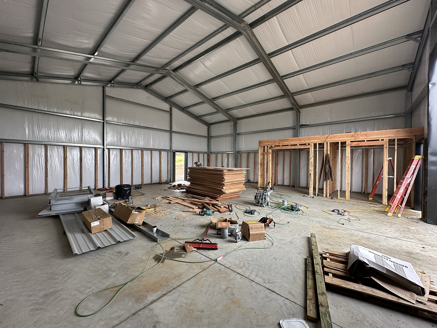
So, here we are in January, 2026, and the building site is now being excavated for underground dust collection, electricity and compressed air. Pipes of three sizes are now under the surface, and the special soil has been replaced over them.
Here you can see the electrical conduits running underground. These were covered in about an hour after I took this photo. In the coming days there might be concrete poured here.
Today, the concrete engineer is digging the footings for the steel building. It’s exciting!
So, just 27 months later (plus the two years the building parts sat waiting for the first permit), we’re in the midst of some real construction!
This is the same shop, from about the same angle as the one at the top of this post. It took me 20 years to build and populate the shop. Now this room is (nearly) empty. All of it is stored in a 40-foot container at the new shop site.
Concrete may be poured soon (maybe next week?) and soon the pad will be ready for the erection of my building. That will be quite fast, with the builders spending just days to change a huge pile of steel (11,000 lbs.) into a finished structure. I’ll post more on this later.
A couple of weeks ago I rented a 40-foot container and had it delivered to the new site. It will house my tools and shop supplies until the new building is ready (several months). And, last Friday my friend Tim and I started moving the existing shop to the container.
I hired a couple of young (strong) men to help, and with a pallet jack, a rental truck and three days of work, we moved all the machines out and put them into the container. Sounds easy, but it was exhausting.
With just lumber left to sort and transfer (and discard!), the move is almost complete.
My Blognosticator reader-odometer passed 500,000 today; that’s something to be proud of.
Fourteen years ago I began writing The Blognosticator. Since then I have written and illustrated 354 posts, received 680 legitimate comments, and have enjoyed not having to delete 883,255 spam comments. Those were rejected by the Akismet software I have running to protect my blog site (thank you Akismet!).
That is 0.07 percent legitimate comments! (And, it’s 99.93 percent spam.)
Akismet has also killed 183,668 malicious attacks on my site, again saving me from lots of trouble, I am sure. That lowers the ratio to 0.006 percent legitimate. That’s a lot of spam!
On my best day, April 30, 2012, I hosted 856 readers. On a typical day I have 97.84 readers. I am happy to have those sincere readers every day. If you are that 0.84 reader, I expect your full participation soon!
I have never made a dime on this blog site. No sponsors (I tried). No advertisers (I didn’t try). My wife seldom reads these posts. I have no friends who read these posts (I have no friends)..
But I believe that I have contributed to the graphic arts and photography industries by writing my missives. I have answered a few questions for people experiencing some of the same problems I have encountered, and I have learned a tremendous amount about a large number of things.
I hope I have steered a few people away from disaster, and I am sure that I have steered a few people toward products and services that I feel are valuable.
I have tried not to whine. I occasionally gripe about a lousy product, but I am sincere in my opinion of that product or service, and I am not doing it to spite anyone. I think I am being helpful.
I don’t use inappropriate language in my blog posts (I reserve that for the thousands of times I misspell a word or click the wrong button on my screen). The Blognosticator is a family-friendly site, though admittedly it’s for a family of folks who are interested in some pretty esoteric topics.
When I published (actually re-published) the matrix catalogs of the Linotype and Intertype companies, I did a service to the industry. My pal Bill Berkuta suggested that all twelvepeoplealive who care about these catalogs are grateful for my efforts. Fortunately he is one of them. I really hope there are eleven more out there!
I have discovered a small but lively community of people who own and operate 100-year-old Smyth book sewing machines. Lovely crowd! I am thrilled to have been helpful to those people too (there are more than 12 of them!). Among the most appreciative of those people are my students at Cal Poly who have actually used the book sewing machine to produce case-bound books. That has been fun.
I have discovered and analyzed the output of the Landa production ink-jet presses, which I consider the most important printing technology in the industry today. For that work I have assembled a following much greater than 12, but still shy of a few hundred. Again, I am working to educate, to share my excitement, and to help people to enjoy the fruits of my studies.
The driving force behind my work here is to share what I have learned, and to help people get their work done more effectively. If I have helped you, that’s all I want. Thank you for reading The Blognosticator.