

At the core of The Blognosticator are posts about the graphic arts, printing processes, solutions to printing processes, and related items. The blog was originally an arm of Graphic Arts Monthly magazine, who hired me in 2000 to write blogs, typically four a month, about the graphic arts.
When that publication went out of business, they apologized to me, turned over the copyright to all of my work, and then promptly – very promptly – shut down their web site, and ceased publishing their printed magazine.
So, I joined What They Think, another graphic arts blog, who had me on salary for a month or two. That just didn’t work out, so I was set free again, and I established the non-profit version of The Blognosticator (what you are reading) on my own. It wasn’t supposed to be non-profit; at Graphic Arts Monthly I was sponsored by Epson. At What They Think, I was paid. Since then I have not made a farthing on this.
But I keep doing it!
Someday, someone will take all this and delete it all from my server, and say, “He was a nice guy. I wonder why he wrote all this?”
Until that time, I continue to write posts, and I am taking a break from my Building Permit posts to write about Artificial Intelligence, and how it has saved a long-running project for me, one that is solidly in the graphic arts field.
Shakespeare Press Museum at Cal Poly
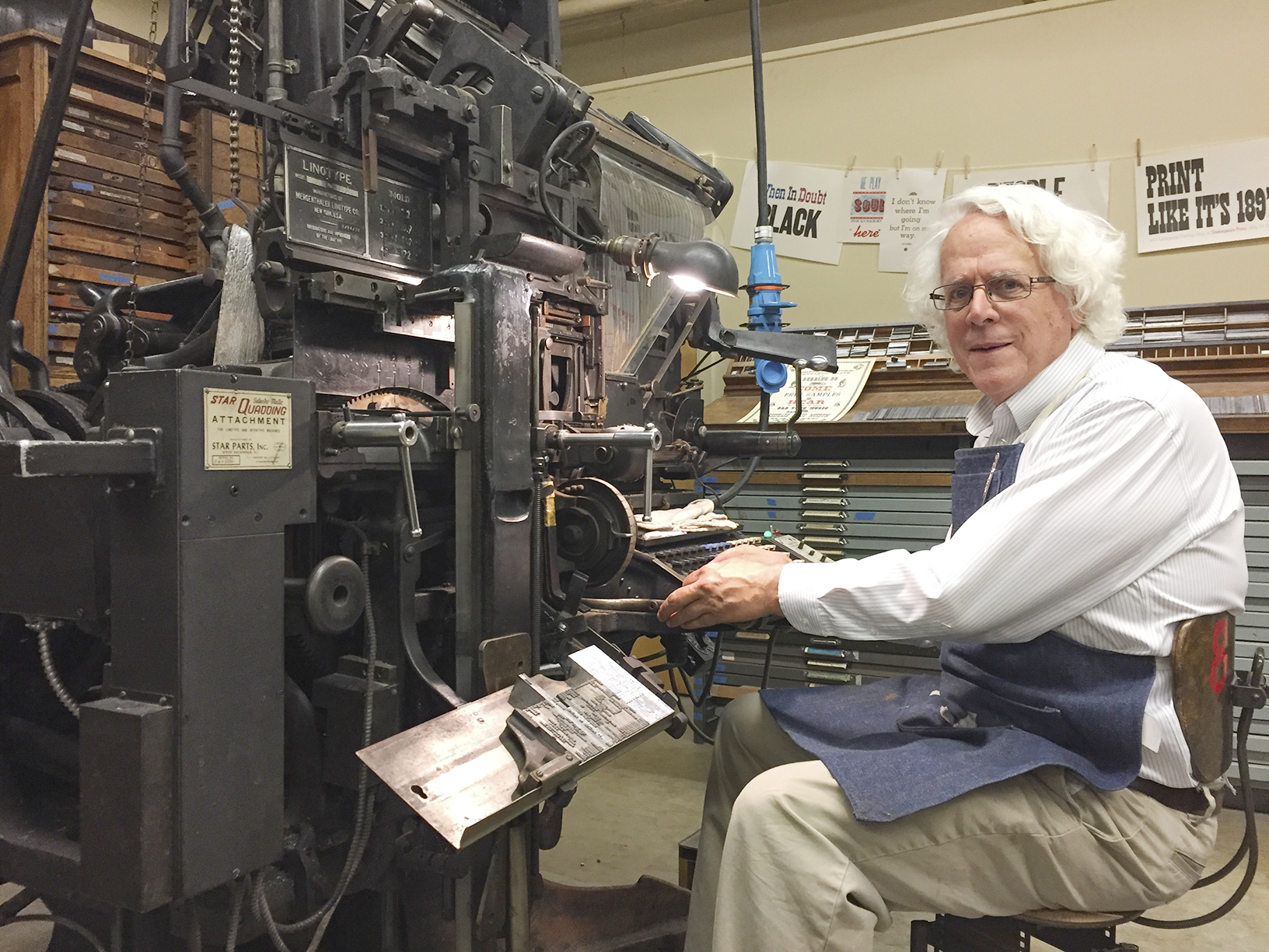
When I was teaching at Cal Poly, I was the faculty advisor to the Shakespeare Press Museum, a delightful museum on the campus of Cal Poly where we have a collection of letterpress printing machines, hundreds of drawers of metal and wood type. Almost everything in the museum works!

Those include the Model 31 Linotype machine, which was given to the museum on long-term loan from another museum in San Jose, California. That machine required restoration, rewiring, some new parts, and lots of care from my friend Bill Berkuta (I call him the Linotype Whisperer). Bill is a genius with printing machines, and he knows his Linotypes! Between the two of us we got it running, and it has been, more or less, running since.
He and I spend an occasional weekend tinkering on the machine, adjusting, cleaning, lubricating, and encouraging it to continue working.
The Linotype Machine
A Linotype machine is a machine that casts lead type in strips called slugs. That is done from a keyboard. When the operator strikes a key, the 3,000-pound machine drops a little brass matrix into the assembler. Each letter falls into place in order. Between words you put tapered steel strips called spacebands. When a line of matrices is complete, the operator elevates the matrices into the machine’s casting section where molten lead (535° F) is injected into the back of the matrices and a line-o-type is created. A few seconds later, it is cooled enough to be solid, and it is ejected from the machine into a galley where it can be taken to a press and used to make printing.
The machine is one of the most fascinating devices ever invented. I am lucky enough to be a Linotype operator. I am even luckier to know a great Linotype mechanic (Bill, the Whisperer).
Once we had the machine at Cal Poly working, I started looking for more than the one magazine of type that came with it. I found one here and another there, and soon we had five fonts!
Along the way I acquired, from the other Linotype wizard, Dave Seat (who operates out of Tennessee), about 20 magazines of matrices for the machine. Dave called one day from Marysville, California (he’s an itinerant wizard). He had a “few” magazines he wanted to give me. It was a take-it-now-or-they-go-to-the-scrap-yard deal. I had less than 24 hours to go up there (it’s about 7 hours from here), pick them up, and bring them back. I accepted. I rented a U-Haul trailer, put it on the back of my van, and headed north. There, we loaded them, he drove back toward Tennessee, and I returned home to put the magazines in the museum at Cal Poly. It was a prize!

Selecting a typeface
A moment of definition for those who think that changing a type font is done by choosing a menu and clicking on a name: changing the font on a Linotype machine is done by raising the magazine, in which there are about 1,000 small brass matrices, then removing that magazine from the machine (lock it first to prevent a catastrophe!), and then carrying it to a rack where you store it. These magazines each weigh about 50 lbs., depending on the size of the type font and the quantity of matrices inside.
After you put the magazine on the rack, you get another 50-pound magazine and carry that to the machine. There, you put it on the machine, then slide it upward and inward until it makes a solid “snap!” sound. Then you unlock that magazine, and crank it into operating position. This takes a few minutes.
Cal Poly’s museum has a total of about 25 magazines now, having expanded the collection to include some great fonts: Helvetica, Bodoni, Garamond, Times, Optima, and a handful of others. Most of them are in excellent condition (matrices tend to stay in good condition for decades) and we can use them all.
There is no digital menu of fonts for the Linotype machine. That, when last made available, was a booklet with columns of fonts listed in order of size, then Delta number, then name. The Linotype company named their fonts with the original names, and then stamped this delta number on the side of each matrix. In front of the delta is the size, in printer’s points. The booklet is the guide to which font goes with which delta number. 12?698 is Helvetica Medium with Italic in 12 point [curious how difficult it was to get a delta character in that last line*].
The booklet is long out of print, and they are moderately hard to find. We have one copy.
Enter the Intertype Machine
In the early 20th century, when most of Linotype’s patents expired, a competitor showed up on the scene, the Intertype Company. This outfit made a competitive machine, and it was almost identical to a Linotype, but different enough to avoid legal action from the original firm. The one thing that was absolutely identical, were the matrices. These were and are to this day interchangeable, and many shops had a mix of Intertype fonts and Linotype fonts. The magazines are not interchangeable.
At Cal Poly we have a few Linotype magazines filled with Intertype matrices. They do not have the delta. They just have the letter T and a number. The guide for those is also long out of print, and we don’t have a copy. The Linotype Whisperer has one, published in about 1955. He snapped a photo of every page for me.

My plan was to create a central database of all Linotype and Intertype matrices, and put it online so that all of the Linotype and Intertype operators in the world could look up a matrix number for either system, and get information about the original font, its available sizes, and whether it is from Linotype or Intertype. The online part of that is more difficult than I expected, so in the short term I have chosen to publish them in traditional form – print and PDF, as booklets.
This involves Optical Character Recognition. Throughout modern times (starting in about 1975, zillions of dollars were spent by various companies to develop hardware and software that could look at (scan) and then identify, and convert printed type into computer-editable type. Almost none of these devices and systems ever worked. Those that did couldn’t identify all type; they tended to have a limited visual library, making it possible to scan some type, depending on the legibility of the typeface of the original.
Adobe Acrobat to the rescue!
Adobe finally made it pretty easy to convert scanned type into editable type using Adobe Acrobat. This software has the best technology for doing this that I have ever used. If you put a scan of a printed page into PDF format, then open it in Acrobat, the program can identify the text and export it in Microsoft Word or plain text format. It is nearly perfect in this conversion, with less than one error in 1,000 characters.
That rate of success is possible unless you are trying to convert the Intertype catalog into editable text. That simply does not work, and as hard as I tried, cannot be made to work. Here is some of the suffering I endured trying:
Reproducing the Linotype Matrix catalog
From the Linotype booklet I scanned and saved as PSD files. I carefully straightened each page, and did a small amount of Levels adjustment to get the contrast between the paper and the lettering to be better. Then I saved each page as a Photoshop PDF. Then, in Acrobat, I opened the files, selected the export text function and had pages of nearly perfect text. This gave me hope that the same would work on the Intertype listings.
Attempting to reproduce the Intertype Matrix Catalog
From the Intertype catalog, I did the same, opened the files in Acrobat, and exported as MS Word documents. They were a total disaster. The program (Acrobat) couldn’t determine that columns of text were related to each other left-to-right. It treated them as columns of text, and applied myriad fonts and sizes and style to each group of letters that it assumed were related. The results were useless.
I went back into Photoshop, reopened the files, and cleaned them up. I moved the columns closer together, I worked to ensure that each line was level; I increased the contrast. And I saved them again, only to experience the same event in Acrobat. I did several versions of this, tweaking lines and spacing, and I got nothing.
I gave thought to retyping the whole catalog (I would have spent less time doing that). But, in the interest of solving the problem, I kept at it. And, I got nowhere. Slowly.
The Macintosh operating system can recognize text in photos. It’s pretty easy. You open a scan of a page with text on it in Apple’s Preview application, and it assumes you want to create editable text from it. It’s uncannily good at this; it can recognize letters in hand-written notes; it can find fonts in the middle of tomato sauce labels; it identified a font on a paint can for me. Apple’s Safari browser can also identify text from photos.
Adobe Illustrator has an even more impressive picture-to-text function: it can take an image of type and not only identify the letters, but tell you what font is used to make them!
These are shining examples of image-to-text. They were both foiled by the Intertype catalog! I tried several ways to get them to identify the columns of text. I even opened one page in Photoshop, cut and moved the columns to make them into paragraphs of text, and that didn’t work either. Nothing worked.
Enter ChatGPT
So, last Saturday, having nothing to do except paint my fence (which I did early in the day), I decided to try ChatGPT. Since all of the other techniques had failed, I thought it would be fun and possibly helpful to see if Artificial Intelligence could do it for me.
I downloaded the application, and having never tried it before, I typed:
Please convert this image to editable text, scanning left-to-right. Convert large spaces into tabs; remove ellipses.
And, it responded:
Sure. Drop the file here.
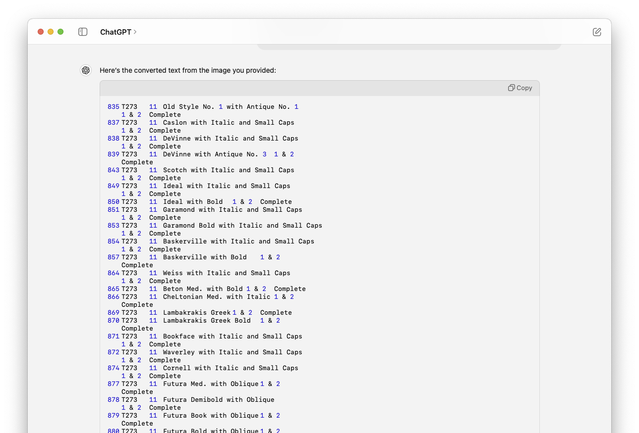
In about two minutes, the resulting text appeared on my screen (surprisingly slowly). Every line was interpreted as one line; the long spaces were converted to tabs, and the ellipses were gone. Bravo! It was flawless.
At a glance, it appeared to be exactly what I wanted. So I decided to try the other 42 files. I uploaded them to the same prompt, and I received a message that I has overstayed my welcome. I had overdone it, and ChatGPT told me to take a break of at least three hours and try again.
After three hours it still wouldn’t accept my images, so I bought a personal license for one month of ChatGPT at $20 (which can be canceled at any time).
Then I tried again. It seems that my $20 was well spent. It worked immediately, and it worked perfectly.
Each page took about 90 seconds, which surprised me. It seemed like a long time to do such a simple thing.
Everything worked delightfully well until I got to page 14, when ChatGPT did everything nearly perfectly. Instead of substituting tabs for multiple spaces, it put in the spaces, as it found them in the document. This was a bit frustrating, but after two or three pages like that, it regained its ability to get the spacing right, and started using tabs again. For those pages that didn’t work perfectly, I used Find/Change to convert rows of spaces into tabs. It took just a few minutes, and then I moved on.
I decided to polish my prompt a bit. I changed it from:
Please convert this image to editable text, scanning left-to-right. Convert large spaces into tabs; remove ellipses.
to:
Please convert this image to editable text, scanning left-to-right. Convert two or more spaces into tabs; remove all ellipses.
…and it slowed down to a crawl. What was earlier taking about 90 seconds was now taking much more time. I phoned my genius child, who told me that this happens when there is a lot of traffic on ChatGPT. His suggestion was to try again on Sunday morning.
A fresh start in the morning
On Sunday morning I put in the same prompt, and the images of text were converted in seconds. The “analyzing” part dropped to about 12 seconds, and ChatGPT was putting the finished text on my screen within a few more seconds. Each page took less than one minute to process completely. I am dazzled by how intelligent the software is. A few pages into the work, I received a comment from the ChatGPT engine in the output area:
The entries appear to use a mixture of normal listing and a specific pattern indicating either advanced features or combinations of styles, noted by “A”, “B”, etc., before the entry numbers. If you need further information or additional assistance, feel free to ask!
OK. I’m impressed. Not only did it convert the pages, but it analyzed the content of the pages, and commented on that content; it knew what it was analyzing!
I was able to complete the project this morning, and I have now compiled and published the first new edition of the Intertype Matrix Catalog since the 1970s. I gave the document a light proofreading, then saved it as an Adobe PDF document. It’s now off to The Linotype Whisperer for his review, after which I will publish it here.
The current booklet is in Font Number order, which is not very helpful. I also sorted the data in alphabetical order, and will publish that in the same edition. With the matrices in alphabetical order, one could look for the font name, then get the font number. In any event, the information will be back in the public domain, and to those in the type-casting world, it might be helpful.
Click here to go to the downloads page for these catalogs.
- To type a Delta character in HTML, you can use either the Δ code or Δ in the HTML stream. In WordPress you must exit the visual editor and enter the code editor to do this. Though I have entered the correct HTML code, I can’t get the Delta to show up in this blog.
Addendum: July 9, 2024
Today, a couple of days after I did this work, I tested both of my prompts to see if one works better than the other. They both took about the same time to analyze, and they both delivered the same editable text. The second prompt:
Please convert this image to editable text, scanning left-to-right. Convert two or more spaces into tabs; remove all ellipses.
…resulted in an interesting comment made by the ChatGPT engine at the end:
This text should now be easier to process or format for any digital needs. If you have any further adjustments or need more help, feel free to ask!
It seemed to understand that the text was cleaner with this prompt than the first (and it seemed to notice that I had tried two different prompts). I am again impressed!