In yesterday’s post I described how I built a camera stand to re-photograph (“digitize”) my film.
In order to be more helpful, I thought I would share here my working drawings and my engineering drawings so that others might make a similar camera stand. It requires precision, but anyone with metal-working skills and basic tools should be able to make a similar device. A CNC machine or milling machine would be helpful, but you could do this with a bandsaw, a drill press and a set of mill files.
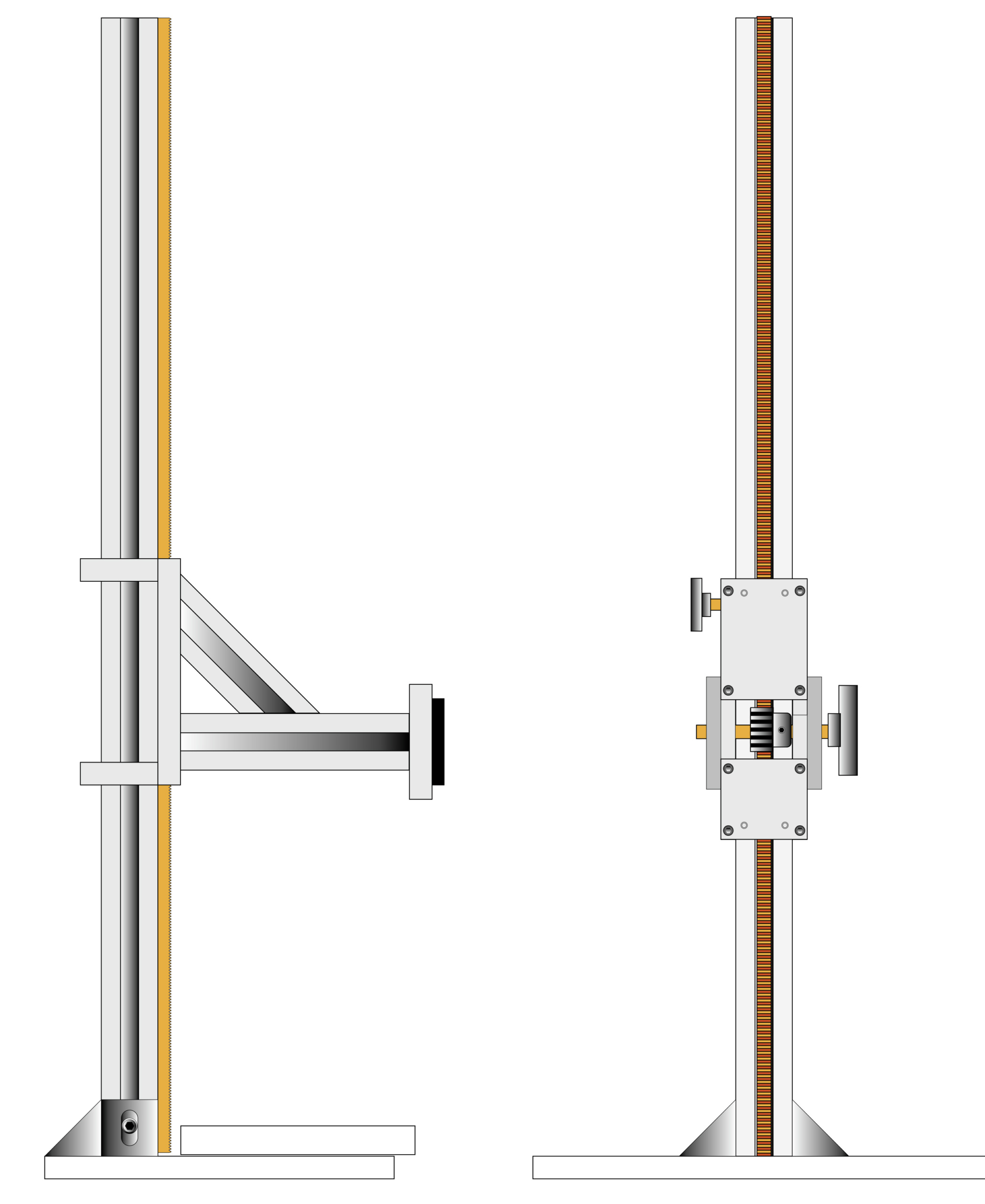
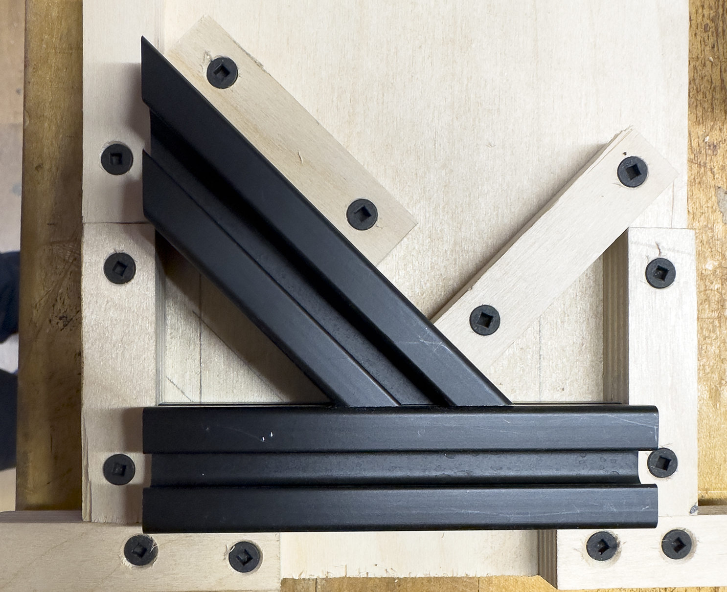
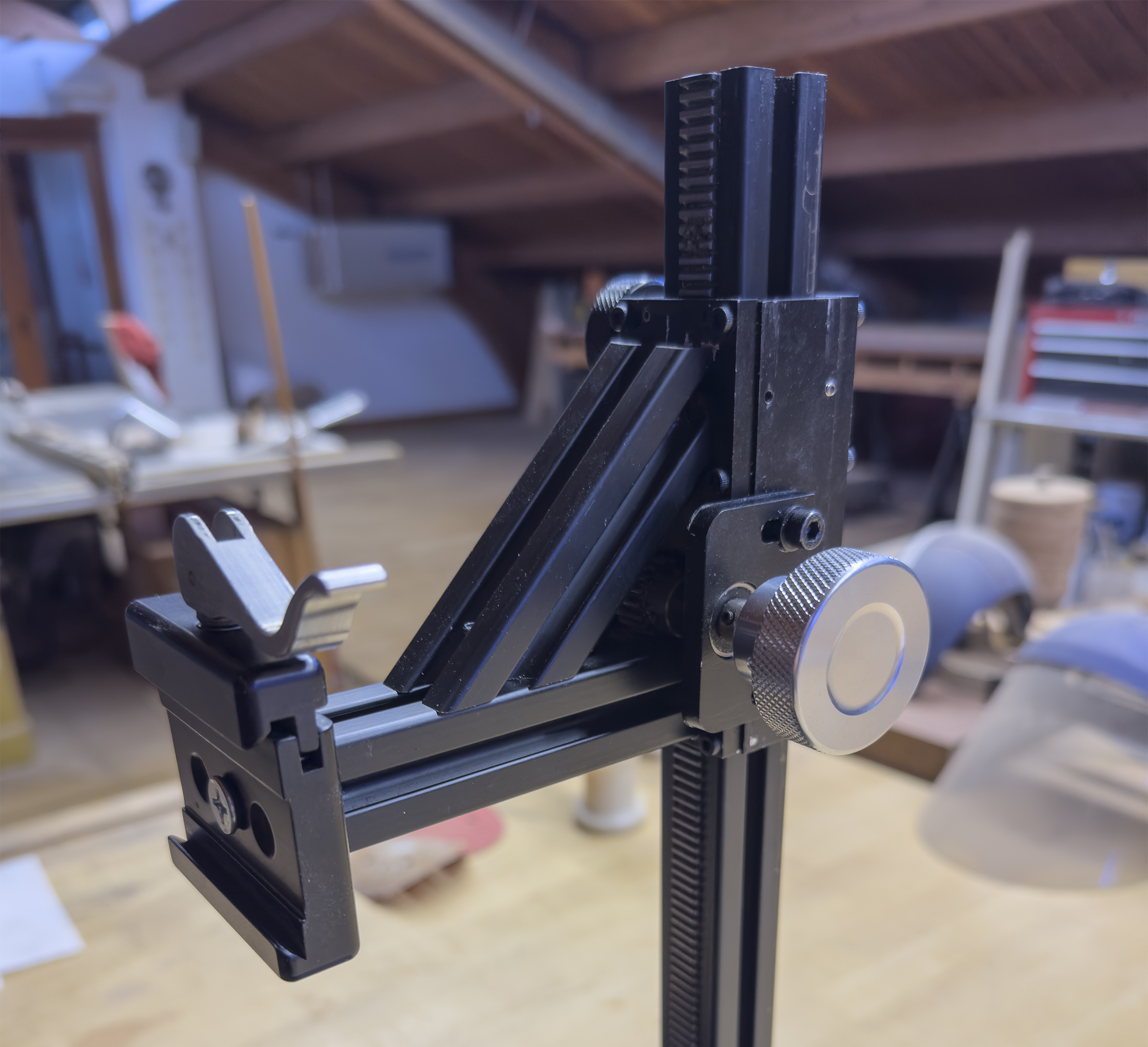
Here are my Illustrator sketches of the camera stand as I conceived it. The vertical post and the horizontal arm are both aluminum extrusions from 80/20, the company that has revolutionized extruded aluminum beams and connectors for makers.
My idea was simple: Hold my camera vertically, with good precision, so that I can copy analog film to digital files. This requires nothing more than making a stand, purchasing a light source, making or purchaing a film transport mechanism for 35mm film, and making or purchasing masks for my 120 and 70mm films. And a lot of work.
The digitization step is a desktop operation. It requires a comfortable workspace (because I’m going to be spending a lot of time doing this!), and freedom from extraneous light. I suspect that I will do this at night to remove ambient light from the equation. To use this set-up in daylight would require masking the image to prevent extraneous light from entering the lens and causing flare.
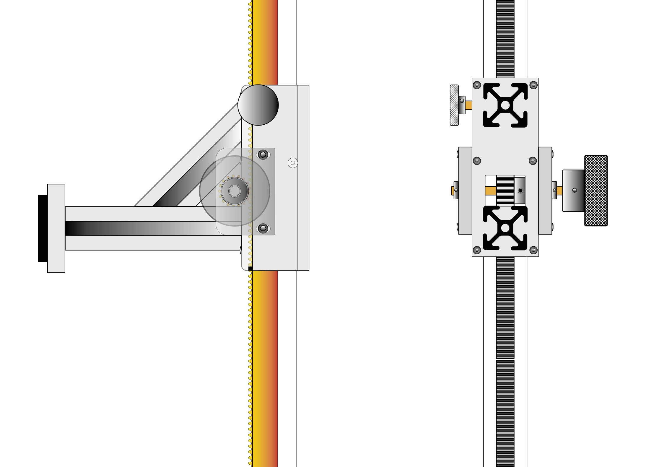
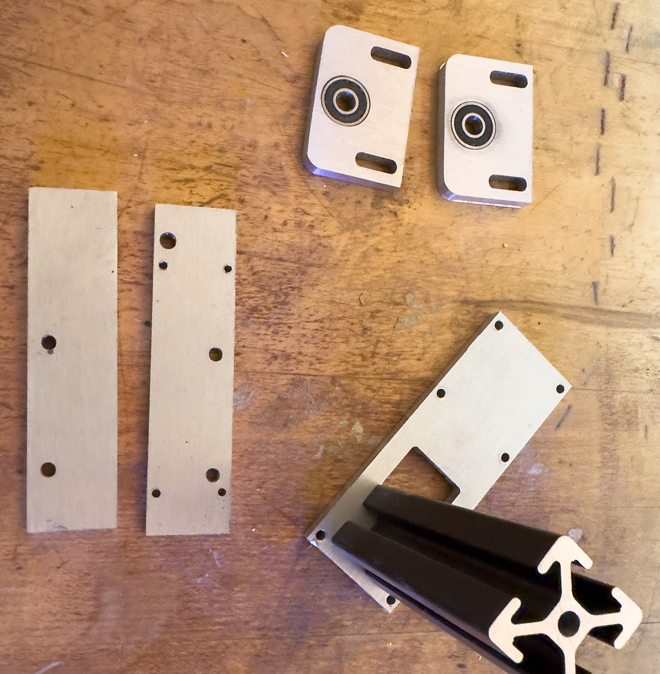
These drawings describe the detailed workings of the moving camera bracket as I intended to make it. On the right I put an accurate silhouette of the 80/20 aluminum bars where they would connect to the moving bracket. The gear rack runs vertically in the post, which I had to machine to fit the rack, which is made of steel.
I have been researching light sources on YouTube “University” (my favorite educational go-to location), and I ordered a light source from B&H Photo that is made by made by Negative Supply. It was moderately expensive ($200), but it is large enough for 4×5 inch film, and with a 97 CRI (Color Rendering Index), it is good enough for anything that I will be re-photographing. The same company makes one with a 99 CRI, but it is much more expensive, and I am not convinced that it’s worth the additional expense. We’ll see.
For my camera, I will be using a Canon R5 Mark II. Its 45 MP sensor will yield extraordinarily high-resolution images from these pieces of film – more resolution than necessary, but that’s OK with me. My lens is a Laowa 100mm 2X macro. I bought this a few months back for this purpose, and I am quite impressed so far. It’s very sharp, and it goes beyond the 1:1 ratio for re-photographing 35mm frames. Canon’s 100mm lens goes to 1.4:1, and that would work well also.
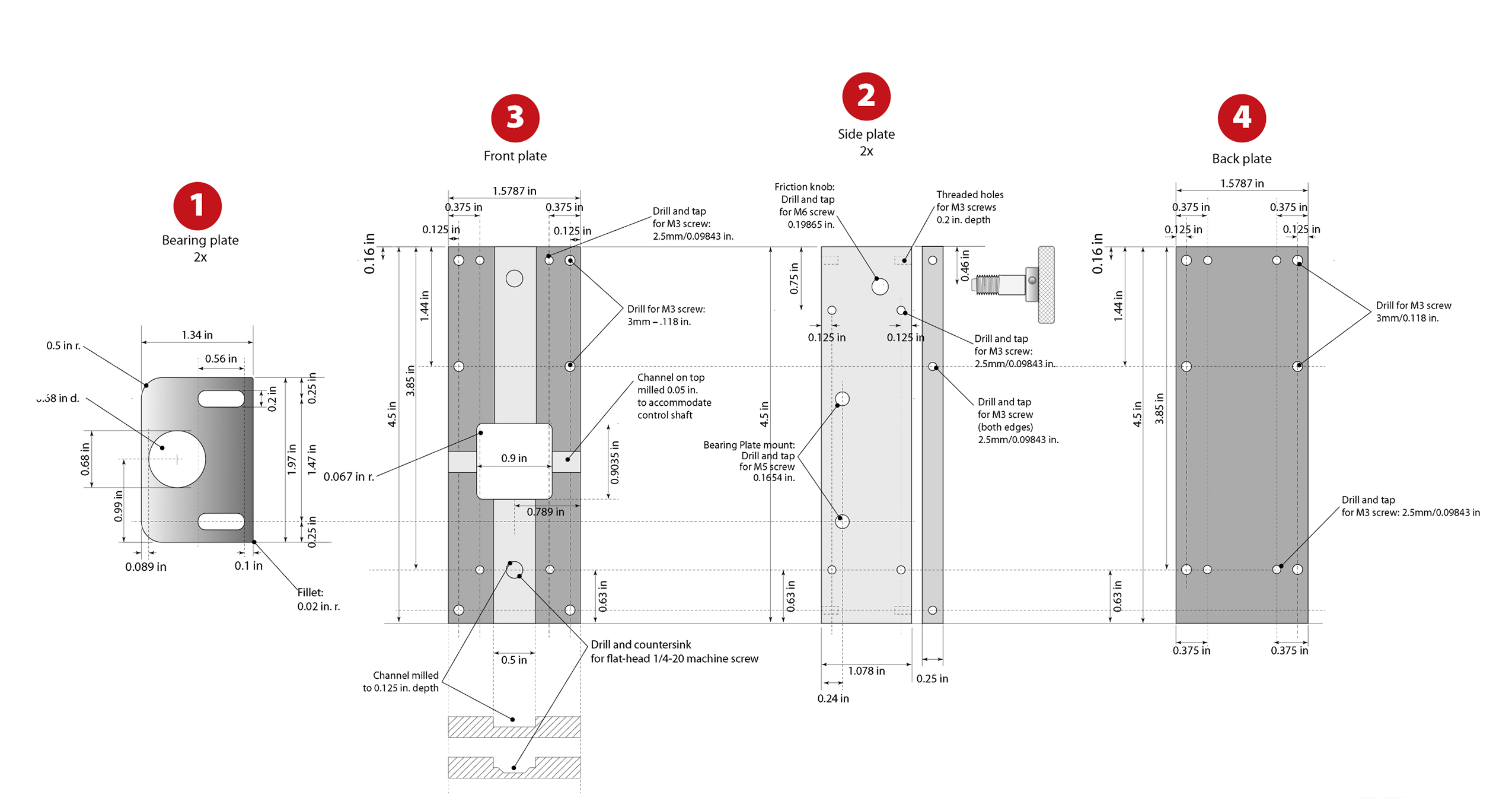
These are my engineering drawings. They were used to make the machining drawings for the CNC machine. I made these drawings in Adobe Illustrator, using its relatively new Dimensioning tool, which is quite nice. I updated the drawings after machining to reflect changes I made to the parts when I machined them and assembled the bracket.
There is a link at the bottom of this page for a PDF version of the updated plans.
(Click to enlarge the illustration)
I will be recording all of my images as Camera Raw, then converting to DNG on the fly as I import them into my Mac (using Adobe’s Photo Downloader software, about which I have mixed feelings). I want every file in my digital archive to be either DNG as source, or TIFF as destination. I have come to the conclusion that these are the only file types that might be “archival” in the long run. Adobe PSD is fine, but not open-source, and there is no guarantee that Adobe will be in business in 75 years, or that PSD files will be legible in the future with any software. TIFF is the file format chosen by FADGI, the Federal Agencies Digital Guidelines Initiative. The Library of Congress and the National Archive are both adherents to this standard.
Also, the the international museum photography group has endorsed FADGI. If they believe in it, I do too!
So those are my standards. I also have to come up with a post-photography system of storage, labeling and indexing. My collection is currently a mish-mash of film in boxes, slide carriers, slide trays, paper envelopes, and floating loose in my file cabinets somewhere. I want to re-photograph, then store in a coherent system so that my heir (sorry, Patrick) can find a photo if he needs it.
Camera stands are nothing new. They are exceedingly simple. Mine is no different, except that I wanted to make it myself.
I share the plans here in case you might want to make a similar stand. All of the parts are available on Amazon. They are all metric. All of my measurements on the plans are in inches (sorry, world). It’s easy to convert:
1 inch = 25.4 mm
1 mm = 0.03937 inch
All of my holes are drilled to metric sizes, and all of my tapped holes were made with metric taps. I added 6mm bearings and collars to the control knob shaft, and I added 6mm threads to the friction knob.
In the edges of all four box parts are tiny little setscrews called “grub screws.” These are an integral part of the design. These are made of steel with tiny nylon tips on one end. They are adjusted to slide gently against the vertical beam, providing a small amount of friction. They also allow for very small adjustments to squareness of the moving bracket. They are adjusted with a tiny hex wrench.
If I build this again I will make two significant changes: I will use 50mm 80/20 extruded aluminum for the vertical post, and I will use 5mm grub screws instead of 3mm. That will give me more control over these friction points, and more accuracy in the alignment of the moving bracket.
The aluminum plate I used for my parts is supposed to be 0.25 inch. I measured mine (Amazon) and discovered that it is close to 0.25 inch thickness. This did not require me to change my design, as the grub screws afford enough adjustment to take out the tiny difference (less than 0.25mm) between the actual thickness of the aluminum and my planned thickness. I did have to adjust the position of the holes I drilled in the edges of the two side plates to compensate for this, but that was a microscopic change, made on the CNC machine.
I used all metric capscrews for assembly, except on the 45-degree 80/20 beam, where I had to use flat-head metric machine screws to clear the rack gear running through the middle of the block.
You can download a PDF of my engineering drawings here.
To read the next post on this topic, please click here.