In my collection of books related to printing and publishing is a delightful edition from Dover of line art engravings from the 19th and early 20th centuries.
I wrote about reproducing these illustrations in a series of blogs I wrote in January and February of this year. They are surprisingly challenging to reproduce with digital technologies. I use that book occasionally as a source of early graphic arts illustrations.
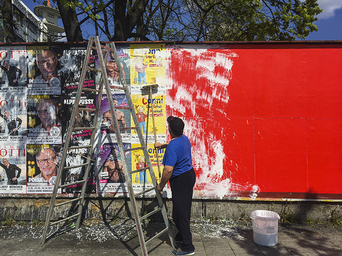
Today, while out on a journey to buy some chain lubricant for my bicycle, I encountered a 19th century event here in Munich. I passed a man putting up advertising posters using a long-handled brush with paste on it. First he brushed the paste on the wall, then he applied a poster, then followed by painting paste on the front surface of the poster with his brush.
I suppose that the paste works its way through the poster and helps to hold it in place when the paste dries.
I have never seen this done before. It was amusing to me, as one of my favorite engravings is of a poster-paster putting up a poster by this technique.
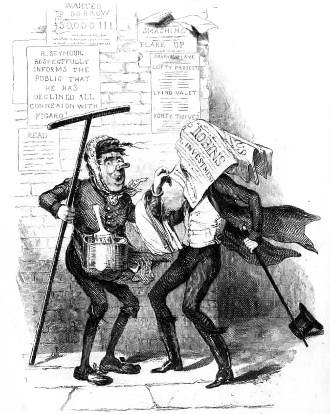
What made it even more amusing was that as the man worked, the wind picked up a couple of the posters he was hanging, and they blew down the street. The poster-paster’s assistant took chase and brought them back. The illustration above, drawn in 1836 by British cartoonist Robert Seymour, came to mind.
Today’s poster-pasting experience was an eye-opener for me. Techniques used in previous centuries are still at work today.
Above, the poster-paster with his long-handled brush applies white paste to the wall, then to the posters after he has applied them.
Yesterday my wife and I ventured south from our temporary home in Munich to the German Alps. We traveled by Deutschbahn trains, and a bus (construction on the rails required this) and then another train to the town of Garmisch-Partenkirchen. From there we took yet another train to the Grainau station where we boarded a cog-wheel train that travels up, and then through Germany’s highest mountain, the Zugspitze.
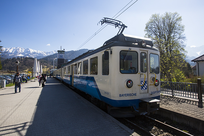
This is the Zugspitzbahn train at the Garmisch station. This one does not use the cog-wheel drive mechanism. We changed trains further up the canyon to get that train.
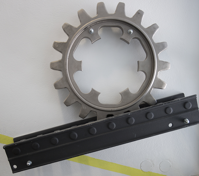
The cog-wheel train, run by electricity from overhead catenary cables, uses a pinion gear in the center of the trucks that engages fixed rack gear teeth in the center of the rails. The gear drives the train up and down the tracks, and prevents it from slipping on the rails (normal trains cannot climb more than a few degrees). This train climbs on grades as steep at 25 percent, meaning that it climbs 2.5 feet for every ten feet of horizontal travel, which is extraordinary.
This is an actual rack-and-pinion gear/track mechanism on display at the Zugspitze building at the top of the mountain. The teeth of the pinion gear hold the train on the rails, and provide motive power to drive the train cars up and down the tracks.
At the end of the cog-wheel train trip, which travels for about an hour through a tunnel dug through the rock, we emerged at the ski lodge near the top of the mountain. Then we boarded a cable car which took us to the very top.
At 9,717.82833 feet elevation I took panoramic photos and regular photos of the Alps in a spread that seems to go on forever. I had my tripod and panoramic mount with me, and I used that for what I consider to be a “normal” panorama – 12 frames with my wide angle lens of the view. It’s breathtaking.
Then I decided to take a high-resolution panorama of the entire spread of the Alps before me. For that I used my telephoto lens, shooting 32 photos to capture a sweep of 270 degrees at the southern-most point on the building at the top of the mountain. I use a Really Right Stuff carbon fiber tripod and ball-head as my travel tripod, and it has degree markings on the base of the ball head. I planned my shot carefully and took a series of carefully-indexed images of the view from the balcony of the building.
Then, back in Munich, I stitched the 32 images together (I use PTGUI Pro for stitching) to make a 270-degree panorama of the German/Austrian Alps looking (mostly) south from the Zugspitze.
This panorama was taken from the top of the Zugspitze in southern Germany. It takes in the Alps from the German border, and looks southward into Austria. Click to see a larger version which is 3636 × 190 pixels, and then click on it again for the largest view. At the extreme left edge is the gilded cross that stands on the very peak of the mountain: 2,962 meters above sea level.
The resulting panorama is very nice. It is just under a gigabyte in size, and measures 24 feet x about 12 inches at 300 ppi at final resolution. I present it here in a reduced size to fit the web. It’s an interesting image, and I plan to print it out 24 feet long, as that will be an even more interesting image.
Note from April 10, 2017: The full resolution file, which is 72,612 x 3,788 pixels in size is available for interactive viewing at gigapan.com.
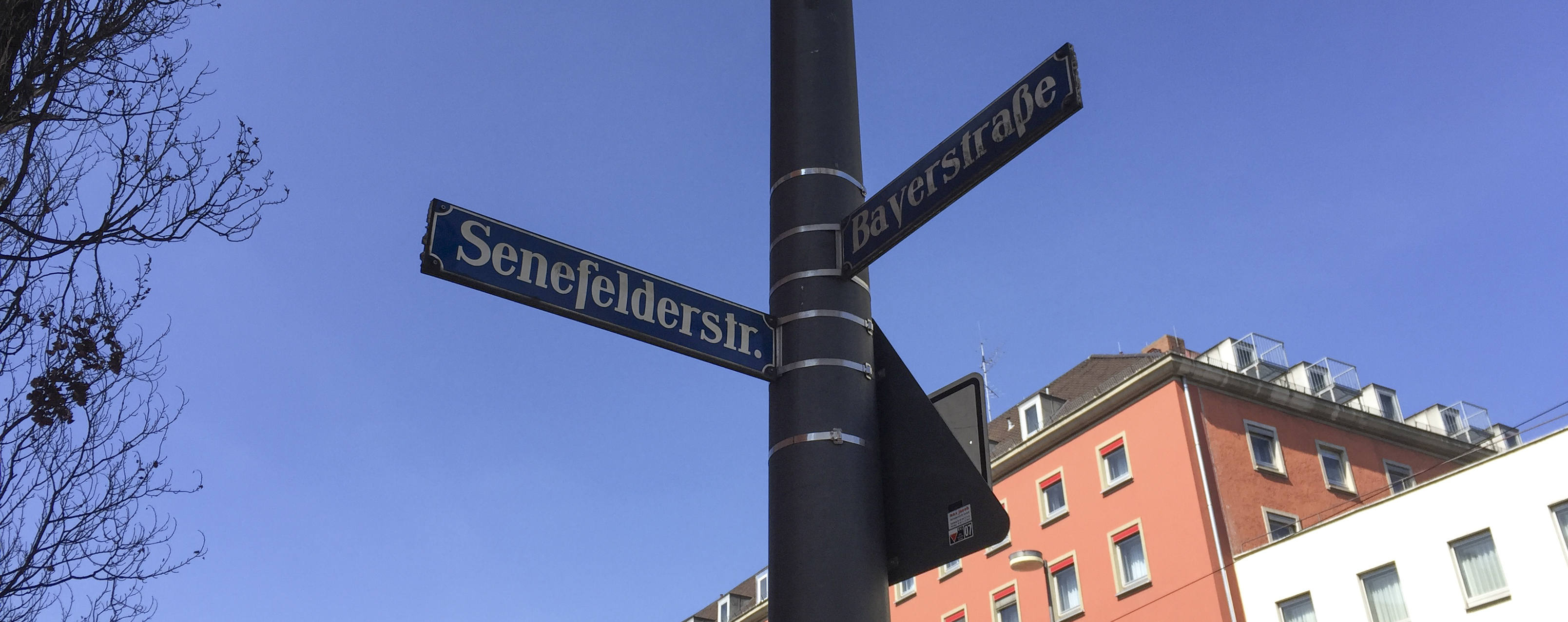
I walked down Bayerstrasse yesterday morning, heading east from our apartment near the Hauptbahnhof, then turned right on Senefelderstraße. I made a point of doing this because I was on my way to the big Calumet camera store in Munich (Calumet has gone out of business in the U.S. but is prospering in Germany).
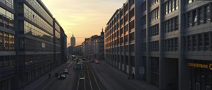
This is the view west on Bayerstraße in Munich. Bayerstraße is named for Friedrich Bayer, the co-inventor of aspirin. I get a headache just thinking about it. This is a block from our apartment in Munich.
My reason for choosing Senefelderstraße instead of the street before it, which would have been a bit shorter, is that Aloys Johann Nepomuk Franz Senefelder is the inventor of lithography, and I have never walked his street before. I took this street to honor him.
I’ve found Senefelderstraße, and have learned that there is also a Gutenbergstraße near the Nymphenburg Castle, and even a Mergenthalerstraße a little further out near the Wurm River. I will go walk those streets and write nostalgically about their namesakes when I get a chance.
Senefelderstraße is not a grand street by any measure. It’s populated by travel agencies and a few low-end hotels. There are a couple of vegetable stalls and a neighborhood market. I walked the length of it.
The corner of Senefelderstraße and Bayerstraße in Munich. This is in the vicinity of the central train station.
Herr Senefelder discovered that an image could be made on a smooth, polished limestone surface using regular drawing tools – pens, pencils and such, then that image could be inked, and the stone cleaned with water to make a reproducible image on the stone. A piece of paper, some pressure, and (as they say in German) voilà! You have printing.
The stone quarry that Senefelder preferred is called Solnhofen Quarry. His limestone slabs were quarried in Solnhofen and nearby Eichstätt, about 100 km. north of Munich. That particular stone was quarried for lithographic stones (and other artistic purposes) for centuries. Today it is treated as an archaeological site because the quarry is rich with fossils. Here is a quote from Fosseil.net, a web site devoted to the archaeological importance of these limestone quarries:
Solnhofen is known for the 10 Archeopteryx prehistoric birds that have been found here. The first feather was found in 1860, and the first Archeopteryx was found in 1861. In the Jura Museum in Eichstätt and the Bürgermeister Müller museum in Solnhofen you can see the original fossil birds.
The Solnhofen limestone was named after the village of Solnhofen in the Altmühltal valley. This limestone is exposed in a large area around the village. Many villages in the area have their own commercial quarries. The limestone is used for building material.
The limestone from the upper Jurassic period occurs in the area between Weißenburg, Regensburg, Nürnberg and Ingolstadt.
In the Altmühltal there are several museums, where you can learn about the geology and see the fossils found in this area. More than 800 species of plants and animals have been found in the Plattenkalk from the Jurassic period.
It’s fun to be in the heart of Germany, in the places where the seeds of printing were planted.
A field trip!
I’ll be taking my Advanced Typography students on a field trip to Mainz, to the Gutenberg Museum, on the 25th of April. There we will see two of Germany’s 12 Gutenberg Bibles, (known as Hubay 8 and 9). We will also receive a lecture by that museum’s specialist on Herr Johannes Gensfleisch (probably his real name).
I’m enjoying the opportunity to go straight to the source on these typographic and printing topics. And you will read about it here in the Blognosticator (German edition) as I make these treks.
For the next five months I’ll be living in Munich and teaching at the Munich University of Applied Sciences. I arrived here a week ago and I had my first classes this week.
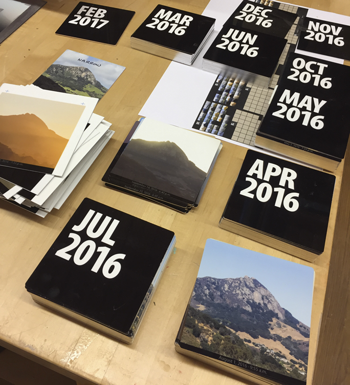
But, last week, before leaving San Luis Obispo, I saw the finishing touches being applied to my Bishop Peak Portrait Project. This is the year-long photographic project that I did to document San Luis Obispo’s signature mountain. It will be installed in the Baker Science Center in the coming weeks, I hope (it’s just a matter of being installed on the wall now).
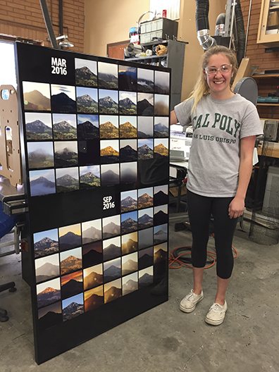
Emma Wilson, my assistant on the Bishop Peak Portrait Project, stands with the first finished panel: March, and September, 2016. Emma had just finished installing the aluminum photos into the display panel. There are six of these panels that will soon go up in the Baker Center at Cal Poly.
This project has been in my blogs for the last 15 months (you can start reading about it here). It involved putting a time-lapse camera on the roof of the Kennedy Library at Cal Poly, and taking a photo of the mountain every five minutes for a year. That year began on March 1, last year and ended on February 28 this year. In the middle I took about 70,000 photos, and culled them down to a smaller 40,000 photos from which I picked the best image each day and had them printed on aluminum plates (about 1/16 inch thick).
I machined these photos on a CNC router to precise dimensions, then inserted into large aluminum panels I cut on the same machine to accommodate the images.
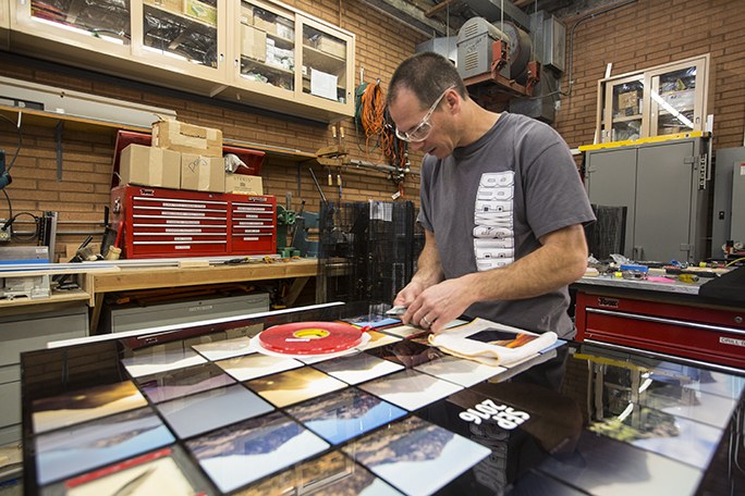
Cal Poly COSAM technician Rob Brewster aligns one of the photos in position on the September panel. We used an amazing double-sided adhesive to hold the photos in place.
I was originally planning to put the panels up, and then slowly populate them in-place until the project was complete, but technical difficulties interfered with my plans, and it ended up taking almost the entire year to get those panels cut and ready for installation. Eventually we decided to put the photos into the panels first, then install the panels – complete – on the wall of the building.
In the weeks leading up to my departure for Germany my student assistant/right-hand-woman Emma Wilson helped me get to the finish line. She and I had been working for several months to prepare the panels and the photos, and get the pieces in place for completion. We worked with Cal Poly technicians Rob and Doug Brewster who figured out how to finish the project and get the panels installed.
It came down to the wire. We were putting photos into the panels on Monday, March 6, and I boarded the plane to Germany on Friday, March 10. I saw the completed panels before I left. Emma, Doug and Rob finished those I was unable to do myself (my classes interfered with the photo project!).
When I return from Germany we will have some kind of an event to mark the installation. I’ll announce it here.
Many thanks to everyone who made it possible: Dean Phil Bailey, Associate Dean Derek Gragson, Doug Brewster, Rob Brewster, Emma Wilson, Jim Eckford, Ashala Lawler, Bryn Forbes, Eric Johnson, Tim Hastings, Dale Kohler, Sarah Sayeed, Patrick Kammermeyer, and others who have helped in various capacities. Thank you all!
To read all of the entries about the Bishop Peak Portrait Project, start here.
In my recent series of blogs about reproducing line art from 19th century copper engravings (and similar line art) using modern digital technologies I showed how scanning as grayscale and converting to bitmap format (with the 50 percent dither option) creates the best line art reproductions.
In the weeks since, I have had a chance to put this to the test on the 29-inch four-color Heidelberg press at Cal Poly. My students and I developed a test sheet for my Color Management course, and across the top of that sheet I placed a series of variations of the line art I had scanned for this blog earlier in the month.
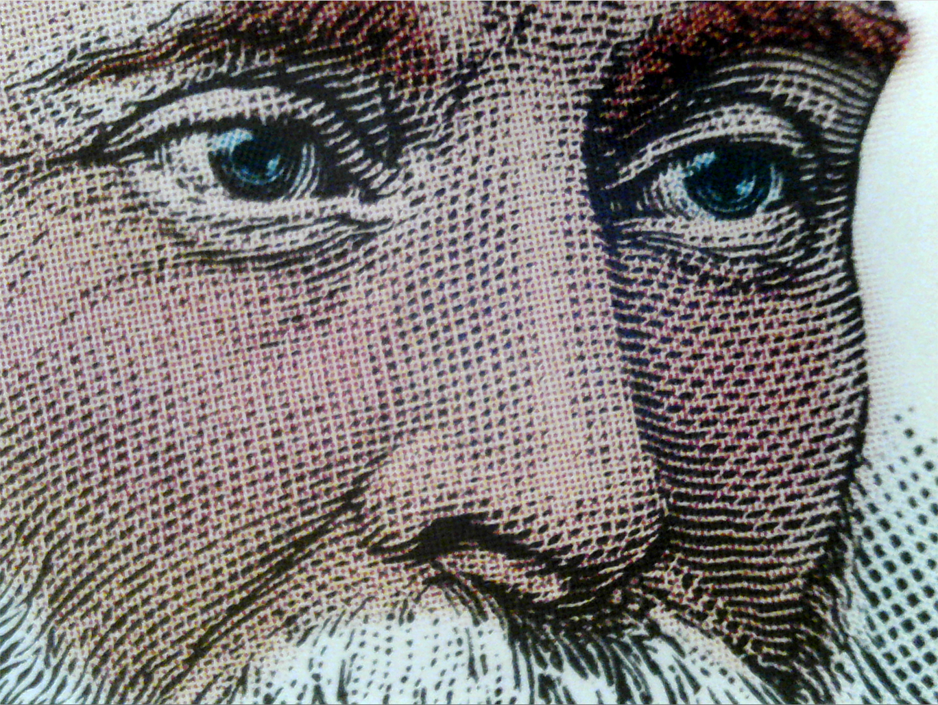
This photomicrograph shows the line art of the original scan (still at 2400 ppi) with color halftone dots overprinted (the Heidelberg prints in KCMY order). This proves my theory that Prinergy’s halftone engine observes the integrity of black-only bitmap images even when they are part of a CMYK tonal image.
I also pushed the technique one step further to introduce a color overlay on top of a bitmap file to colorize the image. The purpose of this was to test my theory that once converted to bitmap (sometimes called “one-bit” art) I could return the image to grayscale and add a color overlay without affecting the line art on the black channel.
The work flow I proposed in my earlier blog works fine for strictly black and white reproductions, but a bitmap file cannot be a color file, so adding the color overlay requires another few steps to ensure success. First, as before, scan at very high resolution. I recommend 2400 pixels per inch because this will capture the finest detail in nearly any engraving. Curiously, the resolution of our Kodak Trendsetter platesetter is also 2400 machine spots per inch, so the two happen to be the same resolution. Having more resolution on the platesetter might result in a better image, but I can’t test that at present (hint to Kodak: Cal Poly needs a new Trendsetter).
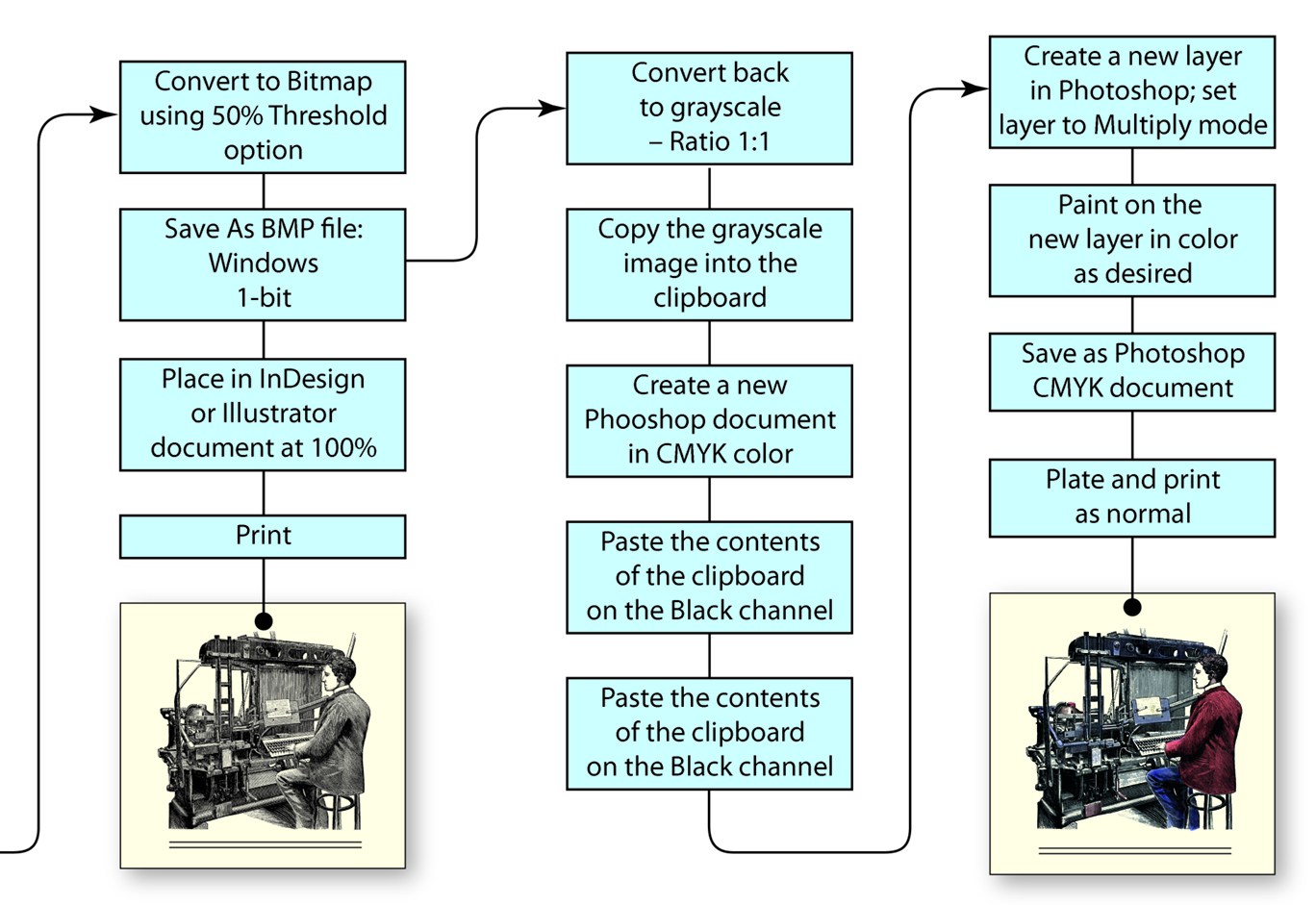
This is the continuation of the work flow diagram I presented in a previous blog. This one includes the conversion of the scan to bitmap, then back to grayscale, and the addition of a second Layer in Photoshop for a color overlay.
Adding a color overlay layer to the bitmap layer requires that the file format be able to contain color. To do this I converted my scanned image to bitmap at 2400 ppi (using the 50% threshold technique) and then immediately converted it back to grayscale (using a Size Ratio of 1) which leaves the art as it was modified to bitmap. The pixels are either 100 percent black of 100 percent white.
Once I have the image back in grayscale, I copy the image to the clipboard. Then I create a new document in Photoshop in CMYK color (Photoshop already knows the pixel dimensions of the clipboard). Once that file is created, I paste the contents of the clipboard onto the black channel, leaving C, M and Y alone.
The safest way to proceed is to create a new Layer in the illustration and paint any color you want on that layer. I set the Mode of the layer to Multiply, and I am then free to draw or paint in color on top of the line art. I choose strong colors – a pink for the skin tones, rich blue for the jacket, etc., and I paint with those colors at 10 percent opacity level in Photoshop. Because the entire layer is in Multiply mode, all artwork on the layer is overprinted on the final file.
The result of this is charming. The illustration holds its original character, but color is added. And, the result of my test on the Heidelberg shows that an image, once converted to bitmap, remains a bitmap file even when the illustration is converted back to grayscale. The color overlay in this example is converted in Kodak Prinergy to halftone dots – which are essential to the appearance of the final illustration – while the line art remains one-bit black and white line art. The result is excellent, and I have learned that the behavior of the Prinergy halftone engine exempts one-bit information from being converted to halftones (which are harmful to the character of the original engraving).
This technique also works for comic book art, allowing the artist to work in black and white, and then later add a color overlay to the work. The benefit here is that comics that print on black-only presses can be printed with the black channel, and those that have CMYK available can print with all four colors. The only difference is whether to apply the color layer to the art or not.
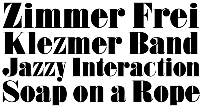
Every really cool font eventually comes out in a “neue” version. The most famous is Helvetica Neue, which was the modernized version of Helvetica, with its normalized weights and corrected curves and very subtle curve changes.
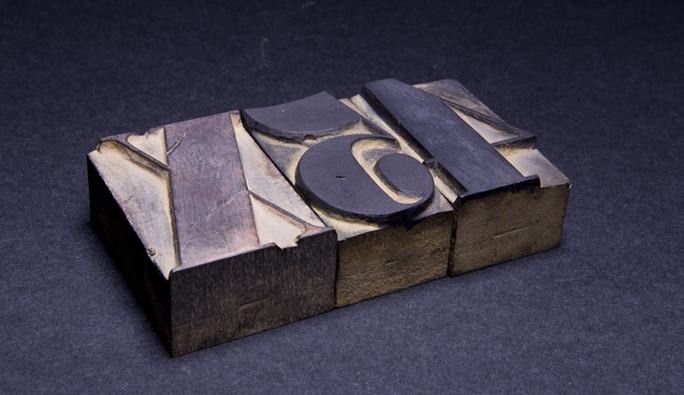
Prince Bold is based on a font of wood type in the collection of the Shakespeare Press Museum at Cal Poly. It was cut in 1832 from blocks of black walnut. It still prints beautifully on the museum’s many letterpresses.
Last year I designed (or more correctly – converted) a type font called Prince Bold. It is based on a font of wood type that is in the collection of the Shakespeare Press Museum at Cal Poly. Interestingly, it turns out to be the oldest item in the collection, having been made in 1832. It was carved mechanically from black walnut by a company in Connecticut, and then sold by a type foundry in New York City. Considering that electric tools were not in use in 1832, it would probably have been carved with steam-powered routing machines. The precision of the carving shows a tremendous degree of sophistication in manufacture. There are incredibly fragile thin line components of the letters, parts that have never broken or failed in the 185 years the type has been in use. The walnut wood used was amazingly hard, and that wood has stood the test of time.
The original wood type is about three inches tall. It appears to have been cut by rotating router cutters, and finished by hand with sandpaper and files.
The original font had the unimaginative name Roman XX Condensed. I renamed it Prince Bold in honor of Raymond J.Prince, who has been so generous to the graphic arts industry, and to Cal Poly, in his philanthropy. Our students made an impressive presentation of Prince Bold to him last year when they all showed up at a dinner wearing bright red T shirts emblazoned with a big Prince Bold P in white on the front.
In the making of the digital font, I first proofed the wood type on our Vandercook proof press, then scanned the proofs and re-drew the letters in Adobe Illustrator. I was faithful to all of the vagaries of the letters in doing this. I wanted the new font to be as accurate as possible. The first version was true to the original, and that version is quite condensed.
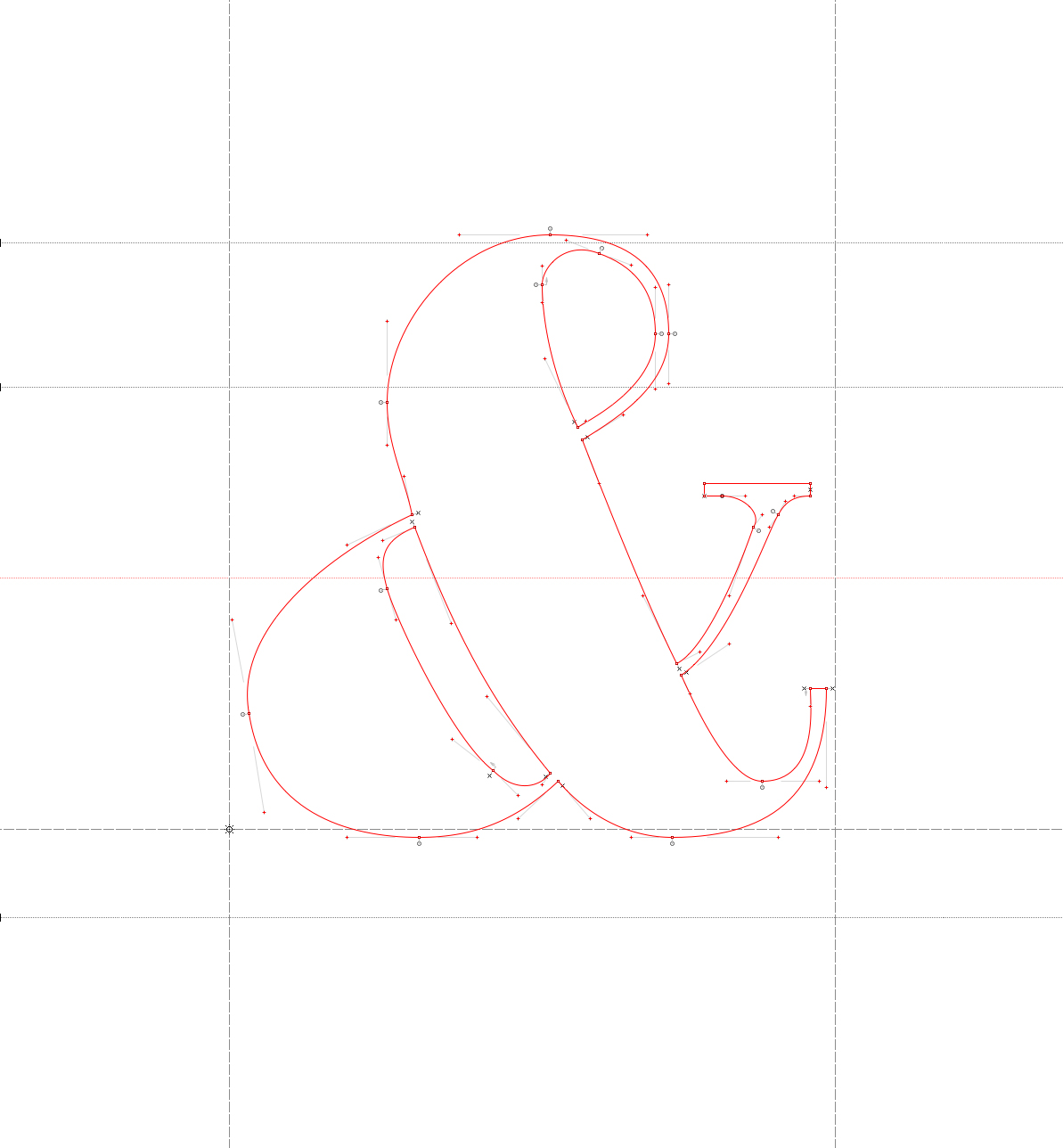
This is the ampersand glyph in FontLab Studio. I try to be a minimalist when drawing letters with vectors. This letter, and all the others have as few anchor points as possible, resulting in smooth curves and gentle variations. Notice that the round parts, top and bottom, exceed the baseline and the X-height lines. This is to overcome an illusion that round letters appear smaller than their counterparts when they are within the boundaries.
When I remade the Roman XX Condensed to Prince Bold, I un-condensed it, using a tool in the font design program FontLab Studio. That was easy: I put a number into a formula and watched as the program widened all of the letters. Then I started the laborious process of correcting the variations in the font. The tiny hardwood serifs were not consistent, the thins were slightly variable, the thicks were mechanically consistent, but visually imperfect. I worked on it for about a month and what came out the other end was a passable font that resembled the original wood type, but looked more modern.
Other small changes included making the round letters larger than their geometric fellows. This, in a digital font, means making the round parts of letters like O and S, and g and p extend beyond the baseline and x-height lines of the design. When done correctly, these letters then look the same size as their geometric counterparts. I also made the punctuation marks larger to match the weight of the font, and I drew a whole list of characters that exist in a regular digital font, but which never existed in the original. These include the accented characters for Romance and Germanic uses, and ligatures, currency symbols, etc.
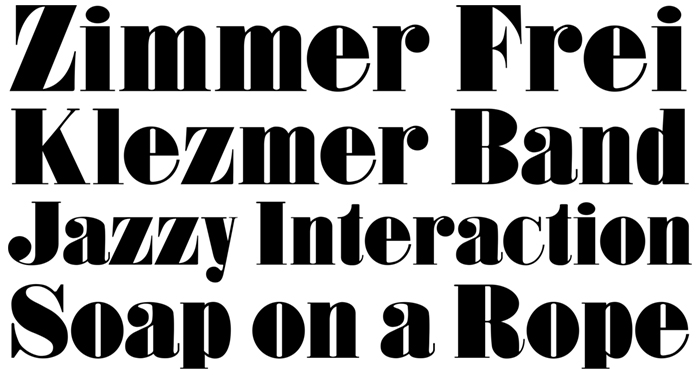
The test of any type font is its use. I have had a few chances to use Prince Bold in printed projects, and every time I use it I see errors in the design that I want to fix. One recently pushed me over the top, so I went to work on Prince Bold and repaired a number of the letters to make the font look better overall.
The most glaring problem was an emaciated lower case z (see above), which was drawn from the original wood type exactly, but when used in text just looked wrong. It needed something, but I wasn’t sure what. The lower case s was similarly skinny, looking out of place among its neighbors. The question mark was ugly and didn’t match the other letters, as was the lower case e. And so on.
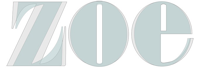
This is the revised version of the lower case z, and wider lower case e and o.
Jim Parkinson, the famous Oakland type designer, once told me that you never finish a type font. He said, “You declare victory and move on!” He has decades more experience than I do (and he is a much more talented designer than I am). But, after being in the type design world for many years now, I appreciate what he said. Instead of perfecting a font forever, it’s important to finish! I’m sure I’m not finished with Prince Bold, but it is a lot better now than it was at first.
This shows the modifications to the three letters (gray), each wider than the original (light green). The z is most different, making it not only match the other letters better, but making it more stylish.
Will I rename it Neue Prince Bold? I don’t think so. But it has been made neuer than it was, and I am much happier with the design now.
The font will be available for sale soon from the Shakespeare Press Museum at Cal Poly. Proceeds of all sales will buy the students an occasional pizza.
Last year about this time I was preparing to install my remote camera on the roof of the Kennedy Library at Cal Poly.
I built a weatherproof box, designed and built a circuit board, tested the system, and then carried it up to the roof and installed it there to take a photo of Bishop Peak every five minutes for a year.
The project required me to build an entire infrastructure for taking, processing, printing, cutting and assembling photos. It was not without its problems.
These are the stacks of aluminum prints, month-by-month on my workbench. The photos are printed by dye-sublimation onto 1/16 inch thick aluminum material. I machine them to a precise size to fit mortises on my display panels.
At the end of the first week I realized that the battery I installed in the box was not large enough. The solar panels were good at charging the battery, but after four days of gloomy weather, the system stopped. The ampere-hour rating of the battery and the ampere-hour consumption of my system could only survive four days without sunshine. We have not had four days without sunshine in many years, but last March we had five. So I added a second battery with a 10 AH rating to cover the occasional gloomy patch. We didn’t have any more gloom until December.
In November, the camera froze one night when the temperature dropped below 32 degrees. I built a heating element and thermostat to overcome that problem (I don’t think it was ever needed).
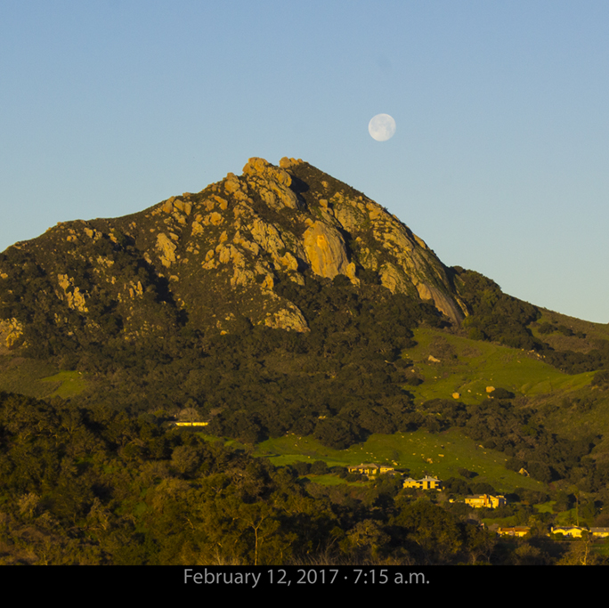
This is one of two photos this month to feature the Moon. In the year of shooting I have collected only a few images that have the Moon and the mountain in the same frame.
In late December and early January we got a lot of rain, and some of the rain found its way into a connector on the solar panel output, shorting-out the system for a day. The camera continued to take photos until the battery died. Luckily I was on the roof to service the camera on the day after it failed.
I have had no water incursion in the camera box, and through wet weather and dry, scorching heat and windy weather, the system kept going. The Raspberry Pi computer and custom made circuit board stood the test of time. It’s still up there running! (I have a complete back-up of the system which I switched in the fall just for good measure.)
…and this is the other. Despite a considerable amount of rain, there have been some beautiful days in the first two weeks of the month.
The camera begins taking photos at 5:00 a.m. and stops at 9:00 p.m. The photos number (after I discard those taken in the dark) over 38,000 at this point. There are just over two weeks left in the project. When it’s finished I will go up and get the final photos, then get them printed, and then I will remove the camera system from the roof.
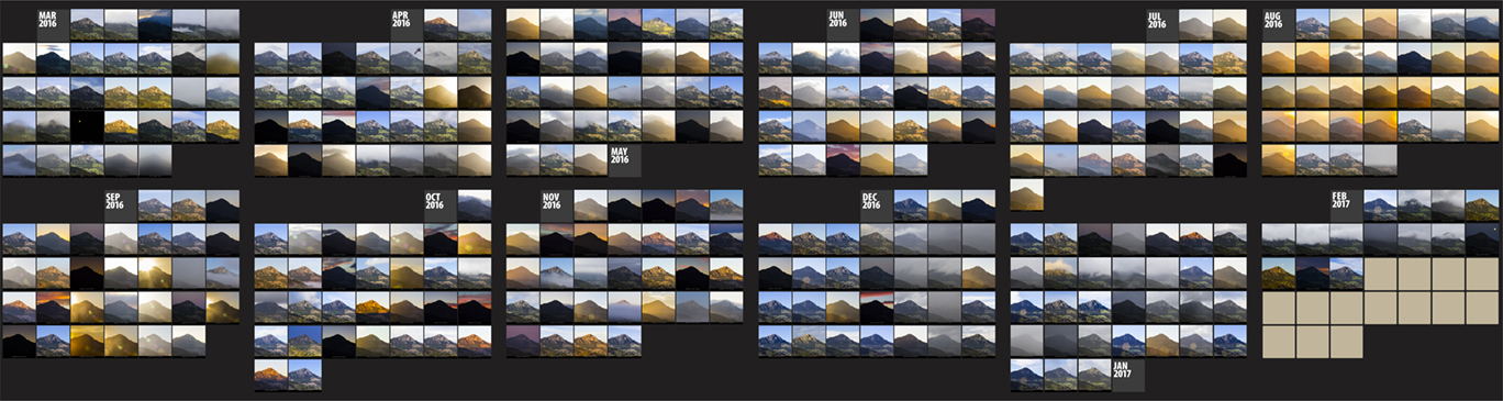
This is a mock-up of the final display with all photos in place to February 14, 2017. What I love about this project is the diversity of the light and the weather on “my mountain.” Notice August (upper-right): that was the month when we had huge wild fires raging in this and two adjacent counties. The sky was red for weeks with ash and smoke from those fires. This will be about 16 feet wide when installed at Cal Poly. Click on the image for a larger version.
The project will soon go on display in the Baker Center at Cal Poly; it will be a large-scale installation featuring 365 photos – one each day from March last year through February this year. The display will be about 16 feet wide and five feet tall. Each photo is printed on 1/16 inch aluminum plate, then machined to a precise size for insertion into my display panels.
I have been working on this so long and so intensely that it feels like a second job. I have spent many hours standing by my CNC router as it cuts the finished photos to size (one minute and 41 seconds per photo), and many more hours preparing the large aluminum panels for the display.
It has been fun and the photos are simply amazing. I’ll post again when the display goes up.
To read the final (?) story on the Bishop Peak Portrait Project, follow this link.
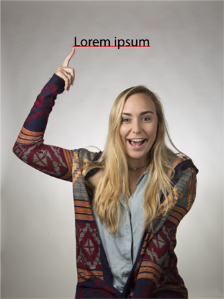
Three years ago I was looking at my roll sheet for my Introduction to Graphic Communication course at Cal Poly. About a third of the way down the list I stopped at the name Lauren Ipsen, and could hardly believe my eyes. Was it possible that I was about to meet the person responsible for the automatically-generated text we get in page layout programs when we insert placeholder text?
This is Lauren Ipsen. Really.
Lauren, a student in her third-year in the Graphic Communication department, is the living, breathing human who has the authentic name that is almost the same as the text that is generated by InDesign and other page layout programs.
The recent update of Adobe Illustrator changed the text tool so that when one clicks with the text tool icon on a page, Lauren’s name is placed on the screen. This is an improvement in Illustrator that was added to prevent people from leaving text anchor points unused in their Illustrator documents. I like the new feature mostly because it puts Lauren’s name on my screen.
Ms. Ipsen is a native of Walnut Creek, California, and is hoping to graduate in 2018, though she may spend a little longer in the program while she takes classes in journalism to learn more about television. She is also hoping to get an internship in the television industry this summer.
Lauren has been studying graphic arts processes and learning about typography, web site design and all of the printing processes we teach. She spent the fall quarter studying in Florence, Italy. Now she’s back in the thick of flexography and offset printing presses, and learning a lot.
On the topic of Lorem Ipsum, Lauren is both amused and flattered by the association. She rather enjoys having a name that is nearly synonymous with placeholder text.
This is a sample of “Greeking” – placeholder text inserted into a document when you are designing pages but don’t yet have the real copy. Pagemaker, the first page layout program, inserted this kind of gibberish, always beginning with the words “Lorem Ipsum.” QuarkXPress offered this as well as filler text in Klingon.
I decided to look into the Lorem Ipsum text a bit, and I found (no surprise) a web site devoted the the subject (loremipsum.de). On that site, which openly invites linking and copying, there is a fascinating history of the Lorem Ipsum text.
Apparently it comes from Cicero, and according to the site, it has been used as filler text for centuries. The modern implementation of it, which first appeared in Aldus Pagemaker (grandparent of today’s InDesign) which would fill any space with the almost-nonsense pseudo-Latin text.
In my youth, we described such nonsense text as “Greeking.” We should probably have been referring to it as “Latining.”
Here is a citation from loremipsum.de about the common text (with some editing by me):
In design magazine, Before and After Magazine, a journalist [John McWade] wrote in volume 4, number 2 the following:
After telling everyone that Lorem ipsum, the nonsensical text that comes with PageMaker, only looks like Latin but actually says nothing, I heard from Richard McClintock, publication director at the Hampden-Sydney College in Virginia, who had enlightening news:
Lorem ipsum is latin, slightly jumbled, the remnants of a passage from Cicero’s ‘De finibus bonorum et malorum’ 1.10.32, which begins ‘Neque porro quisquam est qui dolorem ipsum quia dolor sit amet, consectetur, adipisci velit…’
English translation: There is no one who loves pain itself, who seeks after it and wants to have it, simply because it is pain…
De Finibus Bonorum et Malorum, written in 45 BC, is a treatise on the theory of ethics very popular in the Renaissance.
What I find remarkable is that this text has been the industry’s standard dummy text ever since someone in the 1500s took a galley of type and scrambled it to make a type specimen book; it has survived not only four centuries of letter-by-letter resetting but even the leap into electronic typesetting, essentially unchanged except for an occasional ‘ing’ or ‘y’ thrown in. It’s ironic that when the then-understood Latin was scrambled, it became as incomprehensible as Greek; the phrase ‘it’s Greek to me’ and ‘greeking’ have common semantic roots!
Today I salute Lauren, my student and friend, and I introduce you to her. She will go through her very happy life making her cheerful impression on everyone she meets. Some of them will say, “Isn’t that the stuff that InDesign puts on the page when you fill with placeholder text?”
And she will smile and tell them, perhaps, that it is actually her name that InDesign puts on the page.
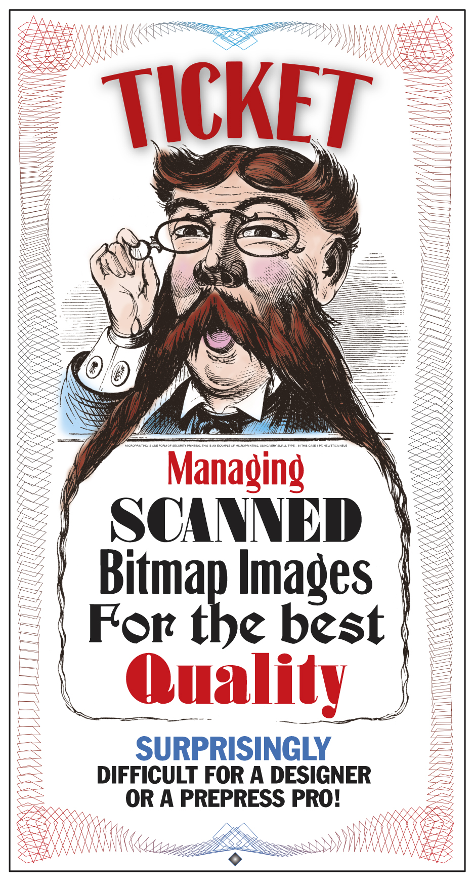
Each year I create a ticket. It’s a personal project, and in recent years it has become something of a personal challenge.
I recently read a book about security printing. It was simply awful. Bad illustrations, meaningless text, too much information about commercial products, and not enough information about the subject of the book. After I read it, I put it in the recycling bin; it will come to better use there than in my library.
Despite my distaste for that book, I decided to practice some security printing techniques on this year’s ticket – just to see what I could do.
This is roughly what this year’s ticket looks like. It has one of my engravings as the base art, a simple guilloche pattern created in Adobe Illustrator, and type fonts of my own design. Just above the word “Managing” is a line of one-point Helvetica Neue Medium type (which becomes microprinting in the finished ticket). This image is about 2X normal size.
The ticket is a method for giving extra credit to my students for attending presentations during Cal Poly’s International Graphic Communication Week events. During this week we cancel most of our classes, and students attend lectures and presentations by industry experts, graduates of our program, technical innovators, and futurists. All of these fine people tell the students about their part in our industry – and these are some impressive presenters! This year we learned about the success that has been seen by Scodix with their impressive post-press technology for foil stamping, embossing and decorating of printed materials. We also learned how Steven Label Company (Santa Fe Springs, California) makes printed electronics for medical devices and for consumer electronics. We learned about Americhip’s work to put electronics into printed products, and how those electronic additions are making their customers look great in the eyes of their customers. We saw the beautiful books published by Chronicle Books, America’s largest independently owned publisher.
As always, it was an extraordinary week.
The students are required to attend lectures during normal class hours. Outside of those required times, though, I give extra credit for each hour a student participates in our activities. At the end of each presentation the students come up to me, and I hand them a ticket. Later, they write their name on the back and give their collection of tickets back to me. I add them up and assign extra credit points. The total of all the tickets turned in tells me how many total student-hours were earned (It’s over 225 this year).
The tickets create a buzz among the students because they are well-made and they are funny. I am amused that they like them so much.
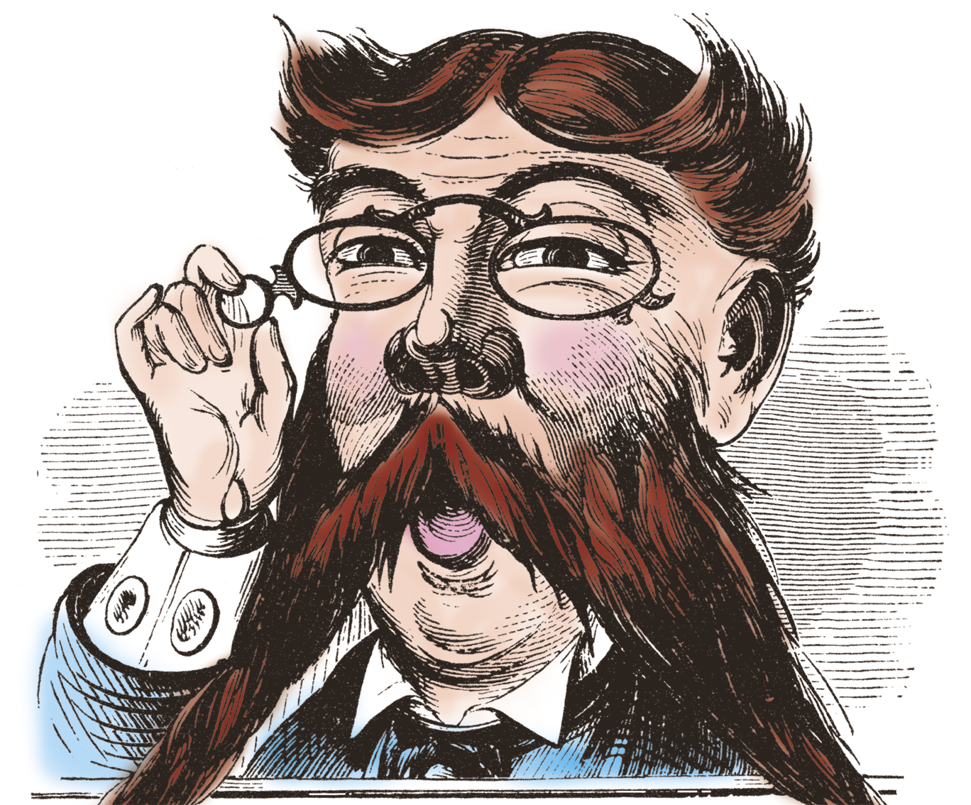
This year and last I have used very-high resolution images of copper engravings as the art on the ticket. I add some text and I print them on our Konica-Minolta C1100 digital press on a nice satin-finish cover stock. This year I added microprinting. Both last year and this year I have included a guilloche pattern created in Adobe Illustrator to make the tickets look even better.
It would be impossible to photocopy one of my tickets successfully (though I don’t expect anyone to try).
Both years I colorized my engravings to add some personality to the art. That required me to develop a technique for colorizing that does not cause the illustration to be turned into a halftone pattern when printed (See my blog from last week for more on avoiding halftones). The technique allows me to paint with color “on top” of the black-only line art of the engraving.
I learned this technique from a friend who draws an internationally-syndicated cartoon. That gentleman showed me how his line art illustrations are colorized in Adobe Photoshop as a color overlay layer which can be used by newspapers that print in color, and ignored by those papers that print his cartoon in black only. It’s a great technique, and it works well for my engravings.
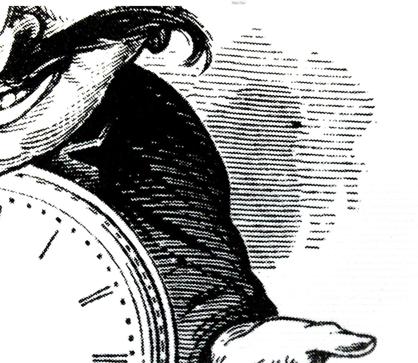
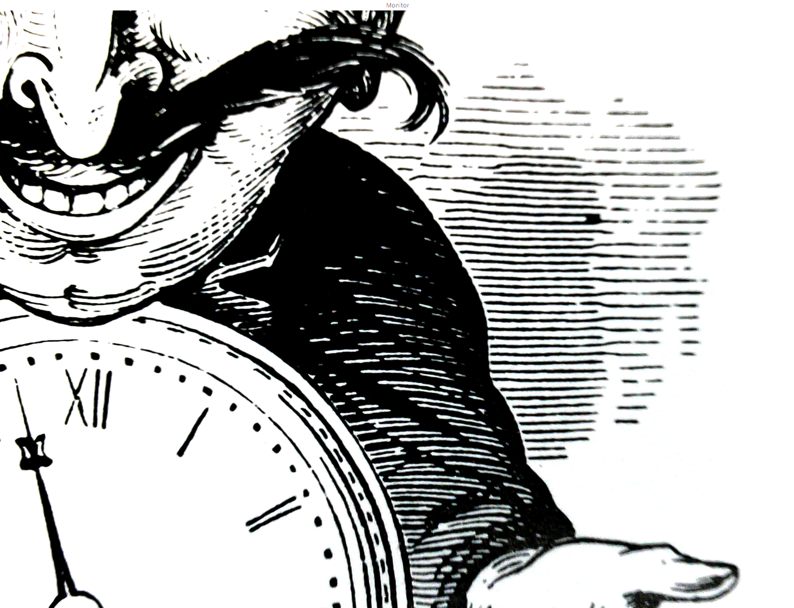
This is a cropped view of the colorized illustration. Click on the image to see it larger.
I start by scanning at 2400 ppi, and I convert to grayscale then to BMP using the 50% Threshold technique (described in my last blog). This results in a one-bit file – strictly black or white. Then I convert the image back to CMYK, which technically changes it from a bitmap image to a tonal image. But – there is no tonality in the image. (I have not had a chance to print this type of image on the Heidelberg press yet; it will be interesting to see if the bitmap remains strictly black and white, or if it turns into a halftone).
From the CMYK image I copy the black information into the clipboard. Then I create a new CMYK document (Photoshop already knows the pixel dimensions). Choosing the Black Channel in the Channels pane, I then paste the black art onto the black channel – only.
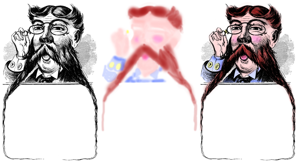
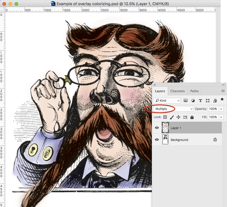
On the left is the scan, in the middle is the color Layer (no black) which is created in Multiply Mode. On the right is the composite of the two layers.
Then I create a new Layer, and define that layer to be in Multiply Mode. This is the layer on which I put the color. I paint with the brush tool mostly, setting the Opacity of the brush (in the title bar) to about 20%. This makes it possible to paint in small increments over the black image, building the color gradually and very nicely.
In Adobe Photoshop: this shows Layer 1 (containing all the color) superimposed on the Background (containing the black line art). I have ellipsed (that’s like encircling) the Multiply Mode to show where it’s located.
The quality of the painting is delightful. It looks like art from another century, and in part – it is!
The final photo-illustration exists as two Photoshop Layers – one for the color, and one for the black. If I save the file as a PSD or TIFF file, it will reproduce nicely on the Konica-Minolta machine, making very convincing line art and color.By changing the Mode of the color Layer, I am in effect printing all the color in overprint mode. This eliminates any problems with register or fit, making the printing easy.
This is the second of several blogs about scanning and reproducing line art from 19th century copper engravings and similar artwork.
When converting scanned line art into printable line art there is only one file format that will work without causing the art to be turned into halftone patterns.
That format is the Bitmap format (.bmp).
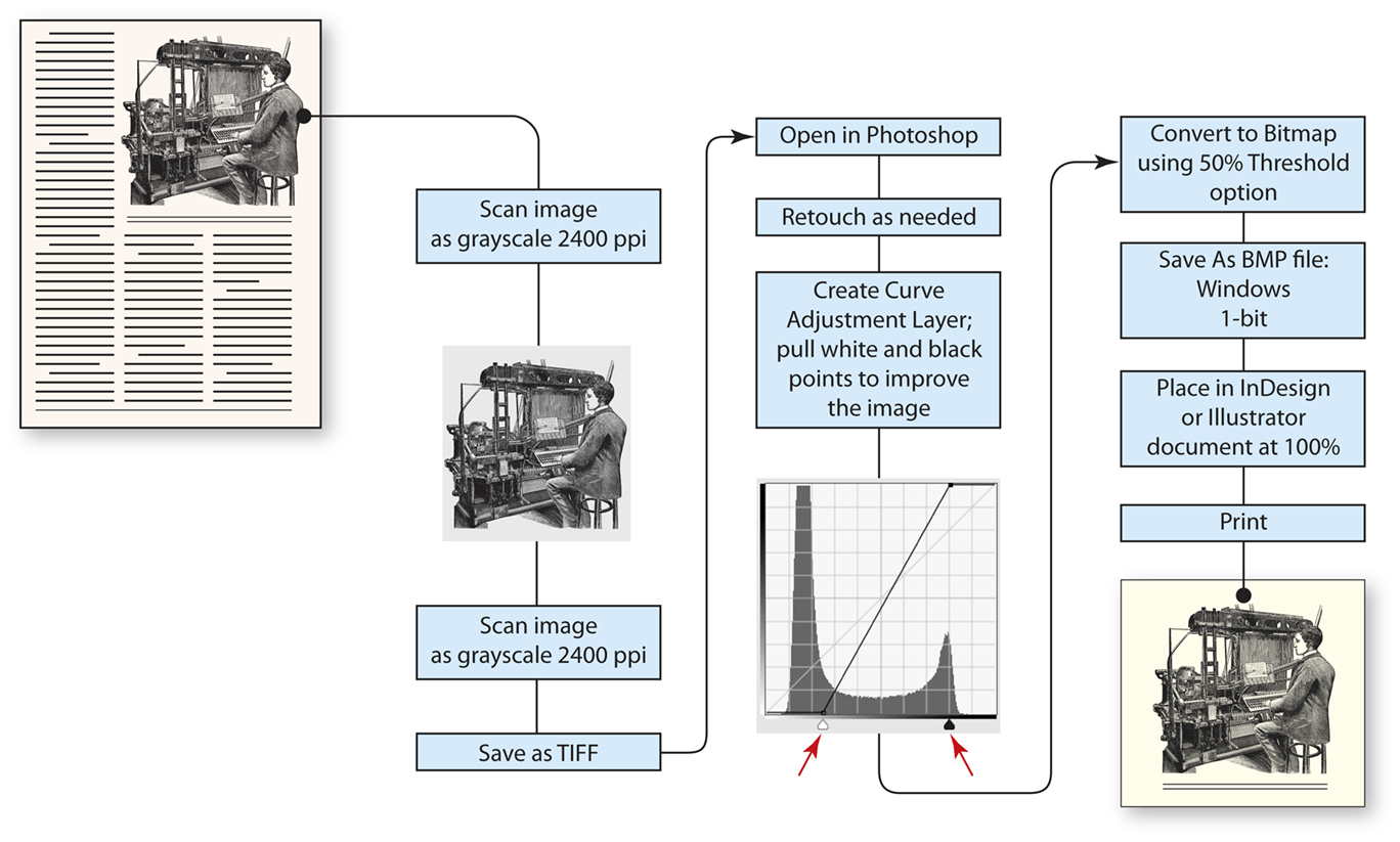
Converting to bitmap requires attention to detail, as it can easily go wrong. It starts with scanning, which I recommend be made to a grayscale file. Some scanners can scan directly to bitmap, but that seldom works well because the scan appears too harsh, and much of the fine detail in an image can be lost. Instead, I recommend scanning as an 8-bit grayscale image at a resolution of 2,400 pixels per inch (ppi). This will be a fairly slow scan because the scanner will be working at such fine resolution.
Once the grayscale image is acquired, open it in Adobe Photoshop and create a Curve Adjustment Layer. On the curve layer, try adjusting the white point and black point (black and white indicators at the bottom) to maximize the detail in the image while darkening the blacks and opening up the whites. Be careful not to cause pinching of the lines and leave some of the gray in the lightest areas.
If the image needs retouching to correct for mechanical damage, fix it while the image is in grayscale mode. That makes a smoother correction that is not obvious in the final image.
After retouching, save the file in TIFF (the scanner created a TIFF) or change the format to PSD. This will become your master file. The final bitmap file will be a derivative file.
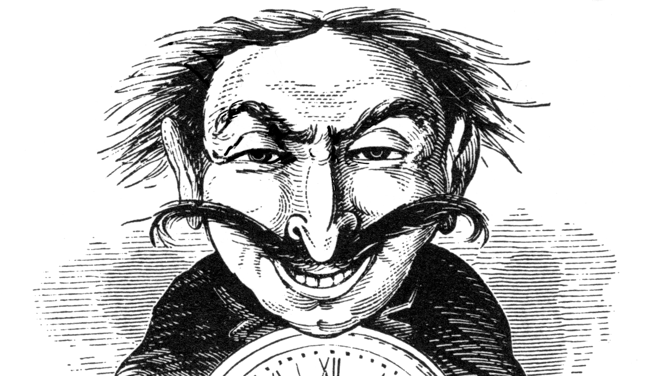
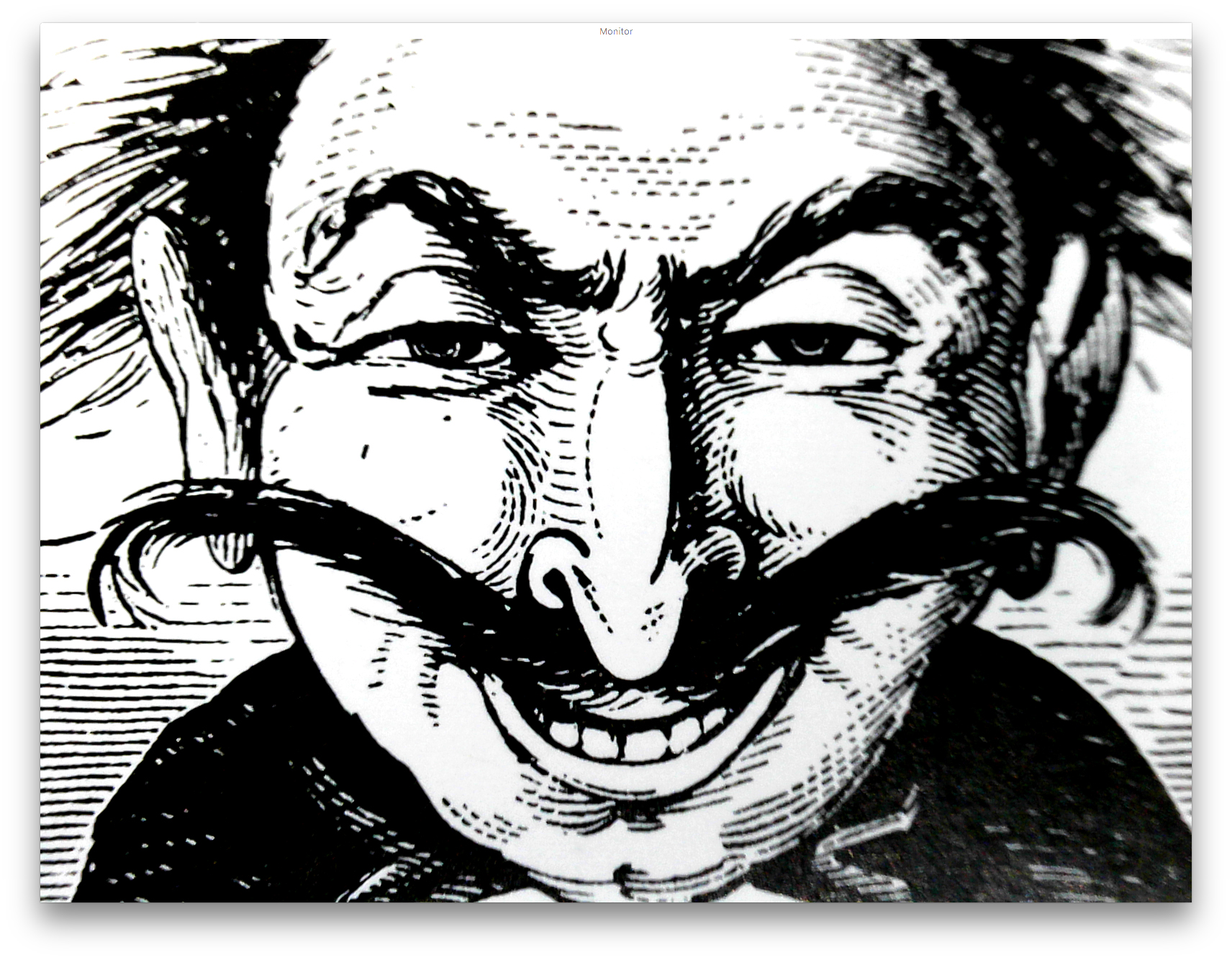
This is an engraving scanned from a Dover book of line art at 2400 ppi. It is represented here as a tonal grayscale image (modified with an Adjustment Layer in Photoshop).
Change the mode from grayscale to BMP (Image>Mode>Bitmap). This, curiously, is the only file format that will keep the line art as line matter and not convert it to halftone dots (or other halftone patterns) in the final reproduction. There are four primary methods of conversion in the menu. Choose 50% Threshold as the method; the others create unnecessary noise and other patterns. The result will be a clean, line illustration that will translate into line-only matter on the final plate (this works well on digital printing machines also). I used a Kodak Trendsetter to make aluminum printing plates for my tests. That machine has a native resolution of 2400 spi, which matches the resolution of our BMP file. The results are extraordinarily sharp. On a different test on a Konica-Minolta C1100 digital press I also obtained excellent results printing through an EFI Fiery RIP as BMP. The resolution of the Konica-Minolta (1200 spi) was adequate to make excellent images of the same art, though obviously at half the resolution of the offset process I tested.
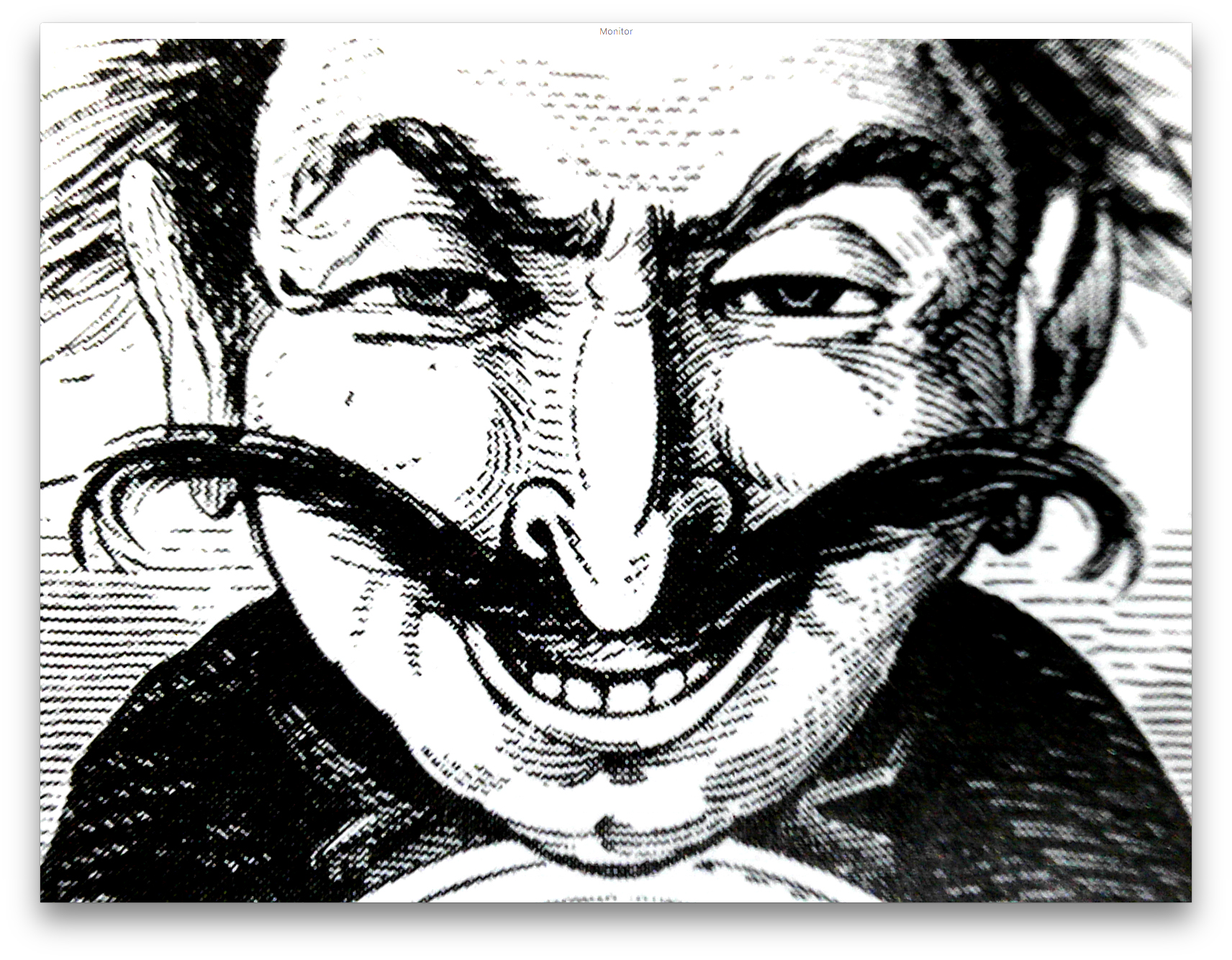
This is a photomicrograph of the same image printed by offset lithography at 2400 spi. Notice the effect of the halftone pattern on the engraved lines. Click on the image to see an enlarged view.
The halftone pattern is especially destructive to the fine lines in the engraving that are designed to provide tonality. By using the BMP file format, this can be avoided (see images below). Click on the image to see an enlarged view.
With the line art image in-hand, proceed as normal with page layout. BMP files are effective in Adobe InDesign and Illustrator. Both applications support placing these illustrations. Scaling is important! You should try to reproduce engraved illustrations at their original size. Making them smaller increases the resolution of the engraving (the distance between the engraved tonal lines of the original), and that will challenge most printing processes. It’s acceptable to increase the size of the illustration in the final layout, but be very careful reducing these illustrations.
This photomicrograph shows how clearly the image is reproduced when saved as a BMP file. The lines on the right are clear, and have not been turned into halftone patterns. Click on the image to see an enlarged view.
This photomicrograph shows the quality of the engraved lines when printed from the BMP file on the offset lithographic version of the job. Click on the image to see an enlarged view.
For output I created CMYK Adobe PDF files. These were processed through Prinergy for the Trendsetter, and through the Fiery RIP for the Konica-Minolta. In both cases the BMP data is treated as line art, and no attempt is made to change it to halftone patterns.
In my next blog I will discuss ways to colorize engraved illustrations.