The Bishop Peak Portrait Project – complete!

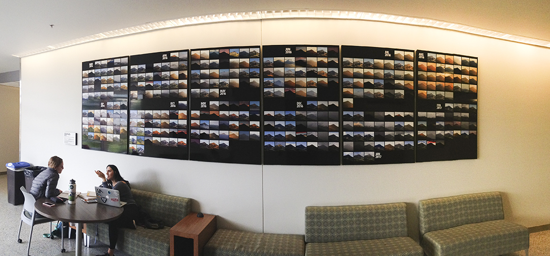
Thank you all for your patience while I built the Bishop Peak Portrait Project, a series of thousands of photos of San Luis Obispo’s most prominent mountain. I started the project in November, 2015 with the construction of a weatherproof box for the camera and electronics, and then started shooting the photos in March, 2016.

The photography continued for a year to the end of February, 2017 when I turned it off and removed the equipment from the roof of the Kennedy Library at Cal Poly.

In the end, 365 of those photos were prepared and built into a large display for the Baker building at Cal Poly.

During the months between the beginning and the end, I machined the panels from an aluminum laminate material called AluPanel, developed a system for machining the individual photos for the display, and cut those to fit. Then we put it together.

The story starts here if you want to go back to read all the details.

This week Cal Poly Facilities workers put the panels up in the Baker Science Center at Cal Poly, and my colleague Rob Brewster (one of the technicians on the project) sent me photos.

I hereby present the completed Bishop Peak Portrait Project:

More photos will follow of course, but I’ve never seen it, and will not be able to see it until late August when I return from my teaching post in Germany.

I am very proud to see the results, and once again thank those who helped make the project happen:

Dr. Phil Bailey, Emeritus Dean, College of Science and Mathematics
Dr. Derek Gragson, Associate Dean, College of Science and Mathematics
Rachel Henry, Communications, College of Science and Mathematics
Rob Brewster, Technician, College of Science and Mathematics
Doug Brewster, Technician, College of Science and Mathematics
Emma Wilson, Graphic Communication student and project assistant
Patrick Kammermeyer, Kennedy Library communications specialist
Catherine Trujillo, Kennedy Library, and campus art coordinator
Eric Johnson, Graphic Communication Dept. IT consultant
Tim Hastings, Facilities Department
Sarah Sayeed, Kennedy Library Information Technologies lead
Dale Kohler, Kennedy Library and Cal Poly ITS lead
Jim Eckford, Rancho Burro technical support
Ashala Lawler, technical support
Bryn Forbes, CNC support and assistance


Posted in Art, Photography, Photoshop techniques, Printing and Printing Processes | Tagged , , , , , , , , , | Leave a comment

Street Art provides an opportunity
for repositioned panoramas

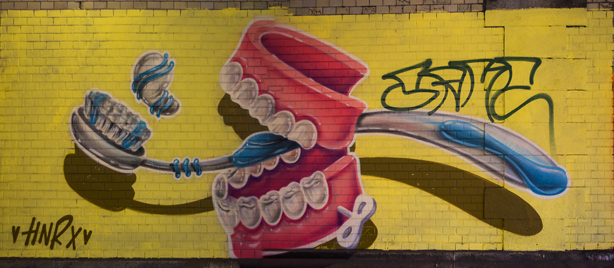
My wife and I traveled today to see a neighborhood in Munich that is famous for its street art. It’s called the Tumblingerstraße area, and it features some very sophisticated works of graffiti – much better than graffiti – that shows some amazing talent and creativity.

I am not a fan of graffiti; I prefer that artists not paint on buildings and train cars, etc. However, this neighborhood has become the canvas for some talented artists who use the urban landscape as their palette. Though there is a municipal sign at the edge of the neighborhood prohibiting graffiti and spray-painting (itself defaced by spray paint), the street artists who do this work must use scissor lifts, or at least ladders, to reach their canvases, and one does not do that kind of art in the middle of the night unseen by the Polizei. This work must be at least condoned by the authorities.

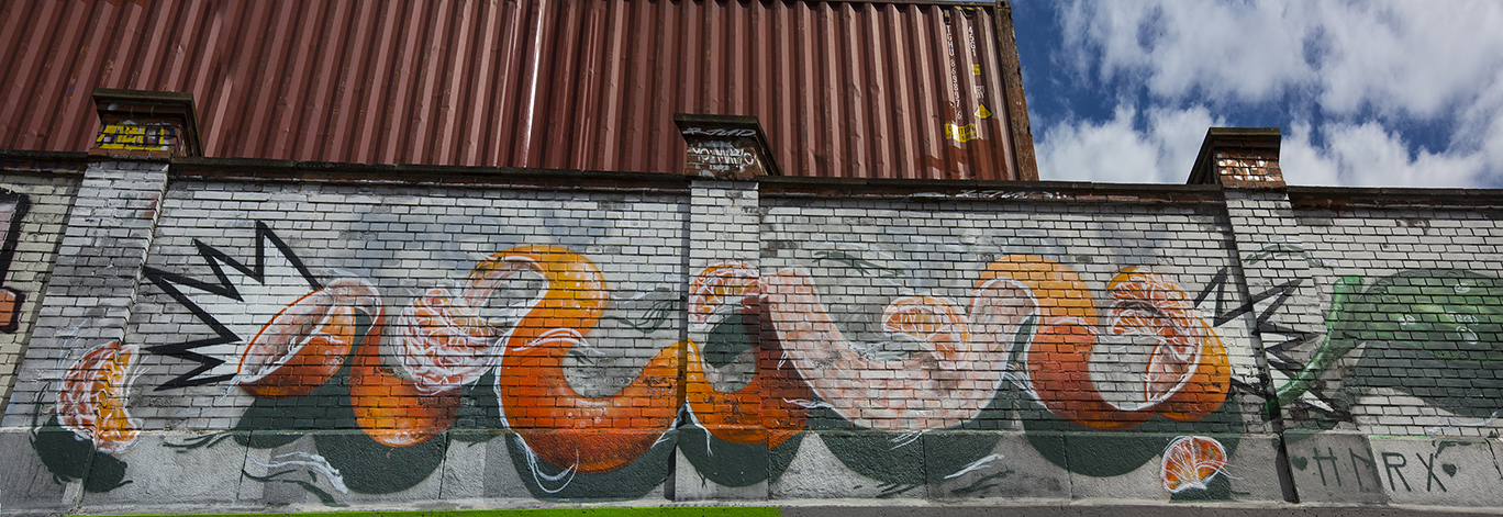
This example is over 20 yards wide, about 12 feet tall. I took seven horizontal images to make the complete image, and stitched them together using Photomerge as described here.

My objective today was to capture some photos of this work, so I took my trusty Canon 5D Mark III camera and my “street lens” (16-35 f2.8) with me to make the images. Tumblingerstraße is a moderately-trafficked street bordering an industrial neighborhood and the Isar river. A huge brewery is located just off the street, and there is a lot of train traffic that passes overhead.

There are cars parked everywhere along the street, making it difficult to step far enough away from the art to photograph each piece in one frame; the sidewalks are wide enough for people and bicycles, and barely wide enough for me to make multiple-exposure “panoramic” images of the art. The term “panoramic” infers that the camera is in one position, and that it turns on its own axis to make a long horizontal photo. In this case, the camera does not stand still and turn. Instead, the camera moves horizontally in increments, making a series of square photos that are later stitched into a large, seamless image that represents the original art in its entirety. I will call these repositioned panoramas.

They are quite difficult to capture and to stitch, and there is only one way I know to get them to come out correctly – straight and undistorted – and that is to use Adobe Photoshop’s Photomerge feature to assemble them into whole images.

Photomerge is very good at this. I used it extensively four years ago to assemble section-scanned film negatives of Kodak Cirkut panoramic camera film. These negatives measured about ten inches tall by over four feet in length. I scanned them on an Epson scanner using its transparency function, and then assembled the sections in Photoshop using this technique. It worked flawlessly. I had an advantage on that project though – the film had no perspective, and the scanning bed stayed absolutely flat and square for each scanned section. Assembling these into coherent images was relatively easy for Photoshop, and the resulting photos were extraordinary.

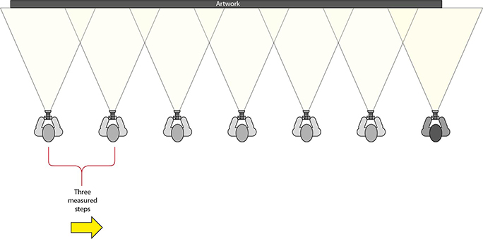
This is my shooting pattern. I stand square to the wall, find a horizontal reference  in the shot (edge of the wall in this case), then take a series of images with careful horizontal indexing – I take three steps between each frame.

Today’s adventure was unaided by a tripod. I have one, but I did not take it with me to Tumblingerstraße. Instead I hand-held the camera and made very careful series of photos of each image I wanted to capture. I checked focus and exposure, then attempted to find something straight to use as a reference. Typically, I used the edge of the wall at the sidewalk for a horizontal reference in each frame. Then I took a photo, stepped three measured steps to the right, took another, and repeated this until I had a series of images that covered the art with significant overlaps.

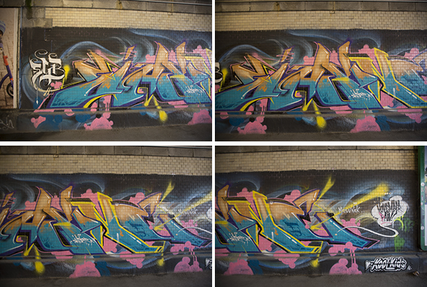
Four sequential horizontal images taken today to capture one work of art. Notice the overlap in the images – this is critical to the success of merging the photos into one.

Back in my apartment I assembled the photos in Photoshop using one of the techniques that Photomerge will practice to get sequential images to match and merge into one.

To get this to work, one must first be extremely careful to take effective photos. Unless you can go back and take the photos again, it’s best to get it right the first time. Check square, check focus, use manual exposure (and don’t change it!), don’t change the distance between the art and the camera (this can be challenging). The process does allow for some error, but it must be minimal.

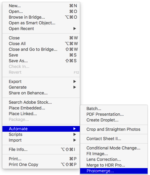
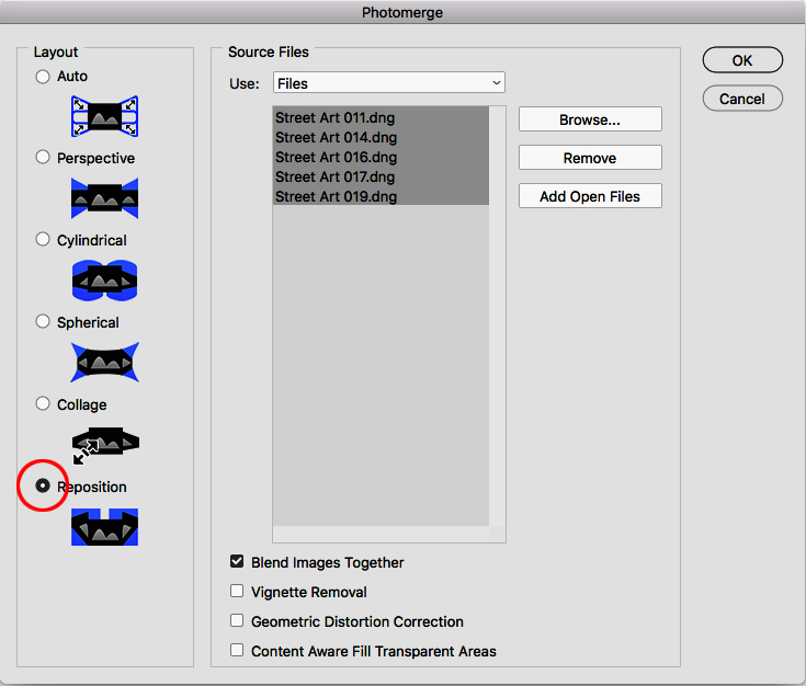
I try for about 20 percent overlap between the photos. Photoshop needs a lot to find common areas and to blend the images successfully. I open all of the contributing images for a single work of art, then choose File>Automate>Photomerge to reach the Photomerge pane. Then, in that pane, I choose the technique that works best for this type of work: Reposition. The other six options will generally not work to assemble rectangular images correctly. A couple of them won’t work at all for this kind of photo.

Photomerge in Adobe Photoshop, showing the selection of the Reposition mode, and the selection of the Open Files in the center. This is the most effective way to accomplish the task of making these images.

Choose Add Open Files then select them all: click, shift-click on the list to include them. Then click OK. It takes several minutes at the resolution at which I work (63 MB per image), but the result can be spectacular.

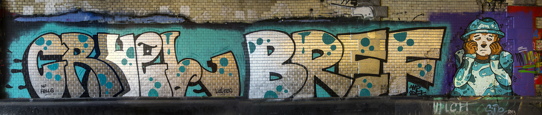
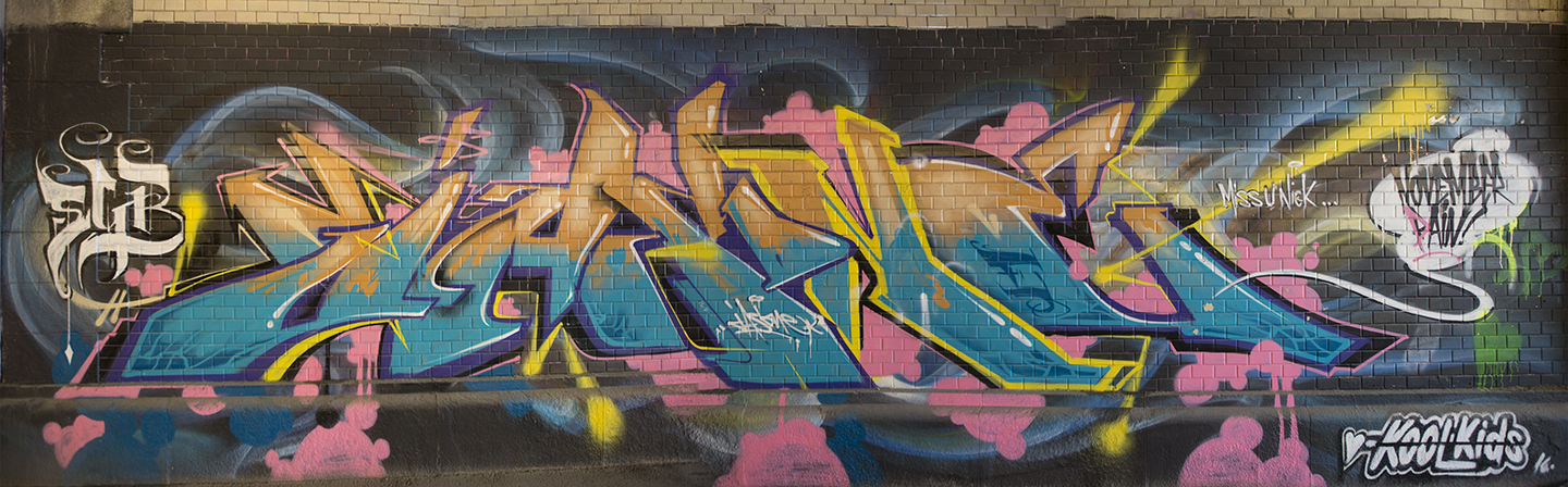
This is the composite image from the four source images shown above. Once completed, it needed only to be cropped to finish the image.

Note that the most visible difference between a true panorama and a sequential, repositioned panoramic image, is that these photos are straight, and do not display the arcs of a normal single-point-perspective panoramic photo. Photomerge has two modes that will do that, but then your straight lines become arcs, and that is unattractive for this kind of work. Notice in these images that the rows of bricks are straight from left to right.

In the end I recorded a faithful photo of each of the major works on display in the neighborhood. I am very pleased with the results. As with all of my panoramic images, the greatest amount of time is spent in front of the computer, as opposed to the relatively small amount of time spent on the scene.

I found myself enchanted by the street art today, and I applaud the creative people who make this work.

Please don’t do it on my apartment building!!

Addendum December, 2021:

I am back in Munich, and have spent a lot of time at Tumblingerstraße recently, photographing the artwork there. This time, my Master’s degree students and I have been documenting the artwork, and my students have been interviewing some of the artists. It has been very successful.

I have written a new blog about a more precise method I used this year to photograph the street art (note that I am not calling it “graffiti” anymore).

You can read the new article here.

Posted in Adventures, Art, Panoramic Photography, People, Photography, Photoshop techniques, Software | Tagged , , , , , , , , , | Leave a comment

Van Gogh’s Père Tanguy in perspective

Museums often have no-photography rules, depending on their policy about allowing visitors to take photos, or the legal arrangements they have with art owners, copyright holders and other things that go beyond my pay grade.

In the Galleria dell’Accademia in Florence, Italy, a few years ago I noticed that the museum had finally given up on its prohibition of photography of the statue of David. On my prior visit they played a continuous recording in numerous languages saying that photography was prohibited. My guess is that the museum staff threatened to quit if management didn’t stop playing the recording.
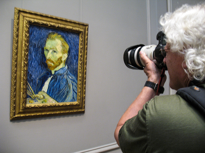
Here I am, having a close photographic experience with Vincent Van Gogh at the National Portrait Gallery in Washington, D.C. in 2008. This gallery allows photos, but does not allow tripods. This painting does not have glass in its frame, making the relief of the brushstrokes visible.

Since the tourists ignored the prohibition anyway, the museum acquiesced to the ubiquity of cell phone cameras. They just gave up. It probably doesn’t matter anyway because the value of a photo of the statue is exactly nothing. These photos are just mementos, photos that people show to others saying, “Look – I took a photo of the David!”

The fact that millions of people have taken (previously illicit) photos of that statue does not diminish the value of the original in any way. Michelangelo would be proud.

(I know that most museums prohibit flash photography, and I know that the powerful ultraviolet light emitted by some strobe flash tubes can potentially damage the colors in works of art. That is a topic for another day.)

Taking photos of fine art in ambient light does no harm to the originals, nor does it hurt the marketing opportunities that museums have to sell postcards. I buy them too, and just like you, I never send them to anyone. They end up in boxes in my storage locker with postcards from other trips to other lands.
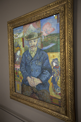
This is my off-axis photo of Van Gogh’s Père Tanguy portrait in the Rodin Museum in Paris. I was able to eliminate all but three pinpoint reflections in the glass that protects the image.

I suppose that an unscrupulous photographer could take an illicit photo of a painting, then print postcards to sell on the sidewalk outside the museum to take business away from the museum. That scenario is unlikely, but in case you are considering this as a career, following is my technique for making a darn good reproduction photo of a masterpiece in a museum.
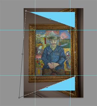
This is the same image, squared-up in Adobe Photoshop. I use the Distort tool to align the image with a grid of guidelines I put into the image frame. The blue was set as the background color so you can see how much distortion was needed to get the image square.

There are two Van Gogh paintings on display at the Rodin Museum in Paris. On my first visit to that museum, nine years ago, I noticed that the paintings were not secured to the wall, only hung on a cable like the paintings that hang in my home. I also noticed that the two paintings were not covered with glass, making the three dimensional brush strokes easily visible. To me, that is what makes Van Gogh’s work so fun to see in person.

On my visit to the Rodin this week I was pleased to see that they have now secured the frames to the wall with very sturdy connectors. I was disappointed to see that they now have glass in front of the paintings (this is good, really, because it protects them from people and the environment). The problem with the glass is that it hides the paint strokes from the viewer, and it increases the reflections on the painting.
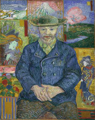
This is the reproduction of the Père Tanguy portrait that is available for free download from the Musée Rodin. The museum had the advantage of taking this image in a carefully controlled photo studio.
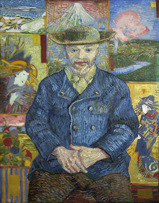
This is my Père Tanguy portrait reproduction after correcting the distortion in the top image. It started as a 62 MB image, and ended up being cropped to about 18 MB. That is enough resolution to reproduce the image on postcard-size works. Note that my image missed a little bit of the right-hand vertical.

I wanted to photograph the image of Père Tanguy, the art supply dealer Van Gogh painted in lieu of payment for pigments and canvas. Mssr. Tanguy was, according to the information at the Rodin Museum, a nice fellow who supported starving artists, and willingly posed when they wanted to trade a painting for the raw materials of their craft. The indoor lighting at the museum shone down from the ceiling in pinpoints of light that reflected off the new glass. It was impossible to take a good photo with the reflections in it.

Instead, I took the photo from an angle that provided the fewest reflections. And, as cinematographers say, I left the rest for “post” (this means that I’ll leave it to the next guy to fix it.)

It turns out that I am that next guy, so it was up to me to fix the photo. I shoot in camera Raw, and then I convert as I import into my computer into DNG format (this is my insurance against obsolescence). I opened the DNG, then made some small tonal adjustments and opened the image in Photoshop. There, I dragged guidelines to the edges of the image as I would like it to be.

Then, using the Marquee tool, I selected a rectangular area of the photo large enough to expand it to fit the space and square the photo to these guidelines. Choosing the Distort tool under Image>Transform>Distort. I usually compress rather than expand the corners when I do this, meaning that one corner (the upper-right in this example) should be brought inward rather than taking the upper-left corner and dragging it upward. This results in a reduction of pixels in the image, and that might be better than an interpolation of new pixels caused by stretching the image. As I pull or push the corners of the image, I add the Shift key to keep the control point from wandering vertically while I am pushing it horizontally (or vice versa).

In the end, I have a nice, square image of Pere Tanguy, free of reflections (mostly) and ready for contrast adjustment and finishing. The Rodin Museum provides the dimensions of the original on their web site, figures which make it possible to return the image to its proper proportions. I set my canvas to these proportions, then scale the image non-proportionally until it fits (with Snap turned on).

I downloaded the Museum’s low-res version of the original image (they no doubt have a photo studio for this work), opened it in Photoshop next to mine, and then I adjusted mine to match better in contrast, color saturation, and black values. The final product is over 18MB, and at that size I could print postcards with good enough quality to set up outside the museum and sell my wares. But I’m too busy for that, and they own the original. It is an interesting exercise, one that is useful for photographing highly reflective art (I used this technique once for photographing badges).

I appreciate the fact that Musée Rodin does not mind when techies like me come to visit, carrying professional cameras and intent on making nice images of their masterpieces. They are generous with their originals, and I am grateful that they seem to have no cares about my taking photos in their beautiful museum.

Posted in Art, History, Photography, Photoshop techniques, Printing and Printing Processes | Tagged , , , , , | Leave a comment

Der Druck ist nicht tot

At least in Germany it’s not.

As I stepped off the train in Heidelberg last Monday afternoon an American asked me for directions. At this I was not very helpful because he and I had been in Heidelberg exactly the same length of time – about ten seconds.

We chatted as we walked into the station. He mentioned that he was visiting the city where his parents met 60 years ago. I told him I was there to visit the printing press manufacturer named after the city we were visiting.

He lamented that publishing is dead. So sorry, he said. He, himself once helped out on a press. Did I know that the press operators used to know just how much ink to add to a unit to get the color right? Yes, I admitted that I knew that, and I had done that very thing myself.

We said our pleasantries and parted ways, he to find the place of his parents’ meeting, and I to the Schnellpressenfabrik to see multimillion-dollar printing machines assembled and prepared for their new owners around the world.

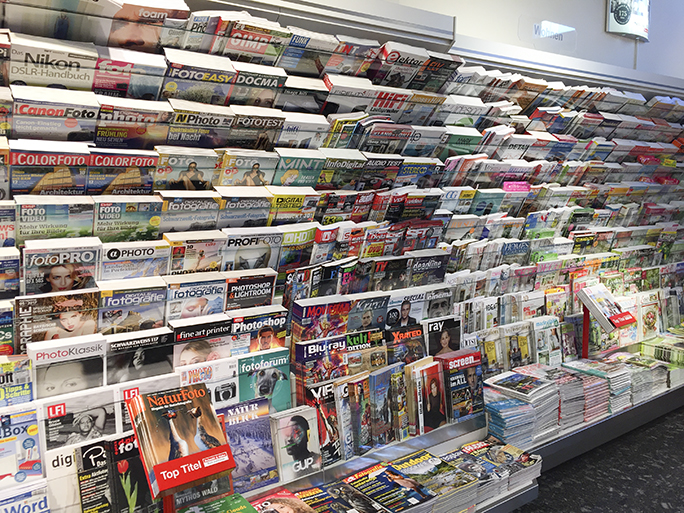
This is a small selection of the many, many magazines for sale at the bookstore located in the Heidelberg Hauptbahnhof. There were another five racks this size in the store. This is eye-candy for printers!

A few minutes later my wife and I visited a nice magazine store in the Heidelberg Hauptbahnhof; we were both looking for something to read – an English language magazine perhaps. As we wandered the aisles in the store I realized that I was standing in the middle of a well-stocked example of the fact that publishing is not dead. I snapped a few photos with my iPhone, while admiring the retail end of the publishing industry.

I am going to take a guess that this single store had over 1,000 magazines for sale. In the photo section where I was standing, there were 49 magazines in German on the subject of photography. There were several in other languages also, but they were in the foreign languages section, which featured another 150 titles.

I walked around and picked a beautiful tourist magazine about the city of Heidelberg. I picked that up and decided to buy it. I also grabbed a copy of the week’s Economist, printed in England (I think) for the European market. I get this magazine back home, and I think that the American edition is printed in the U.S.

I reflected on the man’s comments just minutes earlier on the train platform. So sorry. And I realized that he is absolutely wrong. Ill-informed is probably the better term.

I wondered to myself where he had read that publishing is dead.

Probably in a magazine.

The next morning my wife and I were treated to a tour of the huge Heidelberg printing press factory in Wiesloch-Walldorf just outside Heidelberg. There we saw presses large and small – even the small presses are large these days. We were taken to a building 620 meters in length and 120 meters in width where the presses are assembled. It’s a combination assembly line and individual assembly facility where 4,000 printing units are made each year and shipped around the world.

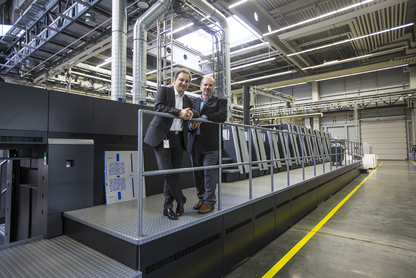
Ralph Schönfeld and Clarence Penge, our wonderful hosts at the Heidelberg plant in Wiesloch, outside of Heidelberg, Germany. They are standing on a press with eight printing units and four coaters. The machine is 93 feet long. It will be used in a packaging plant.

We visited the gear-making building and saw the production area where cast steel components are machined to a precise size, then measured for quality-control on their way to final assembly in a huge multi-color Heidelberg press.

We walked through and over a printing press so large that the feeder is way over my head. This one is destined for a packaging printer in North America. It is over 90 feet in length. The press sheet it prints is 63 inches in width. I suspect that some of the magazines I saw in the bookstore are printed on machines like this (actually it’s more likely they are printed on the smaller 40-inch machines).

My wife Ashala stands at the delivery of one of the huge Heidelberg presses in the demonstration room in Wiesloch. This machine prints on sheets of paper over five feet in width. It is also the fastest press made by Heidelberg – it prints up to 18,000 sheets per hour, which translates to five sheets per second. The amazing thing about this press is that it’s designed to be operated by only two people.

I came away from this experience knowing that printing (and publishing) are doing pretty well. After some lean years fighting our way through the recession, the industry is on the go – especially packaging, and the printers of the world are buying new printing machines to fill the stores in all the Hauptbahnhofs in all the world with beautiful colorful magazines.

And I hope the man from the train found the place where his parents met. I also hope he bought a magazine from the store in the station as he was leaving town.


Posted in Adventures, New technology, People, Printing and Printing Processes, Technology | Tagged , , , , , , , , | 2 Comments

Learning letterpress in a 14th century town

One of the three classes I am teaching in Munich is Advanced Typography.

The students are in their third year in the Print Media program at Munich University of Applied Sciences. Five of my students are exchange students from my home university, Cal Poly.

At Cal Poly I have access to the Shakespeare Press Museum, a delightful collection of 19th and early 20th century letterpress equipment and type. When I teach this course at Cal Poly we just walk down the stairs to the museum so that I can show the students how to set type and print with the letterpress equipment in the museum. At Munich there is no museum, and only one letterpress.

My colleague Martin Delp, who spent last spring quarter teaching at Cal Poly, suggested that when I wanted to teach the students about letterpress printing, we should visit his friend Oskar Bernhard, a letterpress printer in the town of Nördlingen, Germany. That town, which was founded in the early 14th century, is about two hours from Munich by train.

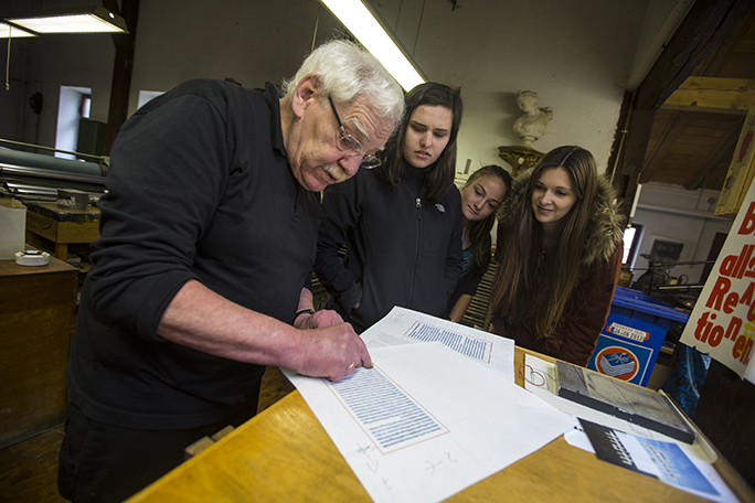
Oskar Bernhard explains the marks on a letterpress proof for my Advanced Typography students. From left to right: Emily Hoehenrieder, Shauna Rinaldi-El Abd and Christine Wiechers.

Last Thursday, my students joined Prof. Delp and me at the Munich central train station and we boarded a train headed for Nördlingen. When we arrived in that city, we walked over to Herr Bernhard’s atelier and began a most impressive day in a working letterpress shop.

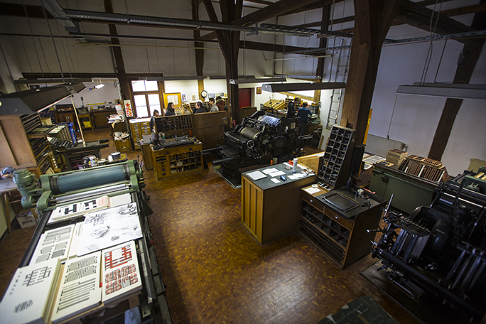
This is a look from the balcony of Oskar’s workshop. On the left is his offset proofer. At center is the Heidelberg K-series cylinder press. At the lower-right is his Heidelberg “Tiegel” press. The students are gathered at the back of the shop setting type for their projects.

Bernhard, a veteran of the typographic industry, has an impressive collection of machines – several letterpress proofers, one Heidelberg “Tiegel” (in America these are called the “Windmill”), a large Heidelberg cylinder press, and a very large offset proofing press. He uses these machines to produce limited edition letterpress books, specialty cards and booklets, and a variety of commercial jobs.

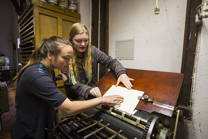
Shauna Rinaldi El-Abd and Ashley Boehmer, both Cal Poly students in the exchange program at Munich, operate the letterpress proofer in Mr. Bernhard’s shop. They are positioning a sheet of paper to be printed on the press.

He has a Monotype machine – a typecasting machine from about the 1950s. The keyboard is still in working condition, but his caster is in need of repair. The rest of his type is foundry type and some wood type in sizes up to about three inches. It’s a beautiful shop, very neat and orderly. And, unlike many letterpress shops, there are not very many orphaned projects sitting on the counters. He is meticulous about putting type away.

The students learned how to use a composing stick, how to add (real) leading to increase the space between lines, and how to quad-out their lines to properly center them. They chose their type from the many drawers of hand-set type in Mr. Bernhard’s collection. He was most gracious in allowing the students to invade his workshop and use his precious equipment.

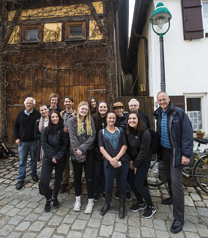
With Oskar Bernhard’s historic building in the background, my students gather for a group photo in Nördlingen. In back are me, Franz Eder, Martin Hämmerle, Christine Wiechers and Oskar Bernhard. Second row: Antonia Schaefer, Jessica Dimulias, Skyler Ulep, Front row: Sophie Wegenknecht, Ashley Boehmer, Shauna Rinaldi El-Abd, Emily Hoehenrieder and Prof. Martin Delp. Photo by Ashala Lawler

It was fun and highly educational. Each student had a chance to set type, to position it on the press and to print several sheets of finished work on Mr. Bernhard’s proofing press. They had an experience that one cannot get in a textbook, nor from a PowerPoint presentation.

After our day in Oskar Bernhard’s workshop, we had a pizza, then took a guided tour of the town, the only city in Germany that still features a wall around the city to keep marauders out. At the end of the day, we sent the students back to Munich on the train, and we stayed behind for a nice dinner and a second day in the historic city.

At Cal Poly we have the motto “Learn By Doing.” One of the reasons that Munich’s program is such a good fit for our exchange program is that its system is also based on hands-on learning. With our visit to Nördlingen and to Oskar Bernhard’s workshop, the students had a worthwhile learn-by-doing experience that they will long remember.

Note added May 10, 2017:
My students and I created a thank you poster to send to Herr Bernhard. We included hand lettering by Sophie Wagenknecht and a translated version of This is a Printing Office by Beatrice Ward. Each student signed the poster and we mailed it to Oskar Bernhard.

Posted in Education, History, Typography | Tagged , , , , , , , , | 1 Comment

The Poster-Paster

In my collection of books related to printing and publishing is a delightful edition from Dover of line art engravings from the 19th and early 20th centuries.

I wrote about reproducing these illustrations in a series of blogs I wrote in January and February of this year. They are surprisingly challenging to reproduce with digital technologies. I use that book occasionally as a source of early graphic arts illustrations.

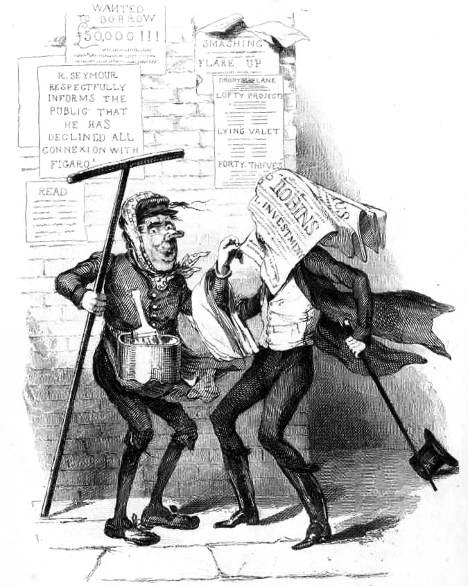
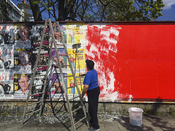
Today, while out on a journey to buy some chain lubricant for my bicycle, I encountered a 19th century event here in Munich. I passed a man putting up advertising posters using a long-handled brush with paste on it. First he brushed the paste on the wall, then he applied a poster, then followed by painting paste on the front surface of the poster with his brush.

I suppose that the paste works its way through the poster and helps to hold it in place when the paste dries.

I have never seen this done before. It was amusing to me, as one of my favorite engravings is of a poster-paster putting up a poster by this technique.

What made it even more amusing was that as the man worked, the wind picked up a couple of the posters he was hanging, and they blew down the street. The poster-paster’s assistant took chase and brought them back. The illustration above, drawn in 1836 by British cartoonist Robert Seymour, came to mind.

Today’s poster-pasting experience was an eye-opener for me. Techniques used in previous centuries are still at work today.

Above, the poster-paster with his long-handled brush applies white paste to the wall, then to the posters after he has applied them.

Posted in Adventures, History, People | Tagged , , , , , , | Leave a comment

270° of the Alps in one panoramic photo

Yesterday my wife and I ventured south from our temporary home in Munich to the German Alps. We traveled by Deutschbahn trains, and a bus (construction on the rails required this) and then another train to the town of Garmisch-Partenkirchen. From there we took yet another train to the Grainau station where we boarded a cog-wheel train that travels up, and then through Germany’s highest mountain, the Zugspitze.

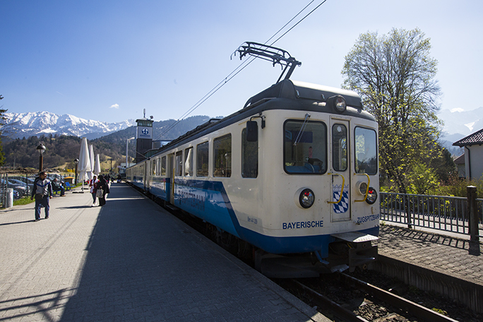
This is the Zugspitzbahn train at the Garmisch station. This one does not use the cog-wheel drive mechanism. We changed trains further up the canyon to get that train.

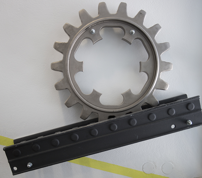
The cog-wheel train, run by electricity from overhead catenary cables, uses a pinion gear in the center of the trucks that engages fixed rack gear teeth in the center of the rails. The gear drives the train up and down the tracks, and prevents it from slipping on the rails (normal trains cannot climb more than a few degrees). This train climbs on grades as steep at 25 percent, meaning that it climbs 2.5 feet for every ten feet of horizontal travel, which is extraordinary.

This is an actual rack-and-pinion gear/track mechanism on display at the Zugspitze building at the top of the mountain. The teeth of the pinion gear hold the train on the rails, and provide motive power to drive the train cars up and down the tracks.

At the end of the cog-wheel train trip, which travels for about an hour through a tunnel dug through the rock, we emerged at the ski lodge near the top of the mountain. Then we boarded a cable car which took us to the very top.

At 9,717.82833 feet elevation I took panoramic photos and regular photos of the Alps in a spread that seems to go on forever. I had my tripod and panoramic mount with me, and I used that for what I consider to be a “normal” panorama – 12 frames with my wide angle lens of the view. It’s breathtaking.

Then I decided to take a high-resolution panorama of the entire spread of the Alps before me. For that I used my telephoto lens, shooting 32 photos to capture a sweep of 270 degrees at the southern-most point on the building at the top of the mountain. I use a Really Right Stuff carbon fiber tripod and ball-head as my travel tripod, and it has degree markings on the base of the ball head. I planned my shot carefully and took a series of carefully-indexed images of the view from the balcony of the building.

Then, back in Munich, I stitched the 32 images together (I use PTGUI Pro for stitching) to make a 270-degree panorama of the German/Austrian Alps looking (mostly) south from the Zugspitze.

This panorama was taken from the top of the Zugspitze in southern Germany. It takes in the Alps from the German border, and looks southward into Austria. Click to see a larger version which is 3636 × 190 pixels, and then click on it again for the largest view. At the extreme left edge is the gilded cross that stands on the very peak of the mountain: 2,962 meters above sea level.

The resulting panorama is very nice. It is just under a gigabyte in size, and measures 24 feet x about 12 inches at 300 ppi at final resolution. I present it here in a reduced size to fit the web. It’s an interesting image, and I plan to print it out 24 feet long, as that will be an even more interesting image.

Note from April 10, 2017: The full resolution file, which is 72,612 x 3,788 pixels in size is available for interactive viewing at gigapan.com.

Posted in Panoramic Photography, Photography | Tagged , , , , , , , , , , | Leave a comment

What’s in a street name?

I walked down Bayerstrasse yesterday morning, heading east from our apartment near the Hauptbahnhof, then turned right on Senefelderstraße. I made a point of doing this because I was on my way to the big Calumet camera store in Munich (Calumet has gone out of business in the U.S. but is prospering in Germany).

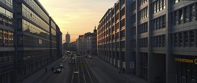
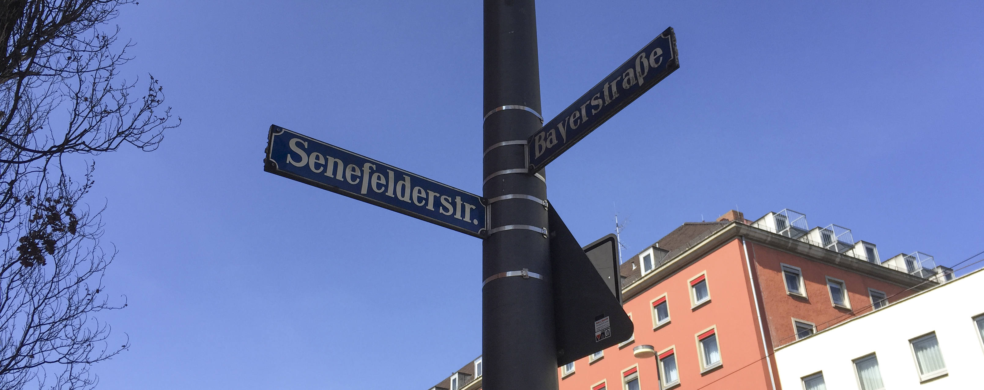
This is the view west on Bayerstraße in Munich. Bayerstraße is named for Friedrich Bayer, the co-inventor of aspirin. I get a headache just thinking about it. This is a block from our apartment in Munich.

My reason for choosing Senefelderstraße instead of the street before it, which would have been a bit shorter, is that Aloys Johann Nepomuk Franz Senefelder is the inventor of lithography, and I have never walked his street before. I took this street to honor him.

I’ve found Senefelderstraße, and have learned that there is also a Gutenbergstraße near the Nymphenburg Castle, and even a Mergenthalerstraße a little further out near the Wurm River. I will go walk those streets and write nostalgically about their namesakes when I get a chance.

Senefelderstraße is not a grand street by any measure. It’s populated by travel agencies and a few low-end hotels. There are a couple of vegetable stalls and a neighborhood market. I walked the length of it.

The corner of Senefelderstraße and Bayerstraße in Munich. This is in the vicinity of the central train station.

Herr Senefelder discovered that an image could be made on a smooth, polished limestone surface using regular drawing tools – pens, pencils and such, then that image could be inked, and the stone cleaned with water to make a reproducible image on the stone. A piece of paper, some pressure, and (as they say in German) voilà! You have printing.

The stone quarry that Senefelder preferred is called Solnhofen Quarry. His limestone slabs were quarried in Solnhofen and nearby Eichstätt, about 100 km. north of Munich. That particular stone was quarried for lithographic stones (and other artistic purposes) for centuries. Today it is treated as an archaeological site because the quarry is rich with fossils. Here is a quote from Fosseil.net, a web site devoted to the archaeological importance of these limestone quarries:

Solnhofen is known for the 10 Archeopteryx prehistoric birds that have been found here. The first feather was found in 1860, and the first Archeopteryx was found in 1861. In the Jura Museum in Eichstätt and the Bürgermeister Müller museum in Solnhofen you can see the original fossil birds.

The Solnhofen limestone was named after the village of Solnhofen in the Altmühltal valley. This limestone is exposed in a large area around the village. Many villages in the area have their own commercial quarries. The limestone is used for building material.

The limestone from the upper Jurassic period occurs in the area between Weißenburg, Regensburg, Nürnberg and Ingolstadt.

In the Altmühltal there are several museums, where you can learn about the geology and see the fossils found in this area. More than 800 species of plants and animals have been found in the Plattenkalk from the Jurassic period.

It’s fun to be in the heart of Germany, in the places where the seeds of printing were planted.

A field trip!
I’ll be taking my Advanced Typography students on a field trip to Mainz, to the Gutenberg Museum, on the 25th of April. There we will see two of Germany’s 12 Gutenberg Bibles, (known as Hubay 8 and 9). We will also receive a lecture by that museum’s specialist on Herr Johannes Gensfleisch (probably his real name).

I’m enjoying the opportunity to go straight to the source on these typographic and printing topics. And you will read about it here in the Blognosticator (German edition) as I make these treks.

Posted in History, Printing and Printing Processes, Typography | Tagged , , , , , , , | 1 Comment

The Bishop Peak Portrait Project is very nearly up!

For the next five months I’ll be living in Munich and teaching at the Munich University of Applied Sciences. I arrived here a week ago and I had my first classes this week.

But, last week, before leaving San Luis Obispo, I saw the finishing touches being applied to my Bishop Peak Portrait Project. This is the year-long photographic project that I did to document San Luis Obispo’s signature mountain. It will be installed in the Baker Science Center in the coming weeks, I hope (it’s just a matter of being installed on the wall now).

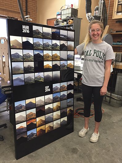
Emma Wilson, my assistant on the Bishop Peak Portrait Project, stands with the first finished panel: March, and September, 2016. Emma had just finished installing the aluminum photos into the display panel. There are six of these panels that will soon go up in the Baker Center at Cal Poly.

This project has been in my blogs for the last 15 months (you can start reading about it here). It involved putting a time-lapse camera on the roof of the Kennedy Library at Cal Poly, and taking a photo of the mountain every five minutes for a year. That year began on March 1, last year and ended on February 28 this year. In the middle I took about 70,000 photos, and culled them down to a smaller 40,000 photos from which I picked the best image each day and had them printed on aluminum plates (about 1/16 inch thick).

I machined these photos on a CNC router to precise dimensions, then inserted into large aluminum panels I cut on the same machine to accommodate the images.

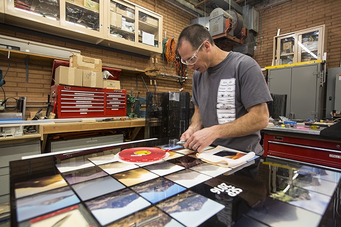
Cal Poly COSAM technician Rob Brewster aligns one of the photos in position on the September panel. We used an amazing double-sided adhesive to hold the photos in place.

I was originally planning to put the panels up, and then slowly populate them in-place until the project was complete, but technical difficulties interfered with my plans, and it ended up taking almost the entire year to get those panels cut and ready for installation. Eventually we decided to put the photos into the panels first, then install the panels – complete – on the wall of the building.

In the weeks leading up to my departure for Germany my student assistant/right-hand-woman Emma Wilson helped me get to the finish line. She and I had been working for several months to prepare the panels and the photos, and get the pieces in place for completion. We worked with Cal Poly technicians Rob and Doug Brewster who figured out how to finish the project and get the panels installed.

It came down to the wire. We were putting photos into the panels on Monday, March 6, and I boarded the plane to Germany on Friday, March 10. I saw the completed panels before I left. Emma, Doug and Rob finished those I was unable to do myself (my classes interfered with the photo project!).

When I return from Germany we will have some kind of an event to mark the installation. I’ll announce it here.

Many thanks to everyone who made it possible: Dean Phil Bailey, Associate Dean Derek Gragson, Doug Brewster, Rob Brewster, Emma Wilson, Jim Eckford, Ashala Lawler, Bryn Forbes, Eric Johnson, Tim Hastings, Dale Kohler, Sarah Sayeed, Patrick Kammermeyer, and others who have helped in various capacities. Thank you all!

To read all of the entries about the Bishop Peak Portrait Project, start here.

Posted in Photography, Photoshop techniques, Printing and Printing Processes | Tagged , , , , , , , | Leave a comment

Once a bitmap, always a bitmap

In my recent series of blogs about reproducing line art from 19th century copper engravings (and similar line art) using modern digital technologies I showed how scanning as grayscale and converting to bitmap format (with the 50 percent dither option) creates the best line art reproductions.

In the weeks since, I have had a chance to put this to the test on the 29-inch four-color Heidelberg press at Cal Poly. My students and I developed a test sheet for my Color Management course, and across the top of that sheet I placed a series of variations of the line art I had scanned for this blog earlier in the month.

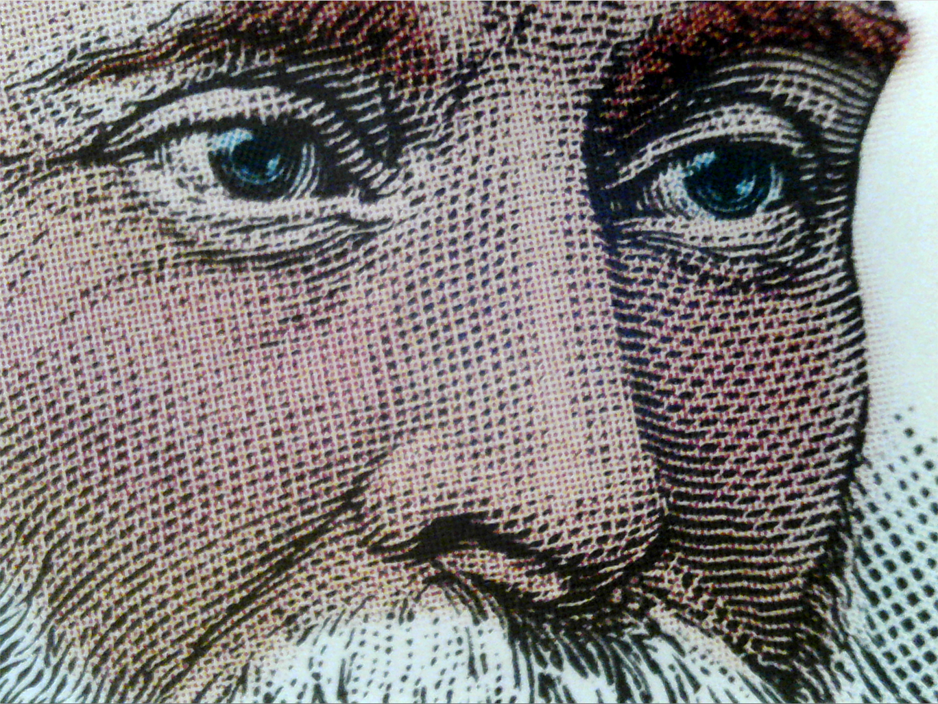
This photomicrograph shows the line art of the original scan (still at 2400 ppi) with color halftone dots overprinted (the Heidelberg prints in KCMY order). This proves my theory that Prinergy’s halftone engine observes the integrity of black-only bitmap images even when they are part of a CMYK tonal image.

I also pushed the technique one step further to introduce a color overlay on top of a bitmap file to colorize the image. The purpose of this was to test my theory that once converted to bitmap (sometimes called “one-bit” art) I could return the image to grayscale and add a color overlay without affecting the line art on the black channel.

The work flow I proposed in my earlier blog works fine for strictly black and white reproductions, but a bitmap file cannot be a color file, so adding the color overlay requires another few steps to ensure success. First, as before, scan at very high resolution. I recommend 2400 pixels per inch because this will capture the finest detail in nearly any engraving. Curiously, the resolution of our Kodak Trendsetter platesetter is also 2400 machine spots per inch, so the two happen to be the same resolution. Having more resolution on the platesetter might result in a better image, but I can’t test that at present (hint to Kodak: Cal Poly needs a new Trendsetter).

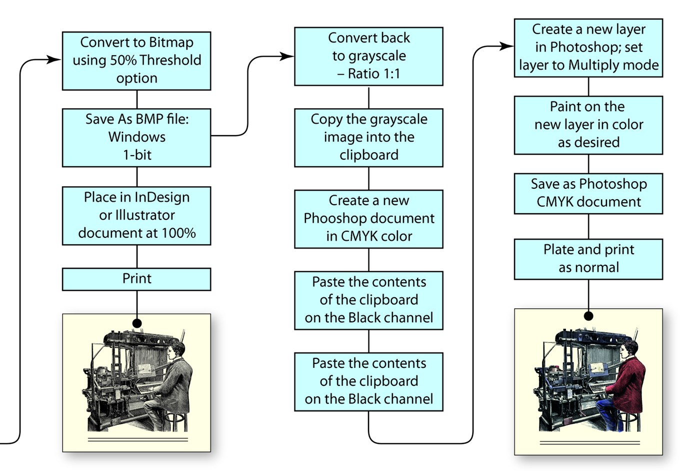
This is the continuation of the work flow diagram I presented in a previous blog. This one includes the conversion of the scan to bitmap, then back to grayscale, and the addition of a second Layer in Photoshop for a color overlay.

Adding a color overlay layer to the bitmap layer requires that the file format be able to contain color. To do this I converted my scanned image to bitmap at 2400 ppi (using the 50% threshold technique) and then immediately converted it back to grayscale (using a Size Ratio of 1) which leaves the art as it was modified to bitmap. The pixels are either 100 percent black of 100 percent white.

Once I have the image back in grayscale, I copy the image to the clipboard. Then I create a new document in Photoshop in CMYK color (Photoshop already knows the pixel dimensions of the clipboard). Once that file is created, I paste the contents of the clipboard onto the black channel, leaving C, M and Y alone.

The safest way to proceed is to create a new Layer in the illustration and paint any color you want on that layer. I set the Mode of the layer to Multiply, and I am then free to draw or paint in color on top of the line art. I choose strong colors – a pink for the skin tones, rich blue for the jacket, etc., and I paint with those colors at 10 percent opacity level in Photoshop. Because the entire layer is in Multiply mode, all artwork on the layer is overprinted on the final file.

The result of this is charming. The illustration holds its original character, but color is added. And, the result of my test on the Heidelberg shows that an image, once converted to bitmap, remains a bitmap file even when the illustration is converted back to grayscale. The color overlay in this example is converted in Kodak Prinergy to halftone dots – which are essential to the appearance of the final illustration – while the line art remains one-bit black and white line art. The result is excellent, and I have learned that the behavior of the Prinergy halftone engine exempts one-bit information from being converted to halftones (which are harmful to the character of the original engraving).

This technique also works for comic book art, allowing the artist to work in black and white, and then later add a color overlay to the work. The benefit here is that comics that print on black-only presses can be printed with the black channel, and those that have CMYK available can print with all four colors. The only difference is whether to apply the color layer to the art or not.

Posted in Art, Photography, Photoshop techniques, Printing and Printing Processes, Scanning | Tagged , , , , , , , | Leave a comment