Running the five-color
Pearl press postcard

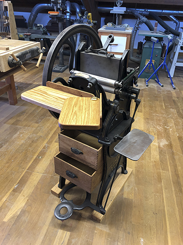
In 2019 I began the restoration of an 1895 Pearl press, a treadle-powered letterpress that was donated to the Cal Poly Shakespeare Press Museum.

That press was a rusty machine when we took delivery of it. I took it to my shop, disassembled it, then sand-blasted the parts and repainted it. After the pieces were repainted, I pin-striped some of the parts then reassembled the press. It was missing some key parts, which I replaced with new ones.

The rusty Golding No. 3 press before I moved it to the shop for restoration.

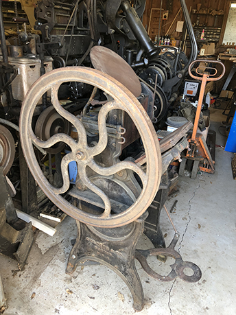
Finding new parts for an 1895 press was surprisingly easy. There are several people who manufacture castings for the machines, and another fellow who makes modern ink rollers that fit the press perfectly. I bought those and installed them on the machine. It needed new springs, which I hand-wound. I surface-ground the ink distribution plate on my CNC router (fitted with an abrasive disk), and had a welder repair the platen, which was mysteriously broken on its corners.

The hardest part to replace has been the main drive gear, which I could not find. I hired a machinist friend to make one for me. The original has several missing teeth, and had been repaired, badly, several times since 1895. My machinist friend bought a new gear “blank” that is a perfect replacement for the original – with several modifications needed.

This is the same press after much of the restoration. The woodwork is not done in this image, and the main drive gear is missing. New rollers and trucks had arrived, but were not yet installed on the machine.

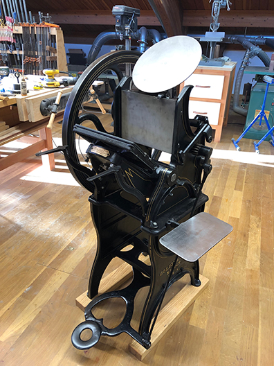
I built new woodwork for the press including the feed and delivery tables, two new drawers for the base, and I added something the original press never had – a drawer cover. Since the drawers are directly under the main parts of the press, solvent, ink and lost paper will occasionally fall down into the press, and I want those not to fall into the top drawer. I machined an ampersand into the drawer top in the same style as the lettering in the press castings. It’s a nice touch.

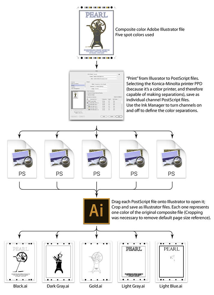
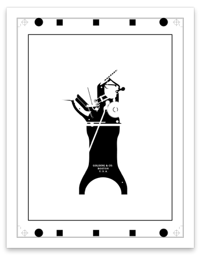
Meanwhile, I drew an illustration of the Golding Pearl No. 3 press, working from a parts drawing in the original instruction manual. I made the illustration into a poster, which has not yet been printed, and a postcard, which I finished this week. Details about the color separations for the postcard are described in my previous post.

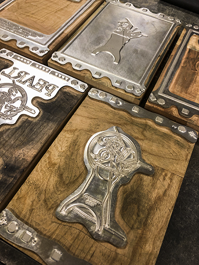
I had my five zinc engravings made for the press run, and I set up the first color – light blue – on the Heidelberg Windmill press (not the Golding; it was still in the shop). Also, printing with precise register on the Golding would be extraordinarily difficult; that press does not have the precision of a Windmill.

I have never run a multicolor job on a Heidelberg Windmill before. In fact I have only run a Windmill for embossing and die-cutting jobs. I had never put ink on a Windmill press in my life. So this was going to be my first printing job on the Windmill, and my first precision register job at the same time. I like a challenge!

These are the zinc engravings I had made for the postcard run. All of them have been used and then washed-up with solvent after their respective color runs. The plate in the foreground is the metallic gold image with all of the detail of the press.

The press runs began five weeks ago on a Friday. I had a few open hours in my Friday schedule, and I used those to work on the postcard. I bought some 100% cotton Neenah paper for the job, but then switched to a paper that has a bit more bulk for this project.

I also ordered Pantone colors from Van Son Holland Ink for four of the five colors of the job. The final color would be gold, and I had five pounds of gold on hand.

The Heidelberg Windmill press is most often run “without guides” (one of its two operating modes). This means that the windmill arms of the press pick up the paper from the center of the feed table, and continue to hold the paper while it is printed, then the arms carry the paper to the delivery stack where each sheet is dropped after being printed. That’s the “commercial” (easy) way to run the press.

This is the Heidelberg Windmill press printing the Pearl press postcard. This run was the dark gray color. Light blue and light gray had been printed earlier.

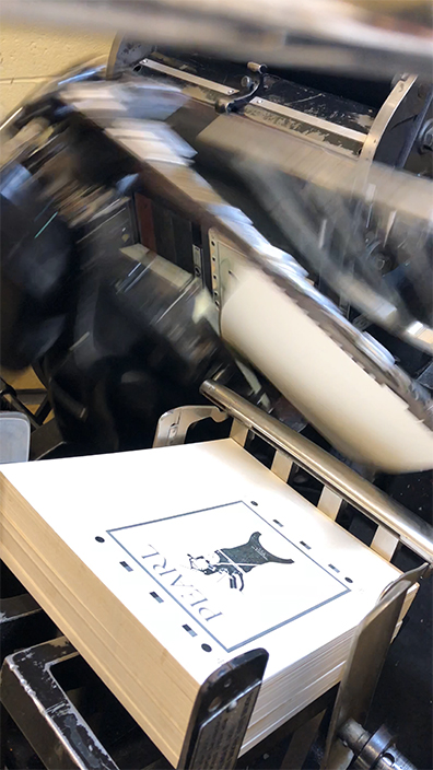
Click here to see a short video of the Windmill running.

The other mode is “with guides” where the windmill arm picks up the sheet from the left edge of the feed table, carries the sheet into the press, then drops the sheet onto brass register guides at the bottom of the press. The machine then moves those guides up and to the right, registering each sheet precisely against the bottom two, and one side guide for register. After the impression, the windmill arm grabs the sheet a second time, and carries it up to the delivery table and drops it there. “With guides” is the only way to print with precision on this machine. It’s much more difficult, so most people don’t bother. I bothered.

Running the first color was easy, since I wasn’t trying to register anything to anything else. It was just a press run. I was careful to be sure that the image was in the right place on the sheet, and was not moving from sheet to sheet.

The is the metallic gold plate mounted in the Heidelberg Windmill chase. Note that the plate is mounted in the lower-right corner of the chase. This is the correct position for printing “with guides” which means with the precision register capabilities of the press. I used wood furniture here, but also added three strips of two-point leading on either side of the plate, and three strips of card stock on the left. These allowed me to get the plate into register by shifting the paper strips to the right of the plate, then locking up the form again.

The second Friday I added light gray to the postcard. This color had to be perfectly registered to the first, of course. There is a thick light gray border that kisses the light blue. It made it easy for me to see if register was perfect, and it was.

The third Friday I ran a dark gray ink, which registered with the light gray in the press illustration, but not along the border. The run went well, though if I had it to do over I would mix some transparent white into the dark gray to lighten it a bit. It’s too close to black for my taste.

On the fourth Friday I ran the black, which put a trapped border on the edge, and inserted crisp lettering into the title and the detailed lettering at the bottom of the card. The black looks good, but again I wish I had printed the dark gray a little lighter (I’ll fix that when I run the poster). The black was designed to trap the other colors where it overprints, and it did that admirably.

These are the finished postcards stacked on a delivery cart. Register marks are printed above and below the artwork; these will be cut off when the cards are trimmed to size.

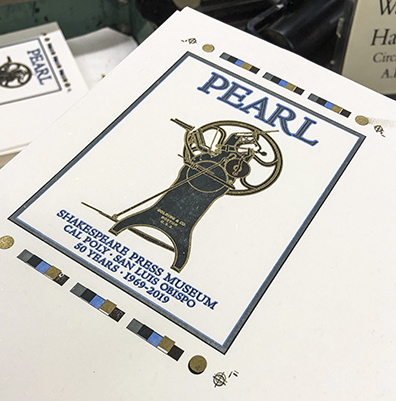
The final Friday arrived and I put the metallic gold ink on the press. This color carries all of the fine detail of the illustration – the springs, the gear teeth, the pin-striping. I got it to register quite quickly (three trips to to composing stone for small adjustments of position). And it looks glorious! The gold makes the press look absolutely wonderful.

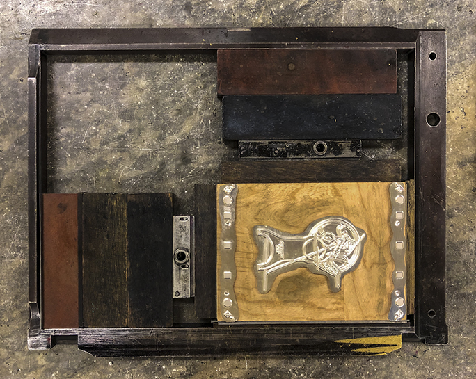
Along the way I had to make some very small adjustments to register the sheets on the press. These adjustments are facilitated by two small screws on the vertical, and one screw on the side guide. The Heidelberg only allows for 4 points (0.0552 in. of 1.4 mm) total movement on the vertical guides, and slightly less on the horizontal guide. At the beginning of each press run I centered those guide screws so that I had the maximum movement available both up and down. The side guide is harder to adjust, so I left it alone, choosing to move the plate in the chase with my paper strips instead.

This is an example of the finished card with all of its marks. You can see the the metallic gold register mark in the lower-right is off by a significant amount. This is a result of that mark being moved accidentally on the plate after it was routed at the plate-maker’s shop. I registered the image to the previously-printed colors, and ignored the errant register mark.

Once in register, the press stays in register. This machine, now 66 years old, runs like new. And when it runs, it makes a delightful symphony of sounds. The air compressor (a large piston pump on the right-rear of the machine) sounds like exaggerated breathing. There are many clanks and pops and whooshes as the windmill arms take the sheets to the press and out again. I love running this machine because it’s a work of mechanical perfection.

Now I have a stack of beautifully printed five-color postcards. I suppose I have to put something on the other side and mail them!

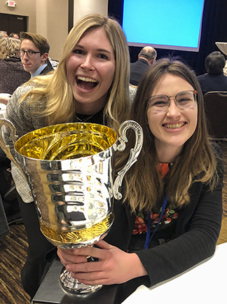
My plan is to use them to invite all of our former student curators to a dinner in honor of the museum’s 50th anniversary. And, after that I will use them to invite people to an event in January to celebrate International Graphic Communication Week.

I’ll keep a handful unprinted on the back, and I will frame one for the wall of the museum. After all, with this job I have created a work of art.

Posted in Art, Printing and Printing Processes, Software, Technology, Typography, Uncategorized | Tagged , , , , , , | Leave a comment

Reminiscences of a prepress guy

I am an old prepress guy. I owned one of the first PostScript service bureaus in the U.S. I was there at the beginning. It was painful, but overall it was a great business. We had been traditional typographers, and then we adopted the Apple Macintosh and PostScript, and we prospered.

Over the years I developed a skill for reading and modifying PPD files so that our Linotronic machines could output materials that otherwise would not run. A PPD is a PostScript Printer Description file, all text, that describes the capabilities of a printer – its dimensions, color capabilities, resolution and more. These files are still in use in our print drivers. Though archaic, they still perform these functions so that the software knows the capabilities of the printer.

I am working on a cool project right now that involves prepress in a way that I have not explored in years.

This is my five-color postcard design. The colors are shown in the color bars above.
The challenge I faced was making color separation files from the Illustrator document.

It’s actually two projects. First is the restoration of an 1895 Golding Pearl printing press. This was part of a collection of printing equipment that was donated to our university by a local family. Their dad had collected the equipment, and stored it (and occasionally printed on some of it) in his two-car garage. When he died, it became a problem. I helped to solve that problem with the aid of friends from the International Printing Museum in Carson, California. In the end, some of the equipment came to Cal Poly’s Shakespeare Press Museum while the rest went to the larger museum further south.

This is my successful work flow for making color separation files
from the Illustrator document.

I got the rusted Pearl press. It has taken me about a year to restore it. First I tore it down to its parts, then I sand-blasted all of the castings, and repainted them. This was followed by a careful reassembly. I replaced missing parts with replica parts, I built all new wooden parts – the drawers, feed and delivery tables. My greatest challenge was the main drive gear, which was missing several teeth. A machinist friend found a gear blank and then machined it to match the original part on the press. It took months to find the blank, then several months to get the new one made.

And now the press is ready to print again, 124 years after its manufacture.

Project Two is a poster and postcard to commemorate the restored press as part of the 50th anniversary of Shakespeare Press Museum, Cal Poly’s working museum of letterpress machines and type.

This is the Golding No. 3 press in the condition in which we received it.
I have since restored it from head to toe.

I started by drawing from a blueprint of the original press from the parts catalog of the manufacturer. I did this in Adobe Illustrator. As I was rebuilding the press I took photos, and was careful to adjust the drawing to the reality of the printing press. It was detailed work, and the result is a an accurate side drawing of the machine with all of its working parts shown.

My plan is to print this art as a five-color poster, and a five-color postcard. The postcard will be printed first, on the Heidelberg Windmill press that I restored earlier in the year (not the press illustrated in this story). That machine, a “black ball” 1953 press, is now in perfect condition, having suffered from many abusive years in a Calgary printing plant while die-cutting parking permit hang-tags. The press wasn’t even oiled for many years, and it was in bad shape when I bought it from a machinery dealer in 2015. Several years of restoration work allowed me to bring the machine back to perfect condition.

The subject of the postcard: This is the nearly complete Golding press in my shop.
Included are all new wood parts, new rollers and trucks, new cast-steel ink plate
on the middle of the press. The ink distribution plate is missing in this image.
I had it on the surface grinder for refinishing.

I have run the Heidelberg press only a couple of times since its restoration, so jumping in with a five-color precise register job will be challenging. But I have the will, and will find a way.

The poster is planned for later in the year. I will print that on our Vandercook proof press with photopolymer plates. It should be a nice product.

This is the Dark Gray separation image. The other four colors are similar.

To print the postcard, I needed to make either photopolymer or zinc printing plates. I started with the photopolymer plates and had difficulty with those (still experimenting!). I decided to order zinc plates from an engraving company in Michigan. That’s where I ran into color separation problems that I had not encountered for years.

For the photopolymer plates, I used ESKO Artwork software, starting with a PDF file, then made a film negative on the ESKO Spark platemaker. Easy. I exposed the polymer plates in our DuPont Cyrel UV unit, and hand-processed them using water and a brush. This didn’t work well (still experimenting!).

To send out for engravings, I needed to separate the file into five separate Adobe Illustrator files. It seemed easy, but I had difficulty doing it. The company doing the engraving cannot separate from a composite color PDF. I tested; I tried; I failed. Several times.

And ultimately, I found myself working with PPD files again.

When you set PostScript file as the destination, the computer will default to a generic “universal” PPD for PostScript. That PPD will not work for color separations because “universal” is not a color-capable printer. Instead, you must choose the PPD for a color printer. I think any color printer will work. I have a Konica-Minolta printer here, and when I choose that PPD, my Illustrator document can be separated into individual colors, each one a separate file.

It was this process that allowed me to save each color as a separate Illustrator file, and to submit them to the engraver.

It’s not a one-step process. Using Illustrator’s Ink Manager, I exported each color plate as a separate PostScript file, then dragged each PostScript file onto Illustrator to open it. Then I had to crop the image to the artwork size (the page is letter-size by default). Once cropped, I had only to Save As in Illustrator format and send the files to the engraver.

Another rookie mistake I made was to send files with embedded fonts in them (it has been a long time!). After being alerted to this error, I converted the fonts into outlines, and saved again, then sent the repaired files back to the engraver. It worked perfectly the second time.

I now have five zinc engravings of my artwork, ready for printing. I will begin that process next week. My plan is to ink-up the Heidelberg Windmill, apply the lightest color of ink to the press, and make the first impressions. I’m making a 500-impression press run. Then I will let the sheets dry for a day and proceed to the darkest color (black), followed at the end by metallic gold.

I’ll post images here of the press run and will report back on how that press run works out.

p.s. For those who think I might be plagiarizing David Lance Goines with this press poster, I assure you that this is a coincidence! The fact that one of his wonderful posters hangs above my desk proves only that I am channeling him with this work.

p.p.s. You may be wondering why I am not printing the five-color postcard on the Golding Pearl press. Simple: though it is a lovely machine, it is not capable of holding precise register. The Heidelberg has register guides to hold the paper in position while printing. Those register controls make this kind of work possible.

Posted in Art, Color Management, History, Photoshop techniques, Printing and Printing Processes, Software | Tagged , , , , , | Leave a comment

A tale of Burning Man dust and light

I pulled my bike up to the rack at Center Camp, poking its front wheel into the wooden slats that would hold it there. On the other side of the rack was a man taking his bike out of the rack.

He said, “I can’t believe you let your camera get dirty like that.”

He was referring to my Canon EOS R camera with its 16-35 mm lens, hanging from my neck.

This is my Canon EOS R mirrorless camera after 11 days in the Nevada desert. It is very dusty on the outside. It worked perfectly during the event, and I am unaware of any dust getting into the camera. I certainly can’t see it in my photos.

“I have a mirrorless, and I have it in a water-tight bag,” he said, gesturing to the bag on the back of his bike.

“This is a mirrorless.” I said, as I removed the camera from my neck and held it in my hands, “I find it’s important to have the camera available so that I can take photos when I see them.”

He responded to my foolishness by tisking. I wished him a good evening. I went out to shoot a huge animated steel sculpture of Pegasus, the legendary winged horse.

A lovely Fire-Dancer performs on Saturday night at Burning Man. Later, the Man was burned in a huge fire-and-fireworks extravaganza. It was very photogenic.

This was my fourth Burning Man, the first for my EOS R. In the past I have taken two 5D Mark III cameras and a variety of lenses. I tend to carry only three when I go out onto the Playa, the huge dry lake bed that is the site of all of art projects, and the place where hundreds of “mutant vehicles” slowly meander around. This year I used the R, and had the 5D in my camper as a back-up in case the R failed in some way. I never got the 5D out.

In addition to the camera and lenses, which I carry in drawstring bags in the panier bag on my bike, I carry a Really Right Stuff carbon-fiber tripod. That’s an important accessory for me because I go out every day at daybreak, and I also go out at night to photograph the various pyrotastic events that mark the evenings at Burning Man. I was shooting a lot of high-ISO photos this year, and getting great results.

The Man is surrounded by fireworks just before the fire was ignited. Fireworks photography is fun because the extremes are present: too much light and too little light at the same time. Longer shutter speeds allow the trails of the fireworks to be recorded, making more interesting images.

My belief is that the camera can get dusty on the outside without affecting its performance on the inside. The better (more expensive) Canons all have rubber seals on their buttons and mounts, and they are designed to be “water-tight” in the field. Water-tight is tantamount to dust-tight in my mind. So I just carry the camera and shoot like crazy. I worry about cleaning the camera when I get back to civilization. Sometimes I give it a wash-down in the middle of the week, taking a wet washcloth and wiping the dust off the camera’s exterior. This works fine but it changes nothing in terms of functionality.

While I am out shooting, I check to be sure my lenses are clean, and I carry a lens cleaning cloth in case they are not. Playa dust is so fine it’s like talcum powder. It comes off of lenses easily, but it sticks to everything else. My shoes gradually turned from black to light gray during the week. It took three washes to get them back to black.

At sunrise, a young man takes in the morning light on top of a metal sculpture.

I shot several thousand photos during the week, concentrating on sunrise and sunset shots. There were times I gave myself an assignment: bicycles, or silhouettes, or light over the mountains to the west. Morning and evening shots are always best since those are the times when there is the least wind and dust. One evening, about 45 minutes after sunset, I was out on the “Deep Playa” – a couple of miles by bicycle out on the lake bed – and I stopped to be overwhelmed by the beauty of the light in the western sky. “This is divine!” I said out loud. It was, and I stood there amazed for a few minutes while I shot a 20-shot panorama of the yellow-gold sky silhouetted by the mountains.

This is my nighttime panorama of the mountains to the west of the Burning Man event.
It was a marvelous evening – still, quiet and gorgeous.

I often read with amusement about Burning Man in national publications, and I think: “obviously this person has never been there.” The New York Times featured a story this week about a Nobel prize-winning economist who visited the Playa during the layout and surveying of the streets. It was a good article that covered the ideas of how cities can grow, and how people interact within them. The article was marred, though, by two references to “orgies” in the desert.

I know that there is an “orgy-dome” at Burning Man. I have never seen it. I don’t care.

I also know that there is a camp where coffee drinks are made all day, and another where Yoga is taught. There are two orchestras and a choir at Burning Man. There is a half-marathon held each year on the Playa. There are easily a dozen bike repair camps there. These are but a few of the hundreds of camps in the Black Rock City during the week of Burning Man. It’s a shame that the author resorted to the tawdry orgy reference when there is so much more going on at Burning Man than that. How about this? Burning Man is very likely the city (75,000 people) where the greatest percentage of the population ride bikes in the entire world (nearly 100%). Even Amsterdam can’t make that claim.

Looking down six o’clock toward the Man with a 400mm lens in a dust storm made for interesting photography one evening. The main avenues are illuminated by kerosene lanterns that are hung each evening by a team of marching Lamp-lighters.

For a photographer, there is nothing quite like Burning Man. It is the palette coming to the brush for me. One has to just be there to see the wonderful sights and sites of the annual event. It’s truly extraordinary. And truly dusty. But one must be there to get the shot. That’s why I go.

One of the many Mutant Vehicles on the Playa at sunrise.

And, when I come home, I clean my cameras and go back to shooting photos of classical music concerts – of violas and bassoons making wonderful music. And, I often say (to myself, of course) “This is divine!”

Posted in Adventures, Art, Panoramic Photography, People, Photography | Tagged , , , | Leave a comment

An EOS R follow-up:
two months later

I bought the Canon EOS R camera in May after considerable research and a one-week rental test of the device.

I am the Staff Photographer of Festival Mozaic, a classical music festival in San Luis Obispo. Each year I shoot three events – one each in fall and spring, and then a two-week festival in July and August. On those occasions I take thousands of photos of violinists and cellists and oboeists and flutists (and others). It is a lot of fun and it is occasionally challenging.

One of my biggest problems in the past was the noise made by my Canon 5D camera shutters. They make enough noise that I can’t be in the auditorium while the players are performing. It bothers people in the audience when my shutter (even in “silent” mode) goes wop-clack-snap-wop (over a 60th of a second). I try to shoot only during the forte parts, or from behind glass doors, or from the sound booth in the auditorium – depending on the location.

But the R has a feature that eliminates that problem: silent operation. It is really silent. Though I can hear a nearly-inaudible tick when my eye is on the viewfinder, no one else can hear that sound.

As a result, I can shoot my photos and not bother a soul. That alone is worth the price of admission for me.

Grace Park, playing violin at the Festival Mozaic during the annual summer festival. This was taken with the Canon EOS R camera and a Canon 400mm f2.8 telephoto lens 1/160 sec. f 3.5. ISO 1600 under mixed lighting, mostly incandescent. This image was cropped from a vertical photo.

I’m in week two of the festival now, and I have shot about 8,000 photos so far. No one hears me click my shutter; no one knows that I am shooting still photos and not video. Almost no one is even aware of my being there. I love that!

In silent mode, the shutter is always open, and the camera samples an image as a slice of time as it passes. As a result of this, I occasionally see a distortion in an image that is a result of the scan of exposure. Instead of exposing the entire sensor at once, the silent mode captures the image as a scan of the sensor, which occasionally bends straight things that are moving (a violn bow is a great example) into strange curved things.

This image of Rolf Haas was taken during the same concert. Notice the curved bow – a result of the Silent Mode on the EOS R. Since the sensor is exposed during the exposure, but the image is recorded as a scan of the sensor, the bow is in different places at each moment of the exposure, resulting in the bowed bow. I have experienced this odd phenomenon in only one or two photos out of thousands .

The R has numerous other features that please me. I have come to love the resolution (it’s a 30.1 Mp sensor; 86MB photos result). It’s nice to be able to crop a bit of a photo and still have 50MB left over!

I shot a series of landscape panoramas while on vacation in June, and they come out 30 percent higher in resolution than my previous work. I like that because it makes the finished images more useful for huge prints. The utility of my panoramas is much greater now, and they are more salable.

The sensor is an integral part of the camera’s auto-focus system. Though it can be slow on occasion, I find the auto-focus is more accurate than my 5D cameras, it’s quick to find faces in scenes (it uses facial recognition), and it results in more photos in good focus than I get with my other cameras. I have become more reliant on auto-focus as a result. I am not skeptical when shooting with the R. I manually touch-up the focus much less than I do with my other cameras. It’s easier to shoot photos in focus, and that makes a world of difference to me.

This is a look at the working end of the EOS R. The small information window is made of eInk, roughly the same thing that Kindles are made of. It is energized when the camera is on, but never loses its image when the camera is turned off. The small touch pad is below on the back of the camera. That touch pad has incurred the wrath of a lot of Canon customers. I simply programmed it to do nothing.

As a person of a certain age (ages starting with the number seven are quickly approaching), I have difficulty seeing through the viewfinder of SLR cameras, and achieving perfect focus has been difficult for me recently. The R solves most of the problems I have with focus, and because it uses an electronic viewfinder, the image is brighter than the viewfinders on my other cameras. I am sold on that, and the LCD screen on the back of the camera (which articulates!). I can touch the LCD image where I want the camera to focus, and it almost always focuses on that object perfectly.

High ISO shooting has become a way of life for me. As I shoot photos of a cellist in Mission San Luis Obispo, which has notoriously bad lighting, I find that ISO 25,600 is a perfectly reasonable speed. This, compared to my SLR cameras, is miraculous. I can gain back one or two stops by using noise reduction in Adobe Camera Raw. The results are excellent.

The R is slightly smaller than the 5Ds, and lighter by a half pound. I enjoy shooting with it; it has become fluid in my hands, and I have made measurable improvement in my work with this camera.

Much criticism has ben leveled at Canon for the R’s poor handling of 4K video. It crops the image on the sensor, and that makes many pundits angry. It makes sense for them to be angry. But I am not angry. I don’t shoot video with this camera. I’m a still photographer. And I love it!

People also criticize the multi-function touch-bar thingee above the right thumb position. I don’t like it either, so I programmed it to do nothing. Problem solved. Maybe they’ll write a software fix for that in the near future, and perhaps I will use it once that fix is made. Meanwhile I’m not bothered by it.

Put me down as a strong supporter of the Canon EOS R camera. I know they didn’t get everything right with this camera, but it’s a professional camera with many features that make my photos larger, better and much sharper than I have been able to make in the past.

Posted in Art, New technology, Panoramic Photography, Photography, Technology | Tagged , , , , , , | Leave a comment

The Laowa Probe macro lens – after a week

I have been shooting with the Laowa lens now for a week. Of course it rained for three days, so I didn’t get out as much as I had hoped.

My overall impression of the lens: it’s well-built. It’s beautifully finished. It’s optically excellent.

I have read complaints that it does not have attractive bokeh, but for macro photography I don’t find its out-of-focus subjects to be objectionable. This is obviously a very specialized lens with very specialized uses. It’s not an everyday 24mm lens. For that it would be awkward. For close-up and super close-up photos, it is excellent.

Milkweed flowers in my wife’s garden. These flowers are about 8 mm. in diameter. I will soon be able to photograph Monarch butterfly caterpillars on these plants, as these are the host plant to those insects. I really like the shallow depth-of-field in this photo, taken at f22 with the Laowa lens. Maximum is f14; minimum is f45.

The lens focuses to 2:1, which means that it’s inside the subject matter much of the time. The built-in LED lights are good, though I did not have much chance to try that. I will in future photographic adventures.

This image shows the out-of-focus effect of this lens. The flowers in the foreground are sharp and detailed while the blue sky and clouds in the background are appropriately out of focus. There is little of the “bokeh” effect that is so loved by photographers.

If you want a unique lens that can take photos inside a glass of beer (submerged) or inside a poppy flower, this is your lens!

This is an inch-square section of an Aloe plant. I shot this at f45, resulting in nice depth-of-field. Even at that aperture, though, the petals in the distance are out of focus. Thus, the depth-of-field at this aperture is probably less than 25 mm at this distance.

I’m not in love, but I am enamored. Love will come with more practice and more experience on my part. I simply don’t have much experience with macro photography, and this lens takes imagination and practice. I also realized that my biggest enemy in the field was the wind. The tiniest of gusts will ruin a flower photo. I think that I might add a large folded corrugated carton to my kit when I go out. I will use that, folded into an L-shape, to be a wind-break for my photos. I think that such a wind-break would add considerably to my success in using this lens in the field.

Posted in Photography, Technology | Tagged , , , , , , , | Leave a comment

More on the Laowa wide angle macro probe lens

In my blog last week I described how the Laowa lens had arrived, and how I illustrated it so that the world would have access to its dimensions.

I have been using it for several days now (though we were hit by an unseasonal rainstorm on Saturday and Sunday which spoiled some of my macro plans).

This is the Laowa lens on my Canon EOS R camera, mounted on my favorite Really Right Stuff tripod at the San Luis Obispo Botanical Garden. The snoot of the lens is very close to an Alstroemeria flower.

Wow! This lens is clever and curious. I took it today to the San Luis Obispo Botanical Garden, located north of town on Highway One. There I was able to put the lens to several close-up tests. I had a chance to try various aperture settings, and I shot as close as I thought it would go. It goes further than that.

…and here is the Alstroemeria flower from the photo above. It rained overnight, leaving drops on the leaves of these delicate flowers. It’s a delightful combination of elements for a macro photo.

My only enemy today was the wind. Most of my photos were hampered by gusty winds moving the colorful flowers I had chosen as my subjects. Despite that, however, I ended up with some nice photos.

Pistils and stamens on display for all the world to see! I was very pleased by this image. It’s taken with an aperture of f22, which provides for more depth-of-field than the maximum f14 of this lens.

I enjoyed the combination of the Laowa and my new Canon EOS R camera. The best feature of that camera today was the fold-out viewfinder, which gave me the ability to focus on the LCD screen in several places where I would not have been able to get my eye on the viewfinder of a normal camera. It was a winning combination of camera and lens for me.

To say that the lens is a close-up is an exaggeration. You often find the tip of the lens inside the subject flower, which is quite amazing. But, if you consider that this lens will enlarge to 2:1, it is not surprising.

…and here is the Laowa lens inside a flower I was photographing. The wind caused too much movement on this one, so I did not get a good image of this flower.

I have four more days with the lens, and will see how far I can push it. I don’t plan anything wild; I just want to see if I can master the thing. On Wednesday I plan to test it with the built-in LED lights. I’ll report back on my work there.

Stay tuned for more about this curious lens.

Posted in New technology, Photography | Tagged , , , , , , , , , , | Leave a comment

The fascinating Laowa macro probe lens

I’m not sure how I learned about it. One day it showed up on my computer screen, and I jumped. Today it arrived on my front porch.

It’s strange and curious and fascinating and some might say useless. I have other thoughts: I think it might be an terrific addition to my camera bag (though my bag won’t fit this lens).

When I first tried to get one, they were back-ordered, and they are expensive. In the weeks since I learned of its existence I have tried to learn everything I can about the lens. How big is it? How does it work? What’s the point of the long probe? Do I need waterproof? How much does it weigh?

This is my annotated illustration of the Laowa Probe lens. Though I have tried to measure and record the dimensions of the lens as accurately as possible, I may not have everything perfect. Please let me know if you find any errors in measurements.

I don’t yet know the answers to all of those questions, but I can answer many of them. I spent the afternoon and evening today measuring and illustrating the lens. This might help others who are considering this lens for video or still photography. If, for example, you want to use a follow-focus motor or adapter on this lens, you can use my illustration to get the necessary drive gears. If you want to submerge the lens in liquid, you now know exactly how deep you can go.

If you want to power the built-in LED lights in the tip of the lens, you will need a USB power supply. I had one on my desk, and I’m charging it now to use in the morning to power the LED lights. I think this will be very interesting. A USB cable with the correct plug comes with the lens.

I have read everything that I can find online, and watched many videos about the lens (start at B&H Photo). I scoured the Laowa web site and watched their videos. I made screen shots and attempted to get accurate measurements of the lens, but was unable to get it exactly right (I also wrote to Venus asking for the technical specs, but they did not respond).

So in the morning I will take the lens out into the wild of my community, attached to my new Canon EOS R camera, and I will make as many photos as I can to show you more about what this curious thing can do.

My initial impression is that it is a very well-built lens. It’s sturdy and it feels good at the controls. Aperture and focus are smooth and effective. The lens looks nice, and it fits the camera perfectly. I had to make a few changes in the menus on the EOS R in order to get the camera to take photos with “no lens attached” to the camera. This lens has no electrical contacts, so the camera does not see it there. To the camera, this looks like a body cap.

The model I have has two 48-tooth gears on the focus and aperture rings. This is the Cinema version of the lens, which costs more than the still photo version without the gears.

I’ll report on my work with this clever device as I can. Stop by in the near future to read about my adventure.

Posted in Photography, Photoshop techniques, Technology | Tagged , , , , , , , , , , , | Leave a comment

My new Canon EOS R mirrorless camera
and a new world of high ISO shooting

I was excited when Canon and Nikon both announced their mirrorless pro (or semi-pro) cameras last fall. The time had come. Sony has been in the market for three generations now, and Canon had made a few attempts (EOS M, etc.) at mirrorless devices. I bought two EOS M cameras, which I like a little bit, but they have frustrating controls and they are difficult to use in sunlight (they have no eyepiece viewfinder, only an LCD which is useless in bright light). Those cameras are gathering dust on my shelf now.

This is the new camera in its first few minutes out of the box. I am excited to learn more about it, and I am sure I will be happy with the silent feature!

I shoot a lot of classical music concerts, and for me the most exciting feature of mirrorless cameras is the ability to shoot in absolute silence. I am usually taking photos from inside the performance hall, and I am hampered by shutter click-clopping. I thought the Sony would be great for this because it can shoot in silent mode.

I rented a Sony mirrorless camera last summer for the music festival, and it frustrated me. Battery life was ridiculously short, some of the menus are incomprehensible, some of the controls are in places where no human can operate them, and overall, I found the Alpha 7 to be an uncomfortable camera to use. (You’ll get used to it! They told me. I didn’t.) I loved the high resolution sensor and the resulting photos, but it was too difficult for me to use.

I clamped the Sony high on a wall and put it on radio control using Sony’s nice iPhone app. This required a ladder and a very early arrival at the concert location. I practiced and it worked beautifully. But the battery died before the concert began and I got nothing. Assault by battery.

The new Canon EOS R is also capable of shooting in silent mode. I rented one for a week in February from my friends at Borrow Lenses dot com. I decided to give it a try.

In the short time between the UPS truck’s arrival and the beginning of the Bach Cantata, I figured out enough to set the camera to Silent mode, to figure out how to use the basics, and I began shooting. Where normally I shoot with my Canon 5D Mark III cameras, I wait for the fortissimo parts so that the audience is unaware of my noisy shutter. With a solo violin there are few fortissimos, so I would not have gotten much on this occasion. But the R makes no sound, so I shot like crazy! I took 600 photos in 90 minutes. Part of this was to experiment with the silent operation, part of it was to become familiar with the location of the controls, and to learn how to shoot with this new device.

I also experimented with all of the available ISO settings – all the way up to 26,500. I seldom shoot with high ISOs because of the noise, but on this occasion I let those constraints fall by the wayside and used the camera to explore every nuance of the performance.

These images show the before-and-after of noise reduction in Adobe Camera Raw. I shot both under poor lighting circumstances at a private residence. The ISO was set to 26,500. Then I applied noise reduction in Camera Raw. These are enlarged substantially, probably 4X normal (it’s a bit hard to show this kind of thing on a web site). The image is of Scott Yoo, Music Director and violinist, of San Luis Obispo’s Festival Mozaic.

Over the next four days I shot several thousand more photos in three other locations. I learned to love the electronic viewfinder. I discovered that I can focus better in low light cirsumstances with that viewfinder than I can with my optical viewfinders on the 5D cameras. I enjoyed being able to see clearly what the shutter speed and aperture are. I loved the display of information inside that little window.

I tried portraits in the sudio at the university, but was frustrated there. I couldn’t shoot with strobe lights in an otherwise unlit studio; it was too dark for the electronic viewfinder on the R. I plan to explore this further, and I will write about that separately.

When my week of rental was up I returned the camera to Borrow Lenses, and I went back to my regular, boring life.

I experimented with my high ISO shots from the R. I discovered that even at ISO 26,500 I was able to get reproduction quality images. I found that much of the noise, though quite significant, can be removed in Adobe Camera Raw, making the images usable at that very top ISO setting. These images are better than I get when I shoot at lower ISOs on the older 5D cameras. I attribute this to Canon’s improved Digic chip in the EOS R. It’s two generations newer and more sophisticated than my other cameras.

I found myself longing for the R, and planning for my summer music festival shooting. Should I rent again or should I just break down and buy one? I chose the latter, and last week my R showed up on my doorstep. I was so excited! I left it in the box for a whole day, then I set up a tabletop studio in the dining room before I took the plastic bag off the camera body.

A camera is only clean once, and I wanted to photograph this one while it was still absolutely pristine. This was fun. I had not even installed the battery and I was taking portraits of this new camera to illustrate this article.

I also got the 626-page instruction manual, and started poring over that to learn about the buttons and menus and controls. Where is the depth-of-field preview button? Oh, you can program that into one of several programmable buttons or the strange multi-function bar on the top-right on the back of the camera (I haven’t found anyone yet who says that’s a nice thing – except Canon).

I watched a multitude of YouTube videos made by Canon and by reviewers who are doing what I am doing – testing to see how we like the new camera. Many do like it, some don’t. Most of the photographers who were expecting a great video camera in the R are disappointed by its cropping of the sensor when shooting in 4K. I’m not a video guy, so I let that shortcoming pass me by. Most pro photographers agree that this is a nice camera, and that Canon has broken new ground with this one. Most are also saying that we will see more from Canon on the pro mirrorless front; this is inevitable. Some are waiting until Canon comes out with the next mirrorless offering, which will be much better.

I have mine now, and I am quite pleased by its silent shooting mode, its seamless ability to use all of my current lenses (I can’t afford the new R-series lenses!). This will be a great camera for me and my music festival work, and I will follow up with more reports on how the camera behaves in various shooting situations.

I think it’s a nice camera, and I am looking forward to using it a lot during the summer festival. I’ll probably shoot a few thousand cellist photos with it (and a few hundred French horn players too!). And no one in the audience will be bothered by my camera’s noisy shutter. That is a thing of the past.

Posted in Color Management, Photography, Photoshop techniques, Software, Web | Tagged , , , , , , , | Leave a comment

Cal Poly’s TAGA students win the Kipphan Cup at TAGA 2019

The Cal Poly TAGA team has won the prestigious Helmut Kipphan Cup at this year’s conference of the Technical Association of the Graphic Arts.

The Kipphan Cup is awarded to the university team whose technical journal is judged to be the best entry in the annual event. Scoring in based on technical writing, design, production quality and the quality of an online component that supplements the journal.

Cal Poly students are awarded the Kipphan Cup at the 2019 TAGA conference in Minneapolis, Minnesota. From left to right: Liam O’Hara, TAGA President, Lauren Helms, Cal Poly TAGA President, Erica Taylor, Jessica Rose, Nicole Cullop, Ana Gonzalez, Aileen Vasquez, Kayleigh Macdonald, Hannah Nguyen, Bruce Leigh Myers, Education V.P. of TAGA.

Students in the Cal Poly chapter began work on their journal in September, 2018, shortly after classes began in the Fall quarter. The team assembled technical papers, and in two cases, invited student scholars to produce a technical paper specifically written for the journal. Those technical papers were written and edited in the Fall quarter while the TAGA team worked on the design and planning of their printed journal. In January, with all of the technical papers in-hand, production began.

The TAGA journals are expected to be produced by students, if possible, and the Cal Poly team did all the work, from cutting paper to binding and packaging the final works. Hundreds of hours of work are spent each year in production, and this year’s journal featured several complex printing processes that helped to distinguish the finished work. The students wanted to deboss the separator pages of the journal, and to do that, they cut polystyrene printing plates on the Kongsberg iCut machine, a computerized cutting and prototyping machine made by ESKO. Those polystyrene plates were then mounted on wood blocks for the printing press. Students used a 1960s era Heidelberg “Windmill” press to perform the debossing on their pages.

Awfully excited! Cal Poly TAGA President Lauren Helms and Kayleigh Macdonald show their excitement on winning the annual student prize at this year’s TAGA Conference.

The TAGA journal was printed by electrophotography on a Konica Minolta C1100 digital press in the Graphic Communication Department. That machine produced the full-color components of the book. The covers were also printed on the Konica Minolta machine.

After printing, the covers were enhanced with gold foil and clear digital embossing effects using an MGI finishing machine. Each journal cover went through several steps of post-press finishing to make the covers look and feel more impressive than a simple printed sheet. The students also personalized each copy of the journal with the judges’ names; this was also done in the MGI digital foil machine.

Hannah Nguyen, the Design Director for this year’s journal, took advantage of the many printing technologies available to the students to produce a beautiful book. Many processes were used: electrophotographic printing, digital embossing, digital foil enhancement, letterpress debossing, letterpress scoring, perfect binding and trimming on the department’s Polar computerized paper cutter. It was an impressive amount of work, and the students had the opportunity to learn by doing (Cal Poly’s motto) as they produced their award-winning journal.

All of the TAGA university students assemble for a group photo.

At the conference, held this year in Minneapolis, Minnesota, eight Cal Poly students were in attendance. The students attended numerous conference technical sessions, a student banquet, and attended several sessions where they met and mingled with the students from the other universities who attended the conference. Universities represented included Clemson (Clemson, SC); Ryerson University (Toronto, Canada); PEGORA (Grenoble, France); Rochester Institute of Technology (Rochester, NY); and Ball State University (Muncie, IN).

This is Cal Poly’s second win in three years. The students have possession of the Kipphan Cup for the year, and it will be on display at Cal Poly in the Graphic Communication Department.

Work has already begun on the TAGA student journal for 2020. A new team is being assembled, designs are being prepared, and the presses will be running soon! Cal Poly’s victorious TAGA students are excited to develop and print the next journal for the competition next year.

For more information: calpolytaga.com

grc.calpoly.edu

Posted in People, Printing and Printing Processes | Tagged , , , , , , , , , , , , , | Leave a comment

300,000 readers!

Greetings, good souls,

In late August of this year The Blognosticator reached and exceeded 300,000 readers.

I was not tracking it closely at the time, being caught-up in beginning of the school year activities, but it happened, and now that I have a moment I am saying thank you to all of you who take the time to read The Blognosticator.

Best wishes, and come back soon to see the latest blogs and controversies of the graphic and photographic arts.

Brian P. Lawler


Posted in Photography, Technology | Tagged , , , | Leave a comment