
The Blognosticator’s first anniversary

Today is the one-year anniversary of the Blognosticator-gone-private.

I had been blogging for Graphic Arts Monthly for three years until their demise in the Spring of 2010, and then for What They Think until that fall and they could not continue to support my work. So, I took The Blognosticator private, posting these blogs on my own site, and hoping for the best.

Today I have posted my 94th blog entry on the site, and have also passed my 14,000th visitor. That averages out to 7.833 blogs-per-month (bpm) and 1,166 readers per month (rpm). That’s pretty impressive in my book.

I often wonder what drives me to do this. I suppose it’s my desire to tell stories, to explain things, to teach. Maybe I want to make my mark on cyberspace. Who knows?

I have learned a lot about the interests of my readers. Many of you are graphic arts professionals, photographers, graphic designers, and people involved in “the trade.” Others are casual passers-by.

My most popular blog, by far, is the one I wrote about how to read a micrometer. That blog has had more readers than any other, and it continues to be found by people searching for that topic.

My second-most-popular is the blog I wrote about Van Gogh’s Starry Night at the  Museum of Modern Art in Manhattan.

Hundreds of photographers flocked to my blog about using the iPad as a receiver for photos from my EyeFi card (over 200 in one day alone). I still get a lot of traffic on that entry, but only a fraction of the huge volume who read the blog on the day after I posted it.

I have received the greatest coverage in industry mentions on my GREP blogs. I am a fanatical GREP user, and have had a delightful time exploring the power of that functionality in InDesign and also the recently-updated Tex-Edit Plus text processor (thank you Tom!). I’ll be writing more about GREP functions again soon.

My Mr. Curmedgeon rants have caused some minor stirs in the industry. Quicken updated their dumb Quicken 2007 for Macintosh (not as a result of my blog, I assure you). Though it now works in Lion, it’s still just as dumb, and it can’t remember window positions or dimensions in (can’t they just make it do what it used to do?). Brain-dead software reins at Intuit!

Pocket Wizard has agreed to replace my Flex TT5 transceivers with a newer model that they hope will please me (and I hope so too!). They have been exceptionally gracious and helpful.

InDesign CS6 claims to be better at making ePubs; I remain skeptical, but will report back on that topic as soon as I get some experience with it.

On my new cameras and gadgets blogs, my GigaPan panoramas have gotten some good responses here and on the GigaPan web site. That has been a really fun adventure, and one that I plan to continue into the future. Hardly a day passes that I don’t try to get a new GigaPan image going. And my early test of the Lytro has been followed by thousands. I still use that clever camera, and continue to be impressed by its technology.

I have learned a lot about spam. I signed up for Akismet, a paid service that filters blog comments to eliminate/reduce incoming spam from writers who are trying to get their comments into blogs to promote I-don’t-know-what. Akismet has filtered 13,000 spam messages for my blog in 12 months. Sometimes they identify over 100 a day. It is astonishing to me that blog spam is so pervasive. The ratio of spam-to-legitimate visitors is nearly 1:1.

Most spam comes from Latin American “sources” most of which are fake web sites with no particular content. I don’t understand the whole phenomenon, as it doesn’t appear to yield any result for anyone. Brazil is the single largest source for these. It just makes no sense. Bravo to Akismet!

I am heartily flattered that you read my work, and I promise to keep it up. In the coming weeks I plan to show some new work from the mountaintops around San Luis Obispo, and perhaps a few panoramas from the Puget Sound, where I am headed in August.

I’ll be testing a new approach to photographing fine art and printing it on my Epson wide-format printer, and I hope that my work is completely successful so that I can help others who are trying to do the same.

So, please stay tuned as The Blognosticator continues into its second year!

And keep that spam coming! Akismet loves it!
 

Posted in Art, Business, Curmudgeon, Mistakes you can avoid, New technology, Panoramic Photography | Leave a comment

Bridging generations (this time it’s the Bay Bridge)

The year 1933 must have been impressive for people living in and around San Francisco.

The city is located on the north end of the San Francisco Peninsula, and in that era it was accessible by road only by driving about 35 miles south to San Jose and back up the other side. Ferry boats plied the waters between Oakland, Berkeley and San Francisco, to Marin County to the north, and Napa County to the northeast.

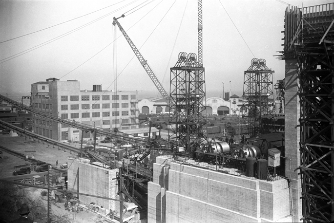
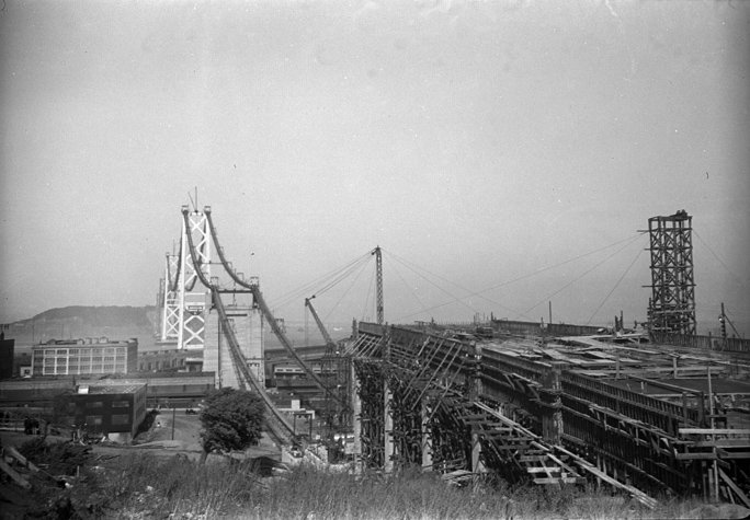
This is a view of the suspension bridge section of the Bay Bridge taken from the San Francisco side. The roadway approach is being built in this photo, and you can see the cable guides lying in the middle. The cables were not yet in place; they were spun in-place the following year.

In 1933 there were two massive bridge projects underway in the City by the Bay: the Golden Gate Bridge was being built across the opening to the San Francisco Bay, and the San Francisco-Oakland Bay Bridge was being built from downtown San Francisco to Yerba Buena Island in the middle of the Bay, and then onward to Emeryville (Oakland and Berkeley) on the east shore of the Bay.

In this photo you can see the massive reels of cable on the winches atop the western anchor of the suspension bridge. There is a man standing in the cable raceway about one-third from the left, and two men standing behind the reels on the abutment in the foreground.

These were two colossal engineering and construction projects, and they were going on simultaneously. The Bay Bridge was started on July 9, 1933, and opened in November 12, 1936 at a cost of $77 million. The Golden Gate Bridge was started seven months earlier, on January 5, 1933 and was open to vehicular traffic on May 28, 1937.

My father, Russell Lawler, was a photographic witness to both projects, and I have been scanning the negatives he took of the bridges under construction during those years. My dad’s profession was insurance; at the time he worked for Pacific National Insurance Company, with his office in San Francisco. I think that his photography of the construction was purely amateur, but it could have been part of his job. I will never know.

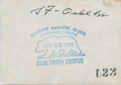
The Bear Photo Service stamp, and my father’s handwriting on the back of one of his Bay Bridge photos. My dad was smart to keep both the prints, which were contact-prints from the negatives, and the negatives themselves. I have been scanning the negatives for these blog posts.

His negatives are reasonably sharp, well-focused, and well-composed. They capture the construction on the San Francisco end of the Bay Bridge, showing the immensity of the work being done to build the huge span across the San Francisco Bay. The suspension bridge part of the span goes from San Francisco to Yerba Buena Island, then the roadway goes through a tunnel to a second span, which is a cantilever bridge that finishes the journey, landing on the Oakland side. At the time, the bridge was the largest steel structure in the world.

The device hanging from the cable raceways was used by construction workers to build the bridge, and eventually, to spin the suspension cables that hold the bridge up to this day. This tower is located on the San Francisco Embarcadero.

That cantilever section is being replaced by a lovely new suspension bridge replacement that is due to be completed next year. The cost of the replacement bridge is estimated to be $8.7 billion (over 100 times the cost of the original bridge not adjusted for inflation).

The original bridge had two-way traffic on both the upper and lower decks. The top was reserved for automobiles while the bottom deck was reserved for trucks. The bottom deck also had two sets of rails on which Key System passenger trains traveled. Those two lines of rails were set aside from the truck traffic by a steel barrier on the southern edge of the pavement. I remember riding the Key System trains across the Bay Bridge from Berkeley when I was a child.

The Key System trains, along with their counterparts in Los Angeles, were taken out of service in a famous cabal by General Motors, Standard Oil Company and Firestone Tire Company, whose efforts were focused on taking light rail systems out, replacing them with gasoline powered GM-built buses, and getting people to buy more gasoline and tires for their motorcars! The three companies were eventually fined $5,000 for their monopolistic crimes, and each company’s executive officer was fined $1.00 (I wonder how they survived that slap on the wrist!)

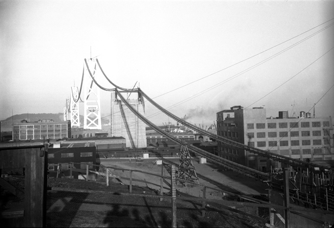
This image is interesting because we can see the four suspension bridge towers in the distance with the cable raceways in position. There is a cable landing in mid-section, where the cables are pinned to a huge concrete tower, and in the far distance is Yerba Buena Island. A tunnel runs through that island that connects the suspension bridge section to the cantilever section on the Oakland side.

One of these photos is dated in my father’s handwriting “S.F.-Oakland Bay Bridge Tower in Embarcadero. Photo from South. Taken 6/1/35.” On the back of each one is a logo of the Bear Photo Service. They were printed originally on “Genuine Crystal Gloss – Guaranteed Forever” and dated June 26, 1935 (some are dated later in the same year). I wonder if the Bear Photo guarantee is still valid.

I am enjoying the process of digging through old photos and bringing them into the 21st century. I hope that you enjoy viewing these images.

Posted in History, People, Photography | 3 Comments

In praise of Data Rescue

For the past twelve days I have been toting cameras around, shooting thousands of photos of musicians playing in concerts around our county.

This is the time of the 42nd running of the musical bulls that we call Festival Mozaic. It is a musical event of high esteem, one that draws performers and audiences from around the world, and features music from all eras.

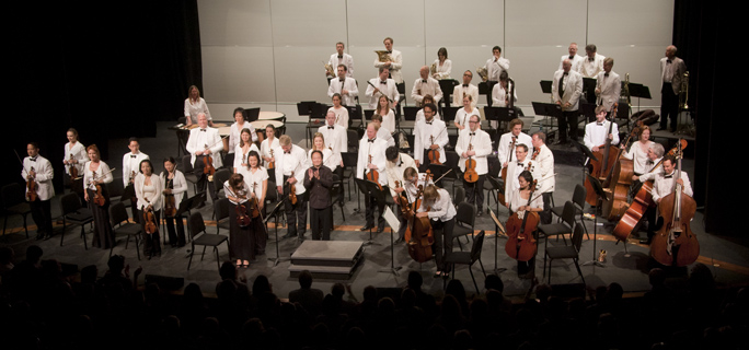
A scene from today’s concert by the Festival Mozaic Orchestra. Music Director Scott Yoo is at the podium.

The festival was originally named the Mozart Festival, but its name was updated a few years back to reflect its more diverse offerings, and now we locals know it’s time for the Festival Mozaic.

I’m the Lead Photographer for this wonderful event, and I have had two student assistants this past two weeks who have helped to document dozens of concerts, rehearsals, dinners, brunches, lectures and other events. It has been fun, and the music has been fabulous.

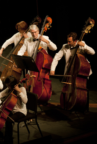
Bassist Ken Hustad in today’s performance. This is one of the recovered files from the Canon 1ds Mark III card. I also have the JPEG version, written to my back-up SD memory card.

I also use the Festival as a way to expand my photographic boundaries. This year I had as many as five cameras placed in a performance space.

On Friday evening I was in Mission San Miguel del Arcangel, one of California’s 21 historic missions, taking photos of the Festival Mozaic orchestra. I had a GoPro camera on a microphone stand over the head of the conductor. It was shooting HD video of the orchestra from that point of view (results: fair to good). I had a remote Canon G11 clamped with a SuperClamp to the pulpit in the Mission, looking down on part of the orchestra and the conductor (results: OK). This one was chosen because it’s absolutely silent, it shoots in Camera Raw, and it produces nice photos. I was firing that one with a Pocket Wizard transceiver.

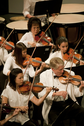
Some of the violinists in the orchestra. My photographic aerie allows me to shoot into the orchestra without impediment with a moderately long lens. In this case the photo was taken with the Canon 100-400 telephoto zoom.

Up in the choir loft I was shooting video with a Sony HD video camera trained on the orchestra, I had a Canon 5D with a moderate telephoto clamped on the railing shooting overall shots (fired by a Pocket Wizard), and I was shooting still frames with my Canon 1ds Mark III camera and a telephoto lens from the same vantage point. These two Canon cameras have very noisy shutters, so I muffled them with wool sweaters wrapped around the body and lens (works pretty well, but I have to limit my photography to the mezzo-forte and louder parts).

I got a lot of nice material, some of which will show up in promotional materials next year, some of which will never be seen again, except to the organizers of the event and their graphic designers.

Today I photographed the closing concert at the local community college. I had three cameras in the lighting booth above the audience. I was located behind double-glass, so I could click away with aplomb, not bothering the musicians or the audience with my noisy camera work.

I arrived an hour early to set-up, and to photograph a lecture given by the Festival’s musicologist on the material that would be presented this afternoon. I started shooting, then remembered that I had failed to erase my memory card after yesterday’s photo event (I photographed 52 beautiful roadsters at a county park on Saturday morning, and a panoramic photo of the same 52 cars at their luncheon barbecue). With the few minutes I had before this afternoon’s concert, I decided to erase the 52 roadsters from my memory card (why? I had time). So, I stepped through each one, and hit the two-step buttons to erase them. It took a few minutes and I was done.

Then I took 394 photos of the concert on the same camera. I took photos of the bass players, the cello section, the violin section and the soloists. I took photos of the strings stringing, the French horns frenching, and the director, directing (though he was dressed in black, and tended to disappear altogether from the scene). I had two other cameras on radio triggers taking overall photos of the orchestra – sometimes simultaneously, sometimes separately. At the end of the concert I had taken pretty close to 800 photos.

Then I drove home and started transferring the images from the cameras to my computer. Each night I send some of the more special images to the managers of the Festival, and they post them on a blog and in their web site. I also need to name and categorize the photos before I forget what happened in the concerts. It’s my style to title every photo from every event as accurately as possible; this helps me the following year when the designer asks for a photo of an individual performer or a specific presentation. It’s also good photo policy.

When I inserted the Compact Flash card from the 1ds (the one from which I had erased the 52 car photos), something strange happened. Instead of seeing my 394 photos from the concert, I had only the 90-something photos of the roadsters, and not a single Festival Mozaic image! This was a strange surprise, and not a pleasant one.

I do have a safety net, though. My camera has two card slots: one CF slot and one SD card slot. I record every photo I take to both cards at the same time, and I was doing this today. My SD card is set to record a back-up in JPEG-small while the CF card records in Camera Raw. I transferred all the photos from the SD card, but, I don’t like JPEG of any size, so I decided to attempt to recover the images from the Compact Flash card.

Data Rescue to the rescue! I own a copy of Prosoft’s Data Rescue software that I have used on the rare occasion where I have a corrupt file or a corrupt card from a digital camera. I started it to work on my Compact Flash card, and in about two hours Data Rescue had recovered all the photos from the concert today, and a few from previous concerts, and an extra copy of the roadster photos in case I need them.

Data Rescue is a sophisticated work of software that scans memory devices and hard drives and finds fragments of files. When it is finished with its scan, it does an amazing job of reconstructing images. All but one image made the trip, and I am now in possession of the photos from today’s concert in Camera Raw, which will give me the greatest resolution and file options in the future.

Hats off to Data Rescue! …and to Mozart!

Posted in Mistakes you can avoid, Photography, Software | 1 Comment

Why do people (people) put numbers (numbers) in parentheses?

(An interesting note: This has become the most-read blog I have posted. It is also the most-commented blog I have posted with 75 comments. Thousands of people have read it, and it has been the subject of searches tens of thousands of times.) I occasionally re-read it, and I stand by my assertions here.)

I was reading an application for a grant program at our local library recently when I encountered a series of phrases that were couched in terminology that just set me afire with curiosity.

The author, who is a colleague of mine, had put Arabic numerals in parentheses after each mention of a number. For example:

The application shall be completed in three (3) parts, and with three (3) copies to be turned in by June 30, 2012.

I have always been irritated by this style of writing because it seems so insulting. Does the author think I’m stupid? Or do they think that I don’t know my numbers?

Where does this come from? Why do people (people) do this (this)?

I looked it up on Wikipedia, and I searched around the Interwebs a bit to find the source of the style, and it seems to be based in legal terminology, though even that seems specious. There is no law that says that you have to put numbers (numbers) in parentheses, nor is there any law that says that you have to assume that people don’t know their numbers.

Curiously, there is legal precedent that defines which of two entries of a number – the written-out version or the numerical version – is considered the valid one in the event that the two don’t agree (as when written on a check). The answer is that the written-out version is the one that banks accept as the correct version, and not the numeric entry. So, if the written version is the legal version, then we don’t even need the numerical version.

So, why do people do this? I don’t have any idea (idea).

Are these the same people who think that the word “paradigm” is a useful word, or those who use “myself” when they mean “me”?

I say it’s dumb (dumb), and it’s time to stop doing it (it). Because it’s really insulting (insulting) and we don’t need numbers (numbers) in parentheses. Ever (ever).

Here’s a suggestion: if you are tempted to put numbers in parentheses after putting them in words, just don’t do it. Instead, use the Chicago Manual of Style technique. Numbers from one to ten should be written-out as words. From eleven onward, put them as Arabic numerals. That’s simple, and it makes written numbers easier to read.

Thank you (you) for reading my blog (blog).

Addendum July 12, 2017:

Today I had an great idea! What if we put numbers as Arabic numerals, then follow them with Roman numerals? Here is an example:

Please ship 23 (XXIII) tantalum capacitors and 9 (IX) paper capacitors to my new address in Munich…

Does this seem absurd? To me it’s no more absurd that putting the numbers as words after the numerals, or numerals after words. Think it over.

January 2023 Addendumb (with emphasis on the dumb!)

This morning I received a promotional e-mail from United Airlines’ frequent flyer program. It offers miles and prizes to those who respond to an offer. And, in a perfect example of the stupidity of putting numbers in parentheses, it says the following:

Eight (8) winners (winners) will receive a year-long (one-year-long) subscription to an application that helps to reduce jet-lag! (jet-lag). Why?

Perhaps it would have been more clear if they had put the deadline date in both Indo-Arabic and Roman numerals to make it clearer? Enter by February 7 (VII), 2023 (MMXXIII).

I repeat my oft-repeated comment: do they think we’re stupid? Do they think that this makes them sound more sophisticated? Do they think it adds clarity to the numbers to repeat them?

This redundancy is just plain dumb. Stop it!

Posted in Curmudgeon, Language and grammar, Mistakes you can avoid | Tagged , , , , , , | 159 Comments

More Mysterious Forces at work: using Mac OS to repair corrupted JPEG and EPS files

In yesterday’s blog I revealed that I can “convert” PNG files to TIFF files just by changing their suffix in the operating system. In fact no conversion is taking place; the file name is being changed, and that’s it. Somehow Photoshop can open a TIFF file that is actually a PNG file (or vice versa) due to the fact that the file structure is similar.

Today’s Mysterious Forces adventure is more complex, and more mysterious.

My wife, a graphic designer, received a handful of files on Wednesday for a four-page newspaper advertising “wrap” ad. Several of those files were corrupt. One of them was an .eps file, probably from Illustrator, and the others were corrupt JPEG images, none of which would open in Photoshop, but all of which would display correctly in InDesign (strange!).

She needed to open the JPEGs and at least look at them, to be sure that they had no repairable flaws. But she could not open them.

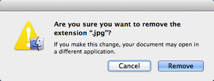
So, following the advice of local Mac guru Justin Sharp (mentioned in yesterday’s blog), I removed the suffix from each of the offending files (using Get Info). When you attempt to remove the suffix from a file, the operating system challenges you: are you really SURE you want to do this?

And, I did it, leaving one of the JPEGs with no icon, and no suffix sitting on the desktop.

When I double-clicked the icon, Mysterious Forces went to work on the file, creating a duplicate file with a JPEG suffix, and a correct icon showing the image of the document. This took just a few seconds.

When I double-clicked on the new document, it opened in Adobe Photoshop, and was no longer corrupt. The original file is still corrupt.

I tried this with the corrupt .eps file also, removing its suffix altogether, and then double-clicked on the orphaned icon. As with the JPEG, the file opened immediately in Adobe Illustrator, intelligible and as originally intended.

I am amazed by this, and I have no idea who/what is doing the work. Is it the operating system? Is it an Apple Event? Is it some tendril of Adobe Photoshop or Illustrator? Is it Preview?

Whatever it is, it works, and it solved the problem of the corrupt files.

By the way, I was able to open one of the corrupt JPEG files in Graphic Converter, the shareware graphics application that we all seem to have in our Applications folder. The others would not open in that application. None of the corrupt files would open in Preview, Apple’s low-end image application.

Posted in Photography, Photoshop techniques, Software | 35 Comments

Mysterious Forces in OSX appear to change file types (but can’t really)

Note to my kind readers (January, 2017):
The mysterious forces described below no longer seem to work. I have experimented with this in recent months, and have had no luck in repairing JPEGs using this technique. But read on anyway! It will still work with older Mac operating systems…

I attended the monthly meeting of the local Macintosh Users Group last night (I am the Treasurer of the group), and listened as a bright young man names Justin Sharp told the audience how to fix things before taking a Mac in for service. It was pretty good stuff.

At one point he was talking about file types, and he mentioned that the Macintosh Operating System will convert photos from one format to another just by changing the suffix of the file.

I was skeptical of this, as I have had to solve problems caused by this same technique for customers and students, and I just couldn’t believe it was true.

His comment was that if you change the .png suffix of a PNG file to .jpg, and click on the “Use .jpg” alert that follows, the file will actually be converted to a JPEG. It seemed preposterous to me. So when I got home I tested it, and in fact it does not work.

This is the kind of alert you get when you change the suffix of a file from .png to ,jpg. If you check the “Use .jpg” button, it will dutifully change the suffix for you, rendering the file inoperable.

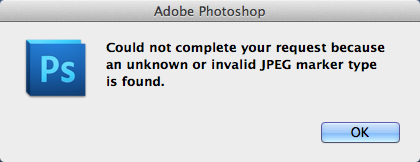
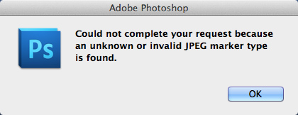
After you change the suffix to .jpg, then attempt to open the file in Adobe Photoshop, you’ll get this error message.

But, I tried a few other variations on this theme, and I discovered that some combinations of photo file types do work this way, just by changing the suffix. I searched the Interwebs and looked high and low for documentation to explain this, and I can’t find any. I did find a blog where Automator is discussed in detail, and it turns out that Automator can convert some files from one type to another without the support of any application. This must be an OS-level tool that Automator calls, and it will convert file types quickly and easily.

So, let’s assume that the OS calls the AppleEvent (called an OSAX) for a file conversion from PNG to TIFF, executes it on a file, and makes it into a TIFF file. Or, you could do the opposite. I tested this, and it works. It may also be that PNG files and TIFF files have so much in common that all it takes is to change the file suffix to make Photoshop think it’s opening the opposite, and it just works. A happy conicidence?

I tried interlaced PNG files and non-interlaced PNG files. Both work. I tried saving a TIFF file, and changing the suffix to .png. It works.

But, when I tried to change JPEG to TIFF or JPEG to PNG, it will not work.

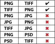
Here’s a chart of my findings:

This can be summarized as follows: PNG and TIFF can be converted back and forth by changing the suffix of the file. Nothing else works.

And, it is an interesting phenomenon that I am chalking-up to Mysterious Forces at work.

This will not work on Windows.

Posted in Photography, Software | 2 Comments

Image Processor – photo horsepower in a nearly unknown tool

Russell Brown, Senior Creative Director at Adobe Systems, created an application plug-in for Photoshop years ago with help from some of the programmers on the Photoshop team. It was first made available on Russell’s “off-campus” site as Russell Brown’s Image Processor.

It was so popular with imaging geeks like me that he was eventually able to convince the powers at Adobe to include it in the Photoshop product so it’s available to all of us without having to go get it and install it.

The Image Processor gives us the power to process any number of photo files, and convert them into other formats. It can also resize images simultaneously, which is what I asked it to do last night to 2,058 images. On a project like this I do not embed the ICC profile into every image, as it would just bulk-up the photos by many megabytes. Instead, I assign the profile to the complete after stitching – then it is only put there once.

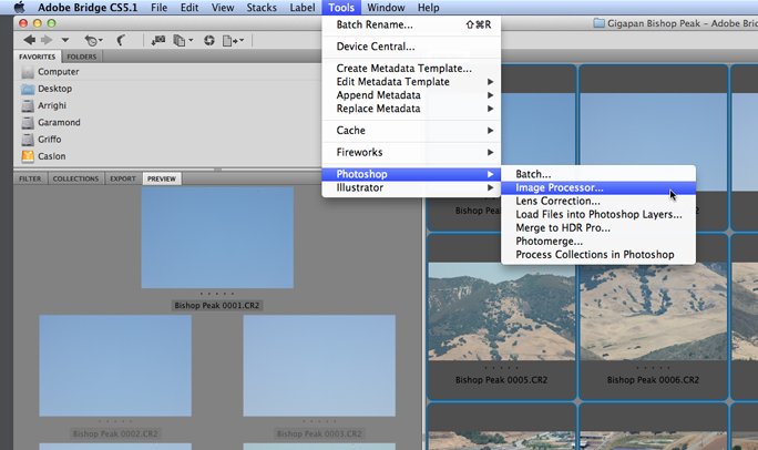
Image Processor is in the Photoshop menus (under Scripts), and it’s available from Bridge (under Tools>Photoshop):

This handy piece of software is what you use when you need to change the resolution of 1,515 images while converting them from Camera Raw to TIFF, or JPEG, or Photoshop – or all three at once. It’s the tool I used last night to prepare 2,058 for my next GigaPan image. You may have read my blog from last week about creating a file that is too big for Photoshop.

The one I took this week is even bigger, and I have decided to make it compliant rather than to make it giant. I have no need at the moment for a single photo that is 63.8 GB – that’s overly large. But I do want the largest photo I have ever made to be able to be opened in Photoshop so I can retouch a few pixels here and there.

My GigaPan work flow is evolving, and has a new step of making the photos smaller than I shoot them (when necessary) so that I can create Photoshop-compatible images of less than 300,000 pixels on the long dimension. I am also shooting in Camera Raw which is not a format fit for the GigaPan Stitch software.

I spent a few minutes with some scratch paper and my trusty HP 12C calculator (the real thing, not an app). I took the size of my 1,515-frame photo from last week, extrapolated the size of the photo from this week, and grumbled and mumbled until I came up with a formula for determining the correct resolution to reach the maximum size allowable in Photoshop, then applied that modification to the 2,058 photos I took this last Sunday from Bishop Peak in San Luis Obispo.

My camera (Canon 1ds Mark III) shoots photos that are 5,616 x 3744 pixels in size. After the mathematical monkeying-around, I determined that I needed each frame to be reduced in resolution to 3,057 x 2,038 pixels so that when I stitch the 98 rows of 21 columns of photos into one whole GigaPan image, it will fall just under Photoshop’s 300,000 pixel limit. There are at least two ways to do this that I know. One would be to make an Action in Photoshop to change the resolution and save the files as TIFFs, while the other way is to use Image Processor to reduce the resolution, and save the files as TIFFs in a separate folder.

It’s probably a toss-up when it comes to image processing, as both techniques use Photoshop to do the processing. I like Image Processor better because it requires fewer steps.

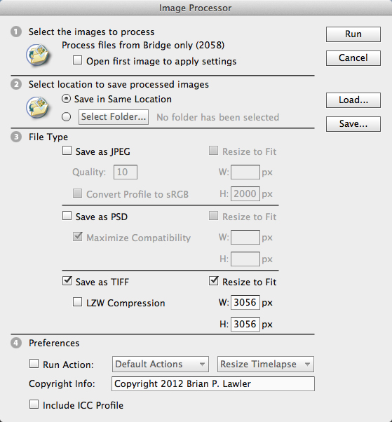
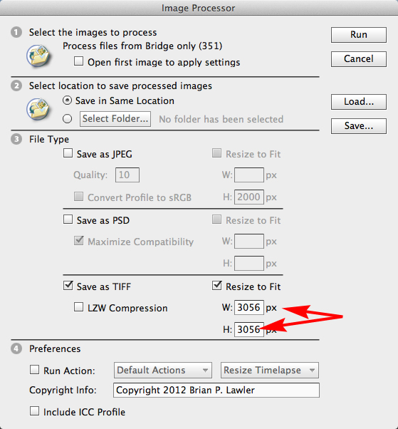
This is the Image Processor palette as I configured it for last night’s adventure. Note that I am converting to TIFF only (I could simultaneously make JPEG or PSD files – in any combination). Note also that I have entered the resolution I want into both Width and Height windows. This translates to “convert the longest dimension to 3,056 pixels.” This last item is handy when you are converting images that are either horizontal or vertical, and you want them all resized similarly.

I started the Image Processor on that task last night a bedtime, and it was finished when I woke up at 3:30 this morning to check on it (I don’t know how long it took). I like to let big jobs like this work while I am sleeping. I now have 2,058 TIFF images at the exact resolution I need for the next step, which is to stitch them in GigaPan Stitch.

One thing that Image Processor does that an (easy) Action will not do is to change resolution logically. That is to say it knows how to make a decision about the longest dimension of an image so that you can ask it to change a folder full of images – both vertical and horizontal – and convert the longest dimension of each one to a new dimension. This eliminates any need to attempt to build an Action that asks the question about whether the image is horizontal or vertical. I didn’t need this last night as all of my images are horizontal, but it’s nice to know it’s there.

Image Processor will also embed an ICC profile or a copyright message, and it will also run an Action of your choice simultaneously if you want it to.

Now on to the stitching step. I will let you know if something goes wrong there – I don’t expect trouble.

Posted in Color Management, Panoramic Photography, Photography, Photoshop techniques | 2 Comments

The first streamliner – photos from the family archive

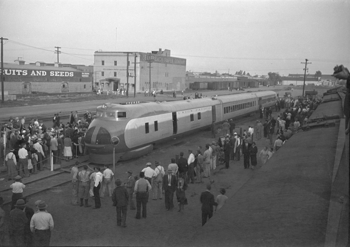
On March 15, 1934, my father, Russell Lawler took three frames (that still exist) of the first streamlined railroad train in U.S. history. I found the negatives of these frames recently while going through some family memorabilia. I also found prints of these frames, on the back of which is written the date and location in my father’s handwriting: March 15, 1934, Fresno.

The train, dubbed the M-10000 by Union Pacific, was the first train to be called a “streamliner” and the first not powered by steam. The train was designed by the Pullman Company, and featured a V-12 internal combustion engine that burned “petroleum distillate.”

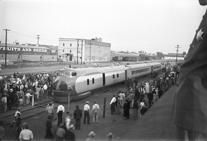
The Union Pacific M-10000 streamliner in Fresno, California. My father took the photo from the top of a railcar on an adjacent track. Notice the police badge on the man at the right edge of the photo.

That engine was built by a General Motors subsidiary called Winton Engine, and it developed a surprisingly small 600 horsepower. The train had only three cars, including the engine, and it was taken on a national tour in 1934 to show the nation that there was an exciting future to rail travel. UP wanted people to believe that the Depression was over and that rail travel in speedy streamliners was the Next Big Thing.

On the day of these photos, my dad was in Fresno, and he photographed the train and the audience it brought to the Fresno train yard. The three frames were taken from the top of a box car on an adjacent track. In one, there is clearly visible the badge of a policeman standing next to my father. Obviously that policeman did nothing to stop my father from taking these photos.

The photos are reasonably sharp, a little grainy, and they show the train and the crowd in great detail.

A second frame shows the same scene, but a little more of the foreground – showing the roofs of the railroad cars on which my father stood to take the photos.

Over the course of a year, Union Pacific Railroad took this train to cities all over America, and (according to Wikipedia) about one million people took the opportunity to go down to their local train station and see the dazzling new streamliner.

Eventually the train was put into regular service between Salina and Kansas City. It was renamed the City of Salina, and it was used until 1942 when it was scrapped for its aluminum to provide that metal to the building of aircraft for World War II.

The reason my dad was in Fresno? He was living in San Francisco at the time, and there is no record of his travels. His job at the time was as an insurance agent for Pacific National Insurance Company, based in San Francisco. There are many photos in the family archive of burned buildings, ships run-aground, and other disaster and near-disaster subjects. It could have been that the company had sent him to Fresno to investigate an insurance claim. We will never know.

The photos of this unique train are very interesting, and they tell a story of the beginning of the streamliner era (which didn’t really happen until the early 1950s). Union Pacific was way ahead of its time, and there was a war on the horizon. That war delayed the introduction of the diesel-powered train, and eventually the end of the steam era. By the time I was in junior high school in the early 1960s, the transfer of rail power was complete, and all of the steam locomotives had been pushed onto the sidings of America’s rail system.

Posted in History, Photography | Leave a comment

I have created a photo too large for Photoshop


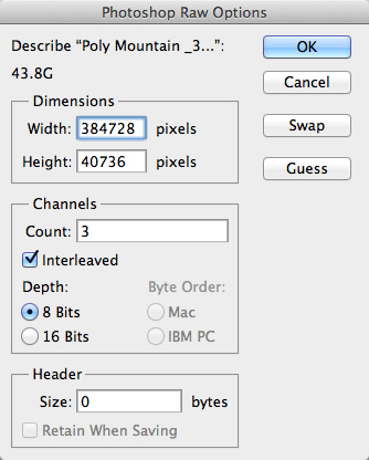
For those who have been following my work to make ultra-high-resolution panoramic photos with the GigaPan robotic camera mount, I have finally triumphed! I made a panoramic image this last Saturday with 1515 contributing images. The resulting image is 384,728 x 40,736 pixels in size, which is really large, and would be 4.701683 x 10 to the tenth power.

That’s 47 gigabytes.

It took about two hours to shoot, another two hours to transfer the images from the camera to the computer, and about eight hours to stitch in GigaPan Stitch, the software that is used to make images that are produced on the GigaPan device.

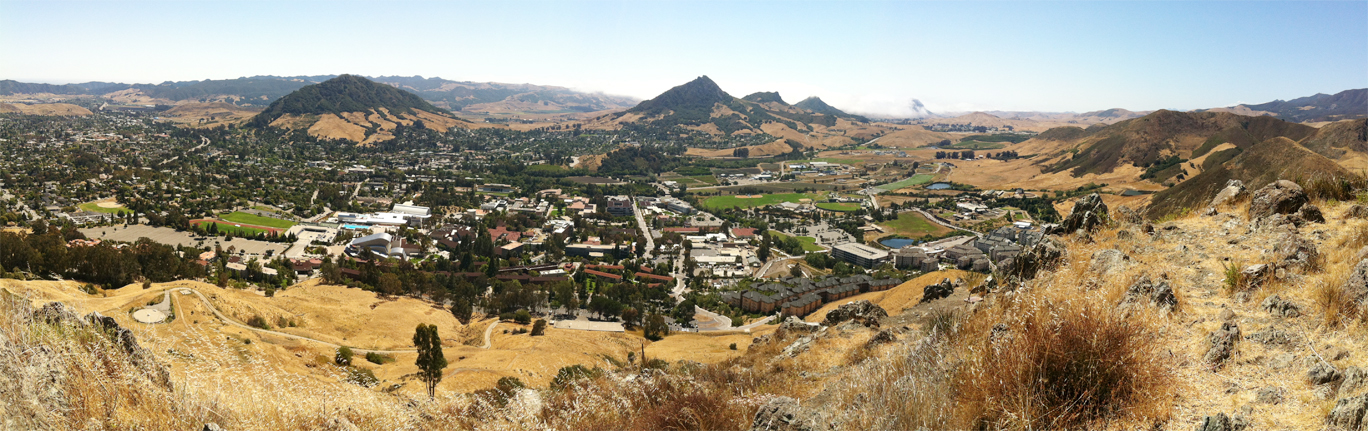
My vantage point above Cal Poly in San Luis Obispo. I put my horrible tripod on an old backpack frame and made the hike up to the top of the Poly P hill, about 1100 feet altitude. From there I made the epic photo on the GigaPan Epic Pro device with 1,515 contributing photos – each 60.2 MB in size.

I had it cooking all day Sunday, and by Sunday evening had completed the final image. My usual work flow for GigaPans is to upload them to the GigaPan site for public viewing, then export them to a format that can be opened by Photoshop. My plan, eventually, is to make one or more huge – really huge – full resolution prints from these large images, and use them to wallpaper a room with images.

This is a panoramic image I made with four shots on my iPhone. It stitched to over 50 MB, but it doesn’t stand up very well to my 47 GB GigaPan image! The one I can’t open.

When this one was finished stitching, and finished uploading to the GigaPan web site I tried to open it in Photoshop, but I received a warning that it’s too big for the popular photo software!

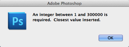
I entered the pixel dimensions and the number of channels into Photoshop’s Raw palette (the other one), and then I received this message from the program:

Oops! I couldn’t go any further because Adobe Photoshop has a 300,000-pixel limit!

My largest image prior to this was a photo taken in May from Cerro San Luis Obispo, overlooking the city, which spans about 200 degrees, and would print to 67 feet long at 300 ppi. At that size and resolution, the photo should provide eye-level image quality adequate to recognize individual automobiles and street signs. It’s available for viewing at GigaPan.com. I plan to print it eventually at full size.

My plan is to print these images on my Epson 9600 wide-format printer. I will print them in strips 44 inches wide and as long as necessary to fill the wall for my exhibition, which is not yet in possession of a venue. I can probably print the photo mentioned above in two long pieces, then I will pay a professional wallpaper hanger to put them up. I will be sure to stock a huge amount of paper and ink before starting, and will hold my breath while they print. I have never printed anything that large in the many years that I have owned an Epson wide-format machine, but there is a first time for everything!

I wish I could bill it to myself, but I probably won’t ever get paid for the work!

After posting my 300,000-pixel challenge on the GigaPan forum I have learned that there is no work-around for this (Corel Paint can open it, but I don’t have that software). It has been suggested that I re-work the photo to make it in two pieces, and then reassemble it when it’s printed.

I think I will start half of the image processing this evening, and do the other half tomorrow night. That way I will have two pieces that can be edited in Photoshop, perhaps scaled to 150,000 pixels each, and then assembled as an image with (only) 300,000 pixels of horizontal resolution.

That should do the trick.

Posted in Photography, Photoshop techniques, Software | 4 Comments

The origin of the Stencil font

We are bombarded by font designs, and seldom give any thought to their origins. I enjoy thinking about the fact that some of the most popular type designs being used today were created in the 15th and 16th centuries. These timeless treasures form the backbone of modern typography while being as old as is possible in the history of typography. People love their favorite fonts!

And, some people hate fonts – in fact most of us hate at least one font – it’s fun to have a font to pick on because it gives us an inanimate thing to hate, one that cannot strike back, one which will not offend the in-laws when in conversation at Thanksgiving dinner.

This is the traditional Stencil font, first designed in the 1930s for metal typography at the Ludlow Typograph Company in Chicago. It has many manifestations in the digital realm, and it certainly existed a long time before Ludlow issued it as brass matrices for their linecasting machine.

One oft-reviled font is Stencil, which is credited to the Scottish-American type designer Robert Hunter Middleton (1898 – 1985) who worked for the Ludlow Typograph Company in Chicago. For those unaware of the Ludlow organization or their machine, the Ludlow was the companion typesetting machine used during the 20th century to set headlines. Type was set with hand-assembled brass matrices in a composing stick which was inserted into a bracket atop the machine, and molten type metal was injected into the molds to make a headline in one piece of metal type.

When set in digital form, Stencil is probably too tight to be used for a real stencil. Adding tracking (plus) will make it more effective for spray paint and rough planking.

These headlines then were inserted into a form of type, usually cast on a Linotype machine, and the printing was done from the combined type.

Ludlow machines were a pleasure to use, they were reliable and required only light maintenance. To say they were robust production machines is fair because no matter what, they always seemed to work. There are Ludlows still operational in the world, and there are specialty firms that will set Ludlow type for printing today, though they are rare.

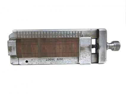
This is the Ludlow composing stick. The brass matrices are hand-set from drawers of characters. When finished, molten type metal is injected into the matrices to make a complete line of headline type.

The fonts available for Ludlow were created for the era, one in which there was spirited competition between the major type foundries – American Type Founders, primarily, and the two major linecasting machine makers – Linotype and Monotype. And, fonts were never interchangeable. What was made for one machine worked only on that machine, and nowhere else. This was intentional, and the philosophy of non-interchageability carried on until the PostScript revolution (which began in 1984) when one could, finally, purchase a font that would work on more than one brand of output machine.

Back to Stencil: It’s likely that Mr. Middleton didn’t “invent” Stencil. He most likely converted a design that was commonly used to make real, functional stencils, and made it available in styles and sizes that would be functional in newspaper headlines. The font had its debut at the tail end of the Chicago type renaissance that was driven by Frederic W. Goudy and Oswald Cooper, among others. American advertising agencies were in love with big, black, bold fonts, and Stencil would have fallen into their hands as a welcome addition.

We don’t know the origin of the stencil itself, but delightful examples of stencil painting exist in the prehistoric cave art that has been found in France, South America and Australia. In these ancient examples the stencil is the human hand, and the artwork was created by spraying paint against cave walls leaving the negative of the hand as the image.

Stencil lettering came into style much later, when mankind needed to label things, or mark them for shipment (a deft multi-millennial jump on my part). The most common font, the one actually called Stencil, is a serif-style font that lends itself to high legibility, while still being functional as a stencil. That functionality includes the ability to be read, and not to collapse when wet with paint, and removed from the stenciling surface, which is why it’s designed the way it is.

Paper and metal stencils are commonly made with the font because it’s convenient, and real paper, metal or plastic stencils are often cut with mechanical die-cut punching machines that have only one font – Stencil. These machines, which can still be purchased for about $4,000, are utilitarian and effective.

Though Wikipedia suggests that Stencil is based on Clarendon (which I would dispute), it doesn’t have many similarities to other common fonts. I decided to see what it might be if it were not a “stencil” font, so I removed the stencil islands (those parts that allow it to work as an actual stencil), and I ran it through WhatTheFont, the clever font identification program at myfonts.com. But, I couldn’t fool What The Font! It came back with five variations of Stencil, and its next suggestion was a Bodoni, followed by a charming font called Steppin Out. But not Clarendon.

This is my font called Unstencil. I used this to test WhatTheFont, the font identification application at myfonts.com.

Perhaps Stencil is a unique design that evolved from its function, and is not based on any font that was common at the time. That would make sense.

There are, of course, many other stencil-style fonts, some sans-serif. I think the best ever is Milton Glaser’s Glaser Stencil. Glaser Stencil is both stylish and functional, and I have made a functional stencil with it to spray paint my car license number on a cloth car cover (it looked very stylish). It is both modern and retro, and is well suited to digital typography.

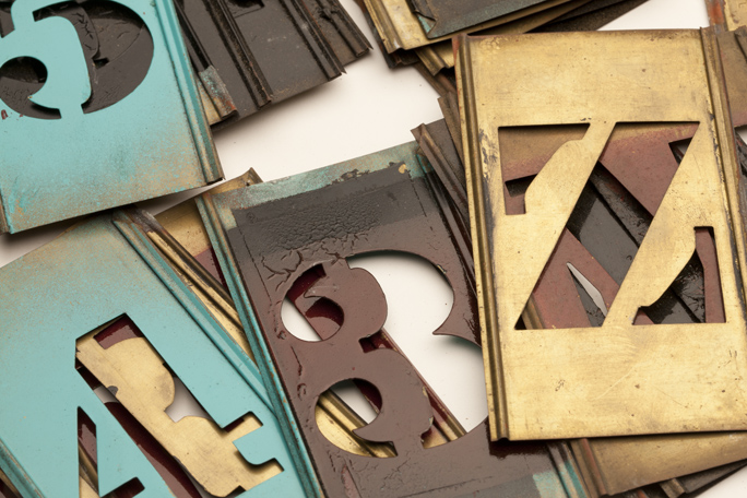
In my collection of ephemera is a complete set of brass stencils in the traditional Stencil font. These have been in my family for a couple of generations; I think that my father probably bought them in the 1950s. I used them when I was in high school to make address signs for my neighbors’ homes. I crafted sheet metal sign plates, spot-welded them to angle-iron posts, spray-pained them in charcoal gray, and then added street numbers with spray paint guided by these brass stencils. With these products I made a little extra spending money.

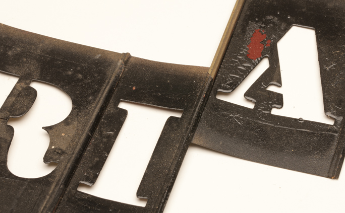
You can see here the interlocking edges of the brass stencils. Sliding them onto the edges of other letters makes them into words. You can also see the paint that I never took off the stencils after I used them.

The clever thing about these brass stencils is how they interconnect, each one sliding onto the one to its side. Assembled, all one need do is mask the top and bottom, and spray away for success. As I look at them now, it’s obvious that I was not diligent about cleaning my stencils as a teenager. They are painfully difficult to connect and disconnect, and I think I might buy a can of paint remover to cleanse them of my teenage misdeeds.

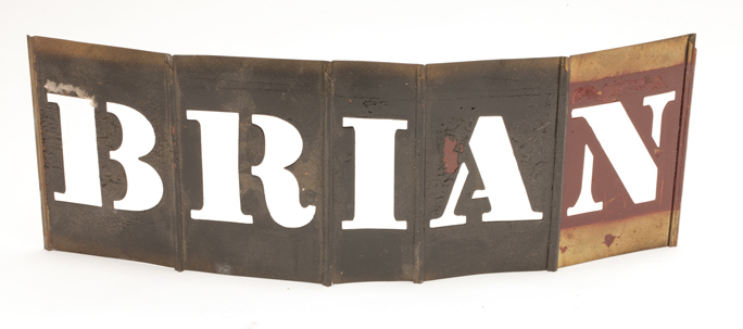
I assembled my name in the brass stencils, though I didn’t paint it anywhere.

A complete set of these brass stencils can be bought today for about $100 at NationalStencil.com. They don’t seem to sell the serif style, offering instead a clean sans-serif font that is easy to read, and probably easier to paint and remove than the “standard” Stencil font.


Posted in History, Typography | 2 Comments