We are bombarded by font designs, and seldom give any thought to their origins. I enjoy thinking about the fact that some of the most popular type designs being used today were created in the 15th and 16th centuries. These timeless treasures form the backbone of modern typography while being as old as is possible in the history of typography. People love their favorite fonts!
And, some people hate fonts – in fact most of us hate at least one font – it’s fun to have a font to pick on because it gives us an inanimate thing to hate, one that cannot strike back, one which will not offend the in-laws when in conversation at Thanksgiving dinner.
This is the traditional Stencil font, first designed in the 1930s for metal typography at the Ludlow Typograph Company in Chicago. It has many manifestations in the digital realm, and it certainly existed a long time before Ludlow issued it as brass matrices for their linecasting machine.
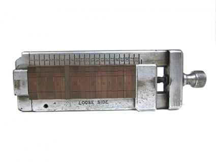
One oft-reviled font is Stencil, which is credited to the Scottish-American type designer Robert Hunter Middleton (1898 – 1985) who worked for the Ludlow Typograph Company in Chicago. For those unaware of the Ludlow organization or their machine, the Ludlow was the companion typesetting machine used during the 20th century to set headlines. Type was set with hand-assembled brass matrices in a composing stick which was inserted into a bracket atop the machine, and molten type metal was injected into the molds to make a headline in one piece of metal type.
When set in digital form, Stencil is probably too tight to be used for a real stencil. Adding tracking (plus) will make it more effective for spray paint and rough planking.
These headlines then were inserted into a form of type, usually cast on a Linotype machine, and the printing was done from the combined type.
Ludlow machines were a pleasure to use, they were reliable and required only light maintenance. To say they were robust production machines is fair because no matter what, they always seemed to work. There are Ludlows still operational in the world, and there are specialty firms that will set Ludlow type for printing today, though they are rare.
This is the Ludlow composing stick. The brass matrices are hand-set from drawers of characters. When finished, molten type metal is injected into the matrices to make a complete line of headline type.
The fonts available for Ludlow were created for the era, one in which there was spirited competition between the major type foundries – American Type Founders, primarily, and the two major linecasting machine makers – Linotype and Monotype. And, fonts were never interchangeable. What was made for one machine worked only on that machine, and nowhere else. This was intentional, and the philosophy of non-interchageability carried on until the PostScript revolution (which began in 1984) when one could, finally, purchase a font that would work on more than one brand of output machine.
Back to Stencil: It’s likely that Mr. Middleton didn’t “invent” Stencil. He most likely converted a design that was commonly used to make real, functional stencils, and made it available in styles and sizes that would be functional in newspaper headlines. The font had its debut at the tail end of the Chicago type renaissance that was driven by Frederic W. Goudy and Oswald Cooper, among others. American advertising agencies were in love with big, black, bold fonts, and Stencil would have fallen into their hands as a welcome addition.
We don’t know the origin of the stencil itself, but delightful examples of stencil painting exist in the prehistoric cave art that has been found in France, South America and Australia. In these ancient examples the stencil is the human hand, and the artwork was created by spraying paint against cave walls leaving the negative of the hand as the image.
Stencil lettering came into style much later, when mankind needed to label things, or mark them for shipment (a deft multi-millennial jump on my part). The most common font, the one actually called Stencil, is a serif-style font that lends itself to high legibility, while still being functional as a stencil. That functionality includes the ability to be read, and not to collapse when wet with paint, and removed from the stenciling surface, which is why it’s designed the way it is.
Paper and metal stencils are commonly made with the font because it’s convenient, and real paper, metal or plastic stencils are often cut with mechanical die-cut punching machines that have only one font – Stencil. These machines, which can still be purchased for about $4,000, are utilitarian and effective.
Though Wikipedia suggests that Stencil is based on Clarendon (which I would dispute), it doesn’t have many similarities to other common fonts. I decided to see what it might be if it were not a “stencil” font, so I removed the stencil islands (those parts that allow it to work as an actual stencil), and I ran it through WhatTheFont, the clever font identification program at myfonts.com. But, I couldn’t fool What The Font! It came back with five variations of Stencil, and its next suggestion was a Bodoni, followed by a charming font called Steppin Out. But not Clarendon.
This is my font called Unstencil. I used this to test WhatTheFont, the font identification application at myfonts.com.
Perhaps Stencil is a unique design that evolved from its function, and is not based on any font that was common at the time. That would make sense.
There are, of course, many other stencil-style fonts, some sans-serif. I think the best ever is Milton Glaser’s Glaser Stencil. Glaser Stencil is both stylish and functional, and I have made a functional stencil with it to spray paint my car license number on a cloth car cover (it looked very stylish). It is both modern and retro, and is well suited to digital typography.
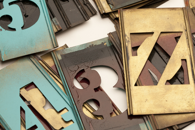
In my collection of ephemera is a complete set of brass stencils in the traditional Stencil font. These have been in my family for a couple of generations; I think that my father probably bought them in the 1950s. I used them when I was in high school to make address signs for my neighbors’ homes. I crafted sheet metal sign plates, spot-welded them to angle-iron posts, spray-pained them in charcoal gray, and then added street numbers with spray paint guided by these brass stencils. With these products I made a little extra spending money.
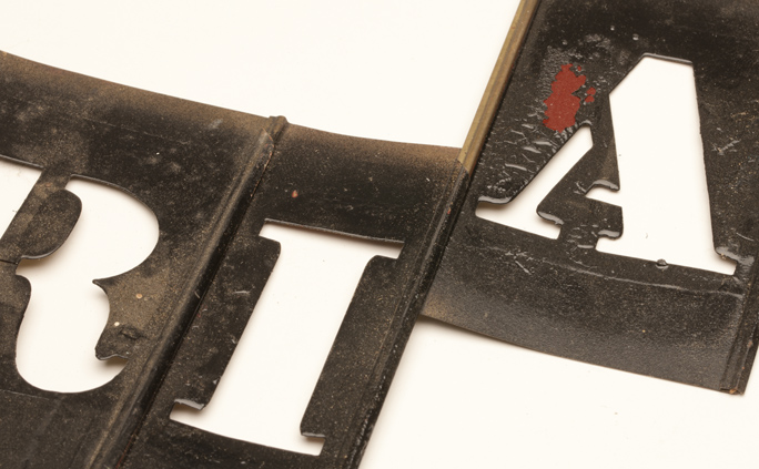
You can see here the interlocking edges of the brass stencils. Sliding them onto the edges of other letters makes them into words. You can also see the paint that I never took off the stencils after I used them.
The clever thing about these brass stencils is how they interconnect, each one sliding onto the one to its side. Assembled, all one need do is mask the top and bottom, and spray away for success. As I look at them now, it’s obvious that I was not diligent about cleaning my stencils as a teenager. They are painfully difficult to connect and disconnect, and I think I might buy a can of paint remover to cleanse them of my teenage misdeeds.
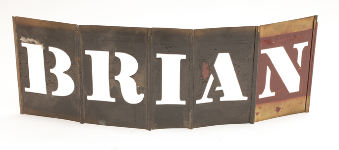
I assembled my name in the brass stencils, though I didn’t paint it anywhere.
A complete set of these brass stencils can be bought today for about $100 at NationalStencil.com. They don’t seem to sell the serif style, offering instead a clean sans-serif font that is easy to read, and probably easier to paint and remove than the “standard” Stencil font.


Pingback: New Logo for Heroic Food in Hudson, NY
This is a well-crafted brand for a non-profit organization that uses a modern “stencil” font. It does the job well, and pays homage to the original Stencil style of lettering. Nicely done!
Brian