The case for using DNG as your primary file type

I have files created by a Kodak-branded, Canon digital camera from this century that can no longer be read. This is my second case of file obsolescence; the first being Kodak Photo CD files that cannot be read by any existing commonly used software (I did find a solution to reading Photo CD discs that involves a UNIX program and using Terminal to control it).

Photos from the old Kodak/Canon camera are not readable with anything I can find. But fortunately I don’t care, because I don’t have an archive of photos from that camera.

The threat of photo file obsolescence

The idea of photo files becoming obsolete is a scary one, because it points out one of the great threats to society. Sometime in the future we will no longer be able to access our images with any existing software.

A few years ago, while preparing for a show in the local art museum, I scanned a number of five-foot-long strips of Kodak Cirkut camera film. Some of these film negatives were more than 100 years old. They still work perfectly; there are clearly visible images on them, and they were transferred to digital files by scanning.

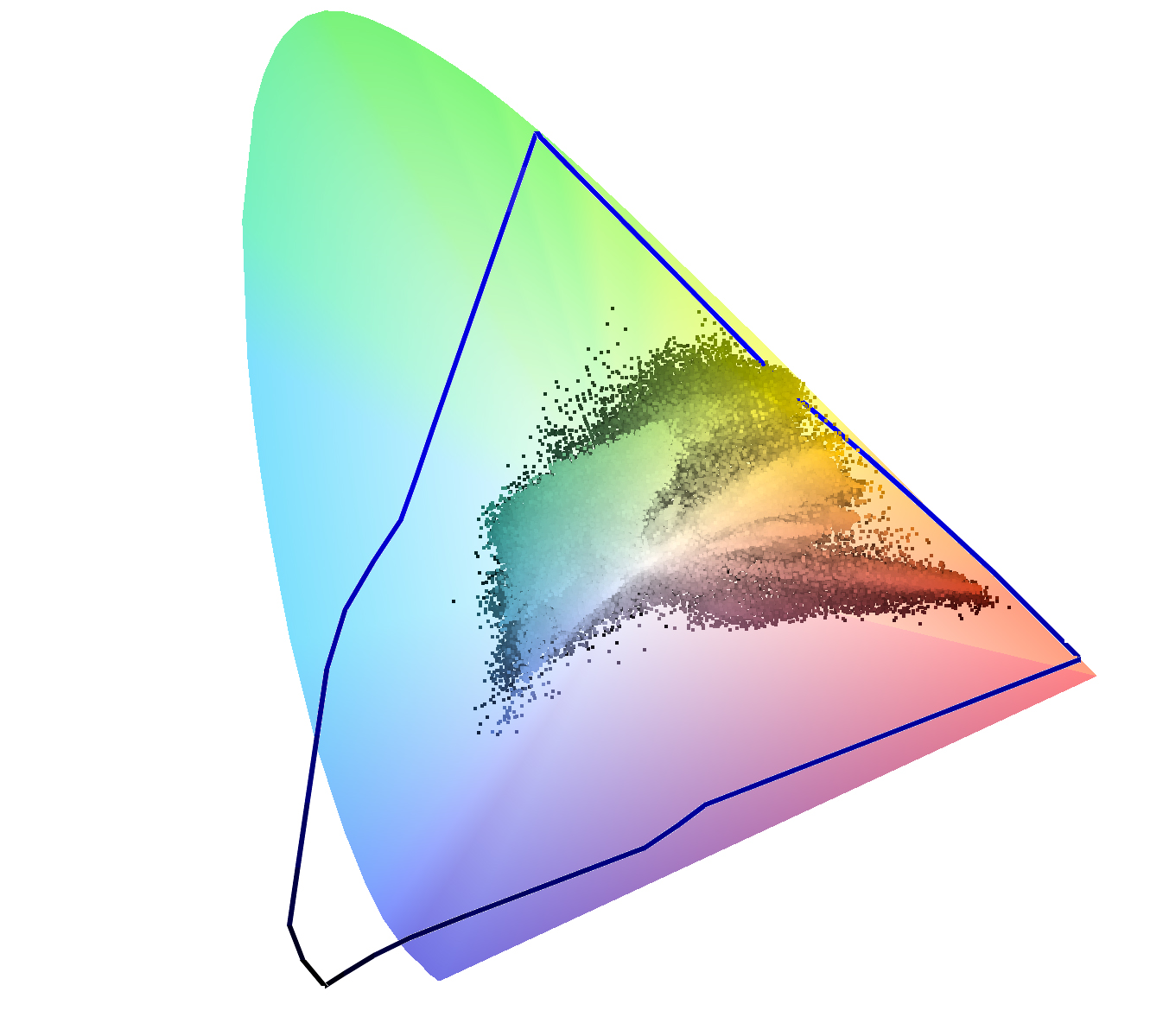
I would like to know that photos I take today will still be useful 100 years from now. Current file types including most camera-specific Camera Raw files will probably not be legible beyond a decade or two, and the companies that make the cameras that create proprietary files have no incentive (in fact they have the opposite) to support their files beyond a reasonable period of time – ten years, 20 years?

Innovation drives new camera capabilities

The constant pace of innovation and improvement in camera technology will drive this. Bigger sensors, better color capabilities, greater bit-depth, white point recording, expanded gamuts, and more (perhaps post-processing focus information?) will force camera manufacturers to move to more capable versions of Camera Raw, and perhaps we’ll have new storage technologies that supersede the SD card, and others that we find so handy today. It’s inevitable.

At some point Canon, Sony and Nikon will each say, “Enough!” for their current storage schemes and they will move on. Adobe, which now supports hundreds of different Raw formats, will inevitably abandon support for the oldest of them and move on.

And that will be the day that we need to go back to some 30-year-old image and open it anew. But on that day the image will not open. It will be lost to technological obsolescence. That will be a dark day.

That day will come soon. (Ironic note: It’s happening now! The new Canon .cr3 file makes the previous .cr2 file obsolete now, though Adobe still can read them.)

Obsolescence-proofing now

Fortunately we have a solution on hand today, one which will prevent obsolescence for some time, and one which we can all adopt immediately to stave-off the possibility of image obsolescence for a while. The idea of any software working in 100 years is unlikely, but not unimaginable.

This file is the DNG – or Digital Negative file. It was created by Adobe in 2004, but has now been made available by that firm to the world community. It has also been offered to the International Standards Organization as an ISO standard, one that can continue to be used in open-source software, and one that may prevent, or at least forestall obsolescence.

Professional archivists are encouraging everyone to use the DNG file to prevent file type obsolescence (as I am describing here).

How do we get to DNG?

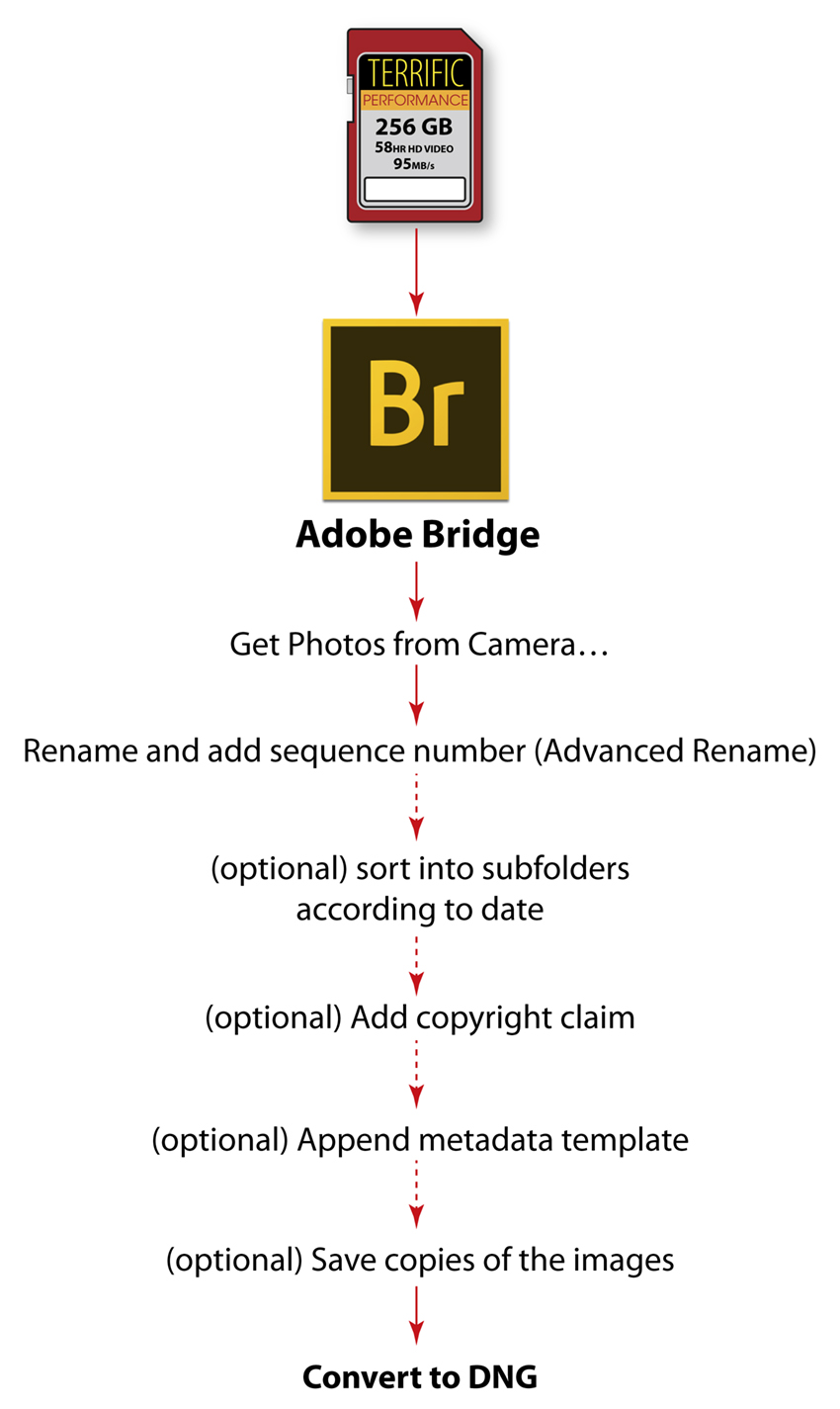
The simplest way to put our images into DNG format is to import images from camera cards using Adobe Bridge, and its companion application Photo Downloader.

Photo Downloader does not sport the finest user interface (far from it!), but it does several things that no other application can do while simultaneously downloading images to a computer. It can do all these things at the same time:

It can also delete the files from the camera card, something I do not recommend. I never delete a photo from a camera card until I am confident that the images are safely stored on a local computer. And, even then I don’t erase the camera memory card until the next time I use the camera.

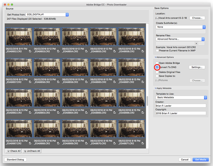
This is Adobe’s Photo Downloader application, which is accessible
only from Adobe Bridge. Once there, choose Advanced Dialog to get to this window
where the better features are available.

This software is only available from the File menu in Adobe Bridge, which is only available to those who have the Adobe Creative Cloud.

It is only possible to read photos from a camera memory card, and not from a folder of existing images. (Bridge can also read images from a camera connected by a USB cable to the computer, but that uses a different application which is not as capable.)

The technique: put a memory card into your computer, or to a card reader. Run Bridge, choose File>Get Photos from Camera, and then choose Advanced Dialog from the application that opens (it’s called Photo Downloader).

Once in that application, choose the images you want to download (start by clicking the UnCheck All button). You can click on one image, then shift-click on the end of a range of photos. Non-contiguous selection is not possible in this application, alas.

Choose the destination folder in the upper-right corner. Choose whether to subdivide the images into folders, and by which criteria (I seldom do this). Then choose Advanced Rename, and choose Text + Sequence Number (and other variables that you may want). I always put a space after the text to separate it from the sequence number. Be sure to allow enough digits in the sequence number to accommodate all of your images.

And, this is the most important part: Check the Convert to DNG check box.

You can also add metadata from your own list of prepared metadata, you can add your own copyright claim to all of the images, and you can write copies of the photos to a back-up disk if you wish.

Then choose Get Media.

Converting Camera Raw images to DNG

Suppose you have a folder of Camera Raw photos on your hard drive, and you want to convert them to DNG. You would want to do this to create a DNG archive of images from those photos you have already stored on your hard drive.

This is Adobe Camera Raw. In the lower-left corner is a button for saving
in a variety of formats, among them DNG. This is useful for converting
a number of Camera Raw files from their native type to DNG.

To convert one or more images from Camera Raw to DNG, chose a batch of images and hit Command-O (Open). This will cause the images to open in Adobe Camera Raw. You might get a warning dialog indicating that you have selected a large number of images to open at one time. Click Continue.

Once they open in Camera Raw, select all (Command-A). Then choose the Save Images button in the lower-left corner of the window.

A new dialog will open. Choose Save in Same Location (or you can save in a new location). Choose .dng as the image suffix, which will automatically select the conversion to DNG.

Click the Save button in the upper-right corner.

It will take about one second per image to convert the files. You can continue to do other things while this is happening.

Converting with the Adobe DNG Converter

Another technique is to use the free Adobe DNG Image Converter. Download this and install it on your computer. It has a logical interface. This application can convert Camera Raw images in any folder into DNG files. It does so quickly and effectively.

Once the conversion is complete, you will have a folder with .dng files in it. Those images are saved in the most obsolescence-proof format currently available.

You can be confident that your photos will work in the future. How long? No one knows, but I assure you it will be longer than if you do nothing with your files.

If you take steps to import all new images into your computer in DNG format, and to archive your photos in DNG format, you may be able to avoid the dark day when you will no longer be able to read your photo files.

DNG files have advantages beyond obsolescence-proofing. Those pesky .xmp “sidecar” files that are created when we open Camera Raw files on our computers are gone! (The same data are embedded in the DNG files). This saves some occasional grief when working with images that have been opened previously when the .xmp file has been misplaced.

Note: DNG will not convert from JPEG images. The file format is limited to Camera Raw files.

I am also confident that JPEG images will be legible for many years, due to their ubiquity, but that is not a reason for using JPEG as your primary file type. JPEGs are not designed for archival purposes. They are for the web and social media uses, not for high quality imaging.

Download a printable version of this essay by clicking on the image below:

Posted in Photography, Photoshop techniques, Software, Technology, Uncategorized | Tagged , , , , , , , , , , | Leave a comment

Getting the Typographic Tremors
reading historic roadside signs

I just returned from a 2,018-mile journey up the coast of California, into Oregon, then back by a slightly different route.

Along the way I visited and camped in National Parks, State Parks, National Forests, and private campgrounds. Along the way I stopped to visit beaches and lighthouses. I hiked through redwood groves and wondered at wonders all along the route.

And I practiced typographic criticism all along the route. On nearly every roadside information sign I grimaced as I found typographical errors, stylistic inconsistencies and major typographical gaffes.

Bronze busts with errors, the most costly of the genre make me want to scream: “Doesn’t anyone proofread these things before they are cast?!”

An example: at AT&T Park, home of the San Francisco Giants, all of the quotes painted (printed?) on the walls are made with incorrect quotation marks and apostrophes. And, to make them even worse, all of the quotation marks are followed by a space (don’t do that!) at the beginning, and preceded by a space (don’t do that either!) at the end. Willy Mays is my lifelong hero; why insult his quotations with bad typography? (Mays is still alive.)

At the Umpqua River, I visited the lighthouse, now operated by the county of Douglas, which keeps it running for navigators at sea. It is a beautiful historic lighthouse featuring a working Fresnel first-order rotating light, apparently the only one of its kind still in operation in the world.

In the museum next door are delightful exhibits that describe the lighthouse and its storied past. It’s quite a place.

I have circled the typographical errors on this informational sign. I could almost not read it for the stumbling blocks of misused marks, etc. Remember my motto: Don’t interrupt the reader!

On a sign in that museum I found 56 typographical errors (I consider incorrect spacing, incorrect apostrophes, incorrect dashes, incorrect quotation marks, to be errors. That’s the point of these essays). Fifty-six!

It starts in the headline, and continues to the bottom, every single apostrophe and quotation mark is wrong. There are ellipses with two dots (don’t do this!), ellipses with dot-space-dot-space-dot (nor this!). There are spaces before closed-quotes, and spaces after open-quotes. None of these is correct.

There are sentences separated by one space (correct!), and there are sentences separated by two, three, and (maybe) four spaces.

There are hyphens used where there should be a long dash (I don’t care which one).

There is an ampersand used in prose where the word “and” should be used.

It goes on and on and on, and it made me quiver with the Typographic Tremors. Someone was paid – a lot of money – to make this sign and erect it on the site.

Why not do it right? Why not consult with a typographer who can point these errors out before they go to printing, mounting and erection?

I am willing to do this for any organization – be it a National Park (they have a staff typographer at Harper’s Ferry) or a local landmarks commission. I stand ready to critique and mark-up any historic marker signs and placards. Send me a PDF! I’ll do it with a smile. No charge!

And, then the viewers of the signs can appreciate their beauty and information without getting the Typographic Tremors.

Posted in Language and grammar, Mistakes you can avoid, Typography | Tagged , , , , , , | 9 Comments

I’m sick @ tired of symbols being used in prose & running text

In addition to hearing professional news announcers use singular verbs with plural nouns (There’s thousands of reasons to do this…), which makes me very grumpy, I often see symbols like @ and & used in running text. This is offensive to the seasoned typographer. Don’t do it!

Remember the overarching theme of these essays: Never interrupt the reader!

This is an exaggerated example of the use of @ and & in running text. If you squint, you’ll see the blobs. These, in addition to being visually unpleasant, cause the reader to stop, translate, and then continue. It’s typographically unwise.

In general, the ampersand and the at-symbol are used to abbreviate things when space is tight. In running text – books and similar typography – one should not abbreviate any word. The words “and” and “at” should be spelled-out. This is also true of abbreviations for states – CA, MO, AZ, etc. These should always be spelled-out, except when used as an address. California is a beautiful word; CA is an ugly postal code. Don’t use the postal code in text.

Why?

These characters – @ & and abbreviations like CA, create visual blobs. Blobs interrupt reading because the reader has to stop and interpret them, converting them back to words. This takes time and it interrupts the reader. That violates our objective of never interrupting the reader.

…and this is the same text (from Les Miserables) with the words at and and used correctly. It reads smoothly.

And excellent typography does not interrupt the reader.

Read about getting the typographic tremors in the next blog.

Posted in Typography | Tagged , , , , , | 6 Comments

I have a preposition for you!

Prepositions are parts of speech that declare where, and when, and they are important to proper language.

Typographers have a responsibility to place prepositions where they belong, and not to hang them at the end of lines.

I often see them used correctly, but placed incorrectly. Prepositions belong with the words that follow them (most of the time).

So instead of putting a preposition at the end of a line, and allowing its prepositional phrase to be on the next line, keep the preposition with its expression.

Note the hanging prepositions in the third, fifth, sixth and seventh lines of this invitation. They are all incorrect. They belong on the following lines with the words they describe.

In this version, I have moved all the prepositions to the correct locations. Try reading the two, and I think you’ll agree that this one reads better. It’s refreshing to read excellent typography and not be distracted by hanging prepositions.

I believe that this should also be true of conjunctions – and, or, for example. Keep the conjunctions with the words that follow so they don’t hang on the end of a line.

All of this is a goal for typographers, but it is often impossible to accomplish due to the line length, or getting the type to fit into a certain space. When you can’t get these pesky words to go with the words that follow them, just do the best you can.

The most important message in this short essay is to pay critical attention to the words in every line. Look! Look closely, and read the copy to be sure it reads correctly and smoothly.

Remember the overarching goal of excellent typography: Never interrupt the reader!

Read about using symbols in prose in the next blog.

Posted in Typography | Tagged , , , , , , | Leave a comment

A pretty good argument for using ProPhoto RGB
as your working color space

Photographers discovered 20 years ago that sRGB is a really bad color space for professional photography. So we all changed to Adobe RGB 1998.

The reasons for doing so are important: Adobe RGB has a larger overall gamut, and conversion to CMYK print gamuts like FOGRA and GRACoL leave colors largely unchanged. Skin tones are rendered slightly better in Adobe RGB, and cyan-green colors are possible in an image, where they are clipped with the much smaller sRGB color space. It was completely logical.

This is a 3D view of the ProPhoto RGB working color space (available in Adobe Photoshop) compared to the Adobe RGB 1998 working color space. The ProPhoto extends beyond the human visual spectrum on the blue axis in order to accommodate a larger range of violet, cyan and green colors. It is also very slightly larger along the red-green axis,
which includes the colors described in this essay.

About ten years ago I was counseled by an Adobe trainer to switch to ProPhoto RGB, a significantly larger working color space. His argument was strong, but I didn’t think it affected me. Someday, he argued, Canon would come out with an ink-jet printer that has such a huge color gamut that I would be begging for it. If I started converting all of my images then into ProPhoto RGB space (this is done in Adobe Camera Raw), I would be able to take advantage of the impressive gamut of that future printer, and I would enjoy the benefits.

Soon, I followed his example and I switched to ProPhoto RGB, applying it to all of my images. My images did not improve (they were just fine in Adobe RGB), but I felt pretty good about my ability to take advantage of a future printer with much more color than my current printer (an Epson 9800). I never expected my images to improve, but I did want to be on board when that new huge-gamut printer came along. To date it has not.

Over the years, probably more a result of being in step with other photographers, I switched back to Adobe RGB 1998. My photos still look good, and I seldom get any reminders from the Color Settings palette reminding me that the color profile I have in my photos is different than the color settings I have established for the Adobe Creative Cloud. My work flow just works.

This past week, however, I encountered a situation while photographing an oil painting where the difference between ProPhoto and Adobe RGB made the difference between  success and failure.

I have been working for months to learn a new technique for making reproductions of paintings. This involves much discipline: accurate lighting, precise exposure, perfect camera positioning, building and applying an excellent input profile (applied in Adobe Camera Raw), and then adjusting the black-point and the white-point to get the best possible tone range in the resulting images.

I don’t want you to think I’m new to fine art reproduction photography. I have been doing it rather badly for decades. I have spent countless hours and many dollars building the right set-up, measuring and preparing the lighting, and taking less than perfect photos of paintings.

In January of this year I attended an inspiring seminar on fine art reproduction by artist/photographer Christopher Campbell and software developer Franz Herbert. The two presented at the annual Color Conference, an event hosted by the Printing Industries of America. It was the best seminar I have attended in years. At the end, Mr. Campbell showed two samples of paintings and reproductions that were indistinguishable. Franz Herbert demonstrated BasicColor Input, the software he develops for BasicColor, a German firm that makes profiling and profile editing software.

This is a comparison of the ProPhoto RGB working color space (black wireframe) to the image capabilities of a Canon 6D digital camera. The size of ProPhoto is important to capture such a large potential volume of colors captured by that, and similar cameras.

As a result of attending that seminar, and doing considerable reading after, I developed a work flow and apparatus for fine art reproduction photography. I built a special wall mount for paintings; I bought clamps and aluminum bar stock to mount my strobe lights in the correct position for this kind of work. I got a new Color Checker SG target from X-Rite, and bought a pair of lasers to aim the lights.

In February I got a copy of BasicColor Input, and began the process of learning how to make and use Camera Raw profiles (I have used ColorChecker Passport for years). In late April I assembled all of this in the studio at my university. I brought my own strobes over (they are better than the lights owned by my department). I set up my lights, measured their positions exactly, and then aimed them using the lasers.

I bought a Hasselblad alignment mirror on eBay (by mail from Hungary), and I bought a Zig-Align mirror for the Canon macro lens I use for this activity. The two mirrors are used to square the camera to the artwork: one goes on the artwork wall, one goes on the camera lens during the alignment stage.

Once assembled, I showed my students how the system works. We set up the Color Checker SG and we made exposure calculations to get the images in the camera – a Canon 6D. We then made profiles using the BasicColor software, and learned that the errors in color from shooting to profile were too high: my average Delta-E was in double-digits. I photographed the painting and opened it using the profile we made. Printing that image to Epson Somerset paper we could see that the color was too orange. Cream colors in the original were just wrong. I worked with the image to make it look better, but it got worse.

Back in the studio, I recorded a custom white balance in the camera, a step that I had omitted in the first round (though suggested by Christopher Campbell and Kevin O’Connor). Then I photographed the Color Checker SG again, and made a new profile. This one turned out much better: average Delta-E of 2.46, peak Delta-E of 5.3.

Again, I photographed the painting and opened the image in Camera Raw, applying the new profile. On printing it, the cream colors were much better, but still visibly wrong.

This is a projection in 2D of the colors in a recent fine art reproduction image I made in the studio at my university with the Canon 6D camera. Notice the colors that extend beyond the triangular gamut of Adobe RGB 1998 at the top-right; these are the cream-yellow colors described in this essay. This image was created in ColorThink Pro software,
which can plot various color gamuts in 2D and 3D space.

In Adobe Camera Raw I changed the bit depth of the photos from 8-bit data to 16-bit data and tried again. The result was the same: cream colors that were orange. I reconsidered everything that I was doing, attempting to figure out how to make it better. I seized upon the idea of the color space, wondering if Adobe RGB is too small for the colors in the painting. I changed the color space to ProPhoto RGB and tried again. Bingo! I could tell immediately that the cream colors had been captured and converted to Adobe Photoshop correctly.

…and this is the same image superimposed on the 2D gamut chart of ProPhoto RGB. You can see that the larger working space accommodates nearly all the colors in the photograph, doing a much better job than its slightly smaller counterpart Adobe RGB 1998.

After analyzing the two gamuts side-by-side, I realized that the most significant difference between the two (in this case) is a small strip of land along the red-green axis, passing through the red-yellow-orange areas of the image. ProPhoto RGB is slightly larger along this axis (there is not much room to move there), but this was exactly the area where my colors were being clipped into the smaller Adobe RGB color space, and this was pushing the creams into stronger reds. When I used ProPhoto RGB, the colors were being recorded and passed correctly to Photoshop, and they were remarkably better.

The resulting image, and the print I made from it, are nearly perfect. It is the most satisfying result that I have ever made.

To download a printable version of this essay, please click on the image below:

ADDENDUM May 18, 2019
This article presumes that other software will play fair with ProPhoto RGB. In the months since I posted this essay I have discovered that Adobe InDesign CC is not always content to accept images with embedded ProPhoto RGB ICC profiles.

In a couple of tests I have done making 19 x 25 inch press sheets for the Heidelberg press at Cal Poly, I discovered that InDesign mysteriously loses the embedded ProPhoto RGB profile when these images are placed in InDesign. Instead of acknowledging the profile and processing the image correctly, InDesign says that the image has no profile at all, and substitutes the document default profile (whatever you have set in the Color Settings for InDesign). In some cases, InDesign does acknowledge the profile while in others it does not (about half the time it does not work correctly).

A solution to this is to use the control Object>Image Color Settings to reassign ProColor RGB to each image whose profile has been dropped. Another solution is to set ProPhoto RGB as your default RGB color profile, and then any image whose profile gets dropped will default, correctly, to the default.

The latter solution will cause severe color shifts to images that are not ProPhoto RGB. For example, placing a small-gamut image (perhaps sRGB) image without an embedded profile would cause it to be rendered by the much larger ProPhoto RGB color profile on output, scaling the reds, green and blues to extreme versions of those colors, and nothing like the original image.

I don’t know if Adobe is aware of this problem, but now you are!

Posted in Color Management, Photography, Photoshop techniques, Printing and Printing Processes, Software, Technology, Uncategorized | Tagged , , , , , , , , | Leave a comment

Making indentations more attractive

As I mentioned in my last article, I believe that one should either indent, or space-after paragraphs in running text. Not both.

And, when using a common indentation to create visual cues for the reader, I believe that you should take it one step farther, and not indent the first paragraph in an article, nor the first paragraph after an illustration or a caption.

This three-column page is made less attractive by indentations in three places where I believe there should be no indentation. I have chosen small indent values (0.22 in.), and I want to eliminate the indentations where marked in yellow.

My reason has to do with coloration – the texture of the printed page. Indentations where they are not needed should be eliminated. This is an easy task in Adobe InDesign. I make two copies of my primary Paragraph Style, one with an indentation, the other without (they should be otherwise identical). The un-indented version will be used only occasionally to make the page look better.

This is the same page with those indentations removed. It’s subtle, but effective. All excellent typography is thoughtful, making the experience of reading pleasant for the customer.

I work to avoid odd open spaces that have the potential to confuse the reader. And, if you have read my other typographic essays, you know that my primary motivation in typography is to avoid interrupting the reader – ever.

Read about prepositions and prepositional phrases in the next blog.

Posted in Typography | Tagged , , , , , , | Leave a comment

Coloration has nothing to do with color in typography

This is my third essay on Typographic Discipline. You can read the previous edition here.

The word “color” or “coloration” is a term used to describe the texture of typography – its visual impact as a block of copy. It has nothing to do with color.

When faced with the complex decisions of how large to make type, how many points of leading to use, as well as the line length for a story, one must wrestle with many settings and microscopic modifications that affect how our reader will see the text, and (perhaps) read it.

Remember that the number one objective in typography is to get the reader to read the text without any interruptions.

Do we indent the text? Do we add space between paragraphs? Entire books have been written about the “canons” of excellent book typography, and I will only touch on this one factor in excellent typography.

I call these things visual cues. They tell the reader that something has changed – a new paragraph, a new subject, a subhead, a new idea, an illustration. The visual cues are roadmaps to reading. They enhance the transmission of information from the printed page to the mind of the person looking at it.

This text block is difficult to read because it lacks any visual cues for paragraphs.

Paragraphs should be set-off from one another. That is simple typographic design. If you look at any beautiful book you will see the practice of excellent typography. The visual cues tell you when a new paragraph has begun; they tell you to read onward, but with a new thought.

Adding indentations to new paragraphs adds those visual cues to indicate a new thought in the text. Aha! (the reader thinks: a new paragraph!). These indentations are 0.33 inch.

I prefer to use the indentation for new paragraphs. This allows me to maintain adherence to a grid that defines my pages. Indented paragraphs give me the best feel on the page for readability. Once in a while I use the space-after instead, a different visual cue that says the same thing to the reader: new thought here.

Here I have used the space-after-paragraph approach to composition. It works well. Note that the spaces are less than one line’s worth of leading (to do that would be criminal!).

Occasionally I see the work of typographers where they apply both indentation and space-after breaks. This, I believe is an unnecessary visual break, one that interrupts reading. It is saying “new thought” but it’s saying it with an echo. The reader isn’t aware of it, but it communicates a break too strongly, and it causes the reader to stop reading for a moment – a stammer if you will. Interruptions defeat excellent typography and are inappropriate.

Use indents or space-after breaks – but not both!

Looking at the textural effect of both space-after and indentation, you’ll see that this is too much of a visual cue. One needs to do one or the other, not both.

Another question about visual cues is the depth of the indentation. How much is enough? How little is too little?

Jan Tschichold, Typographic Director for Penguin Books from 1947-49, wrote in his style guide for that company that only one emspace of indentation is appropriate. Mr. Tschichold’s rule for Penguin seems conservative today, but I am not far behind! I like indentations of two emspaces, sometimes a bit more. I do not like deep indentations because they scream at the reader. A visual cue is just that, a cue. It’s a subtle indicator that enhances reading, no more.

When composing paragraphs of text, try variations on indentation until you create a coloration that is both visually pleasing and where the hints of new paragraphs are pleasantly present – but where they do not interrupt the reader.

Read more on indentations in the next blog.

Posted in Typography | Tagged , , , , , , , | Leave a comment

Microsoft Word and the newest Amendment to the Constitution

In my most recent essay on Typographic Discipline I discussed apostrophes and quotation marks. Those are important, and they are the most common typographic audacity I see every day.

In today’s essay I want to bring to your attention the 28th Amendment to the Constitution, that one having been snuck in there last month by an illiterate aide to an illiterate Senator, and signed into law by an illiterate President – all of whom shall remain unnamed.

That amendment is called the I can do it, by God I can, because Microsoft Word allows me to do it amendment.

This relates to one of the numerous typographic atrocities that are allowed (some are encouraged) in that popular word processing program. It is your Constitutional Right to apply “Italic” style to any typeface, even if the designer of that typeface did not intend for it to be Italicized – ever. You can also make type bold – even if it’s not designed to be bold (more on that another day).

The above sample was typed in Microsoft Word, and the Italic button was clicked to make it “Italic.” That doesn’t work! Use real Italics instead of this horrific “Italic” modifier, and show some class.

William Caslon, Claude Garamond and many other fine typographers are rolling in their graves at the grave typographical injustices that are possible in Microsoft Word.

Type design is an art form, one practiced by studious and attentive people with a mind for detail and the desire to spend months or years designing things that have noble purpose, but which most people simply ignore. Type designers will spend entire afternoons working on the subtle interior curve of the bracket of a capital T, or miss lunch over the descending part of the lower-case y because that’s what typographic design is all about. When a type designer makes a Roman alphabet – one that is designed to stand upright – she does not intend for that alphabet to be sloppily sloped by Microsoft Word! (To be fair, one can do this in Adobe InDesign also, but it’s much more difficult).

No! A typographic designer will spend a year working on the Roman, then spend an another year working on the Italic variant of an alphabet. I’m talking here about thousands of hours of work in the studios of serious typographers; it is not a casual thing to design an Italic typeface. And, Microsoft Word can destroy it all in a click of the mouse.

And the problem is that people do this all the time and they think it looks good. Au to the contrary! (as they say in French). It looks trés HORRIBLE!

So don’t do it. Avoid using the little I icon in Word. Slap your own hand if it ventures over that little icon! (and stay away from the B icon also!).

Instead, choose a legitimate Italic typeface to use for emphasis. It’s only slightly more work. Pull-down from the Font menu and choose the associated Italic font to the one you’re currently using. Make your type look professional and thoughtful by being a smart typographer. And, even if the 28th Amendment gives you the Right to do Atrocious Things in Microsoft Word, avoid the temptation and do it right.

Read about indentations in the next blog.

Posted in Language and grammar, Typography | Tagged , , , , , | Leave a comment

Introducing Typographic Discipline

After taking several months off from blogging, I am back with a new special column called Typographic Discipline. In the coming months I will be writing and illustrating essays that describe how to create excellent typography.

I feel that this is necessary to counter a trend I see in many modern publications and books. The new generation of typographers needs to know how to make great typography, and they need to know why it’s important.

I’ll start with a conversation I had last week with a video producer who had presented a beautiful video about the story of Harriet Tubman. Though her visuals were stunning, her typography was riddled with incorrect punctuation. After the presentation I chatted with the producer and asked if she had access to the source files for the video (she did not). I ended up making sketches on Starbucks napkins describing typographic quotes and apostrophes, and compared them to the ugly ones that you get when you type in many popular applications.

I realize, as an old typographer (I will define this as being a guy who regularly sets type by hand with metal type, and prints from that type using a hand-powered printing press) that many of the new generation of creative producers have no historic context for their typography. Changing fonts in my world sometimes requires pulling-down a menu in Illustrator, and at other times it means shouldering a 50-pound magazine of brass matrices and loading it onto the Linotype machine.

Ground rules: I am not one who stands by rules for typography, as they have historically been too dogmatic (I have a wonderful 1930s-era book about typography that says one should not use sans-serif fonts because they will injure the eyes!) however, I see so much bad typography that I must resort to making some strong suggestions – very close to rules.

Very Strong Suggestion Number One: Never do anything in typography that interrupts reading. There are many, many examples of this, some of which I will discuss in these essays. I will refer to this Very Strong Suggestion often.

Typographic Public Enemy Number One: ugly apostrophes and quotes

When desktop computers entered the scene (about 1978) the apostrophe and the quote marks were taken from the ASCII character set (ASCII 34 and 39 respectively). There was no distinction between open- or closed-quotes. There were no left or right apostrophes, just a single quote mark, like the one on a mechanical typewriter.

And it is ugly!

The first Adobe type fonts (PostScript Type One) had correct typographic quotes, but those had to be accessed with a combination of keys (and often still do – see the chart below). Modern versions of Microsoft Word, Adobe InDesign, Illustrator and Photoshop each enter the correct quotes and apostrophes using the quotes key on the keyboard, though they don’t always get it right (more on that below).

However complex the process to get them, it’s always worth the effort to use the correct marks in typography.

One of my students once asked why this is important. My answer was that punctuation is part of spelling. If you use the wrong quotation marks or apostrophes it’s the same as misspelling a word.

The example on the top is incorrect. The apostrophe faces the wrong direction. This happens when you type the characters in any common text editor. The example on the bottom is correct; it indicates that the apostrophe is replacing something missing to the left – the 19. To get this apostrophe, either type Option-shift-] or type something like x’50s, and delete the x.

When typing on the modern personal computer, the apostrophes and quotes are inserted correctly in most of the common applications, and you don’t need to think about them. There are exceptions, the most common of which is the leading apostrophe on dates like ’50s or I got ’em! These apostrophes should face left; they indicate that something to the left has been left off. If you type apostrophe followed by 50s in Word, InDesign and other applications, the programs assume you are opening a quoted phrase, and insert a right-facing open-apostrophe, which is incorrect. You get ‘50s when you want ’50s.

A simple solution to this is to type the letter x in front of the apostrophe, then the apostrophe, then the numbers: x’50s. Then delete the x. The result will be correct.

Complex quotations will often include one person quoting another person. For those, you occasionally need a pair of open-quotes, followed by a single open-quote, followed by the quoted phrase. This also happens at the other end where you might need a single closed-quote (same character as the apostrophe) followed by a pair of doube-quotes. Word will usually get these right, as will InDesign. But be careful to proofread to be sure that your text is properly punctuated, as these programs sometimes get spoofed.

Adobe InDesign will import (place) text and simultaneously fix the apostrophes and quotation marks as it imports the text. This is a really important point: InDesign will not do this if you paste text into a document. It will instead accept the text verbatim, and will not scan it for correct punctuation. I notice bad quotes in the local newspaper occasionally. They are usually in captions under photos, an understandable error. InDesign will do this better by placing the text, but you must set the Import Options once for it to do it correctly. Choose Show Import Options when placing text one time, then check Use Typographer’s Quotes. Once you have done it once, it will stay in effect until changed.

Read about the problem of sloping type to make it “Italic” in the next blog.

In April, 2020, I wrote a follow-up article on proper punctuation in web sites. You can read that post here.

Posted in Language and grammar, Mistakes you can avoid, Typography | Tagged , , , , , , , | Leave a comment

Ink-jet dreams and realities

Sorry, dear readers, for my long absence.

I returned from Germany to a full schedule of classes that required me to work five days a week (I only worked two days while in Germany), and had to manage a full complement of students (178 in one class, 28 in the other). So it has been a really busy quarter, and I have not written any blogs since August.

Some interesting topics…

Sheet-fed ink-jet printing from Heidelberg
First is Heidelberg’s PrimeFire, a digital sheet-fed printing press that uses Fuji ink-jet heads to print on 40-inch sheets of paper. The press combines Heidelberg’s standard feeder and delivery units, any number of offset units and coaters, and a perfecting ink-jet unit in the middle. On my two tours of the Heidelberg factory in April, I didn’t see this machine. I wish that I had had an opportunity to see it in person.

This is the Heidelberg PrimeFire 106 press. At the far end is the console and two delivery stacks, one for good sheets, one for defects. Standard Heidelberg press units and coaters can be built into the press. Image courtesy of Heidelberg

Two things it does that are unique: one is that it has a reject delivery stack, where sheets that are imperfect stack up, removing them from the finished pile. This is a time-saver, as it eliminates the weeding of bad sheets from the delivered printing. I like that. The second is the most clever inspection technique I have ever seen (why didn’t someone think of this sooner?). The press console is in-line with the press at the delivery end. On request, the press will skip the delivery pile and feed an inspection sheet directly to the operator’s console (through the back of the console) and directly onto the inspection table. That is really nice!

As for printing quality, I have not seen actual output, so I don’t know. But, considering the source, I’m confident that it’s impressive.

This press joins a small number of production sheet-fed presses on the market from Komori/Fuji and others still in development. In both the Komori and Heidelberg presses are similar ink-jet heads from Fuji, called Dimatix.

I have long argued that ink-jet printing is the most important new technology in our industry. It affects everything from desktop printing to billboards, and its impact is being felt on all fronts. The quality of ink-jet is superb, the versatility is amazing, and the cost is coming down (right now the makers of ink-jet devices think that we’ll pay per-page prices for ink; that simply must change). The only weakness of ink-jet printing is speed. Both web-fed and sheet-fed ink-jet printing machines have mechanical/physical limits.

One cannot make an ink-jet droplet fall faster than gravity (without adding an electrostatic charge), and as a result, the speed of ink-jet printing machines hits the wall of gravity, which limits its speed. Where offset presses commonly print four to six sheets per second, ink-jet machines can’t be run that fast. This wall will continue to plague the process.

Gravity notwithstanding, a sheet-fed ink-jet press can spin circles around its offset brothers by printing without make-ready, by printing variable content, and by printing very short runs of very high quality printing. Machines like this have a home in packaging, commercial printing, and in fields we have not yet seen. These presses can print magic! It’s very exciting.

Page-wide ink-jet printing – in stores now!
On a similar note, Hewlett-Packard has finally come to market with page-wide ink-jet printers that are perfectly suited to supplant toner printers in offices. That company had tried this once before, harnessing their fabulous Edgeline heads. The problem with the first machines was (and this is painful) they were not designed to fit through a standard office doorway! The newer printers are the right size, have quality that rivals (or exceeds) toner, and speeds similar. There are a range of printers starting with desktop multi-function machines, and larger machines for office applications. These machines can print up to 70 pages per minute, making them faster than all but their high-end toner competitors.

One of numerous Hewlett-Packard PageWide desktop and office printers. This one sells for about US$700. It’s possible to add feeder drawers below this unit, making it more productive in an office environment. These machine print as many at 70 pages per minute, at about half the price of similar pages printed on a toner-based printer. Source: Hewlett-Packard

This is a field that I had once assumed would be dominated by Memjet, and by companies that incorporate Memjet technologies in their printers. These have failed to materialize, though Memjet does market a desktop office printer that is pretty impressive at less than US$700. HP, with far more R&D capital, has pushed their microelectronic-manufactured ink-jet print heads into an array of machines. Hewlett-Packard has desktop office printers starting at less than US$400.

Xanté, maker of a variety of clever printing devices, sells its Excelagraphics wide-format machine that uses Memjet’s page-wide ink-jet heads. We had one of these at Cal Poly for several years, but reached a point where the machine we had could not be repaired, so it was scrapped. Newer versions of that machine offer better quality and greater reliability than the early model we had.

The Xanté Excelagraphs printer uses Memjet page-wide print heads. It can print on a wide variety of substrates at speeds that are truly impressive. Source: Xanté (with modifications by the author)

Hewlett-Packard has not allowed this to be the only machine in its class. The HP PageWide XL 4000 Printer uses Edgeline heads to print engineering documents at tremendous speeds, and at a level of quality that rivals or exceeds the Xanté machine. I have seen output from this machine, as I have seen output from the Excelagraphics, and both are good. They print on a wide variety of substrates (corrugate, for example). The output is not as good as wide-format ink-jet printers that use reciprocating heads. And reciprocating ink-jet heads move (back and forth) much, much more slowly.

The HP PageWide 4500 printer. This is the smallest of a series of machines in this series. The model 8000 is 40 inches wide. All of them print an A1 size sheet in about five seconds. Source: Hewlett-Packard

Photo-quality page-wide is not here – yet
The promise of an instantaneous photo-quality ink-jet printer is still a promise. We will still be going out for coffee while our photo-quality prints are being produced, and we will continue to be pleased by the extraordinary quality of these photo-quality ink-jet devices. Page-wide output will take a while – but it will come. The demand is too great for HP and others (Epson, obviously) to ignore the opportunity they represent.

Posted in Printing and Printing Processes, Technology | Tagged , , , , , , , | Leave a comment