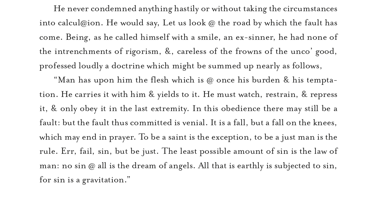
In addition to hearing professional news announcers use singular verbs with plural nouns (There’s thousands of reasons to do this…), which makes me very grumpy, I often see symbols like @ and & used in running text. This is offensive to the seasoned typographer. Don’t do it!
Remember the overarching theme of these essays: Never interrupt the reader!
This is an exaggerated example of the use of @ and & in running text. If you squint, you’ll see the blobs. These, in addition to being visually unpleasant, cause the reader to stop, translate, and then continue. It’s typographically unwise.
In general, the ampersand and the at-symbol are used to abbreviate things when space is tight. In running text – books and similar typography – one should not abbreviate any word. The words “and” and “at” should be spelled-out. This is also true of abbreviations for states – CA, MO, AZ, etc. These should always be spelled-out, except when used as an address. California is a beautiful word; CA is an ugly postal code. Don’t use the postal code in text.
Why?
These characters – @ & and abbreviations like CA, create visual blobs. Blobs interrupt reading because the reader has to stop and interpret them, converting them back to words. This takes time and it interrupts the reader. That violates our objective of never interrupting the reader.
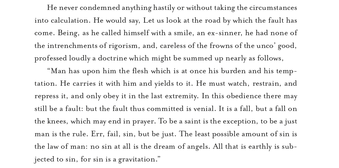
…and this is the same text (from Les Miserables) with the words at and and used correctly. It reads smoothly.
And excellent typography does not interrupt the reader.
Read about getting the typographic tremors in the next blog.


you wrote;
“…the reader has to stop and interpret them…”
Perhaps you do, as it is not common to what you read daily (?)
But it is more like a using a term from another language, once you know it and what it means, you translate that like any other word with ease, n’est-ce pas?
Hi Michael,
I’m not sure about your comment, but I agree that once we are aware of common expressions we read them as quickly as “normal” text. It’s always nice to hear from you.
Brian P. Lawler
Hello,
I study rural Irish culture and society. Somebody has sent me an image of a poster they believe to be from the 1870’s. I don’t know if stenciling was uses in rural Ireland as early as that or if the typeface even existed then.
May I send you an image of the poster for your opinion please ?
all the best,
Tony Donoghue.
Dear Tony,
I’m sorry for the delay in responding. I would be happy to look at the poster to see if I can identify its type.
Brian P. Lawler
The Blognosticator
That would be wonderful, thank you. The typeface has been turned into a crude stencil so there is a possibility it is a strange interpretation of an original font. I cant see any way of attaching a photo of the poster on here. This is my email address: tonydonoghue@gmail.com. If you could please just say ‘hello’ I can then send the photo back to you as an attachment. all the best,
Tony.
As a medical writer, I learned to spell out terms like “less than” and “greater than” in running text; however, I’m encountering a lot of “patients 18 to <65 years of age." Is this type of use of symbols in text acceptable?