Prepositions are parts of speech that declare where, and when, and they are important to proper language.
Typographers have a responsibility to place prepositions where they belong, and not to hang them at the end of lines.
I often see them used correctly, but placed incorrectly. Prepositions belong with the words that follow them (most of the time).
So instead of putting a preposition at the end of a line, and allowing its prepositional phrase to be on the next line, keep the preposition with its expression.
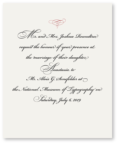
Note the hanging prepositions in the third, fifth, sixth and seventh lines of this invitation. They are all incorrect. They belong on the following lines with the words they describe.
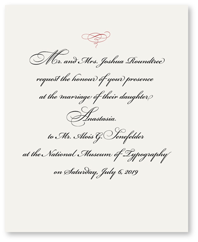
In this version, I have moved all the prepositions to the correct locations. Try reading the two, and I think you’ll agree that this one reads better. It’s refreshing to read excellent typography and not be distracted by hanging prepositions.
I believe that this should also be true of conjunctions – and, or, for example. Keep the conjunctions with the words that follow so they don’t hang on the end of a line.
All of this is a goal for typographers, but it is often impossible to accomplish due to the line length, or getting the type to fit into a certain space. When you can’t get these pesky words to go with the words that follow them, just do the best you can.
The most important message in this short essay is to pay critical attention to the words in every line. Look! Look closely, and read the copy to be sure it reads correctly and smoothly.
Remember the overarching goal of excellent typography: Never interrupt the reader!


