
In my most recent essay on Typographic Discipline I discussed apostrophes and quotation marks. Those are important, and they are the most common typographic audacity I see every day.
In today’s essay I want to bring to your attention the 28th Amendment to the Constitution, that one having been snuck in there last month by an illiterate aide to an illiterate Senator, and signed into law by an illiterate President – all of whom shall remain unnamed.
That amendment is called the I can do it, by God I can, because Microsoft Word allows me to do it amendment.
This relates to one of the numerous typographic atrocities that are allowed (some are encouraged) in that popular word processing program. It is your Constitutional Right to apply “Italic” style to any typeface, even if the designer of that typeface did not intend for it to be Italicized – ever. You can also make type bold – even if it’s not designed to be bold (more on that another day).
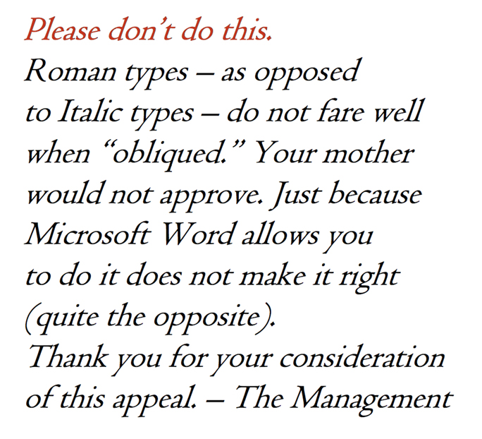
The above sample was typed in Microsoft Word, and the Italic button was clicked to make it “Italic.” That doesn’t work! Use real Italics instead of this horrific “Italic” modifier, and show some class.
William Caslon, Claude Garamond and many other fine typographers are rolling in their graves at the grave typographical injustices that are possible in Microsoft Word.
Type design is an art form, one practiced by studious and attentive people with a mind for detail and the desire to spend months or years designing things that have noble purpose, but which most people simply ignore. Type designers will spend entire afternoons working on the subtle interior curve of the bracket of a capital T, or miss lunch over the descending part of the lower-case y because that’s what typographic design is all about. When a type designer makes a Roman alphabet – one that is designed to stand upright – she does not intend for that alphabet to be sloppily sloped by Microsoft Word! (To be fair, one can do this in Adobe InDesign also, but it’s much more difficult).
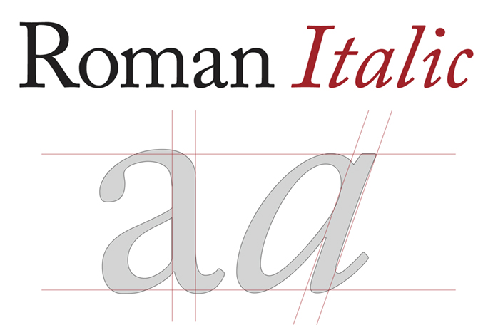
No! A typographic designer will spend a year working on the Roman, then spend an another year working on the Italic variant of an alphabet. I’m talking here about thousands of hours of work in the studios of serious typographers; it is not a casual thing to design an Italic typeface. And, Microsoft Word can destroy it all in a click of the mouse.
And the problem is that people do this all the time and they think it looks good. Au to the contrary! (as they say in French). It looks trés HORRIBLE!

So don’t do it. Avoid using the little I icon in Word. Slap your own hand if it ventures over that little icon! (and stay away from the B icon also!).
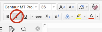
Instead, choose a legitimate Italic typeface to use for emphasis. It’s only slightly more work. Pull-down from the Font menu and choose the associated Italic font to the one you’re currently using. Make your type look professional and thoughtful by being a smart typographer. And, even if the 28th Amendment gives you the Right to do Atrocious Things in Microsoft Word, avoid the temptation and do it right.