
After taking several months off from blogging, I am back with a new special column called Typographic Discipline. In the coming months I will be writing and illustrating essays that describe how to create excellent typography.
I feel that this is necessary to counter a trend I see in many modern publications and books. The new generation of typographers needs to know how to make great typography, and they need to know why it’s important.
I’ll start with a conversation I had last week with a video producer who had presented a beautiful video about the story of Harriet Tubman. Though her visuals were stunning, her typography was riddled with incorrect punctuation. After the presentation I chatted with the producer and asked if she had access to the source files for the video (she did not). I ended up making sketches on Starbucks napkins describing typographic quotes and apostrophes, and compared them to the ugly ones that you get when you type in many popular applications.
I realize, as an old typographer (I will define this as being a guy who regularly sets type by hand with metal type, and prints from that type using a hand-powered printing press) that many of the new generation of creative producers have no historic context for their typography. Changing fonts in my world sometimes requires pulling-down a menu in Illustrator, and at other times it means shouldering a 50-pound magazine of brass matrices and loading it onto the Linotype machine.
Ground rules: I am not one who stands by rules for typography, as they have historically been too dogmatic (I have a wonderful 1930s-era book about typography that says one should not use sans-serif fonts because they will injure the eyes!) however, I see so much bad typography that I must resort to making some strong suggestions – very close to rules.
Very Strong Suggestion Number One: Never do anything in typography that interrupts reading. There are many, many examples of this, some of which I will discuss in these essays. I will refer to this Very Strong Suggestion often.
Typographic Public Enemy Number One: ugly apostrophes and quotes
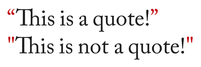
When desktop computers entered the scene (about 1978) the apostrophe and the quote marks were taken from the ASCII character set (ASCII 34 and 39 respectively). There was no distinction between open- or closed-quotes. There were no left or right apostrophes, just a single quote mark, like the one on a mechanical typewriter.
And it is ugly!
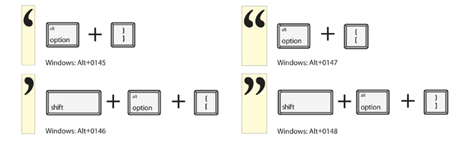
The first Adobe type fonts (PostScript Type One) had correct typographic quotes, but those had to be accessed with a combination of keys (and often still do – see the chart below). Modern versions of Microsoft Word, Adobe InDesign, Illustrator and Photoshop each enter the correct quotes and apostrophes using the quotes key on the keyboard, though they don’t always get it right (more on that below).
However complex the process to get them, it’s always worth the effort to use the correct marks in typography.
One of my students once asked why this is important. My answer was that punctuation is part of spelling. If you use the wrong quotation marks or apostrophes it’s the same as misspelling a word.
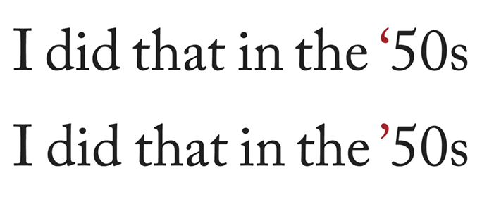
The example on the top is incorrect. The apostrophe faces the wrong direction. This happens when you type the characters in any common text editor. The example on the bottom is correct; it indicates that the apostrophe is replacing something missing to the left – the 19. To get this apostrophe, either type Option-shift-] or type something like x’50s, and delete the x.
When typing on the modern personal computer, the apostrophes and quotes are inserted correctly in most of the common applications, and you don’t need to think about them. There are exceptions, the most common of which is the leading apostrophe on dates like ’50s or I got ’em! These apostrophes should face left; they indicate that something to the left has been left off. If you type apostrophe followed by 50s in Word, InDesign and other applications, the programs assume you are opening a quoted phrase, and insert a right-facing open-apostrophe, which is incorrect. You get ‘50s when you want ’50s.
A simple solution to this is to type the letter x in front of the apostrophe, then the apostrophe, then the numbers: x’50s. Then delete the x. The result will be correct.
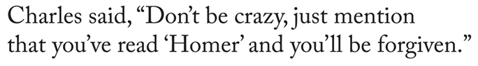
Complex quotations will often include one person quoting another person. For those, you occasionally need a pair of open-quotes, followed by a single open-quote, followed by the quoted phrase. This also happens at the other end where you might need a single closed-quote (same character as the apostrophe) followed by a pair of doube-quotes. Word will usually get these right, as will InDesign. But be careful to proofread to be sure that your text is properly punctuated, as these programs sometimes get spoofed.
Adobe InDesign will import (place) text and simultaneously fix the apostrophes and quotation marks as it imports the text. This is a really important point: InDesign will not do this if you paste text into a document. It will instead accept the text verbatim, and will not scan it for correct punctuation. I notice bad quotes in the local newspaper occasionally. They are usually in captions under photos, an understandable error. InDesign will do this better by placing the text, but you must set the Import Options once for it to do it correctly. Choose Show Import Options when placing text one time, then check Use Typographer’s Quotes. Once you have done it once, it will stay in effect until changed.
Read about the problem of sloping type to make it “Italic” in the next blog.
In April, 2020, I wrote a follow-up article on proper punctuation in web sites. You can read that post here.