
These two caught my eye

Blognosticator Head

At last week’s PRINT13 convention I saw a lot of machines. Most of these machines were incremental improvements on machines I have seen before, and some were not of interest to me because I have limited my bandwidth recently to look only at technologies that affect me. Regardless of my narrow-bandwidth tour of the show, I took note of some exciting new devices on display.

A few years back EFI showed the nascent Jetrion press, a UV-cured ink-jet press that prints labels on pressure-sensitive material. This year they showed the latest of the Jetrion models, one fitted with laser beams that can cut half-way through the printing stock to “die-cut” labels on the fly. I found this very interesting.
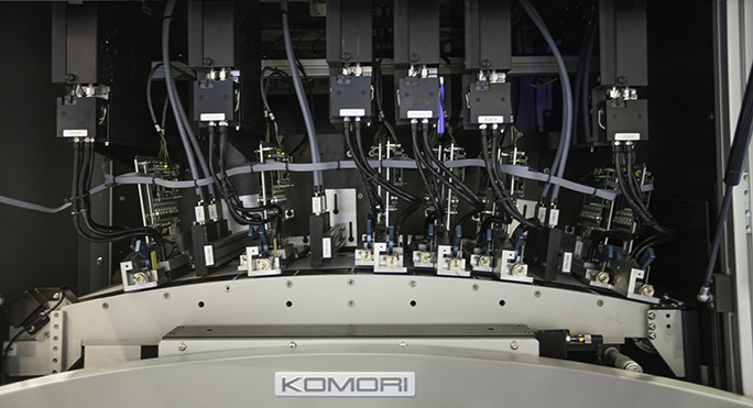
Komori label press

This is the business-end of the Komori/INX/Spartanics UV ink-jet label press. On the left is the white ink and its associated ink-jets, followed by a separate UV curing bar. Next come another color, followed by a curing bar, and then three inks and another curing bar, and last, a sixth ink-jet head. Just to the right of the ink-jet area is the laser-cutting area, enclosed in glass, which keeps the smoke inside, directing it to a ventilation system overhead.

On the other side of the building was a press made by INX (an ink manufacturer) and Spartanics (an engineering firm). This press, called the NW140 UV, will be marketed exclusively in the U.S. by press maker Komori.

The Spartanics press is about half the price of the EFI offering, and narrower (this makes a big difference in productivity).
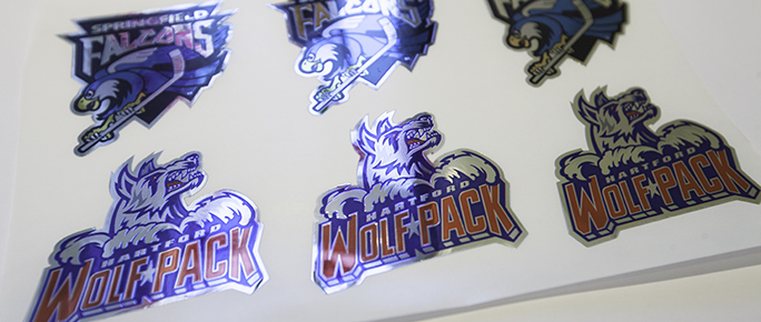
Football labels 2

These labels were printed on aluminized paper, then “die-cut” on the Komori/INX machine, the cutting being done by lasers. The moderately complex die lines seemed not to slow the process at all.

At seven inches in web width, and with a production speed of 80 feet-per-minute, the NW140 press produces very nice looking products with printing, die-cutting and weeding (removal of the non-image material) on the fly. The press prints with white (optional), cyan, magenta, yellow, black, and one additional color. Resolution is a rather low 600 ppi, but in the samples I saw, this mattered little (they chose good samples). One of their samples, a wine label, was of very poor quality. This was likely the result of someone converting the original into a really bad JPEG image with lots of digital artifacts. With that exception, the labels being produced were of unquestionable commercial value.
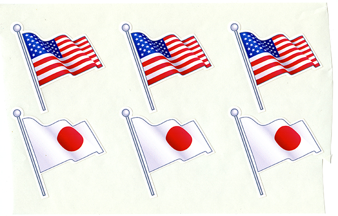
Komori labels 1

These flag stickers were being printed and cut on the machine during the show. A simple design with a simple die-line made the process very quick.

It’s done with smoke and mirrors
What makes these machines so interesting is that the “die-cutting” is done without dies. The method used by both companies is to use CO2 lasers, guided by mirrors, to burn through the printed substrate – and not the base – as the material rolls through the press. The laser beams cut and spark, and create a lot of smoke, which is evacuated from the machine by a large vent pipe going out the top.
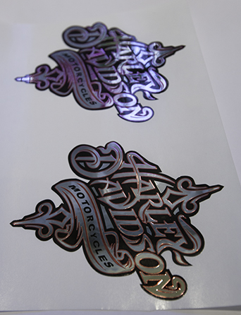
Harley labels

These Harley-Davidson labels were the most complex samples produced by the INX team. The machine produced these without difficulty, and the quality is admirable.

Variable-data die-cutting?
With this, I assume, it’s possible to make variable-data dies, which is to say that each and every label can have its own die line, and those die-lines can change on the fly as the machine runs. Though neither company was demonstrating true individualized die-cutting, they were printing variable-version cutting, making short runs of one design, followed by short runs of another design.

The cost of making and mounting rotary dies on a flexo press is significant. Though recent developments in magnetic dies have changed that for the better, it’s still the business of a die-maker with complex milling machines to make the cutting part of an inline die for label printing. Costs are also significant, with figures in the hundreds of dollars per die being normal.

With either of the machines mentioned above, it’s now possible to make complex die-cut labels without spending any money on dies.

Another solution to this is the one provided by ESKO – the iCut – which is a post-press offline digital “die-cutter.” It’s a machine that moves a surgical blade around on a printed sheet to cut, or partially cut the surface of a preprinted piece. Though the iCut is a nifty machine, it doesn’t compete with the laser-cutting on the Jetrion or the Komori NW140 press. Consider handling alone, and the machine that prints and cuts simultaneously wins the argument.

The Komori press is about the same price as an HP Indigo 4000-series digital press, but at only half the web width. Again, though, it is the ability to make finished labels on the machine that distinguishes these devices.

If I needed 300 die-cut labels printed on an aluminum-surface pressure-sensitive material, the INX/Komori machine could complete that job in minutes. It would be hard for an Indigo or conventional flexo press to do a similar job in a similar amount of time.

 

Posted in New technology, Printing and Printing Processes, Technology | Tagged , , , , , , | Leave a comment

Epson’s new dye-sublimation printers enter the market for ink-jet printed fabric

Blognosticator Head

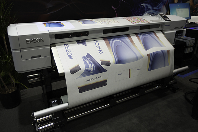
My friends at Epson were showing a couple of new ink-jet printers at PRINT13, printers which are designed to fit into the fabric printing industry.

I’m working on a project right now that involves dye-sublimation printing, and I was impressed by Epson’s new offerings. The company has two, which are the 64-inch-wide SureColor SC-F7000, and a 44 inch version of the same printing technology.

Epson fabric printer

The Epson dye-sublimation printer at PRINT13. The company was printing on dye-sub paper, and showing examples of fabric transferred from the paper. These printers feature roll take-up, and very large ink reservoirs (on the extreme right end of the photo).

My project will be described in a blog in the near future; it’s a major development for me, and I will share it with the world in a week or two. Part of that project will be some large sheets of Lycra fabric sublimated from paper imaged an ink-jet dye-sublimation printer.

Though I have toured the plant that will be doing my printing, and I have seen numerous dye-sublimation devices at the trade shows, I have not done much of this kind of printing myself. That’s about to change.

Dye-sublimation printing on fabrics is done by imaging backwards onto paper, then pressing that material against a synthetic fabric – Lycra polyester is the most common – and applying heat to the sandwich. The heat activates the dyes, creating a gaseous state to occur. The colorants in their gaseous state are then transferred to the polyester material. The result is a colorfast image with brilliant color, tremendous saturation, and reasonable resolution (limited by the weave of the fabric itself).

At PRINT, the Epson 64-inch dye-sublimation printer was printing fabric images onto paper, which was then rolled-up onto a take-up spool. The company did not have the transfer press at the show – that comes from another manufacturer – but they did have many beautiful samples to share with visitors to their booth.

Also on display at the show was a one-off shirt printer that uses fabric inks to image onto cotton and cotton-blend T shirts. That printer is capable of printing short-run production. The demonstrations of that printer were also impressive. The color looked beautiful, and the speed seemed to be reasonable for making one-off or short-run T shirt runs.

I’m looking forward to telling you about my big dye-sublimation printing project. Keep an eye on The Blognosticator to learn about it!

Posted in New technology, Printing and Printing Processes | Tagged , , , , , | 2 Comments

I have seen the future of newspaper printing

Blognosticator Head

A few years ago I got a chance to see the Hewlett-Packard M400 press in prototype form, and I wrote glowingly about that press. It was the first time I had seen an ink-jet web press. It was, and is, impressive (if you’ll excuse the expression). The HP machines – now there are several of them – come in sizes up to 40 inches in web width, and they print at approximately 400 feet per minute. The weaknesses of these presses has always been that they only print roll-to-roll (HP says this is a feature), requiring conversion on an offline machine that takes the roll of printed material and cuts it into sheets, folds it, and delivers it as a finished product.

Other manufacturers of ink-jet web presses include Screen, Kodak, Ricoh, and several others. Xerox has a delightful competitor in its Ci-Press, which prints on a roll of paper with its crayon-printing technology (I really like that one).

TKS ink jet press

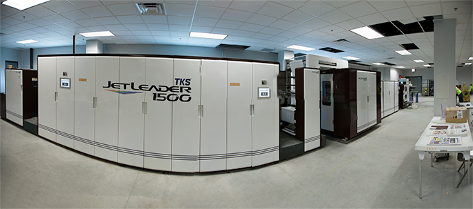
This is the TKS JetLeader 1500, the first ink-jet newspaper press in the United States. This press is capable of printing, sectioning, cutting and folding finished newspapers in one operation. On the press last Monday we saw an edition of the Wall Street Journal printed. Directly in front of the camera is the section of the press where the ink-jet printing is done. Paper feed is from left-to-right.

The sleeper in this market is a medium-size Japanese company called TKS which makes offset newspaper presses, and which entered the market two years ago with the Jet Leader, an ink-jet press made in the style of an offset press. This is important because it’s the after-printing part of printing that makes the difference between just printing and actually delivering a finished product. The JetLeader 1500 is a publications press in every sense of the word. It prints, folds, cuts, sections, folds again, and delivers finished, sectioned newspapers (or other publications) in one operation – paper goes in one end; finished newspapers come out the other end.

No one else does that (KBA has a similar machine called the RotaJet that they developed with R.R. Donnelley. As far as I know there are none of these yet in this country).

I’ve seen several machines at DRUPA where an ink-jet press is set up inline with a separate sheeter/cutter/folder, and though these have the potential of working well, in the demonstrations they don’t work at all – or they seem to be poorly matched. In several cases the sheeter/cutter/folder is of the class of machines that would be found in mailrooms, or in-plant printing of lightweight materials. Anyone who has ever run a news press (and I have run a news press) knows that the folder must be an industrial scale device to work in this environment.

TKS Press delivery

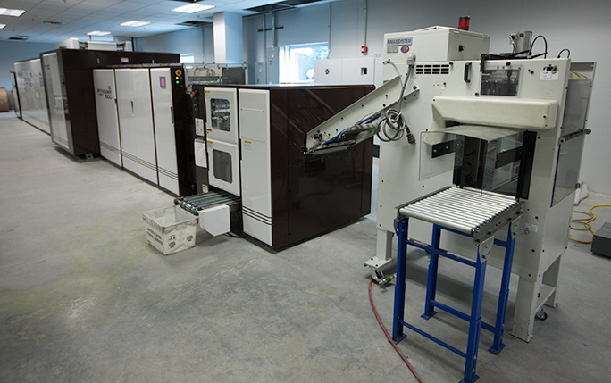
This is the delivery end of the JetLeader press. In the center of the photo is the delivery conveyor; on the right is an optional bundler which will stack finished newspapers then strap them for distribution. This press will soon have an automated conveyor system added to move finished papers off the press to a distribution area in the adjacent room.

Cutting through 72 pages of newsprint is the work of a very sturdy machine. On offset printing presses this task is done by a guillotine blade embedded in the middle of a turning cylinder. That blade comes out each revolution (called the press cut-off) and punches through the whole newspaper at once. The blade exerts tons of pressure on the paper as it cuts through the newsprint. These blades are typically serrated (you can see this at the edge of your daily newspaper).

Last Monday morning I took a painfully long cab ride (morning traffic) to visit the new plant of the Newsweb Corporation on the northern edge of Chicago. This is a company that prints newspapers. They don’t publish any newspapers, they just print them – about 100 of them. They print the Spanish language weekly, the Polish language weekly, and a whole bunch of newspapers in between.

Newsweb is the first company in the U.S. to install a TKS Jet Leader press. It has been in their older plant for just about one year, and it has performed admirably. They moved it during the last couple of weeks to the new facility, and were demonstrating it for the first time this week.

When I first met the company’s president, Rodd Winscott, last year he had had the machine for only a week, but he was thrilled with the capabilities of the machine. His company also has two Goss Community web offset presses, so he has a lot of experience printing newspapers. He explained to me in our first conversation that he measures waste in hundreds of thousands of pounds annually, as all printing companies do. Make-ready accounts for most of this waste, and it is part and parcel of the process to divert the output of a news press into the dumpster.

On the new TKS Jet Leader, he told me they had just completed the first week of commercial production, and had run a variety of newspapers. Total waste: one newspaper.

One newspaper.

Having an ink-jet newspaper press gives Newsweb Corporation the ability to print short-run newspapers. The press has essentially no make-ready, so papers can be run in small quantities, then another newspaper can be printed. Unless the web needs to be changed to make a different size paper, they can change from one title to the next without even a gap between the first and the second publication. This makes it possible for the company to sell to high schools and community colleges, to clubs and organizations, to anyone. Gone are the days when it took 1,000 newspapers of make-ready to print 1,000 newspapers that were salable.

I saw Mr. Winscott at PRINT on Wednesday this week and asked him how it was going. He told me that the firm has ordered a second Jet Leader to complement the first, and that his year of experience with the press has been excellent. The press makes possible an array of new opportunities for his company, and they are reaping the rewards of ink-jet printing for a wider audience.

Goss newspaper press

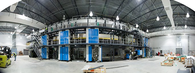
The beautiful new three-story Goss Universal 75 press being erected in the plant at Newsweb Corporation in Chicago. The press is being readied for production in the next few weeks.

Also being assembled in the new Newsweb plant is a brand new Goss offset newspaper press – a Universal 75 with four printing towers and two collecting and binding stations. This is the first completely new newspaper press I have seen in years, and it is further testament to the success of Newsweb Corporation. When their building is completed later this fall, they will move one of their two older Goss Community presses into the plant to pair with the new Goss machine. In the adjacent room will be the two TKS Jet Leader machines doing shorter run production of newspapers.

When I asked Mr. Winscott what he considers his minimum run on the TKS press, he said, “One hundred!” That’s a pretty amazing statement from a man with a newspaper press, but he knows that with the new ink-jet presses, his company can profitably produce runs this small.

With production capabilities like this, it’s hard to believe the oft-rumored line that print is dead.

It’s absolutely not, and I have proof!


Posted in Adventures, New technology, Technology | Tagged , , , , | 2 Comments

Vacation for the Blognosticator

Blognosticator Head

I finished ten weeks of teaching summer quarter on Wednesday, I turned in my grades on Thursday, and on Friday at the crack of dawn my wife and I headed up California’s Highway 101 to the Bay Area, and then across the Golden Gate Bridge into Marin County, and onward to Sonoma and Mendocino Counties.

We are taking a short California vacation because next week I have to be in Chicago for PRINT 13. We’re staying tonight in southern Humboldt County on the famous Avenue of the Giants, a stretch of road that is surrounded by some of the oldest and largest trees in the world. These are the Sequoia Sempervirens variety, some of which exceed 400 feet in height. They are unbelievable.

MirandaNeon

This is the timeless neon sign in front of our resort. There are enough spider webs – and spiders – on this sign to impress the greatest entomologist! This actually means that the sign has not needed repair in a long, long time.

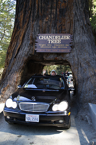
We’re staying in one of those cabins where we stayed in the 1950s when we were children. And, earlier today, we drove through the Chandelier Tree in Leggett, a living redwood tree that was hollowed-out in the 1920s to allow just this – automobiles to drive through the tree. It’s amusing to think that this giant tree continues to thrive despite having probably millions of cars drive through its gigantic trunk. My station wagon cleared the walls with about eight inches to spare.

BrianInTree

…and this is me with my head sticking out of the sunroof. The hood ornament was crooked for three days before I noticed it and fixed it.

Believe it or not, there was a long line of cars with patient occupants waiting to go through the tree. Each of us stopped at the exit and posed for photos. It was strangely like the same event I experienced in the back of a 1956 Mercury station wagon with my dad at the wheel. This time I stuck my head out of the sunroof and waved as my wife took a photo. It was charming, and I was impressed that one can still drive a car through a tree.

As I sat on the porch of my cabin this evening, I took a phone call from a friend who was having trouble with a time-lapse movie he was making. I spent about thirty minutes on the phone; I was working from memory, he was working on the screen of his computer. In the middle of the conversation we talked about Syria, and a little about Iraq, and a little bit about Afghanistan, then back to QuickTime Pro 7. It was a wide ranging conversation.

This is supposed to be a vacation!

It was nice to talk to my friend, and I don’t mind these “tech support” calls because they are a great opportunity for me to flex my mental muscles and work from memorized menus rather than real ones. I have gone almost a day with no access to e-mail, and it will be another two days before I am back on the Internet. I’m typing on my MacBook Air on battery power. My wife is reading a novel on her iPad while I am writing this. Far from primitive, I’m enjoying being “unplugged” at least for a couple of days. I don’t want to be connected for this vacation, but I am content to be writing.

Tomorrow we plan to hike a trail in the Redwoods National Park, followed by a drive along a lonely road to the “Lost Coast” – a section of California’s northern coast which highway engineers deemed too rugged to build a highway. I am carrying my GigaPan camera mount and a bag of camera equipment. I don’t yet know if there will be panoramic opportunities along that road, but I hope I can make at least one image while we’re out there.

Another day in the redwoods

It’s now the end of the second day on the Avenue fo the Giants. We started with a nice homemade breakfast in our cabin, followed by a nice hike along Bull Creek in the Humboldt Redwood State Park. Then we took the drive west along the Mattole Road from the western edge of the state park to the ocean. This is obviously a road less traveled. It starts by climbing several thousand feet out of the redwood forest and into a series of changing ecosystems that range from grassland to huge Douglas Fir trees interspersed with California Madrones.

Founder's Tree

This is the Founders’ Tree, one of the most impressive of the Sequoia Sempervirens in the park. It stands over 400 feet tall, and it’s thousands of years old.

When finally we reached the tiny town of Honeydew, numerous hairpin turns later, we stopped to buy a popsicle and to see the general store. Gas was available for $5.00 a gallon, and there were a variety of supplies that anyone that far away from civilization might need. The locals came and went, packing boxes of groceries and drinks. It’s more than an hour to the “big city” to the east, that city having only 300 citizens.

From Honeydew we continued on the another metropolis – Petrolia – which boasts 60 citizens. In both cases, these small towns serve as both a source for supplies, and the social center of each community.

California is currently hosting two huge fires: one along the northern edge of Yosemite National Park, the other just a few miles east of Highway 101 in Humboldt County. Thousands of firefighters are working to contain these fires and to rescue as many homes and buildings as possible. In Honeydew, the local volunteer fire department has cancelled all burn permits – they don’t want to invite the disasters of the rest of the state upon themselves in this hard to reach valley.

The road to the ocean finally delivered us to the shore – so close that there were Tsunami Zone warning signs along the side of the road as it crossed a couple of miles of sand dunes at the westernmost point of California. Soon, though, we were back up in the mountains on a steep and curvy road that takes it time getting from the “lost coast” to the town of Ferndale.

I never found a location for a GigaPan photo, but I did take a lot of still photos, and a couple of experimental vertical panoramas in the Redwood State Park. I’ll process those when I get home on Wednesday, and if there is anything exciting there, I will post an example here.

Tomorrow it’s another day of day hikes and redwood tree adventures. This place is really spectacular.

Posted in Adventures | Tagged , , , , , , , , | Leave a comment

The Microsoft conundrum

Blognosticator Head

On the announcement last week of Steve Ballmer’s pending retirement, Microsoft’s stock shot up seven points as investors cheered for the future of the company without him. On NPR’s Marketplace they played recordings of Ballmer shouting “DEE-VEL-OH-PERS!” over and over and over again. He did this till he was hoarse. One investor analyst told a reporter that in order to succeed in this business today, you have to have customers who love you. And he said no one loves Microsoft, they tolerate Microsoft.

This is not a good position to be in for one of the world’s most important companies.

Let’s run the MS Scorecard here:

Microsoft has a stable of products, some are tremendously successful, others are worse than duds. In the enterprise computing business, Microsoft dominates with their tremendous server software. There are so many Microsoft-based servers that the Earth would fall out of orbit if they were not here. Their Active Directory software is at the heart of every security entry point on every enterprise server in the world, and it works.

Thumbs-downIn the smart phone business, Microsoft is playing a six-years-late-and-a-billion-dollars-short game; they are taking on Apple and Google (Samsung et al.), companies that people love, with products that people love. They feel that they have to try to be in the smart phone business, but theirs is not a winning position, and their phones are lame.

Thumbs-upMicrosoft Excel is about as good a spreadsheet program as anyone could want. My only gripe with it is that they have forsaken the really helpful on-screen help windows, substituting advertisements instead. This is irritating. Otherwise it’s a must-have.

Thumbs-downMicrosoft Word is the word processor that everyone uses. Nobody loves it; we tolerate it because it is essentially alone in the field of word processor software. Bloated, overly complex, slow to load, and not very good at spell-checking, Word is the necessary evil. Would it pain them to put in a keyboard command for Save As? Word would also benefit from adding GREP, and enhancing their scriptability beyond Visual Basic, which isn’t fun or easy. They need to put in fully-compliant Javascript for it to be really good.

Microsoft claims that people can use Word as a publishing platform. Has anyone at the company ever tried this? Even Microsoft Publisher is better than Word at that (in fact, Publisher is very effective for simple publishing projects). Word as a publishing platform is hopeless; you just can’t get it to do what you have in your head, and that’s unfortunate. Word’s bizarre “feature” that changes the font, the weight, the color and the point size when you click at the very end of a document is a bit of bad user interface baggage that they have been dragging since the 1980s. They should get rid of that “feature” because it’s NEVER what users want. Never.

Thumbs-downPowerPoint is nice, but aesthetically challenged. Everyone uses it, but again, they tolerate it. It’s a crutch, it is a horrible typographic environment, and is a boring program that helps people make boring presentations. It works, that’s all.

Thumbs-downMicrosoft Project is an excellent project planning program with arguably the worst user interface in human industry. What it does, it does really well, once you learn how to work with its insane dialog boxes. Do the various product teams at Microsoft ever get together to compare user interface functions? Menus? Functionality? I doubt it.

Thumbs-upPublisher is pleasant and easy to use, and it has a delightful set of tools – especially the color selection tools – that are a gift to the amateur publisher. It is acceptably fast, quite agile, and it’s easy to learn. There is hardly a printing company on Earth that will accept files from Publisher (except PDFs made from it) for printing. They treat it as a pariah, and that’s too bad because it’s a surprisingly spry program. Publisher’s weakness is in its inability to do anything meaningful with images. The company doesn’t want you to have a direct link to Photoshop because – God forbid! – you might use it and, then, what? Instead, they let you do dumb things to photos in Publisher, and that’s not helpful.

Thumbs-upMicrosoft X-Box is a stunning piece of technology, and is the leader in its field. Consumers love it, and that makes it an impressive exception to the toleration level of the company’s other products. X-Box is exciting, flexible, easy to use and innovative.

Thumbs-downMicrosoft Windows is, and always has been a hatchet job. A bad copy. Unintuitive and uninspired, it has driven owners bonkers since it came out in 1998, almost a decade later than promised. I have always been disappointed with Windows because it isn’t helpful. I have learned to tolerate it when I use it. My usual approach is to launch it (muttering curses at the stupid Control-Alt-Delete thing they could have fixed 20 years ago), then move as quickly as possible into the Adobe Creative Suite which works beautifully on Windows. The pain and suffering come when I have to exit the Creative Suite and return to Windows to complete something, to copy files, log-on to a server, etc. Windows is unfortunately ugly, and a long-term disappointment to me.

Thumbs-downWindows 8 is not a success, according to the trade press, and according to market acceptance. A single digit percentage of Microsoft’s customers have adopted it, and that’s not good. Apparently it is one of the reasons that Mr. Balmer is leaving the company. They might argue that it will take a while for people to appreciate its new look and feel, and they are right. It’s weird, and again, not helpful.

I have tried Windows 8, though briefly, and I found it to be confusing. I wasn’t impressed by the boxes with functions in them. I was confused by the difficulty of finding a place to look through the disks and memory devices connected to the computer. When I did locate my files, I managed to get something done, then I couldn’t figure out how to get out of there (Escape). Escape is a good word to describe a user’s attitude when using this new version of the operating system – they escape from it. At least they took the stupid Control-Alt-Delete thing out, at last! I fear that DOS is still in there.

Thumbs-upType font design: Here Microsoft shines. I have always been dazzled by the company’s commitment to the design of beautiful and functional type fonts (with the exception of Comic Sans, Century Gothic and the misguided Book Antiqua). The company has kept Matthew Carter in work for decades, and in the process has fostered some of the most important type designs in modern times. They have also kept Steve Matteson busy with recent typographic changes to Word. It is befuddling to note that they have spent a lot of cash to make new fonts, but they don’t have any applications that use these fonts well. I congratulate them on their contributions to typography, but remain confused as to what motivated them to do this.

Thumbs-upAnd, speaking of fonts, OpenType, which Microsoft created with Adobe (as part of its vendetta against Apple) is the best thing that has happened to type since Gutenberg. Seriously. OpenType is stunning, effective and thoughtful technology. The features benefit type designers, typographers, publishers and even consumers. OpenType is fabulous. Too bad the company doesn’t publish an application that takes advantage of the features provided by OpenType. Another irony is that Microsoft ships TrueType fonts (an Apple technology) with their Windows operating system. Why?

I’m leaving out scores of other products and embedded technologies, I am sure, but these are those that we in the printing, publishing and photography industries experience day to day.

And, I am sure that some of you will simply label me a Microsoft hater, and will call me unpleasant names. In response to those accusations, I argue that I have tried for decades to like the products that Microsoft makes. I don’t hate Microsoft, I am confused by them. I use many of the products that Microsoft makes, but I have never loved anything that Microsoft has made (OpenType is the exception). I would never stand in line at my local Microsoft Store (another misguided enterprise that is part of their vendetta with Apple) to buy anything they make, improve, update and ship.

I use their products because I have to use them. I don’t love them.

I tolerate them.

Thumbs-upGood luck to Mr. Balmer in his retirement. We shareholders hope the company will improve in his absence.


Posted in Business, Software, Technology, Typography | Tagged , , , , , | 2 Comments

Multiple displays save many dollars in production

Blognosticator Head

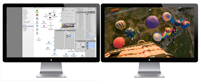
I work at a Macintosh computer with two 24-inch Apple Cinema Displays in front of me. It looks like the console of an air traffic controller. The two displays give me 39 inches (measured) of horizontal view, and just about 13 on the vertical. Sometimes visitors see this and exclaim that computer greed has taken me over.

Cinema Display pair

This is my two-display set-up with screen captures inserted (just like the ads in the paper!). Notice that I have Photoshop palettes open on the left display (and one of my hard drives is open). On the right is the image with no interference from the palettes.

I respond that having two displays improves my productivity. It’s quite simple: I never open or close a palette; I never have to remember where to get a tool while working in Photoshop or InDesign, and I just move about, clicking and choosing to get my work done. The left display is primarily for tools and palettes. The right display is clear for my work area. It’s not hindered by floating tool palettes or color pickers. It’s just the page or the photo – unhindered by software clutter.

Prepress productivity
Years ago I did a productivity study of prepress shops in California. I studies the use of film, masking materials (does anyone remember Rubylith?) and time to produce composite color pages. In some shops the productivity was low, in others it was extraordinarily high. In the cases of the high-productivity, it was access to the right material – in the correct size – at an arm’s length that seemed to make the difference. Shops that went to the trouble of cutting materials to useful sizes, and having a stock of these materials handy were measurably better at getting work done.

So, with that analogy at hand, isn’t it better to reach and get, rather than search around, floundering, trying to find something you need?

Money is time, and vice versa
A 27-inch Cinema Display (or similar device from another manufacturer) is $999 list price (and usually the street price, too). Buying one is a good move for any prepress workstation (managers make note: give them good tools, and they get more work done!). Getting a second one is moderately expensive on initial analysis, but it’s a bargain when you consider improved productivity. Budgeted Hourly Rates for prepress are in the $3.00 per minute range ($180 per hour).

How much does a menu cost?
I tried this hundreds of times to get an average, and it works out to about six seconds to access most first-level menus, and nine seconds to access second- and third-level menus in most of the Adobe applications (Image>Adjustments>Shadow/Highlight, for example). If I work on images in Photoshop, I find that I must use two to three palettes per image, so that’s about 25 seconds total. If those palettes are already open, it takes about half the time to run the mouse over and get the tool (unfortunately, menus can’t be left open like palettes can). I figure I can I save approximately 48 cents per image by not having to get the palettes every time I need one.

Extrapolating this into a shift-long savings, the not-going-to-get-menus value is proportionate to the number of images and the number of jobs you process. But, I would proffer that an average prepress operator handles over 100 images and other files a day. If I estimate that I can save 48 cents per image, and I handle 100 per shift, that’s $48.00 per day in saved time not accessing palettes. Now, let’s look at that $999 Cinema Display once again, and consider how long it takes to pay for it with improved productivity… a payback of just under four weeks. That means that the other 48 or so working weeks of the year are free.

Of course it’s easier to justify this purchase by the savings of time (as opposed to money). If prepress pros save a few seconds here and a few more there, the time adds up. In a single shift, the time saved is significant, allowing more work to be done in the same shift. Everyone benefits, especially the customer, because there is less time spent getting their job ready to print.

The economy of two displays
A second display is not an act of gluttony, it’s a commitment to productivity.


Posted in Mistakes you can avoid, New technology, Technology | Tagged , , , , , | 2 Comments

Drawing a Coleman Lantern with Illustrator’s 3D tools

Blognosticator Head

In my last blog about the failure of my Cinema Display, I included a detailed illustration of a Coleman lantern. This was dredged entirely from memory, and included as an after-note in an illustration of a heliograph that I built in junior high school.

Heliograph illustration

After I posted that blog I realized that there was some instructional value to the lantern illustration because I did it with Illustrator’s odd but effective 3D tools. They are found under Effect>3D>Revolve, etc. I like these tools, but they leave a lot to be desired (more on that later).

The lantern is relatively easy to draw if you have a sense of the construction of such a device. It is made up of several simple parts, a canister of fuel at the bottom, a regulator valve in the middle of a cylinder above that, then a base for the lantern glass, the glass lens, and two tiers of steel caps on the top, one provides a vent for the hot gasses escaping from the lantern.

Then, on the very top there is a machine screw and a wing-nut to hold the glass and the top caps on, and a wire handle that hinges from the lower top cap.

Coleman Lantern illustration

This is my finished Coleman lantern illustration – it’s a little fancier than the one I used in the heliograph illustration. It’s made up of some relatively simple parts stacked atop one another.

In Fundamental Drawing in college I learned how to dissect objects into their primitive shapes: rectangles, cubes, spheres, cones, etc. That’s all it takes to draw the lantern, or any other object. Divide the object into its primitives, and begin. In Illustrator that’s easy because the primary drawing tools are primitives: lines, polygons, rectangles, circles, ellipses. Everything else we draw is either a combination of primitive shapes or a modification of primitive shapes.

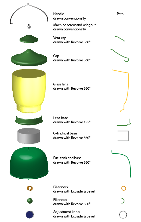
To draw my lantern, I considered the lantern parts from bottom to top, then drew them in unwrapped form. Unwrapping a 3D object means to think of its profile only, revolved around a center pivot point, which is what Illustrator does in its Revolve controls. The program will do a nice job of creating realistic objects, complete with shading. It helps to have a fast processor and a fast display card, otherwise you may have to wait while the computer catches up with your drawing’s complexity.

Lantern illustration diagram

This is the illustration, exploded into its parts. On the right are the profiles of the paths used to create the 3D objects in the illustration. These paths are all you need to make realistic parts of an illustration. After drawing a path, select it, then choose the 3D tool to cause it to become a 3D part in your illustration.

The fuel tank/base is a spherical shape concatenated with a cylinder. Drawing an object with one straight side, turning into a half-round curve will do the trick. To make it more realistic, I put a little half-round curve at the very bottom to create the base seam on the bottom, as shown here:

Base seam

The cylindrical base is really easy – it’s just a three-sided line that is revolved into a cylinder in Illustrator. Make the stroke of the line medium gray, revolve the object, and set the light source at the left edge of the illustration to put a nice gradient onto the surface.

The base for the glass lens is a slightly more complicated path, with a bump at the base and a rolled top. The profile of that path looks like this:

Lamp base detail

After drawing this base I had to experiment with the degree of rotation needed to wrap around the front of the lens, but not to go beyond that. It turned out that 195° is the right amount for a nice looking base.

The lens itself is pretty easy. It’s a rounded cylinder stroked with yellow, then revolved 360°. For the purposes of this lesson I did not put the gas tube, the mantels and the tiny adjustment lever inside the lens; that’s too much detail for this illustration.

On top of the lens are two cap pieces which are very similar. I used one to draw the second. They are both stroked with green, then revolved 360° to make their shapes. At the top are the machine screw and wing-nut, both of which I drew as conventional 2D parts in Illustrator. Drawing screws is easy, but there are a lot of small details you have to get right. I drew one thread, then propagated them downward to make the screw. The wing-nut is an easy item to draw; I have one on my desk that I used as a model. Adding a simple gray gradient makes it look almost real.

The wire handle was also easy. I drew half of it, made it look good, then reflected a copy of the half, joined them at the intersection, then outlined the path, stroked it to make it show better against the other parts.

When finished, the lantern looks pretty much like I remember them to look, and I was able to make it with Illustrator’s 3D functions. It’s easier than it appears if you know how to dissect a drawing into its component parts.

Coleman Lantern outlines

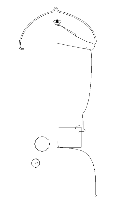
To demonstrate how “simple” the lantern illustration is, this shows the entire thing in Illustrator’s Outline view. There are a total of 12 major objects in the illustration; some have sub-parts (the machine screw has quite a few).

What could Adobe do better with Illustrator’s 3D functions? When you make a 3D object in Illustrator, it’s drawn internally with hundreds, sometimes thousands of Bézier curves and lines. The complexity of these components is mind-boggling. If you Expand one of these objects, you will discover just how many microscopic things Illustrator creates when making these parts. Many times there are three, four, five – ten copies of a line on top of another line that has the same characteristics. Editing things in Illustrator can take a long, long time, and can occasionally be maddening.

When Illustrator makes shaded gradients, it does so with scores of rectangles and other shapes, each filled with a slightly different shade of the same color. It would be much nicer if the program created simpler objects filled with gradients made with the gradient function that is used in the 2D part of the program. That would be really nice, and it would make fine editing tremendously better.

I recommend that you not attempt to edit the objects created by Illustrator’s 3D tools and then Expanding their appearance; it’s too frustrating.

Otherwise, these tools are functional and effective. Illustrations made with these tools are very attractive and realistic. If you don’t look behind the scenes you’re better off.

Author’s note: Coleman is a trademark of the Coleman Company, Inc., a subsidiary of Jarden Corporation. I’m sure that their lantern is covered by various trademarks, to which I make no claim.
Posted in Art, Software | Tagged , , , , , , , | Leave a comment

U-U-U means S-O-S for my Cinema Display

Blognosticator Head

I was a ham radio operator as a teenager, a hobby I did not pursue after high school. I was involved in too many activities to keep it going – scouts, college, girls, travel, marriage, being a parent, owning a business, etc., etc.

When I got my Novice license, I had to take a Morse code test at five words-per-minute, and I was barely able to pass it.

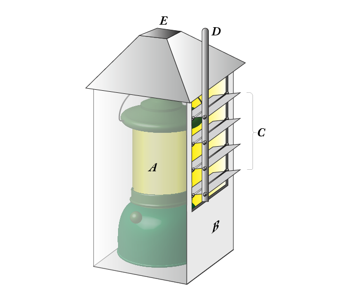
Even though I didn’t excel at audible code, I was excited about visual code, and I practiced with my friend Chris Twig quite often. We would send Morse code with two hand-made heliograph devices we made in metal shop at our junior high school. They were made of sheet steel with louvered doors on one face, and an arm to open the louvers. Inside the metal box we put a Coleman lantern, which got very hot. Chris would sit on one mountain and I on another (we lived on opposite sides of a neighborhood in the Oakland hills). We would spell-out messages in Morse code by opening and closing the louvers in our heliographs and write them down. Then, at school the next day, we would talk with excitement about our nighttime code-flashing. It sounds strange today, but in the early 1960s this was really cool.

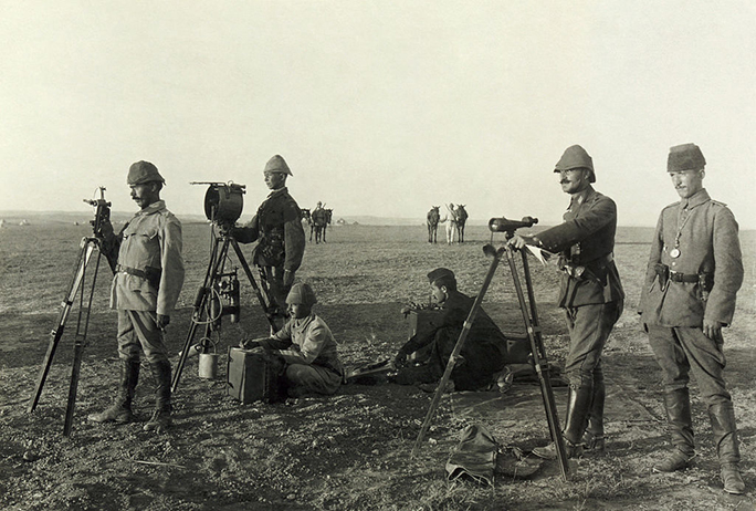
Turkish heliograph

Turkish heliographers (I guess that’s what they would be called) in World War I using a heliograph (second from left) to signal over a long distance. The man sitting on the ground is probably either taking-down a message or reciting one to the operator. These heliographs used sunlight and mirrors to create a signal. Photo: Library of Congress.

(This is really geeky!)

Heliograph illustration

This is what my heliograph looked like. A was a Coleman lantern, B is the sheet-metal case. At C are the louvers that are hinged at the middle to open and close, D is the arm to control the louvers, and E is the vent for the considerable heat put off by the lantern. In my next blog I’ll discuss how to draw a realistic Coleman lantern in Adobe Illustrator using its 3D tools.

Occasionally I can interpret Morse code effectively, but it’s harder and harder as time goes by. The code that drives me completely off my ham radio rocker is the Nokia phone code that signals an incoming call: S-O-M. I guess they didn’t want to make it S-O-S because – if played at the wrong place and time – it might initiate a search by the Coast Guard or some other lifesaving organization. So, instead, they signal S-O-M, which means nothing, except “drive ham radio buffs crazy!”

This morning my right-hand Apple Cinema Display started sending a visual code: dot-dot-dash, which is U-U-U-U. Simultaneously the top of the screen got really dark, meaning that one of the fluorescent tubes inside this display has died (I confirmed this with an Apple technical memo explaining the code and the cause).

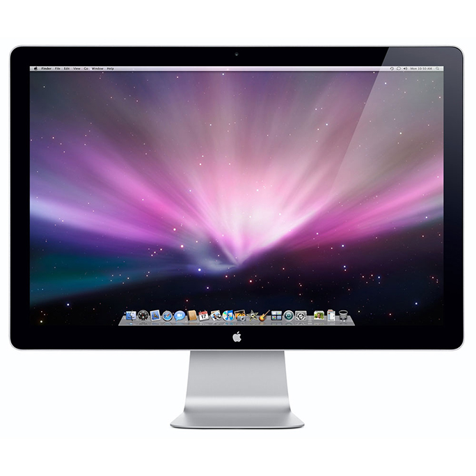
Cinema Display

This is the original 23-inch Cinema Display from Apple. It has two small fluorescent tubes (maybe three) in the back which illuminate the LCD screen to produce an image. One of those tubes has failed on my right-hand display, and it cannot be repaired.

I have been using two of these displays now for over 13 years. They have served me well, and I have enjoyed their exceptional color quality and sharpness. I sent this one out about eight years ago for a lamp replacement; Apple did the work, and in two days it came back as good as new. That lamp replacement held until today. Now, there is no avenue for repair. I looked on the Internet, and I find a lot of parts and repairs for newer LED units, but none for the fluorescent lamp models.

24-inch Cinema Display

This is the “new” one, arriving next week. It is brighter, higher in resolution, and has better image contrast and viewing angle. I’m looking forward to having at least one of these on my desktop.

I’m content that I got 13 years of service out of this display, and this morning I bought a used, Apple 24-inch Cinema Display, one that has an LED light source, and is in the nicer aluminum case with the pedestal stand. It will be here on Tuesday, and I will then run one newer 24-inch display, and one older 23-inch display. I suspect that this will not please me because the brightness and contrast of the newer model will make the old one look tawdry, especially sitting right next to it. So, I will probably succumb and buy a second 24-inch model next week and have two matching displays again. I found a number of them on eBay, and they don’t cost much – less than $500 for some.

Fortunately my display adapter can support these without difficulty, and all I will have to do is plug them in, and then profile them.

If I do a simple amortization of these displays over their service life, they cost only 34.6 cents per business day to have owned for each unit. Considering the quality and reliability, there are very few things in all of computing as good.


Posted in Color Management, History, Technology | Tagged | Leave a comment

Mister master masker makes masking mission


Blognosticator Head

I was visiting a friend’s airplane hangar recently when we were suddenly aware of a louder than normal plane approaching on the ramp. We looked outside and were treated to the arrival of a beautiful Waco biplane, possibly the nicest airplane I have ever seen. With its impeccable paint job, it turned and stopped in front of the hangar.

Waco biplane orig

This is the original photo, reduced in resolution for this blog.

The pilot got out and walked to the adjacent hangar, while I snapped a few photos with my iPhone 4s. The sky was slightly overcast, making the light very nice, and the resulting photos are surprisingly good.

I have been teaching digital photography for several years now, and one of my assignments to my students is a masking assignment. I thought this might make a good one because the plane was photographed in front of an unimpressive steel building, yet it’s worth separating from its background to make the photo nicer. It also has criss-crossing cables from one wing to the other, and cables are a nightmare to keep in a mask while maintaining realism.

Waco Mask

This is my final mask. It’s final until I open it again and obsessively correct it more than I have already corrected it several times, most recently August 3, 2103.

So, I started masking it myself, a test of how long it would take and how well I could do it. I used a number of tricks of the trade. I started by copying one channel, green, and adjusting its tonality with the Levels tool to make a starting mask of the plane. Then I used the brush tool to correct large sections of the interior of the body, then I started on the hard work of drawing the mask.

Close-up of mask area

In this close-up you can see that the windshield areas are masked in gray, which lets part of the background through, making them look more realistic.

I also used the ellipse marquee tool to select the tires, where they cannot be seen clearly in the photo. I drew the ellipse as the tire should be, and then I drew my mask up against the selection. I did this a couple of times before I was satisfied with the shape.

To get the wheel covers, I used Photoshop’s pen tool to make smooth, flowing lines that followed the parts on the plane as accurately as I could. This works much better than attempting to do this with the brush, or any other of Photoshop’s tools. But, it’s easy for me because I am a longtime Illustrator user also, and the pen tool is very familiar.

In the end I have a mask of which I can be proud. It features mostly hard edges, though I adjusted hardness on the wing top, and the rear edge of the rudder to help make the light on those surfaces roll around the edge a bit. I didn’t want my mask to act like a cookie cutter, with edges so hard they make the plane look unrealistic.

Waco biplane 08 med res

In the final photo I can drop any background behind the plane that I want. Click on the image to see it at higher resolution (updated 8-3-13).

For the windshield areas, I drew the mask, then changed its value to gray so that some of the background shows through, but I didn’t like the background, so I put in a new one to remove the hangar details behind the plane. I also took some liberties with the sheet metal on the edge of the wheel strut. There I over-painted the reflections on the original with some nondescript colors I chose from the plane itself.

It took me a long time: over one hour to perfect (and I am sure I can perfect it some more). Will I be using this as a class project? I fear that it is too time-consuming to use for my class, but I will keep it for a workshop I will be teaching down the line.

Posted in Photography, Photoshop techniques | Tagged , , , , , , | Leave a comment

A Big Sur solution to overprint errors

Blognosticator Head

As I was winding south from Big Sur last Friday, where I had spent the day making a GigaPan image of the Julia Pfeiffer Burns State Beach, my phone rang (I had been in a No Service area for over six hours!). I pulled over to take the call, of course.

It was my wife (a graphic designer) calling to ask about a problem she was having with a logo that had been drawn by a local ad agency in Adobe Illustrator. It was strange, she said. The logo appeared in the ad on her screen, and it appeared in the PDF file she created of a page with the ad placed in it.

Acrobat screen

But, the lettering of the logo disappeared when she proofed it on our laser printer. It was driving her crazy.

Acrobat Output Preview

As I passed Piedras Blancas Lighthouse, I tried to get back into my prepress frame of mind. I scoured my memory banks for similar problems. I had a vague notion that I had encountered an Illustrator file once that had a disappearing element in it. What on earth caused it?

With the surf hitting the rocks to my right, and with 45 miles still to go before I could be there to dissect the problem, I thumbed through my brain-index, looking for a reference, but I came up blank.

I was listening to Beethoven’s Emperor Concerto on my car stereo, and was enjoying the second movement with its quiet pizzicato cello part when it hit me. It was probably something having to do with overprint. I accelerated, and made my way south through Cayucos and Morro Bay, excited by the idea of being the knock-out knight in shining armor who saves the day for my damsel-in-distress.

(You have to forgive a guy his fantasies.)

If, when drawing something white (0,0,0,0 CMYK) in Illustrator, you set that object to overprint, Illustrator will interrupt you with a warning saying that this won’t work, unless it’s part of a transparency effect. Most of us treat these warnings as so much “blah, blah, blah” and click on through. But, this is one to which you should pay attention.

Overprint warning

Overprinting colors works fine – when there are colors to overprint – for example, overprinting yellow on top of cyan will create a solid green in the final printing. But overprinting white creates nothing – zilch.

Overprinting white under or over a color will cause that color to overprint it, and you will see only the other color. It’s a strange concept, but it’s valid. White overprinting doesn’t work (unless you’re printing white ink on top of something).

What the agency wanted, of course, was a white knock-out from the color or image under the logo. And, with any color other than white, the overprint would have worked.

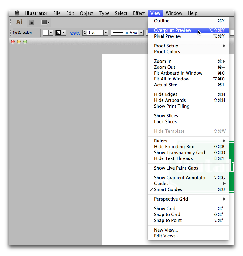
Illustrator overprint menu

The best approach to this is to select Overprint Preview in Illustrator (above) to see the effect of your overprints. If something disappears from the screen when you choose it, you’ve got a problem. If colors change, then you have overprint.

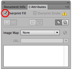
It’s easy to fix. Just select the erroneously assigned white overprint, and uncheck the Overprint checkbox in the Attributes menu (below). The overprint will go away, and knock-out will be done instead.

Overprint checkbox


Posted in Mistakes you can avoid, Printing and Printing Processes, Software | Tagged , , , | 2 Comments