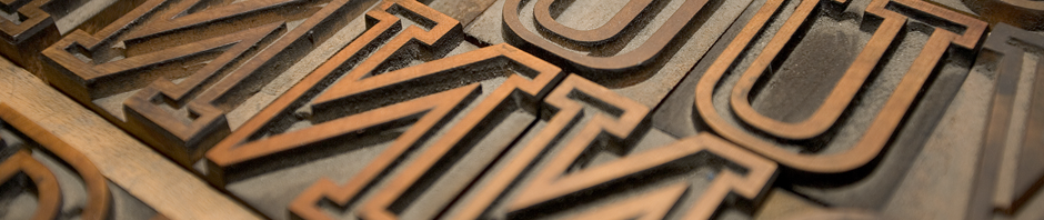

Drawing the lozenge for Lining Livermore

Blognosticator Head

…continued from yesterday’s blog

I’m probably never going to need the lozenge character in any typographic project I do. Nonetheless, it’s there, ready for me, whenever I choose to use it. That’s exciting.

Lozenge

The lonely lozenge. I don’t know what it’s for, but I know how to draw one!

I’m not sure what a lozenge character is for, but I’ve drawn a few of them in my lifetime, and I’m looking forward to using the little guy someday.

That, along with the Hungarian umlaut, and any letter that needs an Ogonek or a Ring.

These are all the special characters that one must draw when making a complete font. Did you know that fonts contain two different slash marks? One is the forward-slash; the other is the Multiply slash, which also has another name: Virgule (from Latin for “rod”). We type-drawing fools also must draw those ugly typewriter quotes that most are found in self-published books, and in most web sites (Web designers take note: you CAN use the correct apostrophes and quotes in web sites. The characters are there!)

Call me crazy, but I really like drawing the various accent marks that are found in fonts. I like the circumflex, the cedilla and the accent-grave, as grave as it is. I love the way these little marks add style to letters. In Lining Livermore I took some liberties with the Japanese Yen symbol. Instead of crossing the leg twice, I added wings to the right side of the letter. I’m sure that some Japanese bureau will not like this, but I do, and on this font I am the boss!

Pilcrow symbol
The pleasant Pilcrow is the demarkation of a new paragraph.

Most of all I love the Pilcrow. That’s the wonderful, sometimes romantic character that indicates a new paragraph. It’s also a good Scrabble word; keep it in mind.

More pedestrian symbols pepper the nooks and crannies of every type face that is worth its salt. There are the symbols for Pi, Sigma (summation), Delta, Product, Partial Difference, Omega, and Integral. It was nearly impossible for me to impart the style of Lining Livermore for these characters, but I tried. I made them fatter than usual, and I added some similar endings to the legs of some of these.
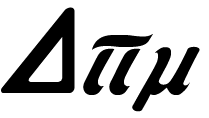
Delta Pi Mu

Delta, Pi and Mu are drawn to match the Lining Livermore font.

More useful symbols include the degree symbol, the plus-or-minus, approximately equal, dagger, double-dagger, Section, and Logical Not. Now how much would you not pay? The ellipsis is there, as is the per-thousand, which is like the per-centage, except with two zeros on the bottom. There is the dollar-sign, the cents-sign, the Yen (as already mentioned, a generic Currency symbol that is never used, the Pound Sterling, and the Euro.

Monetary symbols

Pound Sterling, generic Currency, Dollar, Euro and Yen.

Para ellos que hablan Español, there are the tilde and an upside-down question mark and exclamation mark. There are four drawn fractions: 1/2, 1/3, 1/4, and 2/3. And there are two ordinals: a and o, which are top-aligned with the numerals. Add to that list the centered period and the dotless i, and we have a mostly complete font. I added ligatures for ffi, ffl to the fi and fl that are a standard part of a font.

There is no longer an Apple logo; those disappeared years ago when TrueType fonts were developed.

Asterisk

Asterisks are always fun to draw, and they can readily be drawn in the style of the font. My Lining Livermore asterisk is in keeping with the rest of the letters. Since I had none to model mine after, I created it from one of the letter parts, then copied it around a circle to complete the mark. With a little bit of adjustment, I made it into the new asterisk for this font. The Ampersand is in the metal type, and I drew that faithfully.

T or F

There is one big editorial change that I have made: I drew a new cap T. I just didn’t like the one in the original font, and frankly it doesn’t go well with the rest of the letters. It looks more like a swoopy C than a T. But, for any purists out there, I included the original as a Stylistic Alternate character in my OpenType script. The new T is based on the cap F, which is lovely. I took that letter apart, then fashioned my version of the letter for my font.

Lining Livermore

I have a dozen hours in the font now, and I am making progress. One of the other fonts I have been working on has taken me about four years, so I am sure I have a long way to go.

In my next blog I will talk about kerning – it’s not a process, it’s a career!
 

Posted in Art, History, Typography | Tagged , , , , , , , , | 2 Comments

Typographical archaeology for Lining Livermore

Blognosticator Head

Continued from yesterday’s blog…

After I created the scan of my type proof, I opened it up in Adobe Photoshop and made some corrections (I rotated the G and the O), and I did some tonal clean-up to make the letters look sharper. Then I closed up the space between the lines to make the scan more compact, to fit into an Illustrator file more efficiently, and to make the process of drawing the letters simpler.

Having drawn numerous alphabets in the past, I prefer to work at about two inches tall for the caps. I placed the scan onto a new Illustrator document, then turned it into a template and created a drawing layer on top of the template (why doesn’t Illustrator do this automatically?).

Scan close-up

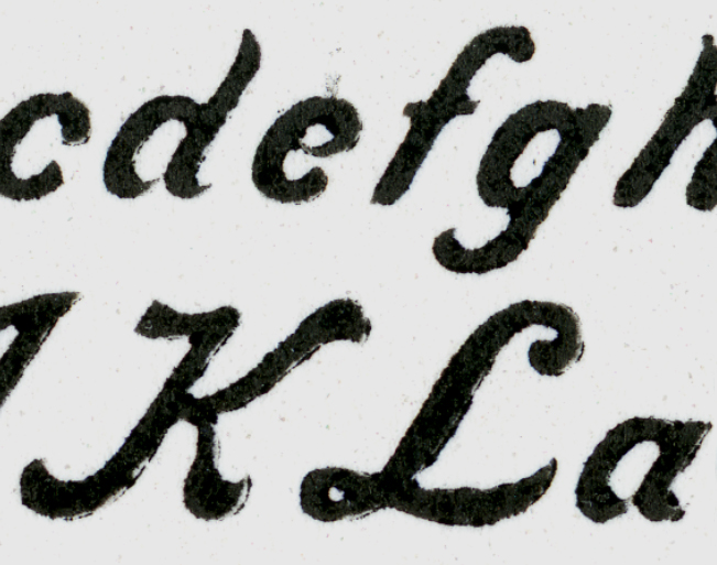
This is the high-resolution scan of the proof from the metal type. Notice that the lower case e and the a appear to connect in this proof. This is a result of ink filling-in the gap between the end of the bowl, causing it to touch the backs of the letters.

When resurrecting an alphabet it’s important to determine the intentions of the original designer. What are the constants in the font? Where does it deviate from constants? How wide are the strokes, and how do they interact? I am interested in making a digital font that is true to the spirit of the original type. What did the designer want the letters to look like? How do the strokes connect (or not connect)? What do the ends look like? These are questions that require some forensic work.

In the case of Lining Livermore, it is a strongly Italic font. I have never drawn such a font before, so I had a lot to learn about Italic letter design, and more importantly, Italic letter positioning. Italic glyphs are positioned to run off the top-right of the character space. In the metal type manifestation, the upper-right of many characters hangs off the type block to later be supported by the adjacent character’s block.

Lining Livermore J vertical

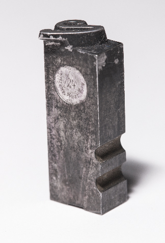
This is the cap V of Lining Livermore. Notice how the swash extends out beyond the type body block. This is precarious because it requires another letter to support it, and prevent that overhang from getting broken on-press. If no letter follows it, the typographer must put a high space in to support the letter.

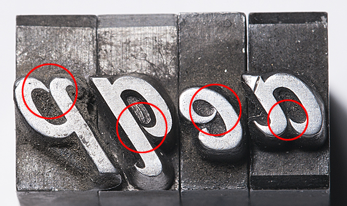
I took the complete lower case alphabet of metal type to examine under the magnifier. The letters in which I was most interested were eap and q. I wanted to know if the stroke of the bowl of these letters connected to the stems, or if the ends came close, but didn’t quite touch the stems. On my proof, all of these seemed to be plugged-up with ink. Under magnification I could see very clearly that the intention of the designer was that the bowls should not touch the stems.

ECU of closed letters

Notice in this photo how the pointed ends of the bowls do not actually touch the bodies of the letters. Notice also the misalignment of the e. It also lacks the chamfers the other letters have, and I must assume it was cast at a different time, in a different foundry than the other letters. After examining the type enlarged this much, I returned to the drawings and modified my letters to be more faithful to the metal type.

In my eapq selection I can see four variations of these finials, each slightly closer to, or farther from the stem. In general, though, they don’t touch, and that’s what I needed to know. I would incorporate that fact into the reborn design.

ECU of lc a

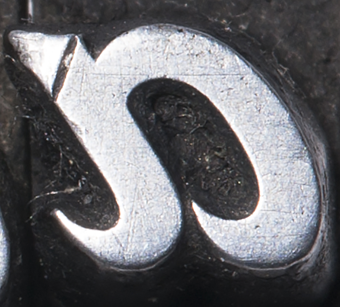
This extreme close-up of the lower-case a shows very clearly that the point on the bowl does not touch the body. Notice also the damage to the letter from 127 years of use. The small scratches come from cleaning the type, and the dents (upper-left) come from the type being dropped into the case – even a short distance – which damages the printing surface. The big dent is probably from something getting between the letter and the tympan in the printing press (thread? a bit of folded paper?).

When drawing letters for a digital font, I always start with the cap H and O. For this font I started with the lower case a, and worked my way forward. Since the Italic slant is so strong, and the differences between lower case and caps so extreme, it was not important to build a font in the order I have always done it. Instead, I just jumped in and did it in order.

Drawing an alphabet is a form of discipline; it requires that each letter be drawn with extreme care and attention to detail and consistency. And, having too many anchor points is unhealthy. I add anchor points sparingly, being careful not to over- or under-design. For example, drawing a circular stroke requires only two anchor points in most cases – three in the extreme. This frugal approach to drawing creates smoother lines, and no lumps, which are momentary changes in direction that cause a letter to look amateurish. To see lumps in a commercial font, look at Microsoft’s disgusting Century Gothic, which has many in its curvaceous parts. That, of course, is unacceptable in letter-drawing.

Glyph spacing illustration

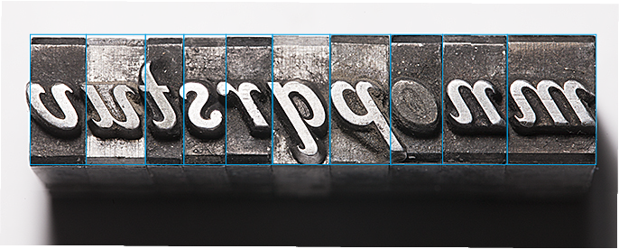
This illustration shows how the letters stand on their bases. Notice that many overextend their body blocks. The lower case o is plugged by printer’s ink that was never cleaned out. The bottom of the lower case m (on the extreme right) has been damaged by being dropped; the other letters are in extraordinary condition.

With the knowledge that the original Lining Livermore was intended to have its ends disconnected, I proceeded. Gradually I constructed the entire lower case alphabet.

Getting the letters from Illustrator to FontLab Studio is a function of enlarging the letter in a scratch file in Illustrator, placing its lower-left corner at the top of the page, and then cutting the outlines and pasting them into a Glyph window in Font Lab. Most professional type designers don’t do it this way, preferring to work entirely in FontLab. Though I appreciate this, I just don’t know the program well enough (even after several years of use) to be familiar with it enough to abandon Illustrator. My approach is more hybrid; I draw the basic letter in Illustrator, then I perfect it in FontLab. There are a couple of features in FontLab that are worth the price of admission: one is the optimize curve function, which will make any curve better, and is especially elegant when removing excess anchor points; taking an anchor point out of a curved path usually causes that path to improve.

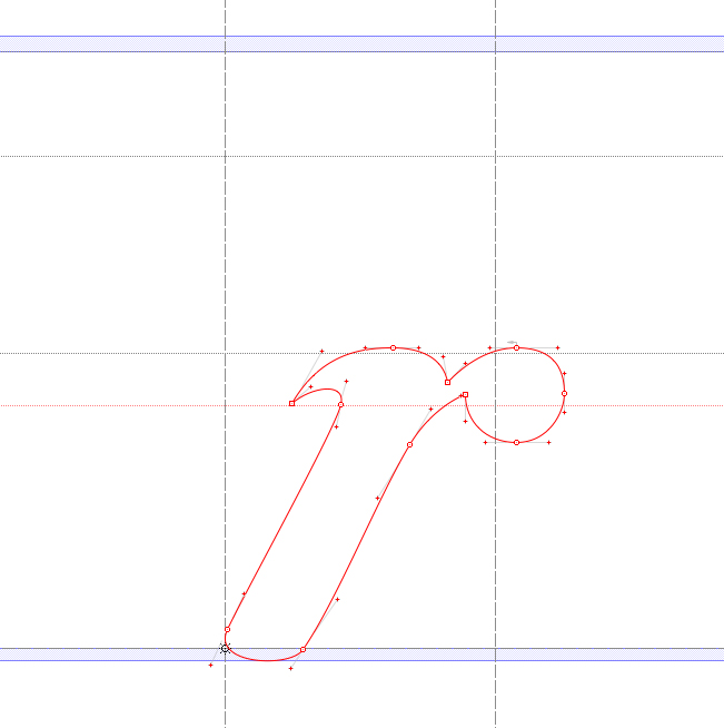
Lower-case r

The glyph for the lower-case r in Lining Livermore shows how art imitates art. The digital character of the r must exceed the body of the letter in order to fit against other similar letters. If you look at the illustration above you will see the same thing happening in the metal type. The screen capture is from FontLab Studio.

Making a complete font – over 245 glyphs – takes a long time. There are 26 lower-case letters, 26 capitals, 10 numerals, of course. But that’s just 66 glyphs out of 245. There is still much work to do after the alphabet is complete. The punctuation, the diacritical marks, the ligatures, currency symbols, and a whole bunch of oddball characters like the eth (both cap and lower-case), which is a character used only in Icelandic. The infinity symbol, registered trademark, copyright, pilcrow, octothorpe (AKA: hashtag) and various others all have to be drawn. And, in the case of Lining Livermore, they have to be drawn “in character.” The registered trademark and the copyright symbols must be drawn with Lining Livermore style.

Copyright and TM

These are my copyright and registered trademark symbols for Lining Livermore. Many fonts don’t stay true to their style when it comes to these marks. I like it better when the marks continue the style of a font, rather than being generic.

FontLab is impressive in its ability to generate many of the hybrid glyphs automatically – the accented glyphs for Romance languages for example. All I have to do is to draw the accents themselves, and FontLab will create the derivative characters. It does a pretty good job, requiring just tiny adjustments after the fact. A small change to the original accent glyph is automatically reflected in the derivative letters, which saves a lot of time.

Gradually the font takes shape. I have two 24-inch Cinema Displays. On the right display I draw the letters and adjust their spacing. On the left display I have a large preview of the type in variations of settings: the alphabet, settings that emphasize punctuation, those that feature all-caps setting (doesn’t work with Lining Livermore!), and the traditional pangrams. As I work on the letterforms, the previews show me the results. It’s a long process of getting the basic spacing organized first, then I move on to more detailed adjustments.

More on the archaeology of Lining Livermore tomorrow!
 

Posted in Art, History, Technology, Typography | Tagged , , , , , , | Leave a comment

Digging into history for a “new” digital type design

Blognosticator Head

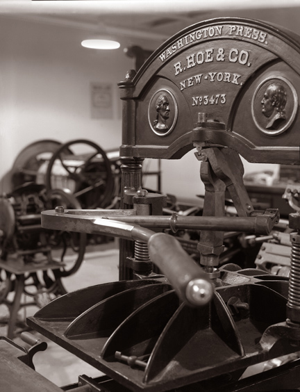
I am the faculty advisor of the Shakespeare Press Museum at Cal Poly. The museum is a working collection of type and printing presses that collectively represent the history of relief printing from 1850 to 1950.

Washington Press 2

This is one of four 1850s-era Washington presses in the collection. Two of them are on display, and are fully functional. When I feel like having a real Gutenbergian experience, I can print on these machines.

We have 19 working letterpress machines, starting with an 1850 Washington hand press, a line of treadle-operated platen presses, two working lever platen presses (C&P Pilot, and Columbian), and we recently acquired a Heidelberg Windmill press, known around the world as a Tiegel (German for “crucible”).

Over the course of about 75 years, Heidelberg manufactured this machine, which became the most popular letterpress printing machine in history. Most of those machines made by the company are still in operation, and it’s possible to purchase one used on eBay almost anytime.

The Shakespeare Press Museum also has a collection of hand-set metal and wood type numbering about 450 fonts. Many of these of common: Baskerville, Stymie, Goudy, Garamond. Some are rarer: Kismet, Engraver’s Roman Shaded, and one particularly interesting style called Lining Livermore.

I have been attracted to this type for many years, and have used it a few times to print small cards and announcements.

Last week I decided to make a digital version of Lining Livermore.

I have made digital versions of about a dozen of the fonts in the collection. We hope to offer these fonts commercially in the future, once the hard work of redrawing them is complete.

Before I attempt to make a revival of any font, I begin an Internet search. If I find the font commercially available, I stop, as there is no point recreating a font that is already available on the market.

In searching for Lining Livermore, I found one oblique reference to the font in a blog, and that was it. Nothing has been done to my knowledge with Lining Livermore. Finding no digital versions of the font, I decided to proceed.

Step Two is to set a specimen of the type, and proof it on proofing paper to scan for digitization.

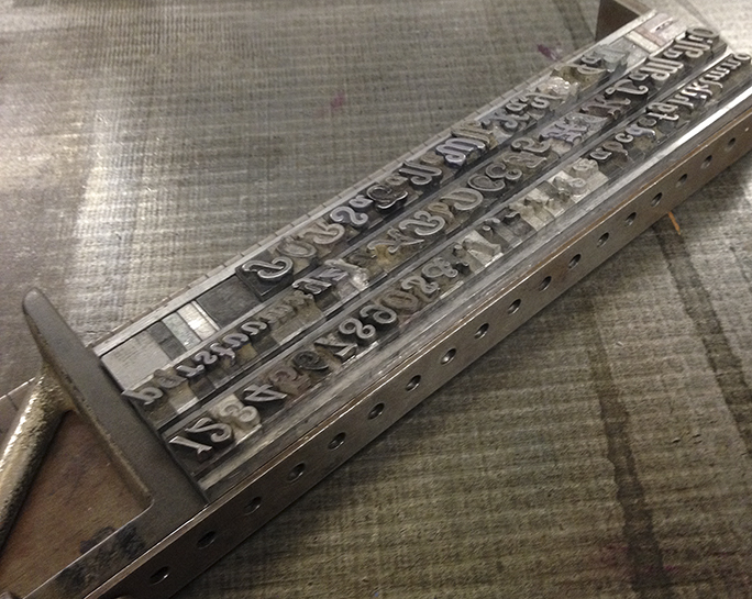
Type in Composing stick

This is the complete Lining Livermore font assembled in a composing stick. Notice the upside-down cap G in the second line. This was an amusing error, but caused me no difficulty. I just turned it over in Photoshop!

The museum’s biggest problem is that of indexing its collection of type fonts. We have made several attempts to do this, and have made some progress. The latest attempt is in a FileMaker database. That database will help us to identify the hundreds of type fonts in the collection, and to guide visitors to the fonts when they are needed.

I searched high and low for Lining Livermore, and finally found it in a closet off the main room, behind a tool box and our janitorial supplies. Even walking into that closet was difficult, as it is a repository for all things we don’t want the public to see. I removed the drawer from the cabinet and brought it out into the light. We have the font in three sizes, and I chose the largest – 24 point – for my proof.

Using a composing stick and some 35-pica slugs as leading, I composed a quick alphabet of lower case, then added the numerals, the caps, and all the available punctuation in the drawer. This is a surprisingly complete collection of type, especially considering that it was likely manufactured in 1887 in Philadelphia. That makes this particular font about 125 years old; it’s amazing that so many of the letters are still here, and still in good condition.

Once that composition was complete, I spaced-out the ends, and did a careful cleaning of the type using solvent and a toothbrush. My objective was to get dried printer’s ink out from the crevices of the type. 127 years of use can cause a build-up on hand-set type!

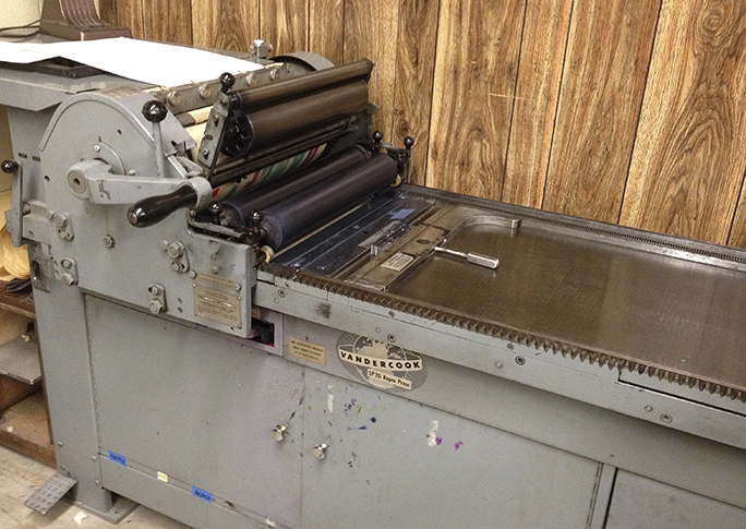
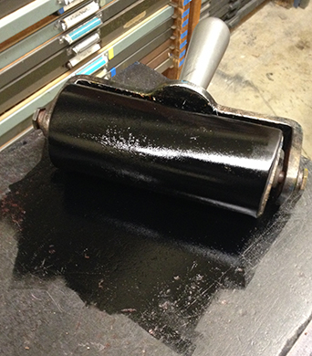
Step Three was to lock the type into the Vandercook proofing press, a Model SP 20. Usually I use a chase and wooden furniture to do this. But proofing loose type is much easier. I just locked the composed lines of type into the press. Inking was done with a small hand brayer. I didn’t want to ink-up the Vandercook for just a few pages of proofing. The first impression was lovely, and I took a couple more to see if I could improve on my luck. I didn’t notice at the time that I had omitted the capital V, an oversight that required me to return to the museum another day to proof just that one letter.

Vandercook proof press

The SP20 Vandercook proof press in the Shakespeare Press Museum. My type is locked-up in the bed, and the paper is prepared on the top cylinder.

Once I confirmed that my proofs were excellent, I cleaned the type very carefully and returned it to the drawer, being especially careful to check every letter going back in to ensure it is in the correct spot. Misplaced letters are a curse to the hand-set typographer.

Then I cleaned the brayer and the inking stone, the leading strips, the surface of the Vandercook press and the work surfaces in the museum. Once everything was back in place, I took my proofs and headed home.

Ink and Brayer

This is the brayer, inked and ready for the proof press. This is washed-up by hand when the work is done.

Step Four was scanning, which is a very important step in the process. I scanned the proofs at 1200 ppi on my flat-bed Espon scanner, saving them as TIFF files. These files were then used as templates in Illustrator, where I prefer to draw letters for the fonts I design. Converting a scan of a letterpress font to vector illustrations is a fairly complex task, as one must use intuition to pluck the consistent parts of a font from the proofs; it’s not as easy as just drawing what is on the screen.

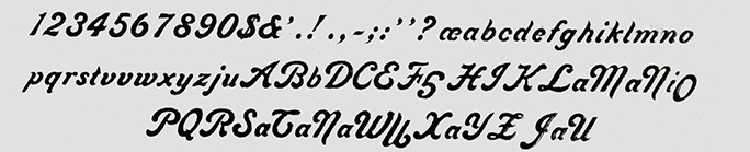
Lining Livermore scan

This is the scan of the proof made on the Vandercook. Now I see that upside-down G! (and there is an upside-down O also).

The font then begins to take shape. More on that tomorrow.


Posted in History, Software, Typography | Tagged , , , , , , | Leave a comment

Things are getting better

Blognosticator Head

Five months ago yesterday I was hit by a pick-up truck while riding my bicycle to the university. On the back of the bike, in my panier bags, were my Canon camera, three lenses, a Really Right Stuff carbon-fiber tripod, two Canon strobe flashes and a set of Pocket Wizard radio strobe triggers. It was planned to be a photographic day.

I was wearing a helmet (I always do!), gloves, a jacket, and my business casual clothes. My trajectory took me into the air, and onto the pavement about five yards from the point of impact.

Brian on Bianchi

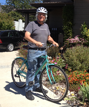
Here I am on my new Bianchi Milano bicycle. It has all the best features of a commuter bike, and I look forward to riding it to work.

While face-down on the pavement, I met some nice fire fighters, a pleasant paramedic, a very professional police officer and a host of others, including my colleague Teresa from the Journalism Department across the hall, who stopped to render assistance. She was my guardian angel that morning. She called my wife to tell her what had happened, and she coordinated the disposition of my photo gear.

Later that morning in the emergency room I was diagnosed with two fractures of my pelvis, and a number of contusions on my hands and legs. I was admitted to the hospital, where I spent three days working up to moving to a step-down location where I could recover in an environment where there were no stairs. I couldn’t go home because we have steps up to our door, and sixteen more to get to our bedroom. It would be a couple of weeks before I made it back to my own bed again.

I went to physical therapy for fourteen weeks, I had multiple MRI scans of my head, neck and arteries, I had surgery on my hip to correct the damage done by the truck’s hood ornament. I am now recovering from that surgery, a process that involves returning to the physician’s office every-other day. This has not been fun.

I walk almost normally now; I can get from my house to downtown, to the movies, and to the tasty taqueria just three blocks down the hill from our home.

And today I bought a new bicycle.

That was much harder than it sounds. I had tried to buy the bike on two other occasions, but I couldn’t do it. I left the store the first time; I couldn’t even go into the store the second time. Today I bought a Jamba Juice smoothie, then sat in front of the store for 30 minutes, talking to my friend Bobby while I gathered the courage to go into the store to buy my bicycle.

Then I did it. I also bought a new helmet (my old one was badly damaged in the collision), one with an adjustable headband.

The bike is my new commuter vehicle, and I intend to return to riding to and from work. I’m off for the summer now, so I can practice riding, and get used to the idea of crossing that intersection again. And, I will practice riding across that horrible intersection a few times before school starts in the fall. I’m fearful, but excited. I put a rack and panier bags onto the bike when I got home, and I put a bell on the handlebars (bikes need a bell!). I rode in circles on my little street, and it felt good to be back on a bicycle.

The challenge is entirely mental at this point, that plus some atrophy of my upper thigh muscles from not riding for five months. I have work to do.

Meanwhile, I have a beautiful new Bianchi Milano bicycle and a lot of time to ride. If you see me go by, please wave!


Posted in Adventures | Tagged , , | 3 Comments

Crafting a graph in Adobe Illustrator CC

Blognosticator Head

The Graph tool in Adobe Illustrator has been around a long time, and has not been improved much since it was first released.

It’s a strange tool because it is capable of generating some lovely visual information, but it’s frustrating because it limits your ability to make changes to the graph without losing its identity as a graph. That’s not always bad.

Graphs are theoretically editable after creation, meaning that you can change or correct the data, and the graph will automatically update. But it wraps components of the graphs so tightly in Groupings and graph contents that you often can’t make even simple changes without violating the sanctity of the data.

Solar panel graph 1

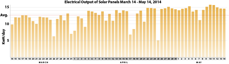
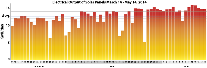
This is the actual output, in kWh, of my solar power system since it was activated on March 14. I drew the graph using Illustrator’s Graphing tool, and then did a bit of retouching and embellishment.

I have used the Graphing tool many times, but not recently. I decided to put it through its paces a couple of days ago when I was evaluating the output of my now two-month-long experience with rooftop solar power generation. My power inverters are made by a company called Enphase, and a part of the system is a very impressive data collection function that collects output information from each individual panel, and forwards that information over the Internet to your online account where you can go to check the status and power output of your system.

Using a web browser, you can check in with your system and get up-to-the-minute output wattage, monthly, and lifetime totals. You can also create reports and download a Microsoft Excel file that itemizes your power production by interval. I chose to get that report for the entire time my system has been operational. This is a pretty manageable amount of data, as I have only been running the system for 60 days.

Microsoft Excel Screen Shot 2

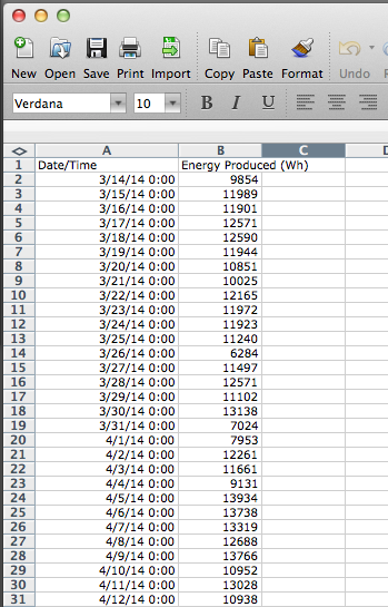
This is Excel’s view of my solar power output. The data come in formatted with too much text in the date/time entries, so I need to remove them. This never works well in Excel, so I copy the columns and paste the data into a word processor to make those changes. Once that’s done, I move to Illustrator and create a new bar graph.

Once in Excel, I copied and pasted the two columns of information into my favorite text editor, Tex-Edit Plus, a shareware word processor with GREP capabilities (I love it!). I didn’t use any GREP for this project, but simply used that program’s Find and Replace functions to remove text I didn’t want for my graphs. The month and year were unnecessary, so I got rid of those. Then I copied the remaining data into the clipboard and went to a fresh Illustrator page.

Excel screen shot

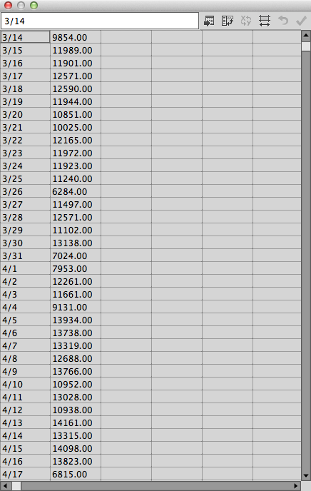
This is the spreadsheet view of Illustrator’s Graph tool. Here, the data are prepared for graphing. It has a nice function where you can switch the X and Y axes of the chart if you paste data in that are in the wrong order.

In Illustrator, I created a new graph by choosing from the Graphing tool pull-out. The two most likely to be successful are the line graph and the bar graph, so I chose the bar graph. Following the advice of Edward Tufte, the genius of information presentation, I always try to make my graphs reflect an honest picture of the situation I am trying to explain. It’s really easy for graphs to go badly, and it’s wise to remember scale, proportionality, and visual honesty when making any graph. I dragged a long horizontal rectangle onto the page, which causes a spreadsheet entry table to appear. I simply pasted my two columns of data into that spreadsheet, and clicked OK.

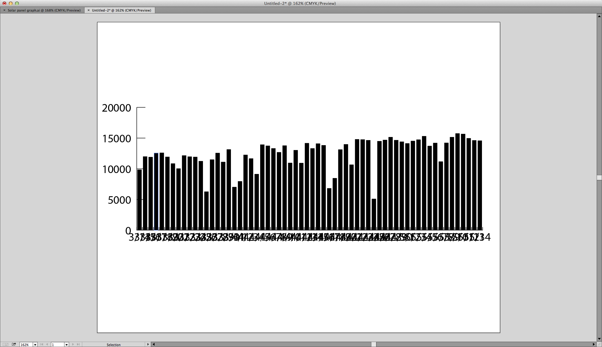
I am always shocked when I first see any graph created by Illustrator because they are just a mash of text and graph elements piled atop one another. This was no exception.

Illustrator graph pile-up

This is what I saw first, a mash-up of data and text. It looks unmanageable, but you start with the point size of the type, and suddenly the graph is legible.

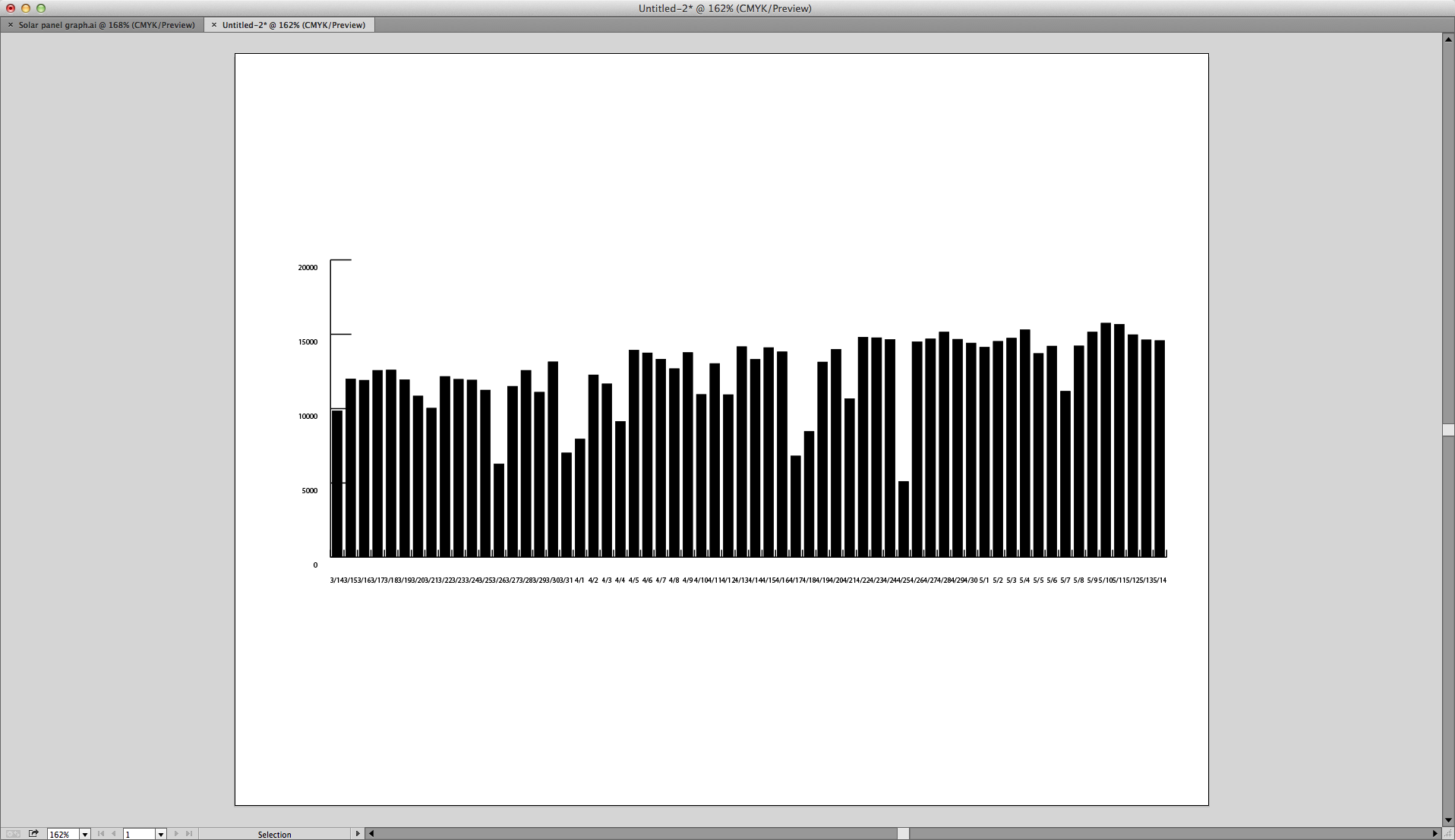
The first thing I did was to reduce the size of the type from whatever it was when it landed to about 8 pt. This made it readable. Then I began the slow process of cleaning up the graph. Using the Direct Select tool (open arrow), I chose the type for the dates at the bottom, and reduced its size again, then centered each block of type by choosing center align with the keyboard command Shift-Command-C. Then I moved that lettering closer to the graph base, and made it bold. These are things that Illustrator will allow to a graph without ungrouping it or Expanding the graph.

Type changed to 8 pt

Here I have changed the point size of the type to 8 pt. It is now intelligible.

Selecting all the vertical bars is easy. I used the Select menu, with Same Stroke as the option, and they were all selected. I changed the fill to a gradient, removed the stroke, and then adjusted the gradient with the Gradient tool so that the warmer yellow-orange was at the top while the yellow end was at the bottom.

From there is was just a matter of embellishment. I added a title, added a legend on the left edge, and then added horizontal lines in the important range of data – those bars with values between 10 and 15 KwH. These lines indicate one-kW values. I finished it off with a new line indicating the Average of the data (12.55 kWh).

Graph example 2

This is my bold color version of the chart. Here I have changed the gradient to a stronger pair of colors, and I have reduced the white spaces between the bars. I have also added Month labels at the bottom, and a line indicating the Average output of the system each day (12.55 kWh).

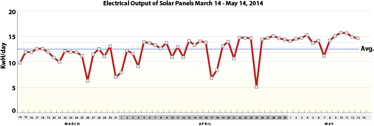
I also made a more dramatic version of the graph with a stronger set of colors in the gradient, and, separately, a line graph of the same data, all with adjustments to the appearance of the graph as created by Illustrator. When working with the bars in the second graph, I wanted to make them wider, without making them taller. To do this, I selected them all, and had to Ungroup four times before I could effect a Transform Each function on them. With that, I was able to widen them without making them taller.

Graphing Solar 3

…and this is the line graph of the same data. It shares the months and days from the bottom of the other graphs, but has the line motif, which is powerful, but I don’t think as effective as the bar graphs.

Of the two styles of graphs, I think the bar graph is more relevant because it shows that production is continuing every day, and that it’s not just the top value that I want to display. I guess that to depict this with complete honesty, I would have to show the hours when the system is not producing any electricity. I’ll attempt that on another day, with bars that show not only the peak generation of electricity, but the off-hours. That would work better for an hourly graph, I am sure.

OG&E bar chart 2

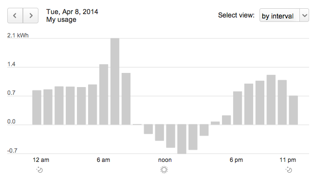
This is my electric utility’s graph of my hourly electrical consumption for April 8, 2014. Notice that in the middle of the day we generate more power than we need, meaning that we are feeding electricity to the electric grid during those times.

Another variation would be to show electric consumption overlying electric generation, which would show that during the day we make more electricity than we need, and in the evenings, we don’t make any at all, but continue to consume electricity from the power company. That would be a bar graph with lines going both up and down, with perhaps a line showing peak solar generation going across the tops of those bars.


Posted in Business, Software, Technology | Tagged , , , , | 6 Comments

Calligraphy in a Millennial world

Blognosticator Head

I’m teaching Advanced Typography this quarter to students in their 20s.

Part of that course involves studying the origins of letters and letterforms, pen-drawn lettering and constructed lettering.

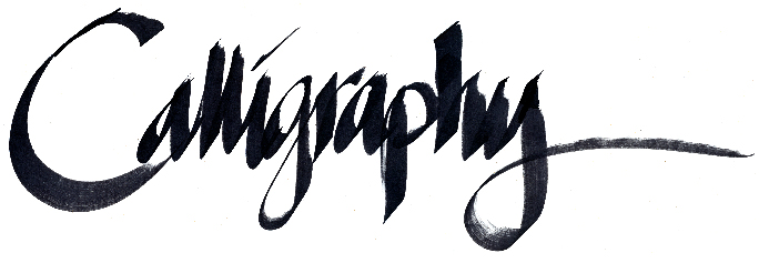
Calligraphy lettering

I wrote this today with the Copic Wide pen, which uses an alcohol-based ink, and has a fairly stiff bamboo (?) nib. The one I have is called a 110. It’s about .75 inch across.

Today in lab I introduced the students to the Copic wide felt pen, a broad-nib felt-pen that is good for calligraphy on a large scale. We were lettering at about 3.25 inches x-height. I demonstrated the basic strokes of calligraphy, and asked them to take a few swipes at basic lettering with a flat-nib instrument. They did pretty well.

It isn’t often these days that I pick up a pen to put letters on paper. It’s fun, and I am still pretty good at it. A long while ago, I taught calligraphy in the local adult school, something I did for many years. It was in a calligraphy class that I met my future wife. We can both handle a pen pretty well to this day, 35 years later.

My students are enchanted by calligraphy, they love the look of hand lettering, and they show this by the oohs! and aahs! they expressed while watching their classmates work with the wide-nib pens. I enjoyed watching them enjoy themselves so much.

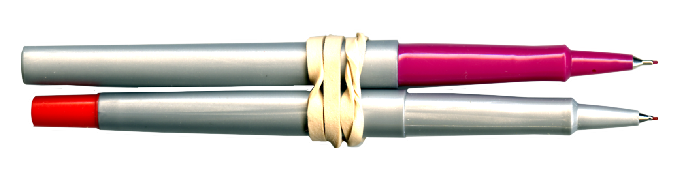
Calligraphy Pens

Two pens – or pencils – tied together can make a lovely calligraphic tool.

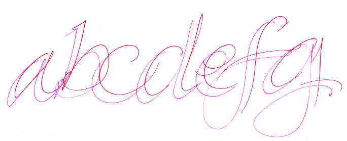
I also shared with them a technique for writing with two pens or pencils tied together with a rubber band. I have always enjoyed this, as it’s easy to make very nice lettering without much fuss, and the feel of the pencils is very pleasant. Almost anyone can draw successful calligraphic letters with this technique.

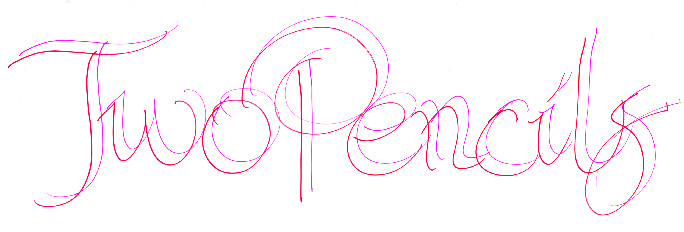
Two Pencils lettering

The secret to calligraphy is to maintain the same pen angle for the entire letter (mostly). I like to start my students at a pen angle of 40 degrees. It matches many of the Oldstyle Roman alphabets they like so much.

With twenty or thirty years of practice, one can get pretty good at this! I hope my students maintain their interest for many years into the future.

abcdefg


Posted in Art, Typography | Tagged , , , , | 2 Comments

6804136

Blognosticator Head

When I was 17 years old I bought my first professional 35mm camera. It was a Nikon F. My high school friend Bill’s dad was a pilot for Braniff Airlines. His schedule took him from San Francisco to Tokyo every other Friday, returning two days later.

Bill’s dad offered to buy camera equipment for me in Tokyo when he made his trips, and I was more than happy to accept his kindness. I had a small printing company in the basement of my family home, so I had a little spending money as a result. One Friday I gave Bill’s dad $300, and the following Monday I had a brand new Nikon F camera body.

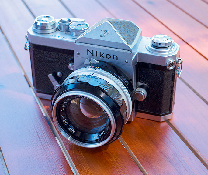
Nikon F 22 body

Nikon F serial number 6804136 has been in my possession since 1967. This is not the original lens, but one of the same focal length and aperture that I bought in that era. What a beautiful instrument this is!

A month later I sent him with more money to buy a couple of lenses. It was the deal of a century.

Bill’s dad wasn’t doing anything illegal or unethical. The customs threshold at the time was $600, so anything he purchased in Tokyo under that amount didn’t require duty to be paid to U.S. Customs.

I ended up with a couple of Nikon F bodies and a nice selection of lenses, all the envy of a pro photographer, but at a fraction of the prices charged in the U.S. I suspect that it had to do with rates-of-exchange and the relationship that Nikon had with Ehrenreich Photo Optical company, the U.S. importer of Nikon equipment at the time.

I bought these cameras and lenses to take photos for the high school yearbook, the a newspaper we published at my school, and for outdoor photography I did when hiking and camping. I already owned a Graphic View II 4×5 view camera, and a not-terribly-good Wollensak lens for that camera. I wanted to be the next Ansel Adams, something that I have never come close to accomplishing.

In my spare time I read the Nikon manuals, studied lens designs, and worked in my darkroom, a structure built into the corner of the laundry room in our basement (my parents must have been very patient people). I also read, and learned how to expose and process black and white film using the Minor White method of the Zone System pioneered by Adams (Minor White made it intelligible).

I was a pretty serious teenage photographer, and I made some nice photos. I think I tended toward editorial photography more than beautiful zone-exposed landscapes, but I took it seriously, and I did pretty well.

Over the years I bought additional cameras, changed from 35mm to medium-format, and continued to shoot. I bought, and I sold, and I traded. When the digital revolution arrived, I was there, getting in early with the Nikon D1, and later the D1x. I really liked digital photography, and was working as a consultant for various tech companies at the time, so it was important to stay on top of this new technology.

I sold the Nikon digital (kept one), and most of the Nikon lenses. I sold the Graphic View II (that’s a good story for another blog), and I sold all the medium-format equipment (another interesting story for another day).

But I kept 6804136, my original Nikon F body and an original 50mm f1.4 lens. I had too much emotional attachment to let it fall into anyone else’s hands.

When I started teaching digital photography several years ago, I took it down off the shelf where I have it on display. I take it to class at the beginning of each new quarter, and I open it up and pass it around for the students to hold and to see how a fully mechanical shutter works. There are no batteries in a Nikon F camera.

It’s a wonderful camera, and I am as comfortable with it today as I was in the 1960s when I was first using it.

Blognosticator Mobile

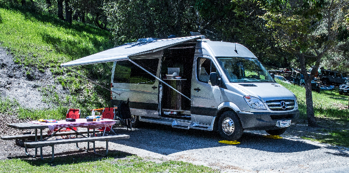
This is the new Blognosticator Mobile Laboratory, a Mercedes diesel van with an RV interior. From this vehicle I will be reporting about campsites in and around my part of the country.

Yesterday, my wife and I took our new Blognosticator Mobile Laboratory out for its maiden campout. It’s a Mercedes diesel van with a camper interior. We bought it in December, picked it up in February, and have been outfitting it with forks, knives and spoons, towels, pancake mix and s’mores makings (though we forgot the coat hangers on this journey). We chose a campground just 30 minutes from home so that if anything went terribly wrong, we could just drive to the store – or drive home.

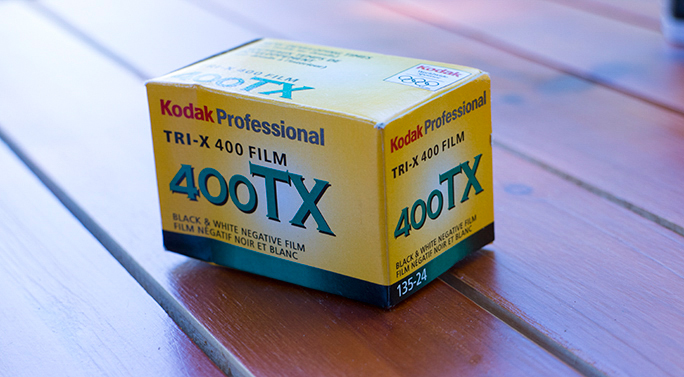
After setting up camp on Saturday, I sat down to clean and polish the Nikon F. I loaded a fresh roll of Tri-X 400 film into it, and I took a half-roll of film. It’s mostly images of the RV, and a few of children playing in the playground. I’ll get it processed commercially this week.

Tri-X Film box

Yes, they still make it! Kodak’s venerable Tri-X black and white film for 35mm cameras was my favorite film in the 1960s. It was cheap in bulk rolls, and I processed it myself. Much of the time I pushed it to 1200 ASA (now ISO), so it was grainy. But the film performs well to this day.

I didn’t take my Weston Master V light meter with me on this journey, instead choosing to calculate exposure in my head. With the Tri-X film in bright sunlight, the correct exposure should be 1/400 sec. at f16. I shot a few frames at that setting, and shot a few at 1/1000 at f8, which is a tiny bit under-exposed. Modern digital cameras have 1/3-stop exposure intervals, but the trusty Nikon F has whole-stop increments. I did shoot a few at half-stop aperture settings. We’ll see when the film comes back.

Today I took a roll of Ektachrome 100 film, loaded that into the Nikon, and shot 24 frames in the campground, and down by the lake. I’ll send that out for processing also, and will see the accuracy of my calculated exposures.

The official exposure formula is more complicated, based on the sensitometric curve, and a series of points measured on that curve where film accepts its initial exposure (inertial resistance to exposure) above “base plus fog” and all the way up to overexposure. But, the rule of thumb for guessing exposure is surprisingly accurate.

I’ll publish a few of my Tri-X frames, and a few of my Ektachrome 100 frames when I get the film back next week.


Posted in Adventures, History, Photography | Tagged , , , , | Leave a comment

The demise of the Big Photo

Blognosticator Head

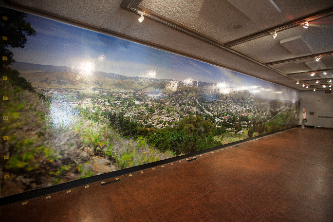
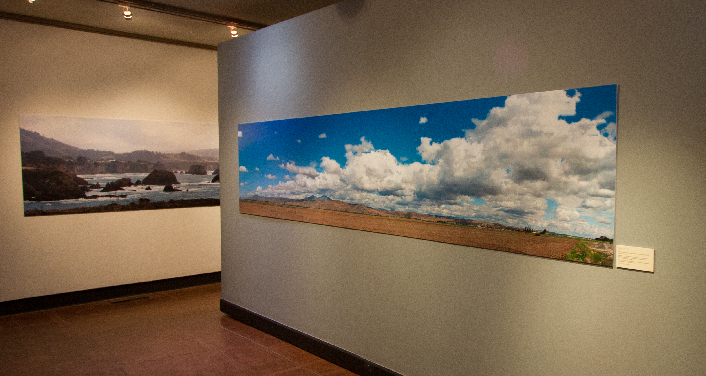
I knew when we put it up that the almost 60-foot-long panoramic photo of San Luis Obispo that I call the View from Daniel’s Point – would eventually come down.

John Cleek, the wallpaper expert who put it up, painted a lacquer base color on the wall back in early February. Then he glued the big photo to the wall using water-based wallpaper paste. The idea was that the photo would be removable with little difficulty when the time came.

That time arrived yesterday, the end of the 45-day run of my panoramic photo exhibition SLO PANO.

SLO PANO walk-through 26

Here is Daniel’s Point just a few minutes before we started to tear it off the wall at the San Luis Obispo Museum of Art. At 58 feet, 7 inches in width, it is almost certainly the largest photo ever exhibited in the city.

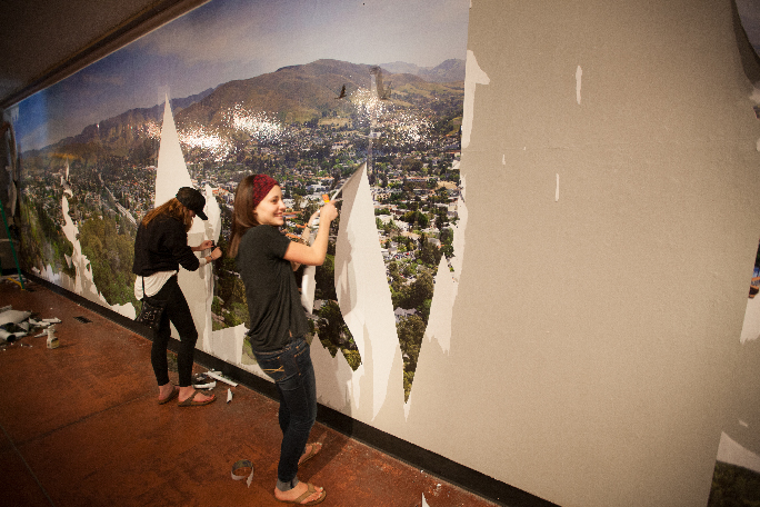
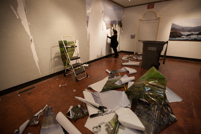
I had a small team of volunteers on hand to pull the photo off the wall, and it was not easy. We all approached the wall differently, some pulling the photo from the bottom, some from the top. The laminate came off of some of the photo, leaving bare paper still glued to the wall, and some of us pulled sections off more successfully. Big pieces were removed relatively easily, while other parts resisted removal.

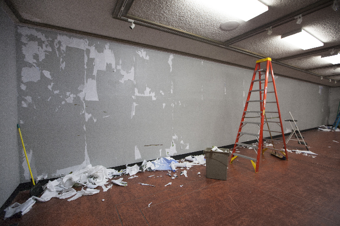
Eventually we figured out a method for removing the troublesome parts. A spray bottle filled with warm water and a little dish soap was used to spray behind the photo paper. This dissolved the adhesive immediately, allowing the paper to be rolled easily off the wall. This worked very well, and with just a few hours more work, the wall was clean.

It looked lonely and naked.

Tearing down big photo 13

Here my young friends and Mikaela and Cruz are forcibly removing sections of the Big Photo. Most of it came off the wall fairly easily. Other parts were more difficult, requiring a spray of water to encourage the adhesive to release the paper from the wall.

But it was great while it lasted. The photos are all down now, and are being distributed here and there. Several of the big photos, and a few of the six-foot panos are being moved to the Arroyo Grande IOOF Hall for a two-month stay there. The pair of historic and modern San Luis Obispo photos are going up at a local business, and the rest have been moved into storage.

Tearing down big photo 04

Pieces of the photo lie on the floor of the museum. These would eventually be crushed into the trash bin in the right center. It was a sad end to a glorious photo.

SLO PANO was a tremendous success. On one day, March 7, there were over 700 people who visited the museum to see the photos.

Thank you to everyone who helped to mount the exhibition, to those who helped to take it down, and to the many, many people who visited during its run.

Tearing down big photo 15

This is the mostly-clean wall at the end of the evening. Just a few obstinate bits of the photo remained for the wall to be ready for the next show, which opens next Friday.

In the past few days I have passed a couple of new milestones. One is that readership of the Blognosticator has now exceeded 70,000, and the other is that I have begun walking without crutches. I can now navigate on my own legs, and that is quite an achievement for me. In January, and several times in between, I was worried that I would never walk again. But physical therapy, perseverance, and exercise have combined to give me mobility again. I can’t get very far on my own two feet yet, but I am pleased with my progress.

I’m going in for a new CAT scan in the coming days, and will get the results of that soon after. It will indicate whether my bones are healing correctly.

Meanwhile I have more physical therapy and more work to get my strength back, and to learn how to walk without a severe limp on my right leg.

Small steps.

Posted in Art, Panoramic Photography, People, Photography | Tagged , , , , , | Leave a comment

A method for mounting large prints on foam core

Blognosticator Head

One of the things I learned while making my large photo exhibition was how to mount huge photo prints without getting wrinkles or bubbles.

I am a user of permanent self-adhesive foam core board. I love this stuff. My favorite brands are Elmer’s and Gilman, which I buy from ArtSupply.com in sheets up to 4 x 8 feet. These boards are 3/16 inch thick, and feature an adhesive so strong, and so permanent that it sticks to anything that touches it instantly. This stuff is unfailing, and occasionally exasperating.

Greenfield clouds, Elk 02

Two of the very large prints in my photo exhibition SLO PANO, on display at the San Luis Obispo Museum of Art through March 30. I printed and mounted these two by myself, and I got away with it. Doing the work with two friends makes it much easier. The print on the right is 14 feet long, and about 37 inches tall.

It’s usually human error that makes the adhesive exasperating. The foam core is just a benign material that – seemingly – grabs onto anything in its vicinity, and it will never let go.

Mounting small posters and sheets – up to about 32 x 40 inches (one of the standard sizes) is easy. It’s a one-person job. I usually arm myself with Big Blue – my five foot extruded aluminum cutting ruler, and Alvin, my 3 x 4 foot self-healing cutting mat. I also have an 1950s era Kodak hard rubber roller with a big cast iron handle. This is used to roll material down onto the smaller foam core boards.

For larger sheets, the job becomes a two-person or three-person project. And, it becomes a lot more difficult.

There are very nice laminating and mounting machines available to the wide-format industry. These, typically, cost about $20,000, and they are worth the investment I am sure. But, my operation is in my home, and I have no room for such a machine. And, my need to mount very large projects is limited. I did a lot of this while preparing my exhibition, but now that it’s up, I haven’t made a big print since.

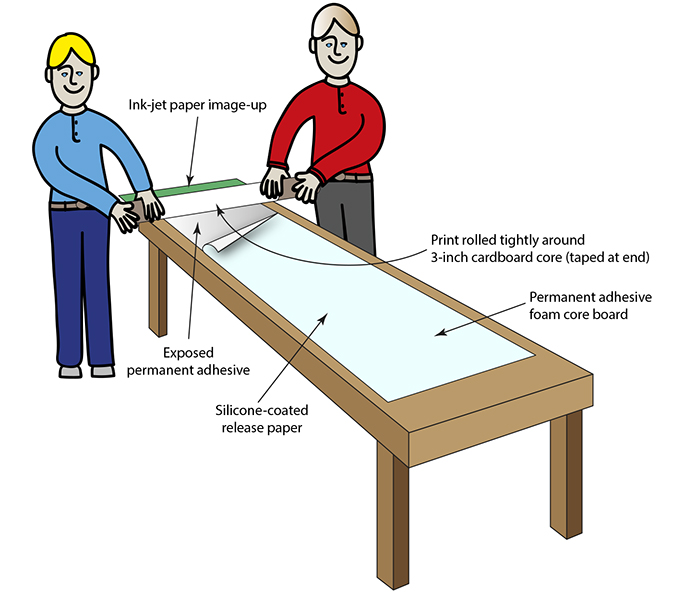
For the low-budget crowd, those without a laminating machine, my friend Catherine and I came up with a great solution to the problem that involves nothing more than a large table, a long 3-inch roll core, and two to three people (three is best).

Print

Here, the Dopëlganger twins prepare to roll a huge print onto a large sheet of self-adhesive foam core board. The third person (not shown) peels the release paper away just in front of the two as they press the photo paper to the adhesive in a continuous motion from one end to the other.

Having a long table is helpful, but it is possible to make do with a shorter table, and shift the work as you go.

Put the foam core on the table, with the adhesive side up.

Roll your large print out on top of the foam core to be sure it will fit on the sheet you have. Once it’s on the table put three strips of painter’s masking tape on the end of the photo paper, exposing half of the tape facing upward. To this you will affix the long cardboard core. Be sure the tape sticks, then wind the print very tightly around the core, image-inward. When it’s rolled all the way to the end, take it to the end of the foam core sheet and have one or two people hold the photo tight on the roll.

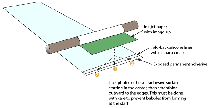
At the end of the foam core, pry up the silicone release paper, and fold-back a one-inch flap, exposing the adhesive. Crease this sharply with your fingernail.

With your two friends holding the tightly-wound roll of photo paper, CAREFULLY position the edge of the photo paper near the exposed adhesive. Then move it over the adhesive, and touch the center of the photo to adhere it to the center of the board. Then push with one finger from that center point toward each edge. This establishes the beginning of the mounted photo.

Tacking the start of the roll

Tacking the photo paper at the head end of the roll is critically important. Start in the middle, and smooth the paper out to the edges. This must be done perfectly to prevent a wrinkle that will ruin the print, so be careful to start it right.

Being sure that the photo is tightly wound on the roll, move around to the edge ahead of your two friends, and have them set the roll of photo material down on the adhesive where you tacked the start. They should push downward while maintaining tension on the print.

Then, pull the silicone release paper away from the adhesive, while your friends roll the print down onto the adhesive. Go slowly, and stay ahead of them only by an inch or two. They will continue to unroll the print while pushing it down onto the foam core. You get only one chance.

When you get to the other end, remove the masking tape, and finish the roll-out. Your work should be perfect.

My team of volunteer helpers and I did this successfully five times while preparing the huge prints for my exhibition, and it worked perfectly every time. In the absence of an expensive laminating machine, this does the trick, and the result is the same.


Posted in Mistakes you can avoid, Panoramic Photography, Photography, Printing and Printing Processes | Tagged , , , , , | 49 Comments

My solar system goes live

Blognosticator Head

As you might have read in my earlier blogs on the subject, I installed solar panels on my roof in the fall, finishing in late November. I bought the panels, racking and hardware and did the rooftop installation myself. This was a way to save a little money, and also I like projects like this. It was an educational adventure and a home improvement project, and I love both.

Installation was reasonably easy. I installed two permanent stainless steel roof anchors on my roof, I bought an OSHA-approved safety harness system to prevent falls, and I climbed up there and put in the brackets and flashing and the rails. Then I installed the inverters (my system uses individual inverters) and the cabling, and finally I installed the panels themselves.

Northwest panels 1

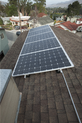
These five panels face southwest. Five panels and inverters line my long roof.

I enjoyed the process of making precise working drawings to give to the city to get my building permit. I enjoyed the work on the roof, and I did it all myself. When it came time to lift the panels to the roof I engaged the help of my friend Eric Johnson who lent a hand to get the panels hoisted up and then in place on the racking. Solar panels are not heavy (about 40 lbs. each), but they are awkward (about 40 x 60 inches in size).

Southeast panels 5

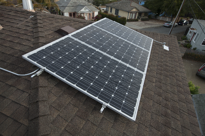
Three additional panels face southeast, catching the morning sun. You can see the roof jack on the right, where the electrical wiring goes down through the roof to the garage, and eventually to the load center.

In January I hired an electrical contractor to make the run through the roof and down the outside wall and into the garage, where he and I pushed through the wall into the back of the electric load center. There, my contractor friend installed a 20-amp breaker, then we pulled wire from the box to the upper roof, and he completed the wiring of the panels there.

Solar panels from apartment 01

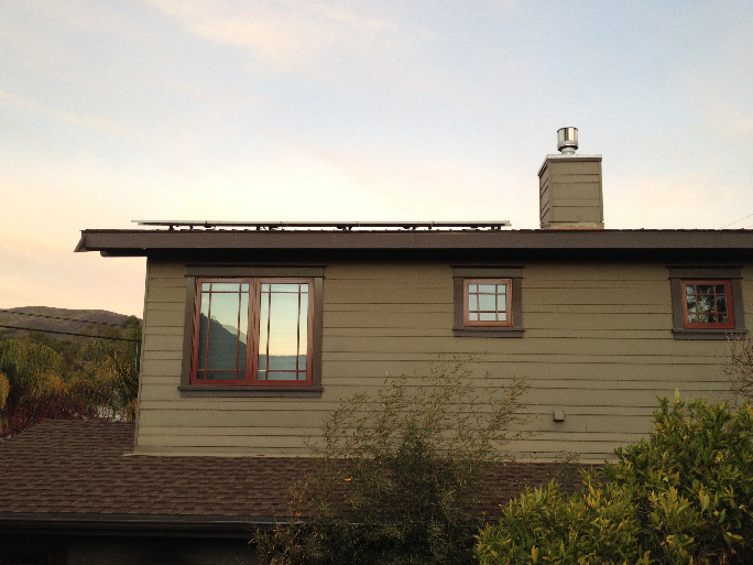
Not an eyesore: the panels, as seen from the neighboring apartment building. The slope of the roof, and the altitude of the roof make the panels all but invisible to my neighbors.

On January 11, the building inspector checked our work and signed-off on the permit, declaring it to be complete. This signed building permit was submitted to our electric utility, along with a long Net Metering application form. Normally, I was told, this takes just a week or two. The electric company installs (or modifies) the electric meter, making it capable of going both directions. Then the electric utility sends a Permit to Operate, which allows you to turn the system on. If you turn it on before receiving permission, it can potentially put utility workers are risk. In my case, it took two months.

Despite their public exhortations, our public utility is not keen to have citizen power generators. They tolerate us, but they are not happy about it. Every kilowatt-hour of electricity I make with my solar panels takes money out of their pockets, and that does not please them. It’s not that they don’t want the power, they do. But, they are in the business of making money by selling electricity. They provide the wires and the poles and the transformers, and it’s anathema to them to have citizens making their own electricity (and not paying as much for that infrastructure as their neighbors do).

I am of the opinion that electricity should be generated where it is used, especially in areas like mine where the sun shines all the time. Rooftop solar systems are the perfect solution to power shortages and brown-outs. The socialist in me says that all new construction in southern California should be required to have rooftop solar panels, and all major remodeling projects should require some solar to be installed. If every house in my city had eight solar modules on the roof, as I do, the local electric bills would drop very significantly.

Which wouldn’t please Pacific Gas & Electric Company.

In the first day of operation, my system saved me $3.997. That’s a tremendous amount of money. Most homeowners wouldn’t get the same savings because they are not in the electrical tier that I am (our home office uses a lot of electricity, pushing us into the fourth tier of electric usage charges). But even at the low tier, the average homeowner in my city could save about $1.54 every sunny day with just eight panels.

What if just half the houses in my city (pop. 44,000) had eight solar panels on the roof? Let’s guess that there are 20,000 residential structures in San Luis Obispo. If 10,000 of them had rooftop solar power, the savings would be about 117,000 kWh of power every day. This, at the lowest residential rate of 13.2 cents per kWh, would save $15,444 per day.

Which wouldn’t please Pacific Gas & Electric Company.

But, it’s 117,000 kWh of electricity available when it’s sunny and hot, when air conditioners are turned on, and when the threat of brown-outs and rolling black-outs looms over the region. It would allow PG&E to sell that much energy to other communities in the state.

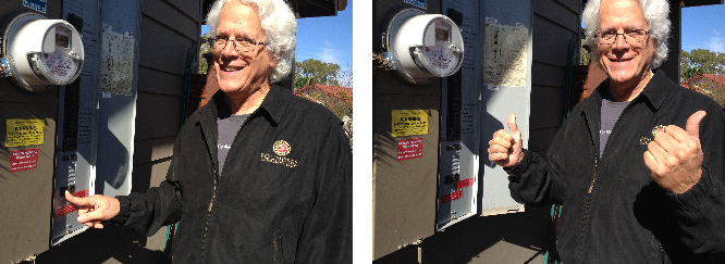
Brian flips the switch 01

Here I was at the moment of truth: 10:40 a.m. Friday morning, I flipped the switch to activate my solar system. What a thrill! Notice the red and yellow warning stickers on the electrical box; they tell interested parties that the system is energized from both sides.

This last Friday, at 10:35 a.m., I finally received my Permit to Operate. Five minutes later, in a small but very impressive ceremony at the load center on the wall of my garage, I flipped the circuit breaker to the on position, and my system started generating electricity.

In the months since it was ready to operate and that day, I could have generated about $240 worth of electricity. What a shame!


Posted in Adventures, New technology, Technology | Tagged , , , , , , | 4 Comments