

Continued from yesterday’s blog…
After I created the scan of my type proof, I opened it up in Adobe Photoshop and made some corrections (I rotated the G and the O), and I did some tonal clean-up to make the letters look sharper. Then I closed up the space between the lines to make the scan more compact, to fit into an Illustrator file more efficiently, and to make the process of drawing the letters simpler.
Having drawn numerous alphabets in the past, I prefer to work at about two inches tall for the caps. I placed the scan onto a new Illustrator document, then turned it into a template and created a drawing layer on top of the template (why doesn’t Illustrator do this automatically?).
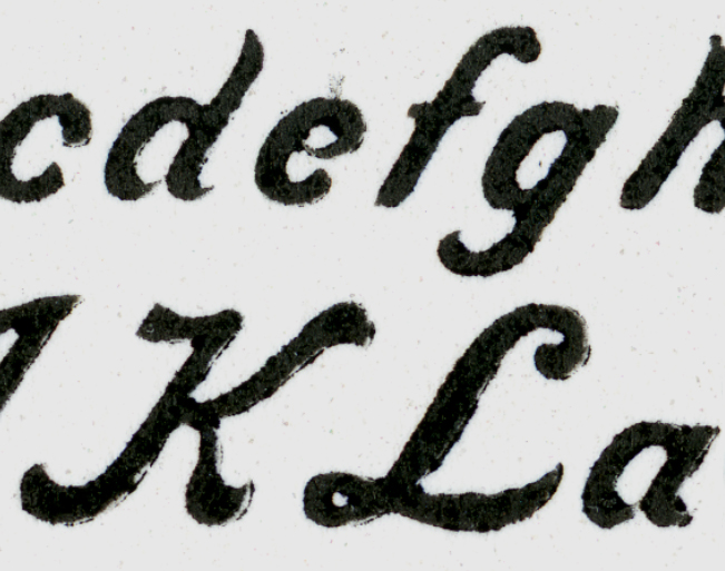
This is the high-resolution scan of the proof from the metal type. Notice that the lower case e and the a appear to connect in this proof. This is a result of ink filling-in the gap between the end of the bowl, causing it to touch the backs of the letters.
When resurrecting an alphabet it’s important to determine the intentions of the original designer. What are the constants in the font? Where does it deviate from constants? How wide are the strokes, and how do they interact? I am interested in making a digital font that is true to the spirit of the original type. What did the designer want the letters to look like? How do the strokes connect (or not connect)? What do the ends look like? These are questions that require some forensic work.
In the case of Lining Livermore, it is a strongly Italic font. I have never drawn such a font before, so I had a lot to learn about Italic letter design, and more importantly, Italic letter positioning. Italic glyphs are positioned to run off the top-right of the character space. In the metal type manifestation, the upper-right of many characters hangs off the type block to later be supported by the adjacent character’s block.
This is the cap V of Lining Livermore. Notice how the swash extends out beyond the type body block. This is precarious because it requires another letter to support it, and prevent that overhang from getting broken on-press. If no letter follows it, the typographer must put a high space in to support the letter.
I took the complete lower case alphabet of metal type to examine under the magnifier. The letters in which I was most interested were eap and q. I wanted to know if the stroke of the bowl of these letters connected to the stems, or if the ends came close, but didn’t quite touch the stems. On my proof, all of these seemed to be plugged-up with ink. Under magnification I could see very clearly that the intention of the designer was that the bowls should not touch the stems.
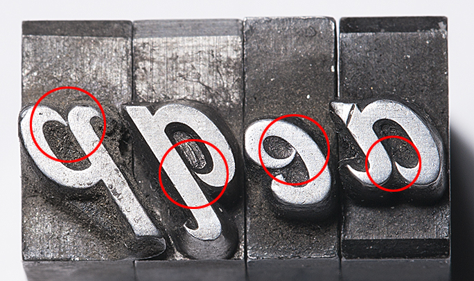
Notice in this photo how the pointed ends of the bowls do not actually touch the bodies of the letters. Notice also the misalignment of the e. It also lacks the chamfers the other letters have, and I must assume it was cast at a different time, in a different foundry than the other letters. After examining the type enlarged this much, I returned to the drawings and modified my letters to be more faithful to the metal type.
In my eapq selection I can see four variations of these finials, each slightly closer to, or farther from the stem. In general, though, they don’t touch, and that’s what I needed to know. I would incorporate that fact into the reborn design.
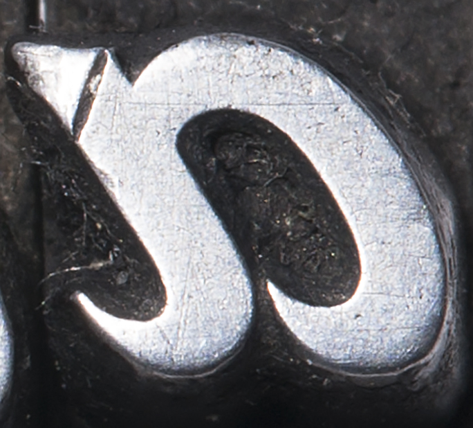
This extreme close-up of the lower-case a shows very clearly that the point on the bowl does not touch the body. Notice also the damage to the letter from 127 years of use. The small scratches come from cleaning the type, and the dents (upper-left) come from the type being dropped into the case – even a short distance – which damages the printing surface. The big dent is probably from something getting between the letter and the tympan in the printing press (thread? a bit of folded paper?).
When drawing letters for a digital font, I always start with the cap H and O. For this font I started with the lower case a, and worked my way forward. Since the Italic slant is so strong, and the differences between lower case and caps so extreme, it was not important to build a font in the order I have always done it. Instead, I just jumped in and did it in order.
Drawing an alphabet is a form of discipline; it requires that each letter be drawn with extreme care and attention to detail and consistency. And, having too many anchor points is unhealthy. I add anchor points sparingly, being careful not to over- or under-design. For example, drawing a circular stroke requires only two anchor points in most cases – three in the extreme. This frugal approach to drawing creates smoother lines, and no lumps, which are momentary changes in direction that cause a letter to look amateurish. To see lumps in a commercial font, look at Microsoft’s disgusting Century Gothic, which has many in its curvaceous parts. That, of course, is unacceptable in letter-drawing.
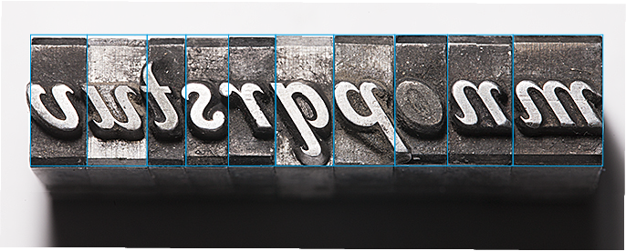
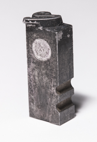
This illustration shows how the letters stand on their bases. Notice that many overextend their body blocks. The lower case o is plugged by printer’s ink that was never cleaned out. The bottom of the lower case m (on the extreme right) has been damaged by being dropped; the other letters are in extraordinary condition.
With the knowledge that the original Lining Livermore was intended to have its ends disconnected, I proceeded. Gradually I constructed the entire lower case alphabet.
Getting the letters from Illustrator to FontLab Studio is a function of enlarging the letter in a scratch file in Illustrator, placing its lower-left corner at the top of the page, and then cutting the outlines and pasting them into a Glyph window in Font Lab. Most professional type designers don’t do it this way, preferring to work entirely in FontLab. Though I appreciate this, I just don’t know the program well enough (even after several years of use) to be familiar with it enough to abandon Illustrator. My approach is more hybrid; I draw the basic letter in Illustrator, then I perfect it in FontLab. There are a couple of features in FontLab that are worth the price of admission: one is the optimize curve function, which will make any curve better, and is especially elegant when removing excess anchor points; taking an anchor point out of a curved path usually causes that path to improve.
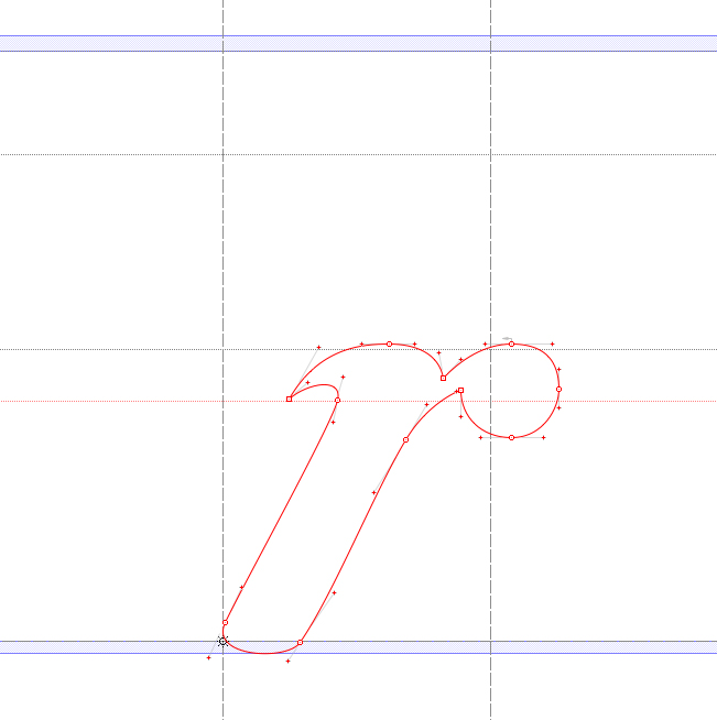
The glyph for the lower-case r in Lining Livermore shows how art imitates art. The digital character of the r must exceed the body of the letter in order to fit against other similar letters. If you look at the illustration above you will see the same thing happening in the metal type. The screen capture is from FontLab Studio.
Making a complete font – over 245 glyphs – takes a long time. There are 26 lower-case letters, 26 capitals, 10 numerals, of course. But that’s just 66 glyphs out of 245. There is still much work to do after the alphabet is complete. The punctuation, the diacritical marks, the ligatures, currency symbols, and a whole bunch of oddball characters like the eth (both cap and lower-case), which is a character used only in Icelandic. The infinity symbol, registered trademark, copyright, pilcrow, octothorpe (AKA: hashtag) and various others all have to be drawn. And, in the case of Lining Livermore, they have to be drawn “in character.” The registered trademark and the copyright symbols must be drawn with Lining Livermore style.

These are my copyright and registered trademark symbols for Lining Livermore. Many fonts don’t stay true to their style when it comes to these marks. I like it better when the marks continue the style of a font, rather than being generic.
FontLab is impressive in its ability to generate many of the hybrid glyphs automatically – the accented glyphs for Romance languages for example. All I have to do is to draw the accents themselves, and FontLab will create the derivative characters. It does a pretty good job, requiring just tiny adjustments after the fact. A small change to the original accent glyph is automatically reflected in the derivative letters, which saves a lot of time.
Gradually the font takes shape. I have two 24-inch Cinema Displays. On the right display I draw the letters and adjust their spacing. On the left display I have a large preview of the type in variations of settings: the alphabet, settings that emphasize punctuation, those that feature all-caps setting (doesn’t work with Lining Livermore!), and the traditional pangrams. As I work on the letterforms, the previews show me the results. It’s a long process of getting the basic spacing organized first, then I move on to more detailed adjustments.
More on the archaeology of Lining Livermore tomorrow!