…continued from yesterday’s blog
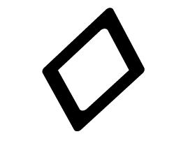
I’m probably never going to need the lozenge character in any typographic project I do. Nonetheless, it’s there, ready for me, whenever I choose to use it. That’s exciting.
The lonely lozenge. I don’t know what it’s for, but I know how to draw one!
I’m not sure what a lozenge character is for, but I’ve drawn a few of them in my lifetime, and I’m looking forward to using the little guy someday.
That, along with the Hungarian umlaut, and any letter that needs an Ogonek or a Ring.
These are all the special characters that one must draw when making a complete font. Did you know that fonts contain two different slash marks? One is the forward-slash; the other is the Multiply slash, which also has another name: Virgule (from Latin for “rod”). We type-drawing fools also must draw those ugly typewriter quotes that most are found in self-published books, and in most web sites (Web designers take note: you CAN use the correct apostrophes and quotes in web sites. The characters are there!)
Call me crazy, but I really like drawing the various accent marks that are found in fonts. I like the circumflex, the cedilla and the accent-grave, as grave as it is. I love the way these little marks add style to letters. In Lining Livermore I took some liberties with the Japanese Yen symbol. Instead of crossing the leg twice, I added wings to the right side of the letter. I’m sure that some Japanese bureau will not like this, but I do, and on this font I am the boss!

The pleasant Pilcrow is the demarkation of a new paragraph.
Most of all I love the Pilcrow. That’s the wonderful, sometimes romantic character that indicates a new paragraph. It’s also a good Scrabble word; keep it in mind.
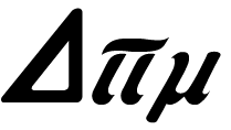
More pedestrian symbols pepper the nooks and crannies of every type face that is worth its salt. There are the symbols for Pi, Sigma (summation), Delta, Product, Partial Difference, Omega, and Integral. It was nearly impossible for me to impart the style of Lining Livermore for these characters, but I tried. I made them fatter than usual, and I added some similar endings to the legs of some of these.
Delta, Pi and Mu are drawn to match the Lining Livermore font.
More useful symbols include the degree symbol, the plus-or-minus, approximately equal, dagger, double-dagger, Section, and Logical Not. Now how much would you not pay? The ellipsis is there, as is the per-thousand, which is like the per-centage, except with two zeros on the bottom. There is the dollar-sign, the cents-sign, the Yen (as already mentioned, a generic Currency symbol that is never used, the Pound Sterling, and the Euro.
Pound Sterling, generic Currency, Dollar, Euro and Yen.
Para ellos que hablan Español, there are the tilde and an upside-down question mark and exclamation mark. There are four drawn fractions: 1/2, 1/3, 1/4, and 2/3. And there are two ordinals: a and o, which are top-aligned with the numerals. Add to that list the centered period and the dotless i, and we have a mostly complete font. I added ligatures for ffi, ffl to the fi and fl that are a standard part of a font.
There is no longer an Apple logo; those disappeared years ago when TrueType fonts were developed.
Asterisks are always fun to draw, and they can readily be drawn in the style of the font. My Lining Livermore asterisk is in keeping with the rest of the letters. Since I had none to model mine after, I created it from one of the letter parts, then copied it around a circle to complete the mark. With a little bit of adjustment, I made it into the new asterisk for this font. The Ampersand is in the metal type, and I drew that faithfully.
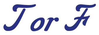
There is one big editorial change that I have made: I drew a new cap T. I just didn’t like the one in the original font, and frankly it doesn’t go well with the rest of the letters. It looks more like a swoopy C than a T. But, for any purists out there, I included the original as a Stylistic Alternate character in my OpenType script. The new T is based on the cap F, which is lovely. I took that letter apart, then fashioned my version of the letter for my font.
I have a dozen hours in the font now, and I am making progress. One of the other fonts I have been working on has taken me about four years, so I am sure I have a long way to go.
In my next blog I will talk about kerning – it’s not a process, it’s a career!


I was just starting in the industry during the changeover from hot type and hand composition to photocomp and then digital type. The first generations of the new technologies were crticized (and rightfully so), by the craftsman of the day. As the 2nd and 3rd generations rolled out that improved and only the pickiest craftsman that were trying to protect their jobs could find fault. (Sound famililar with the offset to digital print debate today.) It is a little ironic that when you scanned your letterpress proof of this type that under magnification you would see it was rastered. Rastering was another complaint of the early digital world, but other than low-res files, you don’t think about it, today.
Hi Ron,
I am an old-timer, and was part of both of those revolutions. But, I always believed that digital technologies would surpass the traditional technologies, and we would be the beneficiaries.
I had a Linotype 202W CRT typesetting machine, and it was a very high-speed machine that used type rasterized at about 1,000 pip to make its images. I could see that resolution without much difficulty. The next machine I got was the Linotronic 300, whose 2540 ppi resolution allowed us to make output with effectively limitless quality. That machine also used PostScript, so the rasterizing took place at the time of output, where the 202’s rasterization took place when the fonts were created.
Scanning the printed proof at 1200 ppi allows me to get microscopic details in the type (you can easily see the meniscus of the ink along the edges of the letters) that I use to draw new letterforms.
Translating between analog (metal type) and digital (OpenType) requires interpretation of the original font, and interpolation of information that falls between the pixels. At that resolution it’s not too hard.
Thank you for your comment, and best wishes,
Brian