

This is the fourth in a series of analyses of the output of the Landa S10P press. If you would like to start at the beginning, click here.
Whenever a printer gets out a magnifying glass, there are bound to be conversations about the behavior of a printing process. That has been my focus, if you’ll excuse the pun, for these posts. My “magnifier” has been a clever new lens from Laowa, a new 2.5X “macro” lens for my Canon R5 camera. Because it magnifies more than 1:1, it is really a “micro” lens, but who cares about the title? What matters is that it’s a spectacular close-up lens that allows me to move in close enough to get images of these printed sheets that show how the machine is making its marks on the substrate.

Resolution of the press
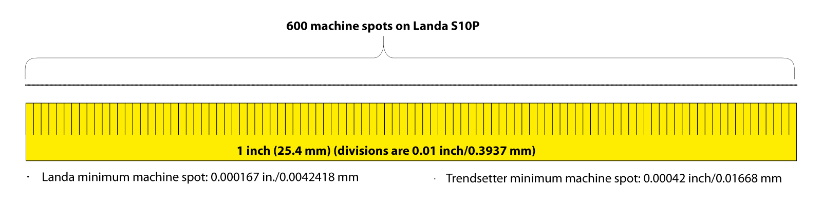
The absolute resolution of the Landa press is 600 spi – machine spots per linear inch. I use that term to describe the smallest size of a single droplet of ink from the machine’s ink-jet heads. It cannot make a mark smaller than that. Compare that spot – 0.00167 inch (0.0042418 mm) – to the smallest mark possible on a Kodak Trendsetter platesetter – 0.00042 inch (0.01668 mm), when used to make aluminum printing plates for offset printing, and the Landa spots look large. But that is only when we have our magnifying glasses out. (The Trendsetter can make smaller spots, but is commonly set to this resolution.)
The secret to quality imaging is using the resolution of the machine to its fullest and making excellent images with the resolution available. Both processes do this handily, and without a magnifier it’s difficult or impossible to tell the difference.
All printing processes are designed to create the illusion of detail, or the illusion of tonality, in the eye of the beholder. That is the reality of our printing processes: illusory techniques. If done well, they are invisible to the viewer; it’s just an image, or it’s just lettering, or it’s a just a line on a printed page.
We in the graphic arts industry know that these marks on paper are much more than an image, lettering or a curvy line. Images on various substrates are created by technologies that have been under development for over a century, with the greatest concentration of technological development being in the past 40 years.
The parts of my test sheets that I analyzed for this post include those showing fine lines and very small type. These are clearly reproduced on the Landa machine, and the quality shows that the sophistication of the Fiery front-end on the machine has methods for handling extremely small elements effectively. Combining the Fiery software and the ink-jet delivery technology of the press, these images are visually comparable to those possible on offset presses with greater resolution.

Too thin to print
Low threshold line thickness is a factor of any raster-image processor. It applies here. As the line thickness gets smaller, the machine draws lines with the closest number of ink droplets possible. This creates a small problem where line thicknesses are limited by the number of available machine spots. For example, with a minimum of one line of machine spots, the Landa press can draw a line as thin as 0.00167 inch in thickness. Lines with more weight are drawn with more than one row of ink-jet spots. But lines thinner cannot be rendered at all. So, the RIP will draw any line with a requested weight less than that 0.00167 inch at the same weight. To do otherwise would mean that the line would not be rendered at all, and that’s not an acceptable response.
Reversing those same lines out of black (or a rich black) creates a slightly more complex problem for the machine: it has to print up to, but not beyond the position of the white line, and then not print ink along that very small path.

Angular anguish
These line weights assume that the ink-jet heads on the Landa machine are perfectly perpendicular to the paper path, and my micro-photos show that this is – almost – true. On the example shown there is a point where the thin line suddenly jumps one machine spot downward before continuing on its path. This could be the result of the ink-jet spots landing a microscopically small distance away from their target, or it could be that the original, which was drawn in Adobe Illustrator, is not “square” to the path of the ink-jet heads. On offset presses there are screen angles to consider; the Landa press does not have the exact analog, as it does not draw halftone dots. This makes imaging simpler, I think.
So, creating a very thin line at any angle other than zero or 90 degrees will certainly cause a jagged edge along its path. This is true for any raster imaging process.
Very small type
Type in very small sizes will challenge any imaging engine. Imagine how thin the crossbar of a capital A in Times Roman is when the type is being set at a common size like 12 pt. The same challenge that we face with thin lines applies to type: the thin lines of letters are very often thinner than the smallest machine spot available on the machine. So the RIP must overcome this by adding weight to the thinnest elements of letters in order to render them at all.
For this test, I set lines of Times and Helvetica at sizes starting at 8 pt. and getting smaller down to 1 pt. At that size, the letters are rendered on the press with only three or four machine spots (ink droplets). Curiously, it works. Even at 1 pt., the type is legible – barely. I have done this same test on offset presses and the same is true there, though there are four times as many machine spots available.

Overall, the rendering quality of type on the Landa machine is extraordinary.
When we reverse-out white type on a black background on offset presses, we often create a multicolor or “rich black” screen combination for that background. This is to make the black more black – increasing the density and contrast of the printing. It also creates an opportunity for the lettering to get ruined by any small register error on press.
The Landa press does not need rich black to be effective. The density of a single-color black is adequate. But, I tried a rich black nonetheless, and the results are very good. Since the Landa press generally does not go out of register (it’s not impossible, but it’s very unlikely) the multicolor background with white reversed-out is rendered very effectively. I would argue that rich black colors are unnecessary on the Landa machine, as single-color black is dense enough to look perfect.


Reg marks the spot!
And, speaking of register marks, I printed some using black only, CMYK, and CMYKOGB to see if the press shows any tendency of going out of register. It does not, though there are some individual color ink spots that are trying to sneak out from under their neighbors. That effect is nearly invisible, even at magnification.

Summary
The Landa S10P press does an extraordinary job of printing fine lines, fine type, and reversed-out lettering. Register of colors on the press is effectively perfect. Density of ink is excellent. The detail in the printed images is comparable to excellent quality offset printing, though the machine’s resolution is not as fine. The combination of an excellent imaging engine (the Landa part of the machine) and an excellent front-end processor (the Fiery part of the machine) make this press a quality production machine.
Something to try next time
It would be interesting to run the fine line and fine type tests at a slight angle, not zero or 90°. This would make any effect of lines not fitting the digital raster pattern of the machine stand out. It would be interesting to run the same test sheet with the entire page rotated slightly. That would really put the machine’s imaging engine to the test. It’s moderately expensive for me to run these tests, but I promise that I will do that on my next press sheet test.
Read on!
To read the next Landa Files post, please click here.