Another Blognosticator milestone

Blognosticator Head

Greetings, dear readers,

With your continued interest, The Blognosticator has now passed the 90,000 reader mark.

The blog is read by more than 200 people every day, and it continues to grow at an impressive rate.

90000 readers

So, please keep those cards and letters coming! (I have never received a card or a letter.) And, keep those comments coming! I especially love those from people who believe that we should put numbers in parentheses after the number is printed in text. There was one (1) of those today. How does putting the numeral 1 after the word “one” make the previous sentence any clearer?

I will continue to write The Blognosticator, and occasionally I might write something controversial. I sometimes enjoy controversy.

My best wishes to all of you. Thank you.

Brian P. Lawler
October 9, 2014


Posted in People | Tagged , , , , | Leave a comment

The most exciting thing I saw at GraphExpo 2014

Blognosticator Head

I troll the hallways at GraphExpo, looking at the many booths showing exciting technologies to potential customers. There are people selling software, hardware, firmware, middleware, and usually – pretzels. This year there was no pretzel vendor, nor an ice cream vendor, both sorely missing in the vast space of McCormick Place.

And, I confess that having trolled these halls since the mid-1970s, I have become jaded. It takes something pretty cool to get my attention.

I appreciate the new models of the presses, and the newest expansions of capabilities. Last year at the Print show, I was really excited about the two ink-jet-and-laser label printers from EFI and INX/Komori. Both of those were really cool, and I could see an obvious market for machines like this.

I often envision myself as a younger man, an entrepreneur walking the show floor, looking for the perfect machine or techniques to differentiate my business from my competitors’ businesses. I remember lusting after the Heidelberg DI press a decade ago. I thought often about how a solid small business could be made with one of those, a paper cutter, and a folder. Small, easy to operate, insanely profitable, and a business that could be run entirely by one or two people.

This year I searched for such a technology, for the machine that could be used to set up a solid small business.

I didn’t find it.

But I was directed to a couple of booths where I saw truly exciting technologies that will change the industry. When I say “directed” I mean escorted by my dear friends Craig Kevghas and Elmo Sapwater to the booths of companies they felt I would like to see. These two gentlemen said, “I really think you need to see…” and walked with me to one or the other of several booths.

At the annual shows in Chicago there are a number of technologies or systems that are awarded Must See ’Em status by a secret panel of judges who let us in on the secrets of the show in advance. These folks spend the summer, I am told, evaluating press releases and web sites of the manufacturers who plan to attend Print and GraphExpo with their wares. They scrutinize and evaluate, and finally give their thumbs-up to a number of products they think we should see.

The product I saw in booth 1177 was not a Must See ’Em product. It wasn’t a big, flashy new machine making glossy folded cartons, or putting colored foil onto printed sheets with glitter (more on that in my next blog).

In booth 1177 was BDT, a company from Rottweil, Germany showing the most boring, but exciting machine component that I have seen in many years.

It’s a paper feeder.

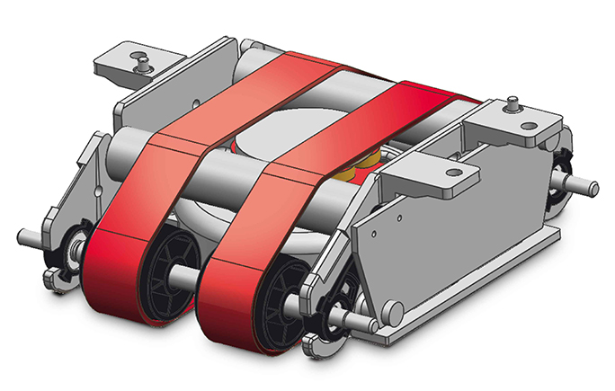
Tornado

This is an illustration of the BDT Tornado feeder module, at almost full size. The device lifts a sheet of paper and feeds it into a printing press. (Image courtesy of BDT)

For anyone who has ever run a sheet-fed printing, folding, or other machine, it is the feeder that causes the most difficulty. Paper feeders are a necessary part of any printing machine that uses sheets of material, and while absolutely necessary, these feeders are also the source of many a headache, and lots of time trouble-shooting problems that come up before the sheets are printed.

Feeders have the tedious but all-important job of picking up one (only one!) sheet of paper, and forwarding it to a pinch-roller where it is tested for thickness (and failed if that’s not right), then pushing or pulling – or otherwise cajoling that sheet of paper along a conveyor to the side-guide and gripper where it begins its journey through the press. Feeders are amazing devices; watching one work is an amusement tantamount to watching a fine mechanical clock work. When feeders work, they work perfectly; when they don’t work, they cause incredible trouble for the press operator.

BDT has developed a feeder so good, so delightfully simple, so wonderfully effective, that it belongs on every sheet-fed press in the world.

Really.

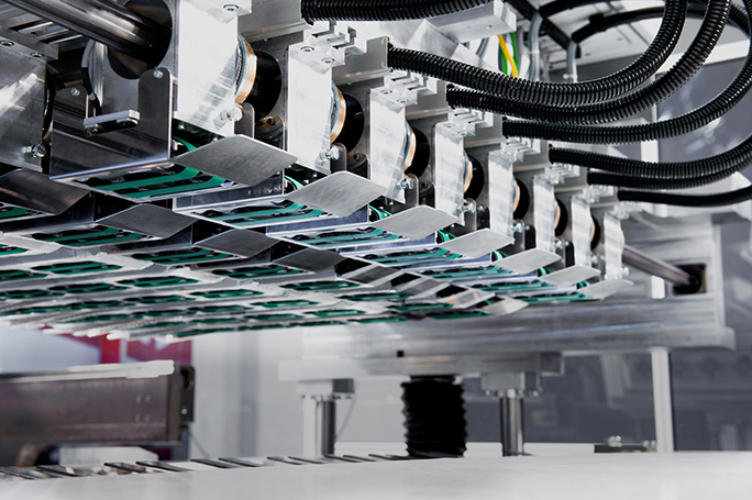
Row of BDT feeders

This photo shows a row of the Tornado modules in a feeder on a press. Each one is about 4 inches in width. The green “tractor-tread” belts propel a sheet at amazing speed into a press or other device with tremendous precision.

The company’s small Tornado module lifts a sheet substrate, then forwards it to the next station in a printing or post-press device with what appears to be 100 percent effectiveness. The Tornado device is so clever and effective that I suspect we will start seeing them on many major brands of presses. I was told that new models of the HP Indigo press feature these feeders. I am jealous of the operators of those machines because they will never get to experience feeder jams, doubles, or misfeeds like all of their forebears. Lucky dogs!

To watch the Tornado with an experienced pressman’s eye is like watching a gymnast who is perfect in her execution. This is mechanical poetry in motion. And all it does is pick up a piece of paper and push it to the next station on a printing press!

Heidelberg! Komori! MAN Roland, Mabeg, Mitsubishi, Polar, Müller-Martini, MBO, et al – take a look at this! You’ve never made one this good.

Words like “foolproof” and “unbelievable” and “wow!” were running through my brain as I watched the gentlemen from BDT demonstrate their diminutive mechanism as it picked up sheets of material (and they demonstrated a wide variety of substrates) and shot them out into a corrugated box.

As I walked away, I thought, “there’s a technology that most people would never appreciate.”

A paper feeder.

I am glad I had a chance to see it, because in its very small way, it will change the world of printing.


Posted in Business, Gadgets, New technology, Printing and Printing Processes, Technology | Tagged , , , , , , | 1 Comment

Making things I designed in Illustrator
– CNC routing

Blognosticator Head

In previous blogs I have described how I have designed things in Illustrator, then built them out of wood in my shop. The shop in question is located in my friend Jim’s barn. We consolidated shops in 2005 when I moved into a small house where there is no room for large power tools.

Since then we have expanded the shop to include several stationary power tools and a very large work bench and assembly table that has electricity and compressed air delivered to its perimeter. I have added digital micrometers to two of our tools – one to the router table, making it precise to 0.001 in., another to our 12-inch planer, adding the ability to dial-in similar precision to cuts we make on that machine.

Moving deeper into the digital domain, last month we installed a large CNC router table, and we have been learning the ropes of computer-controlled routing since then. The CNC machine is a product of a Washington state company called Avid CNC. They sell kits for the do-it-yourselfer to make a CNC machine of your own. The parts are well-made; the precision of the machine is extraordinary.

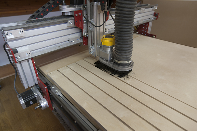
Making T-slot board 08 This is the CNC router, built from a kit made by Avid CNC. At the moment of this photo the router was cutting T-slots in a sheet of 3/4 in. hardwood plywood. That plywood sheet will become a hold-down board for future projects.

Once the machine was assembled, which took the better part of two days, it was ready to run. We entered the learning mode, where we have been for several weeks. We have learned that the machine will do exactly what you tell it to do – even machine right through itself, if you give it the wrong instructions.

It’s a very powerful machine, using four NEMA 34 stepper motors to control the movements and position of a DeWalt 3.5 HP router (replaced twice since with more powerful motors).

We run the machine with a program called Mach3, which is probably the most common machine control software in the industry. That software can be customized to control a wide variety of CNC devices. Ours is pretty simple – left-right (X), back-forth (Y), and up-down (Z). But within these three seemingly simple axes are a world of complexities: cutting speed, spindle speed, plunge speed, cutting depth, number of passes, step-over settings, tabs, and much more.

CNC machines of all types use a control schema called G-code. G-code is text, thankfully, and it’s pretty easy to interpret. Here is a snippet of G-code:

G0 X0.0000 Y0.0000 Z0.8000
(Closet shelves 3)
T1
(End Mill {0.25 inches})
F150.0
F30.0
S6000
G0 X9.0267 Y4.7822 Z0.2000
G1   Z-0.2500 F30.0
G1  Y17.5546  F150.0
G1 X9.0767
G1 X9.0765 Y4.7744
G1 X9.0753 Y4.7632
G1 X9.0728 Y4.7555
G1 X9.0666 Y4.7520
G1 X9.0559 Y4.7498
G1 X9.0435 Y4.7503
G1 X9.0345 Y4.7530
G1 X9.0304 Y4.7559
G1 X9.0277 Y4.7663
G1 X9.0267 Y4.7822
G1 X8.9267 Y4.7810

If you study the G-code, you’ll begin to recognize its instructions. The top line tells the machine to go to X0, Y0, and 0.8 Z, which is eight-tenths of an inch above the work surface. This is “home” for the X and Y axes, and a safe margin above the material so it doesn’t start cutting too soon. The T1 is a definition for Tool 1 (some machines have multiple tools). Ours has only one, and in this case, it’s defined as an end-mill (a simple two-flute 1/4 in. diameter router cutter). The next two lines are X and Y cutting speed (150 in. per minute or 2.5 inches per second, which is pretty fast), and a plunge speed of 30 inches per minute, which translates into one-half inch per second, also pretty fast. The S stands for spindle speed, which in this case is 6,000 rpm.

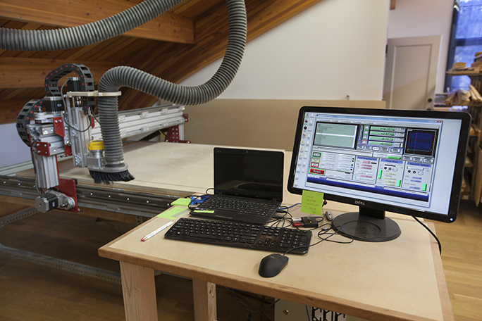
CNC Router 06 The router is controlled by a Windows PC, running two programs: V-Carve Pro and Mach3, both of which are necessary to do CNC design and machine control.

Then the work begins, which an instruction to move 9.0267 inches along the left-right axis, 4.7822 inches along the back-forth (Y) axis, and to hover above the material at 0.2 inches (it will begin cutting there). Following these instructions, we learn that the machine is starting a cutting path at this location because it immediately plunges the cutter .25 inches down (below zero Z), then moves to a new location along the Y axis only (a straight line), then a similar cut along the X axis, and begins a complex “curved” cut described by hundreds of lines of X-Y code positions.

Machines like this don’t really cut curves, they step in both X and Y directions in small increments, making the effect of a curve in the material being machined. It’s equivalent to the effect of applying a raster to a curve in Adobe Photoshop. The curve is converted from a mathematical entity into a series of pixels on an X-Y grid defined by the resolution of the photo. In the CNC software, that raster grid is 0.0001 in., though the resolution of the machine is closer to 0.002 inch. The stepper motors can move in micro-steps, essentially half-steps that can increment the cutter between two poles of the stepper motors.

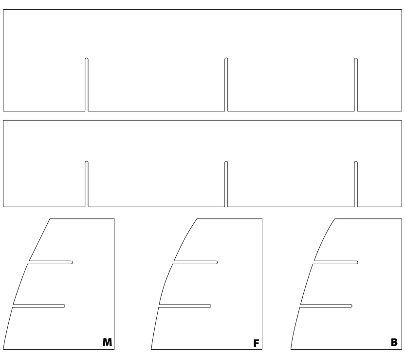
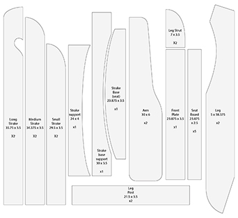
Print These are parts designed in Adobe Illustrator for a set of interlocking shelves I made for a cabinet in my camper van. I drew them at actual size in Illustrator, imported the file into V-Carve, and machined the parts in Baltic 1/4-inch plywood.

I suppose, with a bit of practice, one could write G-code by hand; it would be like writing a photo’s pixels with a word processor. The consequences of error are much greater when you are running a multi-horsepower machine with a spinning blade into a block of wood, or worse – part of its own aluminum or steel superstructure. Oops!

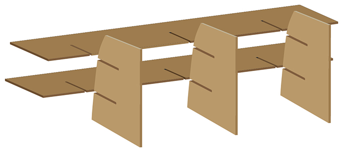
Print This is the exploded view of the shelves I drew in Adobe Illustrator. I used the 3D extrude tools in Illustrator to convert 2D art into 3D representations.

To build the G-code, we use another program. The program we have chosen is a Windows-only application called V-Carve. It’s a very popular CNC design tool for a variety of uses, and it has the ability to import Adobe Illustrator (.ai) files directly. I experimented with a similar program for Macintosh called MESHCam, which is nice, but it lacks many of the capabilities of V-Carve on Windows, and it requires the intermediate step of exporting DXF files from Illustrator (no big deal, but it’s an extra step).

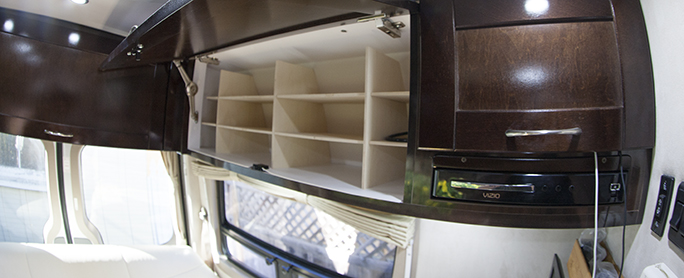
Shelves extreme wide 05 …and these are the finished shelves in the cabinet of my van. They provide easy storage for our clothes when we go out camping in the RV.

The way V-Carve (and similar programs) works is to declare a material size and thickness, and the origin X,Y as one of the corners (three-dimensional space can be reassigned on these CNC machines).

Once the material is defined, then cutting paths can be drawn in V-Carve or imported from Adobe Illustrator. Once those paths have been imported, they can be assigned to cutting tools, with cutting speeds and cutting depths assigned. When complete (and I am glossing over a lot of detail here), V-Carve generates the G-code for the project, and you load the G-code into Mach3, and you make your parts. This, after mounting the material solidly to the cutting table of the machine. You’re in big trouble if you fail to secure your work to the table.

Once it gets going, the CNC machine is a delight to watch. It roars around the material raising and plunging its cutter into the material and making a huge amount of sawdust where there once was solid material. It also makes a lot of noise. In the coming days I will write about some of my projects, and will show examples of how I have been using the machine to make practical things from Adobe Illustrator designs.

Posted in Gadgets, New technology, Technology | Tagged , , , , , | 11 Comments

Drawing on the Photoshop side of the brain

Blognosticator Head

A few blogs ago I wrote about how to use AppleScript to crop a Photoshop document with pixel precision. As part of that same project, I needed to add white space to the canvas and trim marks top and bottom along the edges to mark the location of a cut that was made later on a large metal cutting shear.

The resizing of the canvas is easy. The AppleScript code looks like this:

resize canvas _CroppedPano width 11287 height 17700

This, of course, must be placed within the construct of a script, but looking at the syntax of the instruction, it says simply, “make the canvas bigger (or smaller) to these dimensions: 11287 X 17700 pixels.” AppleScript and Photoshop will carry out your instructions without delay and without asking if it’s OK, so be careful to be accurate with any script that makes changes like this.

_CroppedPano is my variable name for the photo on which I am making the changes.

Now let’s look at how the crop marks are drawn. Photoshop, like Illustrator, uses the Cartesian coordinate system for all of its measurements. Upper-left is 0,0 (early versions of Illustrator put that 0,0 at the lower-left). Photoshop measures everything in the current measurement unit, whatever that may be. At the top of my script I tell Photoshop to use the pixel unit of measure:

set ruler units of settings to pixel units

From this moment on, the program is computing values in pixels.

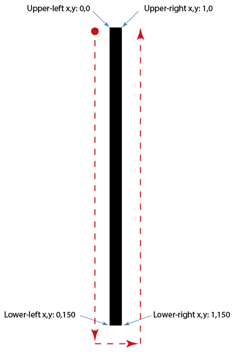
This is the way Cartesian coordinates work in Photoshop (and everywhere else):

Print

The crop marks I want to draw are one pixel wide and 150 pixels tall (in this example, that’s 1/2 inch). I needed one at the top and bottom of each panel, on both the left and right edges, and one-half inch in from the edges (these are crop marks).

Here is the code for the AppleScript to make the first mark at the upper-left of the photo:

set _LineShape to {{150, 0}, {150, 150}, {151, 150}, {151, 0}}
select current document region _LineShape
fill selection of current document with contents {class:RGB color, red:0, green:0, blue:0} opacity 100 without preserving transparency
deselect current document

Parsing those lines of code, the first line lists the Cartesian coordinates of a 1-pixel by 150-pixel rectangle, located 150 pixels from the left edge of the image. The second line of code tells Photoshop to create the variable _LineShape (which is the name of the line I am drawing). The next line fills the shape with black (RGB 000) with 100% opacity and no transparency. The last line deselects the current selection so that I can make another selection.

The other three crop marks are made the same way, but with different coordinates in the x,y positions for all corners.

At the end of the script I return Photoshop to inches units for measure:

set ruler units of settings to inch units

…and then I end the script. The result is a photo with a larger canvas (the background color is used to expand the canvas) and crop marks on the corners:

Running the script – even on multi-gigabyte files – takes just a few seconds. It is absolutely precise and absolutely repeatable.

Here is a photo showing crop marks like those I have described here:

Burning Man at with marks

Notice that it has pairs of one-pixel-wide crop marks top and bottom, left and right. That is exactly what the script does, after it increases the canvas size.

When you need precision, and I often do, using techniques like this can make a job successful where dragging rectangles on screen will not be as accurate.

Posted in Photography, Technology | Tagged , , , , , | Leave a comment

Burning questions, answered

Blognosticator Head

My wife and I went to Burning Man last week. It was something we had wanted to do for several years, and now we have done it.

The legendary counterculture festival is held on a dry lake bed in northern Nevada, and for a week each summer that lake bed turns into a city of over 65,000 people. We were just two of them, but we were immediately swept up in the activity and community of Black Rock City. We had many preconceptions of the event, as my sister has been going for many years, and our son for the past four years. They had told us about the event, and had encouraged us to go this year. Their stories made us want to attend and experience it for ourselves. We were not disappointed by the reality of Burning Man.

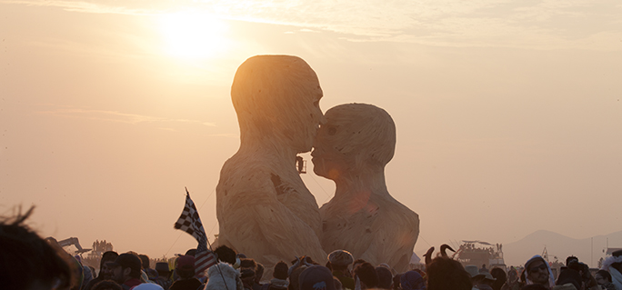
The Embrace sunrise

This sculpture, standing about 50 feet tall, was called The Embrace. It was built by a team of 80 from three cities, assembled on the site, then burned to the ground on Friday morning. The Embrace was funded with crowdsourcing money on Kickstarter. Below is The Embrace an hour later.

Burning embrace

Getting tickets was not easy. The 65,000 tickets sold this year were swept up in less than an hour. Two additional rounds of ticket sales in early and mid summer sold out in seconds. We were lucky to be able to buy tickets and a vehicle pass from two people who could not attend this year’s event. And, those ticket holders were nice enough to follow the no-scalping policy of the event organizers, selling them to us at face value. Burning Man tickets are not cheap: $380 each, plus the parking pass. There was a fellow sitting by his car at the Wadsworth exit of Highway 80 in Nevada with a sign that read “Burning Man Ticket Wanted: will pay $1,000!”

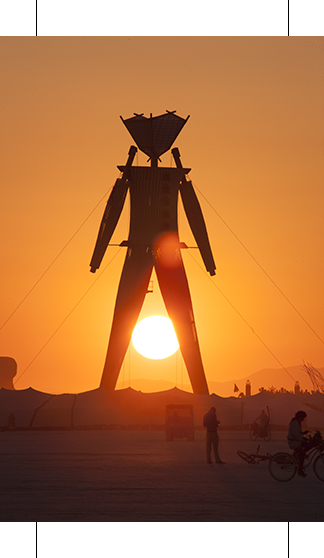
The 65,000 inhabitants of the event live in a semicircle that is several miles across. Outside the area reserved for camping is the Playa, a large open space that continues for several miles onto the lake bed. On the Playa are the Man, a gigantic wooden sculpture of a man towering over 100 feet into the air, the Temple, another structure built by the Burning Man organization, and numerous other constructions. That Man and several of the others are burned to the ground by the end of the week. It’s very odd and absolutely delightful.

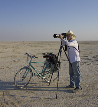
Brian with telephoto Continue reading

Posted in Adventures, Art, Bookbinding, Photography | Tagged , , , , , , | 3 Comments

Making things I drew in Illustrator

Blognosticator Head

Last summer I built a nice Adirondack chair. It was based on an existing chair that had rotted-out, a victim of years of being out in the weather. I decided for the clone that I would make it entirely of oak lumber, and wherever there was a connector, I would use stainless steel.

Adirondack chair on pier

This is my assembled Adirondack chair on the dock of a friend’s pond. The chair is painted with white exterior primer prior to being assembled, then later painted with the final color – purple.

I took the old chair apart, mostly by sawing the rusted fasteners apart, then tracing the wood pieces onto kraft paper. I took the tracings home and spent a bit of time reconsidering the design of the chair. I made some technical changes to make the chair stronger, then I made some changes that I thought would make the chair look better.

I made full-size drawings in Adobe Illustrator, then printed those out on my Epson ink-jet printer on a smooth, uncoated paper at 720 ppi resolution. I didn’t need photo quality; I wanted speed. Then I took a trek to the local lumber yard to purchase some oak boards, and several hundred dollars later, I had all the wood I needed.

Adirondack Chair plan to print

This is my cutting diagram, which I printed on my Epson wide-format ink-jet printer at full size. I then glued the curved patterns directly to the boards, and cut them on the bandsaw. Later, I sanded the pattern paper off.

I ordered stainless machine screws, carriage bolts, washers and nuts from McMaster-Carr, a Los Angeles based purveyor of everything mechanical. Several scores of dollars and a couple of days for shipping later, and I had all the hardware.

I glued the ink-jet printer output to the oak boards (I cut them to approximate size first) with water-soluble glue. Then, using a combination of tools including a table saw, a bandsaw, a chop saw, a router table, a hand-held router and other hand tools, I had all the parts cut and ready for assembly.

For those boards with ink-jet paper glued on top, I used the printed lines as cutting guides on the bandsaw. Where two parts had to be identical, or mirrored (the arms are a good example), I screwed two boards together then cut them at the same time on the bandsaw. Whatever irregularities occurred, occurred to both boards. I completed all the cutting, then moved on to surface sanding and smoothing curves. For those operations I used a hand sander, two stationary belt sanders and a stationary spindle sander.

Chair strakes 02

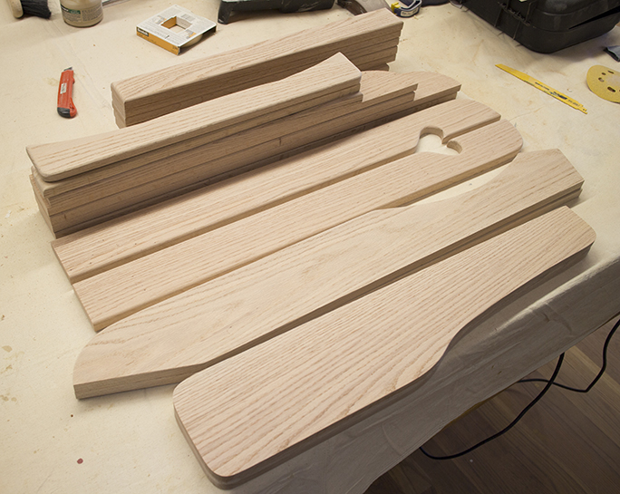
This is the entire chair as cut and sanded boards. Some of the board edges are routed with a half-round cutter – I did this only where the boards touch the person sitting in the chair. All other edges are left square. Assembly began at this point, following a primer coat of white exterior paint.

When all the boards were smooth and finished, I cleaned each one, then applied two coats of latex exterior white primer on the boards. It’s better to paint the raw material then assemble it into a chair than to build the chair and paint it. Unpainted parts, especially those hidden by joints and corners, tend to be an invitation to dry rot.

When the chair was assembled, a couple of days later, I sanded the tops of wood plugs I used to cover the screws, and then I sprayed several coats of exterior latex paint on the finished chair. You may wonder why I started with beautiful oak boards, only to paint the chair with purple paint. Remember that my objective was to make a weatherproof chair. The color was chosen to work with the other colors in our garden.

Chairs on Deck 2

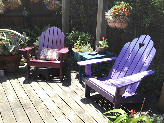
…and here is the finished chair on the right, its beautiful purple color fitting in nicely with the plants and the sister chair on the left in aubergine. I plan to replace that chair soon, as it’s showing signs of decay from the elements.

Using Illustrator as a design tool for real objects is interesting. For me it’s easier and less expensive that getting a CAD program, and I already know how to use it. Working entirely in 2D is easy for me, and Illustrator is delightful for this. As mentioned, I draw at full size, requiring that the canvas be set to the size of the full size lumber.

The finished chair is very nice on our back deck garden (we have a very small yard), and the colors of that chair and its counterpart work nicely with the greens of my wife’s wonderful flora.

A combination of software – Illustrator, hardware – the wide format Epson printer, and harder-ware – the various tools in my wood shop, make nice finished products. It’s nice to be able to design, then build real objects from the computer screen.

Posted in Adventures, Art | Tagged , , , , , | 8 Comments

AppleScripting Adobe Photoshop

Blognosticator Head

I get involved in some pretty big stuff:
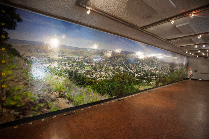
SLO PANO walk-through 26

This was my 58-foot GigaPan photo of San Luis Obispo as it appeared in the San Luis Obispo Museum of Art in March. That photo was printed in 17 sections on glossy paper, then mounted on the wall with wallpaper paste. The same image is now being printed on aluminum sheets for a permanent installation at Cal Poly, San Luis Obispo.

In January and February I wrote about the panoramic photo exhibition I had at the San Luis Obispo Museum of Art. That involved 20 photos. One photo, which I call Daniel’s Point, I printed to 58 feet, 7 inches in width. The original of that image, which was taken with a GigaPan device, is over 44 GB in size. I reduced the size of the file to make the print nearly 60 feet long for that display. For that image, I printed 17 vertical strips, each 44 inches wide, with a one-inch overlap for the wallpaper man to use for register.

When the show ended, my friends and I gathered at the museum and pulled the photo off the wall, and threw it away.

But, someone took notice! A group of students from the Associated Students, Inc. at Cal Poly saw the exhibition and decided that they wanted to have me make a version of that photo for permanent display in the University Union. I was thrilled.

This time, rather than print the photo on Epson Photo Glossy Paper, the ASI wanted it printed on sheets of aluminum. This exhibition is permanent. The supplier of the aluminum prints is a company near Santa Barbara, California. They can print on sheets up to 48 x 96 inches in size.

The process is dye-sublimation, where the image is made onto a paper carrier on an Epson 9600 ink-jet printer. That carrier is printed with dye-sublimation inks on the paper carrier, and the image is reversed as it is printed. The dye-sub paper is then positioned on an aluminum panel that is coated with a polyester emulsion. The sandwich is then put into a heat/pressure press where the photo is transferred to the emulsion on the aluminum.

My image will appear 33 feet long, and about five feet tall. So my challenge was to cut the image into sections that would fit onto the aluminum sheets, with an overlap of one inch to trim before the photos are mounted on the wall.
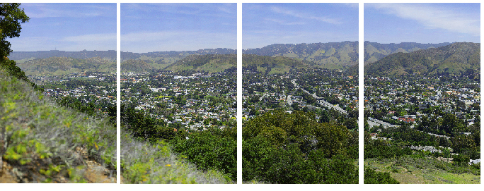
Composite Daniels Point

Four panels of my panoramic image. There is a small overlap on each panel on both sides (except the two on the ends, which only overlap on the inside). To get the panels cropped to the pixel from the original image required the precision of an AppleScript working in Adobe Photoshop.

I needed accuracy to the pixel, as these panels are very expensive to make, and the image must be perfect. When I made my paper version at 58 feet, I did the cropping by dragging guidelines into the Photoshop document, and then cropping to those guidelines. But the paper print had the advantage of being able to be registered on the wall while the wallpaper paste was wet, adjusting it until it fit.

The aluminum panels must fit perfectly without any adjustment possible as they are mounted. I tried doing it by hand, entering pixel values into the Crop tool in Photoshop, which worked fine, but there were times when the software and I didn’t see eye-to-pixel. Photoshop wanted to shift one pixel right or left of my desired size, snapping to the wrong side of a measurement, and this was not acceptable.

So I got out the extensive Photoshop CC 2014 Scripting Guide, the most recent of a series of similar publications from Adobe that document how to use various scripting languages to control their popular software. I have used AppleScripts on many occasions to script Illustrator and InDesign, and I find the process both interesting and efficient. I had never tried scripting Photoshop.

I found the references in the Guide on cropping, and I also taught myself how to draw register marks using a script (that’s for another blog). My immediate challenge was to cut a 99,000 x 16,121 pixel photo into ten pieces, each 10,400 pixels in width and 16,121 pixels tall (except the two on the end which are narrower). Incorporating a one-inch overlap was also part of the process, as I must trim the aluminum sheets to size in a huge metal-cutting shear after they are imaged, and the overlap ensures that the final trim is correct.

The Adobe scripting guide has examples of how to script Photoshop using Visual Basic, Javascript and AppleScript. I prefer AppleScript because I have the most experience in that language, and many years of basic practice. It’s pretty simple, as programming languages go. I built a test photo comprised of four quadrants of solid colors, and I experimented with my scripts until I understood the syntax of the cropping command.

In the end, it’s perfectly logical. It just took me a while to get an understanding of the coding so that I could do my project. The AppleScript code below will crop the right-most of the panels from the whole:
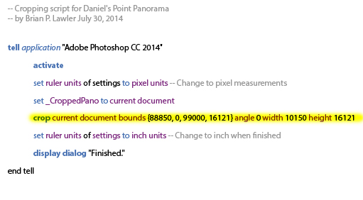
Print

In English, the line highlighted in yellow says: moving over 88,850 pixels from the left corner, and 0 down, crop to 99,000 pixels wide and 16,121 down. The width and height of the cropped image are 10,150 x 16,121 pixels.

The best part of this is that Photoshop follows the instructions of the script to the pixel without any argument. Here is the detail of how the one line of cropping instructions works:
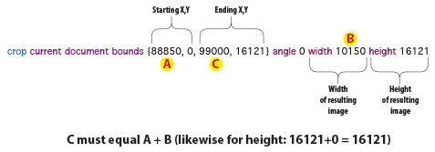
Print

The structure of an AppleScript must include the target application, in this case Adobe Photoshop CC 2014 in a tell statement. At the very end must be an end tell statement. This encapsulates the instructions intended for Photoshop. AppleScripts are adept at getting information from one application, then switching to another application to do something with that information.

Each message to a specific application is enclosed in a pair of tell statements. Interestingly, the script also acts very quickly on the photo. To crop the 4.4 GB image (a reduced-resolution version of the original) with this script takes only a few seconds. Each resulting section measures almost 500 MB.
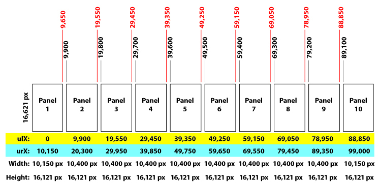
Print

This is a legend of how the photo would be cropped into individual panels from one very large original. I needed this to ensure precision in the final images.

As with any adventure into potentially harmful events with photos, it is smart to work on a copy of your master image rather than risk damaging the original. The process of generating ten panels, each precisely cropped to the correct pixel dimensions, took me less than one hour. This was after I had spent at least that much time teaching myself how to write and execute the AppleScript in Photoshop.

The time spent was well worth the effort, as now that I know how to script Photoshop, I am sure that I will do it again – soon. When each panel was properly cropped, I ran another script that added a one-inch white bar at the top and bottom of each section, then added one-pixel-wide crop marks on the top and bottom to guide the metal shearing operation.
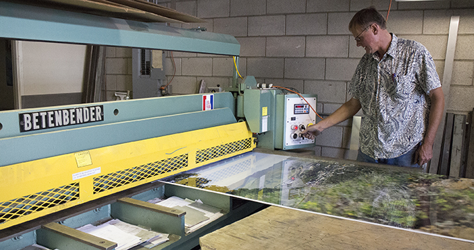
Steve with one panel

This is my friend Steve Rinell with one panel from the huge panorama in his Betenbender shear.

The panels are now printed, and the metal shearing is partly complete. I will write more about the project as it comes closer to completion. The huge photo is scheduled to be mounted in the coming weeks at the University Union at Cal Poly, where it will be on display for a long, long time.

 

Posted in Art, Photography, Photoshop techniques, Software, Technology | Tagged , , , , , , , , | 1 Comment

I can stop griping now – Adobe has finally fixed Photoshop!

Blognosticator Head

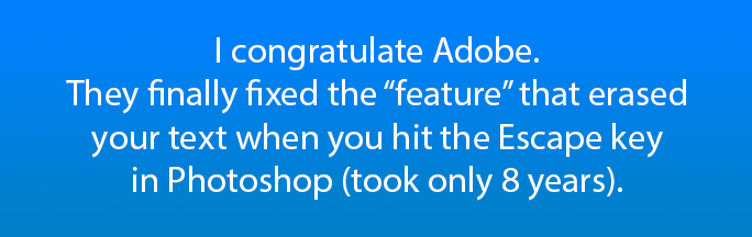
For eight years I have been complaining loudly (the blogger’s “pen” is mightier than the sword, but much slower) about the “feature” in Adobe Photoshop that causes your type to be erased – without an undo that will replace it – when you strike the Escape key.

Escape feature

The reason that this was so irksome is that Adobe, always so proud of their unified user experience allows us to strike the Escape key when we finish using the text tool in Illustrator and InDesign, the result being that the text you were just working on is now complete, and you want to move on with another tool. Striking the Escape key in those two applications causes the text tool to be deselected, and replaced by the solid arrow selection tool.

By contrast, in Adobe Photoshop, you could spend minutes crafting some text, applying a typeface selection, size, leading, tracking, color, minor adjustments here and there, and then, when finished, hit the Escape key to have the program erase your text from the screen. Poof! Gone! And, one could not get it back with the Undo command. No, it was gone for good, and had to be remade.

This was aggravating, especially for the more sophisticated user who became efficient with keyboard commands.

I felt for years that this was a bug, but I was advised by several Adobe representatives that it was actually a feature, one consistent with using the Escape key while using other commands in Photoshop – the effect was to cancel what you had been doing. And, though I agree that the Erase-Your-Type-With-No-Undo feature was consistent within Adobe Photoshop, it was aggravating because it was not consistent with the same tool in the other Adobe Creative Suite applications.

I am happy to announce that quietly, in the middle of the night, somewhere between CS 6 and CC 2014 (I wasn’t paying attention until yesterday) they made the user interface consistent, or at least more consistent than it was. Now, when I strike the Escape key in Adobe Photoshop, instead of the next four-letter word out of my mouth starting with an F, I exhale and smile, and continue with my work.

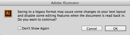
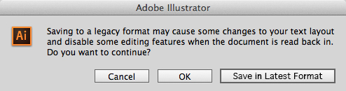
Thank you, Adobe, for repairing the unified user experience in Photoshop. Seriously. Thank you! OK, Adobe seems to be paying attention. Now, Adobe, please listen to this next request, one I have been advocating for over a decade: When saving from Adobe Illustrator, and let’s just say the original file was made in a previous version of that software, instead of giving us the mind-numbing error message:

Illustrator Legacy dialog

How about making it easy to convert to the latest format by clicking a button in that dialog box (and perhaps that could be the default button). That would make is simple to keep Illustrator documents up to date, and would allow us advanced users a simple path to keeping our files current. Would that be so hard? How about this:

Save in latest format

I would be ecstatic if the Illustrator team would provide this level of support to us users. It would simplify our lives and help us to keep our files current.

I’ll get back to you in eight years to tell you if this request has gotten any traction at Adobe.

Posted in Photography, Photoshop techniques, Technology | Tagged , , , , | Leave a comment

You wanted kerning! You get kerning!

Blognosticator Head

Last week I promised to write a blog about the next step in making my Lining Livermore typeface. I thought I was farther in the process than I was.

Getting letters to fit adjacent to each other is a difficult task, and with an Italic design, it’s even more difficult (this is my first Italic design). With “normal” alphabets, one begins with a straight letter like H, and then you design the O, and put them next to each other. These two letters must align perfectly without any kerning before you begin designing the other letters, and before you begin making relationships between the other letters.

Tallphabet HOOH

This is the start of another one of my fonts, Tallphabet, which I designed a few years ago, then completely redesigned last summer to make an OpenType version with small caps and other amenities. This HOH combination gives the designer a starting point.

Once the H and O are designed, I move to some of the round letters, building them from parts that they have in common. In the case of Lining Livermore I was working from a scan of existing metal type. Since I have access to the original type (it’s on my desk as I write this), I can easily compare the letters I am drawing to the actual metal type. What I have found to be particularly valuable is to consult the type for side-bearings and spacing. But with Lining Livermore I didn’t draw the letters in any particular order. I just did one and then the next.

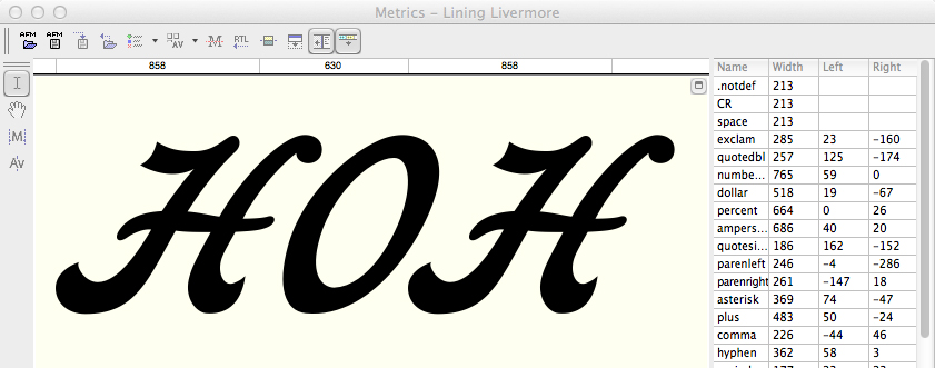
HOH in Lining Livermore

It’s important to adjust the relationship of the cap H and O. Here they are together, and once I have these relationships set, I can move forward with the other letters.

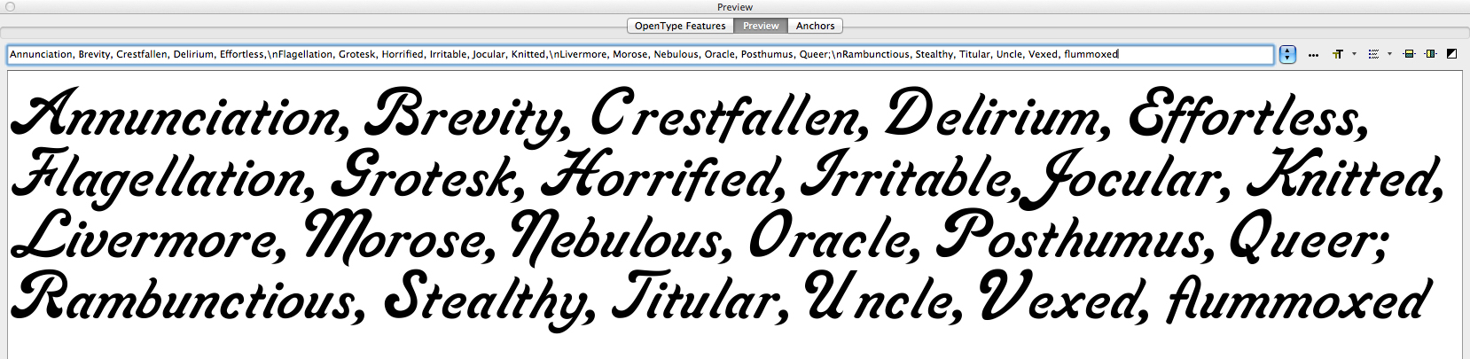
As the font becomes complete, I start making up funny phrases to compare the letters, and then I adjust their position relative to their neighbors. I come up with absurd expressions and put them on the computer screen to test my typeface. I listen to the radio and type what the announcer is saying. I mix up capital and lower case letters in crazy combinations; I add French words and German and sometimes I try my hand at Danish nonsense words just to use the ae and oe diphthong glyphs.

Annunciation, Brevity

These are some of my word and letter combinations that assist in making letter position decisions. As you build, and adjust the alphabet, you develop a textural quality that is acceptable. This design still needs a lot of work, but it’s starting to be a pleasant opus. Notice the vexing space between the cap V and the lower case e. I fixed that already. Same with the unctuous space between the U and the n.

Making a font, as I have already described, takes months – often longer. I fuss over every anchor point of every letter, and I end up redesigning letters over and over until I am happy with them. Jim Parkinson, a full-time typographic designer, once told me that you never finish a font. You just declare victory and move on!

There is probably no other profession that requires such a mix of artistic skill plus a compulsive need-to-perfect. Combine those skills with an eye for detail, and you have the typographic designer. Yet, most people just choose a typeface and start typing. They don’t know or care about the thousands of hours that go into the design and development of an alphabet, or a family of alphabets made into digital form for the computer. That’s OK, because I don’t know about their occupations and interests either.

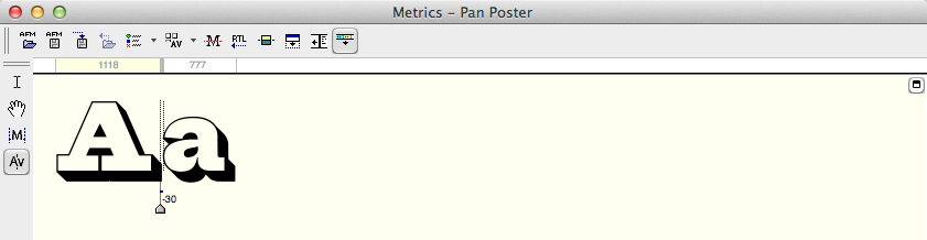
Aa kerning pair screen

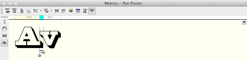
This is the kerning pane in FontLab. Notice the pair of lines between the letters A and a. The indicator shows that I have kerned this pair of letters -30 units (1000 to the em) tighter. There are keyboard shortcuts that speed this process. The typeface is Pan Poster, another design I am working on.

Once it’s all pretty safely working, I start with the kerning pairs. In FontLab there is a wonderful facility for kerning classes of letters similarly. This can save some time. I put all the round lower-case letters into a class, then I make kerning adjustments to the class of characters together. The same can be done with other letters with similarities. Once that is done, one begins the tedious process of comparing every letter to every other letter and making kerning adjustments to the pairs individually.

Again, FontLab has a facility for kerning where you put one letter pair together, and then step through all the characters in the set, adjusting as you go, to make a complete kerning table. It’s not uncommon for an individual font to have 3,000 or 4,000 kerning pairs in addition to the class pairs. The obvious kerning opportunities are the cap T followed by almost any other letter. Cap P, Cap F, cap W and Y are also like this; they provide an opportunity for hundreds of pair combinations.

Av kerning screen

…and later that same day I reached the Av combination. This one requires much more than most because the shapes of the A and the v both require adjustment.

While building the kerning table, you encounter combinations of letters that will never be set together. Following the Cap T with a 3/4 fraction, for example, will never occur in any common typesetting circumstance. I ignore those. Two q’s in a row probably don’t need to be kerned. In the case of Lining Livermore, the design does not lend itself to setting in all-caps. It is simply unreadable, so I just ignore all-caps kerning.

So, the tedious job of building the kerning table is begun. It will probably last well into the next decade. At some point I will declare victory and move on!


Posted in Art, History, Software, Typography | Tagged , , , , , , , | Leave a comment

80,000 readers and growing

Blognosticator Head

Good day!

The Blognosticator reached 80,000 readers this week, thank you.

Print

When I started this version of the blog, 33 months ago, I didn’t know how many people would visit the site, and how many would return many times. Writing and illustrating the Blognosticator is a lot of work, but it’s well worth the effort.

I have published 183 blog posts, and have posted a total of 669 illustrations, most of them original photos and graphics. I generally do not post anything that I did not originate (exceptions are credited in the blog). That policy allows me to publish without worrying about intellectual property rights; I draw it, and I own it.

I write blog entries in clusters, sometimes posting three in as many days. Then I get involved in other projects and I don’t have time for blogging.

So, please keep reading! I will not let you down.

Best wishes,

Brian P. Lawler
The Blonosticator

p.s. The lettering above is from a new font that I am designing. It’s called Pan Poster. At some point it will be made available commercially.


Posted in Business, People | Tagged , , , , | Leave a comment