

Last week I promised to write a blog about the next step in making my Lining Livermore typeface. I thought I was farther in the process than I was.
Getting letters to fit adjacent to each other is a difficult task, and with an Italic design, it’s even more difficult (this is my first Italic design). With “normal” alphabets, one begins with a straight letter like H, and then you design the O, and put them next to each other. These two letters must align perfectly without any kerning before you begin designing the other letters, and before you begin making relationships between the other letters.

This is the start of another one of my fonts, Tallphabet, which I designed a few years ago, then completely redesigned last summer to make an OpenType version with small caps and other amenities. This HOH combination gives the designer a starting point.
Once the H and O are designed, I move to some of the round letters, building them from parts that they have in common. In the case of Lining Livermore I was working from a scan of existing metal type. Since I have access to the original type (it’s on my desk as I write this), I can easily compare the letters I am drawing to the actual metal type. What I have found to be particularly valuable is to consult the type for side-bearings and spacing. But with Lining Livermore I didn’t draw the letters in any particular order. I just did one and then the next.
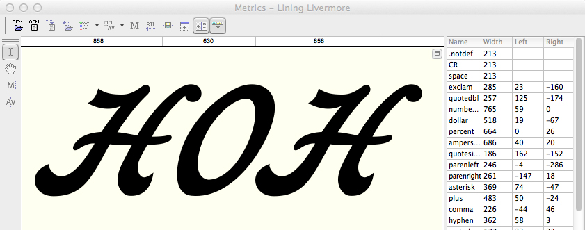
It’s important to adjust the relationship of the cap H and O. Here they are together, and once I have these relationships set, I can move forward with the other letters.
As the font becomes complete, I start making up funny phrases to compare the letters, and then I adjust their position relative to their neighbors. I come up with absurd expressions and put them on the computer screen to test my typeface. I listen to the radio and type what the announcer is saying. I mix up capital and lower case letters in crazy combinations; I add French words and German and sometimes I try my hand at Danish nonsense words just to use the ae and oe diphthong glyphs.
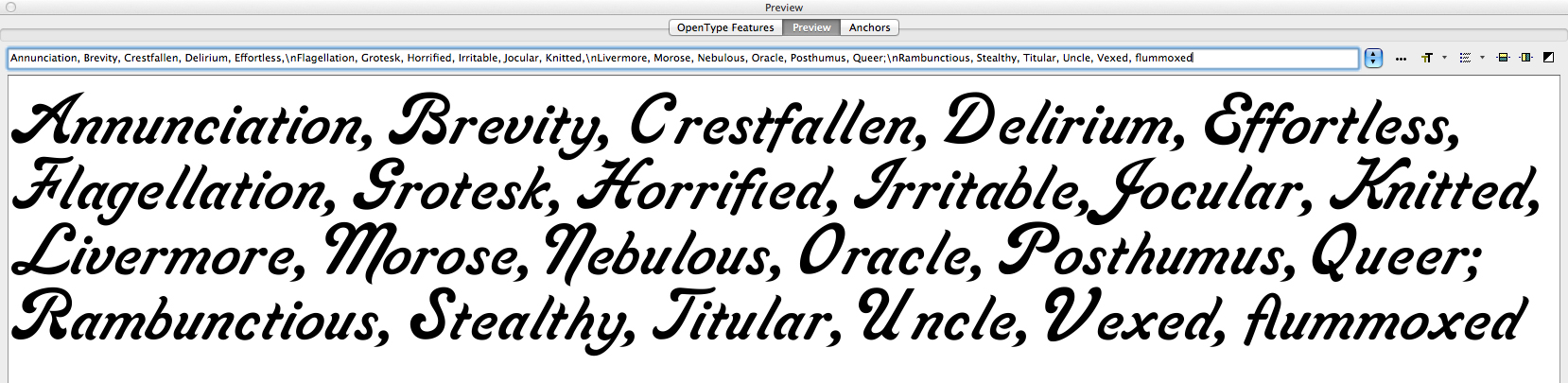
These are some of my word and letter combinations that assist in making letter position decisions. As you build, and adjust the alphabet, you develop a textural quality that is acceptable. This design still needs a lot of work, but it’s starting to be a pleasant opus. Notice the vexing space between the cap V and the lower case e. I fixed that already. Same with the unctuous space between the U and the n.
Making a font, as I have already described, takes months – often longer. I fuss over every anchor point of every letter, and I end up redesigning letters over and over until I am happy with them. Jim Parkinson, a full-time typographic designer, once told me that you never finish a font. You just declare victory and move on!
There is probably no other profession that requires such a mix of artistic skill plus a compulsive need-to-perfect. Combine those skills with an eye for detail, and you have the typographic designer. Yet, most people just choose a typeface and start typing. They don’t know or care about the thousands of hours that go into the design and development of an alphabet, or a family of alphabets made into digital form for the computer. That’s OK, because I don’t know about their occupations and interests either.
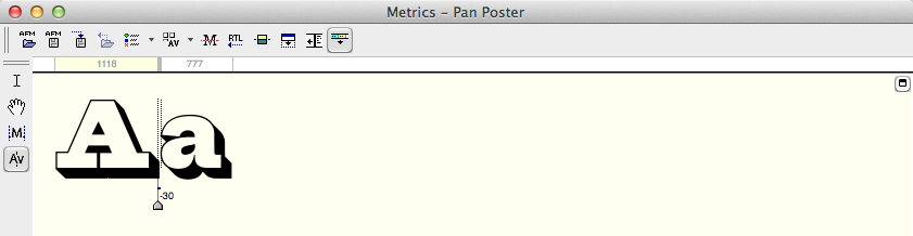
This is the kerning pane in FontLab. Notice the pair of lines between the letters A and a. The indicator shows that I have kerned this pair of letters -30 units (1000 to the em) tighter. There are keyboard shortcuts that speed this process. The typeface is Pan Poster, another design I am working on.
Once it’s all pretty safely working, I start with the kerning pairs. In FontLab there is a wonderful facility for kerning classes of letters similarly. This can save some time. I put all the round lower-case letters into a class, then I make kerning adjustments to the class of characters together. The same can be done with other letters with similarities. Once that is done, one begins the tedious process of comparing every letter to every other letter and making kerning adjustments to the pairs individually.
Again, FontLab has a facility for kerning where you put one letter pair together, and then step through all the characters in the set, adjusting as you go, to make a complete kerning table. It’s not uncommon for an individual font to have 3,000 or 4,000 kerning pairs in addition to the class pairs. The obvious kerning opportunities are the cap T followed by almost any other letter. Cap P, Cap F, cap W and Y are also like this; they provide an opportunity for hundreds of pair combinations.
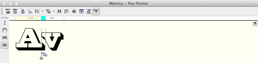
…and later that same day I reached the Av combination. This one requires much more than most because the shapes of the A and the v both require adjustment.
While building the kerning table, you encounter combinations of letters that will never be set together. Following the Cap T with a 3/4 fraction, for example, will never occur in any common typesetting circumstance. I ignore those. Two q’s in a row probably don’t need to be kerned. In the case of Lining Livermore, the design does not lend itself to setting in all-caps. It is simply unreadable, so I just ignore all-caps kerning.
So, the tedious job of building the kerning table is begun. It will probably last well into the next decade. At some point I will declare victory and move on!