
The largest machines in the world

Blognosticator Head

Yesyerday morning a group of TAGA participants visited the Longview, Washington, paper-making plant of NORPAC. This is the largest paper-making facility in North America. Inside its massive buildings are three of the largest machines on Earth.

These machines are for making paper, and they make a lot of it. In one day, the plant produces almost 4,000 miles of paper in various grades. The primary output of the machines is newsprint for North America and Japan. The massive rolls of paper coming off the machine vary from 330 inches (27.5 feet/8.38 m.) to 350 inches (29.1 feet/8.89m.). The paper moves at about one mile per minute. After it is made, rolls of paper weighing over 28 tons are moved to re-rolling machines that move the paper at about 7,000 feet per minute as it is slit into smaller widths and rolled to finished sizes for shipping to newspapers around the world.
Wet end of machine 1 09

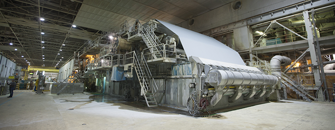
This is the “wet end” of Machine Two at Norpac. This 29 foot machine was making newsprint for the Wall Street Journal while we were visiting the plant. The material you see coming over the top of the machine is called the Felt; it carries the wet paper mash through the machine from the beginning to the air dried section, where other rolls of felt support the paper while it is processed further.

I asked our hosts how long their paper machines are, and they said “longer than a football field.” The machines appear to go on forever, dwarfing any humans nearby.
Finishing end of machine 02

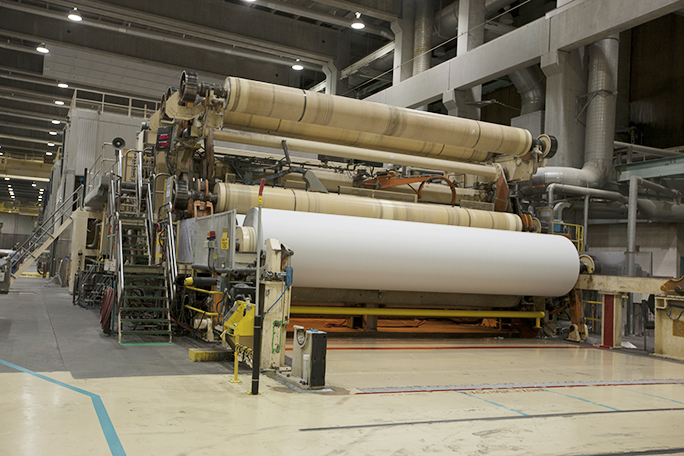
This is the dry end of the machine, where finished paper is wound onto rolls that weigh over 28 tons. The roll you see is about one-third of its final size, running just under one mile per minute. The paper is 27.5 feet wide on this machine.

These machines are called “double-wire” devices, meaning that they are not traditional Fourdrinier-style machines. Instead, paper pulp-and-water mash is injected vertically at the head end of the machine into the system that takes that mash up and over the top of the wet end of the machine, where it begins the long journey through the machine to the finish end. En route, the pulp is dried by hot air, then by steam-filled cylinders, then heated pressure rollers until the mash turns from mostly water to mostly fiber. I was told that water represents 99 percent of the mash at the head, and less than ten percent at the other end.
Yannick with 40 tons of paper 02

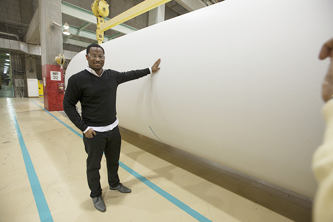
Here Yannick Abba of DowJones has his hand on a finished roll of paper weighing 28 metric tons (61,600 lbs.). The roll is about to be loaded onto a slitting and re-rolling machine to be made into smaller rolls for printing presses.

The Longview plant uses about 55 percent of the electricity in their county, power that comes from the Bonneville Dam, upstream on the Columbia River. The company that owns the plant, a 50-50 consortium of Weyerhaeuser and Nippon Paper, would buy more electricity if there were any available. Instead, the company has recently invested in a tremendously more efficient pulping plant that will save over 100 million KWh per year, making more power unnecessary.

Most of the wood pulp for paper made in Longview is Douglas Fir from Pacific coast forests in Oregon, Washington and British Columbia, Canada. A small amount of other woods are added: pine and some hardwoods. The mix is determined by the formula for paper strength. Weyerhaeuser has a corporate policy of replanting all forest land harvested with new trees within one year, and they operate one of the largest nurseries in the world to provide seedlings for this effort.
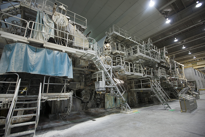
Wet end of Machine 2

This is the wet end of Machine Three at Norpac. This is the newest of the three machines. It is about 150 yards long from this end to the dry end (beyond the right edge of this photo).

I worked in the engine room of a Coast Guard cutter when I was 18 years old. I thought that was a pretty impressive operation with its massive diesel engines, drive systems and the noise of that raw power. That whole engine room would fit into one of the control rooms in the Norpac plant; our ship’s engine room was a pip-squeak operation compared to the block-long paper making machines I saw today.

The output of these machines yesterday was newsprint, though the company also makes other grades of paper for book and publication printing. The finished rolls typically weigh a half-ton or more. Wrapped in kraft paper and capped with a heavy protective side panel of kraft, these rolls are treated with amazing care. A ding, a dent or a crush of the center hub could cause the roll to be unusable. Automated conveyors move the finished rolls from the re-rolling machine to the wrapping stations, then the finished rolls are gently moved into a huge warehouse for shipment by ship to Asia, or by truck or train to west coast newspapers.

Cal Poly’s supply of newsprint probably comes from this mill, though I don’t know for sure. We use only a few rolls a week; the giant operations of the Wall Street Journal, USA Today, the Los Angeles Times and other newspapers consume most of the output from this plant.

As I sat in the Portland airport, waiting to board a plane back home, I saw a man reading the day’s Wall Street Journal. I was thinking, “I know where that paper came from!” I’ll bet the man reading it has no idea that the mill that makes the paper is just miles from here, along the Columbia River north of Portland.
 

Posted in Business, People, Printing and Printing Processes | Tagged , , , , , , , | Leave a comment

French TAGA chapter captures the Kipphan Trophy

This year’s TAGA Conference featured something completely new: the French student chapter from Grenoble won first prize in the TAGA scientific journal competition. This is the first time a student chapter outside North America has captured the prize.

PAGORA Team

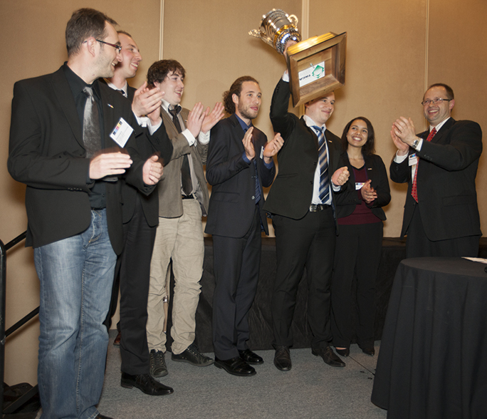
The students from PAGORA, the French university in Grenoble, took first place at the TAGA Conference. Here, they hold the Kipphan Trophy high. On the right is Martin Habekost, TAGA’s V.P. for Education.

The students, who attend PAGORA, the French school of paper, print media and biomaterials, entered an exceptional publication with excellent student research papers within. The thing that impressed me most was the impeccable quality of the translation into American English. These students, who have been participating in TAGA Conferences for years, shined this year with their excellent effort.

Also in attendance this year were students from Cal Poly, Ryerson, Clemson, Western Michigan and Ball State University. Each team had produced, printed and prepared a scientific journal for the conference.

TAGA – the Technical Association for the Graphic Arts – completed its 65th annual conference in Portland, Oregon last night.


Posted in Education, New technology, People | Tagged , , , , , , , , , | Leave a comment

Linotype: The Film

Blognosticator Head

We showed the film: Linotype: The Movie last week at Cal Poly. The movie was great! We had about 100 people in attendance, including John Werner, who was once the director of typography for the New York Times. He made some interesting comments after the showing and told us a few tales about his time at the Times.

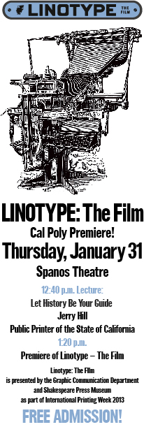
The film was being presented as part of International Printing Week at Cal Poly, a celebration of our industry and its many practitioners. The screening took place at 1:20 p.m. in the Spanos Theatre on the Cal Poly campus (a parking permit is required). Immediately before the screening was a lecture by the State Printer of California, Jerry Hill.

Linotype Poster

Printing Week is so important to our department that we cancel all classes and the students attend lectures by industry experts who talk about everything under the sun related to the graphic arts.

The film was made by Douglas Wilson of Springfield, Missouri. It is comprised of interviews with Linotype operators, mechanics, historians, collectors and others.

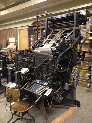
I had spent one morning the previous week moving Linotype machines in the Shakespeare Press Museum at Cal Poly. We were bringing in a “new” Linotype Model 31 (built in 1931), and moving an old Linotype from 1905 out. It will move to another museum. We just don’t have space for two of these machines. We also moved a Linograph machine out. The Linograph was a knock-off of the Linotype machine that was made in the early part of the 20th century.

Linotype 05

The “new” Linotype Model 31 at Cal Poly. This machine will work soon, and it features a Star Quadder, a device that was added after manufacture to push the matrices left, right or center during typecasting. Even the operator’s chair is authentic; this is the chair that was used by Linotype operators all over the world.

The “new” machine we installed has the advantage of being a working Linotype machine. It can be powered up to make type, and its magazines are full of matrices. I plan to rewire the machine in the coming weeks and prepare it for a new and useful life casting type again.


Posted in History, Typography | Tagged , , , , , , , , , | Leave a comment

11.73 Terabytes of storage at my fingertips

Blognosticator Head

I want to be able to store my entire archive on one hard drive so that I can have instantaneous access to all of my files.

As I mentioned in my last blog, I decided to build my own NAS server from parts I ordered online. Once it was finished, my friend Eric Johnson loaded the open source FreeNAS operating system on it, and configured it to work as a single RAIDz drive with 16 TB of native space. After the formatting process, I am left with 11.73 TB of usable space. Where did the other 5.3 TB go? It is used to store information about the information stored on the four internal drives so that the RAIDz system can reconstruct one in the event of a failure.

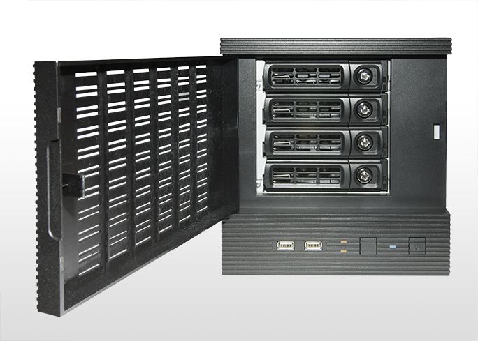
ITX Box door open

Here is the new NAS server with its front door open. The four drive bays are hot-swappable. Each one holds a 4TB drive. This is a lot of storage!

The process of moving gigabytes of data from DVD discs to my new NAS server is going reasonably smoothly. I am copying files one disc at a time from my archive to the NAS, and it takes about 10-12 minutes for each disc – about 4.7 GB each.

As I go I am encountering discs and files on various discs that won’t read. This was the reason that I built the server in the first place. These discs have visible fading on the data side – loss of dye coloration. I’m trying to be optimistic about this, as I have many file duplicates, and the likelihood of another copy of these files is pretty high. But, in the end I am sure that I will have several (or many) discs that won’t read at all.

To understand how dye fading affects discs one must understand how CDs and DVDs are made and written. The top surface of an writable optical disc is a reflective surface of aluminum or gold (yes, it’s real gold). Immediately under that reflective layer is a dye layer, made up of a colored dye that can be altered by the beam of a laser. In the “red book” specification, that dye is described as being photosensitive, altered by a laser in the near-infrared range (DVDs use blue lasers).

Most plastic CD and DVD cases are made of black styrene on the bottom, with clear on the top. This helps to keep ambient white light out of the case on the bottom, which is the writable side. One of my most seriously damaged discs was stored in a clear styrene plastic case, allowing sunlight in, and over time, allowing that light to alter the dye and make it unreadable. This was disastrous for the data stored on the disc. I will never get it back, whatever it was.

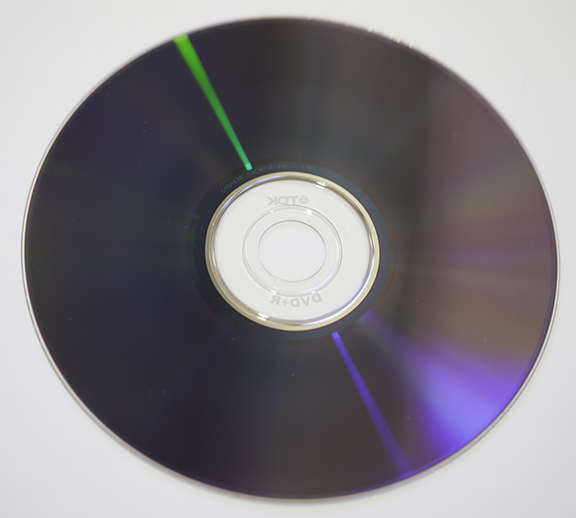
Faded DVD

This is one of my failed DVDs. Notice the lighter area on the right side. This is sun-bleached dye; it no longer contains any data. The entire disc is lost.

I’m glad I built my storage server, and I am glad I am finally getting these files off the optical discs and back onto magnetic drives (I never thought I would say that about magnetic disks). With RAIDz I am at least protected from a single drive failure.

You may be wondering why I chose to use a local storage server instead of using “the cloud.” The answer is that the cloud, no matter how fast, is way too slow for me. I signed up for a 30-day trial account with one service that provides cloud back-ups, and it took so long to upload one of my DVDs, that I figured it would take me more than a year, working every day, to upload my files to the service. After uploading just one disc, I gave up.

I’m still reading the features documentation for FreeNAS, but so far I am impressed with its tools and controls. Mine is on a unsecured local network with just two users, but if I were in an enterprise environment, there are security features that compare with any operating system. There are also alarms and controls to ensure the integrity of the data written to the RAID array.

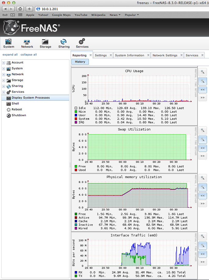
FreeNAS charts

This is the chart page on my FreeNAS server control panel. All of the activities of the NAS system are reflected in these charts.

FreeNAS is controlled by a browser interface, accessed from any machine on the network. It has pages of controls, and a page of performance charts to indicate how well the system is running. I have not learned everything about the system yet, but I will continue to learn as I move more of my files to it. This is not very exciting, but it is very interesting to me, and I hope it’s helpful in allowing me to meet my goal of getting my archive online.

Posted in Business, Mistakes you can avoid, New technology | Leave a comment

Optical discs fail, forcing me to move back to hard drives

Blognosticator Head

For years I have been making writable DVDs as archives for my files. I compile a selection of about 4GB of material in a folder, and when it’s reached that size, I write a DVD. Then I catalog that DVD in a software catalog that lets me search for file names, dates and folder names.

Row of DVDs

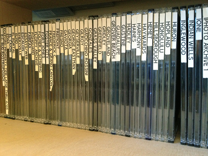
…just a few of my over 300 DVD archive discs. I name them after California cities and other strange things. Then I catalog their contents on a cataloging application that allows me to search for their contents quickly and easily.

My archive is now about 300 DVDs, representing over 720,000 files. But in the fall, I retrieved one of those DVDs and inserted it into my computer, but the computer would not read the disc. It had failed somehow – probably the dyes faded – and now it’s nothing more than a plastic disc. The data on it are lost forever (in this case I had another copy of the files that I needed).

I realized that I need to move the files off of these DVDs and back onto hard drives. So, I began the search for an appropriate storage server to hold all this material. After about a month of research, I decided to build my own server using off the shelf parts and a free-ware operating system called FreeNAS. NAS stands for Network Attached Storage.

NAS Chassis

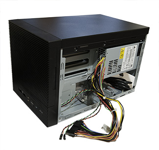
This is the chassis for my new Network Attached Storage computer. I have been accumulating the parts for the last two weeks, and finished building it this morning.

I have been buying the parts from Amazon and Newegg, and from my favorite local computer store, MacSuperStore. I have almost everything now, and I am looking at it as a delightful challenge. I have never built a computer before, but I’m doing it now.

Back in the 1960s I built a lot of electronics, some from Heathkit, some from parts and wires. I was a ham radio operator when I was a teenager, a hobby I did not pursue after I went to college. By comparison, my NAS server should be easy. No soldering.

Intel processor

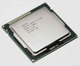
This is the Intel processor in my server. I’m awfully impressed by this. It looks small and unimportant, but it’s surprisingly heavy, and it has a whole world of computing inside!

I am following the instructions of a fellow named Sam Kear whose blogs include one on making this machine. His web site is beautifully illustrated and has links directly to the suppliers of each part of the server. Ordering was easy; I just opened my wallet and started clicking. Days later, the parts started showing up. The operating system is freely downloaded from freenas.org, and I have that ready to run today also.

My NAS server is fitted with four 4TB drives from Western Digital, giving me a disk capacity of 16TB before formatting the unit with RAIDz, the FreeNAS version of RAID storage. I’m not sure how much space I will have once it’s running. The operating system itself is stored on a USB memory device mounted on the logic board.

Drive cartridge

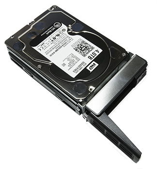
This is one of my four 4TB drives mounted in its cartridge. These can be hot-swapped if a problem occurs. All it takes is another Western Digital 4TB drive and a screwdriver to make a replacement.

The processor is an Intel i3, and I have 8GB of RAM on the logic board, so this machine should run quickly and efficiently. NAS servers are connected via Ethernet on a local computer network, and my plan is to store this machine close to my desk in a location where it doesn’t make much noise.

Chassis side wiring

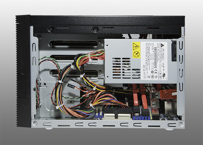
This is the right side of the wired server. The power supply is on the top, with its bundle of wires running down to the logic board. The wide red cables are SATA cables that connect the hard drives to the logic board. On the right you can see the Kingston 8GB USB card squeezed into the case. This has the operating system on it.

Curiously, the capacity of the NAS will be so great that moving my approximately 300 DVDs will represent a small part of the available storage on the unit. If each disc were full, the total of my discs would be about 1.5 TB. My secondary plan is to adopt an open source Digital Asset Management system. More on that later.

This is the first time I have built my own computer, and this server is a complete computer. It has an Intel i3 processor, 8GB of RAM, all of the inputs I could need (and some I don’t need) and it’s ready to go today. I have not yet had the guts to plug it in, so I’ve invited my friend Eric Johnson over to witness the “smoke test” later today. This test is named for electrical tests when you first flip the switch, and hope that no smoke comes out.

Intel Logic Board w fan

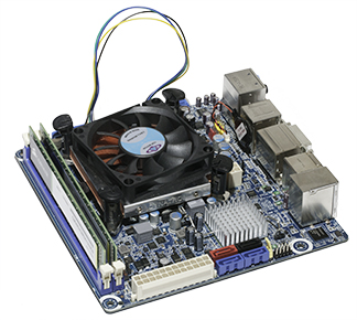
This is my complete Intel logic board before it was wired. The cooling fan is attached to a heat-sink which draws heat off the processor. The boxes along the right side are IO ports that go out the rear of the chassis. There are USB, SATA, S/PDIF optical, audio, Internet and more back there. It’s an entire PC on a 7.5 inch square board.

Configuring the FreeNAS operating system will be interesting. It runs from a USB drive plugged into a small “header” that sticks up from the logic board. I will report back on the performance of this server once I have it running, so stay tuned!

Posted in New technology, Software | Leave a comment

Really Right solutions to my tripod problem

Blognosticator Head

I have written about my mountain-top GigaPan photos in recent months. The results have been spectacular, and I am very pleased with the photos. Carrying the equipment to the mountain tops has been my problem.

The tripod I have been using is perfectly appropriate to the task. It’s a Manfrotto aluminum video tripod. Made for sturdiness, the tripod is moderately heavy, and adding the GigaPan motorized head to the top of it adds a few more pounds to the load. To get the combination to the top of my local mountains I have strapped the tripod and head to the frame of a 1960s era Kelty backpack. That frame by itself is not very heavy, probably three pounds.

Terrace Hill 4

This is the Terrace Hill photo I made on Friday afternoon. The GigaPan image is 18.3 GB, a huge photo that would print at about 67 feet wide at 300 ppi if I needed to do that (and fortunately I do not). Click on the image to see a double-size version, or visit GigaPan.com to see the full-resolution version with interactive zoom.

Add a Camelbak water backpack (a necessity) and the total rig comes in at about 45 lbs. I then hand-carry my Canon camera and its 100-400 mm zoom lens, which is another five pounds. With all this on my back, a recent 1300-foot ascent was almost too much for me. I reached the top exhausted, and sat on a rock for 30 minutes before deciding to go back down without making a photo. It was too hazy to get a nice panorama.

I have considered going back up that mountain to do the photo, but fear of exhaustion has kept me away. I decided I needed either to get a ride up there in a helicopter or to get a lighter tripod. I chose the latter, though it would be fun to get up there in a helicopter.

I already own a carbon fiber tripod made by Manfrotto. It’s nice, but it’s too light for the GigaPan unit and my camera. I needed a strong and stable tripod, but lighter than the one I have been using.

I searched not very far and wide to Really Right Stuff, the famous manufacturer of camera mounts and tripods located conveniently just three miles from my home. There I was shown a variety of that company’s new carbon-fiber tripods, one of which is a perfect replacement for the heavy one I have been carrying. The Really Right Stuff model TVC-33 is the one I chose. It comes with a flat top, but that can be changed to an optional bowl top, which I chose because I have a 75mm bowl on the bottom of the GigaPan head.

RRS Tripod withGigaPan

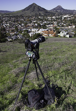
This is the new Really Right Stuff carbon-fiber tripod on Terrace Hill yesterday. On the ground beneath the tripod are two camera bags. One of them was eventually hung on the hook below the tripod head.

And, while I was visiting Really Right Stuff, I was shown two other items that I bought. One is a replacement plate for the GigaPan GP-CB head which makes it much easier for folks who have Really Right Stuff plates on their cameras and lenses to mount the camera/lens to the GigaPan. The one that comes with the GigaPan is a two-piece unit that requires a Bogen-style quick-release plate on the lens. It is fine, but inconvenient for me.

RRS Gigapan bracket

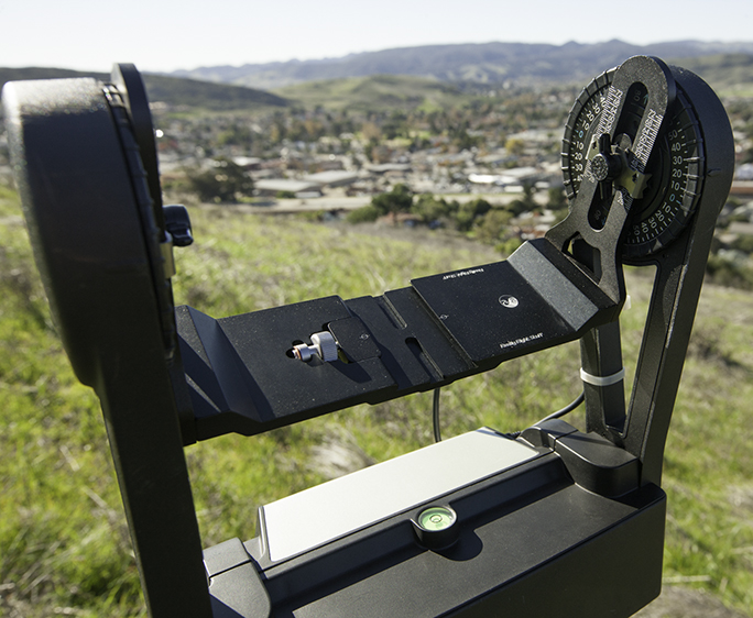
This is my GigaPan tripod head with the Really Right Stuff plate mounted. This simplifies the mounting of a camera and lens on the unit, and it is very slightly lighter than the original plate.

With that plate in place, I can mount my camera and its 100-400mm lens to the GigaPan unit in about three seconds. The lens plate slides into the mount, I tighten a screw on the plate, and I’m ready to shoot. Replacing the original plate on the GigaPan took about five minutes.

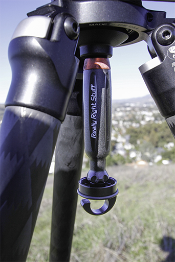
Then my friend Carla at Really Right Stuff showed me the pièce-de-résistance, a new multi-tool that looks like a screwdriver, and contains a clip of tool tips and a hex wrench for the installation and tightening of various devices in the field. On both ends of this multi-tool are 3/8-16 screw threads. By removing the screw handle that came with my 75mm bowl (Manfrotto), and replacing it with the Really RIght Suff multi-tool, I now have a tightener of about the same weight, and I have a set of screwdrivers and a hex wrench.

RRS Multitool on tripod

This is the Really Right Stuff multi-tool in its location on my tripod. It tightens the 75mm bowl at the top, and it provides threads for a hook on the bottom (the hook is not included). In addition, it has 12 tools inside the handle.

The sum of all this is that the GigaPan is slightly lighter now with the Really Right Stuff plate instead of the original, and the tripod significantly lighter than the Manfrotto. In the center of my new tripod is the Really Right Stuff multi-tool, and on the bottom of that is a hook that I can use to hang a camera case or a bag of rocks to add weight to the GigaPan rig when I reach the top of a mountain.

All I need now is two of these, and I could sling a hammock between them to take a nap while making a GigaPan image (several hundred or thousand exposures).

Posted in New technology, Panoramic Photography, Photography | Leave a comment

Fonts were not always universal

Blognosticator Head

We are now into the second generation of young people who have no memory of a time before PostScript and PDF, people who were not adults when we had competing font formats.

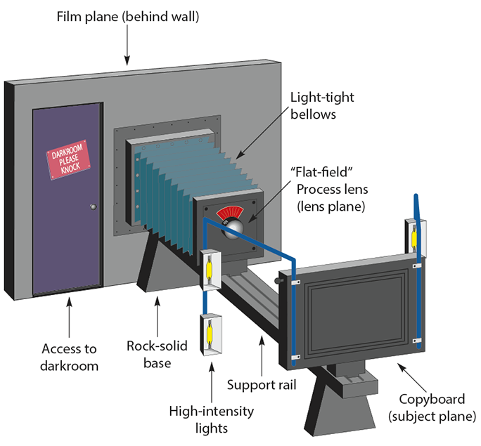
I put this era into the bigger era I call The Awkward Years. This was the time of paste-ups and wax (some people used rubber cement), of phototypography, and of making proofs from hot-metal type and then pasting those proofs into a layout and shooting the whole thing on a process camera.

Process Camera illust

This is a process camera. I had one at my company that was 22 feet long, with a film board capable of making a 24 x 36 inch exposure on a sheet of litho film.

And, of course, the photos had to be made into halftones on that same camera, shooting through a halftone screen in a separate operation.

The photos and line art were assembled separately on pin-registered films which were ultimately exposed to photo-sensitive aluminum printing plates (two separate exposures: one for the line art and a second for the halftones). The process was complex and often inexact.

The Awkward Years were marked by a lot of invention – first phototypesetting, and then cathode-ray tube typesetting (it actually happened in the opposite order, but that will be discussed in a future blog), and eventually laser typesetting. Each of these typographical inventions was successful, and there was a lot of competition in the industry. The major players were Compugraphic Corporation, Mergenthaler Linotype Company, VariTyper, AlphaType, and AutoLogic.

And, type font piracy was rampant. Almost every one of the manufacturers blatantly stole designs, converted them slightly (if at all), renamed them with similar-sounding (but always dumb) names, then marketed the rip-offs to their customers.

The reason this was true was that every typesetting machine manufacturer treated the fonts as the means to get buyers to purchase their machines. Each machine used proprietary font technologies, and the owners of the machines were unable to purchase a font from any other supplier because of intentional incompatibility.

Lino VIP font illust

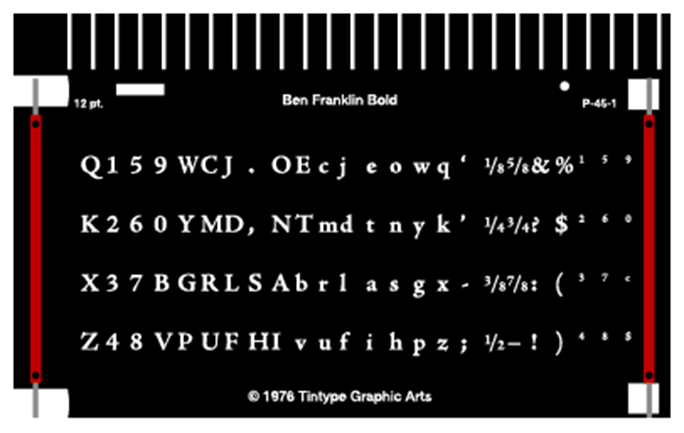
Film fonts like this one, from a Mergenthaler V-I-P phototypesetter, were manufactured for a specific machine, and were incompatible with other devices. The V-I-P was arguably the finest phototypesetter made. Its fonts moved into position, then were held stationary as the individual letter exposures were made. This eliminated the blur that was common on other competitive machines.

All of this ended when Mike Parker, then director of typographic development at Mergenthaler Linotype Company, got his firm on board with Aldus, Apple, and Adobe at the start of the “desktop publishing” revolution. Parker was probably the gutsiest of the major players because his company had the most to lose if it didn’t work. Linotype was the one company that (as far as I know) did not steal any font designs in the phototypesetting era (there were many Linotype font “look-a-likes” during the linecasting era). The reason was that Linotype had the largest library of original fonts, and specifically they owned Helvetica, Palatino, Optima, and hundreds of others that had either been designed by them or for them.

Mr. Parker took a tremendous leap to join with the other founders-of-the-revolution by making the deal that would make it possible for Linotype’s crown jewel fonts to be run on a machine not made by the Linotype Company. Of course the first two high-resolution imagesetters to support PostScript digital fonts were made by Linotype, so the company had an immediate start-up success on that front. Other companies including arch-rival Compugraphic soon came to market with authentic Adobe PostScript imagesetters that could image on paper or film with fonts from Linotype, among others.

At the time, no one knew how this would play-out. I was (I was told) the 15th purchaser of a Linotronic 300 imagesetter in the United States. Mine was fitted with the state-of-the-art “Redstone” RIP, which ran on a 68000 Motorola processor (the same processor used in the Macintosh computer at the time). The Redstone RIP was a real dog, and it would often take hours to image a single page of desktop publishing material. As a result of its questionable speed, it was very difficult to show a return on investment for that device. Compounding that problem was the fact that we charged a per-page fee for output on the machine. Sometimes we could make $20 in three minutes. On other days we could run a job overnight, have it still processing in the morning, and only get $20 for the output.

At the end of the first year I invested another $30,000 in an improved RIP, one that ran at least four times as fast, and suddenly the Lintronic became a money-maker. We could run a typical letter-size page with marks in less than three minutes. Complex jobs often took longer, but overall the machine was a great success. It was precise, stunningly sharp, and it never broke – ever. We had one loose wire in a power supply one day, which I fixed myself; otherwise no one from Linotype ever cast a shadow on my doorstep to service the machine.

All the while, makers of type fonts translated their original designs into PostScript fonts that could run on any of the numerous imagesetters on the market. Compugraphic, for example, had many original fonts that were beautiful.

For the first time in modern typographic history, fonts from different manufacturers could be used on one machine, and the graphic design public went berserk with the huge selection of fonts available for this new generation of machines. A selection of several hundred fonts was no longer the aegis of elite typographers, it was the stuff of average people.

I assert that there are more people making a living designing type fonts today than at any time in human history. A lot of them are awful, but many delightful fonts show up in promotions in my e-mail in-box every week. The variety, and more importantly the quality, of these new fonts is extraordinary.

The Linotype Company is now part of the Monotype Company, once its bitter rival, and the vast library of original fonts designed for and by Linotype is now part of an extraordinary collection marketed by Monotype. Several other “foundries” have also been absorbed by Monotype under the direction of their director, Allan Haley. Mr. Haley was for many years the head of typography at the Compugraphic Corporation. He is a fine fellow, and his work to consolidate the collections of these once-rival companies should be applauded.

I suppose that the idea of font designers as competitors is a strange one, but from the beginning linecasting era through 1984, these companies – and there were really very few of them worldwide – fought tooth-and-nail to beat the other guys in type design and sales.

Consumers of type – graphic designers, art directors, type directors, consumers – are the beneficiaries of the PostScript type era. I like to credit the companies that had the guts to start that revolution. For them, and for many others who joined the revolution, the results have been grand.

Posted in Printing and Printing Processes, Typography | 1 Comment

Bad typography is not easy

Blognosticator Head

My friend Jim is a car aficionado, mechanic, driver, restorer and collector. His favorite cars are Fords from 1933, and he has one that is very special, a custom built street rod with some 1933 Ford parts. It is a work of art.

Bad poster 1

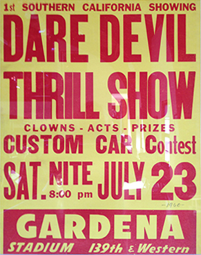
This is one of the authentic car posters on Jim’s wall. Notice the slight irregularity of the wood type, and the stylish use of fonts (stylish for the 1960s).

On the walls of his barn are posters from car shows in the 1950s and 1960s. These are not that old, but are curiously un-modern in style, and are delightfully stylish. What makes them so nice is their use of real wood type and letterpress printing. These posters exhibit skillful typography done with the tools at-hand, and they are done quite well. But, the limitations of wood type are clearly evident in these posters. There are distress marks – probably physical damage to the type – and there are ink splotches, a result of the vagaries of printing short-run posters on a letterpress.

JFE poster sketch

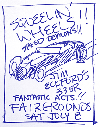
This is the sketch I made on a note paper for the poster I designed yesterday. It features too many effects that would not have been easy in the era of the original posters – angular type for example.

I am intimately aware of the weaknesses of wood type. I work with wood type often. I am the faculty advisor of the Shakespeare Press Museum, a collection of letterpress printing machines and type at Cal Poly. In 1970, when I was an undergraduate in the same program, I was the student curator. Wood type and I are good friends.

For a Christmas gift this year I am designing a look-alike poster for Jim, one that looks like the others but is customized for him and his favorite car. Working with a detailed drawing of the car by an illustrator in Chicago, I filled in most of the body solid red, and then converted the image into a comic-book style halftone (using Photoshop’s halftone function).

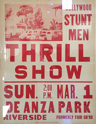
Thrill Show

From this poster, dated 1960, I was inspired to use the stacked lettering of 2:00 p.m. and the color of the lettering. I also like the abbreviation of “fairgrounds” to “FAIR GR’DS.” I was tempted to do something like this, but decided it looked too odd on my poster.

I have a good selection of authentic wood type fonts on my computer, including a few of my own making. One in particular is appropriate to they project because it’s a condensed face without too much filigree. The posters I am mimicking use only sans serif styles. The others are not quite period-perfect, but they work awfully well. I am using Gothic RR Condensed from ITF, and a recent offering from Linotype called Trade Gothic Next LT. By virtue of some rather rash character width adjustments I was able to get the type to look pretty good – very ’60s.

The poster I am making should look like authentic wood type, so I eliminated all kerning, and I added some irregularities to the letter-spacing. Then, without going overboard, I added some distress. Many wood type characters have been damaged by the occasional gauge pin tongue, or being banged with a quoin key by accident. I put in a few, but was very restrained. I want it to look damaged, but not too damaged, and certainly not fake.

JFE Christmas poster 2012

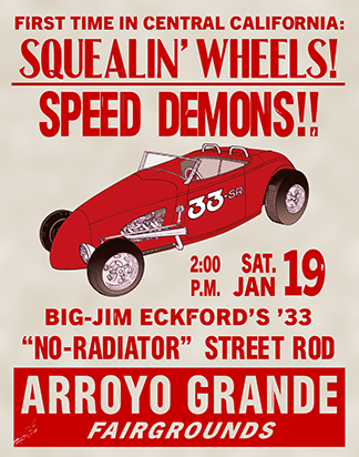
This is my finished poster. The illustration is a little too sophisticated for the era, but the coarse halftone dots may be forgiving on that. Now that I think of it, I should have thrown the color plates out of register a little (I’ll do that next time!).

I also added a few splotches of dark red ink on various letters. This works pretty well. Then I put in a paper-like background created in Photoshop using the Clouds and Gaussian Blur functions. It looks like lignin-yellowed poster paper, and it’s quite effective.

I printed one copy for proofing on my small Epson printer, and then made a few small changes before printing the final poster on my large Epson printer. The resulting poster is delightful. I mounted it on foam-core this morning and then framed it to match other posters in Jim’s garage. I’ll take it to the barn later today and put it up. I might add a bow.

Posted in Art, Printing and Printing Processes, Typography | Leave a comment

Can’t we just have it the way we used to have it?

Sometimes I wish that software developers could just leave things alone.

I paid hundreds of dollars earlier this year to buy the Creative Suite upgrade. Mostly what I got was the new (and very exciting) black interface. Which is really dumb.

Fortunately they allow me to change it back to the old white interface.

Adobe did add a few new features to each of the applications, some of which I really like.

And they took some away from Adobe Illustrator, which I really don’t like.

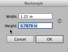
The one that I don’t like the most is a nice feature that used to work in Illustrator, but doesn’t work anymore. It’s in the dialog boxes of the primitives tools like the Rectangle tool, the Ellipse tool and others.

When using the Rectangle dialog, above, it used to be possible to enter the dimension in one entry, then just click once on the other dimension’s title. This caused the same value to be entered in the other space, saving the trouble of having to type it twice. This no longer works in Creative Suite 6.

If you want to draw a perfect square using dimensions, you Option-click on the page with the Rectangle tool, then enter the width – or the height – into the dialog. Then, in previous versions, you could click on the name of the other dimension, and Illustrator would automatically ente the same number in that space. This saved me a lot of time over the years, and I really appreciated it. In fact I often wished that the feature would migrate to InDesign and Photoshop, but it never did.

And, unfortunately, Adobe took the feature away from Illustrator 6.0. I mourn its loss. PLEASE PUT IT BACK, Adobe!

And, there is a bug in Illustrator CS6 where text does not behave correctly when selected as it is in other Adobe applications. If I click on one end of a text block, then shift-click on the other end of the same text block, the application does not select the text between the two clicks. Curiously, if you try it a second (sometimes a third) time, it does work. That’s why I think this is a bug.

PLEASE FIX THIS, Adobe.

Normal text selection techniques include being able to click at one end of a selection, then shift-click on the other end, causing all the text between the two clicks to be selected. This doesn’t work in Illustrator CS6 until you try it twice, or sometimes three times. Then it works, which defines this as a genuine bug.

I know that managing software is a difficult task, and I am grateful for the things in the Creative Suite that do work, and work well.

I just wish that perfectly functional tools didn’t become dysfunctional tools from one version to the next.

Adobe has made a strong argument that their Creative Cloud is a good idea because they can update or repair software constantly if we subscribe to the cloud version of the Creative Suite. After giving this some creative thought, I think that it’s a pretty good idea.

I’m willing to make the leap of faith that the Creative Cloud will deliver the occasional solution to problems like those I describe above.

I’ll keep hoping that Adobe makes repairs to the bugs, and that they see the wisdom of replacing the feature that mysteriously disappeared from Illustrator.

Posted in Software | Leave a comment

A not very brave new world of storage

I just bought a pair of 4TB drives. I installed them in a LaCie RAID drive enclosure to make a single 8TB drive that will become my Time Machine back-up drive.

Until I run out of space again.

I know that people occasionally wax nostalgic about the good ol’ days when everything we had on our computer could fit on a single 10 MB disk drive. Allow me to be nostalgic for a few paragraphs…

I bought my first hard drive in 1980. I don’t remember the brand, but I do remember the size – it was about the size of a small refrigerator, it weighed over 80 pounds, and it took two people to carry it. The platters inside the drive were 14 inches in diameter, and it had a drive motor about the size of a coffee can. A v-belt went from the motor to the disk hub.

Because of the overhead needed to keep track of the information on the drive, the 10 MB drive lost 1.3 MB to directory and housekeeping files, limiting the capacity of the drive to 8.7 MB. I remember the manufacturer of the drive telling me that their drives were not foolproof, so they recommended that I buy two of them, and write to both idependently and separately so that they both had the same information on them in case one failed.

So I bought two, for about $10,000.

The drives worked pretty well, but they had a serious fragmentation problem, leaving sectors of the disk surface empty – and unusable – when we deleted files. This resulted in a false measure of the drive’s remaining capacity. The manufacturer had a solution for this fragmentation problem: you would invoke a command to copy the contents of the drive back to itself, and simultaneously recover the lost sectors. The problem was that the information was “lifted” from the surface, then the surface was erased, then the data in memory would be written back to the newly-erased sectors on the drive, eliminating the unused sectors, and making the free space available again.

Big LaCie drive

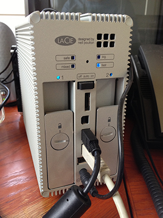
This is the LaCie RAID drive I have. It originally came with two 2TB drives; now it has two 4TB drives (I confess I broke the little seal that said the warranty would be void if broken). Now the drive has 8TB of capacity to act as my Time Machine back-up disk.

The problem with the technique was that the information was erased from the disk before it was re-written, leaving important information held only by whatever memory technology was inside the cabinet. If there was a power failure or just a momentary transient electrical glitch in the power, my data would be lost, never to be recovered.

The drives, and the computer consoles that drove data to them, communicated by a electronic scheme called differential communication. This wasn’t serial, not parallel, but differential. I remember being told that the method was developed for the railroads to communicate over pairs of wires traveling long distances between stations. Differential communication was very reliable, and the signal strength did not suffer from line-loss as it does with serial communication wiring.

Despite their tenuous temperaments, the two 10MB hard drives behaved pretty well over the years, providing a safe storage space for hundreds of typesetting jobs that had been created in my shop. These typesetting jobs were written in a coding scheme called TTS, which originally came from paper tape punch machines. This six-level coding allowed for type and control information to be sent – mechanically – from the typist’s keyboard to the typesetting machine.

Before we had these terminals and the hard disk, we stored jobs on punched paper tapes. If a correction or rerun was needed, we would retrieve the paper tape and edit the file, then generate a new paper tape and run it on our typesetting machines.

Back to my future…

My current hard drive array is a two-drive set-up acting as a single disk. Its capacity is 8 TB, which is a pretty big number: 8,796,093,022,208. Lop-off a few megabytes for housekeeping, and it’s surely a bit smaller. The Library of Congress, according to Wikipedia, adds five terabytes of data to their archive every month. I add a bit less than that.

But, the reason I am installing this drive is that four terabytes was not enough back-up space for my current computer. In the four drive slots on my Mac Pro are two-terabyte drives, totaling twice what my old 4TB back-up drive could record. Now they will be matched, and my Time Machine back-up can at least keep up with the information on my internal drives. I will have solved the problem for the short term.

In the 1980s, when I bought my first hard drive, a single terabyte of data was inconceivable. Ten megabytes seemed impossible to fill (though we did it many times). Back then we were thinking only in terms of text files. The text of a book is extraordinarily small; in a book I just printed, the 632 text pages amount to only 772,000 bytes of data. At that modest size 12 of those books would have fit on the hard drive in 1980. I could fit 11 million books of that size on my new RAID drive.

In 1980 we were not thinking about photographs.

Photographs are the voracious consumers of hard drives; they eat drives for lunch and don’t leave any scraps. My current camera makes images that are 60.2 MB in size uncompressed. In their original (Raw) format, they are typically 20-25 MB each, meaning that my 1980 hard drive, filled to capacity, could have stored less than half of one image. So, when I go out to shoot at an event, and come home with 800 photos in a single day, I am consuming the equivalent of 1,600 of those 1980 hard drives.

And then there is video.

This never ends. My son, who is a cinematographer, shoots whole terabyte drives worth of video in a single day. He owns a stack of external 2TB drives on which he puts individual projects while they are edited. When I think of the challenge he faces, I am grateful that I just shoot still photos. He has consumed exabytes of data (the one after tera), and he’s barely getting started in his career. As cameras get better (higher resolution), I am sure he will be at the forefront of storage-consumption.

And then there are the GigaPan photos

My small but growing collection of GigaPan images is also taxing my storage systems. My largest file to date, the Bishop Peak panorama, consists of 2,058 individual images, each of which is about 25 MB. My work flow for completing a GigaPan image is to convert the Raw images to TIFF, then stitch the TIFFs into the final image. GigaPan images are measured in gigabytes (obviously), and that particular image is 18.4 GB in size, almost 2,000 times the capacity of my 1980 hard drive. The folder of images that make-up the Bishop Peak photo is 108,648,971,239 bytes (109 GB) with over 4,000 high-resolution photos.

…at a price that I can afford!

The amazing thing about all this is that the capacity and price of hard drives has changed so dramatically in the 32 years since I bought the original hard drive. My two new 4TB drives are made by Western Digital. They are exactly the same size as the two 2TB drives I took out. The price per megabyte is an astonishingly low fraction of a penny (it has nine zeroes after the decimal). And the irony here is that these are considered “expensive” in the computer industry right now.

My next task will be to build and install a large storage network device, called a NAS. My reason for doing this is that I am fairly quickly running out of storage on my internal drives, and my back-up archive is on DVDs. I have over 730,000 files stored on these optical discs, and they are starting to fail.

We were warned!

The National Archive told us, years ago, not to trust writable optical discs. Though I did not ignore their pleas, I had no alternative, so I continued to write my archive onto commercial DVDs. Over time, light and dye density have diminished the readability of some of these discs, making some of them unreadable.

To sidestep this crisis, I plan to move my archive off of the seemingly reliable but unstable optical discs and back onto mechanical, moving hard drives in a storage array. As for the capacity of that NAS device, I am currently looking at a 15TB model which can easily hold the archive. All of my archived files comprise only one-tenth the capacity of that device.

It’s ironic that I now see mechanical drives as being more reliable than non-moving optical discs. These are interesting times indeed.

More on the NAS in a future post.

Posted in Business, Digital video, New technology, Software | Leave a comment