

My friend Jim is a car aficionado, mechanic, driver, restorer and collector. His favorite cars are Fords from 1933, and he has one that is very special, a custom built street rod with some 1933 Ford parts. It is a work of art.
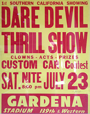
This is one of the authentic car posters on Jim’s wall. Notice the slight irregularity of the wood type, and the stylish use of fonts (stylish for the 1960s).
On the walls of his barn are posters from car shows in the 1950s and 1960s. These are not that old, but are curiously un-modern in style, and are delightfully stylish. What makes them so nice is their use of real wood type and letterpress printing. These posters exhibit skillful typography done with the tools at-hand, and they are done quite well. But, the limitations of wood type are clearly evident in these posters. There are distress marks – probably physical damage to the type – and there are ink splotches, a result of the vagaries of printing short-run posters on a letterpress.
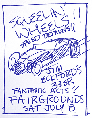
This is the sketch I made on a note paper for the poster I designed yesterday. It features too many effects that would not have been easy in the era of the original posters – angular type for example.
I am intimately aware of the weaknesses of wood type. I work with wood type often. I am the faculty advisor of the Shakespeare Press Museum, a collection of letterpress printing machines and type at Cal Poly. In 1970, when I was an undergraduate in the same program, I was the student curator. Wood type and I are good friends.
For a Christmas gift this year I am designing a look-alike poster for Jim, one that looks like the others but is customized for him and his favorite car. Working with a detailed drawing of the car by an illustrator in Chicago, I filled in most of the body solid red, and then converted the image into a comic-book style halftone (using Photoshop’s halftone function).
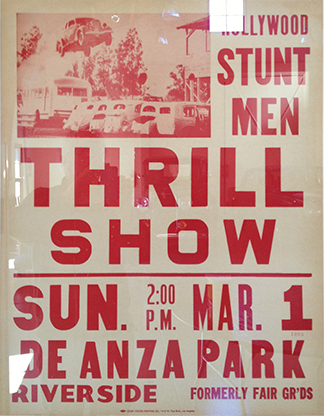
From this poster, dated 1960, I was inspired to use the stacked lettering of 2:00 p.m. and the color of the lettering. I also like the abbreviation of “fairgrounds” to “FAIR GR’DS.” I was tempted to do something like this, but decided it looked too odd on my poster.
I have a good selection of authentic wood type fonts on my computer, including a few of my own making. One in particular is appropriate to they project because it’s a condensed face without too much filigree. The posters I am mimicking use only sans serif styles. The others are not quite period-perfect, but they work awfully well. I am using Gothic RR Condensed from ITF, and a recent offering from Linotype called Trade Gothic Next LT. By virtue of some rather rash character width adjustments I was able to get the type to look pretty good – very ’60s.
The poster I am making should look like authentic wood type, so I eliminated all kerning, and I added some irregularities to the letter-spacing. Then, without going overboard, I added some distress. Many wood type characters have been damaged by the occasional gauge pin tongue, or being banged with a quoin key by accident. I put in a few, but was very restrained. I want it to look damaged, but not too damaged, and certainly not fake.
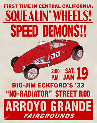
This is my finished poster. The illustration is a little too sophisticated for the era, but the coarse halftone dots may be forgiving on that. Now that I think of it, I should have thrown the color plates out of register a little (I’ll do that next time!).
I also added a few splotches of dark red ink on various letters. This works pretty well. Then I put in a paper-like background created in Photoshop using the Clouds and Gaussian Blur functions. It looks like lignin-yellowed poster paper, and it’s quite effective.
I printed one copy for proofing on my small Epson printer, and then made a few small changes before printing the final poster on my large Epson printer. The resulting poster is delightful. I mounted it on foam-core this morning and then framed it to match other posters in Jim’s garage. I’ll take it to the barn later today and put it up. I might add a bow.