A few blogs ago I wrote about how to use AppleScript to crop a Photoshop document with pixel precision. As part of that same project, I needed to add white space to the canvas and trim marks top and bottom along the edges to mark the location of a cut that was made later on a large metal cutting shear.
The resizing of the canvas is easy. The AppleScript code looks like this:
resize canvas_CroppedPanowidth 11287 height 17700
This, of course, must be placed within the construct of a script, but looking at the syntax of the instruction, it says simply, “make the canvas bigger (or smaller) to these dimensions: 11287 X 17700 pixels.” AppleScript and Photoshop will carry out your instructions without delay and without asking if it’s OK, so be careful to be accurate with any script that makes changes like this.
_CroppedPano is my variable name for the photo on which I am making the changes.
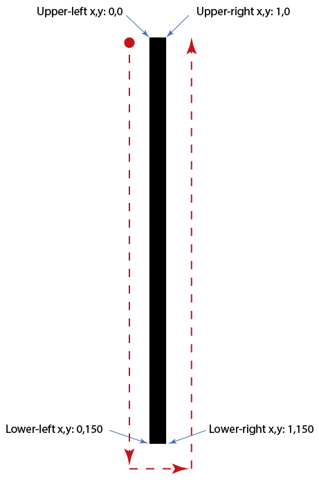
Now let’s look at how the crop marks are drawn. Photoshop, like Illustrator, uses the Cartesian coordinate system for all of its measurements. Upper-left is 0,0 (early versions of Illustrator put that 0,0 at the lower-left). Photoshop measures everything in the current measurement unit, whatever that may be. At the top of my script I tell Photoshop to use the pixel unit of measure:
set ruler units of settings to pixel units
From this moment on, the program is computing values in pixels.
This is the way Cartesian coordinates work in Photoshop (and everywhere else):
The crop marks I want to draw are one pixel wide and 150 pixels tall (in this example, that’s 1/2 inch). I needed one at the top and bottom of each panel, on both the left and right edges, and one-half inch in from the edges (these are crop marks).
Here is the code for the AppleScript to make the first mark at the upper-left of the photo:
Parsing those lines of code, the first line lists the Cartesian coordinates of a 1-pixel by 150-pixel rectangle, located 150 pixels from the left edge of the image. The second line of code tells Photoshop to create the variable _LineShape (which is the name of the line I am drawing). The next line fills the shape with black (RGB 000) with 100% opacity and no transparency. The last line deselects the current selection so that I can make another selection.
The other three crop marks are made the same way, but with different coordinates in the x,y positions for all corners.
At the end of the script I return Photoshop to inches units for measure:
setruler unitsofsettings to inch units
…and then I end the script. The result is a photo with a larger canvas (the background color is used to expand the canvas) and crop marks on the corners:
Running the script – even on multi-gigabyte files – takes just a few seconds. It is absolutely precise and absolutely repeatable.
Here is a photo showing crop marks like those I have described here:
Notice that it has pairs of one-pixel-wide crop marks top and bottom, left and right. That is exactly what the script does, after it increases the canvas size.
When you need precision, and I often do, using techniques like this can make a job successful where dragging rectangles on screen will not be as accurate.
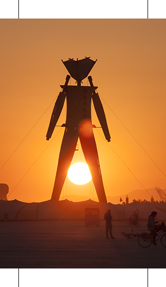
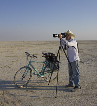
My wife and I went to Burning Man last week. It was something we had wanted to do for several years, and now we have done it.
The legendary counterculture festival is held on a dry lake bed in northern Nevada, and for a week each summer that lake bed turns into a city of over 65,000 people. We were just two of them, but we were immediately swept up in the activity and community of Black Rock City. We had many preconceptions of the event, as my sister has been going for many years, and our son for the past four years. They had told us about the event, and had encouraged us to go this year. Their stories made us want to attend and experience it for ourselves. We were not disappointed by the reality of Burning Man.
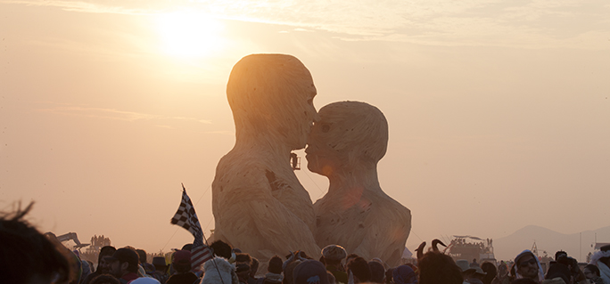
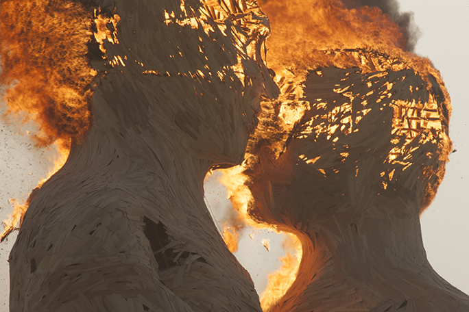
This sculpture, standing about 50 feet tall, was called The Embrace. It was built by a team of 80 from three cities, assembled on the site, then burned to the ground on Friday morning. The Embrace was funded with crowdsourcing money on Kickstarter. Below is The Embrace an hour later.
Getting tickets was not easy. The 65,000 tickets sold this year were swept up in less than an hour. Two additional rounds of ticket sales in early and mid summer sold out in seconds. We were lucky to be able to buy tickets and a vehicle pass from two people who could not attend this year’s event. And, those ticket holders were nice enough to follow the no-scalping policy of the event organizers, selling them to us at face value. Burning Man tickets are not cheap: $380 each, plus the parking pass. There was a fellow sitting by his car at the Wadsworth exit of Highway 80 in Nevada with a sign that read “Burning Man Ticket Wanted: will pay $1,000!”
The 65,000 inhabitants of the event live in a semicircle that is several miles across. Outside the area reserved for camping is the Playa, a large open space that continues for several miles onto the lake bed. On the Playa are the Man, a gigantic wooden sculpture of a man towering over 100 feet into the air, the Temple, another structure built by the Burning Man organization, and numerous other constructions. That Man and several of the others are burned to the ground by the end of the week. It’s very odd and absolutely delightful.
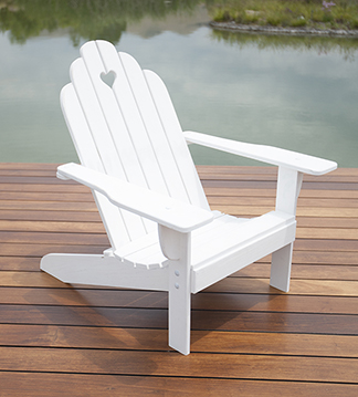
Last summer I built a nice Adirondack chair. It was based on an existing chair that had rotted-out, a victim of years of being out in the weather. I decided for the clone that I would make it entirely of oak lumber, and wherever there was a connector, I would use stainless steel.
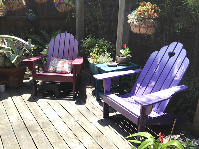
This is my assembled Adirondack chair on the dock of a friend’s pond. The chair is painted with white exterior primer prior to being assembled, then later painted with the final color – purple.
I took the old chair apart, mostly by sawing the rusted fasteners apart, then tracing the wood pieces onto kraft paper. I took the tracings home and spent a bit of time reconsidering the design of the chair. I made some technical changes to make the chair stronger, then I made some changes that I thought would make the chair look better.
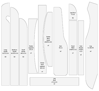
I made full-size drawings in Adobe Illustrator, then printed those out on my Epson ink-jet printer on a smooth, uncoated paper at 720 ppi resolution. I didn’t need photo quality; I wanted speed. Then I took a trek to the local lumber yard to purchase some oak boards, and several hundred dollars later, I had all the wood I needed.
This is my cutting diagram, which I printed on my Epson wide-format ink-jet printer at full size. I then glued the curved patterns directly to the boards, and cut them on the bandsaw. Later, I sanded the pattern paper off.
I ordered stainless machine screws, carriage bolts, washers and nuts from McMaster-Carr, a Los Angeles based purveyor of everything mechanical. Several scores of dollars and a couple of days for shipping later, and I had all the hardware.
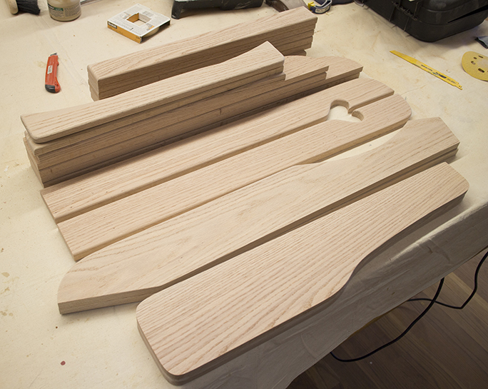
I glued the ink-jet printer output to the oak boards (I cut them to approximate size first) with water-soluble glue. Then, using a combination of tools including a table saw, a bandsaw, a chop saw, a router table, a hand-held router and other hand tools, I had all the parts cut and ready for assembly.
For those boards with ink-jet paper glued on top, I used the printed lines as cutting guides on the bandsaw. Where two parts had to be identical, or mirrored (the arms are a good example), I screwed two boards together then cut them at the same time on the bandsaw. Whatever irregularities occurred, occurred to both boards. I completed all the cutting, then moved on to surface sanding and smoothing curves. For those operations I used a hand sander, two stationary belt sanders and a stationary spindle sander.
This is the entire chair as cut and sanded boards. Some of the board edges are routed with a half-round cutter – I did this only where the boards touch the person sitting in the chair. All other edges are left square. Assembly began at this point, following a primer coat of white exterior paint.
When all the boards were smooth and finished, I cleaned each one, then applied two coats of latex exterior white primer on the boards. It’s better to paint the raw material then assemble it into a chair than to build the chair and paint it. Unpainted parts, especially those hidden by joints and corners, tend to be an invitation to dry rot.
When the chair was assembled, a couple of days later, I sanded the tops of wood plugs I used to cover the screws, and then I sprayed several coats of exterior latex paint on the finished chair. You may wonder why I started with beautiful oak boards, only to paint the chair with purple paint. Remember that my objective was to make a weatherproof chair. The color was chosen to work with the other colors in our garden.
…and here is the finished chair on the right, its beautiful purple color fitting in nicely with the plants and the sister chair on the left in aubergine. I plan to replace that chair soon, as it’s showing signs of decay from the elements.
Using Illustrator as a design tool for real objects is interesting. For me it’s easier and less expensive that getting a CAD program, and I already know how to use it. Working entirely in 2D is easy for me, and Illustrator is delightful for this. As mentioned, I draw at full size, requiring that the canvas be set to the size of the full size lumber.
The finished chair is very nice on our back deck garden (we have a very small yard), and the colors of that chair and its counterpart work nicely with the greens of my wife’s wonderful flora.
A combination of software – Illustrator, hardware – the wide format Epson printer, and harder-ware – the various tools in my wood shop, make nice finished products. It’s nice to be able to design, then build real objects from the computer screen.
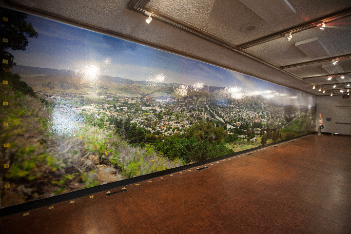
This was my 58-foot GigaPan photo of San Luis Obispo as it appeared in the San Luis Obispo Museum of Art in March. That photo was printed in 17 sections on glossy paper, then mounted on the wall with wallpaper paste. The same image is now being printed on aluminum sheets for a permanent installation at Cal Poly, San Luis Obispo.
In January and February I wrote about the panoramic photo exhibition I had at the San Luis Obispo Museum of Art. That involved 20 photos. One photo, which I call Daniel’s Point, I printed to 58 feet, 7 inches in width. The original of that image, which was taken with a GigaPan device, is over 44 GB in size. I reduced the size of the file to make the print nearly 60 feet long for that display. For that image, I printed 17 vertical strips, each 44 inches wide, with a one-inch overlap for the wallpaper man to use for register.
When the show ended, my friends and I gathered at the museum and pulled the photo off the wall, and threw it away.
But, someone took notice! A group of students from the Associated Students, Inc. at Cal Poly saw the exhibition and decided that they wanted to have me make a version of that photo for permanent display in the University Union. I was thrilled.
This time, rather than print the photo on Epson Photo Glossy Paper, the ASI wanted it printed on sheets of aluminum. This exhibition is permanent. The supplier of the aluminum prints is a company near Santa Barbara, California. They can print on sheets up to 48 x 96 inches in size.
The process is dye-sublimation, where the image is made onto a paper carrier on an Epson 9600 ink-jet printer. That carrier is printed with dye-sublimation inks on the paper carrier, and the image is reversed as it is printed. The dye-sub paper is then positioned on an aluminum panel that is coated with a polyester emulsion. The sandwich is then put into a heat/pressure press where the photo is transferred to the emulsion on the aluminum.
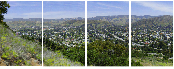
My image will appear 33 feet long, and about five feet tall. So my challenge was to cut the image into sections that would fit onto the aluminum sheets, with an overlap of one inch to trim before the photos are mounted on the wall.
Four panels of my panoramic image. There is a small overlap on each panel on both sides (except the two on the ends, which only overlap on the inside). To get the panels cropped to the pixel from the original image required the precision of an AppleScript working in Adobe Photoshop.
I needed accuracy to the pixel, as these panels are very expensive to make, and the image must be perfect. When I made my paper version at 58 feet, I did the cropping by dragging guidelines into the Photoshop document, and then cropping to those guidelines. But the paper print had the advantage of being able to be registered on the wall while the wallpaper paste was wet, adjusting it until it fit.
The aluminum panels must fit perfectly without any adjustment possible as they are mounted. I tried doing it by hand, entering pixel values into the Crop tool in Photoshop, which worked fine, but there were times when the software and I didn’t see eye-to-pixel. Photoshop wanted to shift one pixel right or left of my desired size, snapping to the wrong side of a measurement, and this was not acceptable.
So I got out the extensive Photoshop CC 2014 Scripting Guide, the most recent of a series of similar publications from Adobe that document how to use various scripting languages to control their popular software. I have used AppleScripts on many occasions to script Illustrator and InDesign, and I find the process both interesting and efficient. I had never tried scripting Photoshop.
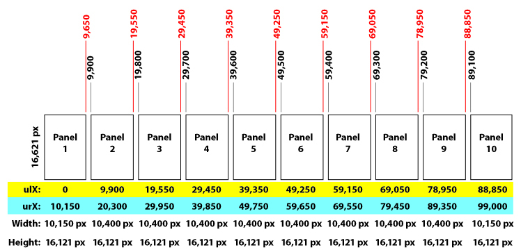
I found the references in the Guide on cropping, and I also taught myself how to draw register marks using a script (that’s for another blog). My immediate challenge was to cut a 99,000 x 16,121 pixel photo into ten pieces, each 10,400 pixels in width and 16,121 pixels tall (except the two on the end which are narrower). Incorporating a one-inch overlap was also part of the process, as I must trim the aluminum sheets to size in a huge metal-cutting shear after they are imaged, and the overlap ensures that the final trim is correct.
The Adobe scripting guide has examples of how to script Photoshop using Visual Basic, Javascript and AppleScript. I prefer AppleScript because I have the most experience in that language, and many years of basic practice. It’s pretty simple, as programming languages go. I built a test photo comprised of four quadrants of solid colors, and I experimented with my scripts until I understood the syntax of the cropping command.
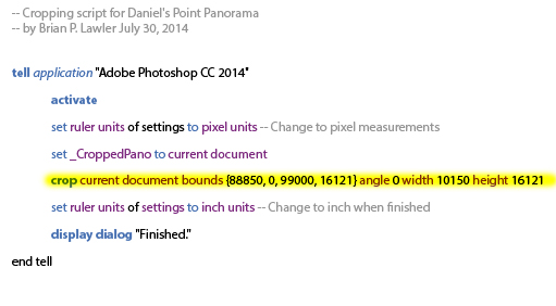
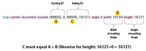
In the end, it’s perfectly logical. It just took me a while to get an understanding of the coding so that I could do my project. The AppleScript code below will crop the right-most of the panels from the whole:
In English, the line highlighted in yellow says: moving over 88,850 pixels from the left corner, and 0 down, crop to 99,000 pixels wide and 16,121 down. The width and height of the cropped image are 10,150 x 16,121 pixels.
The best part of this is that Photoshop follows the instructions of the script to the pixel without any argument. Here is the detail of how the one line of cropping instructions works:
The structure of an AppleScript must include the target application, in this case Adobe Photoshop CC 2014 in a tell statement. At the very end must be an end tell statement. This encapsulates the instructions intended for Photoshop. AppleScripts are adept at getting information from one application, then switching to another application to do something with that information.
Each message to a specific application is enclosed in a pair of tell statements. Interestingly, the script also acts very quickly on the photo. To crop the 4.4 GB image (a reduced-resolution version of the original) with this script takes only a few seconds. Each resulting section measures almost 500 MB.
This is a legend of how the photo would be cropped into individual panels from one very large original. I needed this to ensure precision in the final images.
As with any adventure into potentially harmful events with photos, it is smart to work on a copy of your master image rather than risk damaging the original. The process of generating ten panels, each precisely cropped to the correct pixel dimensions, took me less than one hour. This was after I had spent at least that much time teaching myself how to write and execute the AppleScript in Photoshop.
The time spent was well worth the effort, as now that I know how to script Photoshop, I am sure that I will do it again – soon. When each panel was properly cropped, I ran another script that added a one-inch white bar at the top and bottom of each section, then added one-pixel-wide crop marks on the top and bottom to guide the metal shearing operation.
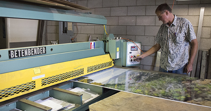
This is my friend Steve Rinell with one panel from the huge panorama in his Betenbender shear.
The panels are now printed, and the metal shearing is partly complete. I will write more about the project as it comes closer to completion. The huge photo is scheduled to be mounted in the coming weeks at the University Union at Cal Poly, where it will be on display for a long, long time.
For eight years I have been complaining loudly (the blogger’s “pen” is mightier than the sword, but much slower) about the “feature” in Adobe Photoshop that causes your type to be erased – without an undo that will replace it – when you strike the Escape key.
The reason that this was so irksome is that Adobe, always so proud of their unified user experience allows us to strike the Escape key when we finish using the text tool in Illustrator and InDesign, the result being that the text you were just working on is now complete, and you want to move on with another tool. Striking the Escape key in those two applications causes the text tool to be deselected, and replaced by the solid arrow selection tool.
By contrast, in Adobe Photoshop, you could spend minutes crafting some text, applying a typeface selection, size, leading, tracking, color, minor adjustments here and there, and then, when finished, hit the Escape key to have the program erase your text from the screen. Poof! Gone! And, one could not get it back with the Undo command. No, it was gone for good, and had to be remade.
This was aggravating, especially for the more sophisticated user who became efficient with keyboard commands.
I felt for years that this was a bug, but I was advised by several Adobe representatives that it was actually a feature, one consistent with using the Escape key while using other commands in Photoshop – the effect was to cancel what you had been doing. And, though I agree that the Erase-Your-Type-With-No-Undo feature was consistent within Adobe Photoshop, it was aggravating because it was not consistent with the same tool in the other Adobe Creative Suite applications.
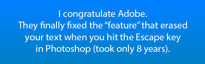
I am happy to announce that quietly, in the middle of the night, somewhere between CS 6 and CC 2014 (I wasn’t paying attention until yesterday) they made the user interface consistent, or at least more consistent than it was. Now, when I strike the Escape key in Adobe Photoshop, instead of the next four-letter word out of my mouth starting with an F, I exhale and smile, and continue with my work.
Thank you, Adobe, for repairing the unified user experience in Photoshop. Seriously. Thank you! OK, Adobe seems to be paying attention. Now, Adobe, please listen to this next request, one I have been advocating for over a decade: When saving from Adobe Illustrator, and let’s just say the original file was made in a previous version of that software, instead of giving us the mind-numbing error message:
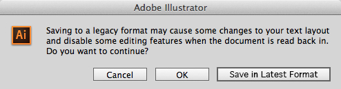
How about making it easy to convert to the latest format by clicking a button in that dialog box (and perhaps that could be the default button). That would make is simple to keep Illustrator documents up to date, and would allow us advanced users a simple path to keeping our files current. Would that be so hard? How about this:
I would be ecstatic if the Illustrator team would provide this level of support to us users. It would simplify our lives and help us to keep our files current.
I’ll get back to you in eight years to tell you if this request has gotten any traction at Adobe.
Last week I promised to write a blog about the next step in making my Lining Livermore typeface. I thought I was farther in the process than I was.
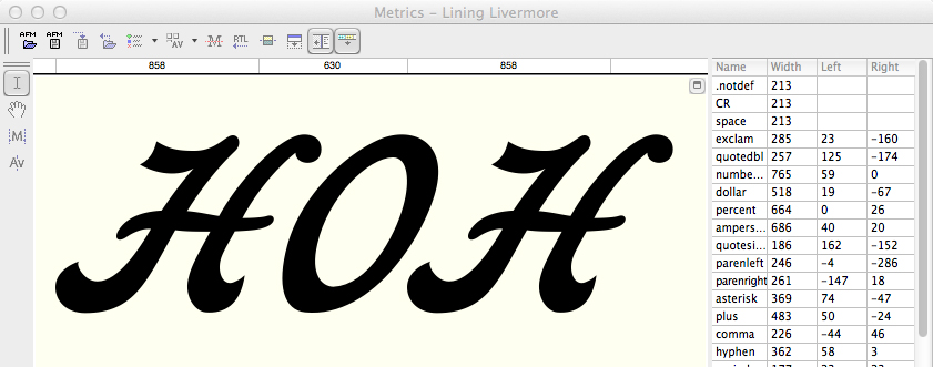
Getting letters to fit adjacent to each other is a difficult task, and with an Italic design, it’s even more difficult (this is my first Italic design). With “normal” alphabets, one begins with a straight letter like H, and then you design the O, and put them next to each other. These two letters must align perfectly without any kerning before you begin designing the other letters, and before you begin making relationships between the other letters.
This is the start of another one of my fonts, Tallphabet, which I designed a few years ago, then completely redesigned last summer to make an OpenType version with small caps and other amenities. This HOH combination gives the designer a starting point.
Once the H and O are designed, I move to some of the round letters, building them from parts that they have in common. In the case of Lining Livermore I was working from a scan of existing metal type. Since I have access to the original type (it’s on my desk as I write this), I can easily compare the letters I am drawing to the actual metal type. What I have found to be particularly valuable is to consult the type for side-bearings and spacing. But with Lining Livermore I didn’t draw the letters in any particular order. I just did one and then the next.
It’s important to adjust the relationship of the cap H and O. Here they are together, and once I have these relationships set, I can move forward with the other letters.
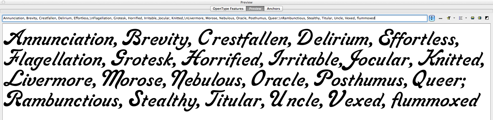
As the font becomes complete, I start making up funny phrases to compare the letters, and then I adjust their position relative to their neighbors. I come up with absurd expressions and put them on the computer screen to test my typeface. I listen to the radio and type what the announcer is saying. I mix up capital and lower case letters in crazy combinations; I add French words and German and sometimes I try my hand at Danish nonsense words just to use the ae and oe diphthong glyphs.
These are some of my word and letter combinations that assist in making letter position decisions. As you build, and adjust the alphabet, you develop a textural quality that is acceptable. This design still needs a lot of work, but it’s starting to be a pleasant opus. Notice the vexing space between the cap V and the lower case e. I fixed that already. Same with the unctuous space between the U and the n.
Making a font, as I have already described, takes months – often longer. I fuss over every anchor point of every letter, and I end up redesigning letters over and over until I am happy with them. Jim Parkinson, a full-time typographic designer, once told me that you never finish a font. You just declare victory and move on!
There is probably no other profession that requires such a mix of artistic skill plus a compulsive need-to-perfect. Combine those skills with an eye for detail, and you have the typographic designer. Yet, most people just choose a typeface and start typing. They don’t know or care about the thousands of hours that go into the design and development of an alphabet, or a family of alphabets made into digital form for the computer. That’s OK, because I don’t know about their occupations and interests either.
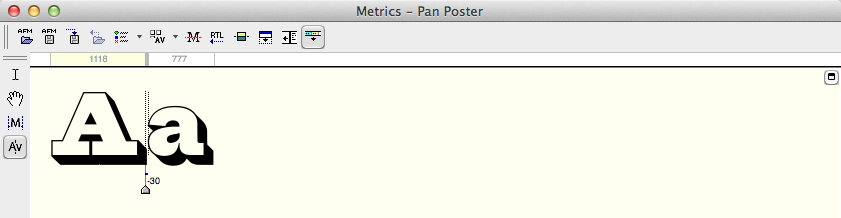
This is the kerning pane in FontLab. Notice the pair of lines between the letters A and a. The indicator shows that I have kerned this pair of letters -30 units (1000 to the em) tighter. There are keyboard shortcuts that speed this process. The typeface is Pan Poster, another design I am working on.
Once it’s all pretty safely working, I start with the kerning pairs. In FontLab there is a wonderful facility for kerning classes of letters similarly. This can save some time. I put all the round lower-case letters into a class, then I make kerning adjustments to the class of characters together. The same can be done with other letters with similarities. Once that is done, one begins the tedious process of comparing every letter to every other letter and making kerning adjustments to the pairs individually.
Again, FontLab has a facility for kerning where you put one letter pair together, and then step through all the characters in the set, adjusting as you go, to make a complete kerning table. It’s not uncommon for an individual font to have 3,000 or 4,000 kerning pairs in addition to the class pairs. The obvious kerning opportunities are the cap T followed by almost any other letter. Cap P, Cap F, cap W and Y are also like this; they provide an opportunity for hundreds of pair combinations.
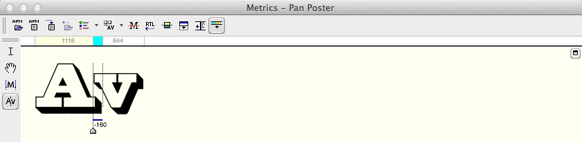
…and later that same day I reached the Av combination. This one requires much more than most because the shapes of the A and the v both require adjustment.
While building the kerning table, you encounter combinations of letters that will never be set together. Following the Cap T with a 3/4 fraction, for example, will never occur in any common typesetting circumstance. I ignore those. Two q’s in a row probably don’t need to be kerned. In the case of Lining Livermore, the design does not lend itself to setting in all-caps. It is simply unreadable, so I just ignore all-caps kerning.
So, the tedious job of building the kerning table is begun. It will probably last well into the next decade. At some point I will declare victory and move on!
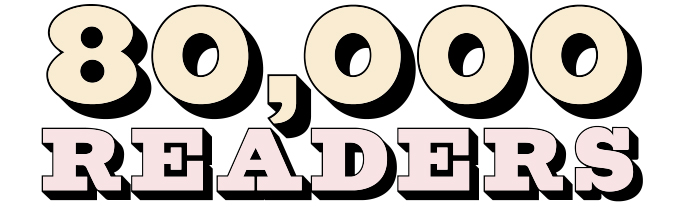
The Blognosticator reached 80,000 readers this week, thank you.
When I started this version of the blog, 33 months ago, I didn’t know how many people would visit the site, and how many would return many times. Writing and illustrating the Blognosticator is a lot of work, but it’s well worth the effort.
I have published 183 blog posts, and have posted a total of 669 illustrations, most of them original photos and graphics. I generally do not post anything that I did not originate (exceptions are credited in the blog). That policy allows me to publish without worrying about intellectual property rights; I draw it, and I own it.
I write blog entries in clusters, sometimes posting three in as many days. Then I get involved in other projects and I don’t have time for blogging.
So, please keep reading! I will not let you down.
Best wishes,
Brian P. Lawler
The Blonosticator
p.s. The lettering above is from a new font that I am designing. It’s called Pan Poster. At some point it will be made available commercially.
I’m probably never going to need the lozenge character in any typographic project I do. Nonetheless, it’s there, ready for me, whenever I choose to use it. That’s exciting.
The lonely lozenge. I don’t know what it’s for, but I know how to draw one!
I’m not sure what a lozenge character is for, but I’ve drawn a few of them in my lifetime, and I’m looking forward to using the little guy someday.
That, along with the Hungarian umlaut, and any letter that needs an Ogonek or a Ring.
These are all the special characters that one must draw when making a complete font. Did you know that fonts contain two different slash marks? One is the forward-slash; the other is the Multiply slash, which also has another name: Virgule (from Latin for “rod”). We type-drawing fools also must draw those ugly typewriter quotes that most are found in self-published books, and in most web sites (Web designers take note: you CAN use the correct apostrophes and quotes in web sites. The characters are there!)
Call me crazy, but I really like drawing the various accent marks that are found in fonts. I like the circumflex, the cedilla and the accent-grave, as grave as it is. I love the way these little marks add style to letters. In Lining Livermore I took some liberties with the Japanese Yen symbol. Instead of crossing the leg twice, I added wings to the right side of the letter. I’m sure that some Japanese bureau will not like this, but I do, and on this font I am the boss!
The pleasant Pilcrow is the demarkation of a new paragraph.
Most of all I love the Pilcrow. That’s the wonderful, sometimes romantic character that indicates a new paragraph. It’s also a good Scrabble word; keep it in mind.
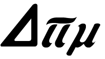
More pedestrian symbols pepper the nooks and crannies of every type face that is worth its salt. There are the symbols for Pi, Sigma (summation), Delta, Product, Partial Difference, Omega, and Integral. It was nearly impossible for me to impart the style of Lining Livermore for these characters, but I tried. I made them fatter than usual, and I added some similar endings to the legs of some of these.
Delta, Pi and Mu are drawn to match the Lining Livermore font.
More useful symbols include the degree symbol, the plus-or-minus, approximately equal, dagger, double-dagger, Section, and Logical Not. Now how much would you not pay? The ellipsis is there, as is the per-thousand, which is like the per-centage, except with two zeros on the bottom. There is the dollar-sign, the cents-sign, the Yen (as already mentioned, a generic Currency symbol that is never used, the Pound Sterling, and the Euro.
Pound Sterling, generic Currency, Dollar, Euro and Yen.
Para ellos que hablan Español, there are the tilde and an upside-down question mark and exclamation mark. There are four drawn fractions: 1/2, 1/3, 1/4, and 2/3. And there are two ordinals: a and o, which are top-aligned with the numerals. Add to that list the centered period and the dotless i, and we have a mostly complete font. I added ligatures for ffi, ffl to the fi and fl that are a standard part of a font.
There is no longer an Apple logo; those disappeared years ago when TrueType fonts were developed.
Asterisks are always fun to draw, and they can readily be drawn in the style of the font. My Lining Livermore asterisk is in keeping with the rest of the letters. Since I had none to model mine after, I created it from one of the letter parts, then copied it around a circle to complete the mark. With a little bit of adjustment, I made it into the new asterisk for this font. The Ampersand is in the metal type, and I drew that faithfully.
There is one big editorial change that I have made: I drew a new cap T. I just didn’t like the one in the original font, and frankly it doesn’t go well with the rest of the letters. It looks more like a swoopy C than a T. But, for any purists out there, I included the original as a Stylistic Alternate character in my OpenType script. The new T is based on the cap F, which is lovely. I took that letter apart, then fashioned my version of the letter for my font.
I have a dozen hours in the font now, and I am making progress. One of the other fonts I have been working on has taken me about four years, so I am sure I have a long way to go.
In my next blog I will talk about kerning – it’s not a process, it’s a career!
After I created the scan of my type proof, I opened it up in Adobe Photoshop and made some corrections (I rotated the G and the O), and I did some tonal clean-up to make the letters look sharper. Then I closed up the space between the lines to make the scan more compact, to fit into an Illustrator file more efficiently, and to make the process of drawing the letters simpler.
Having drawn numerous alphabets in the past, I prefer to work at about two inches tall for the caps. I placed the scan onto a new Illustrator document, then turned it into a template and created a drawing layer on top of the template (why doesn’t Illustrator do this automatically?).
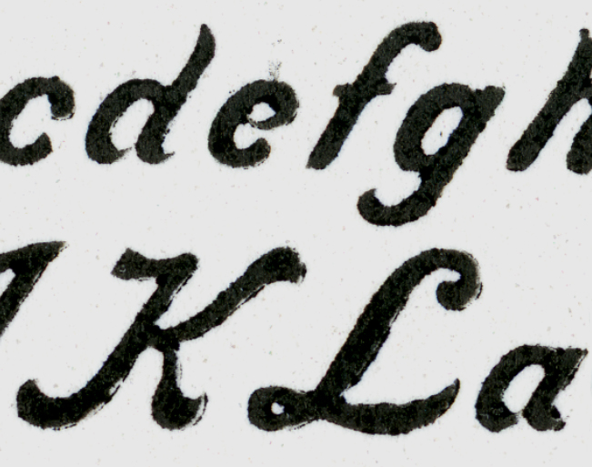
This is the high-resolution scan of the proof from the metal type. Notice that the lower case e and the a appear to connect in this proof. This is a result of ink filling-in the gap between the end of the bowl, causing it to touch the backs of the letters.
When resurrecting an alphabet it’s important to determine the intentions of the original designer. What are the constants in the font? Where does it deviate from constants? How wide are the strokes, and how do they interact? I am interested in making a digital font that is true to the spirit of the original type. What did the designer want the letters to look like? How do the strokes connect (or not connect)? What do the ends look like? These are questions that require some forensic work.
In the case of Lining Livermore, it is a strongly Italic font. I have never drawn such a font before, so I had a lot to learn about Italic letter design, and more importantly, Italic letter positioning. Italic glyphs are positioned to run off the top-right of the character space. In the metal type manifestation, the upper-right of many characters hangs off the type block to later be supported by the adjacent character’s block.
This is the cap V of Lining Livermore. Notice how the swash extends out beyond the type body block. This is precarious because it requires another letter to support it, and prevent that overhang from getting broken on-press. If no letter follows it, the typographer must put a high space in to support the letter.
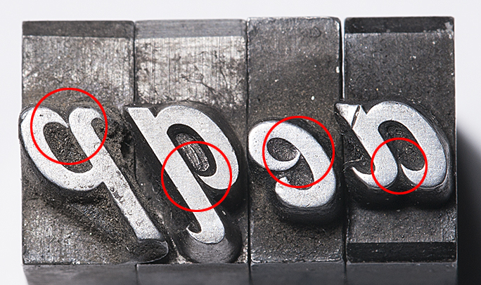
I took the complete lower case alphabet of metal type to examine under the magnifier. The letters in which I was most interested were eap and q. I wanted to know if the stroke of the bowl of these letters connected to the stems, or if the ends came close, but didn’t quite touch the stems. On my proof, all of these seemed to be plugged-up with ink. Under magnification I could see very clearly that the intention of the designer was that the bowls should not touch the stems.
Notice in this photo how the pointed ends of the bowls do not actually touch the bodies of the letters. Notice also the misalignment of the e. It also lacks the chamfers the other letters have, and I must assume it was cast at a different time, in a different foundry than the other letters. After examining the type enlarged this much, I returned to the drawings and modified my letters to be more faithful to the metal type.
In my eapq selection I can see four variations of these finials, each slightly closer to, or farther from the stem. In general, though, they don’t touch, and that’s what I needed to know. I would incorporate that fact into the reborn design.
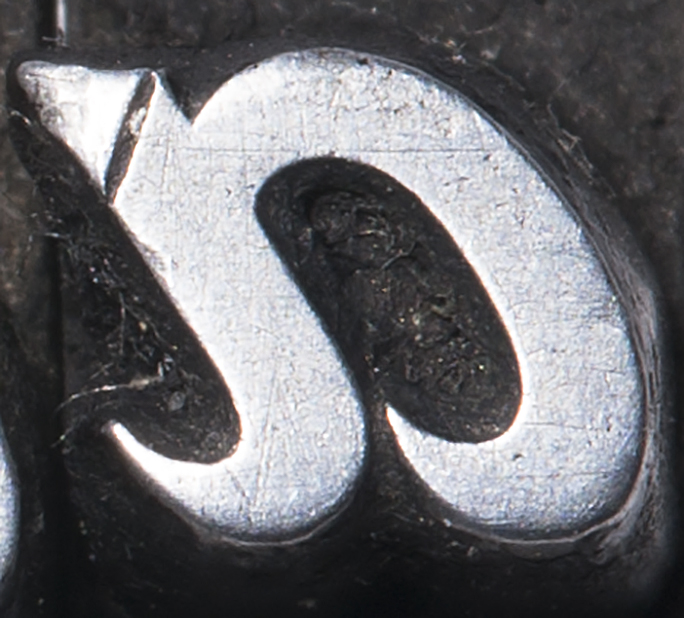
This extreme close-up of the lower-case a shows very clearly that the point on the bowl does not touch the body. Notice also the damage to the letter from 127 years of use. The small scratches come from cleaning the type, and the dents (upper-left) come from the type being dropped into the case – even a short distance – which damages the printing surface. The big dent is probably from something getting between the letter and the tympan in the printing press (thread? a bit of folded paper?).
When drawing letters for a digital font, I always start with the cap H and O. For this font I started with the lower case a, and worked my way forward. Since the Italic slant is so strong, and the differences between lower case and caps so extreme, it was not important to build a font in the order I have always done it. Instead, I just jumped in and did it in order.
Drawing an alphabet is a form of discipline; it requires that each letter be drawn with extreme care and attention to detail and consistency. And, having too many anchor points is unhealthy. I add anchor points sparingly, being careful not to over- or under-design. For example, drawing a circular stroke requires only two anchor points in most cases – three in the extreme. This frugal approach to drawing creates smoother lines, and no lumps, which are momentary changes in direction that cause a letter to look amateurish. To see lumps in a commercial font, look at Microsoft’s disgusting Century Gothic, which has many in its curvaceous parts. That, of course, is unacceptable in letter-drawing.
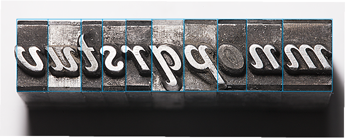
This illustration shows how the letters stand on their bases. Notice that many overextend their body blocks. The lower case o is plugged by printer’s ink that was never cleaned out. The bottom of the lower case m (on the extreme right) has been damaged by being dropped; the other letters are in extraordinary condition.
With the knowledge that the original Lining Livermore was intended to have its ends disconnected, I proceeded. Gradually I constructed the entire lower case alphabet.
Getting the letters from Illustrator to FontLab Studio is a function of enlarging the letter in a scratch file in Illustrator, placing its lower-left corner at the top of the page, and then cutting the outlines and pasting them into a Glyph window in Font Lab. Most professional type designers don’t do it this way, preferring to work entirely in FontLab. Though I appreciate this, I just don’t know the program well enough (even after several years of use) to be familiar with it enough to abandon Illustrator. My approach is more hybrid; I draw the basic letter in Illustrator, then I perfect it in FontLab. There are a couple of features in FontLab that are worth the price of admission: one is the optimize curve function, which will make any curve better, and is especially elegant when removing excess anchor points; taking an anchor point out of a curved path usually causes that path to improve.
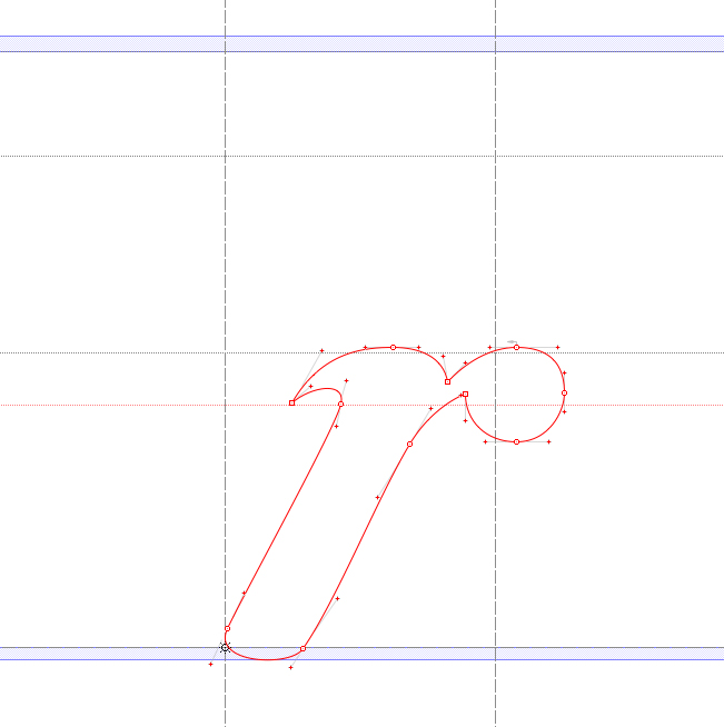
The glyph for the lower-case r in Lining Livermore shows how art imitates art. The digital character of the r must exceed the body of the letter in order to fit against other similar letters. If you look at the illustration above you will see the same thing happening in the metal type. The screen capture is from FontLab Studio.
Making a complete font – over 245 glyphs – takes a long time. There are 26 lower-case letters, 26 capitals, 10 numerals, of course. But that’s just 66 glyphs out of 245. There is still much work to do after the alphabet is complete. The punctuation, the diacritical marks, the ligatures, currency symbols, and a whole bunch of oddball characters like the eth (both cap and lower-case), which is a character used only in Icelandic. The infinity symbol, registered trademark, copyright, pilcrow, octothorpe (AKA: hashtag) and various others all have to be drawn. And, in the case of Lining Livermore, they have to be drawn “in character.” The registered trademark and the copyright symbols must be drawn with Lining Livermore style.
These are my copyright and registered trademark symbols for Lining Livermore. Many fonts don’t stay true to their style when it comes to these marks. I like it better when the marks continue the style of a font, rather than being generic.
FontLab is impressive in its ability to generate many of the hybrid glyphs automatically – the accented glyphs for Romance languages for example. All I have to do is to draw the accents themselves, and FontLab will create the derivative characters. It does a pretty good job, requiring just tiny adjustments after the fact. A small change to the original accent glyph is automatically reflected in the derivative letters, which saves a lot of time.
Gradually the font takes shape. I have two 24-inch Cinema Displays. On the right display I draw the letters and adjust their spacing. On the left display I have a large preview of the type in variations of settings: the alphabet, settings that emphasize punctuation, those that feature all-caps setting (doesn’t work with Lining Livermore!), and the traditional pangrams. As I work on the letterforms, the previews show me the results. It’s a long process of getting the basic spacing organized first, then I move on to more detailed adjustments.
More on the archaeology of Lining Livermore tomorrow!
I am the faculty advisor of the Shakespeare Press Museum at Cal Poly. The museum is a working collection of type and printing presses that collectively represent the history of relief printing from 1850 to 1950.
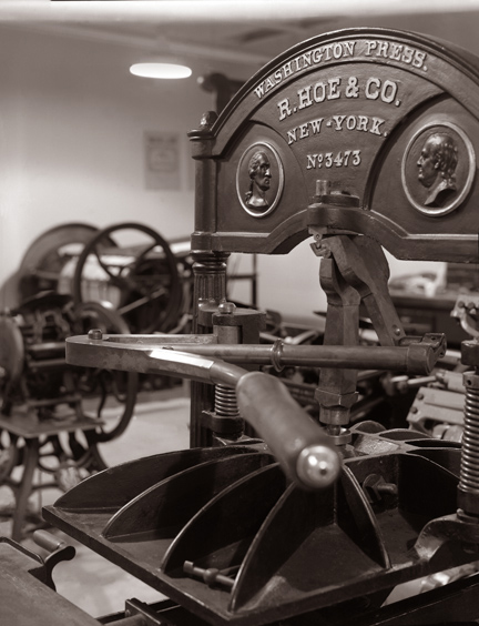
This is one of four 1850s-era Washington presses in the collection. Two of them are on display, and are fully functional. When I feel like having a real Gutenbergian experience, I can print on these machines.
We have 19 working letterpress machines, starting with an 1850 Washington hand press, a line of treadle-operated platen presses, two working lever platen presses (C&P Pilot, and Columbian), and we recently acquired a Heidelberg Windmill press, known around the world as a Tiegel (German for “crucible”).
Over the course of about 75 years, Heidelberg manufactured this machine, which became the most popular letterpress printing machine in history. Most of those machines made by the company are still in operation, and it’s possible to purchase one used on eBay almost anytime.
The Shakespeare Press Museum also has a collection of hand-set metal and wood type numbering about 450 fonts. Many of these of common: Baskerville, Stymie, Goudy, Garamond. Some are rarer: Kismet, Engraver’s Roman Shaded, and one particularly interesting style called Lining Livermore.
I have been attracted to this type for many years, and have used it a few times to print small cards and announcements.
Last week I decided to make a digital version of Lining Livermore.
I have made digital versions of about a dozen of the fonts in the collection. We hope to offer these fonts commercially in the future, once the hard work of redrawing them is complete.
Before I attempt to make a revival of any font, I begin an Internet search. If I find the font commercially available, I stop, as there is no point recreating a font that is already available on the market.
In searching for Lining Livermore, I found one oblique reference to the font in a blog, and that was it. Nothing has been done to my knowledge with Lining Livermore. Finding no digital versions of the font, I decided to proceed.
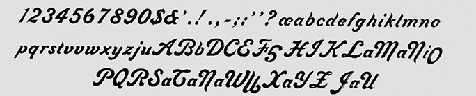
Step Two is to set a specimen of the type, and proof it on proofing paper to scan for digitization.
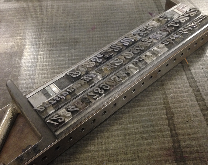
This is the complete Lining Livermore font assembled in a composing stick. Notice the upside-down cap G in the second line. This was an amusing error, but caused me no difficulty. I just turned it over in Photoshop!
The museum’s biggest problem is that of indexing its collection of type fonts. We have made several attempts to do this, and have made some progress. The latest attempt is in a FileMaker database. That database will help us to identify the hundreds of type fonts in the collection, and to guide visitors to the fonts when they are needed.
I searched high and low for Lining Livermore, and finally found it in a closet off the main room, behind a tool box and our janitorial supplies. Even walking into that closet was difficult, as it is a repository for all things we don’t want the public to see. I removed the drawer from the cabinet and brought it out into the light. We have the font in three sizes, and I chose the largest – 24 point – for my proof.
Using a composing stick and some 35-pica slugs as leading, I composed a quick alphabet of lower case, then added the numerals, the caps, and all the available punctuation in the drawer. This is a surprisingly complete collection of type, especially considering that it was likely manufactured in 1887 in Philadelphia. That makes this particular font about 125 years old; it’s amazing that so many of the letters are still here, and still in good condition.
Once that composition was complete, I spaced-out the ends, and did a careful cleaning of the type using solvent and a toothbrush. My objective was to get dried printer’s ink out from the crevices of the type. 127 years of use can cause a build-up on hand-set type!
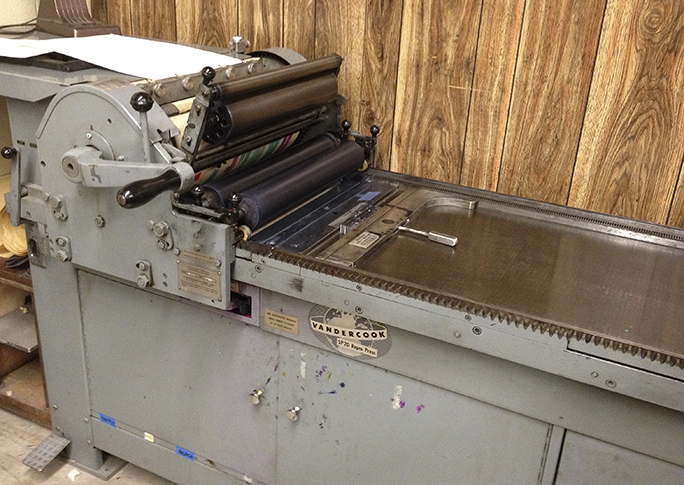
Step Three was to lock the type into the Vandercook proofing press, a Model SP 20. Usually I use a chase and wooden furniture to do this. But proofing loose type is much easier. I just locked the composed lines of type into the press. Inking was done with a small hand brayer. I didn’t want to ink-up the Vandercook for just a few pages of proofing. The first impression was lovely, and I took a couple more to see if I could improve on my luck. I didn’t notice at the time that I had omitted the capital V, an oversight that required me to return to the museum another day to proof just that one letter.
The SP20 Vandercook proof press in the Shakespeare Press Museum. My type is locked-up in the bed, and the paper is prepared on the top cylinder.
Once I confirmed that my proofs were excellent, I cleaned the type very carefully and returned it to the drawer, being especially careful to check every letter going back in to ensure it is in the correct spot. Misplaced letters are a curse to the hand-set typographer.
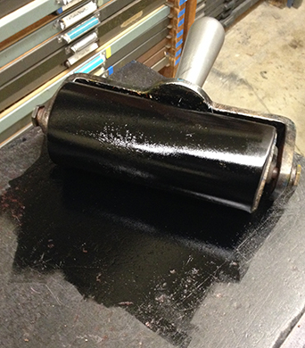
Then I cleaned the brayer and the inking stone, the leading strips, the surface of the Vandercook press and the work surfaces in the museum. Once everything was back in place, I took my proofs and headed home.
This is the brayer, inked and ready for the proof press. This is washed-up by hand when the work is done.
Step Four was scanning, which is a very important step in the process. I scanned the proofs at 1200 ppi on my flat-bed Espon scanner, saving them as TIFF files. These files were then used as templates in Illustrator, where I prefer to draw letters for the fonts I design. Converting a scan of a letterpress font to vector illustrations is a fairly complex task, as one must use intuition to pluck the consistent parts of a font from the proofs; it’s not as easy as just drawing what is on the screen.
This is the scan of the proof made on the Vandercook. Now I see that upside-down G! (and there is an upside-down O also).
The font then begins to take shape. More on that tomorrow.