In the previous post I described how I published these out-of-print booklets.
These are links to the PDF versions of those publications. Please feel free to download them.

In the previous post I described how I published these out-of-print booklets.
These are links to the PDF versions of those publications. Please feel free to download them.
At the core of The Blognosticator are posts about the graphic arts, printing processes, solutions to printing processes, and related items. The blog was originally an arm of Graphic Arts Monthly magazine, who hired me in 2000 to write blogs, typically four a month, about the graphic arts.
When that publication went out of business, they apologized to me, turned over the copyright to all of my work, and then promptly – very promptly – shut down their web site, and ceased publishing their printed magazine.
So, I joined What They Think, another graphic arts blog, who had me on salary for a month or two. That just didn’t work out, so I was set free again, and I established the non-profit version of The Blognosticator (what you are reading) on my own. It wasn’t supposed to be non-profit; at Graphic Arts Monthly I was sponsored by Epson. At What They Think, I was paid. Since then I have not made a farthing on this.
But I keep doing it!
Someday, someone will take all this and delete it all from my server, and say, “He was a nice guy. I wonder why he wrote all this?”
Until that time, I continue to write posts, and I am taking a break from my Building Permit posts to write about Artificial Intelligence, and how it has saved a long-running project for me, one that is solidly in the graphic arts field.
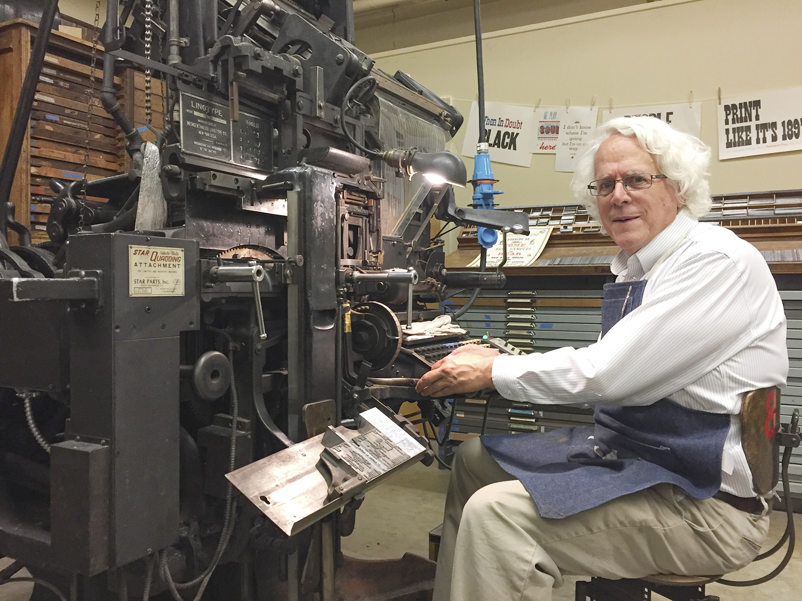
Shakespeare Press Museum at Cal Poly
When I was teaching at Cal Poly, I was the faculty advisor to the Shakespeare Press Museum, a delightful museum on the campus of Cal Poly where we have a collection of letterpress printing machines, hundreds of drawers of metal and wood type. Almost everything in the museum works!

Those include the Model 31 Linotype machine, which was given to the museum on long-term loan from another museum in San Jose, California. That machine required restoration, rewiring, some new parts, and lots of care from my friend Bill Berkuta (I call him the Linotype Whisperer). Bill is a genius with printing machines, and he knows his Linotypes! Between the two of us we got it running, and it has been, more or less, running since.
He and I spend an occasional weekend tinkering on the machine, adjusting, cleaning, lubricating, and encouraging it to continue working.
The Linotype Machine
A Linotype machine is a machine that casts lead type in strips called slugs. That is done from a keyboard. When the operator strikes a key, the 3,000-pound machine drops a little brass matrix into the assembler. Each letter falls into place in order. Between words you put tapered steel strips called spacebands. When a line of matrices is complete, the operator elevates the matrices into the machine’s casting section where molten lead (535° F) is injected into the back of the matrices and a line-o-type is created. A few seconds later, it is cooled enough to be solid, and it is ejected from the machine into a galley where it can be taken to a press and used to make printing.
The machine is one of the most fascinating devices ever invented. I am lucky enough to be a Linotype operator. I am even luckier to know a great Linotype mechanic (Bill, the Whisperer).
Once we had the machine at Cal Poly working, I started looking for more than the one magazine of type that came with it. I found one here and another there, and soon we had five fonts!
Along the way I acquired, from the other Linotype wizard, Dave Seat (who operates out of Tennessee), about 20 magazines of matrices for the machine. Dave called one day from Marysville, California (he’s an itinerant wizard). He had a “few” magazines he wanted to give me. It was a take-it-now-or-they-go-to-the-scrap-yard deal. I had less than 24 hours to go up there (it’s about 7 hours from here), pick them up, and bring them back. I accepted. I rented a U-Haul trailer, put it on the back of my van, and headed north. There, we loaded them, he drove back toward Tennessee, and I returned home to put the magazines in the museum at Cal Poly. It was a prize!

Selecting a typeface
A moment of definition for those who think that changing a type font is done by choosing a menu and clicking on a name: changing the font on a Linotype machine is done by raising the magazine, in which there are about 1,000 small brass matrices, then removing that magazine from the machine (lock it first to prevent a catastrophe!), and then carrying it to a rack where you store it. These magazines each weigh about 50 lbs., depending on the size of the type font and the quantity of matrices inside.
After you put the magazine on the rack, you get another 50-pound magazine and carry that to the machine. There, you put it on the machine, then slide it upward and inward until it makes a solid “snap!” sound. Then you unlock that magazine, and crank it into operating position. This takes a few minutes.
Cal Poly’s museum has a total of about 25 magazines now, having expanded the collection to include some great fonts: Helvetica, Bodoni, Garamond, Times, Optima, and a handful of others. Most of them are in excellent condition (matrices tend to stay in good condition for decades) and we can use them all.
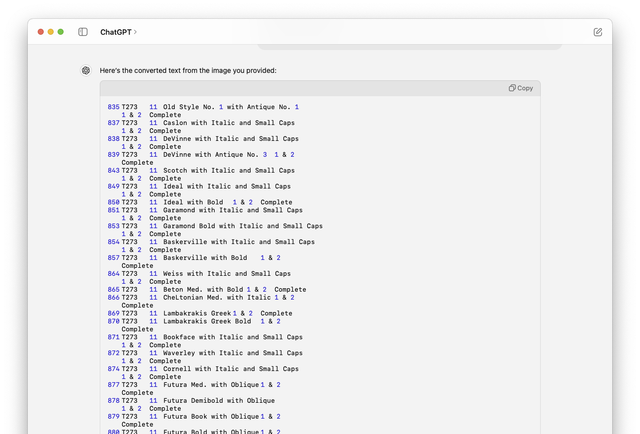
There is no digital menu of fonts for the Linotype machine. That, when last made available, was a booklet with columns of fonts listed in order of size, then Delta number, then name. The Linotype company named their fonts with the original names, and then stamped this delta number on the side of each matrix. In front of the delta is the size, in printer’s points. The booklet is the guide to which font goes with which delta number. 12?698 is Helvetica Medium with Italic in 12 point [curious how difficult it was to get a delta character in that last line*].
The booklet is long out of print, and they are moderately hard to find. We have one copy.
Enter the Intertype Machine
In the early 20th century, when most of Linotype’s patents expired, a competitor showed up on the scene, the Intertype Company. This outfit made a competitive machine, and it was almost identical to a Linotype, but different enough to avoid legal action from the original firm. The one thing that was absolutely identical, were the matrices. These were and are to this day interchangeable, and many shops had a mix of Intertype fonts and Linotype fonts. The magazines are not interchangeable.
At Cal Poly we have a few Linotype magazines filled with Intertype matrices. They do not have the delta. They just have the letter T and a number. The guide for those is also long out of print, and we don’t have a copy. The Linotype Whisperer has one, published in about 1955. He snapped a photo of every page for me.

My plan was to create a central database of all Linotype and Intertype matrices, and put it online so that all of the Linotype and Intertype operators in the world could look up a matrix number for either system, and get information about the original font, its available sizes, and whether it is from Linotype or Intertype. The online part of that is more difficult than I expected, so in the short term I have chosen to publish them in traditional form – print and PDF, as booklets.
This involves Optical Character Recognition. Throughout modern times (starting in about 1975, zillions of dollars were spent by various companies to develop hardware and software that could look at (scan) and then identify, and convert printed type into computer-editable type. Almost none of these devices and systems ever worked. Those that did couldn’t identify all type; they tended to have a limited visual library, making it possible to scan some type, depending on the legibility of the typeface of the original.
Adobe Acrobat to the rescue!
Adobe finally made it pretty easy to convert scanned type into editable type using Adobe Acrobat. This software has the best technology for doing this that I have ever used. If you put a scan of a printed page into PDF format, then open it in Acrobat, the program can identify the text and export it in Microsoft Word or plain text format. It is nearly perfect in this conversion, with less than one error in 1,000 characters.
That rate of success is possible unless you are trying to convert the Intertype catalog into editable text. That simply does not work, and as hard as I tried, cannot be made to work. Here is some of the suffering I endured trying:
Reproducing the Linotype Matrix catalog
From the Linotype booklet I scanned and saved as PSD files. I carefully straightened each page, and did a small amount of Levels adjustment to get the contrast between the paper and the lettering to be better. Then I saved each page as a Photoshop PDF. Then, in Acrobat, I opened the files, selected the export text function and had pages of nearly perfect text. This gave me hope that the same would work on the Intertype listings.
Attempting to reproduce the Intertype Matrix Catalog
From the Intertype catalog, I did the same, opened the files in Acrobat, and exported as MS Word documents. They were a total disaster. The program (Acrobat) couldn’t determine that columns of text were related to each other left-to-right. It treated them as columns of text, and applied myriad fonts and sizes and style to each group of letters that it assumed were related. The results were useless.
I went back into Photoshop, reopened the files, and cleaned them up. I moved the columns closer together, I worked to ensure that each line was level; I increased the contrast. And I saved them again, only to experience the same event in Acrobat. I did several versions of this, tweaking lines and spacing, and I got nothing.
I gave thought to retyping the whole catalog (I would have spent less time doing that). But, in the interest of solving the problem, I kept at it. And, I got nowhere. Slowly.
The Macintosh operating system can recognize text in photos. It’s pretty easy. You open a scan of a page with text on it in Apple’s Preview application, and it assumes you want to create editable text from it. It’s uncannily good at this; it can recognize letters in hand-written notes; it can find fonts in the middle of tomato sauce labels; it identified a font on a paint can for me. Apple’s Safari browser can also identify text from photos.
Adobe Illustrator has an even more impressive picture-to-text function: it can take an image of type and not only identify the letters, but tell you what font is used to make them!
These are shining examples of image-to-text. They were both foiled by the Intertype catalog! I tried several ways to get them to identify the columns of text. I even opened one page in Photoshop, cut and moved the columns to make them into paragraphs of text, and that didn’t work either. Nothing worked.
Enter ChatGPT
So, last Saturday, having nothing to do except paint my fence (which I did early in the day), I decided to try ChatGPT. Since all of the other techniques had failed, I thought it would be fun and possibly helpful to see if Artificial Intelligence could do it for me.
I downloaded the application, and having never tried it before, I typed:
Please convert this image to editable text, scanning left-to-right. Convert large spaces into tabs; remove ellipses.
And, it responded:
Sure. Drop the file here.
In about two minutes, the resulting text appeared on my screen (surprisingly slowly). Every line was interpreted as one line; the long spaces were converted to tabs, and the ellipses were gone. Bravo! It was flawless.
At a glance, it appeared to be exactly what I wanted. So I decided to try the other 42 files. I uploaded them to the same prompt, and I received a message that I has overstayed my welcome. I had overdone it, and ChatGPT told me to take a break of at least three hours and try again.
After three hours it still wouldn’t accept my images, so I bought a personal license for one month of ChatGPT at $20 (which can be canceled at any time).
Then I tried again. It seems that my $20 was well spent. It worked immediately, and it worked perfectly.
Each page took about 90 seconds, which surprised me. It seemed like a long time to do such a simple thing.
Everything worked delightfully well until I got to page 14, when ChatGPT did everything nearly perfectly. Instead of substituting tabs for multiple spaces, it put in the spaces, as it found them in the document. This was a bit frustrating, but after two or three pages like that, it regained its ability to get the spacing right, and started using tabs again. For those pages that didn’t work perfectly, I used Find/Change to convert rows of spaces into tabs. It took just a few minutes, and then I moved on.
I decided to polish my prompt a bit. I changed it from:
Please convert this image to editable text, scanning left-to-right. Convert large spaces into tabs; remove ellipses.
to:
Please convert this image to editable text, scanning left-to-right. Convert two or more spaces into tabs; remove all ellipses.
…and it slowed down to a crawl. What was earlier taking about 90 seconds was now taking much more time. I phoned my genius child, who told me that this happens when there is a lot of traffic on ChatGPT. His suggestion was to try again on Sunday morning.
A fresh start in the morning
On Sunday morning I put in the same prompt, and the images of text were converted in seconds. The “analyzing” part dropped to about 12 seconds, and ChatGPT was putting the finished text on my screen within a few more seconds. Each page took less than one minute to process completely. I am dazzled by how intelligent the software is. A few pages into the work, I received a comment from the ChatGPT engine in the output area:
The entries appear to use a mixture of normal listing and a specific pattern indicating either advanced features or combinations of styles, noted by “A”, “B”, etc., before the entry numbers. If you need further information or additional assistance, feel free to ask!
OK. I’m impressed. Not only did it convert the pages, but it analyzed the content of the pages, and commented on that content; it knew what it was analyzing!
I was able to complete the project this morning, and I have now compiled and published the first new edition of the Intertype Matrix Catalog since the 1970s. I gave the document a light proofreading, then saved it as an Adobe PDF document. It’s now off to The Linotype Whisperer for his review, after which I will publish it here.
The current booklet is in Font Number order, which is not very helpful. I also sorted the data in alphabetical order, and will publish that in the same edition. With the matrices in alphabetical order, one could look for the font name, then get the font number. In any event, the information will be back in the public domain, and to those in the type-casting world, it might be helpful.
Click here to go to the downloads page for these catalogs.
Addendum: July 9, 2024
Today, a couple of days after I did this work, I tested both of my prompts to see if one works better than the other. They both took about the same time to analyze, and they both delivered the same editable text. The second prompt:
Please convert this image to editable text, scanning left-to-right. Convert two or more spaces into tabs; remove all ellipses.
…resulted in an interesting comment made by the ChatGPT engine at the end:
This text should now be easier to process or format for any digital needs. If you have any further adjustments or need more help, feel free to ask!
It seemed to understand that the text was cleaner with this prompt than the first (and it seemed to notice that I had tried two different prompts). I am again impressed!
Chapter 3 – To read from the beginning of this saga, please click here.
The rejections came, and quickly! Both the grading and building permit applications were incomplete. The county planners asked for more complete soils engineering plans. I contacted the soils engineering firm, and got the broader soils reports and submitted those to the county the next day. Then I awaited the next rejection or correction request.

Chapter 4 – Money
The permit applications then passed the “intake” phase. I knew this because the county sent me an invoice for just under $11,000. I was told that this is normal for projects like mine. I gulped, but was relieved to have gotten over the first major hurdle. Asking for money indicated that the County had accepted my applications. Those fees go to pay for the planners to review the plans (and send them back for corrections and additions). These fees also pay for local schools, based on construction costs, and other operations of our local government.
It was the largest charge I had ever put on a credit card. I went online and put the fees into my cart, then put in my card number and pushed the PAY NOW button. And it worked!
After the fees were paid, the planners dug in to my plans, checking them against local and national codes. Since my building is so simple, there isn’t much to consider. I have grading plans, engineering drawings for the concrete pad, engineering details for the steel building, and the soils report. Then there is the electrical plan, which includes lighting, electrical outlets, several in-floor power boxes, and three ventilation fans. I didn’t expect much difficulty on those items. I was wrong, of course.
Chapter 5 – Corrections
In mid-May, I received a letter from the County indicating that my plans had been reviewed and that a Corrections document had been generated. In that letter were 26 corrections and comments. One example: “Remove the heat pump. This type of building cannot have heating or cooling.” Another: ”Electrical outlets below 5’4” from the floor must have tamper-resistant covers.”
There were a small number of questions about the concrete foundation engineering, all of which were answered by the firm I hired to do the engineering. The man at the County rejected the structural engineering drawings provided by the building manufacturer because they were based on the wrong California Building Code year. I paid an additional $1,850 to the manufacturer to get new structural drawings. The only thing that engineer changed, as far as I can tell, was the date. Ouch!
I was told to remove the smoke detectors I had included in my plans; I also removed a booster pump for the fire sprinkler system, and had the contractor replace that with a water main fed by an upstream pump. I added motion-sensing light controls on the exterior of the building, and added motion- and occupancy-sensing controls on the interior.
The most difficult item in the list was the Collateral Load calculation for the building’s roof. Apparently, most steel buildings have an excess load carrying capacity (Collateral Load) in the range of 3-5 pounds per square foot (psf). My building has only a 1 psf capacity.
The County was concerned that the fire sprinkler pipes, charged with water, combined with electrical conduits, light fixtures, and wiring would exceed the 1 psf value. I was in a bind. I asked the sprinkler contractor how much the sprinkler system would weigh, then added to that all the electrical loads, and made a spreadsheet showing that the total weight of these would be just over 0.3 psf –well below 1 psf, and (I hope) this makes the building’s Collateral Load capacity able to support those things with strength to spare.
Chapter 6 –Resubmittal
Making all these changes took several weeks, and lots of conversations with engineers, contractors and the County planner. I had to re-submit all of the elements of the building permit application at the same time to allow the County to review version 2 of all of this. I did that on June 16. Now I wait for their response.
Chapter 7 – And that’s only half the application!
There are two big parts to this application process: first, the building and its foundation, and second, the grading necessary for the building. Those are treated as two different projects by the County. They have different analysts looking at the two parts. Ironically, the building was reviewed prior to the grading. The grading must go first, obviously, but the planner has not yet begun to review the grading plans. That will happen in early July.
More on this project as the various steps are made. I’ll report here as it happens!
In the first installment of this story, I introduced my new shop building, and introduced you to the County Planning Department. They looked at my initial set of plans and threw them back at me. Too big, they said.
I was dejected. I considered selling my unbuilt steel building and giving up. I looked around for other places to build the structure. I thought about swimming out into the sea, taking the building with me. I was really depressed.
Since the building is essentially a kit, made up of standardized components, I realized that I could scale the structure to almost any length. I looked at the engineering drawings and learned that the building modules are 15 feet each. I wrote to the County and asked if I could make the building 45 feet long instead of 60, reducing the square footage from 2,400 to 1,800. I knew this was 138 square feet too large for the allowable size, but I asked.
And they said, emphatically: NO.
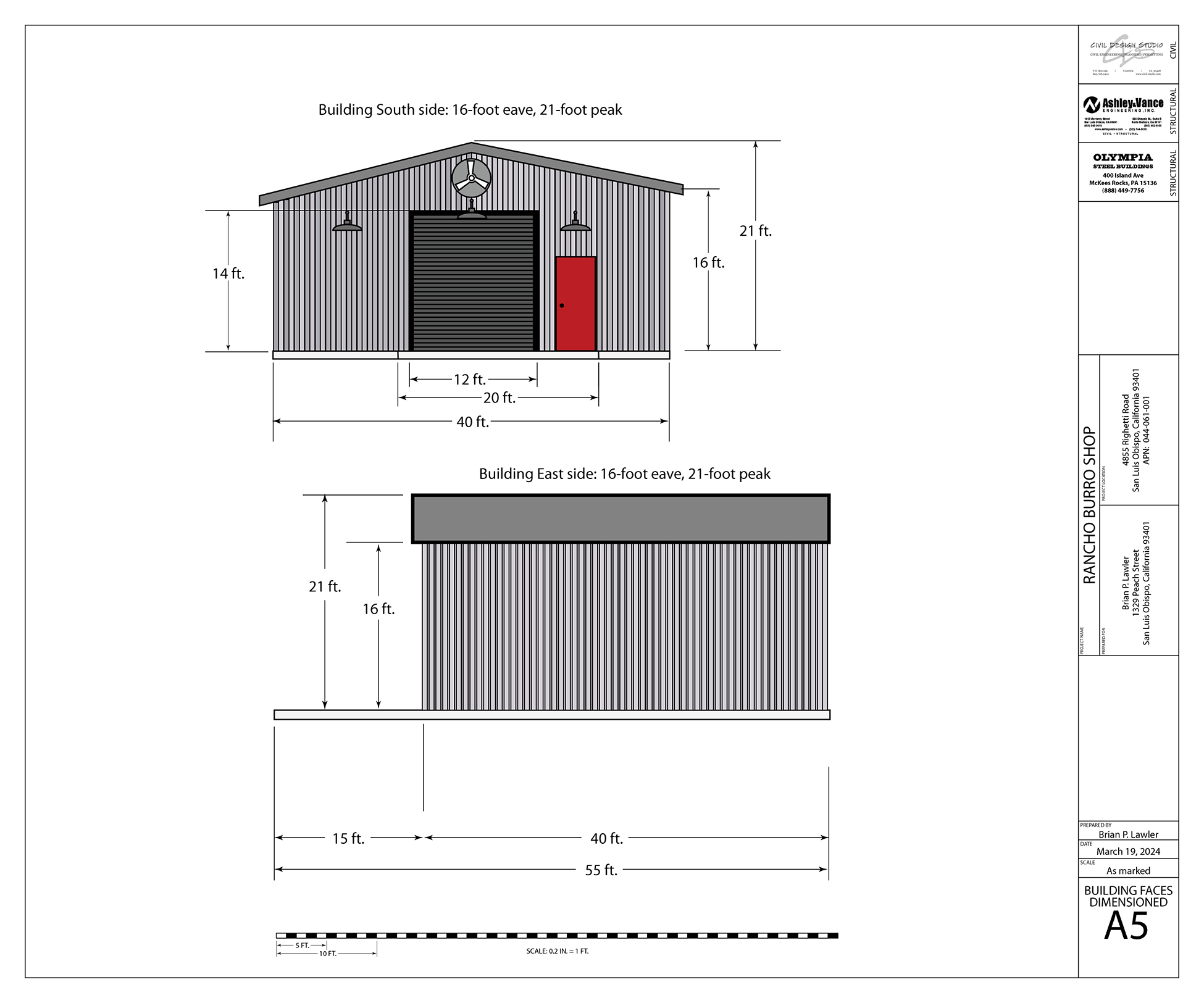
I then reduced it to 40 x 40 feet, removed the lean-to, and removed one of the interior rooms. I worked on the layout to fit my tools inside a smaller structure and came up with a plan that will accomplish that task at 1,600 square feet.
It is still going to be a large shop, and I am grateful to be able to move forward. The County said yes to my new proposal, so I started again. I paid the engineering firm to redraw the foundation at the new size, and asked the civil engineer to redraw the grading plan. Both were relatively easy to change.
Architectural drawings are usually created in Autocad. There are some traditions that I simply couldn’t abide, specifically the use of those dorky “architectural” fonts written in all caps. I find these pedestrian and difficult to read. Instead, I chose to use the Adobe Myriad Pro series, a handsome and legible sans-serif family of faces designed by Robert Slimbach.
These drawings are drawn to either 36 x 24 inches or 48 x 36 inches, always landscape format. I chose the 36 x 24 size because I have a 44-inch Epson ink-jet printer, and I have two 24-inch rolls of plain paper on-hand for the printer. Making the prints will be easy when I get to that stage (after the building permits are issued). Meanwhile, everything is submitted to the building department in PDF format.
Tradition dictates that there is a base legend on the drawings indicating in the lower-right what is covered on each page, revision dates, and contractor stamps along the vertical right-hand edge of the sheet. All of the drawings I have seen are in black ink only. I used color in a few spots on my electronic versions, and I trust that the County analysts will not object.
There are also arcane abbreviations on these drawings, many of which I did not know. There is always a scale at the bottom, and usually a compass rose indicating the direction of the project on the land. As I worked, I referred to already-approved drawings from the other buildings on the same property. I was copying the style of these drawings in my new work.
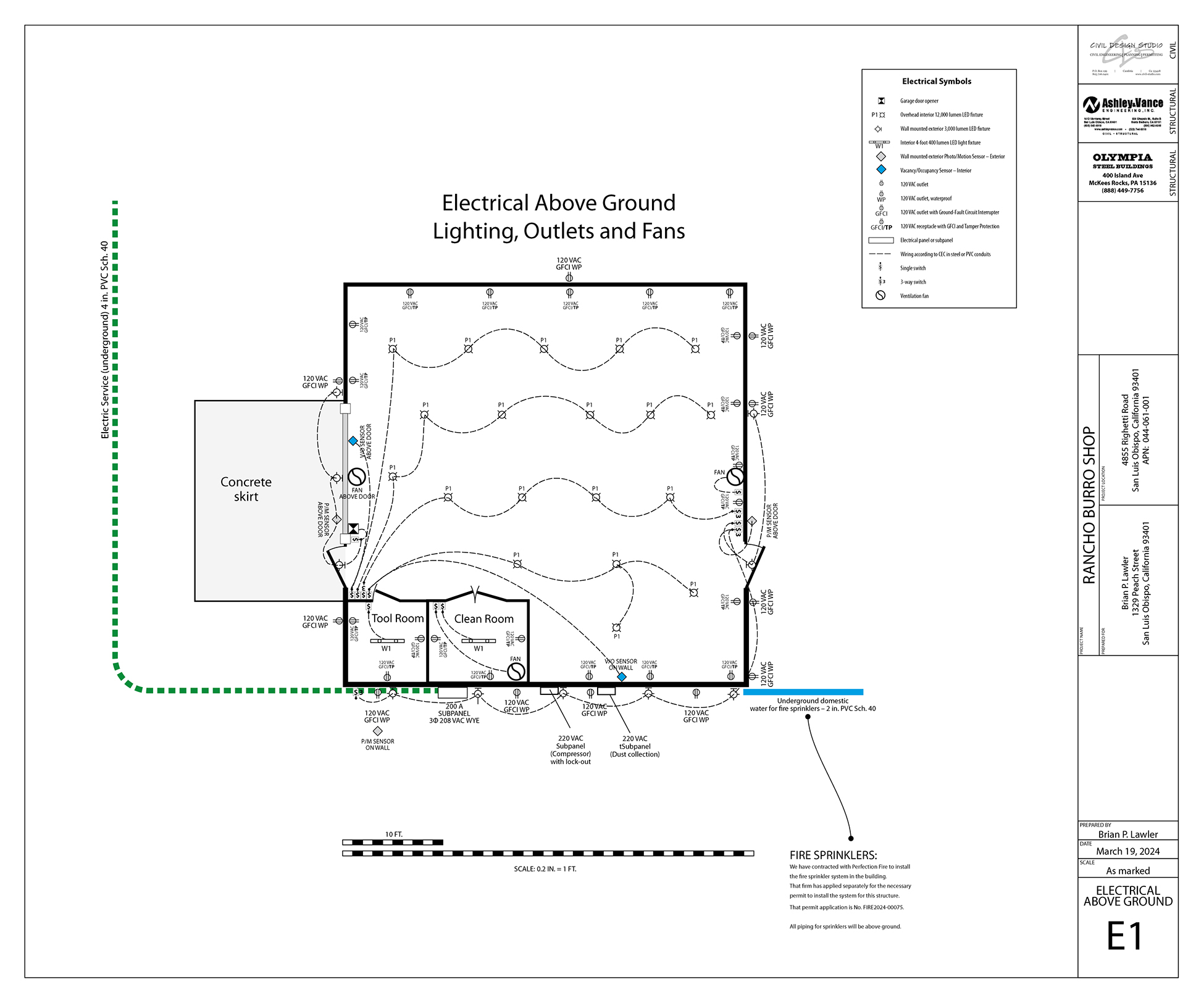
I used Adobe Illustrator to make my drawings. This is because I don’t own Autocad, and I don’t know how to use it. Illustrator is the program I know the best, so preparing my work there made the most sense to me. In several cases, I borrowed elements from other PDF files or plans. Specifically, I copied the topographic markings prepared for another building on the same land, and pasted these into my Illustrator drawings. There are thousands of tiny vector elements marking the topographic contours on the property. This caused an immediate response in Illustrator: it slowed down to a crawl.
I am running the latest version of the Creative Cloud on a new Macintosh Studio M1 Ultra computer with 20 cores and numerous GPUs. It really shouldn’t get so slow when running Illustrator, but it did. I think I was overwhelming the system with my drawings, which were multiple pages in a single Illustrator document. In retrospect, I think I would have been wiser to make the pages into separate documents, and then merge them together in Acrobat at the end.
There were times when I selected a word in a column of text, and the machine would go off into outer space for more than 60 seconds before responding. It was aggravating. I found that changing to the Outline view would save a few seconds, but in general, Illustrator was dragging me into a very dark place as I worked on these drawings. After considerable observation I have come to the conclusion that it is my hard drives (three RAID-5 units) that might be causing the slow-down. Each time the computer goes to the drives, there is considerable speed-up and parsing going on while the drives split-up the data and write it to all four drives simultaneously. If perhaps I had a big solid-state memory device I could avoid this (an investigation for another day).
The dimensioning tool in the latest version of Illustrator is nice, but not quite ready for prime time. I used it successfully on some of my drawings, but I was unable to use it on my primary illustrations because it wouldn’t let me choose a dimensioning ratio of 0.2 inch = 1 foot. It offered 0.25, 0.1, and numerous others, but I wasn’t allowed to enter 0.2. Why?
It’s obvious that Adobe Illustrator is not meant to be used for this kind of work, with thousands of drawing elements on numerous pages (12 in my case). In the past I have drawn far more complex illustrations with thousands of nodes, but I have never witnessed slow-downs like this before.
When I was finished, I saved my completed architectural drawings as a single multi-page PDF document. That does not seem to be frustrated by the topographic information, nor by any of the other complex elements in the drawings. On completion, I submitted the PDF to the County for their scrutiny. I was told by my contractor that they reject 100 percent of drawings that are submitted for a building permit. They will always ask for revisions or additional detail in these drawings, even when they have been prepared by professional (and licensed) architects, engineers, and electricians.
Then I waited for the inevitable rejections.

I have had a fabulous workshop in my friend Jim’s barn for the past 18 years. It’s the best workshop on earth, and I have enjoyed making things there. It has all of my tools in it, and it has a separate tool room and spray paint room for finishing in a dust-free environment, critical to my success.

Jim and his wife Carlen operate the Rancho Burro Donkey Sanctuary, a non-profit animal rescue organization dedicated to saving and reviving lost, injured and abandoned donkeys.
In recent years, Rancho Burro has outgrown its current capacity. Jim and Carlen bought a larger piece of land a few years ago, and have been building the new Rancho Burro there. The new location includes a huge barn with room for more donkeys; there are many acres of pasture and grazing land, and a large arena and “loafing” area for the animals. They have also added a veterinary room, and indoor storage for grain and bedding.
They have recently put the current property on the market, and I assume that it will sell quite quickly. When it does, I will no longer have my shop, and I will have to move.
Jim offered some land for me to build a new shop to replace the current one. I jumped at his suggestion, and have been working on this for a couple of years now. In fall of 2022 I bought a pre-engineered steel building that was delivered to the property in December, 2022. It is currently an 11,000 lb. stack of metal, resting in the shade of the new donkey barn, and awaiting the completion of a concrete pad. That can’t happen until I have two building permits – one for the grading and one for the pad and the building.
The building is 2,400 square feet, and my original plan was to add a lean-to structure to the side of it to house lumber storage, electrical equipment, my Burning Man generator trailer, a large air compressor, and a dust collection system – all outside and under shade.
I hired a structural engineering firm to draw the plans for the concrete pad, and to provide structural analysis of the building for the county planning department. I then hired a civil engineer to draw the grading plans, and an architect to consult on the construction details of the lean-to structure.
I decided to draw my own architectural drawings, something I have never done before. If you have followed my posts here, you know that I am a capable illustrator. It seemed reasonable to graduate to large-scale work and become an architectural draftsman. To do this, I studied existing architectural drawings and learned how they are made.
I needed to provide detailed drawings for the interior spaces of the building, the siting of the building, and the electrical work needed. I was required to provide topographic information, lot-line dimensions, and location drawings for the county.
I had been working on the assumption that a building of this size would be acceptable to the county, as Jim’s new property is very large – almost 46 acres. But I was mistaken (and misinformed). The County (capital C) rejected my work in the first few days of Attempt One, indicating that the planned building would exceed the maximum square footage allowed for the property. They advised me that the largest structure I could build was 1,662 square feet (based on the footprint of the new residence on the same land).
In the next chapter I discuss dealing with rejection. Should I give up and sell the building? Should I find different land for the building? Should I take up the piccolo instead of wood working?

I started writing The Blognosticator in July, 2011.
At the time I was unable to acquire the domain blognosticator.com. That belonged to a nice woman who had bought it and was holding it, hoping that someone foolish enough to create a blog of the same name would come along and agree to buy it.
I offered to purchase the domain, but the price was too high.
I already had acquired blognosticator.net and blognosticator.org, and that was good enough for me. I saved my money and moved on.
A few times in the 13 years since I was approached to purchase the domain, and I tried a few times, but the price was always too high. I just waited.
In March of this year I received an offer to purchase the domain for only $150. I bought it! After making the purchase, the domain went to an escrow company. I think this is a procedure to prevent domain theft, leaving the domain in a location where it cannot be transferred until the escrow period has expired.
That happened yesterday. And, I moved the domain to my host company’s site the same day. It took a few hours, and the process was completed today.
As soon as my domain registrar completes the transaction, the new domain will point to these pages where, perhaps, I will get a few more readers each month.
I waited 13 years to get the most important domain associated with The Blognosticator, and now I have accomplished that.
With total readership of over 450,000, this effort has been worth the trouble. I hope you continue to visit the blog from time to time, following along as I add new posts about my projects and my work.
Thank you to everyone who has visited The Blognosticator!
This is the third of a three-part post. To read the first part, please click here. To read the second part, please click here.
I finished the bike rack clamps yesterday. I drilled and tapped the holes that needed threading, and I then took the parts to the buffing wheel where I made them look very shiny. In the end they were really nice.
I had no trouble doing the finish work, except the threading of the holes using some taps I bought from Amazon. These didn’t work as well as other taps I have, so I had to use an extraordinary amount of downward force to get the taps to bite into the aluminum. My right palm is still sore today from that activity.
Today I took the parts to my garage and mounted them to the bicycle frame. They went on as planned, and I tightened them in place, ready to attach the Pletscher rack. To get that to fit I had to bend the vertical struts a bit, as the rear of the Superstrata is wider than a normal bicycle. Then it was just a matter of tightening all the clamps in place, and adjusting the connecting points to the rack. About an hour later I had the rack on the bike, and a smile on my face.
Thus ends this short-term odyssey. It has been fun and educational, and I saved a lot of money! Overall, I probably spent $50 0n parts and tools. I lost track of how many hours I spent making these brackets. Any way you look at it, I got a good deal!
In my last post I discussed making parts to hold a rack on the back of my Superstrata carbon-fiber bicycle. To read Part 3 of these posts, click here.
I have been machining those parts, and it has been a humbling experience!
On a CNC machine made primarily for cutting wood and wood composites (plywood, particle board, etc.), the cutting of aluminum requires that the machine be run more cautiously, more slowly, and with greater discipline.
Though I have been very cautious, I got a bit ahead of myself yesterday when I positioned the parts in a grouping that was very efficient for a scrap end of an aluminum plate I had on-hand. The machining went well for the first two parts, then I got into trouble. My error was in positioning the parts too close to one another, and in places where their support tabs would be cut off by subsequent cutting paths.
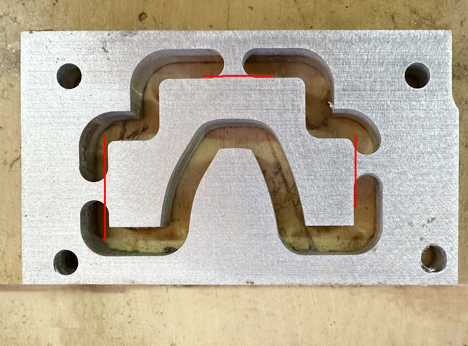
This was a serious mistake on my part, and it caused me to remember an adage in machining circles: holding the material is more than half the work!
I make almost all of my aluminum parts with a .25 inch single-flute cutter from Vortex Tools. That means that there will always be a quarter-inch channel around the periphery of the pieces I cut.
I knew this, of course, and I thought that I had planned for it in the positioning of my parts in the job. But, as my cutting continued – more than an hour into the process – I realized that I had lost control over two of my parts, and I still needed to make more passes to finish those parts. I stopped the machine and redesigned the cutting paths for those two parts to try to salvage the operation. It worked, to a point.
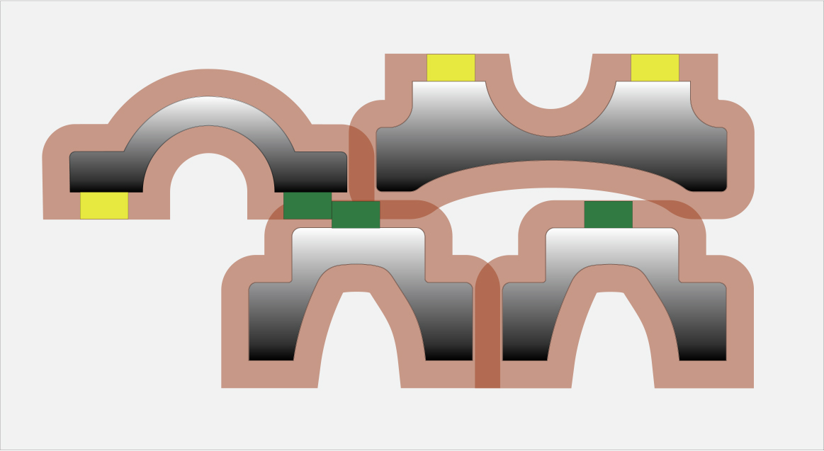
When cutting parts on the CNC machine, I usually insert small tabs along the edges of those parts that are left behind in the cutting steps. These tabs keep the machined pieces attached to the source material. At the end of the process, I cut the parts free by breaking or sawing the tabs, then I sand the remnants of the tabs off to remove them.
Yesterday, while preparing my file for cutting the parts, I put two tabs into the mix that would be cut off in subsequent cutting steps, leaving the original part unsupported. This is not acceptable, because I am pushing a rotating cutter up against the edge of a plate of aluminum with close to six horsepower of machinery, and expecting that little chunk of aluminum to sustain its tentative hold on the parent plate with just one tab!
In other words – I really messed up.
I restarted the project today, and I was be able to salvage the two parts by super-gluing them to the spoil board, a trick I learned from a machinist friend. The super-glue held on one, but broke free on the other, causing an unsightly divot in the surface of that part (not structurally significant). My parts are now cut, but still need to be drilled and threaded.
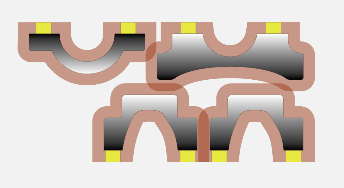
Here is what I did wrong: I positioned the pieces, nested together, into a small grouping that would fit into the area on the metal plate. I failed to make note of the tabs and their positions in the path of subsequent cuts.
What I will do from now on: Whenever positioning parts for nesting, I will draw an offset of 0.25 inch around every part, then analyze where those paths overlap in Adobe Illustrator. If they overlap in places without tabs, that’s OK; if they overlap in areas where there are tabs, then I will have to move the parts away from each other or reposition the tabs in some fashion to prevent those fatal intersections.
My future projects will come out better for this.
This is Part 2 of a three-part post. In the first part, I discussed designing parts to hold a rack on the back of my Superstrata carbon-fiber bicycle. To read Part 3 of these posts, click here.
This is part 1 of a 3-part post on machining aluminum parts for a bicycle. Click here to read Part 2.
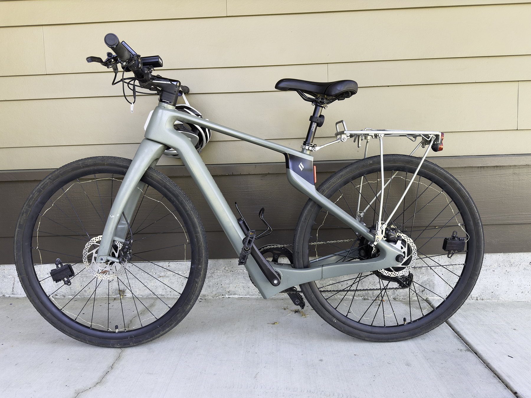
I have a gorgeous Superstrata electric-assist gravel bike.
I bought it a couple of years ago (actually four years ago, but there was a pandemic that interrupted the company’s manufacturing operation), and I have been enjoying it since then.
The Superstrata is a 3D printed carbon-fiber frame. Each bicycle is unique to its owner. When you order, you fill in a form where you enter your physical statistics – arm length, inseam, height, weight, distance from your knee to the floor, and a handful of other measurements.
Superstrata then puts that physical information into their computer and out comes a set of manufacturing instructions that drive their 3D manufacturing printers. After some considerable printing, sanding and finishing, you have a very special bicycle.
I took my bike to Burning Man last summer, where it performed perfectly. It has tires that are wide enough to run on the desert playa, and it is still a fast enough bike to be comfortable when traveling long distances. The range is estimated to be over 35 miles on a charge, which I have never tested.
At past Burning Men (I assume that’s the plural) I took my Bianchi commuter bike, which was comfortable, but occasionally got bogged-down in the playa sand traps.* That bike had a handy Pletscher bike rack and a set of panier bags. These allowed me to carry cameras and tripods on my sunrise and sunset photographic outings.
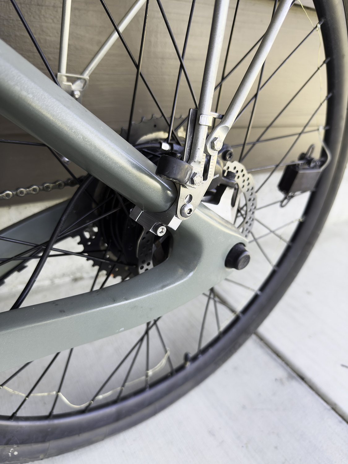
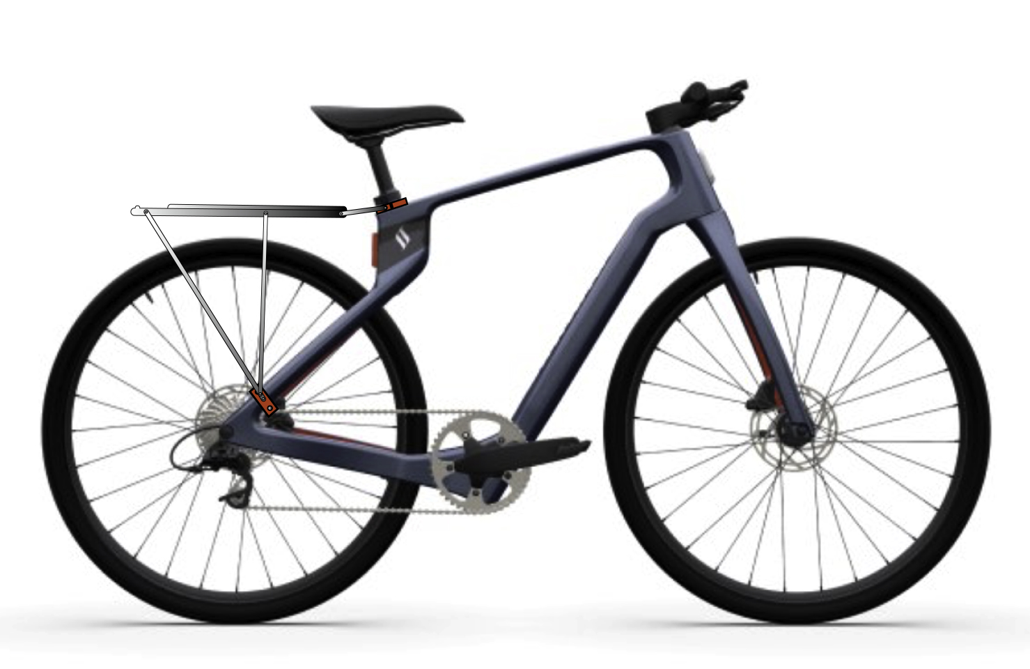
The Superstrata has no back rack, and has no attachment points for a rack. I was told not to drill into the carbon-fiber frame, as that could damage its strength. I need a rack, so I decided to make some clamps that attach to the frame in three locations, creating attachment points that will allow me to put my Pletscher rack on the Superstrata.
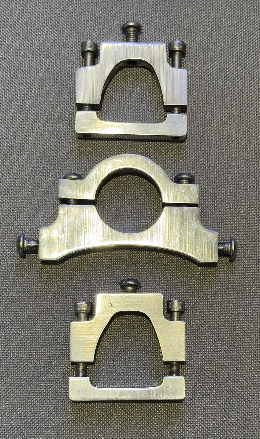
One of the nicest qualities of the Superstrata bikes is the organic shapes of the frame parts. The entire frame is 3D printed in one piece. The forks are printed separately, then the two are put together to make a bike. The constantly-curving arms from the seat to the rear hub change thickness and curve as they travel. I chose a good spot to attach the lower arm of the rack, and made a paper pattern that described that curve adequately.
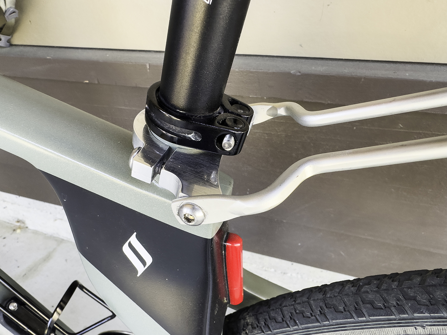
I copied that pattern into Illustrator. Then I printed several versions of that pattern, cut them carefully with scissors, and tested them against the frame. Once I had the fit right, I designed the counter-clamp, which was a bit simpler. The top of the rack attaches at the circular seat post, where there is a convenient spot to put another pair of aluminum clamps that will attach to the seat post base. I am confident that it will be strong enough for my rack.
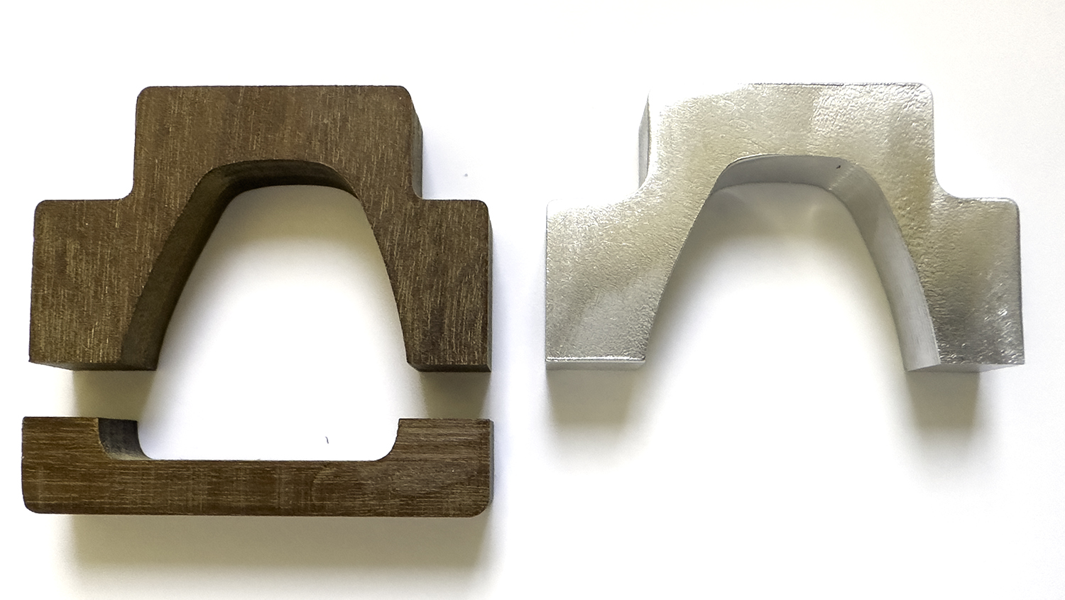
The next step was to move to the CNC machine and cut a prototype in wood. I have a good stock of Brazilian Ipé lumber (called Curbaril by arborists). I planed some of that down to 0.375 inch thickness, and machined a couple of parts in that wood. After a bit of sanding, I brought them to the bike and tested them. They needed some very small adjustments, which I made in my Illustrator file, then made my first aluminum prototype. This worked nearly perfectly.
Meanwhile, I ordered some stainless steel metric hex-head machine screws for these brackets. I needed several sizes and lengths. These were not available at our local Ace Hardware.
After that step, I went into my overdoing it in Illustrator phase. I drew each screw in tremendous detail, drew the screw heads accurately, and then used Illustrator’s 3D tools (better, but still not much to brag about) to extrude 3D versions of my parts to preview what they would look like.
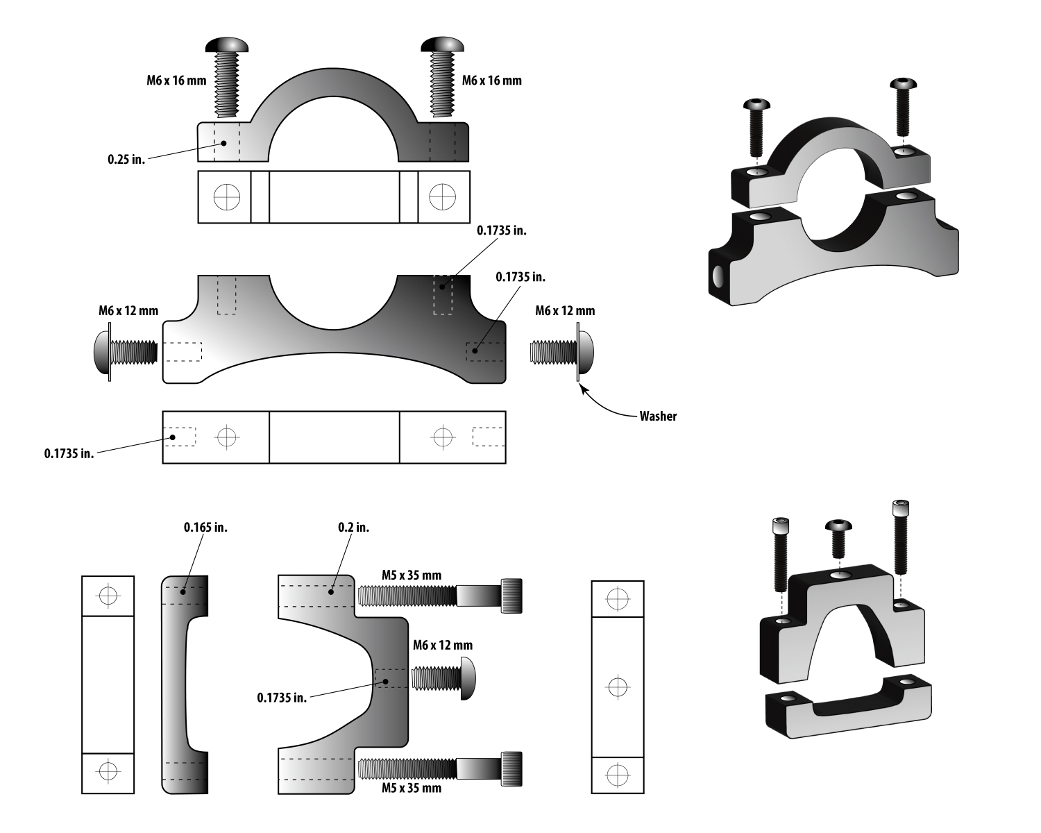
One can learn a lot while tinkering with an illustration. For example, the button-head screw heads are much larger than my original – estimated – drawing, and they would not fit the parts I had drawn. So I stretched the wings of each part to accommodate the larger screw heads, making the parts stronger in the process.
I’m ready now to machine the six parts in 0.375 aluminum. I have to run the CNC machine quite slowly to get a mirror finish on aluminum. That makes the parts nearly perfect when they come off the machine. I do a bit of buffing, and they are ready for use.
The other technique I have learned is to make a “gross” cut of the parts using a 1/4 inch cutter first, then change to a smaller diameter cutter for a very small final cut. To do this, I create an offset in Illustrator that creates a cutting path 0.005 in. away from the final dimension of the part. When those cuts are complete, I change the tool to a 1/8 in. cutter, and machine the final 0.005 along the perimeter of the part. This makes a smoother finish, and saves labor in buffing and polishing.
After the flat cuts are made, I turn the parts on their sides and insert them in a 90-degree work holder I made on the CNC machine. This is a hole in the spoil board with a T-slot board at 90 degrees to the tabletop. With various clamping boards I can affix small items to the work holder and cut their edges. I will use this technique to machine the holes in the edges of these parts – some for tapping threads, and others for allowing a screw free passage through.
I use a laser aiming tool on my CNC machine, which makes positioning relatively easy. I can move the laser to the edges of the aluminum parts to set the machine’s X and Y base positions. Then, moving in increments driven by software, I can drill and cut with extraordinary precision.
I will hand tap the threads in the holes that require threads, and then polish the finished parts to a smooth, mirror finish. Then they will go on the bicycle.
I’m starting to prepare for 2024 Burning Man by making my bike ready. Later this month I will work on the generator, which needs wiring on its water temperature gauge, and see if I can get its oil pressure gauge to work. I’ll report back on those things as I get closer to the Burning Man week. I hope it doesn’t rain this year.
I will report back as I make these parts and affix them to the Superstrata. I don’t expect any trouble.
*Playa sand traps are small areas of the lake bed where the soil is not compacted, but has the consistency of talcum powder. If you ride a bike into one, the bike stops immediately, and your body does not. I have had this happen numerous times, and have invented a medical condition that describes the result: the Bicycular Orchidotomy.
This is part 1 of a 3-part post on machining aluminum parts for a bicycle. Click here to read Part 2.
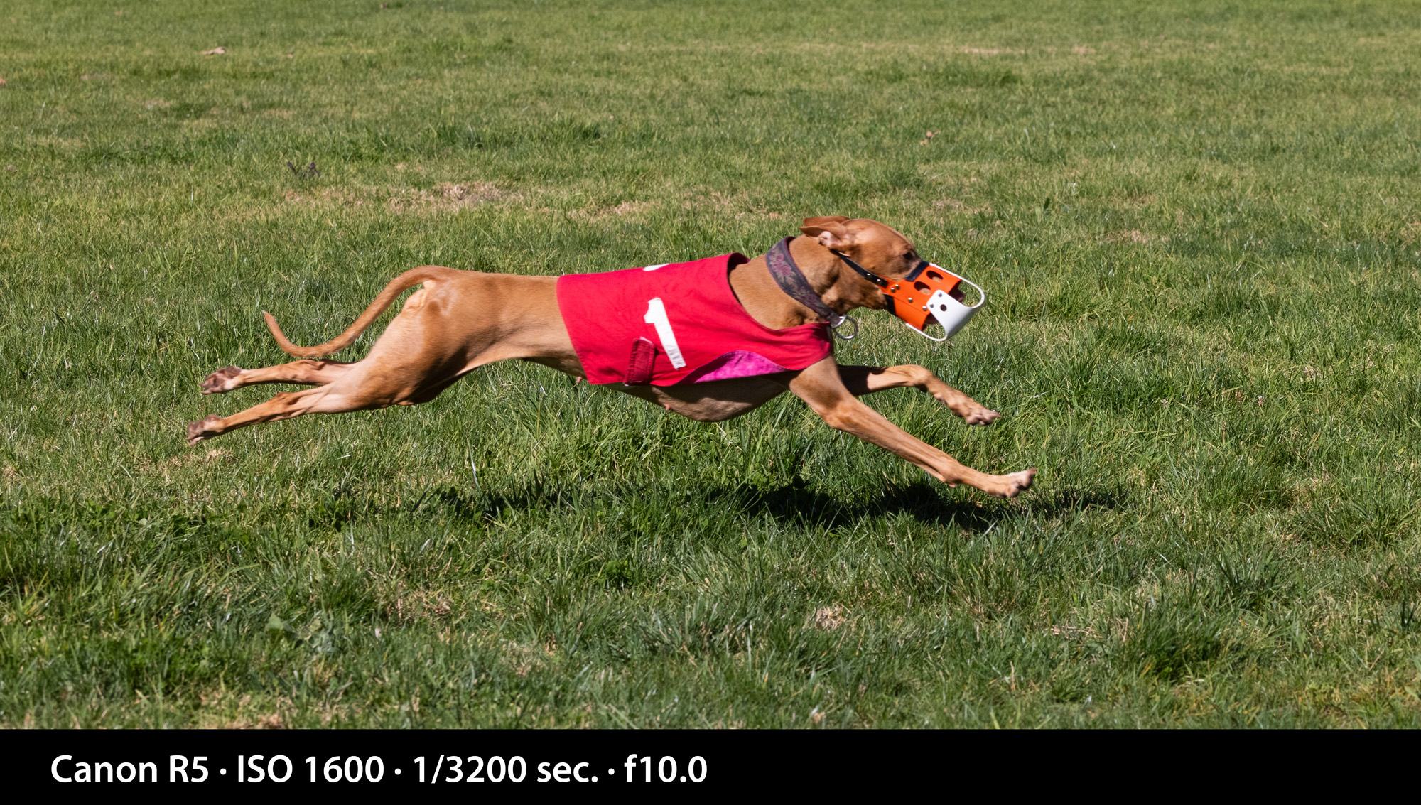
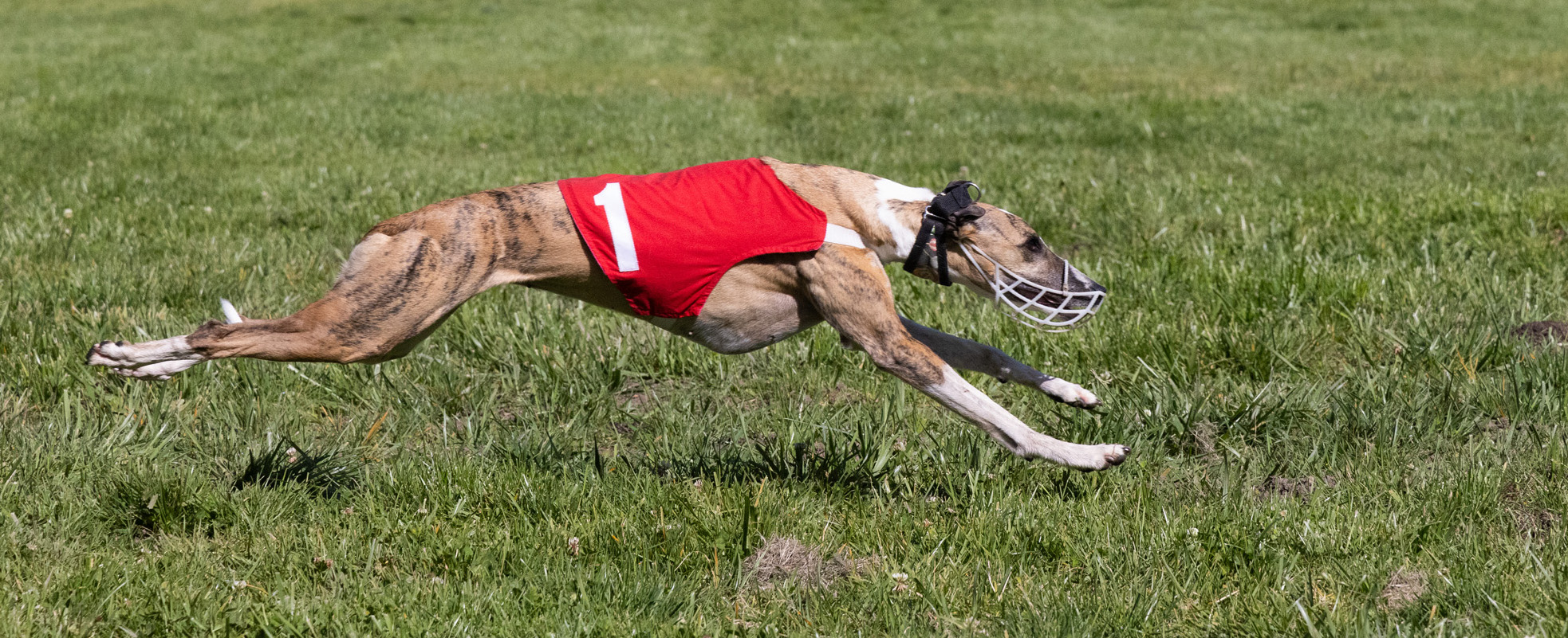
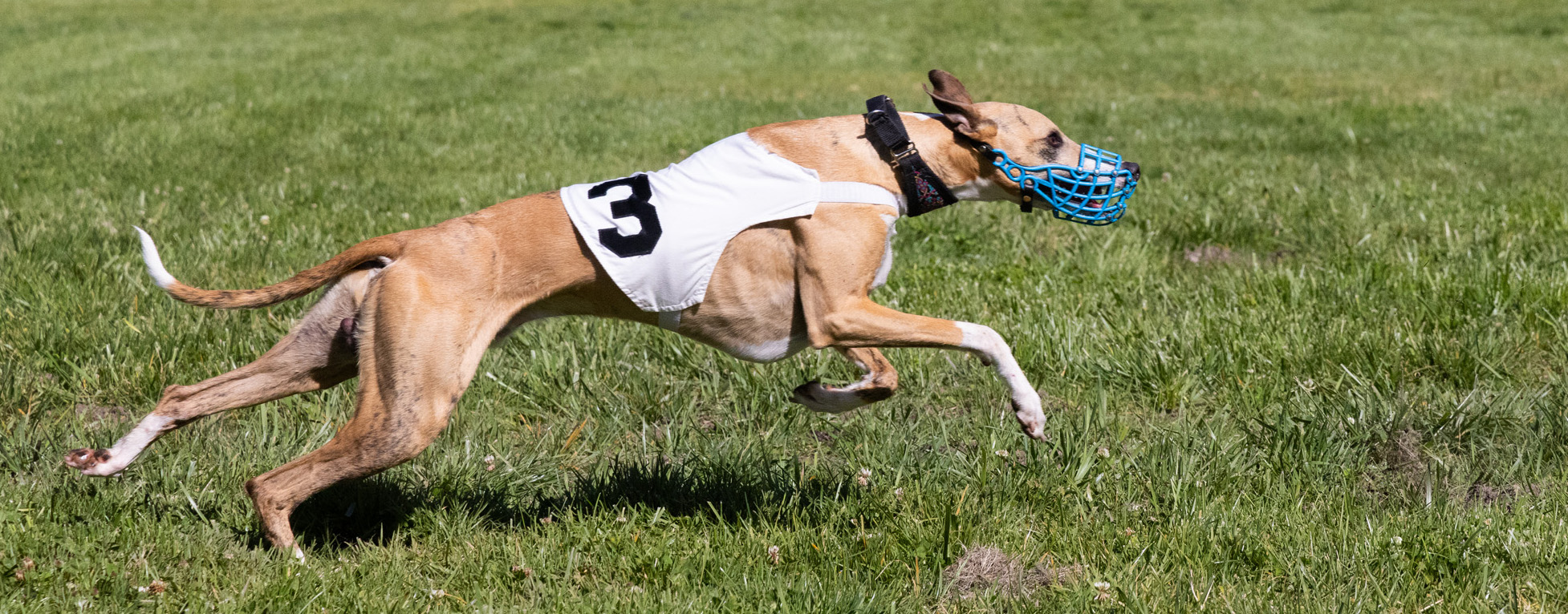
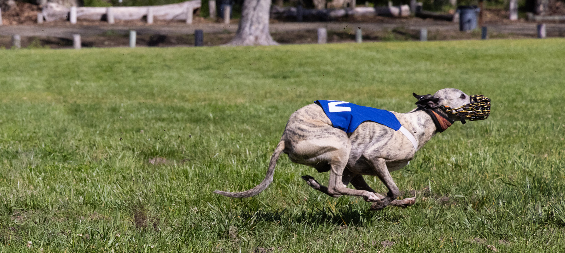
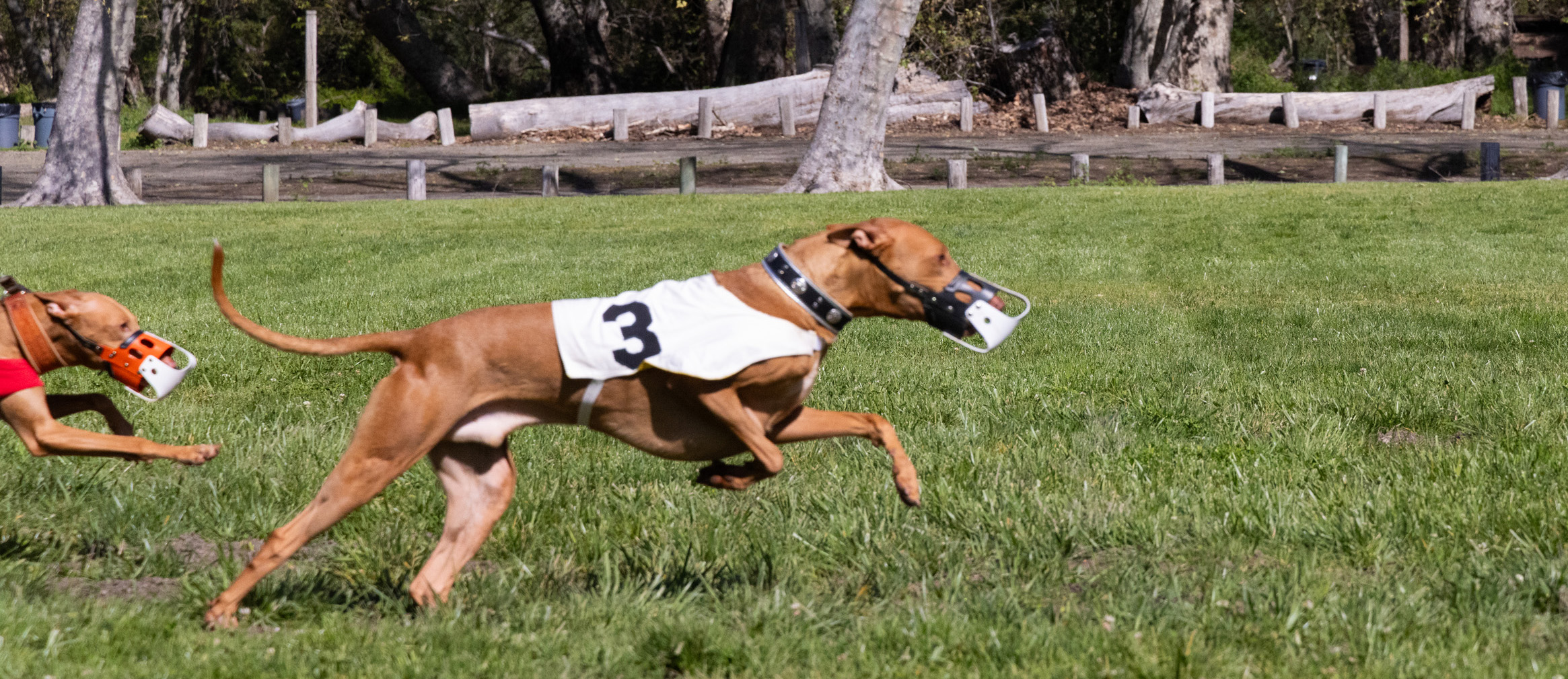
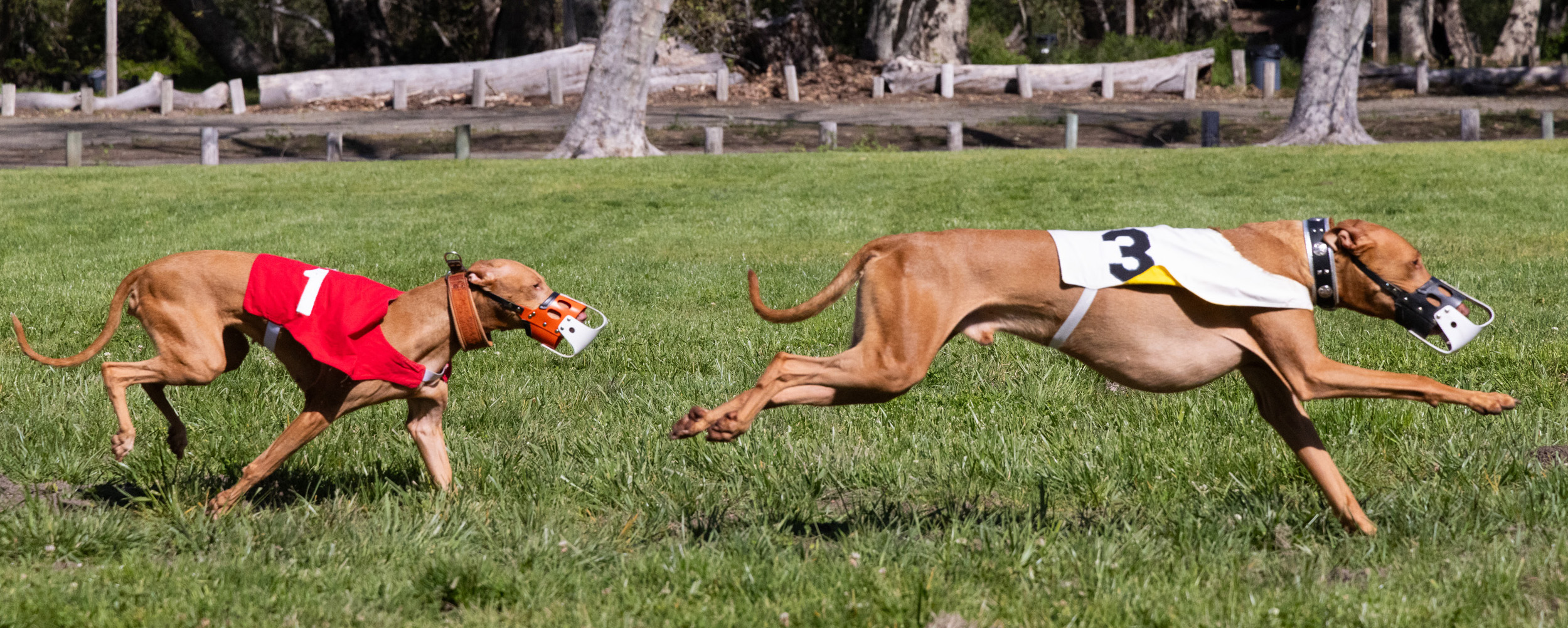
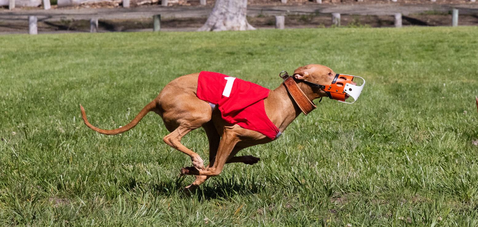
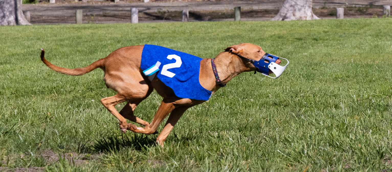
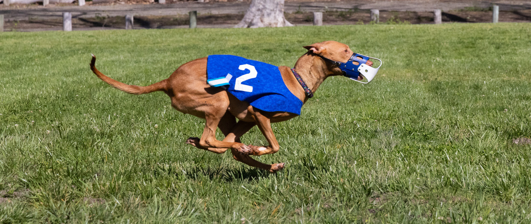
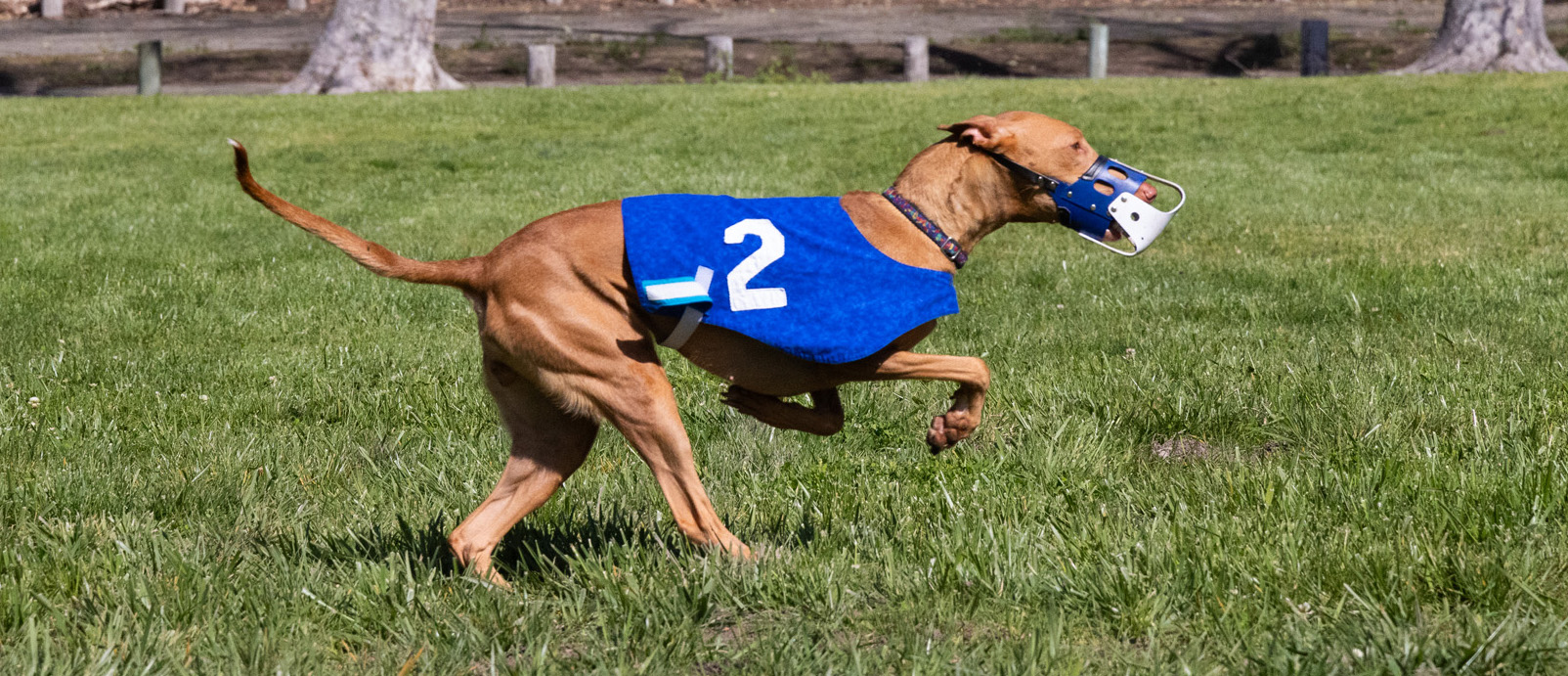
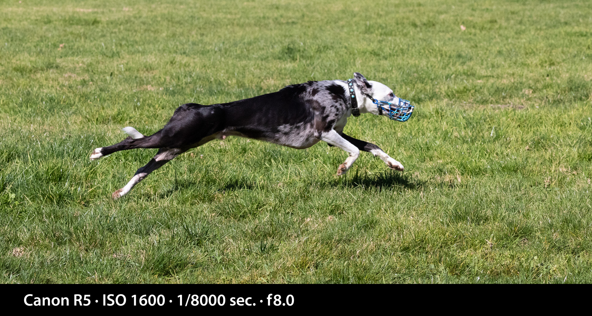
I had the opportunity to photograph dog racing this weekend. I have never seen this activity before, so it was intriguing to me. The event was a gathering of several members of a dog racing group called CCASH – The Central Coast Association of Sighthounds. They get together often to run their dogs in a straight line race led by a mechanized lure that races along the ground in front of the dogs.
At the event I witnessed, the largest number of dogs competing was three. The breeds were varied, and it was common to see some combination of Whippets, Silken Windhounds, Greyhounds or Border Collies competing in the same heat.
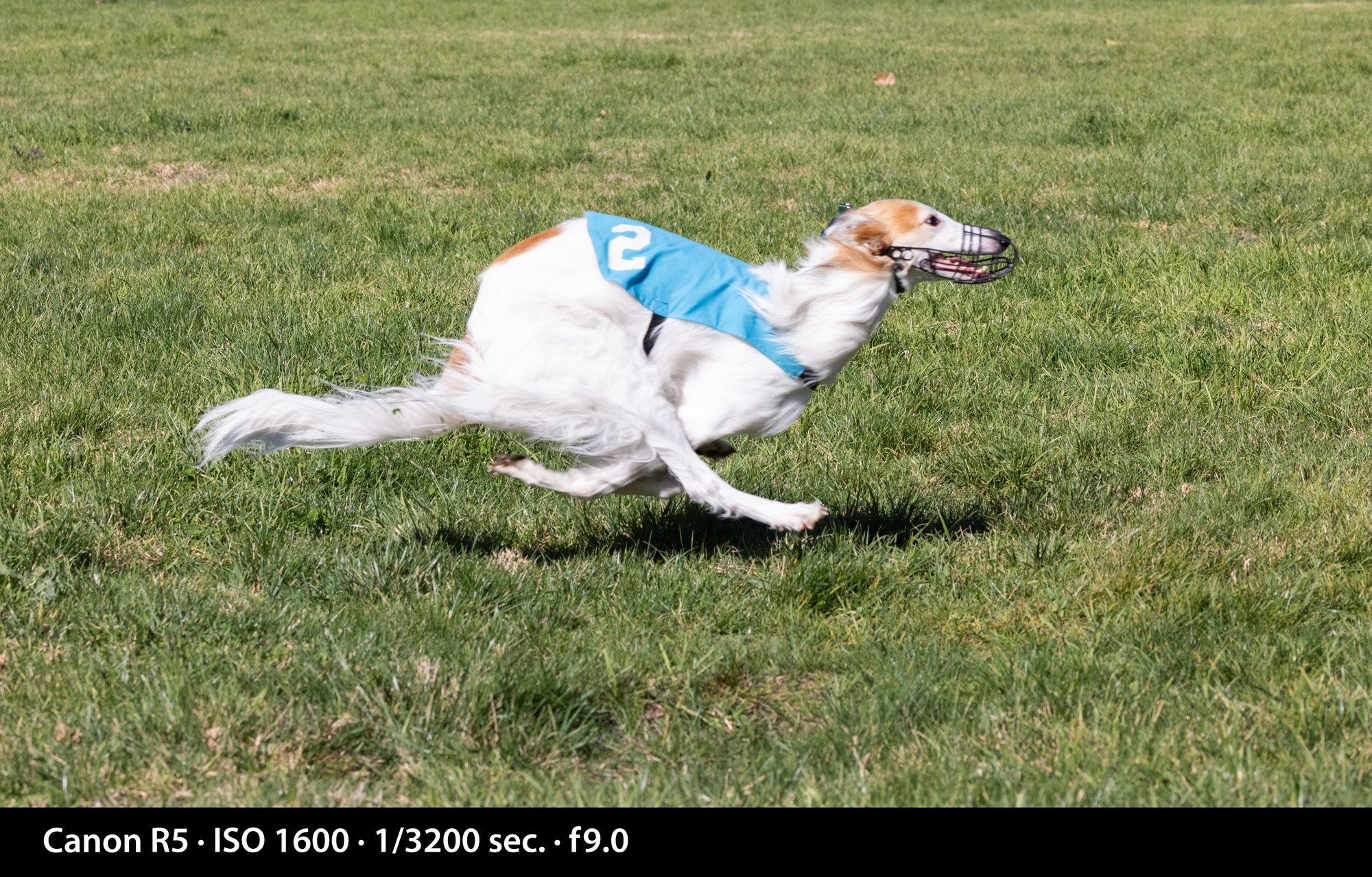
I took the opportunity to learn how to use my Canon R5 in its high speed modes, which I have never tried before (violinists generally don’t move that fast). I had to dig through menus to find the settings, and I put the camera in its fastest mode for this event, which is 20 frames per second. I also left the camera in electronic shutter mode, making it possible for the camera to work so fast.
I taught photography at Cal Poly for many years, and I always asserted that 1/1000 of a second was adequate for high-speed shots. It’s fast enough to freeze a runner, a race car, a motorcycle, a bicycle or a bird. But, I realized in about 1/1000 of a second that it’s definitely not fast enough for speeding dogs. They move too fast!
I decided to turn this into a lesson in high-speed photography with my camera.
My first professional camera was a Nikon F, one I purchased new in 1967 (see the story here). I still have that camera. Its mechanical shutter goes from one second to 1/1000 second. That camera features a titanium foil focal-plane shutter that moves vertically in the opening to allow for such a high speed. This is similar to the focal-plane shutter on a Speed Graphic camera (I have one of those, too!), but the Speed Graphic shutter is made of cloth.
Can 1/1000 second freeze motion? It can stop a person jumping over a high hurdle, or a basketball player in flight, but when you look closely, the 1/1000 shutter falls short of really stopping motion. A bit of motion blur is present in images from that camera (or any other like it) at that speed.
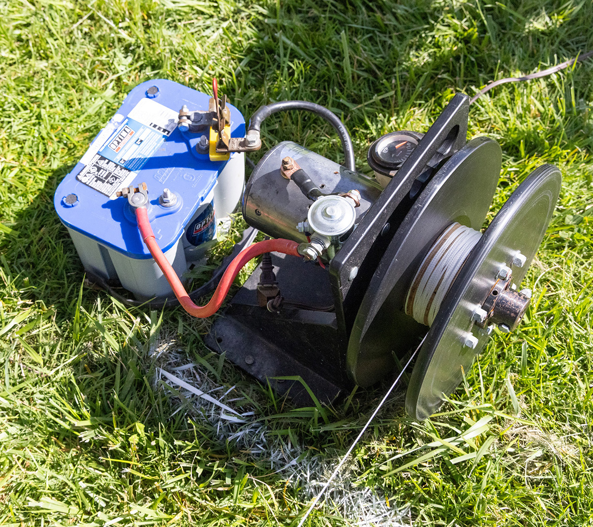
How fast does the shutter need to be to stop a dog moving left-to-right directly in front of the camera? I set up my tripod about 20 feet from the string the dogs follow when running (they chase a fuzzy-tailed lure that is pulled along the ground by an electric motor). Using my 100-500 mm lens, I set the focal length at 100mm. At this length, I would capture whole dogs with a lot of room on either side. In the final images I cropped quite a bit.
Then I searched through my menus, looking for the one called DRIVE. It is there that I can set the various modes for shooting single and multiple frames. I set it to the High Speed Continuous+ setting, which is 20 frames per second. I also set the shutter to electronic shutter, meaning that the mechanical shutter is disabled. The camera makes no sound during a burst of these photos; the only indication you get is a rapidly-flashing white outline around the image in the viewfinder.
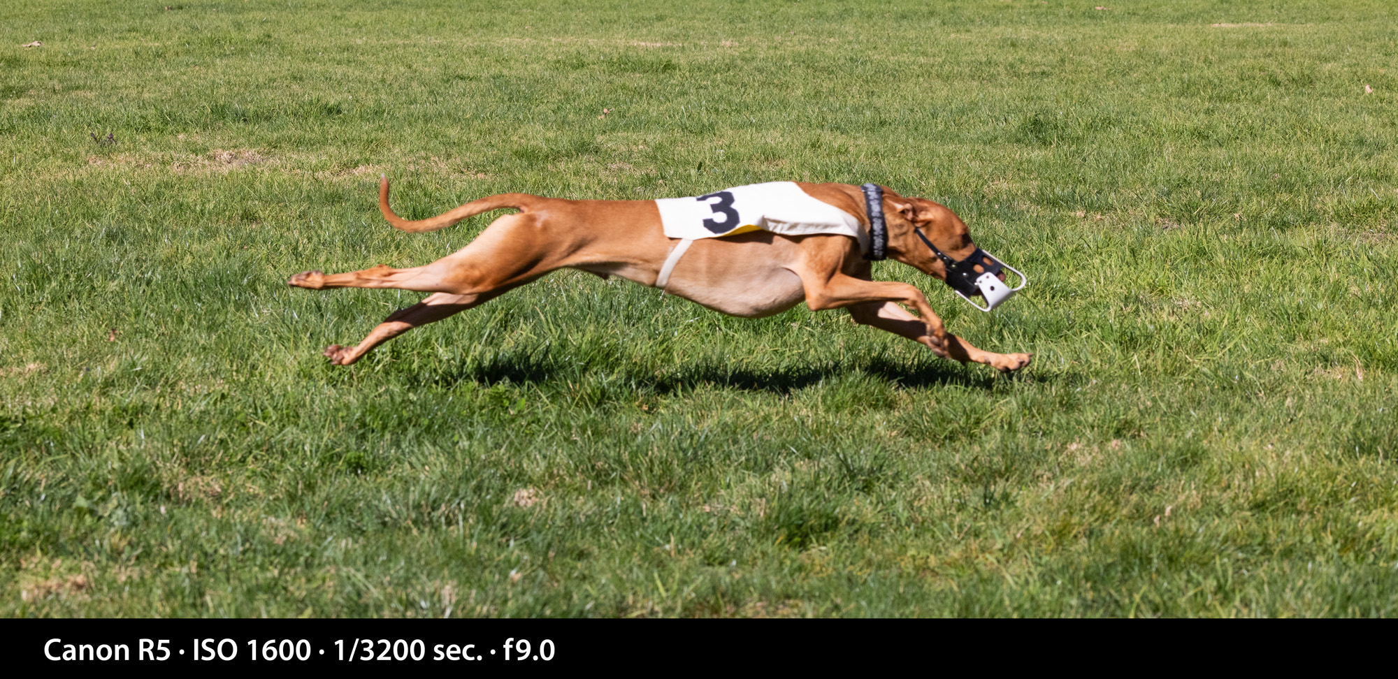
I set the camera 90 degrees to the track, then kneeled on the ground at dog’s-eye level and imagined an area to the left and right of my position. On the left, I would start pushing the shutter button when the dogs were about 50 feet away, and I continued until they had run about the same distance out of the frame on the right.
I was told that these dogs run at about 30 miles per hour, which, when moving in front of my camera, was just a second or two of presence in the scene. I managed to photograph the lure, the dogs and a lot of grass in the interstices. After each run, I deleted the empty frames, saving storage space on my memory cards. When you are shooting that many frames, filling a memory card is a real issue.
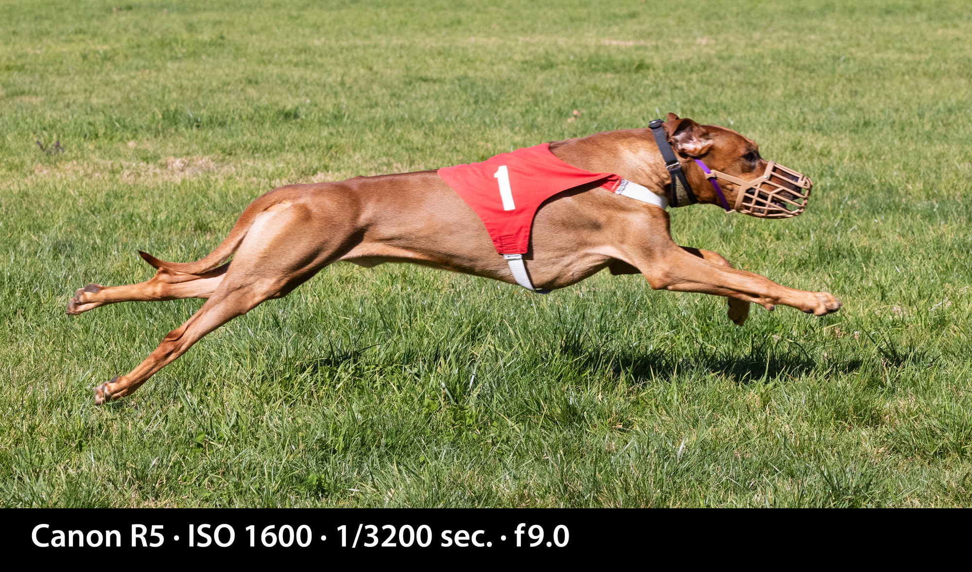
These dogs are trained from birth to go after fuzzy-tailed objects like the lure they chase when racing. Many of the dogs are muzzled to prevent them from biting the lure. It’s a prize they really want!
After each heat of the competition a person walks the lure back to the starting line – 200 yards – for the next heat.
Having never seen dog racing before, I must say that I was impressed by the speed, grace and agility of these very special animals. They love to run, and they are eager to do it several times each day. The dogs are exceptionally well treated, healthy, and obviously contented. They love their owners and handlers, and they really love that lure! I enjoyed the canine athleticism on display.
I found that shutter speeds of 1/1600 and 1/2000 second were reasonable, but faster shutter speeds produced sharper images (no surprise!). My camera can shoot up to 1/8000 second, and I ended up at that speed for my most successful images. I also set the auto-focus to seek animal subjects, and that worked reliably. Several of the resulting images are excellent.
The other setting I used is Tv, which on the Canon camera means shutter speed priority. With the camera set on Tv, and the shutter speed set to 1/8000 second, the camera responded by adjusting its aperture to compensate for the available light. I had set the ISO at 1,600 for the entire event, and this worked well. Though 1600 was a bit high for daylight, I needed the higher ISO to get reasonable apertures for some depth-of-field. As a result, my typical exposures in Tv setting were f9.0 to f10.0.
There is no appreciable noise in the photos as a result of the rather high ISO setting. This can be attributed to the camera’s sophisticated sensor, and to the Digix chip in the camera, with its ability to suppress noise at most ISO settings.
Note: When I searched Google for more information on dog racing I found many articles about Greyhound racing in Florida, and the sometimes-corrupt gambling that is associated with dog racing. I also found a number of articles highly critical of dog racing (especially racing done commercially). There is quite a bit of controversy surrounding commercial dog racing, and some animal-rights organizations have labeled racing cruel to these animals.
The people I met at this event, and the dogs I met and befriended, are – quite obviously – not engaged in dog racing for gambling. Their dogs are healthy, happy, and are treated kindly by their humans. I don’t know any more about dog racing than I have learned by photographing this event and meeting its organizers. What I learned impressed me. These are nice people having fun with dogs that seem to really enjoy what they do.
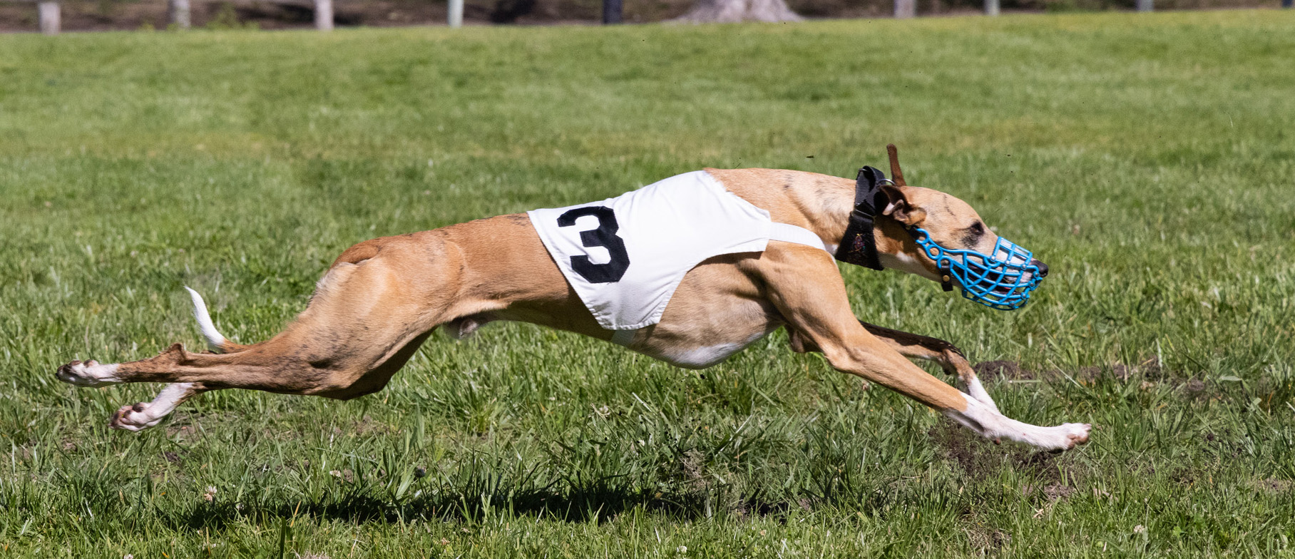
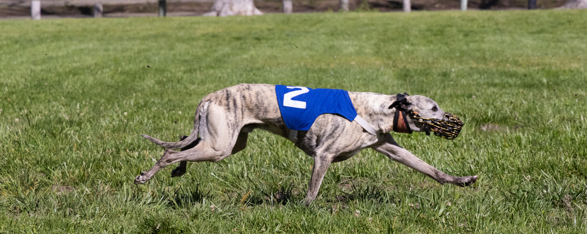
An addendum April 12, 2024
I was invited to return to see the dogs run this past weekend. I decided to take what I had learned and do it again. The only differences were that I chose a different lens for this event. In the photos above, I was using my 100-500mm Canon RF lens. For this session I chose my 24-100 Canon RF lens. I figured 100 mm is 100 mm, right? I think that the smaller lens is not quite as sharp, and not quite as quick to focus as the bigger lens. I can see very slight differences between the photos. I also increased the ISO one stop and in return got another stop of aperture (and depth-of-field). The photos below were all taken as 1/8000 sec. f 10.0 ISO 3200. I used the shutter speed priority function on the camera so that the speed would be favored for each photo.