My Blognosticator reader-odometer passed 500,000 today; that’s something to be proud of.
Fourteen years ago I began writing The Blognosticator. Since then I have written and illustrated 354 posts, received 680 legitimate comments, and have enjoyed not having to delete 883,255 spam comments. Those were rejected by the Akismet software I have running to protect my blog site (thank you Akismet!).
That is 0.07 percent legitimate comments! (And, it’s 99.93 percent spam.)
Akismet has also killed 183,668 malicious attacks on my site, again saving me from lots of trouble, I am sure. That lowers the ratio to 0.006 percent legitimate. That’s a lot of spam!
On my best day, April 30, 2012, I hosted 856 readers. On a typical day I have 97.84 readers. I am happy to have those sincere readers every day. If you are that 0.84 reader, I expect your full participation soon!
I have never made a dime on this blog site. No sponsors (I tried). No advertisers (I didn’t try). My wife seldom reads these posts. I have no friends who read these posts (I have no friends)..
But I believe that I have contributed to the graphic arts and photography industries by writing my missives. I have answered a few questions for people experiencing some of the same problems I have encountered, and I have learned a tremendous amount about a large number of things.
I hope I have steered a few people away from disaster, and I am sure that I have steered a few people toward products and services that I feel are valuable.
I have tried not to whine. I occasionally gripe about a lousy product, but I am sincere in my opinion of that product or service, and I am not doing it to spite anyone. I think I am being helpful.
I don’t use inappropriate language in my blog posts (I reserve that for the thousands of times I misspell a word or click the wrong button on my screen). The Blognosticator is a family-friendly site, though admittedly it’s for a family of folks who are interested in some pretty esoteric topics.
When I published (actually re-published) the matrix catalogs of the Linotype and Intertype companies, I did a service to the industry. My pal Bill Berkuta suggested that all twelvepeoplealive who care about these catalogs are grateful for my efforts. Fortunately he is one of them. I really hope there are eleven more out there!
I have discovered a small but lively community of people who own and operate 100-year-old Smyth book sewing machines. Lovely crowd! I am thrilled to have been helpful to those people too (there are more than 12 of them!). Among the most appreciative of those people are my students at Cal Poly who have actually used the book sewing machine to produce case-bound books. That has been fun.
I have discovered and analyzed the output of the Landa production ink-jet presses, which I consider the most important printing technology in the industry today. For that work I have assembled a following much greater than 12, but still shy of a few hundred. Again, I am working to educate, to share my excitement, and to help people to enjoy the fruits of my studies.
The driving force behind my work here is to share what I have learned, and to help people get their work done more effectively. If I have helped you, that’s all I want. Thank you for reading The Blognosticator.
In yesterday’s post I described how I built a camera stand to re-photograph (“digitize”) my film.
In order to be more helpful, I thought I would share here my working drawings and my engineering drawings so that others might make a similar camera stand. It requires precision, but anyone with metal-working skills and basic tools should be able to make a similar device. A CNC machine or milling machine would be helpful, but you could do this with a bandsaw, a drill press and a set of mill files.
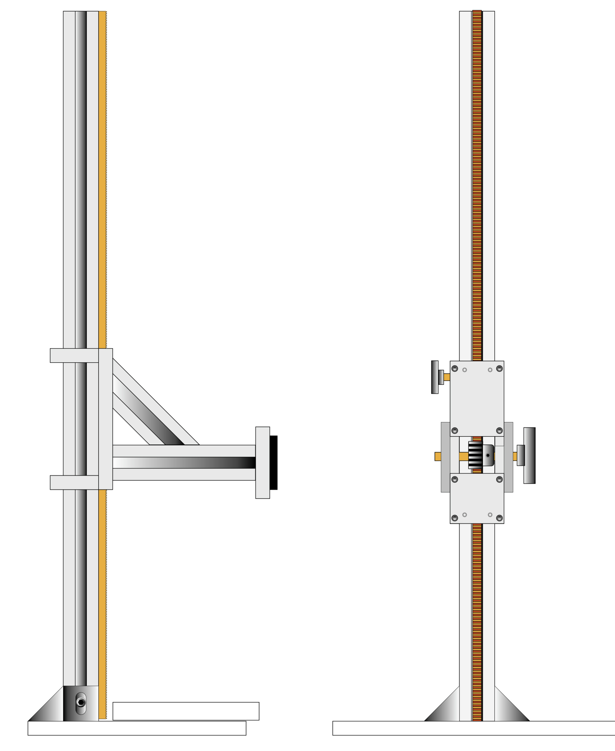
Here are my Illustrator sketches of the camera stand as I conceived it. The vertical post and the horizontal arm are both aluminum extrusions from 80/20, the company that has revolutionized extruded aluminum beams and connectors for makers.
My idea was simple: Hold my camera vertically, with good precision, so that I can copy analog film to digital files. This requires nothing more than making a stand, purchasing a light source, making or purchaing a film transport mechanism for 35mm film, and making or purchasing masks for my 120 and 70mm films. And a lot of work.
The digitization step is a desktop operation. It requires a comfortable workspace (because I’m going to be spending a lot of time doing this!), and freedom from extraneous light. I suspect that I will do this at night to remove ambient light from the equation. To use this set-up in daylight would require masking the image to prevent extraneous light from entering the lens and causing flare.
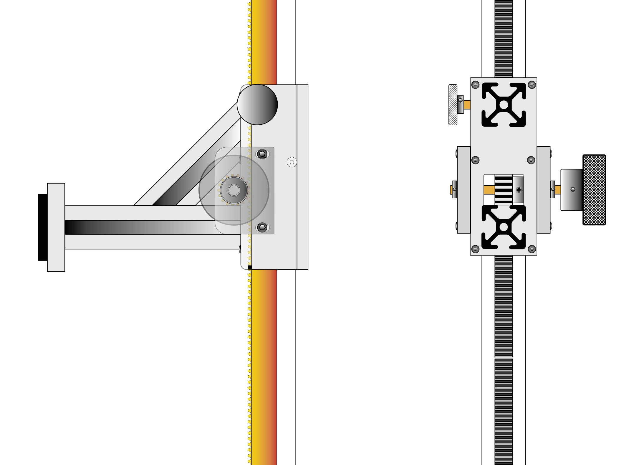
These drawings describe the detailed workings of the moving camera bracket as I intended to make it. On the right I put an accurate silhouette of the 80/20 aluminum bars where they would connect to the moving bracket. The gear rack runs vertically in the post, which I had to machine to fit the rack, which is made of steel.
I have been researching light sources on YouTube “University” (my favorite educational go-to location), and I ordered a light source from B&H Photo that is made by made by Negative Supply. It was moderately expensive ($200), but it is large enough for 4×5 inch film, and with a 97 CRI (Color Rendering Index), it is good enough for anything that I will be re-photographing. The same company makes one with a 99 CRI, but it is much more expensive, and I am not convinced that it’s worth the additional expense. We’ll see.
For my camera, I will be using a Canon R5 Mark II. Its 45 MP sensor will yield extraordinarily high-resolution images from these pieces of film – more resolution than necessary, but that’s OK with me. My lens is a Laowa 100mm 2X macro. I bought this a few months back for this purpose, and I am quite impressed so far. It’s very sharp, and it goes beyond the 1:1 ratio for re-photographing 35mm frames. Canon’s 100mm lens goes to 1.4:1, and that would work well also.
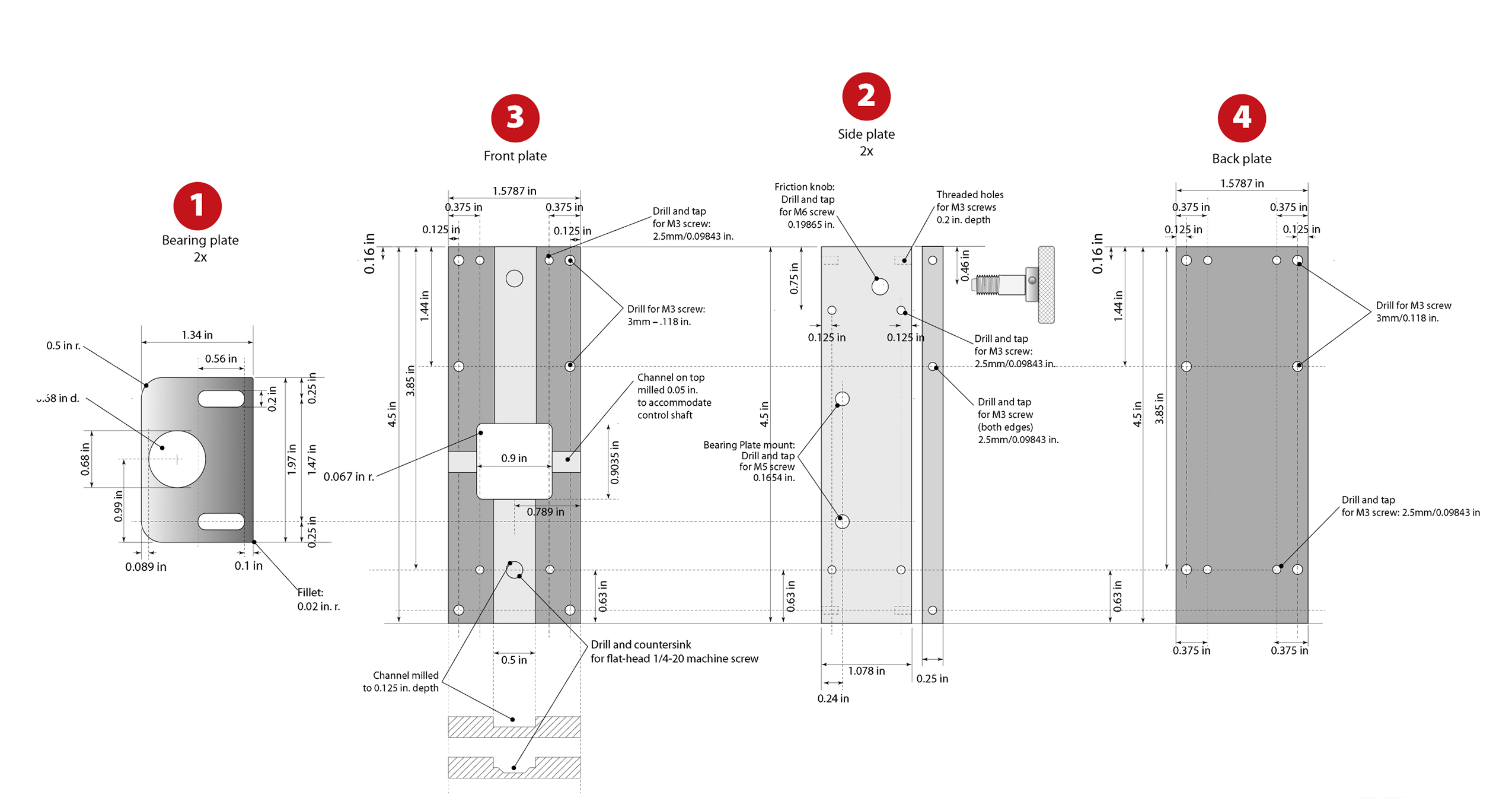
These are my engineering drawings. They were used to make the machining drawings for the CNC machine. I made these drawings in Adobe Illustrator, using its relatively new Dimensioning tool, which is quite nice. I updated the drawings after machining to reflect changes I made to the parts when I machined them and assembled the bracket. There is a link at the bottom of this page for a PDF version of the updated plans. (Click to enlarge the illustration)
I will be recording all of my images as Camera Raw, then converting to DNG on the fly as I import them into my Mac (using Adobe’s Photo Downloader software, about which I have mixed feelings). I want every file in my digital archive to be either DNG as source, or TIFF as destination. I have come to the conclusion that these are the only file types that might be “archival” in the long run. Adobe PSD is fine, but not open-source, and there is no guarantee that Adobe will be in business in 75 years, or that PSD files will be legible in the future with any software. TIFF is the file format chosen by FADGI, the Federal Agencies Digital Guidelines Initiative. The Library of Congress and the National Archive are both adherents to this standard.
Also, the the international museum photography group has endorsed FADGI. If they believe in it, I do too!
So those are my standards. I also have to come up with a post-photography system of storage, labeling and indexing. My collection is currently a mish-mash of film in boxes, slide carriers, slide trays, paper envelopes, and floating loose in my file cabinets somewhere. I want to re-photograph, then store in a coherent system so that my heir (sorry, Patrick) can find a photo if he needs it.
Camera stands are nothing new. They are exceedingly simple. Mine is no different, except that I wanted to make it myself.
I share the plans here in case you might want to make a similar stand. All of the parts are available on Amazon. They are all metric. All of my measurements on the plans are in inches (sorry, world). It’s easy to convert:
1 inch = 25.4 mm
1 mm = 0.03937 inch
All of my holes are drilled to metric sizes, and all of my tapped holes were made with metric taps. I added 6mm bearings and collars to the control knob shaft, and I added 6mm threads to the friction knob.
In the edges of all four box parts are tiny little setscrews called “grub screws.” These are an integral part of the design. These are made of steel with tiny nylon tips on one end. They are adjusted to slide gently against the vertical beam, providing a small amount of friction. They also allow for very small adjustments to squareness of the moving bracket. They are adjusted with a tiny hex wrench.
If I build this again I will make two significant changes: I will use 50mm 80/20 extruded aluminum for the vertical post, and I will use 5mm grub screws instead of 3mm. That will give me more control over these friction points, and more accuracy in the alignment of the moving bracket.
The aluminum plate I used for my parts is supposed to be 0.25 inch. I measured mine (Amazon) and discovered that it is close to 0.25 inch thickness. This did not require me to change my design, as the grub screws afford enough adjustment to take out the tiny difference (less than 0.25mm) between the actual thickness of the aluminum and my planned thickness. I did have to adjust the position of the holes I drilled in the edges of the two side plates to compensate for this, but that was a microscopic change, made on the CNC machine.
I used all metric capscrews for assembly, except on the 45-degree 80/20 beam, where I had to use flat-head metric machine screws to clear the rack gear running through the middle of the block.
You can download a PDF of my engineering drawings here.
I have thousands – tens of thousands – of photos on film. These include 35mm negatives and slides, 120 film from my two Hasselblad cameras, and a boat load (a small boat) of 70mm sprocketed Ektachrome film. The 70mm era was when I was editor of Ballooning Magazine (1979-1984). During that era I was shooting with the Hasselblads (one was a 500 CM, the other was a 500 ELM) because many of my photos ended up in print, and I wanted the larger film to provide more room for enlargement and cropping.
The 70mm film made it possible for me to shoot more than 70 frames on a roll, in a special film magazine on the Hasselblads. This magazine was developed in the late ’60s by Hasselblad for NASA. The silver version of the back was the consumer model of the back they took to the moon several times.
This is the 70mm film magazine for a Hasselblad 500 series camera. My film cartridges held about 70 frames of Kodak Ektachrome 64 transparency film.
I “rolled my own” as was often said in the ’60s, using a light-tight film-rolling machine that would take a 100-foot spool of fresh Ektachrome 70mm film, and then spool it down to smaller steel cartridges to put in the camera. At my graphic arts business we had an Ektachrome film processor, and I had a special reel for holding the long rolls of 70mm film for processing.
For those not familiar, a normal roll of film for the standard Hasselblad back allowed for 12 frames, max (there were other film backs with different formats). That meant changing film magazines constantly, which was a pain – even in the studio. On the surface of the moon, or on the balloon launch field, things happened too quickly for 12-frame magazines. I loved being able to shoot 70 frames without interruption.
Now, these many years later, the 70mm film creates a challenge for me. I am planning to digitize the entire archive, and to do so I am going to have to make my own masks and some equipment for re-photography. But, this also gave me an excuse to build my own copy stand. Though the image size is identical (51 mm x 51mm), the film itself is considerably wider than 120 film, and thus does not fit any standard scanning masks.
As for the stand itself, I certainly could have bought one, and I almost did, but I decided to make it myself, using my CNC machine, and some aluminum plate. And, I told myself that it would cost less, which of course was a bald-faced lie because it took me several weeks just to make the engineering drawings. Buying the raw materials has been fun, and it has enriched Jeff Bezos.
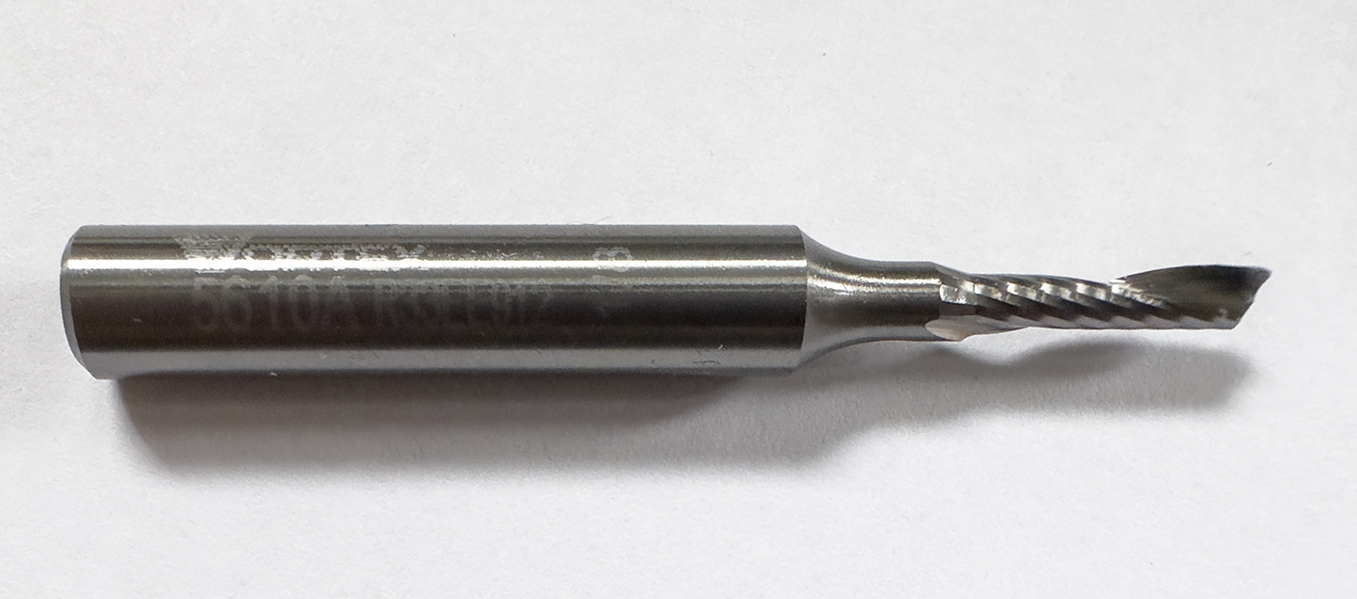
Over the years I have learned a thing or two about cutting aluminum on my CNC machine. The cutters are expensive, but they work beautifully. That is until you make a dumb mistake and tell the machine to break a $72 end mill in half in two seconds. Ouch!
This is a single-flute aluminum cutting end mill. This one, made by Vortex, has a 0.108 inch diameter, and works very nicely for projects like mine. When they break, it’s a small tragedy.
Fortunately, I had two of that particular tool, so I cursed my stupidity and mounted number two (then I ordered two new ones for future stupidities).
Then I cut the aluminum parts, and began to build my dream copy stand.
I started with a section of extruded aluminum from 80-20, the clever company that pushes hot aluminum through macaroni dies to make pieces for fabricators worldwide. At the same time I ordered two smaller pieces to mount the camera – by attaching a camera bracket made by Really Right Stuff, the wonderful people who make the best tripods in the world (not sponsored).
I ordered the rack-and-pinion gears from Amazon, along with two knobs, a stack of bearings, 6mm brass rod, and various other small parts to put the whole thing together.
I machined a channel along one edge of the 80-20 vertical beam to accommodate my gear rack. This involved machining one of the grooves on the vertical beam wider to fit the steel gear rack (I don’t cut steel on my CNC machine). Then I drilled through the 80-20 vertical to drive screws through and into the steel gear rack to hold it in position.
When I ordered the 80-20 pieces, I had the ends threaded for 1/4-20 US machine screws. These will be used to attach the vertical to a small table, and the attach the Really Right Stuff camera bracket to the end of the support arm. The custom-cut parts from 80-20 are always precisely made, and perfectly cut. The table and most of the working parts of my CNC machine also were made by 80-20 (also not sponsored).
Most of my milling operations in aluminum are done with what is called a single-flute mill. This means that there is only one cutting wing at the business end of the cutter. When working in aluminum this is important to prevent hot aluminum chips from melting into the cutting surfaces of the end mills. My chips are varied, but very small, and always clean. That means that they are cut and thrown away from the material (I also use compressed air to blow the chips away).
I always make two outline cuts in my aluminum parts, meaning that I make a rough cut about 0.003 inch away from the final dimension. Then, when that is complete, I make a trimming pass to the final dimension. This usually results in a near-mirror finish.
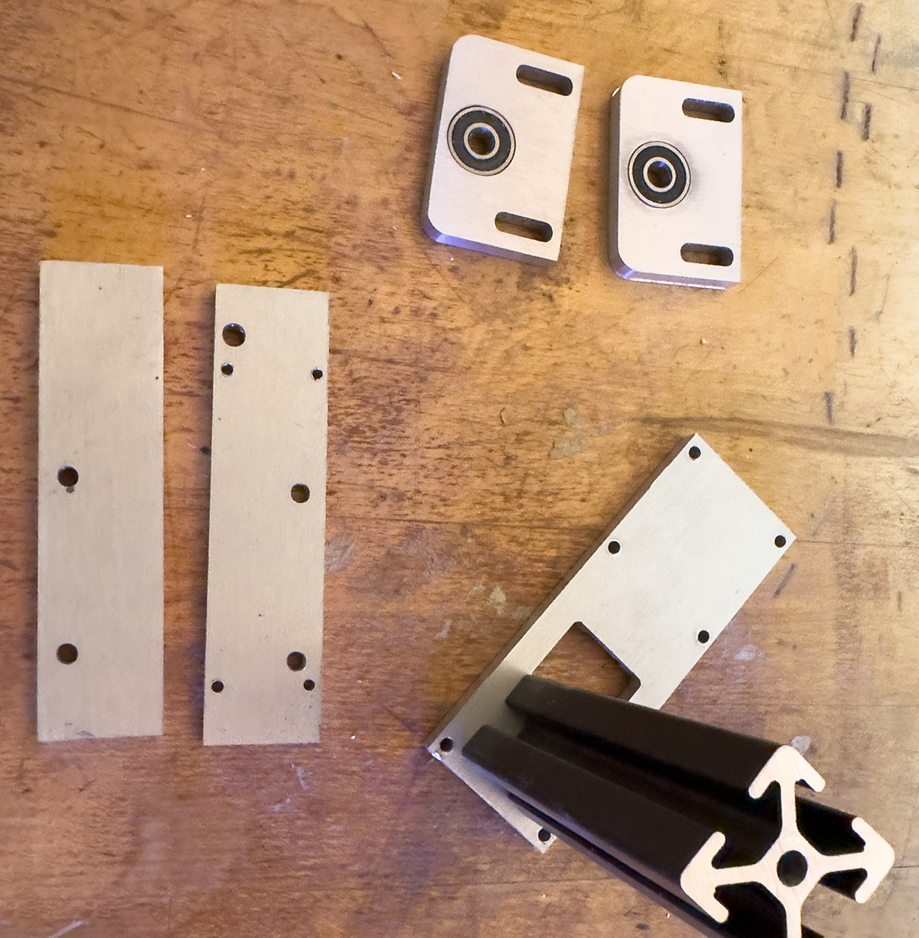
These are my aluminum parts after machining. The two bearing brackets (top) have the bearings in-place, and the front plate has the 80-20 aluminum extrusion standing where it will eventually be attached.
When machining anything on the CNC, the most important part of the job is how you hold on to the material. I recently rebuilt my machine to use devices called bench dogs. I drilled large holes on six-inch centers all over the spoilboard, into which the dogs are placed. One type of bench dog is a solid steel pin with one flat side. The other side is a pin with a threaded rod going through it. On one end of that rod is a brass bar, and on the other there is a hex head. When I use these, I tighten the brass bar to squeeze my material, holding it in place.
For this I also cut some scrap plywood at a 10 degree angle to hold the aluminum plate on top of the spoilboard. The slightly-sloped edges force the board downward as I apply pressure along the edges. I attach the aluminum plate to that scrap material with wood screws. Rule number two in CNC work is never hit the screws with the $72 cutter! (I didn’t, but I have in the past).
Several hours later I had cut most of my aluminum parts. These came out beautifully. The only problem I had was drilling tiny holes into the edges of two plates. This kind of work is always challenging, and I had the usual difficulty this time. I stand the cut pieces in a vise, then I bolt that vice to the spoilboard using the bench dogs. I use an aiming laser in the spindle to position the edges of the material exactly. Then I move the spindle under computer control half-way across the material. Then I insert a centering drill into the spindle and make a program to cut the three vertical holes in the material.
Once all the parts were complete, I had to thread about half the holes to put threads inside. This is tedious work. I managed to get all of them threaded without breaking a tap (a minor miracle for me!). With the threads cut, I was now able to put the parts together.
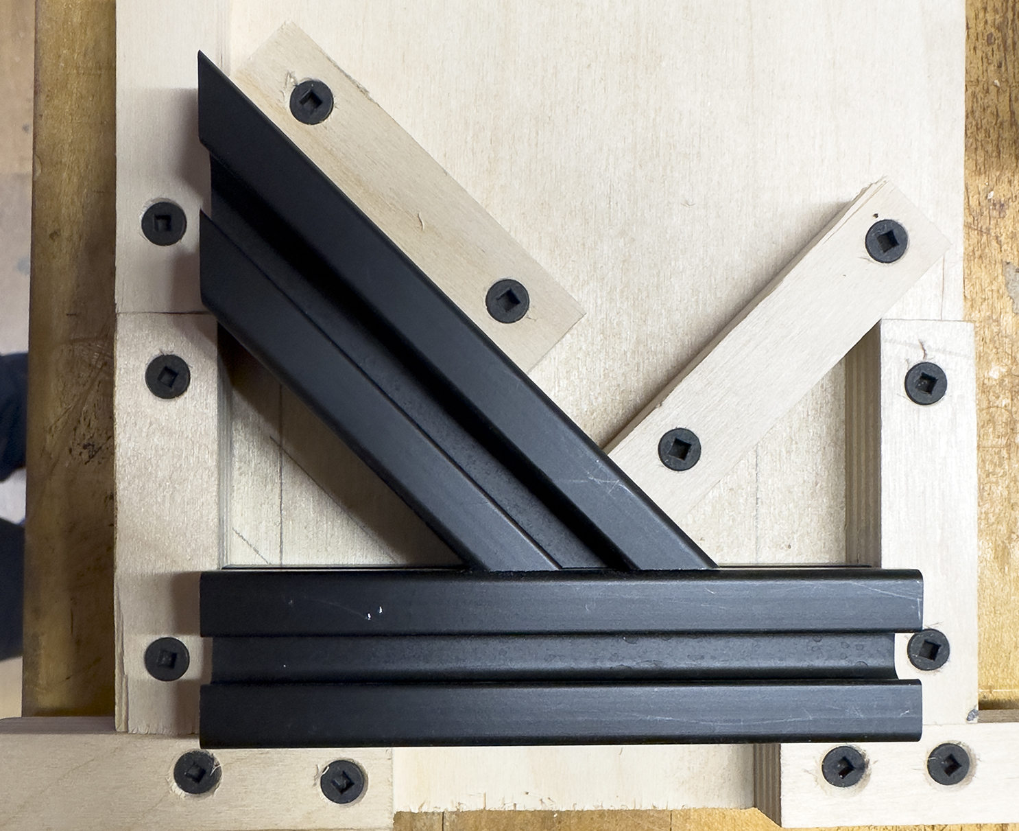
The most difficult part for me was connecting the 45-degree 80-20 bar to the square arm that holds the camera on my stand. 80-20 does not offer a 45-degree attachment device, instead suggesting side plates. Though these would work, they will not fit into the device I have designed. Instead, I made a jig, mounted the two aluminum bars to that jig, the drilled 45-degree holes through the pieces. After that, I threaded the resulting holes and put M5 cap screws inside to hold the pieces firmly in place. This worked well, but does not offer any adjustability.
This is my 45-degree angle drilling jig. It holds the 80-20 aluminum bars in position while I drill holes to thread and later, hold them together accurately.
With the pieces complete, I sanded the parts, brushed them with steel wool, and painted them flat black. This was done to reduce reflections.
I mounted the tall vertical post on which my camera mount slides to a sheet of nice plywood, faced with black Masonite-like material (Formica would have been better). After mounting the post, I realized that it is sturdy, but that there is not enough connection strength at the base. I ordered some 90-degree L-brackets from 80-20, and will add those to the base connection when they arrive. I believe that this will add the additional sturdiness I need.
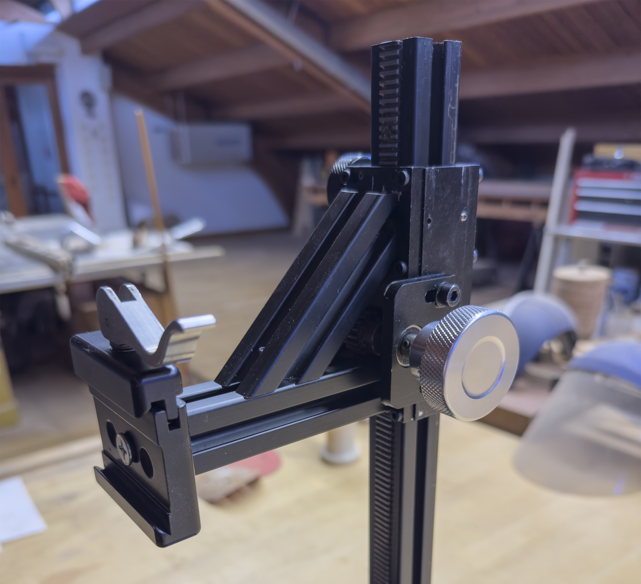
This is the finished camera bracket mechanism on the vertical post of my camera stand. It features one knob (silver) for raising and lowering the camera on the rack gear in the vertical post, and another (black) for tightening the mechanism in-place. It works very nicely.
My Big Plan is to begin digitizing my film soon. I’ll write more as I get going on the project. There will be a lot to learn here!
To see more on this project, and to download PDF of the engineering drawings, click here.
Greetings to those who are interested in Smyth book sewing machines!
UPDATED November 2, 2025!
I had been dawdling on the scanning of the Smyth Model 12 instruction and parts manual. I am sorry. Scanning is pretty easy, but retouching and straightening the pages, then cleaning them up to be consistent is a lot of work. I put it off and off and off, until now.
I scanned the pages last week, and have since cleaned up all the pages and made a full-resolution version and a reduced resolution version for download.
Click on this link to download a PDF (both low-resolution and full-resolution versions are available.) of the manual. The link is below:
In my last technical analysis of the Landa press, I mentioned that the company had gone to the Central District Court in Tel Aviv to seek bankruptcy protection. Facing about $500 million in debt, they hoped to prevent total failure by getting the court to rule in their favor, giving the company time to find new capital.
The judge in that matter, Hana Kitsis, made her ruling stating that it was smarter to allow the company to continue to operate under supervised protection than to force it into insolvency. This seems especially smart in my opinion because Landa’s salable assets in Israel are only $127 million. That, against its debt, doesn’t resolve the greater problem, and fails to supply continued support for its customers.
By granting a short – one week – extension, she gave them the time needed to find an investor, Israel’s FIMI Opportunity Funds, who rescued the company at the eleventh hour. This has not been a completely clean transaction, with FIMI arguing that some of the terms of its purchase were established without their consent. Regardless, FIMI has agreed to continue to pay the court-appointed financial supervisors while the transaction is completed and these disputes are settled.
The speed of the entire transaction is surprising to me, as similar situations in the graphic arts industry in the U.S. have taken years to resolve. This one was opened and closed in a matter of months.
Landa’s workforce – about 500 people in the Spring – has been reduced by layoffs to about 350, and this was also approved by the court-appointed supervisors.
The company has also suffered a number of crises not of their making. The Israeli war with Hamas, and Israel’s continued hostilities in Lebanon and Iran, have contributed tremendously to the troubles at Landa. About one quarter of Landa’s workforce are reservists in the Israeli military, and many of those workers have been in military service since the Hamas invasion in October, 2023.
Compounding this worker shortage is the fact that Tel Aviv is a common target in that conflict. On May 4 of this year, a missile fired by Houthi rebels in Yemen avoided Israeli air defenses and hit targets in the neighborhood of the Ben Gurion Airport, including the Landa facility. Though there were no fatalities, this was another setback to the imaging company.
Additional pressure on supplies coming through the Suez Canal and the Red Sea (attacks perpetrated by Houthi warriors) have adversely affected Landa. The printing press components in the Landa presses come from Komori in Japan, and those shipments have been slowed by the ongoing hostilities in the region.
Those delays, the ongoing war with Hamas and others, workers in conflict, incoming missile attacks, general chaos in Israel as a result of the war, and international uneasiness about doing business with any company on the border of military conflict have added to Landa’s endemic troubles.
The press, which has extraordinary capabilities, took many years and many millions of dollars more than predicted by Landa. Originally announced in 2012, the machine struggled to meet expectations, and was written-off by many pundits and even some supporters in the early years.
Benny Landa, the founder and brain-trust of Landa, is famous for being an eternal optimist, and is among the industry’s most talented and successful inventors. He is also guilty of more than an erroneous technology or sales prediction. His announcements were wrong by many years. But he was right about the primary capabilities of the machine. On that he was absolutely right.
The Landa press took longer than promised, or expected, to be delivered. Today, according to industry publications, there are 51 machines in 14 countries. At about $4 million each, complete, they are competitive in the marketplace. But apparently the company does not break-even on any press sale. Instead, they rely on ongoing support and consumable sales to be profitable in the long run. To me that makes little sense. Landa has not published the cost of manufacture, so we don’t know how much is lost on every sale.
This business philosophy, combined with other fickle market conditions, does not bode well for those daring enough to purchase one of these machines. If Landa were to become insolvent or be forced to liquidate (unlikely at the moment) where would its customers get ink, and the famous imaging belt?
How would any company with a Landa press survive the company’s failure?
Certainly after-market suppliers could step in to provide ink, and given time, even the belt. But it would cause severe disruptions in those operations that have invested in the Landa presses.
What will probably happen My estimation of the situation is that the FIMI organization will help Landa to survive and succeed. Their track record is extraordinary, and this is not the first company-in-distress they have absorbed. FIMI has already announced that they will provide ample cash to Landa to allow it to continue to make presses and to support its existing customers. Then FIMI will fund an effort to grow Landa into a more successful company. The fact that the machine now works beautifully means that it has overcome the most significant hurdle to success. Now they need more customers.
When I look at the field of digital ink-jet printing machines I see a market with several impressive competitors, each producing one or more good offerings to the graphic arts industry. Most are devices that feed a niche market.
Kodak makes the Prosper series of presses. These machines produce stunning quality printing at very high speeds. The machines have been most successful in document printing, specifically bank statements, credit card statements, and collateral printing. They are much narrower, dramatically faster than the Landa, and more limited in the ability to print on various substrates. Prospers are web-fed.
Hewlett-Packard has its line of extraordinary web-fed PageWide ink-jet presses. These are very impressive machines, capable of printing on uncoated substrates. The company offers them in 22-inch width, and up to over 100-inch. These are used for book printing, business document printing, ballot printing, and other purposes. Probably the most important use is producing the faces for laminated packaging with corrugated liner added or other packaging substrates. Amazing speed, excellent quality, and the ability to scale for specific needs are the cornerstones of the PageWide presses.
Fuji makes a series of 74 cm. and 100 cm. ink-jet presses. Some of sheet-fed while one is web-fed. I don’t know as much about these as I should. I have seen output, and it looks good. I spoke with a sales person at Print United, and learned that the substrate selection is limited.
Komori, the company that makes the large components of the Landa press, makes a machine that is called Impremia. Looking at the company’s web site, it looks suspiciously like a Landa press. Coincidence? The company calls the machine a “Nanoprint” press, using one of the terms coined by Landa: Nanoprinting. Snooping around the web today I have learned that Komori has installed one in Japan, one in China, one in Germany, one in Canada and one in Kansas City at Boelte-Hall Printers there.
So, let’s assume that the Komori press is indeed a “Landa” machine, built with cross-licensed technologies from both companies. That boosts the importance of the Landa restructuring to an even higher plateau because it involves more customers in more countries.
I’m sure there are other production ink-jet offerings that I have not mentioned.
The printing industry cannot afford to have Landa fail. It’s simply too important to our industry that this innovative company continue to operate and prosper (apologies to Kodak).
I believe that the Landa press technology is the most important printing technology in the industry today. In the coming years we will see increased competition and improvements to the existing technology. Landa’s summertime announcement of the S20P press shows continued improvement. All of this is good for the industry. I am pleased that the Israeli court gave Landa enough breathing room to survive this financial situation, and that we will have Landa in the industry to provide excellent presses and excellent printing in the future.
This is the fourth in a series of analyses of the output of the Landa S10P press. If you would like to start at the beginning, click here.
Whenever a printer gets out a magnifying glass, there are bound to be conversations about the behavior of a printing process. That has been my focus, if you’ll excuse the pun, for these posts. My “magnifier” has been a clever new lens from Laowa, a new 2.5X “macro” lens for my Canon R5 camera. Because it magnifies more than 1:1, it is really a “micro” lens, but who cares about the title? What matters is that it’s a spectacular close-up lens that allows me to move in close enough to get images of these printed sheets that show how the machine is making its marks on the substrate.
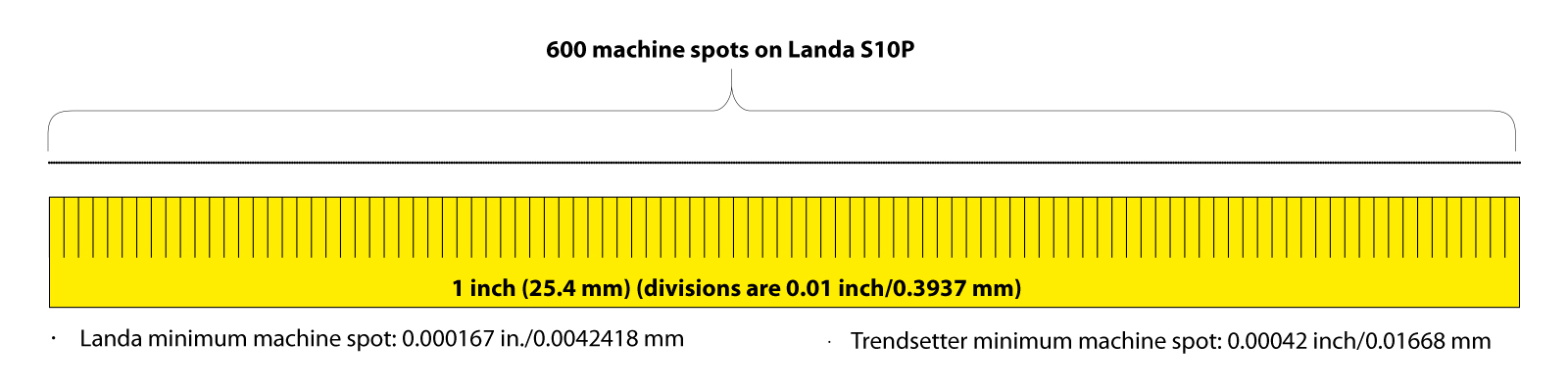
Resolution of the press The absoluteresolution of the Landa press is 600 spi – machine spots per linear inch. I use that term to describe the smallest size of a single droplet of ink from the machine’s ink-jet heads. It cannot make a mark smaller than that. Compare that spot – 0.00167 inch (0.0042418 mm) – to the smallest mark possible on a Kodak Trendsetter platesetter – 0.00042 inch (0.01668 mm), when used to make aluminum printing plates for offset printing, and the Landa spots look large. But that is only when we have our magnifying glasses out. (The Trendsetter can make smaller spots, but is commonly set to this resolution.)
This diagram shows just how small a spot 1/600 inch is (too small to show on any computer display at this size). In the same space that the Landa S10P puts 600 droplets of ink, a Kodak Trendsetter will render 2,400 on an aluminum plate for offset printing. Both are almost too small to imagine, but they represent the state of the art for graphic arts imaging.
The secret to quality imaging is using the resolution of the machine to its fullest and making excellent images with the resolution available. Both processes do this handily, and without a magnifier it’s difficult or impossible to tell the difference.
All printing processes are designed to create the illusion of detail, or the illusion of tonality, in the eye of the beholder. That is the reality of our printing processes: illusory techniques. If done well, they are invisible to the viewer; it’s just an image, or it’s just lettering, or it’s a just a line on a printed page.
We in the graphic arts industry know that these marks on paper are much more than an image, lettering or a curvy line. Images on various substrates are created by technologies that have been under development for over a century, with the greatest concentration of technological development being in the past 40 years.
The parts of my test sheets that I analyzed for this post include those showing fine lines and very small type. These are clearly reproduced on the Landa machine, and the quality shows that the sophistication of the Fiery front-end on the machine has methods for handling extremely small elements effectively. Combining the Fiery software and the ink-jet delivery technology of the press, these images are visually comparable to those possible on offset presses with greater resolution.
This is the rendering of thin lines by the Landa S10P press. At the point highlighted in yellow, the minimum resolution is met. After that, all requested line weights are drawn with the same line thickness, that drawn by one ink-jet spot. Note the little line shift on all of these lines, just in from the left side. This indicates that the lines are not being drawn exactly 90 degrees to the paper path. I cannot explain this. Click on the image to enlarge it.
Too thin to print Low threshold line thickness is a factor of any raster-image processor. It applies here. As the line thickness gets smaller, the machine draws lines with the closest number of ink droplets possible. This creates a small problem where line thicknesses are limited by the number of available machine spots. For example, with a minimum of one line of machine spots, the Landa press can draw a line as thin as 0.00167 inch in thickness. Lines with more weight are drawn with more than one row of ink-jet spots. But lines thinner cannot be rendered at all. So, the RIP will draw any line with a requested weight less than that 0.00167 inch at the same weight. To do otherwise would mean that the line would not be rendered at all, and that’s not an acceptable response.
Reversing those same lines out of black (or a rich black) creates a slightly more complex problem for the machine: it has to print up to, but not beyond the position of the white line, and then not print ink along that very small path.
This is the same line pattern, reversed. Interestingly, the little line jiggle isn’t present in these horizontal lines.
Angular anguish These line weights assume that the ink-jet heads on the Landa machine are perfectly perpendicular to the paper path, and my micro-photos show that this is – almost – true. On the example shown there is a point where the thin line suddenly jumps one machine spot downward before continuing on its path. This could be the result of the ink-jet spots landing a microscopically small distance away from their target, or it could be that the original, which was drawn in Adobe Illustrator, is not “square” to the path of the ink-jet heads. On offset presses there are screen angles to consider; the Landa press does not have the exact analog, as it does not draw halftone dots. This makes imaging simpler, I think.
So, creating a very thin line at any angle other than zero or 90 degrees will certainly cause a jagged edge along its path. This is true for any raster imaging process.
Very small type Type in very small sizes will challenge any imaging engine. Imagine how thin the crossbar of a capital A in Times Roman is when the type is being set at a common size like 12 pt. The same challenge that we face with thin lines applies to type: the thin lines of letters are very often thinner than the smallest machine spot available on the machine. So the RIP must overcome this by adding weight to the thinnest elements of letters in order to render them at all.
For this test, I set lines of Times and Helvetica at sizes starting at 8 pt. and getting smaller down to 1 pt. At that size, the letters are rendered on the press with only three or four machine spots (ink droplets). Curiously, it works. Even at 1 pt., the type is legible – barely. I have done this same test on offset presses and the same is true there, though there are four times as many machine spots available.
These are my samples of small type printed on the Landa press. Even 1-point type is legible! Click on the image to enlarge it.
Overall, the rendering quality of type on the Landa machine is extraordinary.
When we reverse-out white type on a black background on offset presses, we often create a multicolor or “rich black” screen combination for that background. This is to make the black more black – increasing the density and contrast of the printing. It also creates an opportunity for the lettering to get ruined by any small register error on press.
The Landa press does not need rich black to be effective. The density of a single-color black is adequate. But, I tried a rich black nonetheless, and the results are very good. Since the Landa press generally does not go out of register (it’s not impossible, but it’s very unlikely) the multicolor background with white reversed-out is rendered very effectively. I would argue that rich black colors are unnecessary on the Landa machine, as single-color black is dense enough to look perfect.
This is a thin italic type reversed out of black only. Click on the image to enlarge.The same type reversed out of rich black: 20, 20, 10, 100. If you click on the image it will enlarge to fill your screen. There, you will be able to see individual colored ink-jet spots here and there, peeking out from the black surround.
Reg marks the spot! And, speaking of register marks, I printed some using black only, CMYK, and CMYKOGB to see if the press shows any tendency of going out of register. It does not, though there are some individual color ink spots that are trying to sneak out from under their neighbors. That effect is nearly invisible, even at magnification.
Here is proof that register on the Landa press is essentially perfect. Both CMYK register marks and marks using all seven colors are in “perfect” register. Click on the image to enlarge.
Summary The Landa S10P press does an extraordinary job of printing fine lines, fine type, and reversed-out lettering. Register of colors on the press is effectively perfect. Density of ink is excellent. The detail in the printed images is comparable to excellent quality offset printing, though the machine’s resolution is not as fine. The combination of an excellent imaging engine (the Landa part of the machine) and an excellent front-end processor (the Fiery part of the machine) make this press a quality production machine.
Something to try next time It would be interesting to run the fine line and fine type tests at a slight angle, not zero or 90°. This would make any effect of lines not fitting the digital raster pattern of the machine stand out. It would be interesting to run the same test sheet with the entire page rotated slightly. That would really put the machine’s imaging engine to the test. It’s moderately expensive for me to run these tests, but I promise that I will do that on my next press sheet test.
Update: I have been reading about financial troubles at Landa. The company has asked for protection from its creditors in an event similar to Chapter 11 bankruptcy in the U.S. With over $500 million in debt, the company hopes to get court approval to reorganize their debt, or find other relief from their financial troubles. I will investigate and write about this in greater detail when I can.
Meanwhile… back to my analyses of the printing produced by this extraordinary machine:
Reproducing high-resolution line art
On the RGB sheet I had run on the Landa press I put a row of scans from copper engravings made in the late 19th century. These illustrations can be very challenging to reproduce.
It is uncommon in the world of graphic arts that we concern ourselves with the reproduction of scanned line art at very high resolutions. Line art illustrations were more common in the awkward era before the digital revolution of PostScript and high-resolution imaging (pre-1984). With analog graphic arts photography, the process was easier because the only limiting factor for resolution was the grain of litho film, which was effectively infinite compared to the rigid limitations that digital technologies place upon the same processes.
Defining line art Before the invention of the photographic halftone process (credited to Frederic Ives in 1882), non-typographic illustrations – drawings mostly – were limited to inked and non-inked areas.
To reproduce “tonal” photos on printing presses, the most common type of illustration was the line engraving. These were typically made by artisans who engraved drawings into copper or steel plates (in earlier eras, they used hardwood). Using techniques including the control of line thickness, cross-hatching, and line shapes to create the illusion of tonality in an image, these craftspeople made extraordinarily nice illustrations in metal using hand engraving tools. To see a perfect example of this technique, examine any printed currency, which is still created by the hand engraving process.
This is a photomicrograph of the face of Abraham Lincoln from the U.S. $5 paper note. Enlarged like this you can see that the “tonality” of the image is imparted by lines whose thickness changes, whose contours follow his facial features, and crosshatching that adds additional detail. The original of this illustration was engraved by a craftsperson on a copper plate at the Bureau of Engraving and Printing in Washington, D.C. The primary printing process for currency is sheet-fed intaglio, which is how this image was made. U.S. currency also has elements printed by offset lithography and letterpress.
If you look at a photomicrograph of the U.S. $5 note, you’ll see all of these techniques at play. Notice the circular lines around the corneas, the sculpted lines that run over Lincoln’s nose, and back down, and the crosshatching of the lines across his forehead. These are the techniques of a master engraver. There is only one color of ink used to print this illustration: black. It is the interaction of these clever engraving techniques with the paper that creates the illusion of tonality where there is none.
And it is those same lines and crosshatches that are so difficult to reproduce on many printing machines – including the Landa press. Electrophotographic machines (toner) also suffer with images of this type. Offset and non-roto intaglio certainly can reproduce images in this class. But, rotogravure is fatal to line images like this because the process converts everything into halftone-like patterns. A common example of this is text printed in the Sunday New York Times Magazine, which is printed by rotogravure.
Notice that all type (in fact, everything) printed by rotogravure has serration along its edges. It is visible in this example of 10 point type from the New York Times Magazine. Click on the image to enlarge.
It is ultimately the resolution of the machine itself that prevents this kind of illustration from being reproduced in a way that rivals offset lithography. The Landa presses use Fuji Dimatix ink-jet heads to make their marks on the paper (and other non-paper substrates). The resolution (addressability) of those ink-jet heads is 600 machine spots per linear inch. Fortunately for the Landa press, the machine spots created by the ink-jet heads are stunningly sharp, and their sharpness is not degraded as the ink is transferred to the substrate from the imaging belt (a continuous ribbon of plastic material that catches the ink from the nozzles, then, after being dried, transfers that ink with pressure to the substrate). See the press diagram below.
This is a diagram of the mechanism of the Landa s10P press. Click on the image to enlarge.
Now let’s compare that resolution to that of an aluminum printing plate on a sheet-fed offset press. The image of Mr. Luse, above, was printed on a Heidelberg CD74 offset press using Kodak plates. The imaging of the plate was done on a Kodak Trendsetter laser platesetter with its resolution set to 2,400 machine spots per linear inch – four times greater than the Landa press.
This is a macro photo of a portrait of a man named Henry Luse, made in the 19th century on a copper plate. This image was scanned at 2,400 pixels-per-linear inch (ppi) on an Epson scanner, then printed with an aluminum plate on a Heidelberg CD74 offset press with black ink only. Click on the image to enlarge.
For printing photos and other tonal graphics, the Landa presses produce images that are comparable to – and often better than – offset printing. But high-resolution line work seems to be the Achilles heel of the machine’s capabilities. Fortunately this does not hamper the press in the more typical processes, as scanned line art is seldom part of the modern graphic designer’s tools. These line art images are the only part of my test sheets that I would put in the fail category. The press just doesn’t have enough resolution to be effective at this.
This macro photo of Mr. Luse was scanned at 300 ppi, and saved as a monochrome .bmp file. The Landa press reproduced it fairly well, but it also introduced additional colors to make the image. Compared to the much higher-resolution image above, this is not as good, but the overall impression is nice. I am putting this image in the success category, despite its lower resolution, and the resolution limitations of the Landa press.
Yet it still works! Microscopic analysis of the reproduction of line art on the Landa press shows some curious results. Two of the images I created are surprisingly good; the rest are not acceptable. And, I suspect that only the most discerning eye would see the difference between the reproduction of scanned line art as a “halftone” or as a bitmap in the two cases where I have had success. Since the Landa press does not draw actual halftone dots, the stochastic patterns created by the Fiery front end render the two successful images acceptably.
Thus, the fault is not so much in the ability of the press to print such extraordinary detail, but the file type I selected to reproduce the scanned images. Where I had success with images scanned at 2,400 ppi for an offset press and reproduced as bitmap images, the same files don’t print successfully on the Landa when saved as .bmp (bitmap) files. Saving the very-high resolution scan as a grayscale.psd file results in a perfectly acceptable reproduction on the Landa.
And, interestingly, the Landa uses multiple colors to render these images – not just black – which enhances their appearance somewhat.
I will score this as a success on the Landa S10P press (when files are saved in the correct file format). Advice: don’t use the .bmp file format for images to print on the Landa press. Instead, save such files as grayscale and save in Photoshop .psd format.
My next tests will be published in a couple of weeks. I’m going kayaking!
Note: Landa recently announced a new version of their press, the S11P. The most significant difference is speed. Where the presses I have tested print 6,250 two-sided impressions per hour, the new Landa press can print at twice that speed. This puts the S11P squarely in competition with most B1-size offset presses (28 x 40 inch). Other benefits accrue as a result.
This is the second in a series of posts about the Landa S10P press and its capabilities. To read the first post, please click here.
In the previous post I explained how I was attempting to profile the color capabilities of a Landa S10P press, using its seven-color gamut on an excellent coated paper (same paper used when profiling for GRACoL in the U.S.).
This is the X-Rite Isis 2 XL spectrophotometer reading the patches from a sheet printed on the Landa S10P press at Brodnax 21C Printers in Dallas, Texas. The process is relatively fast, taking just minutes to make all the readings.
I had the printer, Brodnax 21C, in Dallas, Texas, print two different press sheets on their machine. One is populated by RGB source files, the other primarily with CMYK images.
Today’s discussion is about profiling the Landa S10P, and specifically about making an ICC profile for that press printing from both an RGB test target set, and one in CMYK, both generated by X-Rite’s i1 Profiler software. The RGB target is a “standard” 2033-patch set with the colors designated as RGB values. I have run this target many times, on many devices, all ink-jet printing machines that expect RGB as source files. The CMYK target is an ECI target.
While teaching in Germany in 2021-22, I used a Landa press to make a similar test sheet, then I visited the labs at FOGRA, Germany’s printing industry research organization, to measure the results and make the profile. I declared it a “failure” because the profile was almost identical to sRGB, which is the second-smallest color gamut in the industry. I was convinced by that experience that it was my error, and that I had not prepared something correctly, I had not used the correct target, or had made some other error.
Despite my profiling “failure” in Munich in 2021, the rest of my test sheet revealed several important things, one of which was that the color space we had chosen to use – ProPhoto RGB – was not acceptable, because the Landa machine, and its Fiery front-end, did not manage the color in that space correctly. It made our photos look muddy, We switched, mid-project, to Adobe RGB, which is a less voluminous color space, and which has many fewer potential colors inside its envelope. That one discovery saved our project, preventing a disastrous printing job.
This year’s test was similar. I put a standard i1 Profiler target set of 2,033 patches on the RGB sheet, and sent the file to Brodnax. The visual impact of that target set is lovely. It looks great. The CMYK test target set is similarly nice, though it doesn’t look as beautiful.
I also had a benchmark for this year’s test sheet – a reproduction of that same 2,033-patch target set printed on another ink-jet machine with more than four colors of ink. This machine is the Epson P9000, which prints with CMYK, Orange and Green (it also has “light magenta,” light cyan and two “light blacks”). The profile that my students made from that target set is glorious. It shows what an expanded-gamut printer can do.
When in Germany, I had nothing against which to compare the performance of the Landa S10P press. This time it would be different. Both are ink-jet machines, both use water-based inks, and both are printing on a premium paper (the Epson paper is glossier, but still a comparable medium). If anything, the absence of a blue ink on the Epson should give the Landa an advantage.
My testing process is common: run the test sheet, then read the sheet with a spectrophotometer (an X-Rite Isis 2 XL), then use i1 Profiler to calculate and create the profile, using ICC v4 standards for the calculations.
I run my analyses in ColorThink Pro 4 from Chromix. That software is the latest version for color profile analysis and editing. It is capable of making visual comparisons in CIELab color, CIEYxy, LUV, and two other less common color spaces. I used both Yxy and Lab for these analyses. The data are the same.
This is the gamut chart posted on the Landa web site. It shows the colors of CMYK offset, RGB and their S10P press superimposed on the CIELab color space (but reversed left-to-right). I have flopped it here so the color space matches my analyses, below.
On Landa’s web site they show a CIELab graph of the color of their press, claiming 86 percent coverage of the Pantone library. I have no reason to doubt their claim, and was hoping that my profiling would prove their claim to be correct. (Note: in October, 2024 I profiled a BenQ RGB display that claims 98 percent coverage of Adobe RGB. I was skeptical, but found that their display is slightly better than they claim!)
The graph used on the Landa site is shown in CIELab color (but, oddly, flipped horizontally). I have flipped their chart here so that the colors in my analyses are represented in approximately the same coordinates, and along the axes commonly used in color analysis (red at the top with 0° hue angle, green 120° counter-clockwise, and blue 240° counter-clockwise from red. This also aligns with the CIELab charts in ColorThink Pro, in i1 Profiler,Adobe Photoshop, and others).
This chart shows how the Landa press prints colors from RGB source files, compared to the color gamut the Epson P9000 ink-jet printer. Those are superimposed on the sRGB color space, which is the second-smallest common color space in the industry.
I made a profile of the seven-color output on the Landa press, taken from the RGB test patch set of 2,033 color patches. Then I made a profile of the CMYK target (printed with all seven colors) using the ECI 2002 CMYK random patch set. In both cases, I measured the output with an X-Rite Isis2 XL spectrophotometer.
Once the profiles were made, I opened each for analysis in ColorThink Pro 4, the most recent analysis tool from Chromix. Using the CIELab color space for these tests, I compared the RGB results to those I got from an earlier test of our Epson P9000 ink-jet printer on Epson glossy photo paper. This paper is glossier than the C2S SAPPI paper used to print my test sheets on the Landa press.
Curiouser: The gamut of colors printed by the Landa S10P is very similar to the gamut of an offset press on a C2S sheet. The gamut of colors is very slightly smaller than GRACoL, despite there being more potential on this press.
The gamut of colors of the Landa S10P seems to be limited to, or very closely aligned with the sRGB color space, which is disappointing, because sRGB is the second-smallest common RGB color space in the industry. This is exactly what I experienced at FOGRA in Munich in 2021; then I assumed that I was at-fault, that I had chosen the wrong RGB target patch set, or that I had handled the target file incorrectly, converting it accidentally to sRGB (default on most installations of Adobe Photoshop). It turns out that the same target patch set printed on the Epson P9000 generates a dramatically larger color gamut. This proves that it’s the management of the color on the Landa prepress system (a Fiery) and not my handling of the file, that caused this constraint.
The CMYK color patch set, the ECI 2002, produced a much different result: it aligns almost exactly with the GRACoL color gamut, that used for measuring and certifying the output of offset presses in the United States. I will test this against one of the FOGRA 37 and 39 CMYK color gamuts in another blog post..
And here is the mystery of this experience, so far:
This chart shows colors that are exclusive to the RGB and CMYK gamuts of the S10P press. The mystery here is that there are colors that can be printed using CMYK source image that are outside the gamut of colors printed on the same machine and paper. The machine can print those colors, so why is it not printing those colors? It seems to me that the press should be able to print all of the colors on this chart (which is certainly can do), yet it does not seem to do that.
With such a potentially huge color gamut (as promised by Landa), what is preventing the S10P from printing colors outside the gamut of sRGB on the RGB front, and outside of GRACoL on the CMYK front?
As a closing thought, I made a chart of exclusive colors on both sheets – remember these are printed on the same machine, using the same seven colors of ink, at the same time on the same paper – there are patches of color that are exclusive to each color space, but ironically inside the opposite color space. These are colors that can be printed with CMYK, and colors that can be printed by RGB (converted to CMYK-Red-Green-Blue in the Fiery) that cannot be printed by CMYK colors (and also processed by the Fiery to the gamut of colors on the Landa). This is illogical, since they obviously can be printed by the machine on that substrate at the same time.
Why would a printing press have colors that it can print not print?
I’ll leave that for us to ponder until the next post.
I recently finished a year teaching at Cal Poly. I retired from that institution in 2020, and was rehired last year to fill-in for a colleague on leave. The course I taught was Color Management, which I had taught for 22 years during my career at Cal Poly. Stepping back into the classroom was interesting, fun, and sometimes quite challenging. I enjoyed working with students again, and I found them to be eager and hard working.
When I was last in the classroom, we had a Heidelberg CD74 four-color offset lithographic press. We had three of these machines over the previous 34 years, and the most recent machine was installed in 2006. I always enjoyed having the freedom to experiment with that machine, and I incorporated press tests in several of my courses using the press as a test bed. It was a fabulous tool.
This is the first of two press test sheets my students and I created for the Landa S10P press. It was printed on a glossy text weight paper in both CMYK, and CMYK plus Orange, Blue and Red for our analysis. Most of the items on this sheet were in RGB color.
After I retired (perhaps because I retired?), Heidelberg removed the press from Cal Poly, and we now have only a single-color Heidelberg GTO offset press. Though it’s a lovely machine, it’s not what I was used to having, and we never print full-color projects on that machine; it’s too difficult.
The year after my retirement, I taught for one year at Hochschule München, the Munich University of Applied Sciences. That university is the sister school of Cal Poly; we have numerous exchange programs there, and we regularly send students and faculty there as part of the exchange.
Munich has a graphic communication program that is very similar to the Cal Poly program. Interestingly, they have a two-color Heidelberg 74 cm. press that is used to teach offset lithography. Like our small press, it is never used for full-color printing, as it’s very difficult to do that.
This is the second press test sheet we created. This one features mostly CMYK images and graphics.
While teaching in Munich, I was invited to see a new Landa S10P printing press at Blue Print, a commercial plant on the outskirts of the city. Our faculty gathered there and we were shown this amazing machine that had recently been installed. The Landa press uses nanographic ink-jet technologies developed at the Landa headquarters in Tel Aviv, Israel. It is a production size machine (28 x 40 inches) that produces two-sided full-color printing that rivals, and often exceeds, the quality of fine offset lithography.
After that demonstration, I had that printing firm publish a book written and illustrated by my students, about which I wrote in several posts. You can read about the machine and the students’ work here.
In 2023 I was invited to visit two Landa press installations in the U.S., both in Dallas, Texas. These plants use the Landa presses for both commercial and packaging printing.
This year, while teaching at Cal Poly, I decided to incorporate the Landa press in my curriculum. It would have been impossible to have the students travel to Texas (or anywhere) to see the machines, but I did the next-best thing. My students and I developed a pair of test sheets to be run on the Landa press that we would later evaluate as a part of our study of color management in general, and of the Landa S10P press in particular.
I arranged to have these sheets printed at Brodnax 21C Printers in Dallas, Texas. Jim Singer, co-owner at Brodnax, facilitated this project, and made it possible for my students and me to have these sheets printed for the course.
This blog post, and several that will follow, are the fruits of our labor. I will describe the test sheets we made, and share with you the results of those tests. These results are, to the best of my abilities, reflective of the capabilities of the Landa press, and they reveal the strengths, and some weaknesses, of this technology.
The concept of a press test sheet I have made scores of press test sheets over the years as a teacher. These contain photos in various formats, text in very small sizes, line art, solid-color patches, reverse-out printing, very subtle color tints, ICC profile test patch sets, rich-black tests, and as many things as I can fit on a page that will challenge the technology being tested.
In Munich, my students and I made a test sheet that was printed by the commercial firm. From that test sheet I was planning to generate an ICC profile that would describe the color gamut of the Landa press. I included one of the many available test patch sets used for profiling a press. I then visited the headquarters of FOGRA, the German printing research organization, to measure the press sheet, and it was an utter failure. For some reason that I was never able to pin-down, the profile described a gamut of colors that was about the same volume as the sRGB color space.
This is about the opposite of the capabilities of the Landa press, which the manufacturer suggests will print over 90 percent of the Pantone color library. sRGB, by comparison, is about 20 percent of that gamut. Something was wrong about my efforts to measure the capabilities of the press.
Despite that failure, though, my press test sheet yielded some very important results that my students and I used to our advantage when we published our book (more on that as I continue here).
Regions of the press test sheet On these recent test sheets, I wanted to see how the Landa S10P press behaves with the following:
1. Color profile test patches – both RGB and CMYK
2. Color images in both RGB and CMYK
3. Embedded profiles – a wide variety from sRGB to ProPhoto RGB
4. Color file formats: PSD, TIFF, SCT, PNG, Lab
5. Grayscale file format: PSD
6. Duotone image, saved as Photoshop EPS, with three select Pantone colors
7. Very small type
8. Very fine lines – positive and negative
9. Text reversed-out of black, and text reversed-out of rich black
10. Line art scans of very fine line engravings at 300, 600, 800, 2300 and 2400 ppi
11. Halftone scan of the same engraving
12. 0-255 grayscale ramp in RGB
13. 0-100% ramps of Cyan, Magenta, Yellow and Black, separately
14. A named Pantone color
15. A trapping opportunity (four colors all intersecting)
I chose photos that would challenge a CMYK press: an orange pick-up truck, orchids with strong violet and purple colors, a hot-air balloon with a rainbow pattern, very strong red and blue colors in an RGB image, a highly saturated photo in RGB and the same photo in CMYK.
I know that the S10P press uses a Fiery front-end, and I had the printer run the job with CMYK color and CMYK plus Orange, Violet and Red (I was unaware that the press could be run in CMYK only).
I wanted to stress the system as much as I could to determine if there are weaknesses, or file types, or color spaces that the Fiery/Landa would choke on. Interestingly, all of the file types I included printed successfully.
The same cannot be said of embedded color profiles. I printed from smallest gamut to largest gamut:
sRGB, Adobe RGB, eciRGB, ProPhoto RGB
I also printed one large photo with Adobe RGB for half of the image, and the GRACoL profile in CMYK for the other half.
When I ran a similar test in Munich, the Landa press there did not reproduce the image with ProPhoto RGB embedded well. It was muddy, and unacceptable. My students and I regrouped and saved our files in Adobe RGB for the final book printing.
In the coming weeks, I will write posts about how the press performed on all of these challenges. It has been an interesting process, one that revealed some unexpected results, and some very pleasant surprises.
Check in here in a few days to read the next post.
At Printing United last year I visited the Aeoon Technologies booth, where I met Austin Thom who runs a business in Oregon printing digital images on T shirts with one of these machines. I was dazzled by the quality of the shirts the company was showing. Even those – especially those – that had been washed a number of times still showed brilliant color and did not seem to have lost their brilliance to the laundry.
My three T shirt muses model the direct-to-garment shirts. It is unfortunate that we were unable to make a profile of the printer that makes these images.
Aeoon makes five machines for printing on T shirts and other garments. The machines vary mostly in throughput. Some have two pallets for printing while one has three. The quality and features are otherwise similar. One of their machines is a hybrid that combines a traditional screen-printing system with an ink-jet printer in one unit.
All are CMYK ink-jet printers with the ability to print a white under-print (either solid or tonal). This allows printing on non-white fabrics with extraordinary quality.
The resolution of the printers ranges from 600 and up to 2,400 dpi. One of the samples I brought home from the show features only lettering, approximately 5 point type, in white, printed on a gray shirt. The legibility is stunning; the sharpness is extraordinary. I was amazed by the quality.
This is a close-up of the very small type on a sample shirt provided by Aeoon. I have provided a measuring device along the edge so you can get a good idea of the quality of the image on the shirt. Click to enlarge.
I haven’t ordered shirts recently, so I kept the business card and the sample shirts on my desk, and shelved the idea of ordering shirts from Austin’s company until last month. I created a design and had him run two sample shirts with full-color printing on a Port Authority black shirt. As part of that design, I generated a white plaque to under-print my design so it would be visible on the black garments.
I have been teaching at Cal Poly this school year, returning to the classroom after four years of retirement (one of them teaching in Munich). My course is Color Management, a third-year offering that is required for students in our bachelor’s degree program in Graphic Communication, and is also required for students in the university’s Art & Design program who are majoring in photography.
Among the topics I teach is profiling printing machines. This involves printing a color target, then measuring the printed target with a spectrophotometer, and building an ICC profile with the acquired measurements. Our department currently has several electrophotographic printers (Xerox, Ricoh, Konica-Minolta). The most capable of those is the Konica-Minolta. We also have several ink-jet machines (Epson, HP). We also have a Mark Andy flexo press with eight units, and a couple of very large format UV ink-jet printers.
What we don’t have anymore is a large format Heidelberg multi-color press. We had Heidelberg presses for over 30 years while the company was able to place a machine in our plant. But, times have changed, and Heidelberg removed their beautiful machine in 2020, and did not replace it.
This is one of two pages of color targets I had printed on the direct-to-garment shirts. The other page was printed on the back of each shirt.
I reached out to the Oregon T shirt printer for my students in Color Management. This would expose the students to machines and printing technologies not available in our region, and would also allow us to examine and measure printed output from cutting-edge machinery in this course.
I decided to measure the output of the Aeoon direct-to-garment press. I prepared a profile test target set for CMYK, and sent the files off to Newberg, Oregon, asking them to print the target sets on both black, and white shirts. For both the black and white I had them print a white under-base, and I also had them print on the white shirts without under-base white. They returned the finished goods to me a few days later, and they are beautiful.
I have been using X-Rite’s i1 Profiler software for many years, and before that, ProfileMaker, Color Blind, and a number of other profiling programs since the advent of color management in the early 1990s. This is a limited-market field for software developers, as there are a relatively small number of buyers of such software. I am grateful that X-Rite has kept their profiling software current.
Here, the i1 IO instrument is reading the color patches on my second attempt at profiling a T shirt printer. This example was printed on a Roland direct-to-film printer, then transferred to the shirt in a heat press. This also failed!
With some difficulty, I put the printed shirts on top of an X-Rite i1 IO automated spectrophotometer and instructed that device to read the color patches on the shirts. When the IO encounters irregular surfaces like T shirt cloth, it slows down. For this project it slowed down all the way. Reading one side with 756 patches took about 45 minutes. The other side took as long. And, it took numerous tries to get the readings. On one pass I exited the i1 Profiler program to read my e-mail. i1 Profiler does not play well with other software, and when I returned, the program quit, angry that I had attempted to multi-task.
On the second attempt, my machine fell asleep about half-way into the first side. Waking it up caused the same problem, and I failed again. I installed a program called Jolt of Caffeine on my MacBook, and told the machine not to fall asleep for two hours. That worked. But the software, in Row 26 of 27, stopped reading and never started again. Arghh! Each of these attempts took about an hour.
On Try Number Seven I was successful in reading the entire front of the shirt. Then, after reading the back, I received an error telling me that there was too much variability in the patch readings. My only option: quit. So, I failed on the black shirt, and decided to read the white shirt (with white under-base). After 90 minutes of reading, I got the same error. So I declared defeat, and sulked for a while.
This is the charming error message I received from the i1 Profiler software after over an hour of reading the colors on the T shirts. There is no recovery from this error. I simply had to give up.
Since there is no way to repair this error, I can’t retry.
Plan B, or maybe C:
In our department at Cal Poly, we have a Roland Direct-to-Film printer that makes heat-transfer films for T shirts. I decided to take the same artwork and have it printed on two T shirts using the direct-to-film technique. One of my students made the film on the Roland printer, and transferred those images to two black shirts with white underbase (instead of printing front and back of one shirt).
They look great! The colors are vibrant, and everything looked like it was on the right track. I mounted the first of the shirts on the i1 IO spectrophotometer and began the process of profiling the Roland/transfer process. I had high hopes. After the initial calibration, the IO asks you to identify the corners of your patch sets. I did this and received a new error: the dimensions of the target set are incorrect. There was no recourse. I had to quit.
At least it didn’t wait for an hour, attempting to read the shirt before telling me that the dimensions were wrong.
I declared defeat and gave the T shirts to a couple of my students. On to another project now!