
Steve Jobs – visionary and genius

We learned today of the death of Steve Jobs, co-founder of Apple, Inc.

Mr. Jobs stepped down as President of Apple on August 25, and was to stay on as Chief Executive Officer. But his death today at age 56 cuts short his intentions to continue to steer Apple from the CEO’s chair.

In the weeks since his resignation, there have been scores of articles and testimonials about Mr. Jobs’ genius, his ability to set the agenda for the computer and entertainment industries, and to design the future of technology.

These articles talked about his ability to tell us what we need. Among the things he told us: the Apple II computer, the Macintosh computer, the LaserWriter printer, the iPod, the iPad, the iMac, Apple TV, and hundreds of software tools that literally shaped the 21st century.

What all of these articles missed was the thing that I think is the most important accomplishment of this creative genius: he created the desktop publishing revolution, a revolution which has touched the lives of everyone in the graphic arts world for the past 27 years.

I teach a class on the history of the graphic arts. I have a timeline of important people in the industry which starts with Johannes Gensfleisch (AKA: Gutenberg). Much later on the timeline is Ottmar Mergenthaler, inventor of the Linotype machine, and Tolbert Lanston, the inventor of the Monotype machine.

Much later – in 1984 – are John Warnock and Chuck Geschke, founders of Adobe Systems. On the same point of the timeline are Mike Parker, Director of Typography at Linotype Company, and Paul Brainerd, founder of Aldus Corporation and inventor of the PageMaker application.

The matchmaker of the Desktop Publishing revolution was Steve Jobs. Without his vision — and his money — the players we know would not have started the revolution, and we might still be making paste-ups (Heaven forbid!).

Mr. Jobs had the vision to see that we could use computers and software to do publishing. He pulled the players together to spark the revolution. And, the revolution succeeded.

I argue that Jobs is as important as Gutenberg, as important as Mergenthaler.

He did for publishing in 1984 what Gutenberg did for literacy in 1455. He was the catalyst for change in an era when change was desperately needed. He brought quality, precision, and efficiency to publishing where there was none before.

He brought complementary companies and their visionary founders together and convinced them that it was the time to move. And, they moved. And we are the beneficiaries of the electronic publishing revolution.

I thank Steve Jobs for his vision and his ability to pull the players together. I have been riding the wave of this revolution since the first week (I bought a Mac as soon as I could get one; I bought a Linotronic 300 imagesetter as soon as I could get one, etc.).

It has been an exciting ride. Always interesting, yet exciting. We owe it all to Steve Jobs.

And we will miss Steve Jobs.

Oh, yes, we will miss Steve Jobs.
 

Posted in New technology, People | Leave a comment

36 inches of missing sheetrock

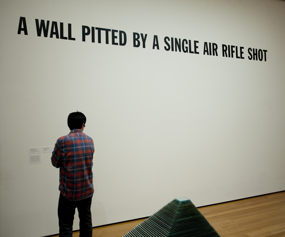
Lawrence Weiner, a fine artist born in 1940, has an incredible job: he designs museum displays that are stark, bold and simple.

Lawrence Weiner’s exhibit, A Wall Pitted by a Single Air rifle Shot, on display at the Museum of Modern Art in Midtown Manhattan.

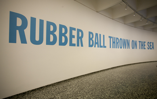
His work is on display at the big museums. The Hirschhorn Sculpture Gallery, one of the many Smithsonian museums in Washington, D.C., features his work, “Rubber Ball Thrown on the Sea” and the Museum of Modern Art in New York City has his work, “A Wall Pitted by a Single Air Rifle Shot” on display.

These works are very large typographic works, applied to otherwise undecorated walls. The Hirschhorn Gallery work is painted directly on the wall. I couldn’t get close enough to the MOMA display to determine if it’s painted or made of vinyl lettering.

Rubber Ball Thrown on the Sea, is installed at the Hirschhorn Sculpture Gallery in Washington, D.C. The letters are over two feet tall.

I attempted to figure out the exact font for these works using What They Font, but didn’t get them precisely. They are slightly compressed sans-serif news headline style fonts, devoid of ink-traps, displaying simple “headlines” with Weiner’s messages.

Weiner is considered a “conceptual artist.” His works have been shown in many museums and galleries around the world. Many are typographic in nature, some are more “conceptual.” At the MOMA, Weiner has a work which involved removing a 36-inch square of sheetrock from the museum wall. That’s it.

Forgive my cynicism. I like his typographic work. I just wonder how one gets paid to have a museum remove the wall board from the gallery wall and give the artist credit for it.


Posted in Art | Leave a comment

MOMA exhibits 23 digital fonts

I spent the day at the Museum of Modern Art in Manhattan. It’s a delightful place, filled with paintings and sculptures dating from the late 19th century to the present.

Famous for its industrial design displays and its graphic art, MOMA has occasionally turned its attention to typography.

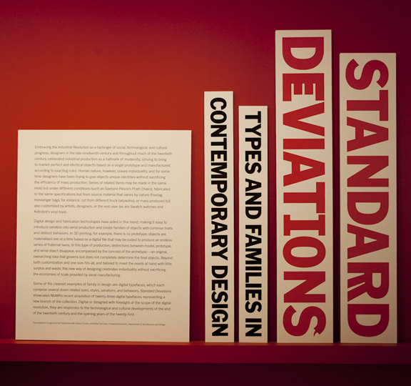
In the current exhibits is an homage to a new set of 23 digital typefaces that have been acquired by the Museum. These are on display on the Second Floor in a show entitled Standard Deviations.

With a strong bias toward the work of Matthew Carter and Zuzana Licko, the show has examples of alphabets on the walls, and special animated videos on a series of computers on one counter. The animations were done by Émigré Fonts in Berkeley (and one features an incorrect apostrophe!). There are a few fonts by Hoefler-Jones, and a couple of independents also.

This is one of several panels showing the Museum’s new additions of digital type fonts.

There are handsome display panels explaining typographic basics, terminology, and technique, and on each of the examples is a description of the artist and his or her motivation for making the alphabet on display.

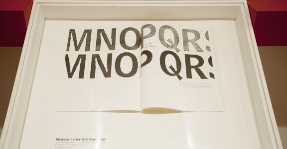
Matthew Carter’s Bell Gothic Bold is shown here in a display case. The font, which was designed by Carter for AT&T telephone directories, is also shown at appropriate sizes (8 pt. or smaller for the directory) and inappropriately — about four inches tall for the large display.

I always feel proud when a museum or a non-graphic arts organization or publication brings attention to the work of typographic artists. It’s nice that they have their moment in the spotlight.

MOMA’s acquisition and display of these digital fonts is appropriate and well-deserved.

Posted in Art | Leave a comment

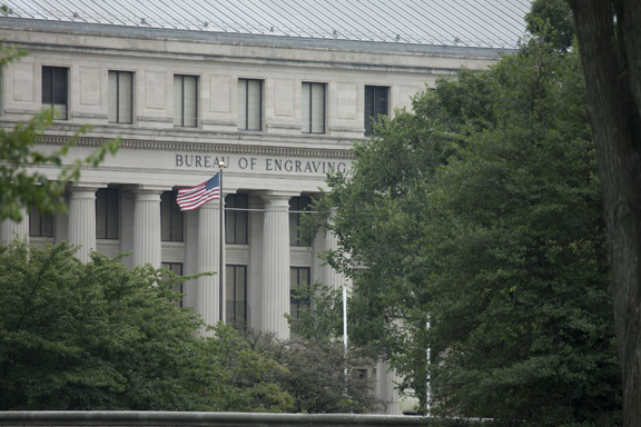
On the ground floor of the Bureau of Engraving and Printing

This entry was updated on October 27, 2011 to add photos.

Yesterday I got the tour of a lifetime at the Bureau of Printing and Engraving in Washington, D.C.

I had an appointment at 10:00 a.m. I expected it to last 90 minutes. This was not the public tour, but a “Distinguished Guest” tour. It was led by a delightful young man named Kevin Nance who gives tours to senators, congressmen, the Secretary of the Treasury… and me.

I had arranged the tour through the Director, Larry Felix, who is very supportive of graphic arts education. He came to Cal Poly last year to speak to our students about the Bureau, and about the process of printing currency.

The tour began with a visit to the office of Letter and Script Engraver Dixie March. Dixie is the person who engraves the words into the plates that make money. She can make THE UNITED STATES OF AMERICA look as glorious as anyone ever has. Every time you take a piece of paper money out of your wallet, you are looking at her work.

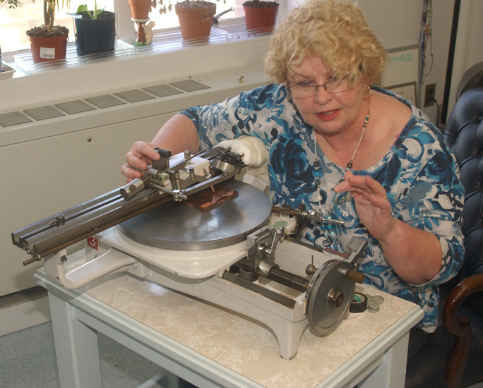
I was attracted immediately to a ruling machine that stood on a rolling stand in her office. “I have one of these!” I exclaimed, “…but I don’t know how to use it.”

At first I think she might have thought me crazy. I do have one of them – it’s located in the Shakespeare Press Museum at Cal Poly. A former student and I attempted to figure it out a year ago, and we got pretty close. Dixie gave me a thorough demonstration of her machine, and now I can make another attempt at using it when I get a chance.

Dixie March, Letter and Script Engraver at the Bureau of Engraving and Printing at her ruling machine. She was showing me how it works so I can learn how to use the one I have access to in the museum at Cal Poly.

On Dixie’s work table was one nickel sheet that contained 32 images of the U.S. one-dollar bill. She demonstrated how she checks it for imperfections, making microscopic corrections with microscopic tools – tools she makes herself. When the plate is complete, it is chrome plated and prepared to run on one of the Bureau’s gravure presses. These plates last only about 800,000 impressions, a result of the abrasive paper and special inks used for currency printing.

After leaving Dixie’s office we were taken to the office where components of currency engravings are combined on a huge hand-cranked machine called a Transfer Press to make composite plates. These machines, some dating to the 19th century, are used to make the master plates that are used to make the 32-up plates for printing. The process of putting together elements of a banknote on these machines is called siderography.

The Bureau is an example of art-meets-manufacturing. There are numerous people in the building whose 19th century skills are known to only a few dozen craftsmen and women in the world. There are also experts in precision machining, quality control, machine vision systems, and mass production. It’s unlike any printing plant I have ever visited.

In the rooms that followed, my tour took me to the offset platemaking department, to the offset press, and ultimately to the gravure press, the numbering and packing department, and the shipping area.

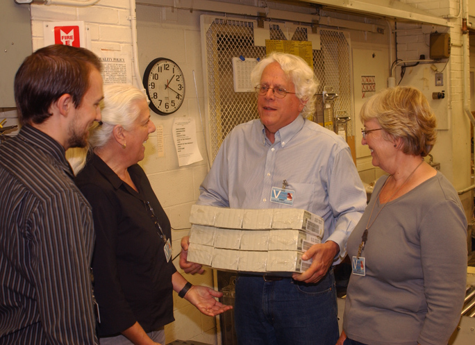
In a delightful photo-op, I had my photo taken, holding $1.2 million in freshly packed $100 bills. On the wall in the press room is a sign that says, “Free Samples – Tomorrow.”

What a burden! This is me with $1.2 million in freshly-printed $100 notes. It was fun to handle that much money. They made me give it back.

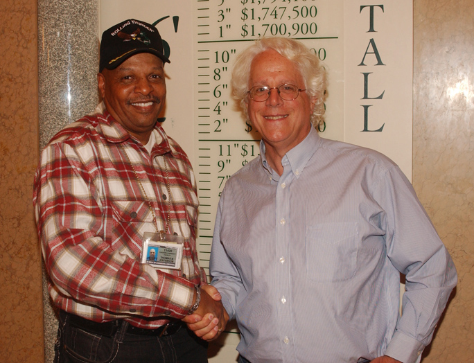
The photos above were taken by Bureau Photographer Thomas M. Jefferson. Director Felix assigned him to accompany me and my family on the tour.

This is Bureau photographer Thomas M. Jefferson and me at the Bureau of Engraving and Printing.

Oh yes! I’m writing a new book. That book will be available in 2012, and I will crow about it here. You will not fail to notice.

Click below to get on my mailing list. I’ll let you know when the book is printed – target date March, 2012.

Posted in Uncategorized | 3 Comments

A dream fulfilled

The smokestack of the Hamilton Wood Type Manufacturing Company. This beautiful brick stack stands above the factory that once produced type and cabinets for printers. Today, the building houses the Hamilton Wood Type Museum.

I spent an extra day in the midwest after GraphExpo last week. A friend and I drove four hours north of Chicago to Two Rivers, Wisconsin, to visit the Hamilton Wood Type Museum.

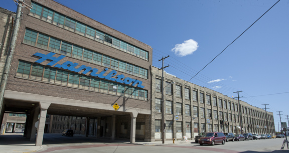
The Hamilton factory dominates the town of Two Rivers, Wisconsin.

The building is a formidable 19th (and early 20th) century manufacturing plant the size of a city block, with a giant smokestack with Hamilton Mfg Co spelled in white bricks. The three-story facility is still a working factory, used by a company called Fisher-Hamilton, which manufactures laboratory furniture and chemical fume hoods. Apparently a few dozen people still work in the Two Rivers plant building these products.

The first floor on the south end of the factory is now occupied by the Hamilton Wood Type Museum, the remains of what was once a huge manufacturing operation that made wood type, type cabinets, type drawers, furniture, and all of the accoutrements of a letterpress printing plant.

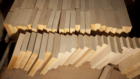
Blocks of type-high maple are stacked in the museum, adjacent to the pantograph-router, where letters are cut from patterns.

The business was founded in the year 1880 by James Edward Hamilton (incorporated in 1889), who went by the nickname Ed. He began his business in type-making when the local job printer asked him to make some wood letters for a poster. The type he made was successful, and he was asked to make more.

Hamilton’s first work in type-making was with Holly, which he cut with a scroll saw and laminated on a wooden base to make it type-high. His type was called Holly Wood Type, and he went into competition with the east coast type manufacturers Tubbs, Wells and others who were making type out of end-grain maple and other hardwoods. Hamilton’s laminate Holly Wood Type was comparable to, or better than his competitors’ offerings, and he made a name for himself among the nation’s printers.

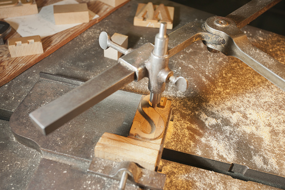
In the center is a wood type pattern. The pantograph follower chases the pattern (operated by hand), as the router cuts the same letter in a block of maple 18 inches to the right. The pantograph allows the pattern to be scaled, making it possible to make various sizes of type from a single pattern set.

Ed Hamilton was also very good at marketing; he worked tirelessly to sell his wood type to newspapers and job printers. He sent sample letters to potential customers, with an advertising and price sheet enclosed, and the orders started to come in.

The Hamilton Wood Type Company soon had hundreds of employees, a larger building, and began to manufacture printer’s cabinets, desks, shelves and other cabinetry needed in the printing trade. Type was the biggest part of the business, but wooden products of all types made the company the go-to organization for printers.

The router cuts the pattern of the letter into a small block of maple, making a single character of wood type.

The company’s wood type selections grew, and the volume of shipments grew also. A printer could order wood type from less than one inch in size (36 point type was typically the smallest), up to huge letters 18 or 24 inches in size.

And, Hamilton’s type was as beautiful as it was functional. Though the Holly Wood Type had been successful, Hamilton switched to the more traditional end-grain hardwood type, sanded and polished to perfection before being cut into letters.

These are the chisels used by craftspeople in the finishing of wood letters. Where the round router cutter leaves a round corner (interior), a chisel can make it sharp and angular.

The factory closed in the 1980s, and several years later the community of Two Rivers, Wisconsin, reopened it as a public museum, and an educational organization. Today, old-timers who worked in the plant come around and explain the process of making wood type to the young museum staff. This helps to keep the story of the Hamilton Wood Type Museum alive.

Though the Hamilton Wood Type Museum has each of the machines necessary to make wood type, the organization seldom makes any production quantities of type. My observation is that the planing and sanding machines on display will not work, so preparation of maple blanks for type-making would require more modern machines (perhaps located in a part of the museum not accessible to visitors?).

The pantographs used for the actual cutting of type are still in the plant, and are still functional. The two routers mounted on the pantographs in the demonstration area are powered by compressed air instead of the original steam-powered routers, and they appear to be able to make type just as Hamilton did when the plant was running (I would have loved to try it).

The museum is a wonderful place that kindles memories of letterpress printing, and encourages people to learn about the process. I have long wanted to visit the plant, and now that I have seen it, I feel as though it is a dream fulfilled.

Posted in Uncategorized | 1 Comment

Getting to say I told you so

(without a nagging tone of voice)

It is rare that a parent can enjoy the sheer thrill, the ecstasy of being able to revel in saying “I TOLD you so.” Heck, the more I think of it, it’s rare that anyone can say it.

It’s rude; it’s shrill; it’s condescending, but boy is it fun!

For years I have been lecturing on the future of digital printing. I have taught hundreds of students in Graphic Communication about the electrophotographic printing process, about the various devices that image with powdered plastic and electrostatic energy. It’s delightful stuff, but I think that toner has met its match with ink-jet.

And I have felt this way for years. Ink-jet printing machines of various types have swept into the screen printing arena, taking the lion’s share of the sign market, creating new industries for point-of-purchase, three-dimensional display, and interior décor fields.

This is the Xanté Excelagraphics printer featuring Memjet ink-jet technology. It’s fun to watch it print, because it seems so unlikely that it can print as fast as it does.

For wide-format, photographic, and display signage (wide-format is defined as printing up to 48 inches in width), ink-jet is essentially the only way to go. Only very-large-format offset presses can compete, and there are very few of those around. When they do compete, it must be on long runs, so ink-jet wins most of the time.

For office printing, workgroup printing, and general business printing, toner leads by far, with ink-jet being the realm of college students in dorm rooms with hundred-dollar ink-jet printers and expensive ink habits. Toner is expensive also (we just don’t hear about it as much).

For about a decade I have been aware of the work being done by Memjet, and their corporate sponsor, Silverbrook Research. There have been a lot of articles and industry rumors about the company. About six years ago I was briefed by a Memjet executive about their MEMS fabrication efforts and the idea of a massive ink-jet head.

The videos started showing up on the Memjet web site a few years ago showing labels literally shooting out of a high-speed printer in full color. The others showed a (poor, lonely) toner printer warming up while the Memjet prototype printer fired-out finished pages at less than a second each.

The one that got my attention was the wide format printer prototype printing a huge panoramic photo at a speed that humbles those of us with conventional boustrophedontic (I can go years without being able to use that word) ink-jet printers.

So, we as an industry have been salivating for years over the coming-very-soon Memjet printers, and it’s delightful to see two of them here at GraphExpo this year.

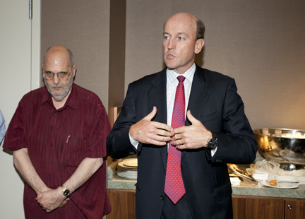
Len Lauer, President and CEO of Memjet, announces the Excelagraphics-Memjet collaboaration at a press conference on Monday, September 12. Behind him is Frank Romano, who introduced the product, and used the phrase “disruptive technology” to describe the machine. I usually blanch at the use of that phrase, but in this case I agree with him. Memjet technology (and similar devices) are in fact disrupting conventional printing systems, and will continue to do so in the near future.

One is the Neopost AS-950C digital color printer; the other is the vaunted wide-format Excelagraphix printer from Xanté which uses a set of Memjet heads to print a 42-inch path at either six or 12 inches PER SECOND.

I own an Epson 44-inch wide-format printer. I use it for fine art printing, commercial posters and graphics, and for photographic printing. When it prints at the resolutions I love (1440 and 2880 ppi) it takes a long, long time to make a print. But, I love it.

Imagine a printer of similar (I intentionally didn’t use the word “equal”) quality printing many times faster, and then imagine the impact on the graphic arts industry. Imagine a printer that can produce a 96-inch long poster, 42 inches wide in eight or 16 seconds.

One no longer has to imagine that. It will soon be available from Xanté (spring, 2012 we are told) with this new machine.

This is the ColorDyne press, a label printing machine that uses Memjet ink-jet heads. One other Memjet product was visible at the show, an envelope printer.

And, Memjet executives whispered in my ear on Monday evening that they are working with two other wide-format printer manufacturers to bring other versions of their high-density print head to market.

Posted in New technology | Leave a comment

A moment of silence at GraphExpo 2011

From GraphExpo 2011 in Chicago

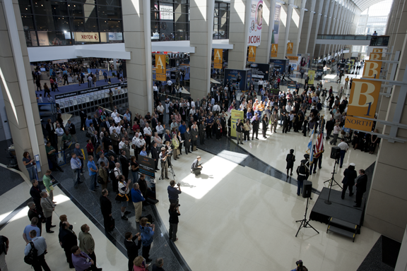
For a brief moment on Sunday, September eleventh, GraphExpo came to a very quiet halt; we all stood still, and we listened while the bagpipe played. Hundreds of GraphExpo visitors stood in the building just outside the main show and paid respects to those who died in the terror attacks of 2001.

The memorial moment was appropriate and respectful.

The color guard exits the hall at the end of the 9-11 memorial service. The event was amazingly quiet, and dignified. No presses, folders or die-cutters could be heard in the background.

At an event where “normal” is the cacophony of paper folding, presses snapping, and bejeweled dancers gyrating in the Xerox booth to music, this few minutes was a reflective break.

Ten years have flashed-by, and GraphExpo has changed dramatically — along with the economy and our industry in general. The 2002 GraphExpo was a fractional reflection of the previous years, but over the years it has grown back to a show that is nearly as big as the heyday (I remember years when the show occupied two large halls at McCormick; now it is just one).

The visitors, about 25,000 total over the four-day event, still come with money in their pockets, and they buy presses and all of the accoutrements of the printing trade. They also learn about e-books, iPads, smart phones and the electronic delivery of documents — all things which characterize the changes we have seen in the last decade.

Though I was not at GraphExpo on 9-11-2001, I know a lot of people who were, and I am grateful that I was at home that day in my quiet suburban home with my family. I remember the stories of shared automobile journeys across the country, of planes abruptly landing in Lincoln, Nebraska, of people hiring taxis to drive them to Pennsylvania from Chicago.

This has been an “interesting” period in our history.

I was glad to have been witness to the moment of silence at GraphExpo 2011, and I salute those who organized and participated in the dignified service.


Posted in Uncategorized | Leave a comment

Sleeping in the shadow of the Lakeside Press

First of my reports from GraphExpo 2011:

I awoke this morning in the Hyatt McCormick hotel in Chicago, adjacent to the McCormick Place, a convention center that is the legacy of the former Editor and Publisher of the Chicago Tribune, Robert Rutherford McCormick (1880–1955), whose tireless work for decades turned Chicago into a great place to have a convention.

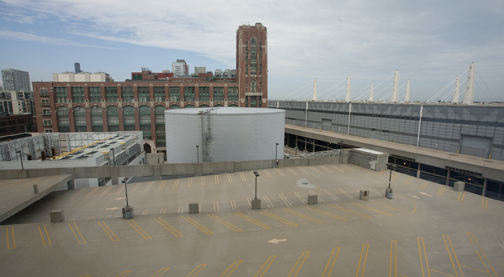
This is the view from my hotel window, a surprisingly historic structure in the background.

Outside my window is a large parking lot without a single car in it, and beyond that a huge (and really ugly) water tank. Beyond that the now-abandoned R.R. Donnelley & Sons Building.

Abandoned may not be the right adjective. It’s not being used for printing anymore, Donnelley having moved their headquarters into the Loop, and their printing plants scattered to the four winds. It’s not clear from the outside if the building has anyone or anything still inside.

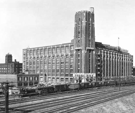
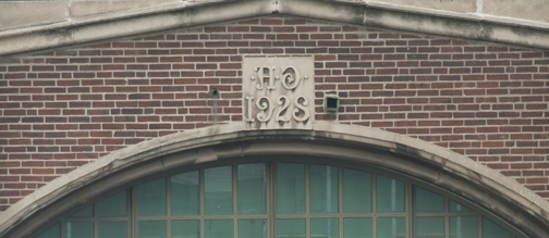
The R.R. Donnelley Building was built originally in 1928, and the tower added in 1949, judging from the inscriptions on the building, and a small amount of research I have done online. This photo dates from 1955. The McCormick Place convention center now sits astride these railroad tracks.

The first time I saw the Donnelley building was 1973, when I visited the Donnelley plant headquarters as a student of Graphic Communication. At the time the building housed floors and floors of (mostly) men, working on the Sears Catalog. I remember seeing first-hand these skilled craftsmen “stripping” the emulsion off of black and white photos, and floating it onto another carrier film to make composite images for pages of the famous catalog. It was on that day that I finally understood why the process of assembling film for printing is called “stripping.”

This is the inscription over the main door of the building, stating that the building was built in 1928. Higher up on the building is another inscription saying that it was built in 1949.

Complete film pages, comprised of a number of photos floated together onto a single carrier film, were later converted into halftones, or built into composite forms that were used to make rotogravure cylinders. We didn’t have any of the modern conveniences like digital photography and Adobe Photoshop. Everything then was done by hand, and some of the work required a degree of skill that has not been seen in decades.

The thing I remember most about my tour of the Donnelley building was the entrance to the Donnelley Board Room. There were columns of stone cut with precise letters by the Catholic priest and calligrapher, Edward M. Catich (1906-1979). The lettering was based on rubbings of the Trajan Column in Rome, which Fr. Catich studied while he lived and worked at Pontifical Gregorian University there.

All around the Donnelley Building are these printer’s crests, made in ceramic and glazed with colors. It’s an impressive monument to the printing industry.

I had, at the age of 23, never seen anything quite so beautiful. I had studied and taught calligraphy as a young lad, and this was like going to the source (even if it was a replica) of the Trajan Column letters. Here, before my eyes, was the original Roman alphabet as cut by the famous friar. I was awe-struck, and said as much to my host (though I remember he was not as moved as I was).

The original R.R. Donnelley “logo” featured an American Indian in silhouette. Over the years, it was modernized several times, and today is simply lettering (nice lettering) with the R R Donnelley name only (no periods after the Rs).

When Donnelley opened their new, glassy downtown-Chicago building in later years, I hope they took the carved columns with them. It would be a shame for no one to see the beautiful workmanship.

And today as I type this, the old red brick building is about 40 yards from my desk. It now sits adjacent to the aforementioned water tank (cooling for McCormick?), and it looks lonely.

Adorning the exterior of the grand old building are the crests of famous printers and typographers. This heraldry is done in bas relief, beautifully crafted and glazed in permanent colors. It’s a grand testament to another era of printing.

It’s also a fitting place for Chicago to have put the McCormick Place convention center. Here every year tens of thousands of printers converge on this hallowed location to look at the new, the colorful, the digital.

I wonder if they know anything about the building just outside the hall?


Posted in History | 6 Comments

Web-safe colors – time to move on!

This entry appeared originally on What They Think in July, 2010. It has been updated.

Back in 1987 when computers first started to have color monitors, the audience grew into two distinct groups, those with money (who could display a potential of 16,777,216 colors on their CRTs), and those with less money (who could display a potential of 256 colors on their CRTs). This was based entirely on the cost of the display “adapter” – a card that plugged into the computer to drive the CRT. The 16-million number is called 24-bit color (2E8 x 3).

These “adapters” were powerful digital-to-analog devices which represented a significant part of the price of a computer.

Over the years, computers got faster, and these video cards got better and less expensive.

When the World Wide Web was first designed in 1990, the number of computers with 24-bit capable video adapters was pretty small, so the designers of the web chose to designate a small number of possible colors for display in HyperText Markup Language (HTML). The issue of “safe” was brought about by the differences between the gamma standards for IBM and “compatible” PCs and Apple Macintosh computers. Of the theoretically possible 16 million colors, it was determined that only 216 would be designated as “safe” allowing those with less-capable display cards and those with more capable cards to see the same colors on their CRTs.

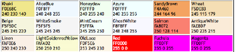
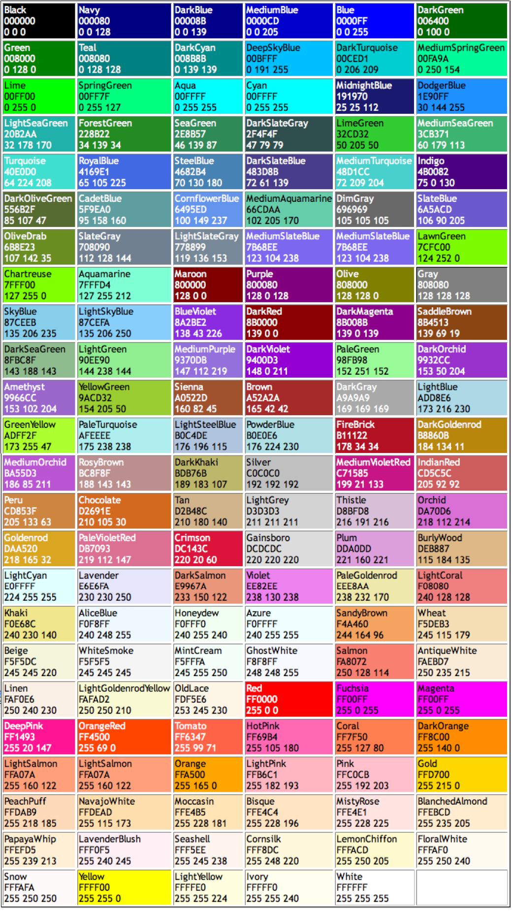
This is a sampling of “web-safe” colors, and interestingly, they can be called by their names (OldLace for example) in HTML (isn’t that quaint?).

The number 216 was chosen so that six shades of each of the red, green and blue colors could be shown (6E3), and those 216 colors were further affected by the gamma (contrast and saturation curve) of the CRT. Windows has traditionally used gamma 2.2 while Macs have traditionally used gamma 1.8. These differences are visible.

It has been a long, long time since a computer of either type has had a display card that can only show 256 colors (about 15 years allowing for those who hang on to old technology), essentially “forever” in web terms. Yet today some people still hold to the concept that in order to show a color in a web page one must use the “safe” colors. This is utter nonsense, and it’s time to get over it.

The full palette of 24-bit color is available on every computer display today. Every single one. No exceptions. Anyone who can’t display the 24-bit palette needs to get a new computer, or a newer used computer (they all have the complete palette).

In Wikipedia, which has an extensive explanation of “web-safe” colors, there is an interesting comment: “The use of ‘web-safe’ colors has fallen into practical disuse, but [has] persisted in culture.”

The reason I brought this up in today’s blog is that I overheard a fellow-teacher recently explaining that all colors in a web site had to be “web-safe” and that students should not choose colors outside that palette. I cringed, as I thought we had made some progress since 1995. I thought that, since I have had a 24-bit color capable display for almost 20 years, the rest of the world had made similar steps. But I must be wrong. The selection of type fonts must also be limited to those that we can order from the Ludlow machine.

Here’s the scoop: forget web-safe colors; though they are pretty, they are an unnecessary concept, except as a subset of the 16-million-color palette that is available on all of our computer displays. So, pick any color you like! Use it or abuse it, but don’t buy the hype that colors in a web site must be “safe.” That is anachronistic nonsense. We are in the 24-bit century now.

Here are all of them: I like “MistyRose” the best!

Posted in New technology, Web | 2 Comments

Lawler, Brian, reports on how to put last names first

The original of this post appeared on What They Think in June, 2010. It was brought up to date today, August 21, 2011.

In a recent blog I introduced the idea of GREP styles in Adobe InDesign; that’s a really great feature for the occasional job where you want to format text as it is placed or as it is typed. It can save time in print production.

Today’s example is more common; I use it about once a week. I find I have a list of names (I am a teacher) that is in the wrong name order, either last-name first or the opposite. No matter what, it always seems to be in the wrong order.

So, I use GREP in InDesign to reverse the order. For simple lists (middle names add complexity, so I’ll discuss this later) it’s just a matter of reversing the order of the two words on each line.

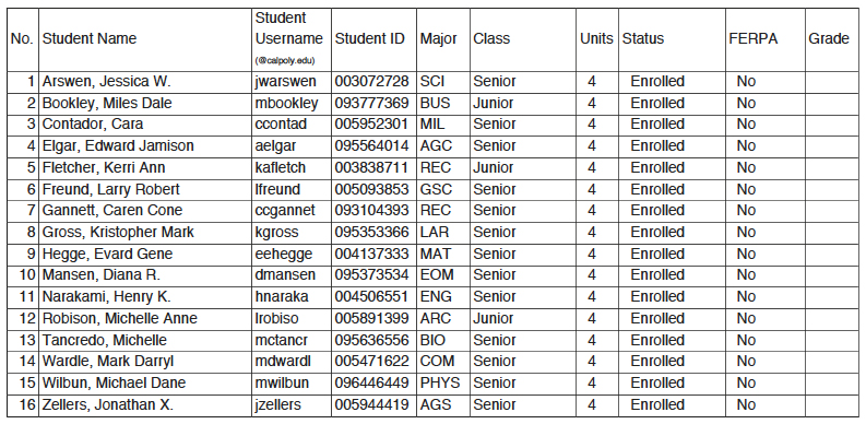
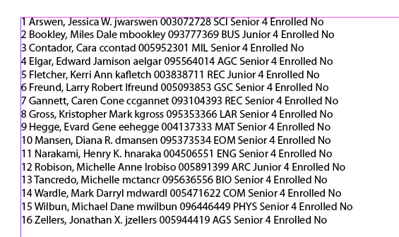
My challenge here is to take a last-name-first list, shown in its original form (PDF) above, and reverse it (while shedding some extraneous data in the process). It’s surprisingly simple using GREP. Step one is to copy the text from Adobe Acrobat Professional, and paste it onto a page in InDesign. The context is unimportant. Following is the same material in InDesign:

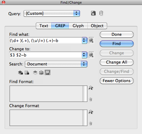
To make the change, I use the Find-and-Replace pane in InDesign, with GREP selected from the tabs there. The search string in GREP is:

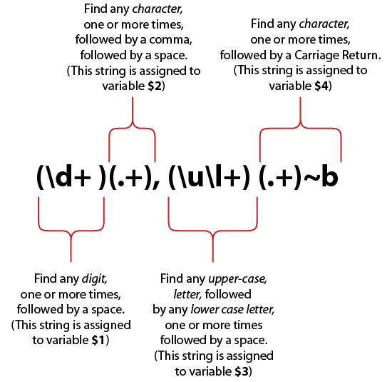
(\d+ )(.+), (\u\l+) (.+)~b

Following is the explanation of how this works:

The selections are automatically assigned to variables as shown. Once the selections are done, I reverse them in the Replace string by putting $3 before $2, separated by a space, and finish with a carriage return. This plays the data back in the opposite order. The remaining elements, stored in $1 and $4, are ignored and discarded.

Above is the functional GREP search and replace pane.

It’s delightfully easy, and it takes almost one second to complete, putting not a moment of wasted time on the clock.

The thing I like most about GREP searches, when they are needed, is how much time they save. Though the seemingly cryptic code can be intimidating, they are easy to build with the pull-down menus for the search and replace functions.

An added benefit of the GREP search pane in InDesign is that it allows you to store your successful search strings, so that you don’t have to puzzle this out more than once after you get it working.


Posted in Uncategorized | Leave a comment