
How to read a micrometer

Printers and prepress people often need to know things like the thickness of a sheet of paper, or the thickness of a blanket.

We make calculations for packing, for folding, for the spine of a book, and more, using measurements of tiny things, and for that we use a micrometer. There are several variations of this instrument, but the most common is the simple Outside Micrometer, an instrument that affords amazing precision while requiring no batteries!
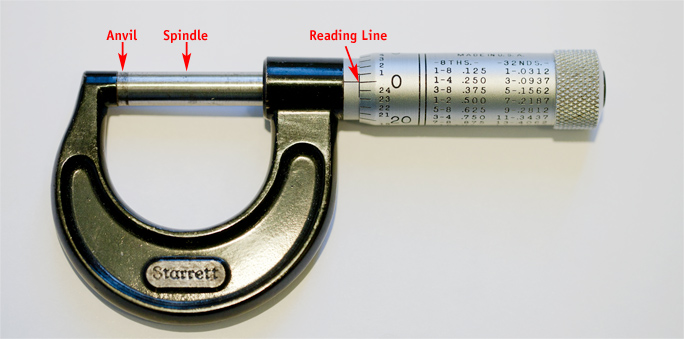
This is a common Outside Micrometer. Mine is a simple model made by L.S. Starrett of Athol, Massachusetts. A micrometer like this costs about $100 today. You can spend a little less or a lot more, depending on features.

The micrometer has a history that parallels the development of industry. A microscopic measuring tool was drawn by Leonardo da Vinci in one of his famous sketchbooks, but there is no evidence that he built the device.

In France, in 1639 W. Gascoigne invented a micrometer caliper comprising jaws and a vernier scale. The previous year he had used screw threads to measure the angles of the stars, and this probably represents the first application of the technology employed in a modern screw-thread micrometer.

In 1772, James Watt invented a table-top micrometer. He is more famous for his invention of the steam engine. Other machinists and mechanics followed in their footsteps.

The common micrometer is an essential tool for making small measurements, but for some it’s a mystery. Let’s remove the mystery from the micrometer!
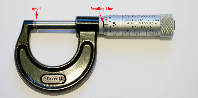
This image shows the micrometer after reading the thickness of a piece of paper, which measured just less than six thousandths of an inch. The correct reading is 0.0055 in.

It’s a simple machine consisting of a screw spindle inside a sturdy frame. The threads of the spindle are the key to its precision. Each turn of the spindle represents 0.025 inch, or twenty-five hundredths of an inch. Four turns of the spindle represents 0.1, or one-tenth inch.

To measure the thickness of a piece of paper, one inserts the sheet between the end of the spindle and the anvil (some micrometers need calibration, requiring the spindle to be closed, then the barrel – on the right – to be set to zero.) One then gently closes the gap between the spindle and the anvil, with the paper in between.

A typical sheet of paper is between 0.002 and 0.008 in. The thickness is called its “caliper.”
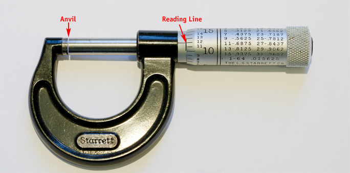
In this example, the micrometer is reading exactly 0.012 inch. This is the thickness of an offset printing plate I read to determine the packing on a printing press.

Plates are typically 0.012 in. (which is spoken as “twelve thousandths”) or slightly more than 1/100 inch.

The nice thing about an Outside Micrometer is that you can easily measure to about half of its basic precision by estimating the mid-point between two of the lines. This means that a micrometer which is precise to 0.001 is actually capable of making readings that are 0.0005 in. This is an incredibly precise measurement.
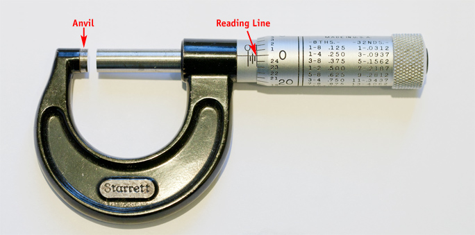
In this example the opening is very wide, at exactly 0.10 inch. It takes four complete turns of the thimble (on the right) to get to 0.10 inch; each turn is 0.025 inch. Notice that there are four vertical ticks visible to the left of the arrow; the sum of these is 0.10. The capacity of this instrument is one inch – 40 turns of the thimble.

So, when the measurement falls between two lines on the Reading Line, you can say that a sheet of paper is 0.0045, or “45 ten-thousandths” of an inch. Most people who use micrometers would say “Four and a half thousandths.”

We often hear newscasters referring to things in football-field units, and very small things a “the thickness of a human hair.” What, exactly, does that mean? How thick is a human hair? Mine is 0.0023 in. My cat’s hair is much thinner: 0.001 in. I have measured human hairs that are much thicker than mine, so it’s not a reliable unit of measure except in a metaphorical sense.

U.S. currency is 0.004 in. thick, or the thickness of two human hairs. But, let’s not split hairs over this.

Now there is no mystery to the micrometer.

Posted in Education | Leave a comment

Cal Poly dedicates a new Konica-Minolta bizhub C8000 digital press

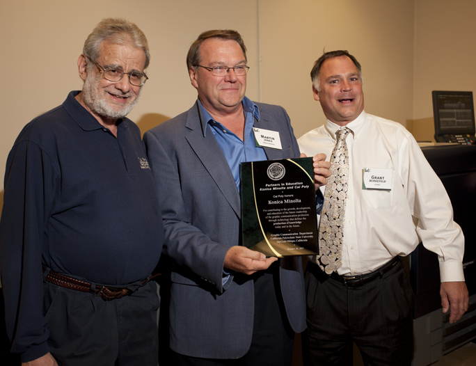
At a dedication ceremony today in the Graphic Communication Department at Cal Poly, Dr. Harvey Levenson, Martin Jones of Konica-Minolta, and Grant Berkefeld of Ultrex Business Systems of San Luis Obispo, California, celebrated the installation of a new Konica-Minolta digital press contributed to the department.

Harvey Levenson, Department Head of Graphic Communication at Cal Poly with Martin Jones of Konica-Minolta, and Grant Berkefeld of Ultrex Business Systems celebrate the new Konica-Minolta press at Cal Poly.

The BizHub is Konica-Minolta’s largest and finest digital press, providing toner-based printing with a complete range of binding components in an in-line system.

The system can print, fold, staple, saddle-stitch or perfect-bind and deliver complete documents in full color on a variety of paper stocks.

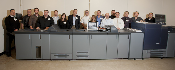
This is the bizhub C8000 from Konica-Minolta. Behind it are all the people affiliated with Konica-Minolta who attended the dedication. Some are dealers, some are distributors, and some are trainers from Konica-Minolta.

Attending the dedication ceremony today were representatives of Konica-Minolta and various distributors, dealers and trainers affiliated with the company. Also present were students of Cal Poly’s University Graphic Systems, a student-run printing enterprise as part of their baccalaureate program in Graphic Communication.

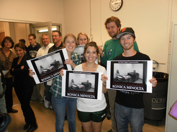
Cal Poly Graphic Communication students Ashlyn Aiu, Jenny Gonzales and David Messer hold posters commemorating the dedication of the Konica-Minolta digital press. Photo by Harvey Levenson.

The digital press will be used for classwork, production printing for the department, and for education in the field of digital printing technology. The machine is part of the school’s 33,000 square foot printing laboratories which include sheet-fed offset lithographic presses, flexographic printing machines, a newspaper press (featured in a blog last week), and other printing technologies.


I’m writing a new book about printing processes and prepress. Click on the link below to give me your e-mail address, and I will let you know when the book is published (target date is March, 2012).

Posted in Education, New technology | Leave a comment

Homage to the semicolon

I was working with a non-profit group last week to print a large poster on my wide-format printer. They had used a “free” font that was downloaded from dafont.com. It is a clever font, and I like the design. But the spacing in the original was horrible. Worse than horrible.


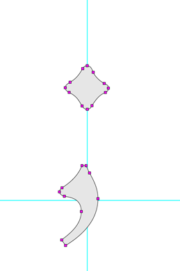
This is the semicolon from the font Centaur by Bruce Rogers. This is not the work of an amateur, and it’s no accident. The fact that it has 22 control points, and is crafted so carefully is a statement of how complex type design is. Notice also that the comma part is not centered under the upper component. That, also, is no accident. I’m sure Mr. Rogers wanted it that way.

Though the designer had done a credible job on the letters, the spaces were way too big, and the spacing of the letters within their character spaces was really awful.

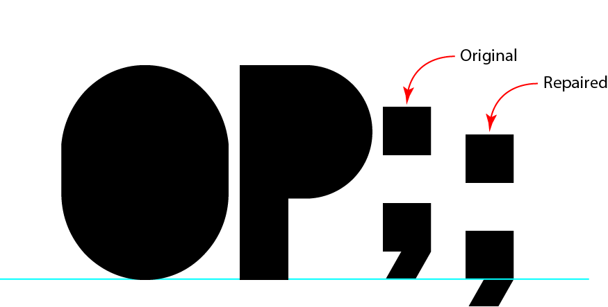
This is the font in question, called Blackout (free from DaFont.com). The original font had the semicolon in the wrong place (in my opinion). I fixed it, and a lot of spacing errors, before being able to use it.

I needed to use the font to make a series of titles for an arts presentation, so I decided I could either:

1. Set the type, then spend an hour kerning it back to “normal” or,
2. Open the font in FontLab, fix it (about an hour), then generate a new font and use that one.

I chose to do the latter. It gave me the chance to center the characters better in their spaces, and to adjust a few characters so that they sat on the baseline correctly. The semicolon was one of those.

While working on it, and the colon, I realized that people don’t use the semicolon very much these days. It’s a mark that has fallen into disuse, being replaced, I guess with a period and a capital letter on the next word.

There is nothing wrong with this; I like to use full-stops and new sentences wherever I can.

The semicolon in question was about a half-inch above the baseline, positioned in such a way as to look really odd. It was easy to fix. But I found myself wondering how the heck the designer decided to put it up where it was in the uncorrected version of the font.

It’s a comma with a period overhead. Could this designer be so detached from letter design to put it there on purpose?

Was it a case of being “artsy”?

I have no idea. But, the buyer of the font got what she paid for, and I spent only an hour repairing it; then my work was made easier.

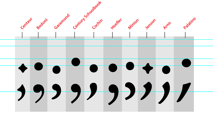
Following is a selection of semicolons from a number of fonts I like. This shows how diverse the semicolon is. The blue lines are various x-height and X-height lines (each font is different), and a baseline, which is constant.

I’m writing a new book about printing processes and prepress. Click on the link below to give me your e-mail address, and I will let you know when the book is published (target date is March, 2012).

Posted in Uncategorized | Leave a comment

Print is dead! Long live print!


My colleague Ken Macro was on an airplane recently between Minneapolis and Chicago, and found himself sitting next to a man who asked his profession. “I’m a college professor,” Ken told the man; they were at cruising altitude.

And, what do you teach? the man asked. “Printing,” said Ken. To which his neighbor said, “I thought that print was dead.”

I don’t want to accuse my pal Ken of losing his temper, but I think that’s a fair description of what happened next.

Ken insisted that the man stand up. “Stand up!” he said, and the two of them stood up. Ken pointed at various other passengers aboard the plane: “Book, book, book, magazine, magazine, book, book, book, Kindle, newspaper, book, magazine…”

And then he finished it off with, “I rest my case,” and they sat down.

I hear it all the time also, and I want to say I agree with Ken. It’s hard to beat printing when it comes to people’s reading habits. I own an iPad, and I am enthralled. I have even read a few books on it, using both the Kindle Reader app and Apple’s iBook app. I found the experience to be pleasant for fiction. The day before yesterday I bought a computer software manual on the Kindle, and I tried to read it. I just couldn’t do it. There is something about a software manual that just requires a printed copy.

I am still working my way through it, but it’s frustrating. I guess it has to do with linearity and non-linearity. The software manual is non-linear while the novels I have read are linear. One is a form of entertainment, the other is a reference book.

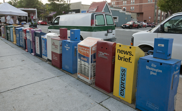
Yep. Print is dead. Here is further evidence: these are the newspaper boxes just outside the Clarendon Metro station near Washington, D.C. 20 different news and entertainment publications have boxes there. On the other side of the station are another dozen (some are duplicates).

I also hear from various people that newspapers are dead. I am here to tell you otherwise. Our local publication, the San Luis Obispo County Tribune, is an excellent example of why newspapers are doing OK. First, there will always be newspapers as long as there are high school sports. Second, there will always be newspapers as long as there are obituaries, and third, there will always be newspapers as long as there is a Police Blotter. I live for the Police Blotter.

The Tribune does the blotter exceptionally well, publishing a column every couple of days with the transcripts of 911 emergency calls – not serious emergencies, just the silly stuff. It’s called What’s Your Emergency? and it is the highlight of my morning to read it. No one can write anything this funny. An example: a woman called 911 to report that someone had put garden gnomes on her lawn overnight.

As long as there are crank 911 calls, I will subscribe to the Tribune, and I will help keep printing alive.

I’m writing a new book on printing processes and file preparation. To get more information, and to be included in my announcement of its publication, please give me your e-mail address by clicking below.

Posted in Education, Uncategorized | Leave a comment

And the violinist swiped his iPad


I am doing photography this weekend for Festival Mozaic, which is a local musical organization that holds concerts and educational events throughout the year.

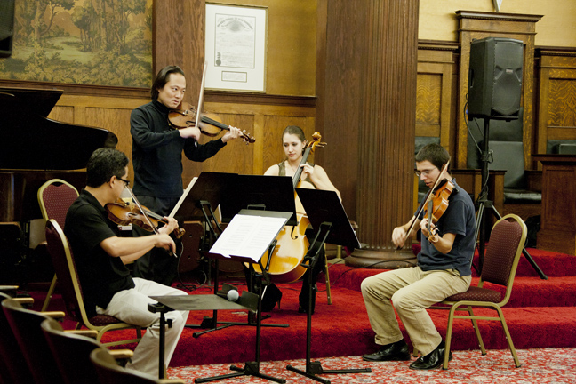
Scott Yoo, standing, plays violin in a performance/lecture for Festival Mozaic, in San Luis Obispo. Mr. Yoo is the Musical Director of the organization. He is playing here with Jason Uyeyama, violin; Madeleine Kabat, cello; and Ben Bartelt, viola.

My assignment on Friday evening was to make photos of a string quartet in a lecture-concert led by Scott Yoo, the Festival’s Music Director and one of its finest performers.

Yoo is also the musical director of the St. Paul Chamber Orchestra and Mexico City Philharmonic Orchestra. His accomplishments read like a modern-day Mozart in a world of performances.

Mr. Yoo was directing and playing in an intimate hall to a small audience. I was trying not to make shutter-click noises, except when it would not bother the performers or the players. I started on the right side of the room, with a long lens. I noticed that Yoo would play his violin, sometimes feverishly, then reach to his music stand to change the page of his music. But there was something different.

On Scott Yoo’s music stand was a white iPad with the pages of the string quartet he was performing. He would swipe the iPad when making a page change. Also on the stand is some printed sheet music that he used during the concert/lecture.

When I moved to the left side of the room, I realized that he was swiping an iPad that was on his music stand. Mr Yoo had arranged all of his music on the iPad, and was swiping between pages. It was the first time I have ever seen this in a musical performance.

I remember just 18 months ago when Time magazine asked an open-ended question regarding the iPad: What’s it for?

Posted in New technology, Uncategorized | Leave a comment

The Lytro plenoptic camera


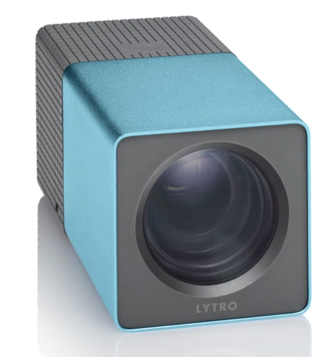
I bought a Lytro camera today. The device is due to ship in February or March next year, and I am looking forward to getting mine. I ordered the blue one:

“My” blue Lytro camera. I will be waiting by the mailbox until March to receive it. The camera takes photos by recording light waves, and processes them into photos after the fact. The images it creates can be focused or refocused anytime with special software. Photo courtesy of Lytro.

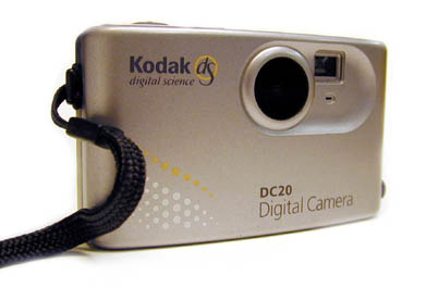
This won’t be the first new camera technology I have bought. I once bought a digital camera from Eastman Kodak Company, at about the same price. It took 12 photos in a sealed case (no removable memory) it used a serial cable, and each image was 640 x 480 pixels in size. That camera, called the DC20, was cute, and it introduced me to digital photography.

I am gambling on the Lytro camera being the beginning of something exciting. It is the first commercial manifestation of a plenoptic camera, one which captures light rays rather than images.

The idea is that you can take a photo and focus it later. The camera will capture 11 million “light rays” which capture the way that light comes into the camera. After taking the photo, it will be able to be processed using a Macintosh (only) application that can convert the light rays into an image. After the image is made it can be refocused again and again dynamically.

You can try Lytro images online at Lytro.com. They are very different, and very exciting.

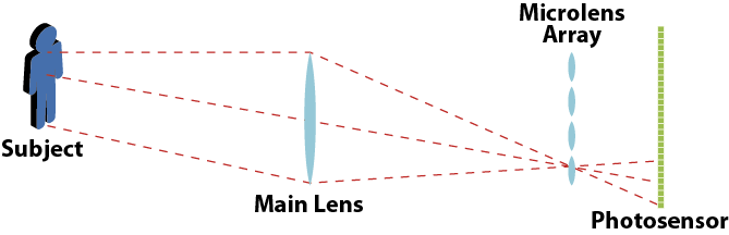
The camera is the invention of a graduate student named Ren Ng, who made a working model of the camera in 2004 while a researcher at Stanford. His thesis on the topic explains how the camera works, and how the processing is done “in post.” A simplified diagram of the operation of the camera is shown below.

This illustration of the concept of the Lytro camera is taken from a drawing by Ren Ng, in a Stanford University Computer Science Tech Report (CSTR 2005-02, April, 2005, Image copyright Ren Ng, 2004-2005). Mr. Ng and his colleagues inserted a microlens array in front of the sensor in a digital camera. The sensor collects all of the light in all of its angles as collected on the sensor. Algorithms process the information after exposure to define focus.

After completing his work at Stanford, Ng and several of his colleagues started Lytro, they got some venture capital to develop the invention, and now they are – almost – ready to ship.

The new Lytro is being marketed heavily to the younger generation, with cool, hip people shown in the publicity, taking photos of each other in social scenes. The photos are then uploaded to a web site where they can be shared with the entire community, and everyone can focus on his own favorite spot in the scene. The photos will be quite popular on Facebook, I am sure.

My Kodak DC20 camera. It was the first digital camera I owned, and I credit it with giving me the bug. It had the capacity to record 12 photos of 640 x 480 resolution. It had no removable memory, so the photos had to be downloaded with a serial cable.

I bought the Kodak DC20 camera in about 1994, and I sold it a few years later on eBay (I probably should have kept it as a memento). With 17 years’ experience in digital photography I am now capable of making photos that are better than anything I did with film, and am able to leap tall buildings in a single bound.

Now imagine a camera that doesn’t need to be focused when the photo is taken, one which has a f2.0 aperture, making it capable of capturing images in very low light, and one which produces photos that can be modified after exposure. Now imagine that technology 17 years hence. Will Canon, Nikon, and others offer silent, mirrorless SLR cameras that can capture light rays?

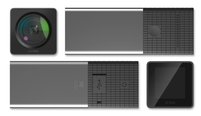
The Lytro cameras feature beautiful industrial design. On the back is a small touch screen, which allows the photographer to touch the screen where she wants the camera to focus. The camera has a zoom lens, and a fast f2.0 maximum aperture. Once the images are captured, they can be viewed on the camera, or transferred to a Macintosh computer over USB, then converted with the Lytro Light Field Engine, a program that converts the light-wave image into a useful photograph. Photo courtesy of Lytro.

I would like that, because often enough I take a photo with my $7,000 Canon camera, and it chooses to focus on something in the background when I think it should be focusing on something in the foreground. I can blame only myself for this, as focus is my responsibility. But, just imagine being able to change the focus of an image in Adobe Photoshop (they have announced this as a possible feature in a future version of the software), or in the Lytro camera software.

I like Lytro’s kind of imagination, and I am happy to invest in it.

I’m writing a new book on printing processes and file preparation. To get more information, and to be included in my announcement of its publication, please give me your e-mail address by clicking below.

Posted in New technology, Photography, Uncategorized | Leave a comment

Women in command of their printing press


I spent the evening Sunday with the team of talented young women who print the Mustang Daily, Cal Poly’s full-color newspaper.

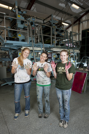
Cal Poly Graphic Communication students Sarah Eckberg, Julia Cross and Emma Goulden stand in front of the newspaper press in the DowJones Publications Lab at Cal Poly. Ms. Cross is the Head Presswoman – in charge of all the nightly crews who run the press.

Most of us say that Cal Poly has the only student-edited, and student-printed full-color daily paper in the U.S. I argue that it may be the only such paper in the universe. I have heard rumor of a student-printed paper on a small planet near Alpha Centauri, but it’s only a rumor.

The student news team has been led for the past few years by a female “HP.” HP stands for Head Presswoman (in this case).

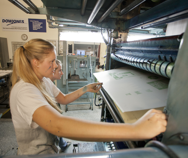
Student press operator Sarah Eckberg mounts a plate for the Mustang Daily. The paper, which has a circulation of about 6,500, is printed nightly by the student teams.

It wasn’t always so. When I was an undergraduate at Cal Poly (1969-1975) we had almost all male students, with just a couple of women who had the nerve to join us. We cast lines of type on hot-metal machines, and we printed the daily paper (then three days a week) on a Goss Cox-O-Type reciprocating letterpress machine (it was horrible!).

Over the years, the ratio of female students in our program, called Graphic Communication, has changed dramatically. Now the program is dominated by young women. Of the 311 students currently enrolled, we have only 83 young men — 26 percent.

And, on the Mustang Daily production crews, there is only one young man. One.

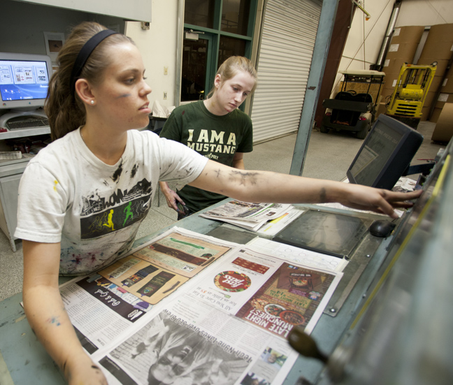
Julia Cross runs the web press to full-speed in the press run on Sunday night. Because of a web break, the run was delayed by 35 minutes. But, the complete edition was completed before 1:00 a.m. Behind her is press trainee, Emma Goulden.

This is a snapshot of the future of the graphic arts industry professionals: 74 percent female.

These young women are up to the challenge. They are in command of the ship, and it’s obvious that their gender makes no difference in their ability to perform the important task of running big, sometimes dirty machines. (At one point in Sunday evening’s press run, the HP handed out instructions to a small group of students – all young women – who had arrived late to see the press run for class credit. She said, “Grab a rag, put some solvent on it, and clean any surface you see that has ink on it.)

I was in the company of real, youthful leadership, and I was impressed.

_____

I’m writing a new book about printing processes and file preparation. To put your name on my mailing list, please click on the link below. I will let you know when the book is available (my target is Spring, 2012).


Posted in Education | 8 Comments

Another nod to early three-color photography


When Sergeii Prokudin-Gorskii traveled around Russia in the early years of the 20th century, he carried a three-color camera, one which exposed three images onto a monochrome negative plate in rapid succession. The result was color separations on film.

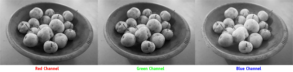
My three-color still-life of pears on the kitchen counter at my friend’s house in upstate New York. This was taken with three separate exposures made through red, green, an blue filters.

This technique is still used in the motion picture industry when archiving (actual) film from motion picture cameras. Because color emulsions fade over time, and the lifetime stability of color film cannot be assured, the master negatives are separated with red, green, and blue filters onto individual rolls of black and white film, each representing the color of the original in a non-fading emulsion. When the movie-makers of the future want to resurrect the color “original” they then print the negatives, one after the other, onto fresh color film through the red, green and blue filters, and they will have a faithful color film again.


This, curiously, presumes the availability of film printers — and film — in the future, so the whole thing may be a crazy idea.

It’s better, I believe, to scan every frame of the master motion picture, then store the digital files, and resurrect with a digital device rather than onto film. Which presumes the existence of digital devices capable of reading the files in the future, but that’s another problem.

Yet… red-green-blue photography is still an interesting way to take photos. I have done it on numerous occasions with great success. For this I use Wratten gelatine filters from a color separation camera (ca. 1975) and expose an image on my Canon digital camera with the filters held in front of the lens. I make three successive shots, and then assemble the images in Adobe Photoshop.

It’s best to photograph things that don’t move, obviously.

In my most recent effort to capture “pure” color with my (ironically color) digital camera, I set the camera to monochrome, which is only truly monochrome when set to JPG, and then captured a lovely bowl of pears on the counter of my friend Gary Stine’s upstate New York kitchen. The exposures were made on a relatively neutral countertop made of slate.

The resulting images are nice, and the composited RGB color image is excellent. I had to make only a tiny color cast adjustment of magenta to correct the neutrals once I was finished with the image.

The technique:

1. Open each of the separate color images at a resolution that is appropriate to your output needs.

2. Copy the Red channel into the clipboard

3. Choose File>New and make an RGB image with the dimensions suggested by Photoshop (It gets the resolution from the item in the clipboard).

4. Go to the Channels menu, and clock on the word “Red” then paste.

5-7. Repeat the process with the Blue and Green channels.

8. When complete, view your image in RGB, and color-correct if necessary.

Posted in Photography | Leave a comment

Admiring the most valuable painting in the world


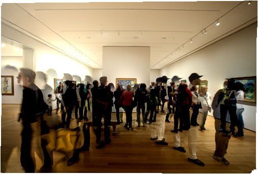
Crowds gather in the gallery on the fourth floor of the Museum of Modern Art in New York City to see Starry Night, Vincent Van Gogh’s masterpiece that hangs there, behind a nearly invisible sheet of glass. It really is something to see.

People mingle in front of Starry Night. Curiously, there are two other Van Gogh paintings on the wall to the right. No one seems to notice!

Painted by Van Gogh in 1889, the Starry Night is a study in color and style. It is the very image of impressionism. Scientists and scholars have photographed it, analyzed it, theorized about it, studied the layers of paint, and then written about their findings. In the end, everyone agrees it’s a very nice painting, certainly it’s Vincent’s best.

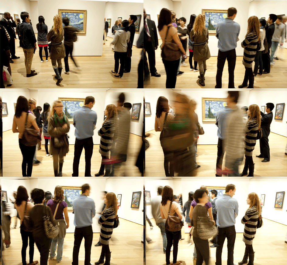
While admiring it last week in the museum, I found myself more impressed with the painting’s effect on people than the painting itself. This work of art overtakes people; they become enchanted by its brush strokes, they sigh; some weep. It’s quite amazing.

One could argue that the Mona Lisa (La Giaconda) by Leonardo da Vinci is more “valuable.” It might be, but it’s not as nice a painting. I have done the same act of people-watching in the Louvre as I did last week with Starry Night. People shuffle up to La Giaconda, they admire it, they comment on her eyes, they are scolded by the museum guards for using their strobe flashes. But it is not the same experience. La Giaconda is dark and somber, while Starry Night is emancipating and optimistic.

Seeing Starry Night is more of a pilgrimage, a religious experience. While in its presence, you become mesmerized by the interpretation of a night sky by a mentally disturbed 19th century painter. You wonder how he saw in that clear sky the brush strokes that make up this great work. Van Gogh was obsessed with becoming a better painter, and as most people know, the poor fellow never sold a painting in his lifetime (other than to his loving brother Theo). I’d say this is proof that he was a great painter.

People are so enchanted by Starry Night that they usually miss the other two Van Gogh paintings that hang within a few feet of the beautiful starry night. On the wall to its right are the Postman Joseph Roulin, and the Olive Trees, both painted the same year in the same town.

A person who studies the world of color could spend a while just considering how Van Gogh chose his colors, and how he made his paints. His palette was a superb selection of complements working together. In Starry Night are oranges and yellows that are perfect complements to the blues that make up the sky. This man knew his color theory, or he was genius enough to sense the proper colors to make the painting work.

When you are next in New York City, make the pilgrimage to see Starry Night. You will weep. With joy.

Posted in Art | 1 Comment

The 1,000,000 square foot pressroom


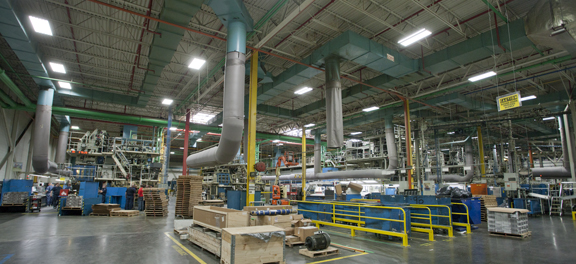
Last Friday I had an extraordinary tour of the pressroom at Quad Graphics in Saratoga Springs, New York.

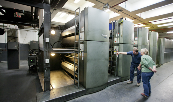
This is one of the pressrooms at Quad’s Saratoga Springs, NY, plant. In the background are three Goss M1000 presses with 6-page capacity. In the adjacent pressroom is another row of machines, ending with an 8-across Goss Sunday press on two floors.

This plant was the first plant built by Quad outside of Wisconsin, and it has presses so large that they remind me of the engines of merchant ships. All the plant’s presses are offset lithographic machines; the largest is the Goss Sunday press that can print eight pages across a 66-inch web of paper. Other machines are “just” six-across, making them among the largest offset presses in the U.S.

Several days each week, the Saratoga Springs plant prints newsmagazines; then the plant turns to monthly magazines, commercial printing and catalog work.

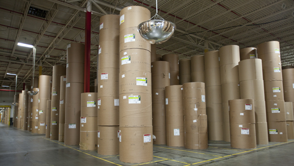
This is what 55 million pounds of paper looks like. As we toured, we were “greeted” by fork-lift trucks zipping back and forth with paper rolls, taking them to the presses.

The supply of paper on-hand is mind-boggling: 55 million pounds of paper fill a section of the huge facility. One learns in this industry that a large supply of paper is not necessarily a good thing (large inventory equals large money—idled), but when queried about the inventory, Dan Frankowski, the Plant Manager, told me that this represents only 30 days of work in the plant. A rail spur and lines of semi-trucks keep the plant supplied with more.

With turn-arounds and press capacity like those in this facility, production of 55 million pounds of printing in one month seems like an easy task, and the Quad team makes it look easy. They do it with a smile.

Quad Graphics Plant Manager, Dan Frankowski, shows one of the Sunday presses to my wife Ashala during the tour. The press was printing 66-inch wide paper at the time on two “decks” (two floors) at about one mile of paper per minute.

Quad’s corporate culture is legendary, with company-supplied medical care (several doctors on-site), an expansive exercise facility, and rewards for good health, the employees want for nothing in this plant. Everywhere we went, we were greeted by smiles and handshakes. The press operators and bindery workers beamed as we walked by.

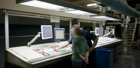
Here we were shown the controls of the Sunday presses. Above the ink controls table is a computer showing ink consumption by press unit. Over to the right is the control console for the second deck of presses.

This is printing as manufacturing, but manufacturing with a heart. The company puts nothing (read that again: nothing) into landfill. All scrap materials are recycled, composted, incinerated for energy, or used again. The plant’s bailing operation is itself a model of efficiency, three huge vacuum systems lift paper scraps from the machines as they run, then shred the paper into small bits, and automatically bail the resulting materials for shipment back to the paper mills.

Quad is a company that uses Lean as a focal point for all their activities. I saw Toyota-coined terms like Kaizen and Kanban written on pages and posted on progress boards. And, many of the most important activities — planning and keeping track of jobs — are done on paper with felt pens in a large room called the War Room. People meet with people to discuss production challenges, and to create human solutions to these challenges. In the most impressive room in the plant, I saw a device called a Cisco Telepresence, which is a teleconference room for various Quad plants to meet online. While in the Telepresence, I witnessed a meeting taking place between three local Quad employees and a man in another plant (we were told he was in Wisconsin). Though he was on a large television screen, he seemed to be in the room.

The Telepresence cuts costs for travel, and cuts short many of the difficulties caused by people not being able to see eye-to-eye. The room opens up opportunities for people in four plants to meet simultaneously, and it appears that they are each in the room. I have never seen teleconference technology so appealing and so transparent. In every other location where I have seen it, the machines stand idle, a result of technical clumsiness or people’s reluctance to use the technology. It’s nice to have seen Telepresence, because it really works.

The printing technology that impressed me most was the company’s “multi-mailer” facility that sorts magazines into carrier-route sort bundles. Not only does the machine put these magazines into the right carrier route, but into proper mailing order so that the postal delivery person takes each recipient’s mail in order from the bundle. This means that each house or apartment is in properly delivery order when it leaves the Quad printing plant.

Being the prankster that I am, I imagined how fun it would be to drop a stack of Hot Rod magazines into the Fitness pile. I was told that it wouldn’t matter because the system has a machine vision quality-control device that photographs the cover of each magazine, and compares it to the delivery list to ensure that the correct magazine is being addressed to the correct recipient. It would have caught my trick immediately, and that takes all the fun out of my would-be prank.

What an amazing company! What an amazing plant! Quad Graphics knows how to run a company, and how to produce excellent printing. Most important: they know how to treat people right, and it shows.


Posted in Uncategorized | Leave a comment