
It’s a red-letter day at Smith Controls

This blog originally appeared in 2010. It has been updated with fresh information.

I’ve been studying and practicing GREP functions for about three years now, and I have to say I’m getting pretty good at it! I keep my various cheat-sheets handy when practicing GREP, but I find it to be one of the most delightfully geeky things that you can do in Adobe InDesign.

I love little GREP challenges, like turning a list of names from first-name-first to last-name-first, which is delightfully simple using GREP (I demonstrated this in an earlier blog).

My challenge this week was a large block of text in an InDesign document where the company wanted their name converted to small caps every time it appeared in text. You can do this with Character Styles as you type, or by selecting the text after it is in the InDesign document, but that’s slow and tedious, and you might miss one.
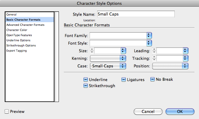
Step One is to create a Character Style whose only function is to set Case to Small Caps.

So, I set-up a Character Style whose only function is to make the Case of the type Small Caps (in this demonstration I added red color also). To apply this Character Style to a paragraph or larger selection of type, I created a Paragraph Style with all the other characteristics of the text, and then added a GREP Style function to the Paragraph Style.

This allows me to apply this Paragraph Style to an entire document, and the GREP Style will be applied to everything.
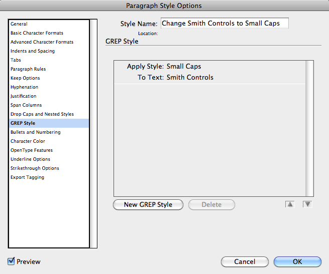
Step Two is to create a Paragraph Style with all of your typographic settings, and add a GREP command to that style, calling for the specific text to have the Small Caps Character Style applied. This will automatically apply small caps to the specific text.

This function has been in InDesign since CS3, but is little-known, and seldom-applied. I think a lot of people could use this, if they but knew it was there.

About a decade ago, while working as a contractor for Eastman Kodak Company, I produced a book for them which (they insisted) had to have the word KODAK in all-caps every time it appeared in print (at first they wanted me to put the little ® after it every time, but I talked them out of that). The book I had written had been through several torturous rounds of vetting by the legal beagles and the public relations team, and I had a tight deadline. I used search-and-replace, carefully, to catch every possible instance of Kodak and turn it into KODAK.

With the GREP Style function in InDesign, I could have done it in seconds, applying the change to the entire book with one quick edit of my Paragraph Style.
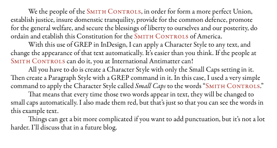
Here is the finished text, with small caps applied. I did nothing except add the GREP command to the paragraph style, and InDesign did the rest. This was set in InDesign 5.5, which behaves the same as its predecessor with GREP.

Warning! Changing a word from U&lc to Small Caps might change the line-fall or the pagination of the entire document, so be sure to look at every page of your document to be sure that this little trick does not cause a virtual text explosion.

For more on GREP styling, I recommend reading a number of sources. The best is an e-book from O’Reilly publishers called GREP In InDesign CS5 by Peter Kahrel. Mr. Kahrel has written an easy-to-implement guide to GREPping, and it has been at my right hand for months. I love it. The other places to look for information about GREP searching and styling are InDesign Secrets, and the InDesigner.com site. Both have excellent resources on GREP.

_____

I’m writing a new book about printing processes and prepress. Click on the link below to give me your e-mail address, and I will let you know when the book is published (target date is March, 2012).

Posted in Imposition and Pagination | 1 Comment

Folding by the numbers

This is an update of a blog I wrote in 2010. I added new information based on a new version of the flyer discussed.

I printed a project in late summer – a four-panel “tourist” flyer designed to go into one of those racks at the Chamber of Commerce, on hotel Concierge desks, and at the airport. It is designed to compete with flyers for hot-air balloon rides over Napa, Disneyland, and Universal Studios. By comparison, the Shakespeare Press Museum is an exciting activity!

The final dimensions are 3.6667 x 8.5, a standard width for such flyers.

The problem with these types of projects is the folding and the margins. I wanted this one to be perfect: folded right where I want it to fold, artwork and text perfectly centered in each column. I am sure that you have seen many flyers that fail to fit when folded; that’s easy: divide a sheet into thirds and design a flyer on each panel, then fold it. Oops!

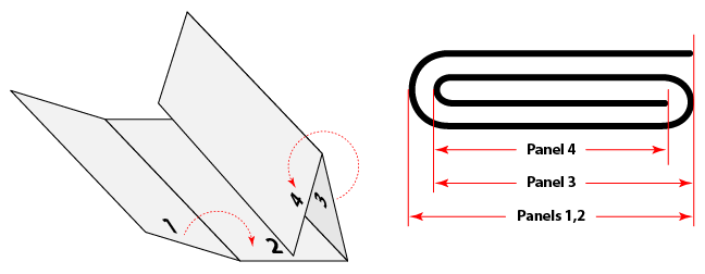
Fold-overs, sometimes called rolling folds (shown above) cause trouble because the panel being folded-in must be shorter than the others. Over the years I have adopted a formula for making these folds precisely, and here it is:

Let’s take a three-fold flyer as our first example: U.S. Letter size 8.5 x 11 in., final folded size approximately 3.667 x 8.5. I say “approximately” because the outside panels will be very slightly larger, a result of the compensation for the fold-in panel.

My formula is 5 times the paper thickness (caliper) subtracted from the fold-in panel, and then split and added to the other two panels. One could trim the finished sheets to a size just under 11 inches if necessary, but for this example I will assume that the 11-inch dimension will remain.

When I was a younger man, I practiced graphic arts on a drafting table with a T-square and right-triangle. Back then I would simply subtract 1/16 inch (0.0625 in.) from the fold-in panel, and fudge the rest. The problem with fudging is that the columns would never balance, and one or both the outside panels would be slightly off-center. So, I worked on the formula over time, and now I am pretty confident in it.

My flyer for the Shakespeare Press Museum is a four-fold, with two rolling folds. For that I needed to compensate twice – once for the right-most panel, and again for the second fold-in panel (including the right panel). For most of us this is pretty obvious. But what is not obvious is that anything you subtract from a panel must be added back to the static panels in even parts so that the “outside” panels fold exactly in half, and the rolling folds fold in without causing trouble.

For my four-panel flyer I am using paper that is 0.003 in. in caliper. The panels work out to be as follows (inside of the sheet, left-to-right):

Four-Panel Flyer dimensions: Sheet size (trim) 14.667 x 8.5 in.

Panel A:    3.667 + 0.022 = 3.689 in.
Panel B:    3.667 + 0.022 = 3.689 in.
Panel C:    3.667 – 0.015 = 3.652 in.
Panel D:    3.667 – 0.030 = 3.637 in.

When you add those up it comes to 14.667, the original paper dimension.

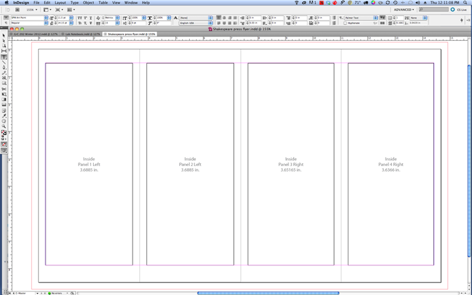
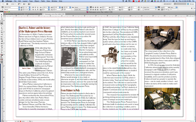
When making my layout in Adobe InDesign, I created two Master Pages, one with these dimensions, and one the mirror of these dimensions for the other side of the sheet. Then I put text boxes (essentially guidelines) inside each one with my chosen margins.

Ironically the text columns are all different (except the outer two), so all of the artwork in the flyer must be adjusted slightly to fit these slightly different column widths. My constant was the margins between the text and the fold on each panel; that’s where it counts, because the distance from the text to the fold must look consistent.

For the Shakespeare Press flyer I printed small tick-marks in the bleed area to mark my folds according to these dimensions. Folding exactly on those tick-marks creates a perfect flyer. The two panels fold-in nicely, the outer panels are precisely the same size, and outer dimension is (only) 0.022 greater than the desired 3.667 inch objective. No one at the Chamber of Commerce will notice.

But tourists and visitors will flock to the museum as a result of seeing our flyer!

___

I’m writing a new book about printing processes and prepress. Click on the link below to give me your e-mail address, and I will let you know when the book is published (target date is March, 2012).
Posted in Imposition and Pagination | 3 Comments

Get a Grip!

Wherein the Blognosticator acts as Key Grip for his son in a beautiful redwood forest

My Son Patrick is a cinematographer in Los Angeles. You have probably seen his work if you watch music videos, or have looked through the LRG online catalog. You can see much more at vimeo.com (forgive my pride when I tell you he’s really good at what he does).

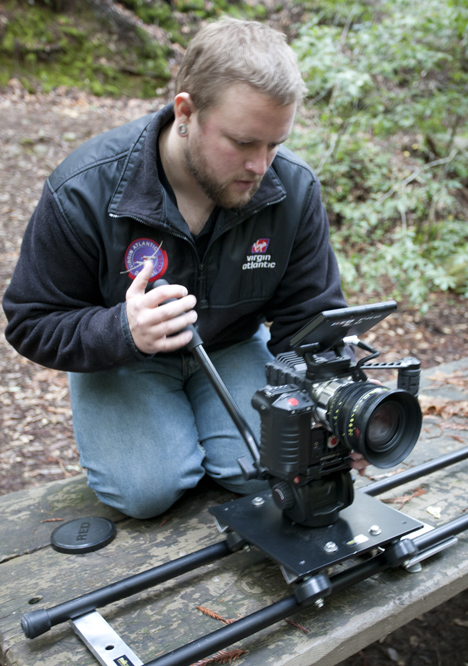
Patrick controls the Epic X camera with a Red 18-50mm lens along a small dolly track.

Patrick began his career as a movie maker years ago when he picked up my video camera and started shooting action movies in our front yard. Over the years he learned a lot about film making, ultimately graduating from the Academy of Art in San Francisco with a degree in cinematography.

Last week he “picked up” a new Red Epic X digital motion picture camera. And yesterday I was his Key Grip on a shoot in a redwood forest in Mendocino County, California. He would say, “big lens” and I would hand it to him. One thing I learned about being the Key Grip: you learn really quickly never to let go of anything until the recipient says, “Got it!”

The reason this is true is the value of the “things” I was handing him. The “Big Lens” is a $6,000 lens. It can’t ever hit the ground, or even a table. It is handled like a valuable work of art, which it is.

The Epic X is the latest digital cinema camera from Red, a California-based company that is among the leaders in the world of serious motion pictures. The Epic has a sensor in it that is capable of capturing cinema-quality images with a variety of frame rates and resolutions. My still photo background prevents me from appreciating everything it does, but I am learning.

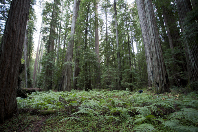
Beautiful sword ferns and a carpet of clover cover the ground in Montgomery Woods.

We were shooting video in Montgomery Woods, a California State Reserve that until 2006 boasted the tallest tree in the world. Locally, and affectionately known as The Mother of the Forest, the tree is somewhere in the 375 foot range. In 2006, arborists found a much taller tree in a nearby forest, one which measures just over 391 feet. Montgomery Woods is still a lovely place, even if its tree is in second place.

In wintertime, Montgomery Woods is fabulous. I have visited a few times in the summer months, but never in winter. On our visit yesterday we were working in near-freezing temperatures, but I was reasonably comfortable in my insulated boots and bicyclist’s mittens.

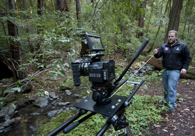
Patrick used a string to pull the Epic along its track in the forest. Beautiful mossy trees made way to views of the lush forest in these shots.

The winter visit had advantages: very few visitors – the park normally has only six visitors per hour in summer months – we saw about a dozen people in three hours. We also enjoyed seeing a forest ground cover that is not as verdant in summer. Everything is mossy green, the forest floor was covered in Sword ferns, and below those was a blanket of clover. Greens greener than almost anything in the world make this place sacred in my mind.

My cinematographer son would shout from around a tree, “Can you bring me another battery?” (We had six). I would grab the battery and take it to his shooting location.

We carried into the forest the Red Epic, two specialized lenses for that camera, and my still camera with three lenses. We also carried two tripods and a five-foot dolly track for rolling shots.

The batteries, extra memory cards (Red memory cards are 128 GB each), and extra gadgets made the shoot particularly technical; we looked like a couple of motion picture Bedouins, I am sure. But I am confident that Patrick got some wonderful video scenes. His video is posted on Vimeo.

For those interested in the Red Epic camera, you can get on the waiting list now, and expect a camera body in the coming months. The eagerness with which professional cinematographers hold Red announcements is amazing. There is a certain imprimatur about the Red. If one were cynical, one could call it a cult, but my observation is that the camera is an amazing piece of mechanical, electronic and cultural engineering. It makes beautiful cinema.

Red is driving filmmakers to digital production, and away from film, in droves. When you look at the specifications of the camera and its Mysterium sensor, you will be impressed if not amazed. Disk drive manufacturers must love Red cameras!

What impresses me about the Epic (in addition to its stunning resolution) is the new smaller size and weight. The Red One, predecessor to the Epic, weighed more than three times as much, and that made it an incredibly heavy unit when paired with almost any lens. Epic is – almost – a hand-held device, one which can be mounted in small spaces, and one which captures cinema-quality images in digital formats.

If nothing more than an opportunity to spend time with my son shooting in one of the quietest and most beautiful places on Earth, it was a wonderful cinematic adventure. I also learned how to say, “Got it!” whenever I am handed a lens.

Posted in Digital video, New technology, People, Photography | 1 Comment

Fine art reproduction, complete

This blog originally appeared on What They Think in September, 2010. I have updated it here with new information about fine art reproduction.

In my last two blogs I discussed the process of reproducing fine art. So far we have lighting and polarizing, both of which are discussed in detail:

PART ONE
PART TWO

With the images captured on my memory card, I moved to the process of making a camera profile. There are two ways to do this, one is to make a color profile that works in Adobe Photoshop’s Camera Raw pane. The other is to make a camera profile as an ICC profile to be applied to an image after it is open in Photoshop. I chose to use the Camera Raw process.

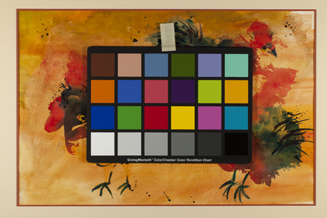
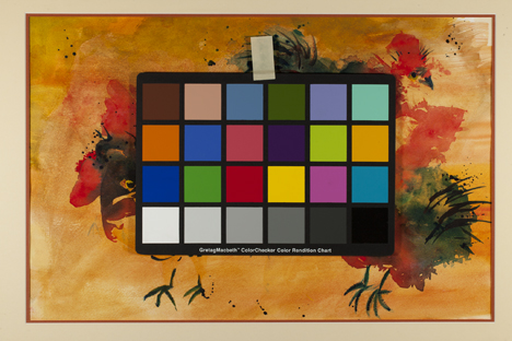
In this image I placed the large Gretag ColorChecker card. Now part of X-Rite, the company has been making this exact color card for decades. I could have used the smaller ColorChecker Passport, but it’s unimportant.

To make a profile for Camera Raw, one needs a DNG file, which my camera does not make. I could have used Adobe’s DNG Converter software to make a DNG from one of my Camera Raw images, but chose instead to make a DNG from the Raw pane in Photoshop. To do this I opened one of my properly-exposed images (containing the Passport color card) in Raw, then chose the Save Image button in the lower-left corner of that pane.

This is the ColorChecker Passport interface. It (usually) finds the ColorChecker pattern automatically in an image, and then makes a profile for the camera and lighting that is automatically made available in Photoshop’s Camera Raw palette. The software works nicely, and the profiles are effective.

In that pane I can choose to Save an image in TIFF, DNG, Photoshop and JPEG formats without opening the image in Photoshop. I chose DNG and saved the file. Then I dragged that DNG file onto the ColorChecker Passport software. It located the 24 color patches very quickly, and then allowed me to make a profile. The resulting file is saved in the appropriate folder for Photoshop.

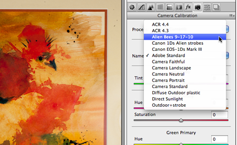
This is the Camera Profile menu within Adobe Camera Raw. The camera profiles made by ColorChecker Passport are made available here. They also work in Adobe Lightroom.

Back in Photoshop, I opened one of the properly-exposed images of the painting that did not have the color target, then applied the newly-minted profile from the Camera tab in the Camera Raw pane, chose the highest native resolution possible, and opened the image. The other thing that is critical in fine art reproduction is to set the color temperature correctly in Camera Raw. My new strobe lights (not those I used in this example) are Einsteins, and those maintain a nearly perfect 5200 Kelvin color temperature at all intensities. I type 5200 into the Color Temperature value in Camera Raw, and the color of the original (corrected by the Passport profile) is nearly perfect.

So, now I had a color-correct image in my computer, and all that remained was to print it on my wide-format Epson ink-jet printer.

Which is no simple task.

I had not profiled my printer since my ill-fated installation of Snow Leopard back in summer ’09. That was catastrophic, and I still must print from a pre-Snow Leopard computer to use the correct Epson drivers. The way I finally solved this problem was to purchase a Mac Mini, and install Leopard (OS-X 10.5) on it, along with my older copy of the Creative Suite CS4. Now, using Screen Sharing, I print all of my work to the Epson printer using the Mac Mini. It’s a great solution to an insoluble solution with newer operating systems.

I printed the targets on my favorite paper (Epson Premium Luster) and then took them to school to read on the iOne Isis and the new iOne iO table. With spectrophotometric data in-hand, I built printer profiles for my Epson, and made a couple of prints of the painting to-size.

These prints were a bit too contrasty, so I modified the image with a curve in Photoshop, one which would open-up the midtones a bit, and flatten the image overall. The second printing was superb!

The painter was happy with my prints, and I am happy that I had success with this project.

Next assignment: reproduce an oil painting!

____

I’m writing a new book about printing processes and prepress. Click on the link below to give me your e-mail address, and I will let you know when the book is published (target date is March, 2012).
 

Posted in Art, Color Management, Photography | Leave a comment

Fine art reproduction, continued

This blog originally appeared on What They Think in September, 2010. I have updated it here, and will add new information on the topic in the coming days.

In my blog yesterday I described how to make a “fine art” reproduction, starting with a framed original painting. My project was off to a good start, and I had the photo studio set-up to make a digital image of that art.

My challenge wasn’t too difficult, but the photography was complicated by the fact that the art is framed. I can, but prefer not to remove the art from the frame. This is often the case with originals in frames. Sometimes one is not allowed to remove the art from its frame. Other times, like this one, it’s difficult to get the art out of the frame, then restore it to its framed condition without damage.

Or maybe I’m lazy.

In any event, I was having trouble with the lighting and the glass. In order to get proper exposure across the face of the art, and not get hot spots on the edges, I had placed the lights equidistant from the corners of the artwork.

When I looked through the viewfinder, I saw the lights reflected back at me. It was time for Plan B: Polarizing filters.

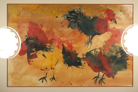
You can see the Alien Bees lights reflecting off the glass in this image, which was taken before I invested in polarizing filters and gelatine for the lamps.

I bought some Rosco polarizing gel material in a roll, and some cardboard gel holders from Paul C. Buff for the Alien Bees lights. I also bought a pair of Buff’s reflectors that hold filters. Then I bought a Tiffen circular polarizing filter for my macro lens. All of these additional goodies cost me about $300 plus a week for delivery.

Back in the studio, I set-up the shot again, this time prepared better for the facts of life with reflections.

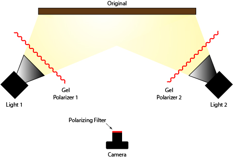
With the polarizing filter in position on the strobes, and a polarizing filter on the camera, I was able to eliminate the glare of the lights on the glass.

I positioned my lights exactly as I had before, added the polarizing gels to the reflectors, and then put the new polarizing filter on the lens. In five seconds the reflections were gone! Voilà!

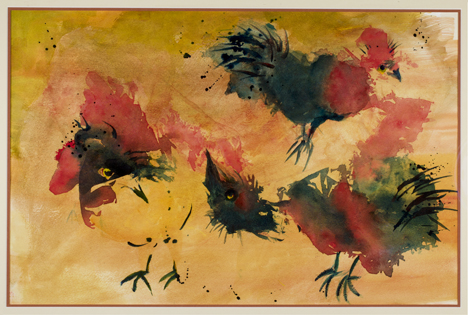
This is the image after the introduction of the polarizing filters. It is very acceptable.

Exposure is critical for fine art reproduction, so I borrowed a nice light meter from my friend Kevin O’Connor, who had a spare for the project. Kevin was also coaching from the sidelines.

I moved the lights in tiny increments until the exposure was perfect all the way across the glass, corner-to-corner.

Part three was to set a custom white balance with the camera. I use a Canon 1ds Mark III for this project, and it allows me to shoot various custom white settings, and record them to the memory card. I used a white card (could have used gray) to make a test shot, then established that white as my custom white balance.

Once I had that white balance established, I used the X-Rite ColorChecker Passport (and a full-size Color Checker also) to record the behavior of the camera on the memory card. With these images I would later make a camera profile (more on this later).

With the full-size X-Rite Color Checker on top of the painting, I made a series of exposures. From one of these I made a camera profile using X-Rite’s ColorChecker Passport software. I used that profile to open the file for reproduction (more on this in a coming blog).

While I was in the studio, I also photographed an X-Rite (Gretag) ColorChecker DC, which is the more complex 240-patch camera target that works with ProfileMaker Pro software. And, I threw in a Kodak Q-14 grayscale target just for fun.

With nearly every color target known to photkind, I had the test images in hand.

Then I made a series of carefully-bracketed images of Carlen’s painting, and declared victory. Or partial victory.

This was just the process of capturing the image. I still had to reproduce it!

…which I will describe in my next blog.

____

I’m writing a new book about printing processes and prepress. Click on the link below to give me your e-mail address, and I will let you know when the book is published (target date is March, 2012).

Posted in Art, Color Management, Photography | Leave a comment

Wherein The Blognosticator attempts fine art reproduction

This blog originally appeared on What They Think in September, 2010. I will supplement it in the coming days with more up-to-date information.

I made a deal sometime back with my friend Carlen that I would make a reproduction of one of her paintings. The original hangs in my living room, and she wanted one for her studio.

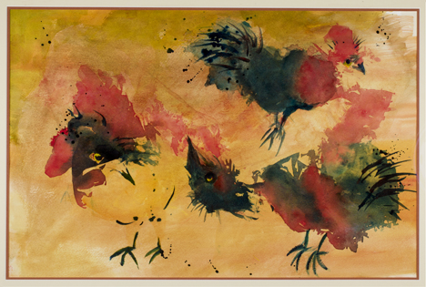
This is the painting in question. It was made on an uncoated medium, so photographing it was not very difficult. Used by permission of the artist.

So, this past summer I took steps to fulfill my promise to make a copy. In some parts of the industry this is called Fine Art Reproduction. In other parts, it goes by the pretentious name “giclée” printing. That word is the French for “squirted” which, I suppose, describes what an ink-jet printer does to ink on its way to the substrate. Ask a French person what “giclée” means, and you’ll learn an altogether different definition that is not appropriate in a family blog like this one (I find this particularly amusing when talking to pretentious “giclée” dealers).

My task was to photograph, then print a full-size print of Carlen’s painting. One would think that this is an easy task, but I knew better. When I had my business we did a fair amount of reproduction photography for scanning on our Crosfield scanner. Anything that we couldn’t wrap around the drum would be photographed onto Ektachrome film, and then scanned.

Our set-up was a black wall, on which we would place the (often framed) artwork. Then we would carefully copy the art on a 4×5 view camera with strobe lights. Occasionally we would have a difficult original – one with highly glossy paint, or tremendous relief – and that challenged us. But, we managed, somehow, to get it done.

We had a beautiful Dainippon Screen process camera, but its lights were pulsed-xenon, and they had an incoherent Color Rendering Index curve which did not render perfect color onto Ektachrome, so the view camera was better. The copy board on that camera also made it impossible to photograph framed art or art with relief.

My project this last week was only slightly different: I was using a digital camera. Otherwise the challenges are the same. The painting is framed, and I am loath to remove the art from the frame. The glass, I presume, is UV-filtered to protect the artwork, and to compound my photographic efforts.

I began by working in an all-black environment. The studio has black walls, a gray floor, and a dirty acoustic ceiling (the ceiling does not seem to affect the environment). I set-up a charcoal gray tripod and mounted the frame on that tripod. Then I put the lights in place, equidistant from each corner of the frame, and equidistant from the center of the artwork. For this I used a tape measure.

I had two Alien Bees strobes with a wired trigger for this project, and since the artwork is small enough, they were more than adequate. I used the standard aluminum reflectors that come with those lamps.

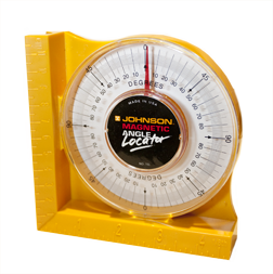
My angle meter, purchased at the local hardware store, indicates slope. I use it to ensure that the camera and the art are on the same angle.

Next, I put the camera in place on a tripod. I used the tape measure to get the camera centered. For squareness I used an angle meter – this is the sort of tool a carpenter uses to measure the angle of a roofing joist, or the angle of the blade in a table saw. I measured the angle of the artwork on the easel, then matched the angle of the camera.

I purchased a book on copy photography from Amazon. The book was published by Kodak in 1984. Though digital photography was not available when it was published, the book is overflowing with good advice to the wanna-be artwork photographer. I ignored the agitation technique illustration, opting to pay more attention to the lighting and reflection-avoidance information in the book.

My lighting was according to the book, and I was able to adjust the lights so as to minimize reflections.

So, I was all ready to take the copy photo. All I needed was a light meter (either in the camera or outside it) and a few minutes to make the shot. Or so I thought.

More on this in my next blog.

Posted in Color Management, Photography, Uncategorized | 2 Comments

A story of amazing proportion

Back in the Awkward Years (1960-1984) we used to make paste-ups, then photograph them on large process cameras to make large sheets of film from which aluminum printing plates were made.

Photographs were handled separately from line art, and the resulting films were hand assembled on a light table on separate overlays of acetate film held in position by register pins.

This may sound like a scary story that is told around the campfire at camp, but it’s true.

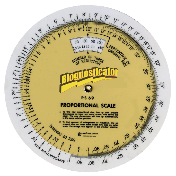
One of the essential tools of the trade in those Awkward Years was the circular calculator, also known as a Proportion Wheel. This is a circular slide rule with geometric markings. On the outer wheel is the final size in inches (I’m sure these things exist with metric measurements); on the inner wheel is the current or original size. When you look in the little window, you see the percentage at which to shoot the photo of the art to get it the right size to put into the film.

There is also a scale indicating the reduction factor, a value I never found valuable.

When reducing an image to a smaller size, the percentage is critical. We used to fudge this a bit to prevent trouble on the light table. We would routinely shoot halftone negatives about two percent larger than the proportion wheel indicated. This caused trouble occasionally, when we would crop-off some guy’s ears, but most of the time it helped to prevent gaps in the photo, and thus reshooting the halftone.

My cameraman, a wonderful man named John Flynn, shot every halftone five percent larger than indicated by the artists. He found that he had to reshoot fewer photos that way. We seldom noticed. That’s part of the reason I call this era the Awkward Years.

I was reading an issue of Communication Arts magazine in 1985 where the publisher, Richard Coyne, described how his magazine had a machinist make a special proportion wheel with a machined vernier scale mounted on it. He commented on how the magazine had such tight tolerances that they needed such a precise scale.

What he was missing was that a proportion wheel is performing long division. And, long division can also be done with a pencil on a piece of paper, or on one of those newfangled pocket calculators. Imagine that!

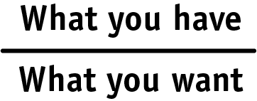
The formula for proportion is really simple. It’s:

and any pocket calculator will give you the percentage to several digits of precision. The other advantage of using a calculator is that once you have the percentage you can multiply it by the other dimension of the photo to ensure that it fits its window.

It’s amazing how math works!

Of course we never use these proportion wheels today. We just put the photo into a window on the page, and we scale it to fit while holding the shift key down to maintain proportionality. And, when it fits, we let go.

It’s not as awkward as it used to be. Thank goodness!

Posted in Education, History, Photography | Leave a comment

Attention all alumni

While chatting with a fellow last night, I learned that he was “an alumni of Cal Poly.”

The problem is that he’s not an alumni. He’s an alumnus.

This is a problem word, one used almost universally incorrectly in our society. It’s also an important word because it affects most of us. It’s important that we not sound like we didn’t learn about grammar when we use the word for a person who attended a school, or participated in a training program, or did something with a group of people.

In English we seldom conjugate nouns, or perhaps it’s better to say that we don’t have declensions for words in our language. There are some exceptions.

Data is almost always accepted as either singular or plural these days. The correct way to use it is singular: datum, plural: data. But, face it, this just sounds funny. So, we all cave and use data incorrectly… the word, not the actual numerical information.

Forum is another one. It’s singular noun. Its plural form is fora, which is so obscure that it is almost never heard, and when it is, you do a double-take to be sure you heard it right. I attended several fora this last week. Eek!

But alumni/us/a/ae is a an important word, still, and we must all learn it correctly so that we don’t sound undereducated.

Here is the way to do it:

Men: singularly, you an alumnus; plurally you and your colleagues are alumni.


Women: singularly, you an alumna; plurally you are alumnae.


Mixed gender: plurally you are alumni.

That’s it.

And, next time you are bragging about being an alumni of the class of ought-six, you can get it right.

Download a chart of the alumni conjugations here.

I will write about criteria on another occasion.

Posted in Education, Language and grammar, People | Leave a comment

Working with the new iOne Display Pro

I’ve been monkeying around with the new iOne Display Pro, a new color instrument from X-Rite that replaces the iOne Display instrument that some of us have been using for years.

The iOne Display Pro, and its not-too-distant cousin the ColorMunki Display, are the two new entry-level devices from X-Rite for calibrating and profiling computer displays and projectors.

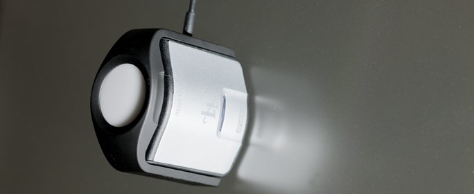
My iOne Display Pro on the surface of one of my two Apple Cinema Displays. The instrument features nice industrial design, and excellent functionality. It’s handsome and it works!

The new iOne Display Pro is a smartly designed instrument that works nicely on modern LCD displays, laptops, and projectors. The ability to profile a projector is quite an accomplishment, and one that I like especially when I am doing lectures about color and color management.

The instrument ships with a new X-Rite profiling application called iOne Profiler. It offers the ability to set the white point, the ambient light in the room, and then to profile a display or projector using the instrument.

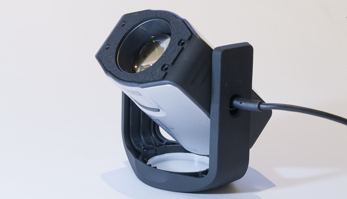
This is the iOne Display Pro in position to measure the behavior of a projector. There is also a standard 1/4-20 tripod screw on the mount so you could mount it on a photographic tripod.

I have been using it for several months, and I like it. The final step in the profiling process allows me to compare the new profile with the most-recent older one, using a variety of (rather bad) photos for comparison. If I like the results, I can accept the new profile, which saves it in the correct folder, and then activates it in my System Preferences.

The device works on both Mac and Windows.

And, for those who are fond of the ColorMunki products from X-Rite, the newest Color Munki Display uses the same instrument with the ColorMunki software. I have not tried this, but I may be able to use the new instrument with the ColorMunki software (I’ll let you know).

iOne Display Pro sells on Amazon for $249 and the ColorMunki Display for $169.

Posted in Color Management, Education, New technology, Photography | 2 Comments

Blognosticator news

Greetings, loyal readers (both of you),

I apologize for falling off the edge of the Earth recently. After my post about micrometers, I was struck down by a bolt of kidney lightning, and have been in bed for three weeks.

Last week I had surgery to correct the problem, but that surgery was unsuccessful. I will spare you the details. But, I am back at my desk, feeling pretty well, and will be undergoing surgery again in two weeks. At some point I will share some delightful 3D images of my kidneys, made by a process called IV-CAT.

Meanwhile back at the Blognosticator, I have news! The two domains:
www.blognosticator.net
www.blognosticator.org
are both mine now, and they are both active. You can reach The Blognosticator more easily now.

I spoke with the woman who owns www.blognosticator.com, and she is willing to sell her domain, but at a price that I was unable to pay. Alas. She’s very nice; we just could’t make a deal.

So, best wishes to you, and keep my left kidney in your prayers!

Brian

Posted in Uncategorized | Leave a comment