This blog originally appeared on What They Think in September, 2010. I will supplement it in the coming days with more up-to-date information.
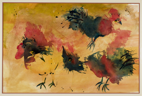
I made a deal sometime back with my friend Carlen that I would make a reproduction of one of her paintings. The original hangs in my living room, and she wanted one for her studio.
This is the painting in question. It was made on an uncoated medium, so photographing it was not very difficult. Used by permission of the artist.
So, this past summer I took steps to fulfill my promise to make a copy. In some parts of the industry this is called Fine Art Reproduction. In other parts, it goes by the pretentious name “giclée” printing. That word is the French for “squirted” which, I suppose, describes what an ink-jet printer does to ink on its way to the substrate. Ask a French person what “giclée” means, and you’ll learn an altogether different definition that is not appropriate in a family blog like this one (I find this particularly amusing when talking to pretentious “giclée” dealers).
My task was to photograph, then print a full-size print of Carlen’s painting. One would think that this is an easy task, but I knew better. When I had my business we did a fair amount of reproduction photography for scanning on our Crosfield scanner. Anything that we couldn’t wrap around the drum would be photographed onto Ektachrome film, and then scanned.
Our set-up was a black wall, on which we would place the (often framed) artwork. Then we would carefully copy the art on a 4×5 view camera with strobe lights. Occasionally we would have a difficult original – one with highly glossy paint, or tremendous relief – and that challenged us. But, we managed, somehow, to get it done.
We had a beautiful Dainippon Screen process camera, but its lights were pulsed-xenon, and they had an incoherent Color Rendering Index curve which did not render perfect color onto Ektachrome, so the view camera was better. The copy board on that camera also made it impossible to photograph framed art or art with relief.
My project this last week was only slightly different: I was using a digital camera. Otherwise the challenges are the same. The painting is framed, and I am loath to remove the art from the frame. The glass, I presume, is UV-filtered to protect the artwork, and to compound my photographic efforts.
I began by working in an all-black environment. The studio has black walls, a gray floor, and a dirty acoustic ceiling (the ceiling does not seem to affect the environment). I set-up a charcoal gray tripod and mounted the frame on that tripod. Then I put the lights in place, equidistant from each corner of the frame, and equidistant from the center of the artwork. For this I used a tape measure.
I had two Alien Bees strobes with a wired trigger for this project, and since the artwork is small enough, they were more than adequate. I used the standard aluminum reflectors that come with those lamps.
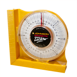
My angle meter, purchased at the local hardware store, indicates slope. I use it to ensure that the camera and the art are on the same angle.
Next, I put the camera in place on a tripod. I used the tape measure to get the camera centered. For squareness I used an angle meter – this is the sort of tool a carpenter uses to measure the angle of a roofing joist, or the angle of the blade in a table saw. I measured the angle of the artwork on the easel, then matched the angle of the camera.
I purchased a book on copy photography from Amazon. The book was published by Kodak in 1984. Though digital photography was not available when it was published, the book is overflowing with good advice to the wanna-be artwork photographer. I ignored the agitation technique illustration, opting to pay more attention to the lighting and reflection-avoidance information in the book.
My lighting was according to the book, and I was able to adjust the lights so as to minimize reflections.
So, I was all ready to take the copy photo. All I needed was a light meter (either in the camera or outside it) and a few minutes to make the shot. Or so I thought.
More on this in my next blog.


I am trying to reproduce my art on canvas. It is produced from my original photography and I manipulate it to look like an oil or pallet knife art piece. Problem is, that the person that is trying to reproduce it on a H.P. large format printer is losing all the detail. It is coming out either like a blob…or a washed out piece of C***. I want to use these guys as they are inexpensive and very close to the gallery. Is there a setting in photoshop that this guy is missing? I use Corel…and am at a loss when it comes to Photoshop. I have a Sharpening tool that does detail with one click to my satisfaction, but it looks like it is a 5 step process with Photoshop….I suggested that he re calibrate his printer…:)I need to have it look 3D. Been done by my last printer..he passed away:O(
I can’t advise you on the Corel front, as I have no experience with that application. Photoshop’s Sharpening process is not five steps, it’s just one. Select Sharpen from the pull-dwn menu, or better, choose Smart Sharpen. Or, you can use the Unsharp Mask tool, which isn’t as clever as Smart Sharpen, but works effectively.
As for the color at your output service, I suggest working with a company that supports color management. You should embed a color profile in all of your images, and you should work with a company that supports color management in printing.
Without a reliable color management process in-place, it’s a shot-in-the-dark every time you go to that firm.
One of my friends uses Costco’s services to print his work, and he loves them! There are downloadable color profiles available for every Costco location, and they work! Costco prints on canvas (might vary from location to location), and they do a fine job on many prints.
Keep me apprised of your progress.
Brian