I was working with a non-profit group last week to print a large poster on my wide-format printer. They had used a “free” font that was downloaded from dafont.com. It is a clever font, and I like the design. But the spacing in the original was horrible. Worse than horrible.
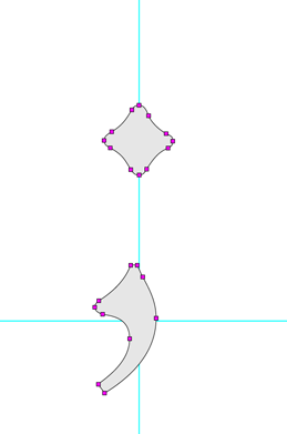
This is the semicolon from the font Centaur by Bruce Rogers. This is not the work of an amateur, and it’s no accident. The fact that it has 22 control points, and is crafted so carefully is a statement of how complex type design is. Notice also that the comma part is not centered under the upper component. That, also, is no accident. I’m sure Mr. Rogers wanted it that way.
Though the designer had done a credible job on the letters, the spaces were way too big, and the spacing of the letters within their character spaces was really awful.
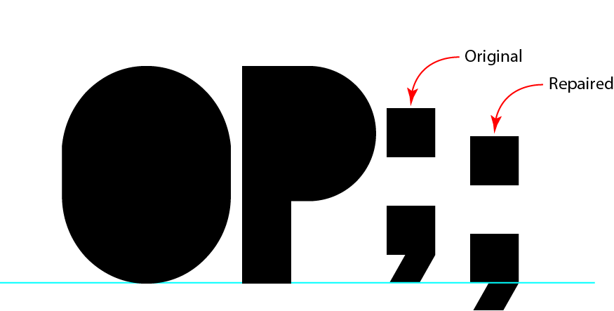
This is the font in question, called Blackout (free from DaFont.com). The original font had the semicolon in the wrong place (in my opinion). I fixed it, and a lot of spacing errors, before being able to use it.
I needed to use the font to make a series of titles for an arts presentation, so I decided I could either:
1. Set the type, then spend an hour kerning it back to “normal” or,
2. Open the font in FontLab, fix it (about an hour), then generate a new font and use that one.
I chose to do the latter. It gave me the chance to center the characters better in their spaces, and to adjust a few characters so that they sat on the baseline correctly. The semicolon was one of those.
While working on it, and the colon, I realized that people don’t use the semicolon very much these days. It’s a mark that has fallen into disuse, being replaced, I guess with a period and a capital letter on the next word.
There is nothing wrong with this; I like to use full-stops and new sentences wherever I can.
The semicolon in question was about a half-inch above the baseline, positioned in such a way as to look really odd. It was easy to fix. But I found myself wondering how the heck the designer decided to put it up where it was in the uncorrected version of the font.
It’s a comma with a period overhead. Could this designer be so detached from letter design to put it there on purpose?
Was it a case of being “artsy”?
I have no idea. But, the buyer of the font got what she paid for, and I spent only an hour repairing it; then my work was made easier.
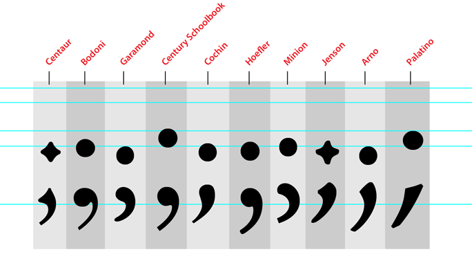
Following is a selection of semicolons from a number of fonts I like. This shows how diverse the semicolon is. The blue lines are various x-height and X-height lines (each font is different), and a baseline, which is constant.
I’m writing a new book about printing processes and prepress. Click on the link below to give me your e-mail address, and I will let you know when the book is published (target date is March, 2012).


