This entry appeared originally on What They Think in July, 2010. It has been updated.
Back in 1987 when computers first started to have color monitors, the audience grew into two distinct groups, those with money (who could display a potential of 16,777,216 colors on their CRTs), and those with less money (who could display a potential of 256 colors on their CRTs). This was based entirely on the cost of the display “adapter” – a card that plugged into the computer to drive the CRT. The 16-million number is called 24-bit color (2E8 x 3).
These “adapters” were powerful digital-to-analog devices which represented a significant part of the price of a computer.
Over the years, computers got faster, and these video cards got better and less expensive.
When the World Wide Web was first designed in 1990, the number of computers with 24-bit capable video adapters was pretty small, so the designers of the web chose to designate a small number of possible colors for display in HyperText Markup Language (HTML). The issue of “safe” was brought about by the differences between the gamma standards for IBM and “compatible” PCs and Apple Macintosh computers. Of the theoretically possible 16 million colors, it was determined that only 216 would be designated as “safe” allowing those with less-capable display cards and those with more capable cards to see the same colors on their CRTs.
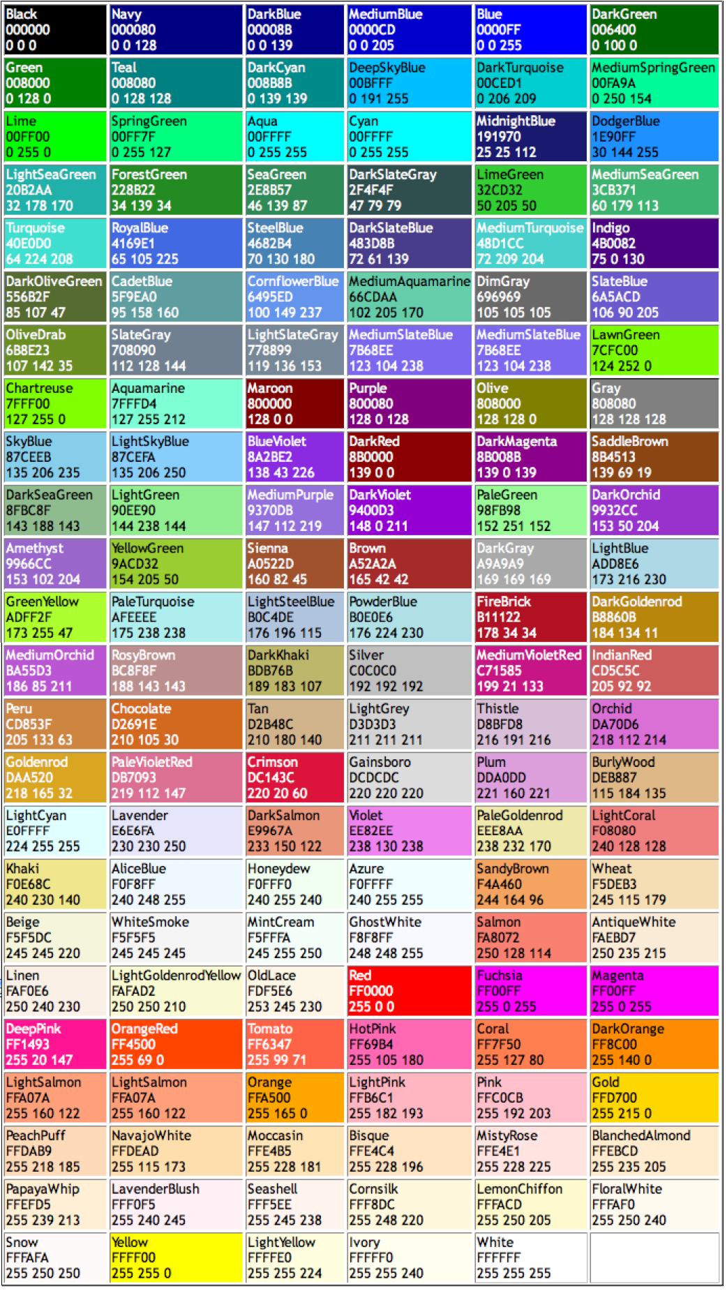
This is a sampling of “web-safe” colors, and interestingly, they can be called by their names (OldLace for example) in HTML (isn’t that quaint?).
The number 216 was chosen so that six shades of each of the red, green and blue colors could be shown (6E3), and those 216 colors were further affected by the gamma (contrast and saturation curve) of the CRT. Windows has traditionally used gamma 2.2 while Macs have traditionally used gamma 1.8. These differences are visible.
It has been a long, long time since a computer of either type has had a display card that can only show 256 colors (about 15 years allowing for those who hang on to old technology), essentially “forever” in web terms. Yet today some people still hold to the concept that in order to show a color in a web page one must use the “safe” colors. This is utter nonsense, and it’s time to get over it.
The full palette of 24-bit color is available on every computer display today. Every single one. No exceptions. Anyone who can’t display the 24-bit palette needs to get a new computer, or a newer used computer (they all have the complete palette).
In Wikipedia, which has an extensive explanation of “web-safe” colors, there is an interesting comment: “The use of ‘web-safe’ colors has fallen into practical disuse, but [has] persisted in culture.”
The reason I brought this up in today’s blog is that I overheard a fellow-teacher recently explaining that all colors in a web site had to be “web-safe” and that students should not choose colors outside that palette. I cringed, as I thought we had made some progress since 1995. I thought that, since I have had a 24-bit color capable display for almost 20 years, the rest of the world had made similar steps. But I must be wrong. The selection of type fonts must also be limited to those that we can order from the Ludlow machine.
Here’s the scoop: forget web-safe colors; though they are pretty, they are an unnecessary concept, except as a subset of the 16-million-color palette that is available on all of our computer displays. So, pick any color you like! Use it or abuse it, but don’t buy the hype that colors in a web site must be “safe.” That is anachronistic nonsense. We are in the 24-bit century now.
Here are all of them: I like “MistyRose” the best!


I think unfortunately a lot of people learning web design for the first time do still hear about web safe colors, as you say, and many feel that they need to limit themselves to this list. I agree with you, and I think nearly any modern (experienced) web developer would, that there’s no reason to limit yourself to web safe colors. What I do like to do sometimes though, is look at lists of web safe colors to figure out the general color scheme for a website I’m designing… it’s easier to look at a list of 216 colors and then later on refine your color scheme down to the precise (likely non web-safe colors) you want to use. I’ve found this website – http://websafecolors.design/color-chart – has a particularly nice web safe colors list to look through for this purpose.
Hi Victor,
That’s a good approach to choosing colors, and I think you have a solid reason for applying it. I wish you much success with your teaching.
It’s also nice to use Adobe Color, and the various Color palettes in Illustrator, Photoshop and InDesign to compose palettes of colors that are both pleasing and functional.
Best wishes,
Brian P. Lawler