Three-color photography on a boat

This entry originally appeared on What They Think in July, 2010.

Fourth of July – afternoon. The conversation ranged from the oil in the Gulf of Mexico to the freshness of the guacamole. At some point someone made the mistake of asking what I had been doing recently. I told this person about making three-color photos with my digital camera and red, green and blue gelatin filters.

I “just happened” to have the filters with me.

After some discussion, I set up a shot with my friend Chris, my camera on a tripod, and with Chris’s wife Rebecca standing-by with my three gelatin filters, ready to hand them to me in rapid succession.

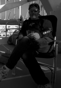
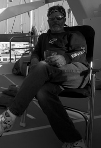
My friend Chris photographed the same way the Prokudin-Gorskii would have done it in 1912. This was made with three separate exposures, then put together in Photoshop. Notice the small errors of color that exist in the sunlight on the deck, and the boat in the background. These differences are caused by time-between-frames.

I put the camera on “monochrome” and asked Chris to sit very, very still. And, as other friends laughed about what we were attempting to do, Rebecca handed me the gels and I snapped three photos as quickly as I could.

Meanwhile, the boat rocked very gently in its slip. I didn’t think this would work, but it did.

These are the individual frames – red, green and blue – of the color photo.

My color image of Chris, sitting in a deck chair, is delightful; he sat very still as instructed. The result is excellent. If you look closely, you will see that all movement in the background is shaded by magenta, yellow and cyan misfit parts. But Chris sat still and the image of him is good.

As I described in my initial blog on the topic (three blogs back), the objective was to try to replicate the work of Russian photographer Sergeii Prokudin-Gorskii, who made photos of both stationary and slightly-moving objects (rivers, people trying to stand still, etc.).

I plan to make one more series of photos using this technique in a photo studio with strobe lights and a model. If these turn out nicely, I will post them here. If not, I’ll not bring it up again. So, don’t hold your breath!

Posted in History, Photography | Leave a comment

Three-color photography, digitally

This entry originally appeared on What They Think in July, 2010.

In my last blog I described the work of Sergeii Prokudin-Gorskii, a Russian photographer who documented Czarist Russia with a special three-color camera. His work took him over tens of thousands of miles, and he took thousands of photos. About 2,000 of them are now in the U.S. Library of Congress.

Prokudin-Gorskii’s camera exposed a glass plate through red, green and blue filters to make a color-separated image. Later, he would contact-print these plates to make positives, and then he could project the resulting images through red, green and blue filters to recreate the scenes he photographed.

I thought I would try this technique, using a Canon digital camera and a set of color separation filters I found in my office at the university last week.
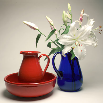
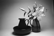
This photo is the result of my three-color experiment. Fortunately, the flowers and the vases sat very still for my experimentation.

The process of making color images with RGB filters is not new or even novel. But I had never done it. I had done the opposite many times, separating a color photo through these same filters to make Cyan, Magenta and Yellow color separations on a process camera, and later, on an enlarger.
These are the individual exposures: red, green and blue, made with my Wratten color separation filter set on my Canon 1ds Mark III camera.

In 1993, a company called Leaf (later owned by Scitex, and now by Phase One) sold a digital back for the Hasselblad camera that had a 2,048 x 2,048 monochrome sensor in it. At the time that was stunning resolution. When you purchased the camera back, you also got a motorized RGB filter wheel which would mount on the lens. To make an exposure, the software would tell the camera to take the first frame, through the red filter, then the second through the green, and the third through the blue. Then the software would assemble the images into an RGB image on the computer.

It worked great, and compared to shooting medium-format film, and processing, and scanning – it took a lot less time. The problem was that you could only take photos of things that didn’t move. I saw the Leaf camera in use once at a catalog production facility in Los Angeles. The company was shooting images of knickknacks, all of which stood still. I was told at the time that the camera had paid for itself in a few months by eliminating the film and scanning from the process.

Now, 17 years later, I am trying to recreate the work done by the Leaf camera, and about 100 years after Prokudin-Gorskii did it in Central Asia.

I set up my Canon camera, which has a setting for “monochrome” shooting. I put some nice vases and flowers into an arrangement, and lighted it with a strobe and a soft-box to diffuse the light. Holding the red, green and blue filters in front of the lens, I made a series of exposures, then went to the computer and assembled them by cutting and pasting the images into a new RGB Photoshop document. The results are extraordinary, which is to say very nice.

My first image worked nicely, with the exception of a very slight yellowish cast on the white paper background. I tuned that out with a color balance adjustment layer. Final product: very acceptable.

The camera, when set to “monochrome” really creates an RGB image that has been modified to be monochromatic in nature. When I transfer these images to Photoshop, they come up as color images in red, green and blue. But, there is almost no information in the non-specific channels, so I just take the prime color channel to the final image and discard the other “noise” that appears in the other channels.

I experimented with settings on the camera. When I changed to JPEG, the Canon delivers a monochrome image – just one channel. When I bring these into Photoshop and assemble them into a composite image, they are really lovely. They all require some white balance after assembly, but I write that off to impurities in the filters, or age, or both. (The filters were made in the 1970s.)

I’m very happy with the results. The photos look “painterly” and not quite like a routine digital image. I like the saturation and the color, and I like the overall tonality.

Later this week I am going to try some three-color photography of a live model, just to see if I can. Prokudin-Gorskii did it in 1915; I should be able to do it today!
 

Posted in Art, Photography | 5 Comments

Photographer to the Czar

This entry originally appeared on What They Think in July, 2010.

Eight years ago, while visiting the Library of Congress in Washington, D.C., I happened upon a photograph that captured my attention, and started a journey that has taken me in a variety of fascinating directions.

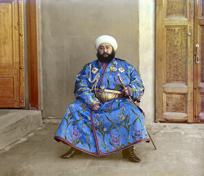
The photograph is an image of the Emir of Bukhara,* in what is now Uzbekistan. The photo appears so sharp and brilliant that it must be modern, but the dress of the Emir, and the overall appearance of the image seems old.

The glorious image of the Emir was taken by Russian photographer Sergeii Prokudin-Gorskii.

What is unique about Mr. Gorskii is that he was the first person in history to use color photography commercially. Color images had been made experimentally by photographers much earlier, the first is credited to James Clerk Maxwell in Scotland in 1861. French photographer Louis Arthur Ducos du Hauron (1837–1920) made successful scenic color photographs prior to the Russian’s work, but Prokudin-Gorskii perfected the process and made thousands of successful color photographs.

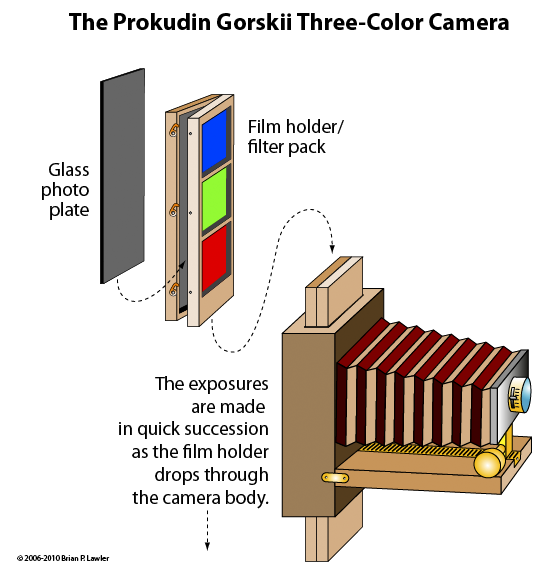
Gorskii’s camera was probably made by him, but it was fashioned after a German camera that he had seen while visiting western Europe. His camera used glass negatives which slid in a special holder through the camera during the exposures. In each film holder were three colored filters – red, green and blue. Each filter colored the light passing through the lens on its way to the glass plate. The result was a grayscale negative glass plate with three color separations imaged onto it.

In 1905 there was no practical way to print a color photograph, so Prokudin-Gorskii built (or had built) a three-color lantern-slide projector, a device which allowed him to project his images in color onto a theater screen. To make his photos visible, he contact-printed the glass negatives to glass positives, then he projected those positives for his audiences.

Prokudin-Gorskii’s photos are remarkable. They are sharp, vivid photos that tell a story about the Russia he knew. And, he served the Czar well, producing images far and wide of his kingdom.

When the Bolsheviks took over in 1918, Czar Nicholas and his family were executed. Those in the Czar’s service, including Prokudin-Gorskii, were forced to flee the country or be killed. Gorskii escaped into Finland, taking with him all of the glass plates he had made for the Czar, and he eventually made his way to France, where he lived until his death in 1944.

Saving the images made Gorskii a hero of Russian expatriates and nations sympathetic to their cause. But, the French government had no money to support the photographer or to purchase his photos. France was preparing for the next war, and preserving Czarist Russian history was not important at the time. Eventually they became of interest to a researcher for the United States Library of Congress, who located them in the basement of a French apartment building. The Library of Congress purchased the images from the descendants of Prokudin-Gorskii, and they were brought to Washington, D.C.

Though the photos have been reproduced numerous times, including a book about Gorskii published in 1980, it wasn’t until the development of Adobe Photoshop that it became possible for modern-day photographers to reconstruct the images made by this energetic photographer at the beginning of the 20th century.

Every fall, while teaching my class in color management, I have my students take the Prokudin-Gorskii images and assemble them into color photos. They are required to assemble them in correct order, then to carry out color correction and retouching to make these images as good as possible. It’s an exercise in keeping history alive, working with color, and understanding the roots of imaging.

A few weeks back, while sifting through a box full of photographic accessories in my office at the university, I came upon a nearly perfect set of color separation filters – Wratten four-inch gelatin filters in steel frames. As I admired these “relics” (I used them in a class I took back in 1972) I wondered if I could recreate the method of work of Sergei Prokudin-Gorskii using my modern digital camera.

And, this morning I set up my first experiment to retrace his photographic steps.

*Mohammed Alim Khan, Emir of Bukhara (1880-1944)

Posted in Art, History, Photography | 4 Comments

Indent-to-here, and using GREP to insert it


This entry originally appeared in July, 2010 on What They Think.

A seldom-used, but extraordinarily powerful command in InDesign is the Indent-to-here command, which is generated by hitting Command-\ (Control-\ on Windows) at the point where you want an indent to occur.

You can accomplish the same thing by using a Paragraph Style with indents, the first of which is a negative indent, followed by one or more tab characters to establish the subsequent indentations.

The benefit of Indent-to-here is that you can decide to create an indentation anywhere using the command, and all of the text from that point onward will be indented, until the next carriage return. “Soft Returns” are included in the indent, so they don’t cancel the effect.

When I write tests I use Indent-to-here a lot. Anytime a question or possible answer exceeds one line, I use Indent-to-here to hold the indentation point of the question or the answer.

The advantage of using Indent-to-here is that you can do different things on each line. In some cases the question takes more than one line; in other cases the answers take more than one line. In either event, the Indent-to-here command allows you to set the indent contextually.

This paragraph of text is “normal” in that it runs-on. It can be made better by using the Indent-to-here command in InDesign (QuarkXPress also has one).

This second example has Indent-to-here placed before the “Suppose” which causes all text from that point, until the next carriage return, to be indented there.

Indent-to-here will work anywhere. Though illogical, the paragraph above demonstrates this concept. Wherever you put it, indentation stays there.

The second phase of this topic is getting the Indent-to-here command in there without having to go to the trouble to typing it in. InDesign supports what are called GREP searches, which is geek-speak for some very powerful search and replace functions that use “regular expressions” as either the search string or the replacement string.

Using Find and Change in InDesign, and using the optional GREP functions, it is possible for me to search-and-replace all of the numbered paragraphs (questions) with an Indent-to-here command. And, using similar search strings, I can replace all of the alphabetic answer lines with an Indent-to-here command. These differ only in that answer lines have a slightly different structure: tab, letter, period, tab, copy. And, each one is a letter as opposed to a numeral.

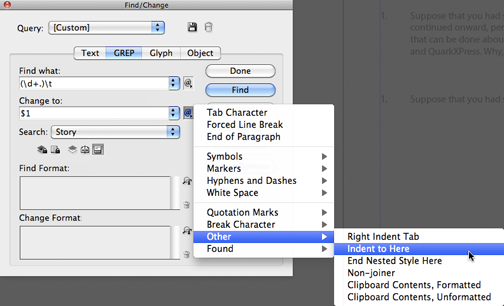
The example here shows the use of GREP to search and replace, adding the Indent-to-here command into the text.

GREP can search for numerals (one or more in this case) and replace with a string, and then it can search for tab followed by a single letter followed by a period and a tab. GREP can differentiate between capital and lower case letters if you want.

My solution is to insert the Indent-to-here command at every likely spot in a test where it might be helpful. In those lines where its function is moot, it is harmless. In any line that exceeds the line length, the Indent-to-here command causes the text to look, and read better.

This simple command is a life-saver for excellent typography.

Posted in Uncategorized | 3 Comments

AppleScript is a terrific tool for prepress

This entry originally appeared on What They Think in February, 2011.
A few years ago I wrote a small book called Beep! It’s about AppleScript. That book, now in its fourth edition, has never been printed on paper. I use it in my classes, and I have loaned it to other teachers who use it to teach very basic AppleScript programming to people who want to jump into programming, but want the happy-face version. I have never published it on paper because I keep changing it, and change is a curse when you must go back to press. The other reason I have never printed it is that I am a cheapskate, and printing costs money, while a PDF file costs (apparently) nothing.

For those who think that programming is an art, AppleScript can be as rewarding as any other programming language, and it’s slightly easier to learn than C++ or other high-level programming languages. It’s important to remember that all programming languages require a discipline that most of us don’t have. Programming languages are intolerant of error in grammar or syntax. They are strict and sometimes opaque – meaning that the solution to a problem is not easily discerned. Programming also takes patience and time, rare commodities in a prepress environment.

OK, now the disclaimers are stated, let’s see how you can use AppleScript in a prepress and printing environment…

Each year I assist in the production of a printed (printed!) directory of merchants and business people in our community. It is published by the local Chamber of Commerce. The Chamber maintains its member database on a Windows PC, and the application is unknown to me. Each year they generate the output to be published in two forms: pure alphabetical and category-then-alpha. This is so there is a cross-reference in the book.

Accountants come first, and within Accountants, Avery is first, followed by Charlesworth, etc. I use the same data for both listings, omitting any information that is unnecessary in the process.

The data come to me with markings that we agree upon, and sorted by the Chamber in the order they want. Problems occur with company names like !excitement (which starts with an exclamation mark) and 20-20 Marketing, which always sorts to the top, but doesn’t always belong there. The markings are possible in their database system, and they are reliable for me to use as search strings in my AppleScript programs, which I use to change things into printable styles that are use in Adobe InDesign.

Here is a key fragment of my AppleScript, which I run with an excellent text editor called Tex-Edit Plus, as it is applied to their database output:

 replace window 1 looking for return & "[#C]" replacing with return & "<pstyle:Category>"
 replace window 1 looking for return & tab & "[#O]" replacing with return & "<pstyle:Company>"
 replace window 1 looking for tab & "[#M]" replacing with return & "<pstyle:Principal>"
 replace window 1 looking for tab & "[#A]" replacing with return & "<pstyle:Address>"
 replace window 1 looking for tab & "[#P]" replacing with tab
 replace window 1 looking for tab & "[#Z]" replacing with return & "<pstyle:Address>"
 replace window 1 looking for tab & "[#F]" replacing with tab
 replace window 1 looking for tab & "[#E]" replacing with return & "<pstyle:Email>"
 replace window 1 looking for tab & "[#W]" replacing with return & "<pstyle:Web>"

The bracketed tags are the agreed-upon tags output from their database. The <pstyle:> tags are those acceptable to InDesign. Like other styles, these tags only identify the style to apply to the text that follows. The actual definition of the styles occurs in InDesign.

And, there is the beauty of the process. The styles (color, fonts, sizes, alignment, etc.) can change from year to year, and the style names (and my AppleScript work) can remain the same. So, the content is consistently prepared (I wish this were true) and the styles can be changed at the whim of the designer.

The nice thing about building the AppleScript is that it can take a file with hundreds or thousands of entries (this is a small city, so ours listings are small) and process them in about five seconds to make the database printable. I admit that I am constantly modifying the AppleScript to accommodate problems in the database files. There are occasional errors in the database records, but in the end the process saves hours and hours of hand work.

The hours and hours I spent creating and correcting (debugging) the script pay off in savings in the long run.

Addendum for August, 2011: This year the Chamber of Commerce has changed design agencies to do the production, and that agency has changed the style of the listings, which will require me to modify not the basic function, but the order of my AppleScript. I have looked at the new format, and I have a scheme in mind for processing the data this year. But I won’t tackle that until later in the summer.


Posted in Uncategorized | Leave a comment

Mask of ingredients

This episode originally appeared on What They Think in February, 2011

This is my last blog on masking. I promise. At least for a while.

My challenge today was to mask a photo of ingredients for a recipe in a cookbook, dropping the background, and replacing it with a colored gradient.

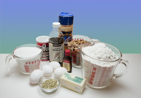
This is the finished photo with its replacement background. This one was particularly tricky because the glass measuring cups and the vanilla bottle have variable transparency. The mask must allow some of the background through, but not all.

This would be an easy mask were it not for the transparent measuring cups and bottle, which must be masked differently to allow some of the background through. This is one where most of the work has to be done by hand, and this one took me about 30 minutes to complete.

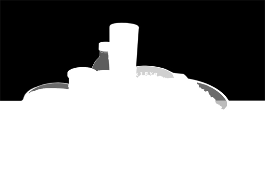
I could use MaskPro for the basic shape, and I did that. But the interior shapes of the glass containers I did by painting with a brush with various gray shades to allow more or less of the background to show-through. More for the clearest containers, less for the more opaque containers.

For the two-cup Pyrex cup on the right, I decided to use a darker gray to mask more of the background. For the two measuring cups on the ends, I used a lighter value to allow more of the background to show. For the bottle of vanilla I allowed most of the background to show-through, but I had to modify the shape of the mask inside the top of the bottle to accommodate the dimples in the glass. Reflections bend and twist around shapes like this, and I followed the shapes of the plastic as I drew the gray mask.

An easy way to draw these masks is to draw with solid black, and then to select the black interior spaces with the Magic Wand, and then change the solid black into a gray value according to the amount of transparency I want.

This is the mask. Notice the work along the edges of the glass and plastic containers. Varying amounts of gray allow the background to show-through.

Extreme attention to the way light wraps around the salt cylinder is important. There is a bit of a glow along the edges as the cylinder rolls around the edges. I experimented with a very hard edge at first, then drew a softer version to allow some of the glow to show, and it makes the salt look more natural. This softer mask allows the photo to look more realistic. The edge of the baking powder can also needed a bit of softening to make the edge look realistic and not “cut out.”

For almost all of this I used a simple paint brush, varying the hardness of the brush according to my need to make edges look “real.”

Posted in Photography | Leave a comment

The Mask of Zero!

This episode originally appeared on What They Think in February, 2011.

In my continuing effort to make masking easier (nearly impossible), I have come to the conclusion that masking technique must be selected on an image-by-image basis. There is no single tool for making a successful mask. Instead, it is a combination of tools such as Mask Pro (described in my previous blog on the subject) and the Refine Mask tool in Adobe Photoshop that make the best masks.

Those tools, and a lot of hand work, make a perfect mask.

For today’s episode I decided to make a mask by hand, using the brush tool. My only “special” consideration was the hair, on which I used Photoshop’s Refine Mask tool to improve a bit on my work. It added a bit of realism to the hair, and I am happy with the result. The rest of the mask was made the hard way, which is to say I painted around the figure to remove it from the background.

I never do this on the photo itself; instead I paint on a Layer Mask, which can be added to any unlocked layer in Photoshop. Then it’s just a matter of choosing the painting tools and investing an hour or more to the task.

In this example I spent about 65 minutes, which if I were charging for my services, would be a charge of about $130.00, and that’s a lot to charge to mask an image – especially one that appears so simple. I could have done it faster (see my earlier blog on using a modified channel to accomplish a similar effect). But on this one I didn’t want to do it faster, so I did it the hard way and I timed myself.

The hardest part, after the hair, was the zipper. That took a little more time than just pushing the brush along the edge of the image. I used a hard-edge pencil tool and drew every gap between the teeth, then I used the same tool to paint along the outer edge to complete that section of the mask.


Here you can see the effect of my mask through the edge of the eyeglasses.

The next-hardest part was the eyeglasses. A mask on eyeglasses must be partially-opaque, as the glass lenses in the frames have imagery in them. For that I painted with a light brush on the mask, allowing part of the original image to show-through, but also masking it. It’s tricky to get the frames to appear realistic, but I seem to have succeeded there.

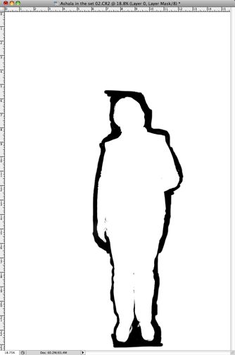
This is the detail of the eyeglasses in the mask. Notice that the translucent part is represented by gray, while the masked part is represented by black.

The mask is successful, very clean, and commercially acceptable. Putting the model on top of an alternative background proves its real quality; it looks very convincing.

This is the complete mask. The zipper that caused the difficulty is on the left side of the jacket.


Posted in Photography | Leave a comment

I wanted to thank that Masking Man

This episode originally appeared on What They Think on January 22, 2011.

Today I’ll take you on a journey to mask one of the same images I used last week, a photo of my gracious wife (she being gracious for allowing me to use her image in my blogs) standing on a plain white paper background. The background, for those who care, is a Savage brand official photographic paper background, nine feet in width, suspended from a Savage brand backdrop stand.

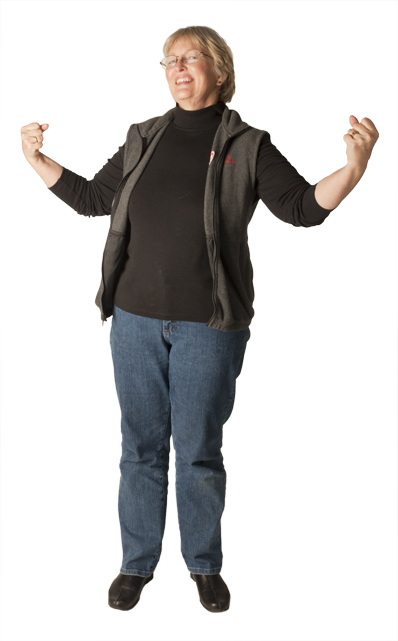
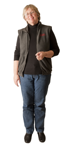
This is the final image, after being masked with MaskPro and Photoshop.

The lighting is two Canon 580EXII battery-powered strobe lamps on the paper behind the model, and three Paul C. Buff Einstein 640 WS strobe lamps to illuminate the foreground subject. I use a Giant softbox (also made by Buff) and an umbrella as a second front source, and a “separator” light high and behind the model, glancing off her head (top-right-rear). All of this is triggered by radio transmitters on the camera (requires two).

Once in the computer, I need to remove the background. As with the two previous episodes, I want to make a mask in Photoshop using a Layer Mask.

For this example I used a third-party application/plug-in for Photoshop called Mask Pro that allows me to paint a mask that ultimately becomes a mask in Photoshop. Mask Pro is sold by OnOne Software for US$149.00, which is a boatload of money for just making masks. But, considering how many masks I make, it’s worth every penny.

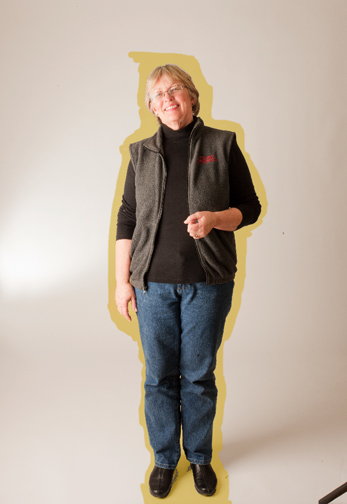
This is my wife in MaskPro. The yellow-gold brushstrokes indicate the outline being created in that special software.

To build the mask, you double-click on the Mask Pro software from Photoshop (image already open and color-corrected). This opens the image in a different window. In this window your choose colors to keep and colors to drop with two eyedroppers. I find it best to the mask in sections, depending on the various foreground and background colors. Skin tones of the face versus various whites and grays in the background I do first. Then I clear the two color palettes and sample clothing for the mid-body and background whites and grays. Once past mid-body I clear again, and choose new clothing colors for the jeans and background colors again.

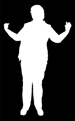
This is the mostly-finished mask made in MaskPro. It still needs some work around the shoes, but the rest is nearly perfect. Filling-in the remainder of the background is done with the paint bucket tool in Photoshop.

Last, I clear again, and do the shoes and the adjacent background. The shoes are always difficult, but it’s easy to fix them in Photoshop using the standard brush on the Layer Mask.

I have used Mask Pro for about six months now, and I have become fond of its ability to mask these photos pretty nicely. It’s particularly effective – though not perfect – on hair. With some practice, and testing with its sliders for brush size, softness and threshold, I am able to make a very good mask of even the fuzziest hair.

In some cases I complete the mask in Mask Pro, then use Photoshop’s new Refine Mask tool to enhance the mask even more. I’ll discuss the Refine Mask tool in my next blog. Notice how cleverly I avoided putting a date on that blog. It’s really busy outside!


Posted in Photography | Leave a comment

Who was that Masking Man?

This blog originally appeared on What They Think on January 18, 2011

In our last episode of Masking Man, I demonstrated how I had used a duplicated channel, which I then modified with the Levels tool, to make a mask to drop a photo from its background.

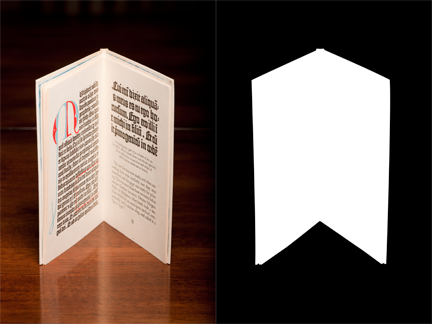
The original photo on the left is fine, but I wanted to feature the book without the background. The mask on the right allows me to remove the book from its background and replace it with another background.

Today I will demonstrate how I would mask a mechanical object from its background. I chose one of the photos of the Tommasini books (described in an earlier blog) taken on a dark wooden table. The idea is to make an image that floats on a new background (or no background at all).

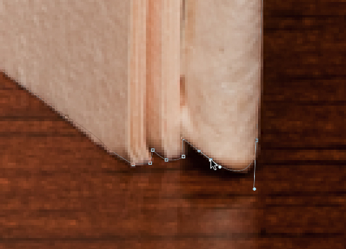
For this kind of mask I use Photoshop’s Pen tool, which behaves exactly like the Pen tool in Adobe Illustrator. I am very comfortable with Illustrator, so the introduction of the Pen in Photoshop was something that I welcomed.

In this example, which is to mask not-quite-straight lines of the edges of a book against the background, the pen tool is perfect. Adjusting anchor points and handles allows me to follow the shapes of the book very accurately. And, since every anchor point and handle is editable, I can fuss over the points until I am perfectly happy with the resulting outline.

After drawing my path, I have created a perfect Clipping Path, usable in InDesign if I need it for a run-around or a knock-out. But in this example I want to float the book in Photoshop, substituting a gradient background for the original.

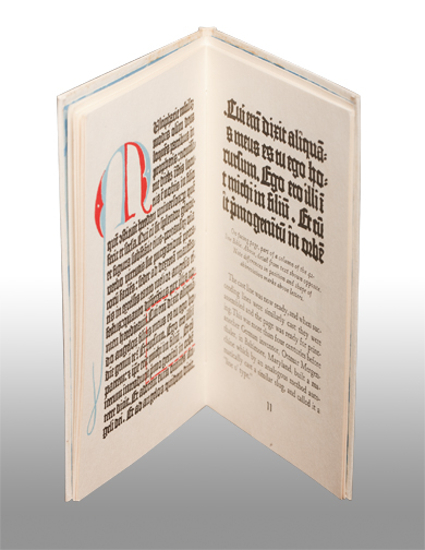
To do this, I converted the pen path into a selection, which required just a Command-Click on the path icon, and then I made a Layer Mask, which automatically dropped the background (unlock the background layer first). Adding the gradient was just a matter of making a new channel, filling it with the gradient, and sliding it below the Background (original) layer in Photoshop.

With images like these, with Layer Masks and Effects Layers, I always save the resulting file, complete with all the layers, as a Photoshop (.psd) file. TIFF will also work, but it is fast becoming obsolete (not used much these days).

As to the effectiveness of the mask, it’s clean and accurate. Choosing the correct background will make the photo exactly what I had in mind when I started the project.


Posted in Photography | Leave a comment

The challenge of masking images

This blog originally appeared on What They Think in January, 2011

It’s simply amazing how many images need to be masked. By masking an image, I can separate the subject from the background, and that seems to be my second job these days.

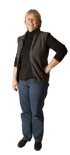
I’m in the middle of the annual rush to take photos for a local bank, and these photos all must be masked. They are photos of people standing on a white paper background. In spite of that background, and the strobe lighting that I cast on it to blast it out to white, every image must be masked in Adobe Photoshop.

I am sure that some would argue that I am not doing a good enough job of lighting, and I agree. However, with the number of strobe lights I have, and the size of the space where I usually work, it’s what I can do. I use three 640 watt-second Einstein strobe lights for the foreground, and two Canon portable strobe flash units to illuminate the background. It’s a lot of light, but I still feel that I could use another pair of Canon portable strobes on the background to make the background whiter (and make the masking process easier). Those lights, including the radio triggers, are about $600 each; that will have to wait.

Masking is a classic photo and Photoshop challenge. Cutting things out of backgrounds is a task that many of us must complete in our day to day work. And it’s sometimes really, really difficult. At the very best it can be time consuming.

One would guess that masking a person standing in front of a white backdrop could be done with channel masks, and then perfected with the masking tools in Photoshop. This is true, and on some of my images, those where the subjects are wearing dark clothes, the process takes just a few minutes because the foreground can be separated from the white background quite easily with the Levels control in Photoshop.

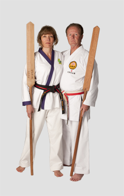
Others, like the photo above of two people wearing karate gis (a white two-piece costume), cannot be separated easily because the differences between white and white are too subtle to be separated with the Levels controls. For this one, I need to create a layer mask. For that I use a combination of tools – brushes, mostly – with black to mask out the background, and white to keep the foreground.

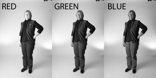
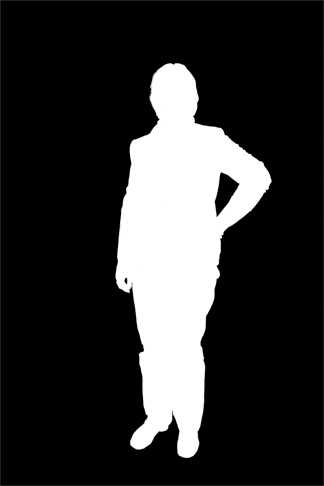
Beginning with channel analysis, I search for the color (red, green or blue) that provides the best contrast between the subjects and the background. In many photos, it’s the green channel. I can copy that channel, then adjust the tonality of the resulting copy to create a mask based on the tones in the photo. With some retouching after the fact I can build a mask to drop the background in a matter of minutes. The mask below is one that took just a few minutes, a result of copying the green channel and adjusting it with Levels.

For more difficult scenes I resort to hand work.

In the next few days I will discuss several ways to mask images in Photoshop, these may of some value to those who do prepress work, or retouching, file preparation or image modification. This kind of work touches us all in some way.


Posted in Photography | Leave a comment