
New FontShop iPad book is a stunning visual experience

…and it’s a useful tool for typographers!

FontShop, an online font vendor, has for years published a wonderful book available called FontBook. It’s about 6×12 in. and three inches thick, and it costs about $100. I have bought two editions of this book over the years, and it’s a fabulous reference to the world of digital type. The current edition is 1,703 numbered pages of fonts!
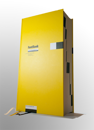
The current printed edition of FontBook, a 1,700-page cloth bound book from FontShop.

With approximately three fonts per page, that’s over 5,100 fonts in the book.

What I like best are the origins, the designer’s name, the foundry, the historic references. The FontBook is my able assistant, my go-to book for almost everything typographic. Font Shop does not sell every font on Earth, but it does sell a large number of them.

In mid-July FontShop sent an announcement of the latest edition of their Font Book, announcing that it would be selling later the same day, that it was much larger, and 80 percent lighter! How? They put it on the iPad.
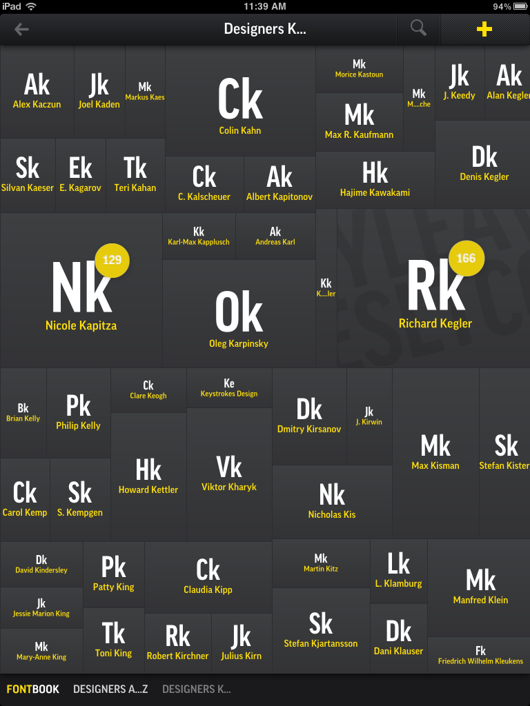
This is a typical page in FontBook. This one is for finding fonts designed by people whose last name begins with K. Other categories include foundry, year, alphabetical, and category listings.

And, wow! They did it right.

There are now hundreds of thousands of fonts represented in the Font Book (they say it’s 610,000) and it has a most intriguing interface that is unlike anything I have seen before. You can choose from designers, foundries, categories – serif, sans-serif, blackletter, etc. – and then you can see the font, see its complete character set, compare it to other fonts, sample lettering set in a specific font, then send samples to your friends as e-mails, Tweets, Facebook comments, and more.

If you have any interest in type, and if you have an iPad, this is a completely new experience. You’ll find on opening it that it draws you in, and doesn’t easily let go. You’ll find yourself finding fonts designed the year you were born (mine is Palatino), fonts that are made by a particular font foundry – most of the foundries are well represented – or fonts designed by your favorite designer (mine is Hermann Zapf).
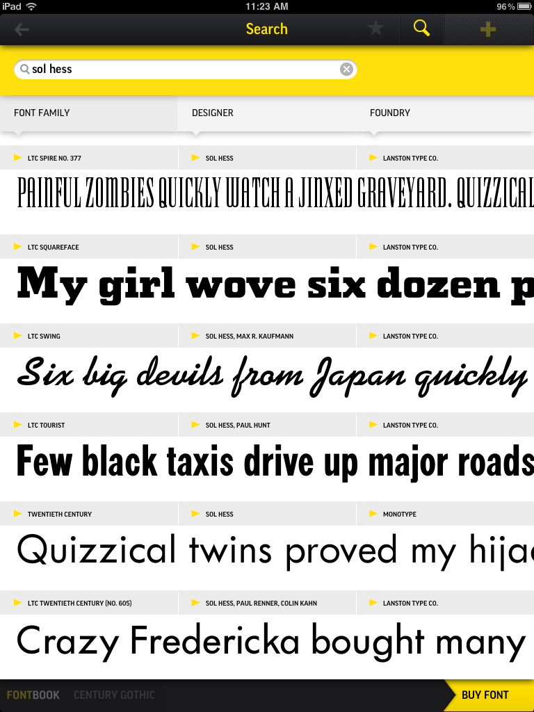
In this example I am searching for fonts designed by Sol Hess, a 20th century designer who worked for Lanston Monotype, Linotype, and other foundries.

I have owned my copy for more than a week, and I still find myself getting lost in its delightful interface, which I think is more like Alice’s Adventures in Typography than any actual book. I fall down rabbit-holes in the book, and find my way back out again, each time discovering something new, something delightful or something clever.

Being a commercial entity, FontShop has a little button at the lower-right of every font example page that says, “Buy Font.” This book becomes a reference, an encyclopedia, and a catalog from which one can find and purchase digital fonts.

But, even with over 600,000 fonts, there are still some missing. I couldn’t find one of my all-time favorites – Parsons – in the book, and I don’t know why. Parsons was originally designed by Will Ranson at Barnhart Brothers & Spindler in the early 20th century. I own a digital family of Parsons, purchased a few years ago from Alphabets, Inc. and credited to the work of Inna Gertsberg and Susan Everett.

The fact that I can’t find this particular font in the FontShop book is not a surprise. It is impossible for these innovative developers to get every font in existence into this new book/app, and it might be that Font Shop does not have marketing agreements in place to display or sell all of the fonts from all of the font designers in the world.

Meanwhile, back at my iPad, I find this new application/book/experience so compelling that I recommend it to anyone with an interest in typography. It’s nothing short of amazing. And, it’s cheap – just $5.99 at the iTunes Store.

 

Posted in Art, Education, New technology | Leave a comment

The Stinkin’ Badges Project

(This entry originally appeared on WhatTheyThink.com on March 28, 2011)

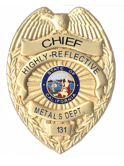
I have taken a break from my work analyzing the Memjet printer (I know that everyone is waiting for more news on that, but this project took priority for a while) to do some photography for a federal agency. The project was to photograph some of the law enforcement badges used in the various agencies in this department. One of them is the Dept. of Highly Reflective Metals.

This was a nightmare assignment, one which most photographers shun because it’s so darned hard to do. I would rather photograph weddings than badges (not really). My first attempt was to place the badge on a white card, use soft overhead portable strobe light, and take a photo. Wrong, wrong wrong!

This was a catastrophe, and I should have seen it coming; I think I was being lazy. On my second attempt, I employed the right technology. I used three 640 watt-second Einstein strobe flash units, an isolation igloo from Photoflex, and a badge trapeze of my own construction – see below. I also added a white card suspended from a light stand with a hole cut in it to allow – only – the front element of my lens to show through. Reflections are your enemy with any form of jewelry photography, and badges are a particularly difficult type of jewelry because they are rounded on the front face, creating the opportunity to reflect everything in their environment including the camera, the lights, stands, and more.

This is one of the badges I photographed in my tent. You can see the trapeze of fishing line I used to suspend the badges in mid-air while photographing them.

So, isolating the badge in a white tent surrounded by a massive amount of light allowed me to get good depth of field, perfect illumination, and almost no reflections. My badge trapeze is nothing more than a pair of posts made of foam core with strands of fishing line stretched across between them. I suspended each badge on the fishing line, then put the trapeze into my igloo, and made the photos. Even with the fishing line support, I still had a tiny bit of retouching to do in Photoshop on each image. Exposure was not a problem; in fact I had to reduce the amount of light I was flashing into the igloo.

Here is the badge photography set-up. Note the white card with a hole cut in the middle to allow the lens to look through. On both sides are 640 ws Einstein strobe flash units. The tent is made by Photoflex, and it is great for small table-top photography where the objective is to remove all shadows.

I use the radio controls for my Einsteins, so controlling the lights is easy and extraordinarily accurate. The Cyber Commander radio controller allows me to adjust a single strobe lamp in 0.1 stop increments. I used the new Canon 100mm macro lens at f32 for most of my exposures, which ensured that everything on each badge was in perfect focus. On one of the badges I could not get a shot without disturbing reflections of the camera lens. I solved the problem by shifting the camera to the side, and shooting the badge about 10 degrees off-axis. Then I returned it to square in Adobe Photoshop using its geometric editing controls (distort and perspective). That worked perfectly.

Here is my advice to erstwhile badge photographers: proceed with caution! If you are careful, and if you set-up your photographic environment correctly, you will succeed. If I had it all to do over, I would rent a Canon shift-tilt lens for this project. These lenses allow the camera to be moved left or right (or any direction), and then the image shifted by virtue of the mechanical shift mechanism of the lens. This would make it possible to avoid the direct reflection of the lens on the badge faces. I have to go now to enforce the law for the Department of Highly-Reflective Metals. Back soon!


Posted in Photography | Leave a comment

The Blognosticator is back!

Welcome to the Blognosticator.

This is my blog about things related to printing, prepress, digital photography, and sometimes unrelated topics.

I have included here a number of blogs that were originally posted to The Blognosticator when it appeared on WhatTheyThink.com, and blogs from Graphic Arts Monthly, and Converting Magazine, both now defunct.

I have been writing blogs for the graphic arts industry for four years, and have amassed a collection of about 400 pieces.

Please let me know if there is a topic you want me to address, as I am open to all suggestions.

And, thank you to the staff of WhatTheyThink.com for their support in 2010 and 2011.

Best wishes to all,

Brian P. Lawler
The Blognosticator


Posted in Uncategorized | Leave a comment