

I am the faculty advisor of the Shakespeare Press Museum at Cal Poly. The museum is a working collection of type and printing presses that collectively represent the history of relief printing from 1850 to 1950.
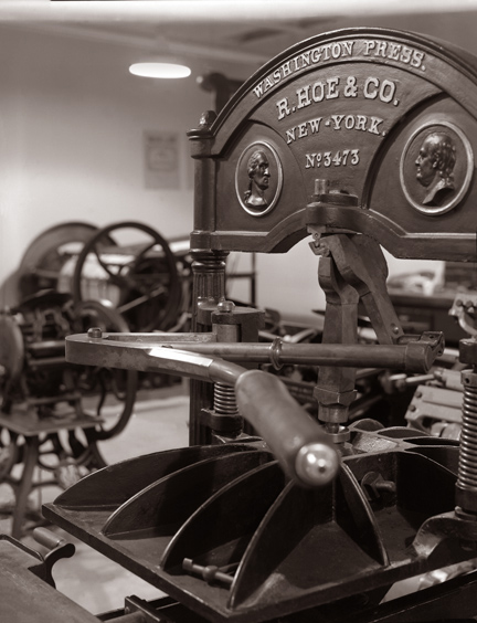
This is one of four 1850s-era Washington presses in the collection. Two of them are on display, and are fully functional. When I feel like having a real Gutenbergian experience, I can print on these machines.
We have 19 working letterpress machines, starting with an 1850 Washington hand press, a line of treadle-operated platen presses, two working lever platen presses (C&P Pilot, and Columbian), and we recently acquired a Heidelberg Windmill press, known around the world as a Tiegel (German for “crucible”).
Over the course of about 75 years, Heidelberg manufactured this machine, which became the most popular letterpress printing machine in history. Most of those machines made by the company are still in operation, and it’s possible to purchase one used on eBay almost anytime.
The Shakespeare Press Museum also has a collection of hand-set metal and wood type numbering about 450 fonts. Many of these of common: Baskerville, Stymie, Goudy, Garamond. Some are rarer: Kismet, Engraver’s Roman Shaded, and one particularly interesting style called Lining Livermore.
I have been attracted to this type for many years, and have used it a few times to print small cards and announcements.
Last week I decided to make a digital version of Lining Livermore.
I have made digital versions of about a dozen of the fonts in the collection. We hope to offer these fonts commercially in the future, once the hard work of redrawing them is complete.
Before I attempt to make a revival of any font, I begin an Internet search. If I find the font commercially available, I stop, as there is no point recreating a font that is already available on the market.
In searching for Lining Livermore, I found one oblique reference to the font in a blog, and that was it. Nothing has been done to my knowledge with Lining Livermore. Finding no digital versions of the font, I decided to proceed.
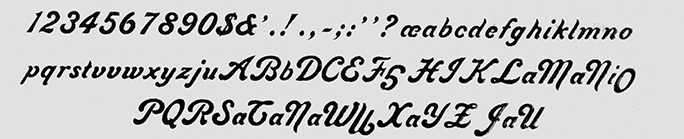
Step Two is to set a specimen of the type, and proof it on proofing paper to scan for digitization.
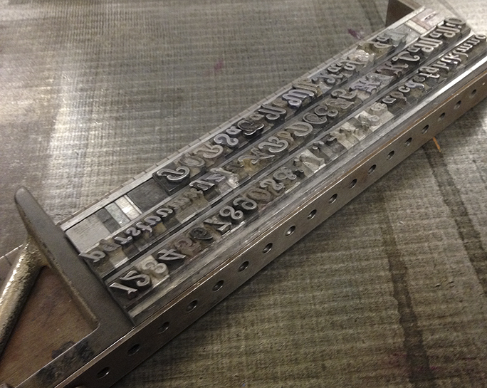
This is the complete Lining Livermore font assembled in a composing stick. Notice the upside-down cap G in the second line. This was an amusing error, but caused me no difficulty. I just turned it over in Photoshop!
The museum’s biggest problem is that of indexing its collection of type fonts. We have made several attempts to do this, and have made some progress. The latest attempt is in a FileMaker database. That database will help us to identify the hundreds of type fonts in the collection, and to guide visitors to the fonts when they are needed.
I searched high and low for Lining Livermore, and finally found it in a closet off the main room, behind a tool box and our janitorial supplies. Even walking into that closet was difficult, as it is a repository for all things we don’t want the public to see. I removed the drawer from the cabinet and brought it out into the light. We have the font in three sizes, and I chose the largest – 24 point – for my proof.
Using a composing stick and some 35-pica slugs as leading, I composed a quick alphabet of lower case, then added the numerals, the caps, and all the available punctuation in the drawer. This is a surprisingly complete collection of type, especially considering that it was likely manufactured in 1887 in Philadelphia. That makes this particular font about 125 years old; it’s amazing that so many of the letters are still here, and still in good condition.
Once that composition was complete, I spaced-out the ends, and did a careful cleaning of the type using solvent and a toothbrush. My objective was to get dried printer’s ink out from the crevices of the type. 127 years of use can cause a build-up on hand-set type!
Step Three was to lock the type into the Vandercook proofing press, a Model SP 20. Usually I use a chase and wooden furniture to do this. But proofing loose type is much easier. I just locked the composed lines of type into the press. Inking was done with a small hand brayer. I didn’t want to ink-up the Vandercook for just a few pages of proofing. The first impression was lovely, and I took a couple more to see if I could improve on my luck. I didn’t notice at the time that I had omitted the capital V, an oversight that required me to return to the museum another day to proof just that one letter.
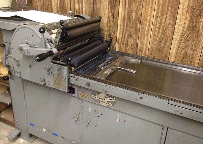
The SP20 Vandercook proof press in the Shakespeare Press Museum. My type is locked-up in the bed, and the paper is prepared on the top cylinder.
Once I confirmed that my proofs were excellent, I cleaned the type very carefully and returned it to the drawer, being especially careful to check every letter going back in to ensure it is in the correct spot. Misplaced letters are a curse to the hand-set typographer.
Then I cleaned the brayer and the inking stone, the leading strips, the surface of the Vandercook press and the work surfaces in the museum. Once everything was back in place, I took my proofs and headed home.
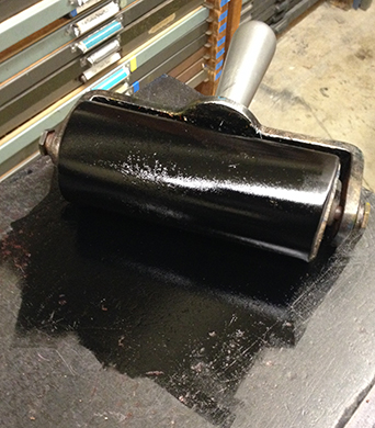
This is the brayer, inked and ready for the proof press. This is washed-up by hand when the work is done.
Step Four was scanning, which is a very important step in the process. I scanned the proofs at 1200 ppi on my flat-bed Espon scanner, saving them as TIFF files. These files were then used as templates in Illustrator, where I prefer to draw letters for the fonts I design. Converting a scan of a letterpress font to vector illustrations is a fairly complex task, as one must use intuition to pluck the consistent parts of a font from the proofs; it’s not as easy as just drawing what is on the screen.
This is the scan of the proof made on the Vandercook. Now I see that upside-down G! (and there is an upside-down O also).
The font then begins to take shape. More on that tomorrow.