
I just returned from a 2,018-mile journey up the coast of California, into Oregon, then back by a slightly different route.
Along the way I visited and camped in National Parks, State Parks, National Forests, and private campgrounds. Along the way I stopped to visit beaches and lighthouses. I hiked through redwood groves and wondered at wonders all along the route.
And I practiced typographic criticism all along the route. On nearly every roadside information sign I grimaced as I found typographical errors, stylistic inconsistencies and major typographical gaffes.
Bronze busts with errors, the most costly of the genre make me want to scream: “Doesn’t anyone proofread these things before they are cast?!”
An example: at AT&T Park, home of the San Francisco Giants, all of the quotes painted (printed?) on the walls are made with incorrect quotation marks and apostrophes. And, to make them even worse, all of the quotation marks are followed by a space (don’t do that!) at the beginning, and preceded by a space (don’t do that either!) at the end. Willy Mays is my lifelong hero; why insult his quotations with bad typography? (Mays is still alive.)
At the Umpqua River, I visited the lighthouse, now operated by the county of Douglas, which keeps it running for navigators at sea. It is a beautiful historic lighthouse featuring a working Fresnel first-order rotating light, apparently the only one of its kind still in operation in the world.
In the museum next door are delightful exhibits that describe the lighthouse and its storied past. It’s quite a place.
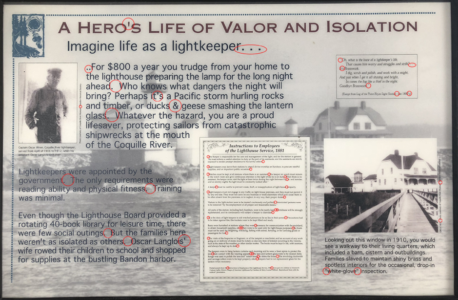
I have circled the typographical errors on this informational sign. I could almost not read it for the stumbling blocks of misused marks, etc. Remember my motto: Don’t interrupt the reader!
On a sign in that museum I found 56 typographical errors (I consider incorrect spacing, incorrect apostrophes, incorrect dashes, incorrect quotation marks, to be errors. That’s the point of these essays). Fifty-six!
It starts in the headline, and continues to the bottom, every single apostrophe and quotation mark is wrong. There are ellipses with two dots (don’t do this!), ellipses with dot-space-dot-space-dot (nor this!). There are spaces before closed-quotes, and spaces after open-quotes. None of these is correct.
There are sentences separated by one space (correct!), and there are sentences separated by two, three, and (maybe) four spaces.
There are hyphens used where there should be a long dash (I don’t care which one).
There is an ampersand used in prose where the word “and” should be used.
It goes on and on and on, and it made me quiver with the Typographic Tremors. Someone was paid – a lot of money – to make this sign and erect it on the site.
Why not do it right? Why not consult with a typographer who can point these errors out before they go to printing, mounting and erection?
I am willing to do this for any organization – be it a National Park (they have a staff typographer at Harper’s Ferry) or a local landmarks commission. I stand ready to critique and mark-up any historic marker signs and placards. Send me a PDF! I’ll do it with a smile. No charge!
And, then the viewers of the signs can appreciate their beauty and information without getting the Typographic Tremors.
Something that has cost me a good deal of tooth enamel over the years is the common failure of subject verb agreement in statements of the form “None of these are …” It should be,”None of these is …” I expected better from you.
Dear Don,
I apologize for the error, which has been corrected, and I appreciate your letting me know it was there.
Brian P. Lawler
The Blognosticator
“Doesn’t anyone proofread these things before they are cast?!”
I feel your pain. I feel comradeship. Then all too quickly the new-found flower wilts.
“On a sign in that museum I found 56 typographical errors (I consider incorrect spacing, incorrect apostrophes, incorrect dashes, incorrect quotation marks, to be errors. That’s the point of these essays). Fifty six!”
Where’s the hyphen in fifty-six? He didn’t proofread? Surely not. Well, it just shows, nobody’s perfect. But then, wait! There’s more!
“It starts in the headline, and continues to the bottom, every single apostrophe and quotation mark is wrong. There are ellipses with two dots (don’t do this!), ellipses with dot-space-dot-space-dot (nor this!). There are spaces before closed-quotes, and spaces after open-quotes. None of these are correct.”
Over the years, this common failure of subject verb agreement has cost me a lot of tooth enamel. I have learned to put it behind me rather readily, but I was expecting better from you. Now, please repeat after me, professor: none of these is correct.
Dear Don,
Noted, corrected, and apologized-for.
Thank you for your kind letter.
Brian P. Lawler
The Blognosticator
Who is this interloper using my name to comment on your article?
What extraordinary coincidence; how could it be that we share both the same unusual name, and the same abhorrence of subject verb disagreement? Is it possible I myself made the earlier comment and subsequently suffered amnesia?
Hi Don,
The chances that another person has the same name as yours are slight. I suspect that it was you who commented those years ago, and that you have forgotten.
Your comments on my blog post were extensive, and I wrote an apology to you after correcting the text.
It’s nice to hear from you again!
Brian P. Lawler
The Blognosticator
No, honestly, it wasn’t I. Have you perchance compared the email addresses each of us provided?
The other Don is obviously a man of wit, but I would submit my copy is somewhat more succinct.
Hi Don,
I searched my comments history, and I found that you have sent four comments. All came from the same e-mail address: dcjlg@msn.com.
Brian
My own error noted.
We rely on your promise not to show email addresses.
Could you delete that post, or at least the sensitive part, please?
Thank you.