Every year about this time I get out my recipes and I make a load of biscotti to give away as gifts, and a few for myself.
I love biscotti, and I love making them. Years ago I was given a recipe by my friend Tim Mantoani, a photographer in San Diego. This recipe is from his grandmother Lorraine, who makes the best biscotti in the world. A few years ago, I took the recipe and modified it a bit, and published it in a recipe book my students made for my course in Advanced Typography.
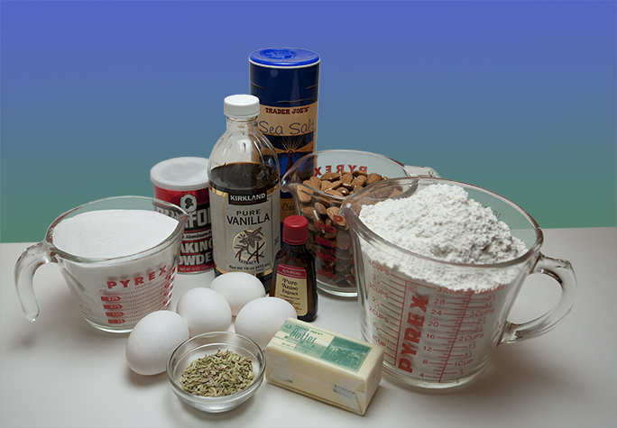
The biscotti ingredients: sugar, vanilla, baking powder, eggs, fennel, butter, anise extract, almonds, flour and a pinch of salt.
I have published it twice, and modified it a number of times to suit my typographic taste.
I also baked the cookies and photographed them for the recipe book, which was fun and tasty. It was also a great opportunity to do some table-top product photography, and to embellish the resulting photos to show these extraordinarily flavorful cookies.
After the photos were complete, I decided to change the setting from plain white sweep to a color background, and I needed to modify some of the reflections and highlights in the photos. These changes and corrections were to prepare the photos for print. In the world of advertising photography, this is a routine process of making a product look a little better, a little sharper, a little prettier, and bigger than life.
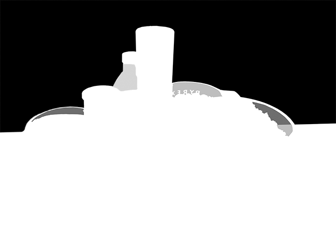
This is the biscotti mask. Notice the gray areas, which represent partial transparency for the background. The gray area on the right has two tones: one for the background, one for the tabletop.
The photography is straight-forward. I lit the shot with a single softbox suspended over the subject, and a little forward of center. I shot these photos with my Einstein strobes, which I love for their color consistency and overall quality.
After opening the image in Adobe Camera Raw, and adjusting the color temperature a bit to get my neutrals neutral, I opened it in Photoshop, and began the process of making the photo better to please the art director. While this work was continuing, I was enjoying biscotti and herbal tea, a great complement to Photoshop.
For the photo of the ingredients I needed to draw a mask to remove the backdrop. I did this first by choosing a channel with the greatest contrast between subject and background, and I copied it, then pasted it into the mask layer for the image. With Levels, I darkened the darks then lightened the lights to make a high-contrast drop-out mask. I then dropped a new background behind the image, a gradient of green to blue.
This detail shows the mask with its various levels of gray to reveal more of the background – but not too much.
This worked very nicely, but there are areas in the photo where flour, almonds and sugar are in glass measuring cups, and the transparency at the tops of those cups needed to be added to the mask. The result of this is that the color background is allowed to show through the glass at a fraction of full value. To do this I painted on the mask with gray in the tops of the cups. I used a half value gray, and it looks perfectly convincing in the final image.
And, at the edge of the flour cup there is a difference between the backdrop and the table top, which I had to acknowledge with a change in the density of the mask. This prevents the measuring cup from looking like it isn’t sitting naturally on the table top.
Once the mask was complete, I made small adjustments in the way that the background shows through the bottle of vanilla, and then I declared victory and moved on. I think I also did one pass of Unsharp Mask on the image to make it appear a bit crisper.
Here is my second photo, showing a single cookie with a cup of coffee. It was a nice photo, but it needed “something” so I added a mask and dropped in a new color background, shown in the next photo.
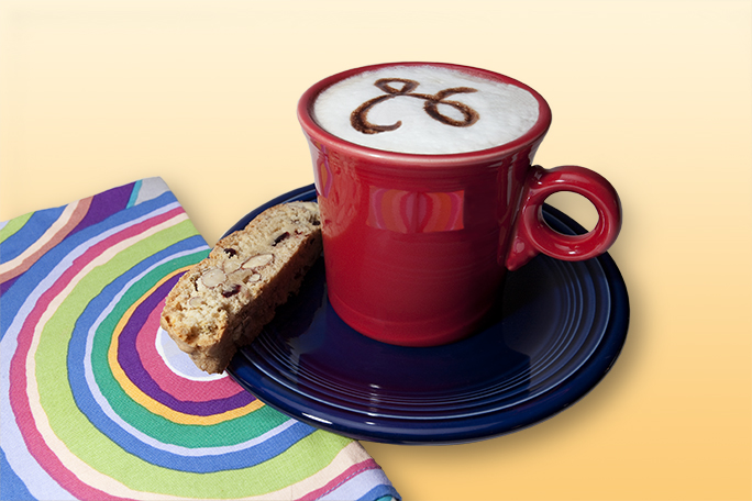
The coffee cup and boscotto (singular) on the blue plate also needed a bit of work. Though the original image was nice photographed on a plain white sweep, it needed something to add a little more color. I decided to mask the white background out and replace it with a gradient complementary color, one I selected from the colorful napkin in the photo (the napkin comes from Picking Daisies, a San Luis Obispo specialty store).
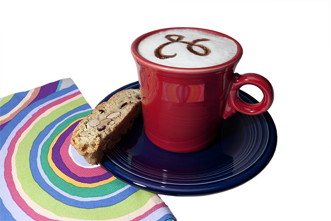
Here is the second photo with its added mask, and a shadow.
Once that mask was complete – and it was much simpler than the other mask – it looked OK, but it needed a little something, so I added a shadow. To make the shadow, I copied the mask, inverted it, blurred that a bit with Gaussian Blur, then I drew modifications to the shadow that I wanted. In the end, the shadow is convincing and it adds quite a bit to the photo. The last step was to sharpen the individual cookie on the plate, which I accomplished by selecting it with the Quick Selection tool, and applying Unsharp Mask. I pushed this pretty far, knowing that the cookie should simple crackle with sharpness. The result looks good enough to eat.
Here is the shadow for the coffee cup photo. I made this with an inverse copy of the mask, then I blurred it, and painted in some changes to make it look for realistic.
For the cover of the recipe pages I included another variation of this same photo, also sharpened to enhance the appearance of the biscotti. In that image I also had to add a blur of red in the lower-right corner to fill the triangle of space left between the plate and the edge of the page. This is obvious when you know it’s there; otherwise it’s just more of the plate.
When I was finished, I had eaten most of the biscotti, so I made another batch!
Click here for a PDF of the finished Biscotti Recipe
The recipe is included here for you to try. These cookies are delicious, and I thank Tim’s Nana Lorraine every time I make them and enjoy them.




Brian:
What “flower” do you find best for this recipe? We have azaleas, and I think that gooseberry is coming into bloom.
Merry Christmas!
Ellis
Hi Ellis,
I am humiliated! I didn’t see that one as I typed it. But, it’s fixed now, and I thank you for being my best proofreader… since 1966.
Brian