Years ago I made a reproduction-quality proof of a type font in the Shakespeare Press Museum at Cal Poly. This font is comprised a sets of three letters that can be assembled into monograms.
Monograms were quite popular for business stationery in the early 20th century, and are often seen in embroidery patterns.
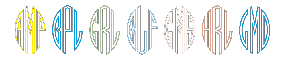
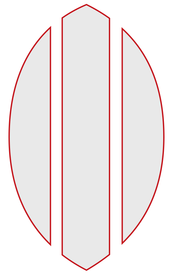
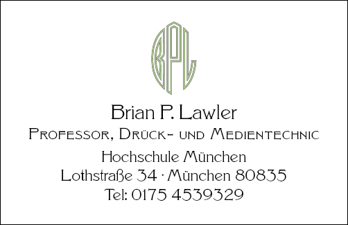
This font has left, center and right elements, each one designed to stand with two others to make a three-letter monogram.
I was up all night last night, reinstalling the software on my iPad Pro (a story for another day), and I was left with long wait times as a new operating system and back-up were downloaded and installed on that device.
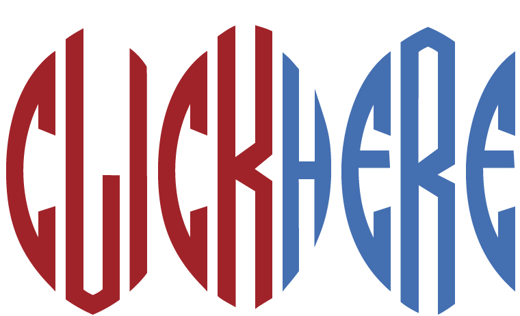
I decided to work on the monograms to make a digital font. There are many monogram fonts in existence, some of which look very much like the one I was planning to draw, but I went ahead and began the work anyway. My design is relatively faithful to the metal type in the museum, and different enough from the others online that it would not be a waste of time.
The idea is that each letter has to fit a third of a pointy ellipse shape with white space between the elements. I also decided to make the first version of the font an outline font (the solid version followed).
I started by drawing the letter O for all three spots, then worked on derivative letters including P, R, B, and C. Pretty soon I had created the N, M and W letters, and worked my way to U, V, X and Z. I finished the others and made a test font.
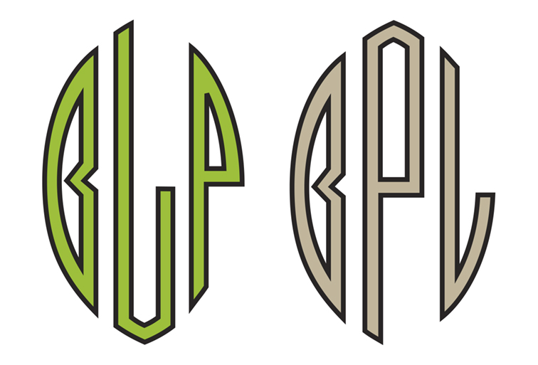
What I realized, but wouldn’t admit to myself is that drawing the left-side letter D was impossible. I tried several versions of the letter D, but they violated the basic structural rules that I had created for the other letters. Nothing worked for the left-hand D.

I looked online, and I discovered that no one else had figured out the D either. I was relieved. Most monogram fonts use a reverse D in the left position. I decided to do the same. It’s a cop-out, I admit, but there really isn’t much else I could do. In the end, I put a forward-facing D (shown on the left, and really ugly) as an alternate character in the font.
My next challenge was mapping the font to the keyboard. I would, of course, use upper-case and lower-case keys for the left and center glyphs, and I figured I could use Alt and Alt-Shift for the right-hand glyphs. Alt worked in most cases, but there are several “escaped” glyphs that won’t work because they don’t space (when you type an accented character, the computer puts the accent on screen, but it does not advance to the next letter; instead, it waits for you to type the accented letter, which is then presented under – or over – the accent mark).
I figured out which glyphs go under which Alt and Alt-Shift combinations so that I can set the entire alphabet in all three positions. When I was in doubt, I put the right-hand glyphs in two positions so that either Alt or Alt-Shift will work.
It works, but I wish it worked more consistently.
In the end, I am very pleased with my Monogram font (except the backward D). I have tried it in a number of settings, and it looks pretty good. And, it only took a couple of days of work to get ready for beta testing.
I have posted a set of downloadable fonts for noncommercial use. You are welcome to download them,
Below is a link to a folder containing both the outline and solid versions of the Monogram font, and a character map to help you get the correct characters. I hope you enjoy these fonts.