

This is a continuation of a blog I wrote two days ago. To read the first part, click here.
After I put all the letters (called “glyphs” In typography) into a master Adobe Illustrator document, I built the destination environment for the letters in FontLab. There, I assigned a cap-X height, a lower-case x-height, and an Italic slope.
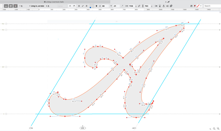
that space in light blue. Working in an Italicized environment was confusing to me at first, but I figured it out, and am now comfortable with these glyph spaces. The red nodes indicate anchor points in the letter: round nodes are curve nodes; square nodes are corner nodes. I really like the FontLab controls for drawing letters – they offer precise control over the position, angle and length of each node and handle.
This turns the spaces in which the glyphs reside into parallelograms. The Italic slope is 30° in Lining Livermore, which I determined by measuring the slope of the letters in my photos. Once the FontLab settings were made, I prepared the first letter to move, and calculated the amount it needed to be enlarged to fit the glyph spaces in the destination application.
I create a “pasting page” in another Illustrator document where I paste a copy of each glyph, then scale it to the correct size for FontLab (I could more simply enlarge the entire master document then just copy and paste into FontLab). Then the process is to select a single glyph in Illustrator, copy it, paste it onto the pasting page, and scale it to the right size. Then I cut the glyph, move to FontLab, open the glyph window and paste.
Once in FontLab, I move the glyph into the correct position on the glyph window. “Correct” is the operative word here: I have never made an Italic font before, so this was new territory. Roman alphabets are simpler: there is a left sidebearing, and a right sidebearing. They are usually equal, with some exceptions, and it’s easy to gauge where a glyph sits inside its glyph rectangle, depending on the “natural” spacing of the font you are creating.
With Italics, however, I was befuddled. Do I center the glyph in its space? Do I imitate the overhang in the original metal type (which is even more confusing, since the metal type is not cast on parallelogram-shaped blocks)? I found, with some experimentation, that placing the left edge of each glyph on the left edge of the glyph space, then setting the right sidebearing either touching or overlapping the right-hand edge of the glyph I was placing gave me the best spacing.

In this way I allowed the overhanging parts of most letters to overhang, and thus intrude into the left side of the following character’s space. This is not intuitive, but eventually it made sense. I completed the entire font using that technique. Now I am in the process of adjusting those glyphs to get them to fit their spaces more effectively. It will take time.
When I finish that I will move on to kerning, which will be an all-new experience for me in the Italicized world I have created.
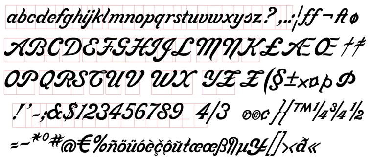
So Lining Livermore is almost ready for prime time, which is to say “beta-testing.” I will pass a few copies to friends and family to give it a shake-down.
On the day I started writing this blog I read the latest post from Lucas at Type Network about new revivals of fonts from the American Type Founders Collection. I was excited to see these new fonts – until I saw Livermore Script. I was crushed. On the same day that I made my first “finished draft” of Lining Livermore, they beat me to market.
So, what do I do now? Scrap the entire project? Kill Lining Livermore and move on to another font? I don’t know.
I have drawn the necessary hundreds of glyphs for Lining Livermore, and I completed years of work, working quietly in the background, to get this far.
I will continue to “perfect” the font, working to make a beautiful Italic font that represents the original metal type, and then I will probably use it myself and appreciate the effort whenever I do.
Meanwhile I congratulate the modern ATF revivalists – Mark van Bronkhorst, Igino Marini, and Ben Kiel – for their work to make a commercial digital version of Livermore. It looks great.