

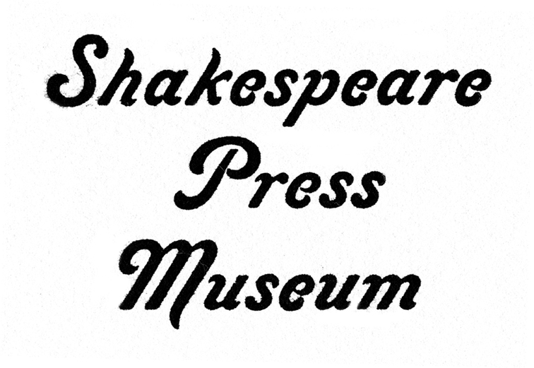
Deep in the recesses of the back room of the Shakespeare Press Museum at California Polytechnic State University is a cabinet. It contains about 20 drawers of hand-set metal type.
We never use this type because it is difficult to use, and it is the rarest of the museum’s collection of about 600 drawers of wood and metal type. If it were used, it would certainly get damaged, and that’s not acceptable.
I’m sure you can appreciate what an interesting design this is.
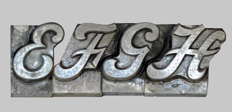
The reason it would be damaged is that this font has extraordinary wings of unsupported metal – the most pronounced of any font I have seen. This means that parts of the letters hang off the sides of the blocks on which the type was cast. In order to prevent those wings from breaking off on the first impression of a printing press, there is, somewhere, special spacing material that is designed to support the parts of the letters that hang over the edges.
We don’t have that special spacing material, so the fonts of this style have been designated as never-use fonts for their own protection.
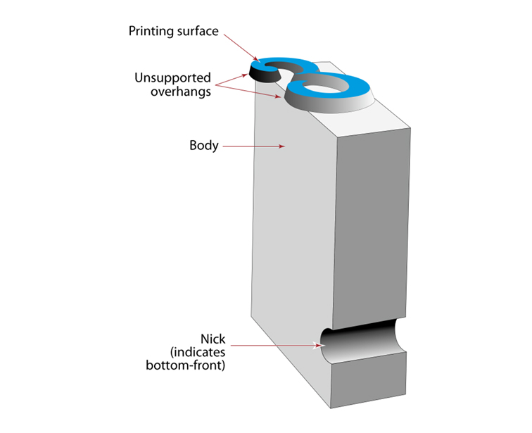
If the type is printed without that support, those fragile overhangs will be broken off, ruining the type.
(I have made that mistake a number of times in my career.)
The Lining Livermore type was made about 150 years ago by a foundry in Philadelphia, Pennsylvania named the McKellar, Smiths & Jordan Foundry. This company was one of numerous small type foundries that later became American Type Founders. ATF became the largest type foundry conglomerate in the United States. Its type designs dominated hand-set typography for two centuries, and the vestiges of that firm are still in existence (though today those vestiges are designs being converted into digital fonts).
I looked for decades to find Lining Livermore in any catalog of type from ATF and others, and was never successful in doing so. I finally found a reproduction of the McKellar, Smiths and Jordan specimen book in which there is a sample of Lining Livermore.
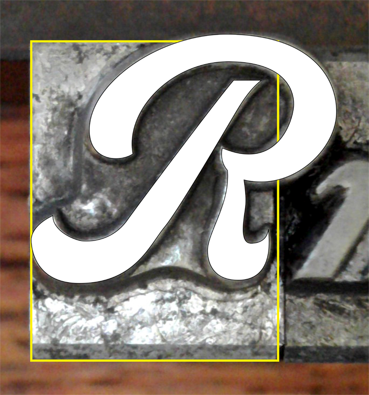
The type I used for this project is 40 pt. (an abnormal size), with much greater detail.
Notice how inking and printing the specimen makes the type look bolder, and the details fill in.
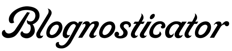
It’s a unique font. It is very Italicized – about 30° – and it has huge, sweeping capital letters and diminutive lower-case characters. The style is not completely consistent in that it has no consistent angle of emphasis (the thick-and-thin parts of letters). The caps are significantly bolder than the lower-case, and there are those overhanging parts that challenge typographers who possess the actual metal type.
I first discovered this font of type in the early 1970s when I was the student curator of Shakespeare Press Museum. I knew it was special when I dug it out of the very back corner of the museum. I carefully proofed the type on a Vandercook proof press, printing on beautiful coated soft white proofing paper. My plan was to photograph it and maybe someday redraw it for photocomposition.
Decades passed, and a few years ago I started work on that process.
I have drawn many fonts for digitization by scanning these beautiful proof prints, then drawing the letters in Adobe Illustrator using the scanned images as a template. This process worked well for all of the other fonts I made, but Lining Livermore refused to cooperate. There are tiny gaps in the lower-case letters that plug-up when the type is inked and printed, closing the space between parts of the letters that are designed to be sharp.
Despite making these careful proofs, I never got one that showed the pure original design of the letters.
This past summer, while preparing for my year here in Germany, I got out my digital microscope and set it up on my desk. Then I arranged the Lining Livermore type in rows and photographed each pair of letters in the complete set. I chose a magnification of about 20X, and carefully moved each pair of letters under the lens of the microscope, and made my exposures.
Then I filed those photos away for some long winter night in Munich when I was stuck indoors with nothing to do. This month those long winter nights arrived, and I began to work on Lining Livermore.
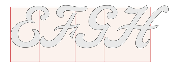
My process is simple: I cleaned up the photos in Photoshop to enhance their brightness and contrast, then I placed each photo into an Illustrator file, set the photo as a template, and then drew each letter on top of the photo template, being as careful as I could to follow the exact shapes of the metal type.
More importantly, I drew a rectangle on each letter to indicate that letter’s position on its block of lead, so that I would know the exact sidebearings and positions of the letters on the type blocks.
Then I copied the Illustrator drawings to a master document and assembled the letters that I would be converting into a digital font.
That, in my font design work flow, is the technique to get the letters drawn and ready to move into FontLab.
For that process, and the steps that are needed to make a digital font in FontLab, read the next chapter of this story.