

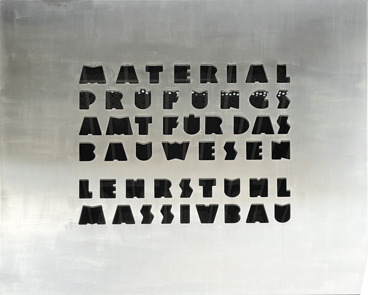
I went on a journey last week to buy some foam-core board. En route, I saw a handsome metal sign at the Technische Universität München.
In English, this translates (roughly) to:
MATERIAL TESTING
OFFICE FOR CONSTRUCTION
FACULTY CHAIR
LARGE SCALE CONSTRUCTION
The sign is cut in a thick (approx. 10 mm) sheet of aluminum, and the lettering is unique. I would call it “Constructivist” or “Bauhaus” (it’s too Constructivist to be Bauhaus), and it has a touch of Art Deco influence.
There are many beautiful signs that I have found around Munich, and this one is my favorite.
I came home and decided to write this blog post. But first I had to clean up the photo, removing some reflections and background lights. Then I had to make it look really beautiful. And, then I had to design a complete alphabet from the lettering in the sign. Then I decided to create a type font in the style of the sign.
Now, several days later, I have completed the first draft of that font. I am calling it Bauschrift Schwartz (Construction Lettering Black).
Interestingly, the sign has most of the alphabet, and the dieresis (umlaut) accent on two of the U’s. I only had to create eight other letters in the same style to complete the alphabet.
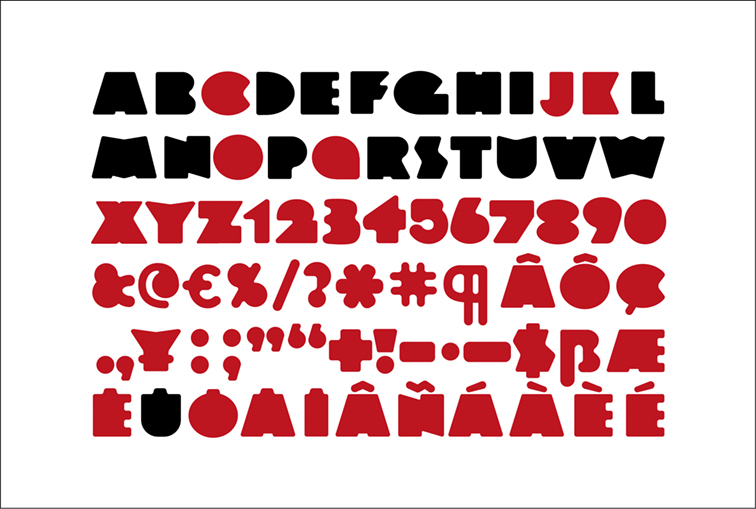
Then I had to draw the punctuation and the numerals that will make a usable font. For Romance and Germanic languages this means the 26 capital letters (repeated in the lower case positions), all the standard punctuation, numerals, and the accented characters for AEIOUY with the dieresis, and the acute-accent for those same letters (French and German use this), the accent-grave, cedilla and circumflex for French and Portuguese, and a few others: the question mark, exclamation mark (and upside-down for Spanish), the ampersand and the percent sign.
…and the @ sign, and the dollar sign, and the Euro glyph and an asterisk, etc., etc.
I decided to stop there, as I doubt that many of the glyphs usually found in a type font are necessary for such a unique style like this. The percentile symbol, the series symbol and a herd of others are so unlikely to be used that I didn’t draw them at all (and they would look really odd).
Drawing the numerals was relatively easy, except for the number 5. That one eluded me, as it doesn’t read as a 5 unless there is a distinct bar across the top, and a counter in the lower half. Since all of the square edges in this alphabet are rounded, the hole in the 5 and the lip of the bottom-left of the glyph must also be rounded. I made several versions before I was happy with the one I chose, and I’m not convinced that I got it right.
I designed years ago called BPL Dingbats III. That font is, as far as I know, the only pi font in existence
that has actual pie characters for both apple and cherry pie!
I built the font in FontLab 7, the latest version of that incredible font creation application. I have been using FontLab for over a decade, and this version is dramatically better than the previous versions. I just had to learn how to use it. And, I am working on the small screen of a MacBook Air while I am in Germany, so I don’t have the luxurious two-screen set-up that I enjoy at home in California.
My preference is to draw letters in Adobe Illustrator. I am skillful there, and it’s a simple cut-and-paste path between Illustrator and FontLab.
Getting used to the small screen was challenging, but pretty soon I was moving quickly through the steps to make the font and test it. There are many features of FontLab that I don’t know yet, and it will take months for me to become facile with this version. Meanwhile I had a font to make!

not a very useful font, but I had fun making it, and paying homage to the original work.
As with any font, it’s the details that make it a complex task. Building kerning tables is semi-automated in the latest FontLab, but I am not able to take advantage of that feature yet. So, because I know how to do it by hand, I spent several hours going through the letter combinations adding the kerning values. I am pretty fast at this, so it wasn’t too bad.
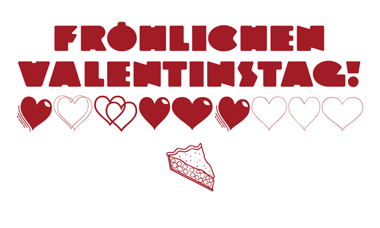
If you would like a no-warranty version of the font to try, click on the lettering below. Remember that it’s a draft, subject to a great deal of tinkering. I think it was type designer Jim Parkinson who once told me that you never finish a type font. You declare victory and move on!
Update 16 February 2022: The font is now v.2. I improved the ß glyph dramatically and I added lots of kerning pairs. It’s more functional now.

(That’s the German. Really.)