

About four years ago, Apple changed the color space of the iPhone from whatever it was (maybe sRGB?) to a new color space called Image P3. This is the color space used by flat panel TV screens.
This was a smart idea on Apple’s part because the capabilities of the newer devices – iPhone, iPad and various Macs – are so much greater than sRGB and other small gamut color spaces. The potential of the Retina Displays is immense and Apple responded by making the official color space on these devices much, much larger with P3.
But in all my studies and classes I have never taken the time to compare Image P3 to other big gamut color spaces. I have now done that, and I am impressed.
In 2019 I made a presentation at the annual Color Conference in San Diego on fine art reproduction. As a part of that, I compared the color space of my Canon digital camera and studio strobe lamps to the Adobe RGB color space, and found that it (ARGB) didn’t cover some of the critical colors in the painting I was trying to reproduce. By changing to the ProPhoto RGB color space I was able to capture those elusive colors, and the resulting print was much more accurate.
I’m teaching in Munich now, and the subject came up in class this week.
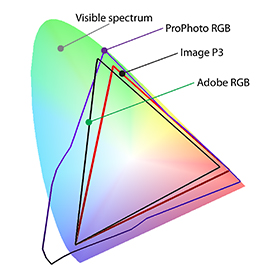
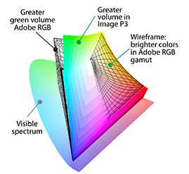
Using the latest version of ColorThink Pro, I opened three profiles: Image P3, Adobe RGB and ProPhoto RGB. I graphed them in both 3D and 2D to get a sense of both the size and the volume of these profiles.
ProPhoto is by far the largest, and Adobe RGB and Image P3 are close competitors. Image P3 captures measurably more color along the red-green axis than Adobe RGB, the same area where I gained ground using ProPhoto RGB. These are important colors: peach, yellow, orange, and many images will benefit from having these colors within P3’s gamut.
Adobe RGB has greater area on the green axis, and has brighter reds and magentas, while Image P3 shows greater bright color volumes on the green end of the green-red axis.
So, is one of these color spaces “better” than the others?
ProPhoto has more volume and more area – more total colors and more brightness range than either Image P3 or Adobe RGB. This is probably most valuable for photographers and designers who are going to print on wide-gamut ink-jet printers and presses.
Adobe RGB is likely the most popular color space among professional photographers now, but for those preparing images for delivery on flat-panel TV displays, iPhones, Androids and iPads (especially the newer models with Retina Displays), P3 is a better choice.
Planning the color as you open it from a digital image (the color profile is assigned as a Camera Raw file is opened) will help to match the image to its destination to take advantage of the full range of colors and brightness available on different delivery systems – print or electronic.
Note: I used ColorThink Pro to make these charts. That software, from Chromix, is the best product for looking at color images and profiles in mathematical space for purposes of comparison and problem-solving.