

Greetings Blognosticator readers!
I (sort of) apologize for my long absence from this blog. I retired from my teaching position at Cal Poly in mid-June, and have been relaxing since then by not contributing essays to this forum. Instead, I have been working in my wood shop, doing home repairs, and doing a lot of reading. I have also been doing quite a bit of kayaking on Morro Bay, in San Luis Bay, and on Santa Margarita Lake, all of which are close to my home. I like retirement so far!
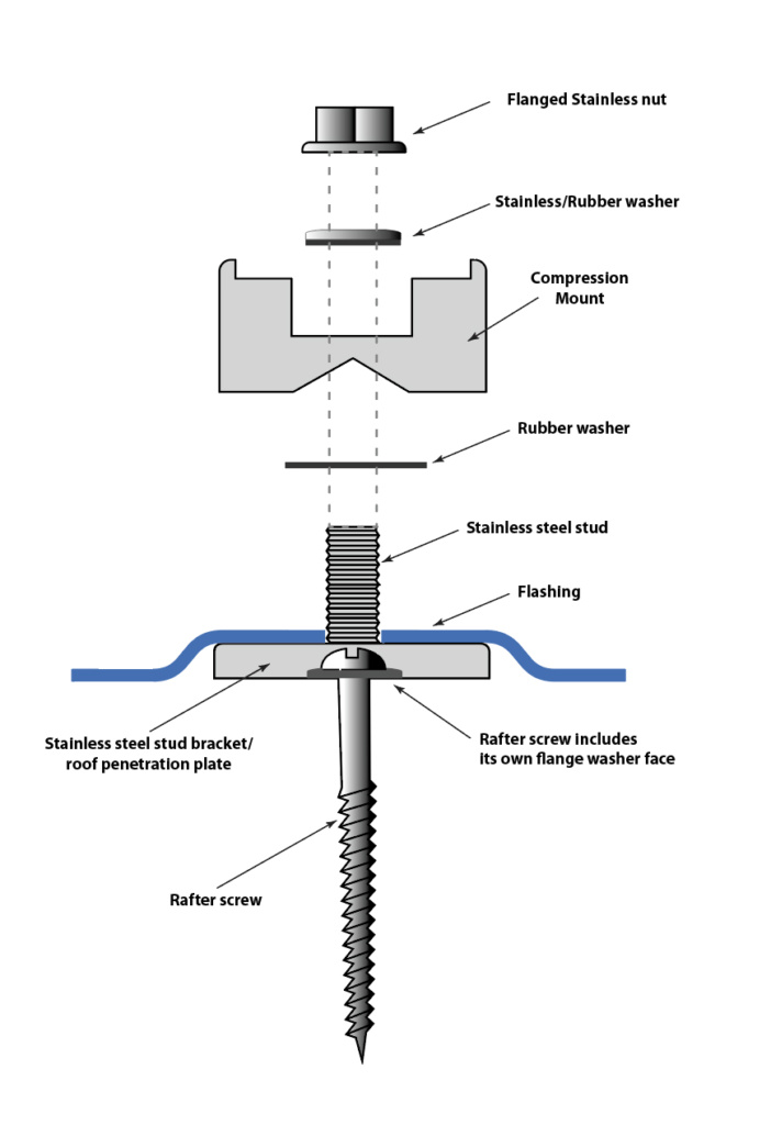
Seven years ago I installed eight solar panels on the roof of our home. I did a lot of the installation myself, and hired an electrical contractor to handle the connection to the utility box and working with the city inspector to get the work approved so that the electric utility would allow me to turn it on.
At the time I estimated that the return on investment would be pretty fast: four years.
I got a federal tax credit for about 30% of the cost of installation. I also got the do-it-yourself discount. I did all the planning, permit applications, site drawings (I went overboard on these, making realistic drawings in Adobe Illustrator), the roof preparation, installation of the rails, panels and inverters. My electrician put in the conduits, and drilled through the roof into the garage to deliver the power to my electric panel. He and I pulled the wires together, did all the finished wiring on the roof, and celebrated the completion of the project when we got the permit approved.
The local officials were impressed by the detail.
In San Luis Obispo we get a lot of sunlight; it almost never rains, and it never snows. My pre-installation estimates showed that the panels would generate enough electricity to break-even in about four years. After we turned the system on, it generated more power than my estimates, and it paid-off in three years and three months.
But I still had an electric bill.
I had foreseen this, and I had the electrician put an extra stub conduit on the roof with a weather cap on it. I had also received my building permit for 12 panels (even though I installed only eight in the first round).
So, adding four more panels – after three years – was really easy. I bought the panels, installed the rails and attached these to the roof. I ran a new conduit to the stub, pulled the wires, and connected everything together at the junction box. Then I turned the system on and was suddenly generating 50 percent more energy!
And my electric bill dropped to zero (though our utility requires a minimum $10 per month to be connected to the grid).
On the “net metering” agreement I have with the utility, I get one power bill each year, and that bill arrived last week. For 2020 I paid $10 each month, and, after all charges and debits, I owe the utility a whopping $18.06 for the year. My cost for electricity for the year was $138.06.
The investment of money and labor to install these solar panels was obviously a good one. For the first three years I checked the host web site every day, then, after pay-off, I stopped looking every day. After installing the additional four panels I was back to checking it every day, but I lost interest after a couple of years.
Last week I decided to check up on my system: Was it still working correctly? Am I still generating enough power to break-even? How did 2020 compare to previous years? Are the panels degrading in efficiency?
(And this is where this article takes a turn toward the graphic arts…)
I use Enphase inverters on my system, and they report through a hardware portal to the Enphase web site. This site allows me to monitor my system, to check for equipment failure, and to monitor my power generation. That site allows me to see my generation graphically, and it also allows me to download spreadsheet files for analysis offline.
I downloaded two years’ worth of data in CSV format. Then I opened those files in Microsoft Excel, deleted some text that was redundant, and saved the file in text-based tab-delimited format (this may not have been necessary). Oddly, I couldn’t get Excel to find-and-change the entries – it just refused to work – so I placed the tab-delimited text into an Adobe InDesign document and did the editing there (strange, I know, but it worked). Then I exported it back to a text-ony file.
The amount of data is not overwhelming – two years of two columns of data – but I knew that I would need to make a relatively large page for my graphs in Adobe Illustrator to show the information adequately.
Adobe has relegated the Graph tools to the Illustrator backwater, so I had to move them to the current tool bar (this is done at the bottom of the tool bar pull-out menu). Once there, I started with the line graph tool and made a 36-inch-wide graph rectangle with the tool. This opens a table into which you can upload data in several formats, among them tab-delimited text.
I imported one year as a line graph and plotted the daily watt-hour values on the vertical while plotting the days of the year on the horizontal. 2020 was a leap year so it has 366 data points; 2019 has only 365; this creates a single-day problem of alignment that I decided to ignore (it’s gestalt).
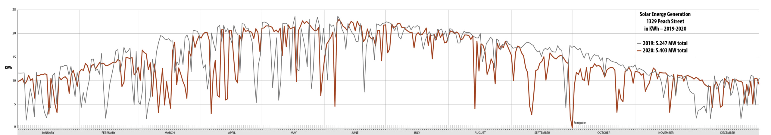
It reminds me of the financial graphs presented in the Wall Street Journal.
CLICK TO ENLARGE
Graphs can be tricky. It’s difficult to show clearly what is important, and do it in a way that is attractive. Illustrator’s graph tool is also a bit strange in its automatic formatting of text and indices. It chooses a default font (perhaps it’s the one you’ve been using most recently?) and scrunches mountains of data (the horizontal date information) into a pile of overlapping entries. I selected these text items with the Direct-select arrow and changed them from 36 point Myriad Pro to 4 point Myriad Pro Condensed. That made them legible at least.
The text indices for the Watt-hours were too small, so I changed them, and also edited them to Kilowatt-hours by removing three zeroes from each one (the vertical values are still valid). On a good day in summer we generate 22 KWh of power; on a cloudy day in January we generate about 5 KWh.
One pleasant thing about the Graph tool is that elements in the graph are easy to select en masse. The line graph is made up of 365 separate line elements, each ends with a small rectangle at its intersection with the next. To color, stroke and fill these individual items I use the Select menu to choose all items of the same stroke weight, or all items with the same stroke and fill. In the process I can customize the graph to make it more attractive.
As long as I don’t Expand Appearance on the graph, the data in it are interactive. If you change an element in the table, the graph will be updated automatically. Most of the time I like this feature, sometimes it gets in my way. Deleting, grouping, averaging, or joining elements will result in one of Illustrator’s obsequious dialog boxes telling me that I cannot do that.
Data-on-data
My final graph of the year 2020 looked pretty good, until I showed it to my greatest critic – my wife – who was confused by it. After taking her thoughts under consideration I decided to redraw the graph as a vertical bar chart. This gives the data body, showing that the solid areas represent electricity being generated. The line graph shows just a wiggly line that is not as informative visually.
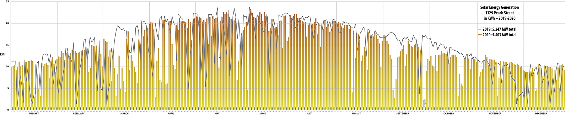
with 2019 generation data overlaid as a line graph.
CLICK TO ENLARGE
But having a graph of my power generation for one year didn’t answer my questions. How did my panels perform compared to another year?
I drew a second graph with 2019 data as a line graph. I selected the line elements only from that graph and pasted the data on top of the bar graph for 2020 (this is where the 366-to-365 data points became an issue). With this line graph superimposed atop the bar graph I can see that my electricity generation from year to year is approximately the same.
Taking the hours of daylight into account (a simple curve with its peak in July), my system generates a more or less constant amount of power relative to exposure to the sun. Thus my charts are annual descriptions of sunlight falling on my roof.
Curiously I made more power in 2020 than I did in 2019. This answered a couple of my questions: are the panels still performing efficiently? and do they perform about the same as they did the previous year? I was pleased by both answers.
Eventually I added a gradient to the vertical bars with red at the top (for high output) and yellow at the bottom for low output. Superimposing the 2019 data on top of the 2020 bar graph is noisy, but it does illustrate the output for the year in a way that I can see it clearly.
In 2020 we had our house fumigated, and thus the panels were covered for 1.5 days. That is the only time that I have not generated power with the system.
I like Illustrator’s Graph tools; they put the data on the page in a way that I can customize it to make an attractive (and effective?) graphic illustration of numerical data. Adobe has not updated that tool in many years. Perhaps it is in need of a facelift to make the graphs more attractive or easier to manipulate.