I see iPhones being used for all sorts of “professional” applications including video capture, and now that the phone sports a 12Mp camera, graphic arts quality photography. No excuses professional photography.
Several years ago I was made aware of a new iPhone and iPad application from Pantone called MyPANTONE that allows me to select colors from the Pantone swatch books, from photos, or from live scenes, and then use those colors to build color palettes that can be exported (easiest method is e-mail) to a desktop computer, and then opened and used in the Adobe applications. The app also makes QuarkXPress-compatible color files, but I have never tested those.

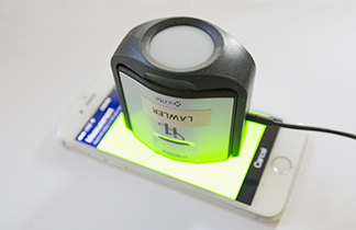
This is my X-Rite i1 Display colorimeter sitting atop my iPhone 6, reading colors that are being flashed there by the new Pantone ColorTRUE application. At the end of the process, the iPhone is calibrated and profiled. It works!
(I tried exporting a palette today, and it will not open in the Creative Suite… I wonder what has happened.)
Nov. 21 follow-up note: I reported the problem to Pantone, and in a few days they responded to tell me that they have now seen the problem, and are devising a fix. It is rare that tech support ever responds these days, but the Pantone folks have been very responsive and very courteous. I will report when the problem is solved.
Despite that big bug, I like MyPANTONE, and will continue to use it, hoping that the company fixes whatever is wrong – soon.
The issue of color comes up when I first launched MyPANTONE. There is a disclaimer on the splash screen that warns me that colors displayed on the iPhone or iPad may not be accurate, etc., etc.
And there you have the crux of the problem. The iPhone screen may not be accurate; in fact it’s pretty obvious that it isn’t accurate. My new phone has a visible pink tint to the screen, one which I ignore – mostly.
Last week I became aware of a new application from PANTONE, one called ColorTRUE. It allows me to calibrate my iPhone screen using one of several colorimeters and one spectrophotometer. By an amazing coincidence I own one of those instruments. I downloaded it in a heartbeat!
ColorTRUE requires that you install a small accessory application on your Macintosh, and connect an instrument to the same machine. I use the i1 Display instrument, which I use often to profile and calibrate my computer displays. Then, using the instrument on the face of the iPhone (or iPad), I run a calibration of the iPhone, which takes about four minutes. The interface on the iPad is slightly more elegant than the interface on the iPhone (a function of available screen real estate). Various colors are flashed on the screen of the iPhone, and the i1 Display reads them and sends them to the Mac, which then sends the data to the iPhone where a color profile is built.
The net of this is that I can now calibrate and profile my iPhone and iPad. It works, and it works well.

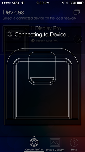
This is the X-Rite app ColorTRUE indicating that it is talking to my X-Rite i1 Display colorimeter. Once communication is established, the ColorTRUE app puts colors on the iPhone’s screen in succession to build a list of colors. With that data, the software creates an iPhone color profile that corrects the color on the phone.
But, I only get the benefit of the calibration when I am using applications that are ColorTRUE smart. The list is very short:
MyPANTONE
ColorTRUE
running the iPhone Photo Gallery modified by ColorTRUE
End of list.

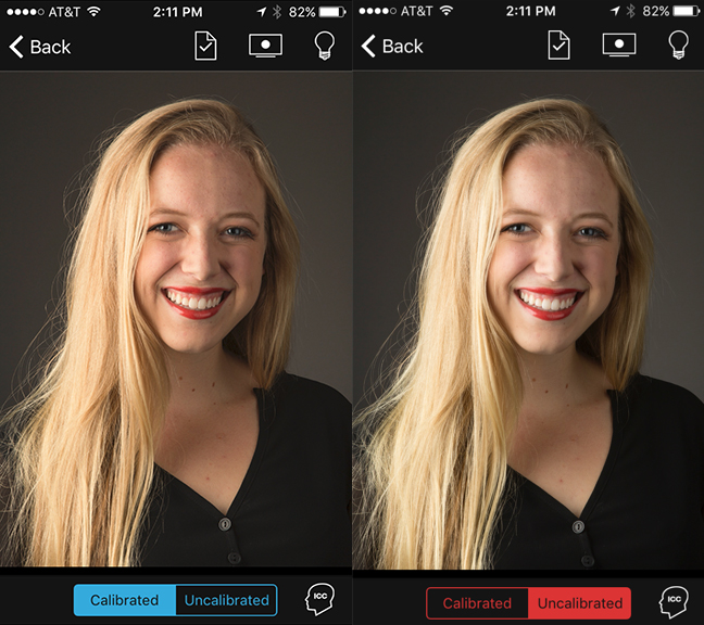
This is a photo I took recently being displayed by the Photo Gallery with ColorTRUE adjusting the color of the iPhone screen. On the left is the calibrated view, which is slightly warmer than the uncorrected version on the right.
It is conceivable that there will be more apps that can take advantage of the color profile, and that would be great. In the meantime, I am pleased with what I see.
I can open images in my photo galleries, and view them in ColorTRUE, applying one of several RGB color profiles to those images. I prefer Adobe RGB (1998). In my estimation that profile warms-up my images to the degree that I like, and they appear more saturated than they do in the iPhone’s native sRGB color space. I can also simulate one of several CMYK profiles to see what effect converting to CMYK might have on an image. The one closest to my usual choice is FOGRA 27, and I find that simulating the FOGRA space is very similar to the same image on my desktop Mac simulating the same thing.
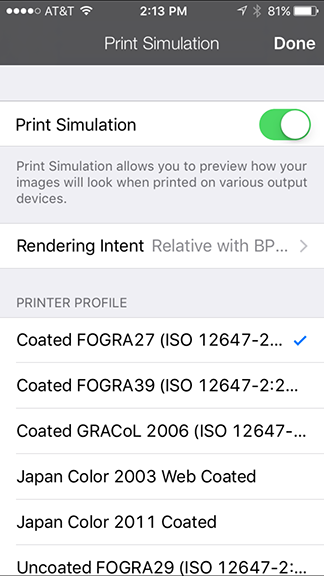
This is the settings menu where a CMYK profile can be selected. I have chosen the FOGRA27 profile here, it being the closest to my CMYK favorite – GRACoL – which is not on the list of available CMYK profiles in the ColorTRUE app.
Other settings allow me to control the native white point of the phone: 6500K is the most logical, as it is the same as other LCD displays, and is compliant with the ISO 3664 international standard. There is also a brightness setting with various choices, my favorite is the Office environment where the brightness is very reasonable in my indoor work area.
In a world of color, and for a person who teaches color management, these apps, and the supporting instrumentation, make it possible for me to use my iPhone in the field and see accurate color, and very reasonable interpretations of how photos would be converted to the colors of a sheet-fed printing press.

