Some of you may recall my obsession with a 1935 Smyth book sewing machine and all of the steps it took to restore it and get it running again.
This is the now-completed Smyth book sewing machine in the Shakespeare Press Museum. The museum is part of the Graphic Communication Department at Cal Poly, where I taught before my retirement.
After my return from Germany last September, I worked a lot on that machine and got it to the point of actually sewing signatures of a book into book blocks. There are still some small adjustments to make to get it working perfectly, but after over three years of work, it’s finished and I’m mighty proud that it sews books.
That machine, a 1935 Model 12 Smyth book sewing machine, had sat on display in a glass case at the California State Printing Office in Sacramento for about 20 years. The lubricants in the machine had turned to a waxy adhesive, and the clutch was locked in the engaged position by the stiff goo. The wheels wouldn’t turn; the screws wouldn’t budge. The motor was dead.
It also had outdated and illegal electrical wiring, with exposed high voltage contact points that were not to-code in the 21st century. I remedied those electrical problems by putting the old motor and speed regulator into e-waste and starting over with a new totally-enclosed motor and a fancy variable-frequency drive to control it.
I spent the better part of three years working intermittently on this machine.
In late November, 2022, I demonstrated the Smyth machine to a class of 37 young women studying Book Design Technology in the Graphic Communication Department at Cal Poly. During that demonstration I broke a part on the machine – a result of allowing a reciprocating arm to fall into the machine and shear-off an aluminum guide bar. Fortunately, the Smyth Machine Company is still in business, and they still use the same part on their modern machines! I ordered a replacement, and it arrived last week.
I was successful in sewing signatures together with the machine using six needles and six threads. The machine uses a combination of punches that come up through the spine of each signature, a needle with fresh thread in it, and a crochet hook that grabs the thread after it goes through the spine of the signature, turns it 90 degrees, and pulls it back up through an adjacent punched hole in the signature. From there that thread gets hooked by the next stitch, and that combination of actions makes a chain stitch that holds the book together for binding.
Despite the broken part, I was able to make a complete book block, ready for subsequent operations to make a finished case-bound (often called a “Smyth-sewn”) book.
Project completed!
You can read the related stories about the restoration of the machine here.
I spent the last year in Europe, mostly in Munich, and I had a wonderful opportunity to visit several countries as a tourist before returning to the USA.
My wife and I became vagabonds after my final semester teaching at Hochschule München. We traveled mostly by train, and we stayed in hotels and rented vacation apartments. In each city we visited, we learned the local transit system and took buses, metro trains and trams to get around. We walked a lot.
In August, we took a short airplane flight from Amsterdam to Bergen, Norway. When we landed in Bergen we were pleasantly surprised by the sign at the airport there that has a curious punctuation mark on the end.
Oh my god! I’m in BERGEN? (Perhaps I thought I was in Buenos Aires?)
Is this because the Norwegians are not sure you’re in Bergen, or is it that the you are not sure if you are in Bergen? In any event, I have never seen a sign like this at any airport in the world.
Public transportation from the airport in Bergen to the downtown is inexpensive and quick. We dragged our luggage onto the tram and headed into town. (I became very fond of the Yiddish word “schlep” on this journey, as it is much more descriptive of my attitude toward baggage.)
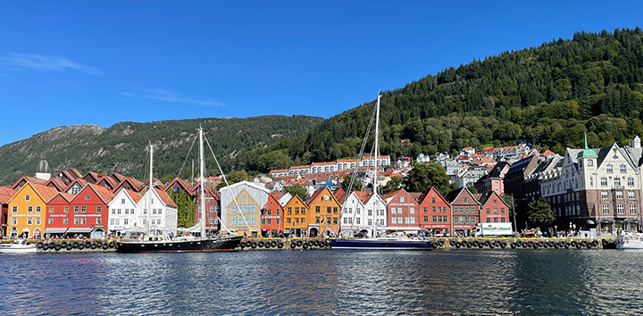
Once in our hotel, we began a four-day stay with all the tourist trappings: the fjord tour, the funicular (and a hike back down), the cable car, etc. Since we were in the heart of the harbor area, we had a view of the old town, where historic buildings are lined up along the waterfront. This area is a UNESCO World Heritage Site, and is deserving of its title. (They also deserve a UNESCO World Heritage Cinnamon Roll Site title!)
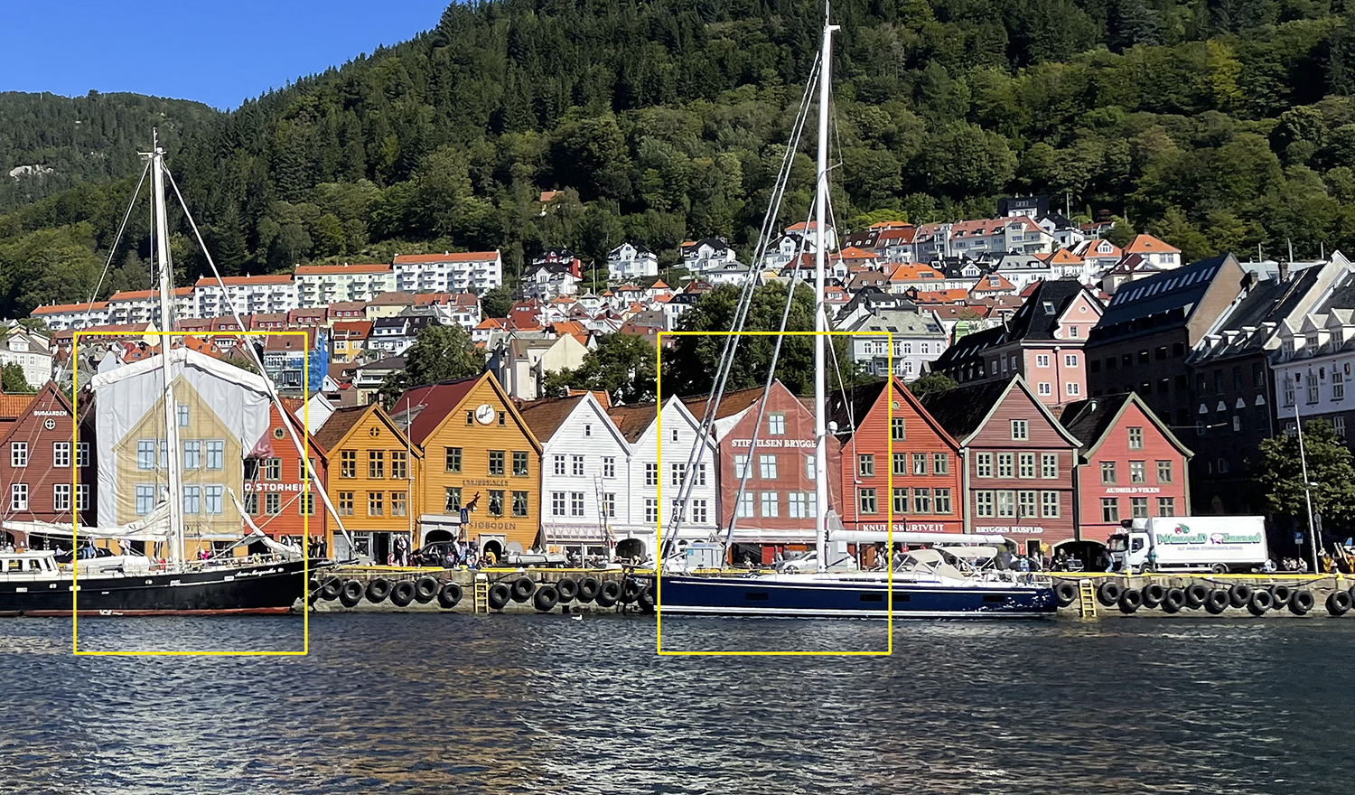
Two of the buildings along Bryggen in Bergen are wrapped in ink-jet printed fabric.
The street called Bryggen faces south along the docks and features a line of small businesses that were once boarding houses. They are Bergen’s most charming structures. I took a photo from a boat as we left the harbor. The next day, while walking along Bryggen, I noticed that several of the buildings are in fact ink-jet printed façades that look like antique buildings. These cover scaffolding and construction – a clever way to maintain the World Heritage of the street while the buildings are undergoing renovations.
The buildings are printed on a sturdy fabric, meant not only to look pleasant from the outside, but strong enough to deflect falling debris, protecting the public from danger.
I have highlighted the two ink-jet building façades here. The one on the left is really obvious; the one on the right blends in nicely with its neighbors. Click to enlarge.
I have seen much larger printed scaffold coverings, one in Paris that was itself a trompe l’oeil work that looked like the original building underneath. It’s very clever stuff!
I assume that these huge coverings are printed on Vutek printers or similar machines. They are, on close examination, sewn to fit the façade of the structure. One of the coverings in Bergen was laced to the scaffolding to prevent it from wind damage and to keep it looking nice from the outside.
I wonder what happens to these coverings when the work is done. Are they discarded? Are they reused on other buildings? I would be curious to know if there is an aftermarket for printed scaffold coverings.
In several previous articles I have written about the process of repositioned panoramic photography. It works best when there is no perspective – strictly two-dimensional subject matter.
With my experiences with street art (see the most recent article here), this works perfectly. Photographing flat art – and painted walls are pretty flat – is what works best with this technique.
Photographing three-dimensional subjects causes this technique to fail with near-certainty. I think the first time I tried this seriously was when I attempted to photograph a huge Heidelberg printing press by taking an image, then taking three steps to the right, then taking a photo, etc. The resulting image, after assembly, was a catastrophe.
This is easily explained: perspective does not exist on flat subjects, and real things like printing presses have dimensionality. They have depth, and at every point on the camera plane that perspective is different. There is simply no way for software to reason-away differences in perspective.
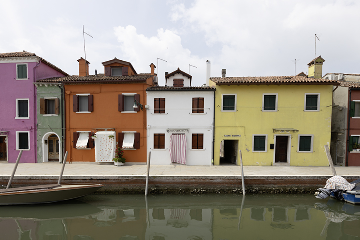
This is my repositioned panoramic photo of a street and canal in Burano, Italy. The full resolution file is over 52,000 pixels in width and can be printed about 5 meters (15 feet) in length at 300 ppi. Click on this image to enlarge is to about 2x size. You may be able to click on that image to enlarge it more (depending on your browser).
Tempting fate, on a recent visit to Burano, Italy, I did it again. This time, instead of a 20-meter long printing press, I took a series of repositioned photos of an entire city block along a canal in that charming town, and attempted to put them together into a single repositioned panoramic photo.
I worked, kinda sorta. Well, not very well really.
But, enough of it worked that I persisted, and I was eventually successful in making a single image of the entire block, and it is charming. In the process, I took some liberties with the sides of buildings, the bows of small boats, and the waterway that separated me from the subject matter.
I took a total of 27 photos, each about 10 careful paces apart (I was not carrying my ball of string or my tape measure). The overlap between them was significant, but so was the perspective variance and the distortion of the wide angle lens (Canon 16-35 f2.8 at 21mm).
This is one of the 27 contributing photos of the Burano photo. Notice the television antennas on the roof of every building. These were challenging to keep in my master sky mask, but I managed to keep almost all of them.
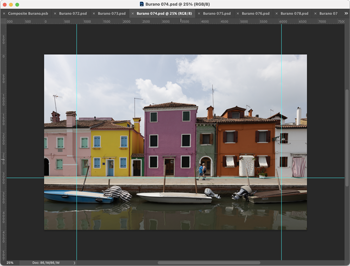
To stitch them in Adobe Photoshop – which does a spectacular job on repositioned photos taken of two-dimensional subjects – I first had to take some of the distortion out using Photoshop’s Perspective controls. I put a baseline guide in, then two vertical guides, and I used an Action to perform the same perspective change on each image, straightening its vertical lines – mostly.
This is my screen in Adobe Photoshop after running my Action that placed guides on the photo, then applied Perspective to the image to compensate for some distortion from the 21mm lens.
After that I used Photoshop’s Automate>Photomerge function, with its Reposition option to put these images together. It didn’t do very well at all. I tried several times with subsets of the images, and was eventually able to create two big chunks of the repositioned photo that I then assembled into one using drag-and-drop. This final image was OK as a starting place, but there were fractional boats in the canal, and mooring posts that disappeared half-way to their pinnacles.
It looked pretty good, but it would take too much work to make it into a convincing photo.
So I gave up on Photomerge and decided to build this image by hand, assembling each image adjacent to the next by putting each onto its own layer, then creating a master mask to cut out the perspective parts that don’t work. This was complicated by slight differences in size and camera angle, so on each image I did some scaling and a bit of distortion to get the image to fit its neighbor to the left. Then I put the next image in, and did the same until I had completed the block-long photo.
Most of the buildings on the block are conjoined with their neighbors on both sides. There are only four alleys on the block where you can see into the distance to another building in back. So, with the exception of the rooftops, which have considerable depth, the façades of the buildings are two-dimensional.
I began my work by using the Magic Wand tool and selecting the sky, then making a drop-out mask with that selection on each image. After I had positioned all the images together I built a master sky mask by assembling all of the separate masks into a new channel mask. I replaced the original cloudy blue sky with a similar cloudy blue sky image.
This is the Master Sky Mask of my Burano photo. With this, and a replacement cloudy sky, I was able to make a pretty good looking composite image. I couldn’t use the original sky because it would not have fit my image with parts of buildings edited out. Click on this image to enlarge it.
The most difficult part of my master sky mask was television antennas. On top of almost every building there are skinny poles with various antennas attached. These didn’t select well with the Magic Wand, so I enhanced them with the paint brush on the sky mask, allowing them to be seen better against the sky.
I also had to remove parts of buildings in the background and visible from the street where I took my photos. This was done in the Master Sky Mask; I replaced these architectural artifacts with sky, and it is very convincing.
When the buildings and the sky finally made sense, I had to work on the boats in the canal. There is usually one boat per building in the photo – sometimes two – and each had reflections on the water of the canal toward the camera. Because of my intervals, the perspective of those boats, which are much closer to the camera than the buildings in the back, changed considerably from photo to photo. To remedy this, I took the best boat photo from each of the two overlapping images, and pasted it on top of the composite photo. This worked well, but I had to invent some of the reflections in the foreground.
When all was complete, I had my repositioned panoramic photo. At final resolution I can print this at about 5 meters long (about 15 feet) by 38 cm. tall (about 15 inches) at 300 ppi resolution. I don’t have any plans for the photo at present, but perhaps the city of Burano would like it for their City Hall. Or they could just walk outside and look at the real thing.
Addendum 3 September 2022
I’m in Norway this week, and will soon be returning to the United States after a year in Germany, teaching and experiencing the European lifestyle (excellent).
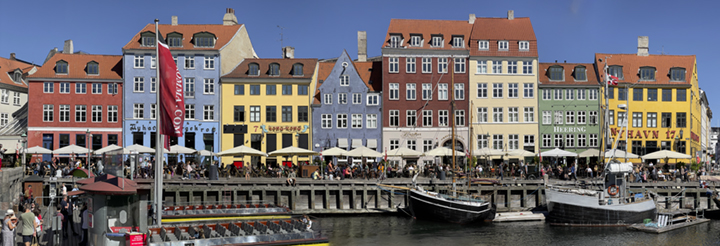
In Copenhagen there is a famous canal-waterway called Nyhavn, which features lovely old buildings, all painted different colors, and all built together along the waterfront. It is a mecca for tourists (me too!) because of its beauty.
I decided to try my repositioned panoramic photography there, using the same technique as described above. This time I used my iPhone 12 camera – normal lens (which is actually a moderately wide angle lens) – and I shot 17 photos along the opposite side of the canal. I did it with much more overlap this time, about 50 percent, and I took photos until I ran into a kiosk that prevented me from going any further (I would have liked to do the next block of buildings but there would have been a gap in the middle).
I opened all 17 images in Adobe Photoshop and used its Photomerge function to assemble the images into a repositioned panorama. This time it worked beautifully!
Except for the distortion of the left-hand sailboat, it is nearly perfect, and I have done no retouching on this image. I’m very happy with this one.
This is my repositioned panoramic image of the Nyhavn canal in Copenhagen. It can be printed at 300 ppi at about 1.5 meters in length. I will probably cut-and-paste the undistorted sailboat in the foreground before I do anything with the image. The most pleasant thing about this photo is that it required almost no extra steps to process. I opened the images and ran Adobe Photoshop’s Photomerge function.
Addendum to the addendum 14 September 2022
I liked the result of the photo above so much that I bought a Metro ticket and went back to Nyhavn another day (Copenhagen’s Metro is fabulous!).
This time I took my Canon EOS R camera and my only practical lens for this kind of work (16-35 zoom). Where I stepped three big steps between the shots on the photo above, using my iPhone 12 with the “normal” lens, this time I shot at 35mm, and I took only one big step between photos. I started at the left where the tourists board the sightseeing boats, and I took over 270 photos to reach the end of the canal where it meets the channel.
It took me about an hour. I didn’t use a tripod because I had shipped my tripods back to California. My only difficulties in getting a complete set of source photos were the obstacles on my side of the canal: tourists taking selfies and portraits of their friends and a few kiosks and signs that blocked my view. I shot until I bumped into a medium size ship moored on the south side of the canal. I had to stop then. I started again on the other side of the bridge there and shot images all the way to the end.
Just as I stopped at the bridge, the Queen of Norway went by in her limousine, with her motorcycle escorts and entourage! It was exciting. I had never seen a queen before.
The next morning I boarded a United Airlines airliner for my return flight to California, arriving the same day, but 11 hours en route. Now I am back in my home, putting the pieces back together after a year abroad. Among those pieces is my desktop computer, which sat idle during my absence. I put the hard drives back on the desk and plugged them in, and started it up. It works! (My RAID software tells me that I have one failing disk drive; I will replace that later today with a new one.)
This morning I made another attempt at Nyhavn, using 127 of the photos I took last week along the canal. I used Photohop, again, and its Photomerge function to stitch them together. And it worked admirably. I had to paste one of the boats into the canal on the left, and a part of one of the buildings was oddly distorted, so I pasted that part in from one of the source images.
It turned out nicely. This one can be printed about 8 feet in length at 300 ppi, and it has about 500 MB of size. I might try printing one very large to see how it fares.
Here is a reduced size image from my attempt today:
This is my second attempt to photograph the Nyhavn canal and stitch it together into one photograph. I made this image with 127 original images from my Canon EOS R camera. This is only half the canal; the other half lies to the right of this image. I have the source photos to put the other half together, but I have not attempted that yet. You can click on this image to enlarge it a bit.
Addendum to the addendum to the addendum: Back in the USA after a year in Germany
We returned from our year-long adventure in early September. We immediately went to our storage locker, where all of our personal stuff was sequestered, and brought it all back home. It was kind of like moving. It was exactly like moving.
Then we reset our phones and changed our calendar preferences and tried doggedly to remember the passwords for the computers and bank accounts and other software and hardware that had been idle for 12 months.
And, after a few weeks resetting and cleaning and getting everything back in the closets, I decided to print the Copenhagen photo on my Epson wide-format printer. I had postponed this as long as I could because I knew it would be difficult to rouse the machine from its deep sleep. In 2017, after only five months in Germany, it took me most of a day to get all the ink-jet heads working again. I ran the test page and the nozzle diagnostic about two dozen times, and eventually it was working. I expected no less this time (I expected total failure this time).
I started up the Mac that runs my Epson, and I couldn’t remember the password for the machine. Nothing. Nada. Rien. Kein Passwort! I tried everything under the sun and failed. Then I tried screen sharing, and it also expected a password, but in this case it presented a hint: “Printer” so I typed “Epson” and the machine woke up. What a relief!
(I would never have guessed “Epson” as a password, and I never bothered to enter that password into my 1Password application to keep track for me. I was lucky to have had the hint.)
After a version update to Adobe Photoshop, I launched the program and opened the Nyhavn pano, chose my Mirage RIP software to print it, and amazingly, it printed flawlessly. No missing nozzles, no clogs, no problems! Hurrah!
I am very happy with the print. It’s glorious. The colors are gorgeous, the detail is amazing, and the method I used for repositioned panoramic photos was a success. I am sure I’ll do this again.
I am also very happy with my Epson printer and its uncanny ability to sit idle for a year and then start up with no clogged nozzles and not a moment of hesitation. Bravo, Epson!
In our industry we throw around lots of arcane terms – offset, litho, ink-jet, gravure, roto, screen printing, make-ready, prepress, flexo, etc., etc.
I’ve been doing my best recently to learn similar terms in German, some of which don’t have an exact counterpart in English. One of my recently captured words is “Gegendruck.” Gegendruck means “back pressure” in English.
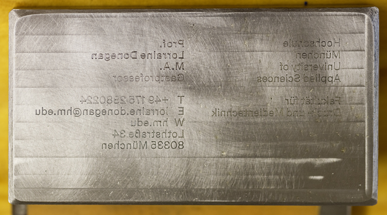
This is the steel printing die for my colleague’s business card. The lettering is cut with a CNC milling machine into a 12mm thick block of steel. Then a master engraver cleans-up the corners of some letters with a hand engraving tool. The image goes about 0.05 mm. into the steel.
Though it is close, it’s not an adequate English translation. The closest I can come is “counter” or perhaps “counter-die” – which is not really accurate because the term describes a thick card that is used to push against the back of the paper on a steel-die engraving press.
Counter-dies are common in foil stamping and embossing. They are three-dimensional bases that push the paper into a metal die that is either stamping or embossing that paper.
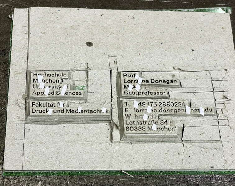
The Gegendruck is made on the press by making one impression of the steel intaglio die onto a thick card base (about 10 mm thick). These Gegendrucken do not have detailed relief except that they push against the image areas of the printing plate. They cover areas of the impression, not the lettering or the image.
Here, “Ronny” Kaevski, the steel die press operator, cuts the Gegendruck for one of the cards.
After printing on the Gegendruck, using an X-Acto knife, you cut away the non-image area of the card, leaving blocks that support the text or image being printed. Those areas are flat. In the plant where I learned how to do this (I made one myself), the press operator also adds tiny bits of sticky paper to accent marks, and to periods and commas that might be slighted by the impression on the press if not enhanced.
Once the Gegendruck is finished, it is secured to the underside of the impression area. Above it is the tympan (this term describes it generally) and above that is the frisket, a mask that covers the parts of the sheet not being printed by the die.
This is a close-up of the finished Gegendruck. Notice that the areas left high are the areas with type. Tiny pieces of sticky paper enhance the impression on punctuation marks and accents to prevent them from printing poorly.
I have seen many intaglio presses over the years, some of them roll-fed (roto-gravure) and some of them sheet-fed (intaglio or steel-die engraved). Until a few weeks ago I had never seen a hand-fed steel-die press, nor had a chance to see one working.
This type of printing is reserved for classy business and personal stationery, for fancy invitations and social printing, and security printing on a small scale. Currency is printed on the same technology, but on much larger machines that are machine-fed.
On this occasion, I was having business cards printed for my colleagues at Hochschule München. The cards, which we printed on Gmund Soft White 300 gsm paper were printed in two colors: the black lettering printed on the steel-die machine (called “Stahlstich” in German) and the red university logo printed by letterpress on a Heidelberg Windmill press (called a “Tiegel” in German).
The printing company, on the outskirts of Munich, is called Martin Schall GMBH. The firm specializes in security printing and specialty steel-die engraved printing, foil-stamping (“Prägedruck” in German) and extraordinary combination foil-stamping with embossing. Their presses include two 53 cm. Heidelberg offset presses, three large 100 cm. Heidelberg cylinder letterpresses with foil-stamping modifications, one Heidelberg 74 cm. cylinder press with foil stamping modifications. The firm also has two Heidelberg Tiegel machines for foil stamping and printing with ink.
The firm’s four steel-die presses were all built by Friedrick Heim & Co. in Offenbach, Germany in the 1960s. I can’t find any evidence that the company still exists.
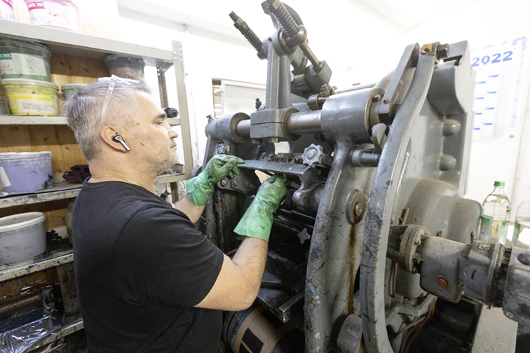
Ronny mounts the steel die into the press. It hangs from the top of the machine, and passes the inking roller en route to the impression position. Then the impression plate rises up from below and transfers the ink from this plate to a sheet of paper with tons of pressure.
The making of steel dies for printing has always been an art practiced by master engravers who cut into soft steel plate with engraving tools (called “gravers”). It is a complex and painstaking process, with extraordinary results (look at currency for examples of this skill). Another technique is to make a photoengraving into steel or copper using photo-resist, a film negative, ultraviolet light and sulfuric or hydrochloric acid to etch the image into the steel plate.
At Schall, the company has a master engraver, Maximilian Schall, son of the founder, and an artist with extraordinary skill with a graver.
For commercial projects like mine, the company uses a CNC milling machine with precision carbide cutters. Digital files like those I created are converted to outlines in Adobe Illustrator, then cut into a steel plate about 0.5 in. thick. The depth of the engraved image is 0.05 mm (0.0127 in.). Because the machine is cutting with a rotating tool, all of the internal corners of the plate have round-corners. Max uses a hand graver to cut into the corners and sharpen those up to make them more faithful to the design.
Once the plate is machined, it is mounted in the Heim press and inked. The ink is American-made Cronite water-based ink for intaglio. The press floods the plate with ink, then a wiper removes the ink from the surface of the plate, leaving the ink only in the recessed areas of the engraving.
This photomicrograph shows the detail of the lettering in the steel die. The engraver has enhanced the corners of some letters to increase their sharpness.
Impression is several tons, pushing the plate onto the paper, and forcing the ink to transfer to the paper. This gives the printing that legitimate raised effect, where the ink stands out from the paper.
The Heim presses are hand-fed, and the operator uses one hand to lift a fresh sheet of paper, put it against the register guides and print. Then, using his other hand, he flips the paper around for a second impression on the same sheet. Finished sheets are laid out on a counter to the operator’s side.
The process is not very fast. Each impression takes about 10 seconds, limiting the output from these machines to 300 to 400 impressions per hour. After printing, the cards must dry overnight before going to the next process – printing by letterpress in my case, then the letterpress printing must dry overnight before the cards can be cut to size.
Overall, the quality of these cards is stunning. They are the classiest business cards in our university I am sure. We printed enough that it’s unlikely that any of the professors will run out in the coming years.
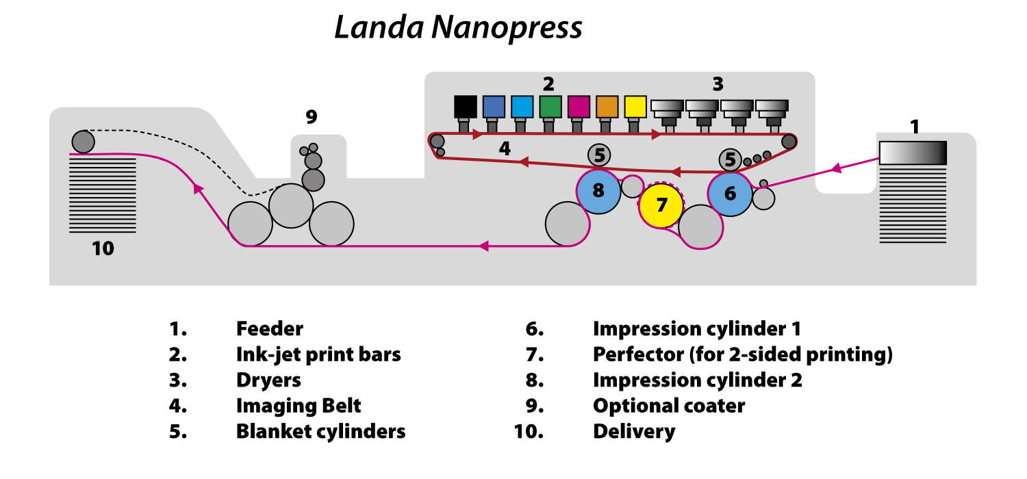
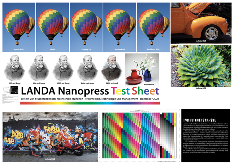
After numerous visits to the printing plant where the Landa Nanopress is running, I have a pretty good idea of how that machine works. I am assisted by a very nice diagram on the wall adjacent to the machine.
Fundamentally, the Landa Nanopress is a production ink-jet printing press. Its maximum sheet size is B1, or 1000 mm x 700 mm (the press is slightly larger than B1). The ink is water-based pigment. There are seven colors on this model: CMYK, plus orange, green, and blue/violet. These additional colors add tremendously to the color gamut of the press, making it one of the largest of any production press.
The ink-jet heads are made by Fuji/Dimatix. The resolution of the machine is 1,200 spi (machine spots per linear inch), meaning that the resolution of the ink-jet heads is 1,200 spi. The resolution in the other axis – belt direction – is 600 spi, which is a function of belt speed and other factors (likely the speed with which electronic instructions can be delivered to the heads). This resolution is comparable to toner-based printers like the Konica Minolta production machines which also have 1,200 spi resolution.
Offset presses, by comparison, use aluminum printing plates that are imaged on machines with at least twice that resolution, typically 2,400 spi. A Kodak Trendsetter can render 2,400 spi images – and more – with its combination of extraordinary feed accuracy and laser imaging precision. Another machine with which I have experience is the Spark from ESKO, which has over 5,000 spi resolution.
Both of those machines are capable of “currency” resolution. The Landa press is not in that league.
However, for commercial quality printing, the Nanopress is capable of producing competitive quality with an expanded color gamut, the combination of which makes it a formidable machine in the marketplace. This is especially true for general commercial printing in short runs in nearly any category of printing. The example I wrote about in my last blog shows that this machine can print very high quality books in short runs at an economical price. Wth no plates, and a very short make-ready, the machine is a true short-run production printing press.
To understand the path of ink-to-paper, you can follow the accompanying diagram.
A job is imposed into pages and forms (a form is one complete side of one press sheet). The press can print on both sides of the sheet in one pass through the press, where most offset presses cannot do this.
Prepress for the Landa machine is similar to that for any offset press. A skilled prepress operator assembles files – typically PDF files – into their component parts, and then positions those parts in the correct locations for printing. This could be as simple as two large “pages” for a full-sheet poster, or it could be many smaller pages imposed for a book. In any event, the elements of the printing job are made into complete forms, then crop and bleed marks, register marks and labels are added to make the forms ready to print.
The prepared forms are sent to the EFI Fiery RIP that is embedded in the Nanopress. This device is customized to run the Nanopress with its seven-color ink system, and capable of delivering data to the Landa electronics about the colors and positions of every imageable spot in all seven colors on the press sheet – both sides, and at a rate that keeps the machine running at its production speed of 6,500 impressions per hour, one-sided. Printing on both sides cuts that speed in half.
The press operator moves the files through the Fiery, and it in turn creates all of the instructions necessary to run the machine – instructions that fire an ink-jet nozzle at every possible location on the press sheet in every color. Those files are supplemented by machine instructions for paper feed, ink volume, drying temperatures, perfecting (as required), coating (optional) and delivery. The complexity of the systems on this machine is greater than that of an offset press because the machine is not only moving and putting ink on paper, the Nanopress is imaging billions of microscopic ink-jet spots on that paper as it goes through the press.
The image starts on the ink-jet Print Bars. When running, the print bars emerge from air-tight parking places and move to hover over the Imaging Belt. When instructed to do so, the ink-jet nozzles are activated, and potentially billions of microscopic droplets of ink are ejected from the print bars onto the moving imaging belt.
In general, printing presses image the darkest color first, and then work their way to the lightest color. This is true for the Nanopress. All of the ink is deposited onto the belt, which then moves under a series of air dryers whose purpose is to dry the thin film of ink on the belt. By the time the ink film reaches the right-hand end of the press, the image is already dry.
The belt carries the ink around the corner and then turns left and into the press where it meets a sheet of paper that has been fed into the cylinders. As the image on the belt comes in contact with the paper, the thin film of ink is transferred by pressure from the belt to the paper. This transfer takes place between Blanket Cylinder 1 and the first Impression Cylinder (with the belt and paper between).
The ink on the paper is completely dry when it emerges from the pinch of those two cylinders.
The paper is then passed around an intermediate cylinder and on to a Perfecting Cylinder which can either pass the sheet onward, or flip the sheet over, handing its trailing edge to the next Blanket and Impression cylinder pair for printing the other side.
This technique requires that the front side and back-side images must be printed to the belt in alternating order to perfect a sheet. So, when perfecting, the belt will carry images in front-back-front-back order. If the sheet does not perfect, then there would be only one side imaged to the belt, and it will double the output of the press by printing only the one side of each sheet.
On an offset press, one tries not to lose control of the gripper-edge by delivering the trailing-edge of the sheet to the gripper. On Heidelberg presses, for example, the perfecting system flips the sheet when perfecting, but maintains register by holding on to the original gripper edge – even when it is feeding the opposite direction into the press when perfecting. The Nanopress does not do this, but it does have sophisticated front-to-back register control using cameras that monitor the position of the images on the paper.
Front-to-back register is also controllable on the press console with register cameras capturing images of the register marks on both sides of the sheet as it is imaged.
Once both sides of the press sheet are imaged, the paper is carried toward the delivery pile. Along this path there is another set of cylinders that can optionally hand the sheet to a conventional coating unit (part of the Komori press components). Here, an aqueous liquid coating can be applied to the sheet on both sides if desired.
The press sheet is carried by the delivery chain and dropped onto the receding delivery pile. The printing is then complete. On recent presses there are two delivery piles; these can be used to increase productivity in a number of ways.
When the press goes to its idle stage, the seven ink-jet bars recede into parking places where the heads are kept away from dust and air in the machine. Both humidity and temperature are maintained in these parking spaces to protect the ink-jet heads, keeping them ready to run the next job.
At Blueprint, they keep the press warm and humidified 24 hours a day. The press is run for two shifts, and stands idle for the third shift.
Post-press operations – cutting, folding and binding – can commence immediately because the press sheets are completely dry the moment they arrive at the delivery. Offset printing would need to dry for at least a few hours before commencing on these operations.
In the fall, my Master’s degree students and I worked on a project to write and publish a book about street art and street artists in Munich. We chose to photograph the work of these artists in one neighborhood called Tumblingerstraße. There, the city of Munich has declared that graffiti is legal.
This is art on Tumblingerstraße taken in mid-May, 2022. Works like this change quickly, one artist painting over the work of another from days or weeks earlier. The quality varies significantly from artwork to artwork. This example is extraordinary.
The block-long palette is a workplace for those who practice fine art with a spray can. The locals call it the Wall of Fame. The turnover of street art along this block is sometimes so rapid that a work will be covered up by a new work within days. I have seen the artwork change twice in one week – once in the rain!
My students split up into teams, some working on finding the sometimes-elusive artists, and others working on the photography of the artwork. We interviewed local experts, painters, and the man who runs an artists’ collective adjacent to Tumblingerstraße called Bahnwärter Thiel (Railroad Man Thiel). Trains run alongside this neighborhood too, whizzing overhead as you walk down the highly-decorated block.
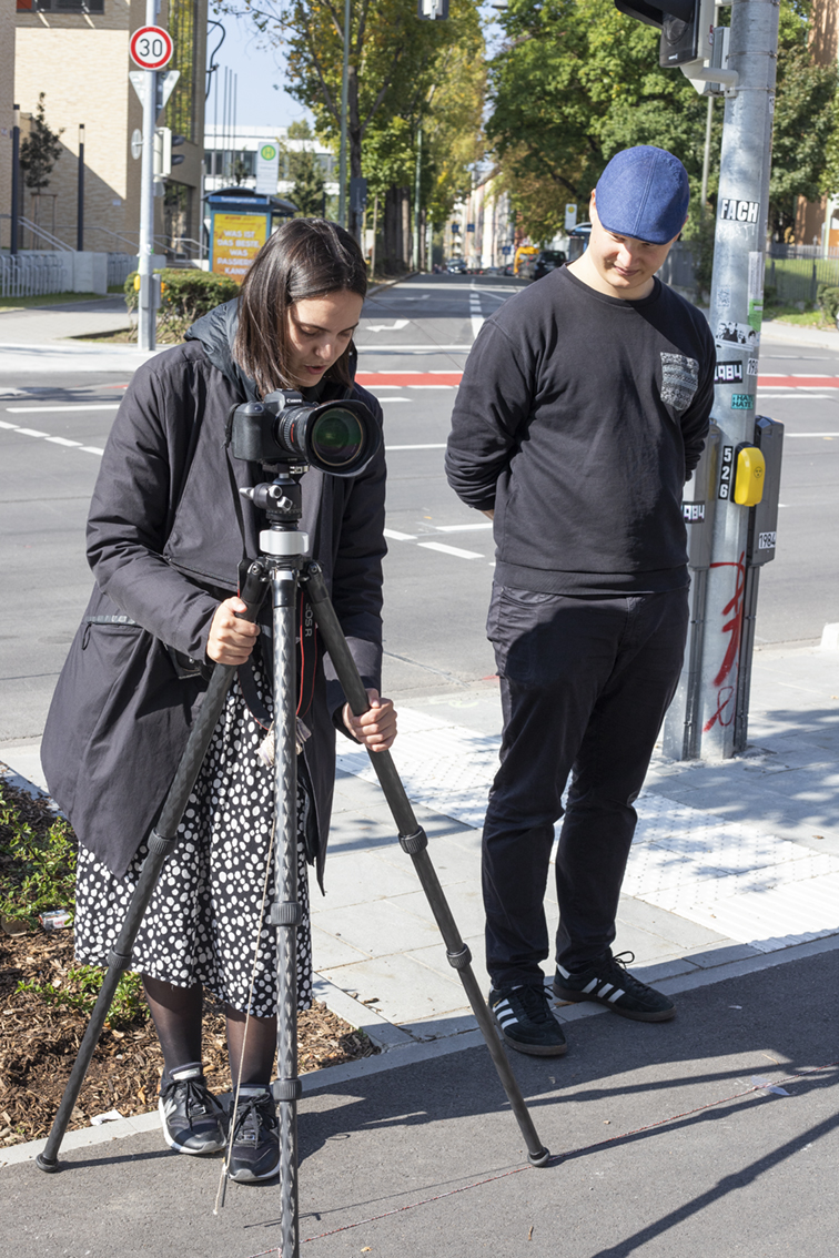
For the street art photography we practiced something I call repositioned panoramic photography. This is a technique I have used on several occasions in the past, and I have perfected it through practice. I bought a roll of string, and we tied a knot in the string every meter. Then my students taped that string to the sidewalk three meters away from the wall.
Two of my students working on the repositioned panoramic images She is positioning the camera directly over the string, taped to the ground on the sidewalk.
With a plumb-bob on the tripod, we moved the camera along that string, stopping to take a photo at every one-meter interval. We were shooting with a medium wide lens with careful (manual) exposures to ensure consistency. What we ended up with are overlapping photos of the artwork with about 85 MB of data per shot.
Another team of photographers, using still cameras, photographed every nook and cranny of the street, gathering detail photos of the paint and the empty cans (the street artists are reasonably careful not to litter; they dispose of their paint cans properly – most of the time).
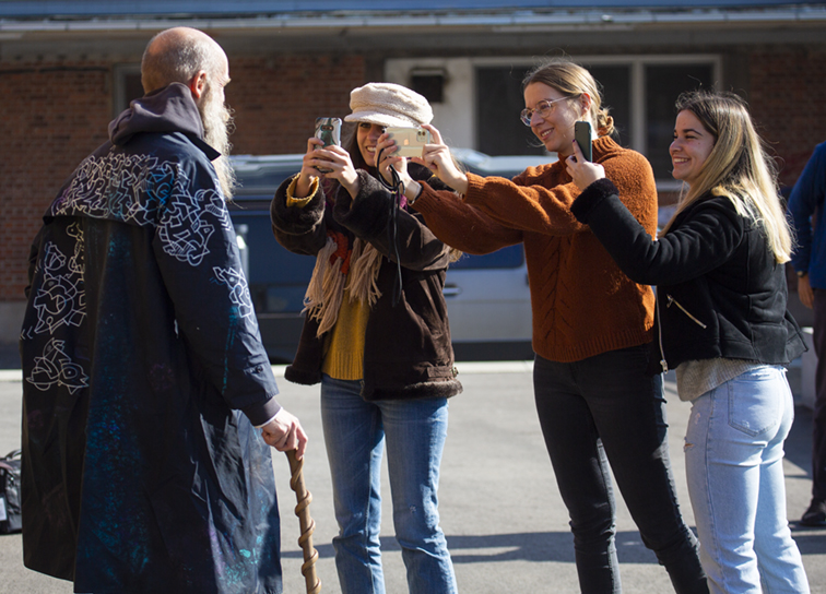
A third team of photographers took portraits of some of the artists working on their art.
Three of the students using Portrait mode on their mobile phones to capture portraits of one of the street artists featured in the book. The quality of those images was more than adequate for print.
When we were finished gathering photos and stories, another team of students transcribed the interviews and edited them into what the Germans call a “porträt” of each artist. These are stories that describe the people and their work. They are intimate descriptions of these men (we couldn’t find any of the women in the street arts community) and their philosophies about art and expression.
A smaller team of senior editors then fashioned these written portraits of the artists into a cohesive story about Tumblingerstraße and its contributors. They worked to define the “voice” of our book so that the stories were consistent in style and language.
Meanwhile the students and I worked on stitching the stepped panoramas together into ultra-high-resolution panoramic images for our book. Adobe Photoshop is an excellent platform for this kind of work, as its Automate:Photomerge function is very good a piecing together stepped images into flawless horizontal panoramas of hundreds of megabytes.
Yet another team began to build the pages for our book-to-be.
And, that is where the Landa Nanopress comes into this story.
I had seen the press running (read about it in this blog), and had asked the company president if they would print our book. With his affirmative answer, I began to work on getting press specifications, creating and printing a test sheet, and making the basic mechanical requirements for my students to follow in designing the book.
I also needed money to print the book, so I applied for, and received an innovation grant from our university to get this book, and several smaller projects printed.
This is the test sheet I created to determine the qualities of the Landa Nanopress. The balloon photos at the top are designed to show how different RGB color spaces reproduce on the press. ProPhoto RGB is on the right, and despite being a huge color gamut, the resulting images did not look very good. I changed to Adobe RGB instead.
My test sheet revealed that the seven-color Nanopress would make an excellent printing platform for a book about street art. The vibrant colors of the artwork – including brilliant oranges and greens – would reproduce well on this machine. This was going to be a perfect pairing of technology and art.
I am an advocate of big-gamut RGB images for print. I have long believed that saving my photos with Adobe RGB, or ProPhoto RGB profiles gives them an opportunity to shine on the printed page. In this case I was working with the students to create ProPhoto RGB files for the book.
My test sheet proved me wrong, though. Those images I printed from the ProPhoto space did not reproduce well at all, instead turning them muddy and unattractive. But, that is why I made a press test sheet!
After consulting with a representative of EFI here in Germany (they make the RIP that runs the Nanopress), I decided that my best path would be to use Adobe RGB (though after researching it a bit, perhaps ECIRGB might be better – this is yet to be determined).
We reprocessed the photos with Adobe RGB source profiles.
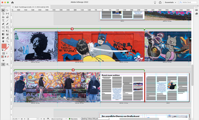
After two months’ work, we completed the book in Adobe InDesign. It was ready to print. The grant would not come through until March, so we waited.
These are two of the six fold-out pages in the book. Each of the fold-outs is 950 mm in length (about 38 inches), covering three pages in the layout. Combined with individual adjacent pages, the fold-out sections measure more than one meter wide (about 55 inches).
When the grant money became available, I made arrangements for the books to be printed. Our press run would only be 125, but that is what the Nanopress does best. Limited editions are not only possible, they are routine on this machine. And, comparing the cost of printing on the Landa Nanopress with offset printing shows that when you don’t have to make plates and do even nominal make-ready, the Nanopress wins. You get gorgeous printing and you don’t have to spend a lot of money and time getting ready to print.
My summer semester Bachelor’s degree students and I used the Nanopress demonstration as a teaching opportunity. I took 14 students to see the book being printed, and to give them an opportunity to see this amazing machine at work. Representatives of Landa were on-hand to give the students an all-around tour. The machine was running beautifully, and the students had a rare view inside the machine.
The press run didn’t take very long: the book was comprised of three full B1 press sheets for the book body, and one additional press sheet for the covers. They ran about 150 sheets of each, and the entire run was completed in less than an hour.
The students eagerly accepted samples from the Nanopress, rolled them up and left the plant excited to have seen this new technology at work.
After printing, the press sheets were shipped to a bindery in Frankfurt where they were trimmed, folded and perfect-bound into beautiful examples of the work created by my Master’s students. Their work paid off in a form previously not seen – seven-color production printing on the Landa Nanopress that is beyond what we normally see from commercial presses.
This is the cover of the book: Tumblingerstraße. I commissioned this work by a local Munich artist whose work is featured in our book. On the Nanopress, the greens and oranges are reproduced with amazing intensity, something not possible with traditional CMYK printing.
Last September I moved to Germany to teach for a year at Hochschule München in the Print and Media Technology program. This is my second time teaching here. The program is very similar to the program at Cal Poly, where I taught for 22 years. There is an exchange program with both teachers and students trading places for one or two semesters each year.
In the first weeks after my classes began in the Winter semester I was invited by a colleague to visit a commercial printing company in Munich that had installed a Landa Nanopress, one of the first in Europe, and one of a few dozen of the machines in existence. I was excited to see one of these machines outside of the controlled circumstances of a trade show hall. I wanted to see a Nanopress in production.
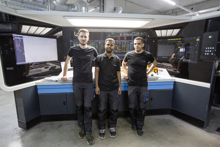
Three young men from Landa and Blueprint AG who run the Landa Nanopress in Munich.
The press is the brainchild of industry wizard Benny Landa, who in 2012 showed the machine to the world at the DRUPA exhibition in Dusseldorf. It was the most exciting new technology that year, and people stood in line to get a ticket to see the Landa team demonstrate the new machine.
This was not Mr. Landa’s first printing machine. He invented the Indigo printing press in the 1970s, and that machine became popular in the printing industry in the 1990s. Indigo is a toner printing system that is quite different from other electrophotographic machines in that its particulate is suspended in a liquid hydrocarbon called Isopar, giving the machine a higher resolution and greater control over the placement of microscopic particles of toner onto paper and other substrates.
While the Indigo had significant success, the company struggled to compete against other machines in the same category – Xerox, Konica-Minolta, Ricoh, Heidelberg, Kodak – and many feared that Indigo organization would fail. In 2002, Hewlett-Packard bought Indigo, not only saving it from failure, but creating a new division to improve and expand the Indigo offerings. Today, the Indigo press is one of the major players in digital printing and packaging. It has carved-out a large share of the market for short-run, exceptionally high quality printing in the digital field.
Gerhard Meier, President of Blueprint AG, extolls the virtues of the Nanopress to a group of visiting professors from Hochschule München last fall.
With the sale of Indigo, Mr. Landa started a new company in Tel Aviv, Israel, called Landa Group, specializing in nanotechnologies. The product of that firm is the Nanopress, a machine that combines production printing size (B1 size: 1000 x 700 mm), reasonable production speed (6,500 impressions per hour, one-sided), and resolution of 1,200 x 600 ppi, making it competitive in the field of commercial printing. Offset presses typically print at twice that resolution, but the image quality and clever imaging techniques used by the Nanopress make an admirable printed product that is difficult to differentiate from offset without a microscope. Because of the excellent screening techniques, these sheets look like stochastic printing from offset presses.
The Nanopress in Munich is a model that features seven printing inks: the standard CMYK plus orange, green and blue/violet. Driven by an EFI Fiery controller, the press has a remarkable color gamut, and photos printed on the machine exceed normal process color printing in color range and brightness. Some of this is a result of the extraordinarily thin ink film thickness of just 100 nanometers, which allows light to pass through the ink and reflect back with less absorption than conventional printing inks with a thicker ink film thickness.
The press uses a stochastic halftone screen method to image photos and graphics, freeing images from the traditional rosette patterns of four-color halftones. This also eliminates any possibility of moiré patterns, a curse of printing with more than four colors of ink constrained by standard screen angles.
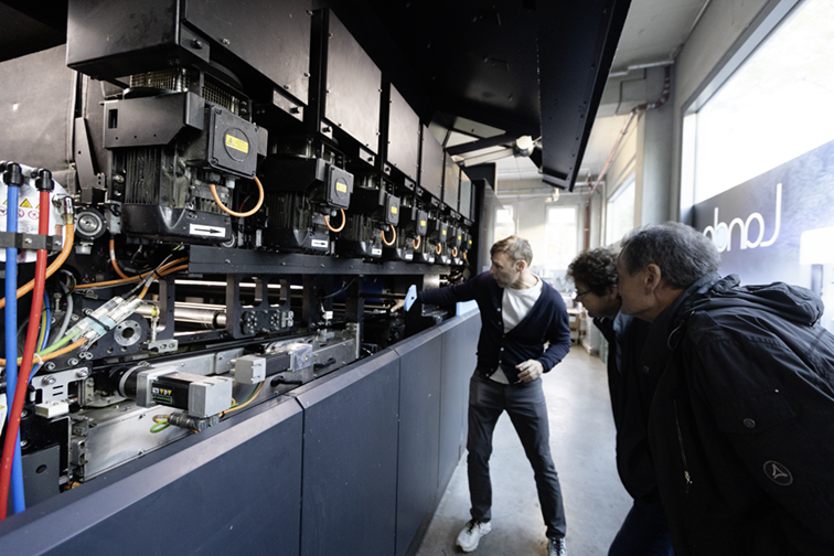
Herr Meier shows his guests the inner workings of the Nanopress from the operator side. The seven ink-jet head assemblies are just inboard of the black boxes with yellow labels above him.
The imaging is done with ink-jet technology. The Nanopress has rows of Fuji/Dimatix ink-jet heads that produce their microscopic droplets, depositing them on a huge rolling belt that runs the length of the press. All of the colors of ink are deposited onto the belt, and then immediately dried by a row of dryers, resulting in the ink being a flexible entity that is transferred to the paper (or other substrate) in one step, arriving there fully dry.
If the sheet is to be perfected, it is passed to a perfecting cylinder, which flips the sheet and feeds it under the belt a second time, the ink for the backside being transferred by a second impression cylinder. After the two-sided sheet is finished, it goes to the delivery – or it can be sent to a conventional coating unit for aqueous coating.
The press feeder, coater, delivery, and all paper handling components are made by Komori in Japan. The Nanopress itself is built in Tel Aviv. This machine is very large. It is as long as a four-color offset press, three times wider, and about as tall. In addition to the printing machine, there are ink pumps, heaters, humidifier units, and a formidable array of devices for moving the belt through the machine and then removing the nanometers-thick ink from the belt to transfer it to the paper. It is exciting to watch it run.
When the ink-jet heads are making images, they are positioned inline with the belt and paper. When not printing, they retreat into air-tight landing positions to protect them from exposure (the ink cannot be allowed to dry on the heads).
The machine is capable, as most digital presses are, of making just one finished impression. Theoretically there is no make-ready, and there is no need to run many copies to get the machine “up to color.” In practice, the machine does need to be run up to color and the register of colors must be checked before production begins. But, with far fewer sheets run to get to full production – compared to an offset press – the machine is very practical for short-run, very high-quality printing. It is also capable of variable-data and variable-image printing where every sheet can conceivably be unique.
An interesting characteristic of the Nanopress is that it has only one operating speed: 6,500 impressions per hour. No faster, no slower. When perfecting, the output drops by half, a result of turning the sheet and putting the nano ink on the backside. A technician from Landa told me that the company is working to make the machine run a bit faster in future versions. That speed is acceptable in my opinion, based on its other capabilities.
The Landa machine is not alone in the market. Digital ink-jet presses from Komori, Fuji, Koenig & Bauer and others are also making their way into plants around the world, edging for an opportunity to meet the demand for production size and quality printing using short-run ink-jet technology.
On our first visit to the Nanopress we received a tour of the machine and were dazzled by the test sheets provided by the printer – Blueprint AG. While we visited we saw sheets of routine short-run commercial printing for numerous clients. Germany is home to Porsche, VW, BMW, Audi, Mercedes Benz and other auto and truck manufacturers. We saw printing for several of those companies being run on the Nanopress. The work was extraordinary because of the expanded color gamut. This is a machine that calls out to graphic designers and photographers. There are greens, oranges and blues on these sheets that we almost never see on traditional presses, a result of there being seven colors available on the machine.
Another class of work that we saw was beautiful printing of menus. These were jobs that would be impractical to run on an offset press because the finished run would be shorter than the make-ready. Clearly it is practical to print 50 sheets on this machine.
The president of the company allowed us to take sample sheets that day, and we all walked out of the plant carrying our very special roll of paper with beautiful images printed on Mr. Landa’s new machine. I carried mine to the U-bahn station rolled up to protect it from the falling snow. When I got to my apartment I unrolled it and admired the work even more.
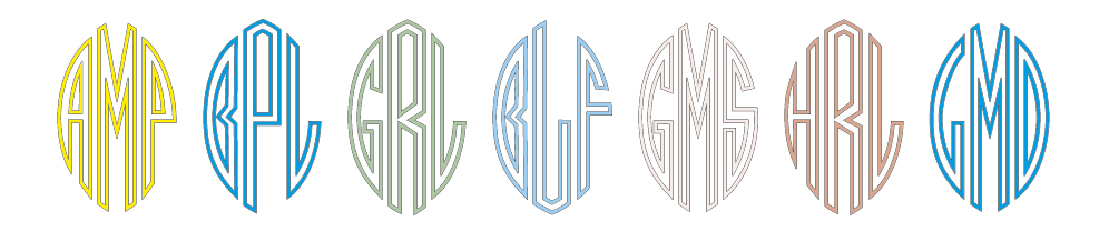
Years ago I made a reproduction-quality proof of a type font in the Shakespeare Press Museum at Cal Poly. This font is comprised a sets of three letters that can be assembled into monograms.
Monograms were quite popular for business stationery in the early 20th century, and are often seen in embroidery patterns.
This font has left, center and right elements, each one designed to stand with two others to make a three-letter monogram.
I was up all night last night, reinstalling the software on my iPad Pro (a story for another day), and I was left with long wait times as a new operating system and back-up were downloaded and installed on that device.
I decided to work on the monograms to make a digital font. There are many monogram fonts in existence, some of which look very much like the one I was planning to draw, but I went ahead and began the work anyway. My design is relatively faithful to the metal type in the museum, and different enough from the others online that it would not be a waste of time.
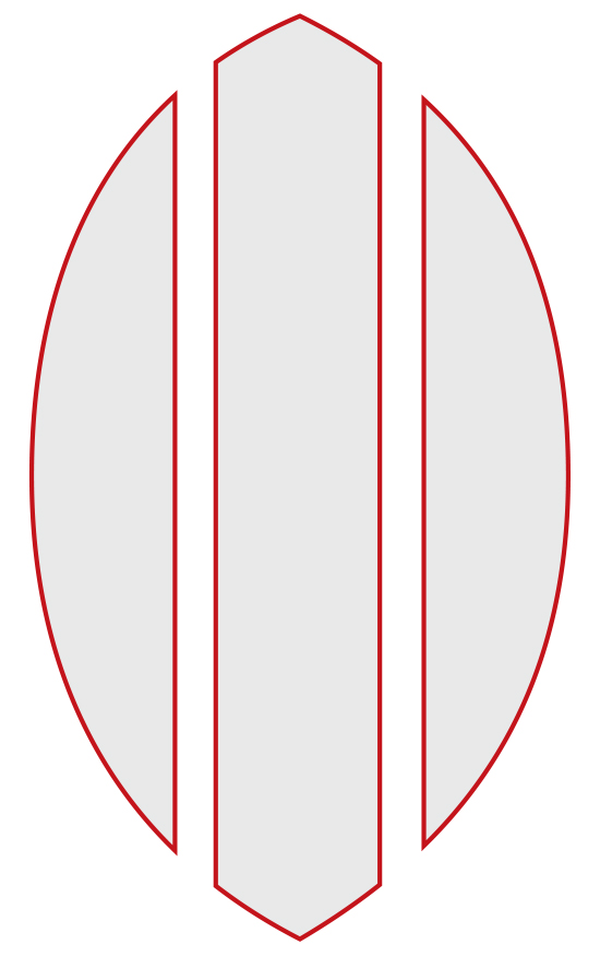
The idea is that each letter has to fit a third of a pointy ellipse shape with white space between the elements. I also decided to make the first version of the font an outline font (the solid version followed).
These are the three shapes into which I chose to draw letters: left, center and right.
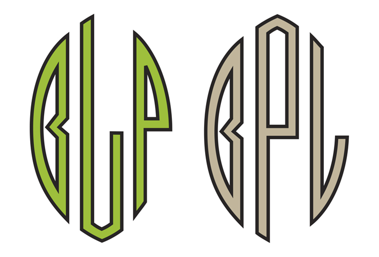
I started by drawing the letter O for all three spots, then worked on derivative letters including P, R, B, and C. Pretty soon I had created the N, M and W letters, and worked my way to U, V, X and Z. I finished the others and made a test font.
What I realized, but wouldn’t admit to myself is that drawing the left-side letter D was impossible. I tried several versions of the letter D, but they violated the basic structural rules that I had created for the other letters. Nothing worked for the left-hand D.
Here is the dilemma of the left-hand D: It just doesn’t work. I ended up doing what many other monogram designers have done, and flipped the D so it faces backward. C’est la vie typographique!
I looked online, and I discovered that no one else had figured out the D either. I was relieved. Most monogram fonts use a reverse D in the left position. I decided to do the same. It’s a cop-out, I admit, but there really isn’t much else I could do. In the end, I put a forward-facing D (shown on the left, and really ugly) as an alternate character in the font.
My next challenge was mapping the font to the keyboard. I would, of course, use upper-case and lower-case keys for the left and center glyphs, and I figured I could use Alt and Alt-Shift for the right-hand glyphs. Alt worked in most cases, but there are several “escaped” glyphs that won’t work because they don’t space (when you type an accented character, the computer puts the accent on screen, but it does not advance to the next letter; instead, it waits for you to type the accented letter, which is then presented under – or over – the accent mark).
Here are two versions of a monogram for my initials (BPL). Traditional monograms (like those embroidered on handkerchiefs) have the initial of your last name in the middle, and your first and middle initials on either side. I don’t own any handkerchiefs, so I choose to put my initials in proper order (right). I really like the two-color letters made by choosing a fill and stroke of different colors.
I figured out which glyphs go under which Alt and Alt-Shift combinations so that I can set the entire alphabet in all three positions. When I was in doubt, I put the right-hand glyphs in two positions so that either Alt or Alt-Shift will work.
It works, but I wish it worked more consistently.
The monogram is set with a fill and stroke color at the top, followed by another period font from the Shakespeare Press Museum collection, one called Art Point. I drew that font for digital use about ten years ago, and it works well as a contrasting font for the Monogram font.
In the end, I am very pleased with my Monogram font (except the backward D). I have tried it in a number of settings, and it looks pretty good. And, it only took a couple of days of work to get ready for beta testing.
I have posted a set of downloadable fonts for noncommercial use. You are welcome to download them,
Below is a link to a folder containing both the outline and solid versions of the Monogram font, and a character map to help you get the correct characters. I hope you enjoy these fonts.
This is a continuation of a blog I wrote two days ago. To read the first part, click here.
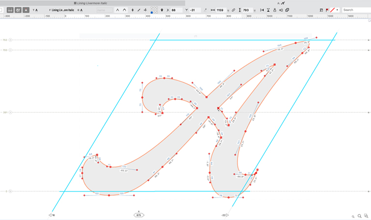
After I put all the letters (called “glyphs” In typography) into a master Adobe Illustrator document, I built the destination environment for the letters in FontLab. There, I assigned a cap-X height, a lower-case x-height, and an Italic slope.
This is the cap A in its glyph window in FontLab. I have enhanced the parallelogram lines that describe that space in light blue. Working in an Italicized environment was confusing to me at first, but I figured it out, and am now comfortable with these glyph spaces. The red nodes indicate anchor points in the letter: round nodes are curve nodes; square nodes are corner nodes. I really like the FontLab controls for drawing letters – they offer precise control over the position, angle and length of each node and handle.
This turns the spaces in which the glyphs reside into parallelograms. The Italic slope is 30° in Lining Livermore, which I determined by measuring the slope of the letters in my photos. Once the FontLab settings were made, I prepared the first letter to move, and calculated the amount it needed to be enlarged to fit the glyph spaces in the destination application.
This is my Adobe Illustrator master document containing almost all the glyphs I created to make the font. Many others were created in FontLab because it’s easier and more precise to work in that environment. There are also some experimental glyphs here – characters that never made it into the font. I don’t think that the 19th century designers of Lining Livermore knew what an eth is, and the Euro glyph certainly didn’t exist. Notice the red sidebearing rectangles. These were taken from the micro photos of the type, and assigned by the width and height of the lead blocks on which the letters are cast.
I create a “pasting page” in another Illustrator document where I paste a copy of each glyph, then scale it to the correct size for FontLab (I could more simply enlarge the entire master document then just copy and paste into FontLab). Then the process is to select a single glyph in Illustrator, copy it, paste it onto the pasting page, and scale it to the right size. Then I cut the glyph, move to FontLab, open the glyph window and paste.
Once in FontLab, I move the glyph into the correct position on the glyph window. “Correct” is the operative word here: I have never made an Italic font before, so this was new territory. Roman alphabets are simpler: there is a left sidebearing, and a right sidebearing. They are usually equal, with some exceptions, and it’s easy to gauge where a glyph sits inside its glyph rectangle, depending on the “natural” spacing of the font you are creating.
With Italics, however, I was befuddled. Do I center the glyph in its space? Do I imitate the overhang in the original metal type (which is even more confusing, since the metal type is not cast on parallelogram-shaped blocks)? I found, with some experimentation, that placing the left edge of each glyph on the left edge of the glyph space, then setting the right sidebearing either touching or overlapping the right-hand edge of the glyph I was placing gave me the best spacing.
The images on the left show the glyphs inside their original type block spaces, showing the overhangs as they exist on the original type. On the right are parallelograms with the same glyphs within. The parallelogram environment is the world of FontLab as I am using it for this font.
In this way I allowed the overhanging parts of most letters to overhang, and thus intrude into the left side of the following character’s space. This is not intuitive, but eventually it made sense. I completed the entire font using that technique. Now I am in the process of adjusting those glyphs to get them to fit their spaces more effectively. It will take time.
When I finish that I will move on to kerning, which will be an all-new experience for me in the Italicized world I have created.
So Lining Livermore is almost ready for prime time, which is to say “beta-testing.” I will pass a few copies to friends and family to give it a shake-down.
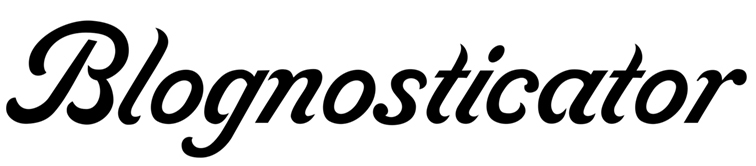
On the day I started writing this blog I read the latest post from Lucas at Type Network about new revivals of fonts from the American Type Founders Collection. I was excited to see these new fonts – until I saw Livermore Script. I was crushed. On the same day that I made my first “finished draft” of Lining Livermore, they beat me to market.
So, what do I do now? Scrap the entire project? Kill Lining Livermore and move on to another font? I don’t know.
I have drawn the necessary hundreds of glyphs for Lining Livermore, and I completed years of work, working quietly in the background, to get this far.
I will continue to “perfect” the font, working to make a beautiful Italic font that represents the original metal type, and then I will probably use it myself and appreciate the effort whenever I do.
Meanwhile I congratulate the modern ATF revivalists – Mark van Bronkhorst, Igino Marini, and Ben Kiel – for their work to make a commercial digital version of Livermore. It looks great.
Deep in the recesses of the back room of the Shakespeare Press Museum at California Polytechnic State University is a cabinet. It contains about 20 drawers of hand-set metal type.
We never use this type because it is difficult to use, and it is the rarest of the museum’s collection of about 600 drawers of wood and metal type. If it were used, it would certainly get damaged, and that’s not acceptable.
This is my digital font in its early stages. Much work remains to be done on spacing and kerning. I’m sure you can appreciate what an interesting design this is.
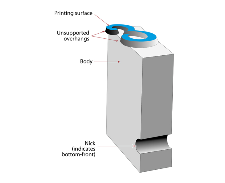
The reason it would be damaged is that this font has extraordinary wings of unsupported metal – the most pronounced of any font I have seen. This means that parts of the letters hang off the sides of the blocks on which the type was cast. In order to prevent those wings from breaking off on the first impression of a printing press, there is, somewhere, special spacing material that is designed to support the parts of the letters that hang over the edges.
We don’t have that special spacing material, so the fonts of this style have been designated as never-use fonts for their own protection.
This illustration shows the position of the letter on the lead type block. The parts of the letter that hang over the edges are designed to be supported by the next character’s base. If the type is printed without that support, those fragile overhangs will be broken off, ruining the type. (I have made that mistake a number of times in my career.)
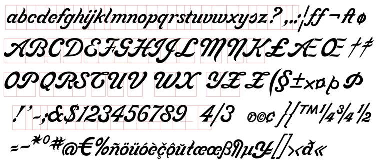
The Lining Livermore type was made about 150 years ago by a foundry in Philadelphia, Pennsylvania named the McKellar, Smiths & Jordan Foundry. This company was one of numerous small type foundries that later became American Type Founders. ATF became the largest type foundry conglomerate in the United States. Its type designs dominated hand-set typography for two centuries, and the vestiges of that firm are still in existence (though today those vestiges are designs being converted into digital fonts).
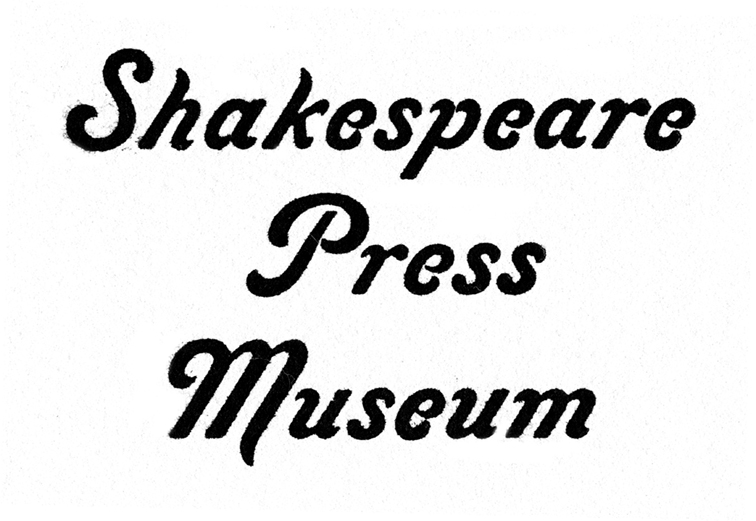
I looked for decades to find Lining Livermore in any catalog of type from ATF and others, and was never successful in doing so. I finally found a reproduction of the McKellar, Smiths and Jordan specimen book in which there is a sample of Lining Livermore.
This is enlarged from the proof print, made from the original type at 18 pt. The type I used for this project is 40 pt. (an abnormal size), with much greater detail. Notice how inking and printing the specimen makes the type look bolder, and the details fill in.
It’s a unique font. It is very Italicized – about 30° – and it has huge, sweeping capital letters and diminutive lower-case characters. The style is not completely consistent in that it has no consistent angle of emphasis (the thick-and-thin parts of letters). The caps are significantly bolder than the lower-case, and there are those overhanging parts that challenge typographers who possess the actual metal type.
I first discovered this font of type in the early 1970s when I was the student curator of Shakespeare Press Museum. I knew it was special when I dug it out of the very back corner of the museum. I carefully proofed the type on a Vandercook proof press, printing on beautiful coated soft white proofing paper. My plan was to photograph it and maybe someday redraw it for photocomposition.
Decades passed, and a few years ago I started work on that process.
I have drawn many fonts for digitization by scanning these beautiful proof prints, then drawing the letters in Adobe Illustrator using the scanned images as a template. This process worked well for all of the other fonts I made, but Lining Livermore refused to cooperate. There are tiny gaps in the lower-case letters that plug-up when the type is inked and printed, closing the space between parts of the letters that are designed to be sharp.
Despite making these careful proofs, I never got one that showed the pure original design of the letters.
This past summer, while preparing for my year here in Germany, I got out my digital microscope and set it up on my desk. Then I arranged the Lining Livermore type in rows and photographed each pair of letters in the complete set. I chose a magnification of about 20X, and carefully moved each pair of letters under the lens of the microscope, and made my exposures.
Then I filed those photos away for some long winter night in Munich when I was stuck indoors with nothing to do. This month those long winter nights arrived, and I began to work on Lining Livermore.
My process is simple: I cleaned up the photos in Photoshop to enhance their brightness and contrast, then I placed each photo into an Illustrator file, set the photo as a template, and then drew each letter on top of the photo template, being as careful as I could to follow the exact shapes of the metal type.
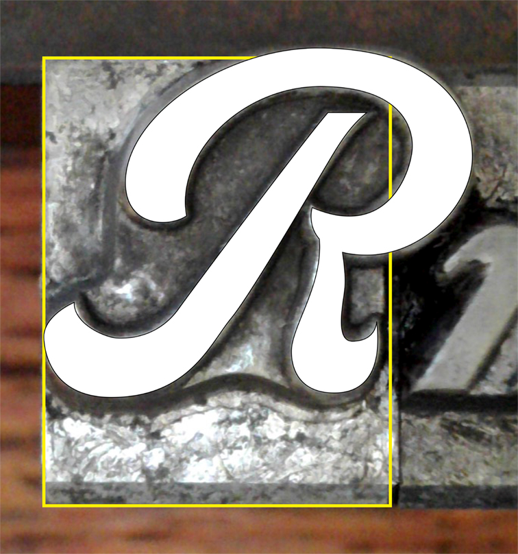
This is the letter R in Adobe Illustrator showing the photo taken with my digital microscope. After turning the photo into a template, I drew the letter in Illustrator (white), and outlined the block of metal on which the letter is located (yellow) to get the side bearings of the font. Notice the overhangs on the right and the top, which are unsupported in the original type. These overhangs would require a block of lead (usually the next letter) to support the overhang to prevent it from being broken off on the press. Metal type is very fragile, and overhangs like this cannot be printed without support.
More importantly, I drew a rectangle on each letter to indicate that letter’s position on its block of lead, so that I would know the exact sidebearings and positions of the letters on the type blocks.
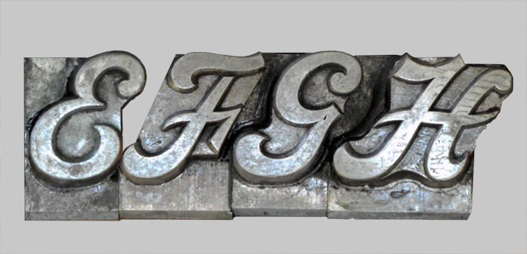
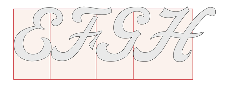
This photo shows the letters EFGH and their metal blocks. The space between the E and the F goes unsupported, so would require another letter (usually a lower-case letter) next to support the fragile overhang. The original type is, of course, reversed. I flipped the images in Photoshop to make it easier to draw the letters in Adobe Illustrator (no point working backward!).
Then I copied the Illustrator drawings to a master document and assembled the letters that I would be converting into a digital font.
…and these are the same letters from my master drawing in Adobe Illustrator. The red lines show the character’s position on the original blocks of lead. Notice that all of the letters have overhangs.
That, in my font design work flow, is the technique to get the letters drawn and ready to move into FontLab.