

We are now into the second generation of young people who have no memory of a time before PostScript and PDF, people who were not adults when we had competing font formats.
I put this era into the bigger era I call The Awkward Years. This was the time of paste-ups and wax (some people used rubber cement), of phototypography, and of making proofs from hot-metal type and then pasting those proofs into a layout and shooting the whole thing on a process camera.
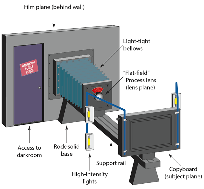
This is a process camera. I had one at my company that was 22 feet long, with a film board capable of making a 24 x 36 inch exposure on a sheet of litho film.
And, of course, the photos had to be made into halftones on that same camera, shooting through a halftone screen in a separate operation.
The photos and line art were assembled separately on pin-registered films which were ultimately exposed to photo-sensitive aluminum printing plates (two separate exposures: one for the line art and a second for the halftones). The process was complex and often inexact.
The Awkward Years were marked by a lot of invention – first phototypesetting, and then cathode-ray tube typesetting (it actually happened in the opposite order, but that will be discussed in a future blog), and eventually laser typesetting. Each of these typographical inventions was successful, and there was a lot of competition in the industry. The major players were Compugraphic Corporation, Mergenthaler Linotype Company, VariTyper, AlphaType, and AutoLogic.
And, type font piracy was rampant. Almost every one of the manufacturers blatantly stole designs, converted them slightly (if at all), renamed them with similar-sounding (but always dumb) names, then marketed the rip-offs to their customers.
The reason this was true was that every typesetting machine manufacturer treated the fonts as the means to get buyers to purchase their machines. Each machine used proprietary font technologies, and the owners of the machines were unable to purchase a font from any other supplier because of intentional incompatibility.
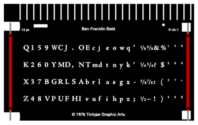
Film fonts like this one, from a Mergenthaler V-I-P phototypesetter, were manufactured for a specific machine, and were incompatible with other devices. The V-I-P was arguably the finest phototypesetter made. Its fonts moved into position, then were held stationary as the individual letter exposures were made. This eliminated the blur that was common on other competitive machines.
All of this ended when Mike Parker, then director of typographic development at Mergenthaler Linotype Company, got his firm on board with Aldus, Apple, and Adobe at the start of the “desktop publishing” revolution. Parker was probably the gutsiest of the major players because his company had the most to lose if it didn’t work. Linotype was the one company that (as far as I know) did not steal any font designs in the phototypesetting era (there were many Linotype font “look-a-likes” during the linecasting era). The reason was that Linotype had the largest library of original fonts, and specifically they owned Helvetica, Palatino, Optima, and hundreds of others that had either been designed by them or for them.
Mr. Parker took a tremendous leap to join with the other founders-of-the-revolution by making the deal that would make it possible for Linotype’s crown jewel fonts to be run on a machine not made by the Linotype Company. Of course the first two high-resolution imagesetters to support PostScript digital fonts were made by Linotype, so the company had an immediate start-up success on that front. Other companies including arch-rival Compugraphic soon came to market with authentic Adobe PostScript imagesetters that could image on paper or film with fonts from Linotype, among others.
At the time, no one knew how this would play-out. I was (I was told) the 15th purchaser of a Linotronic 300 imagesetter in the United States. Mine was fitted with the state-of-the-art “Redstone” RIP, which ran on a 68000 Motorola processor (the same processor used in the Macintosh computer at the time). The Redstone RIP was a real dog, and it would often take hours to image a single page of desktop publishing material. As a result of its questionable speed, it was very difficult to show a return on investment for that device. Compounding that problem was the fact that we charged a per-page fee for output on the machine. Sometimes we could make $20 in three minutes. On other days we could run a job overnight, have it still processing in the morning, and only get $20 for the output.
At the end of the first year I invested another $30,000 in an improved RIP, one that ran at least four times as fast, and suddenly the Lintronic became a money-maker. We could run a typical letter-size page with marks in less than three minutes. Complex jobs often took longer, but overall the machine was a great success. It was precise, stunningly sharp, and it never broke – ever. We had one loose wire in a power supply one day, which I fixed myself; otherwise no one from Linotype ever cast a shadow on my doorstep to service the machine.
All the while, makers of type fonts translated their original designs into PostScript fonts that could run on any of the numerous imagesetters on the market. Compugraphic, for example, had many original fonts that were beautiful.
For the first time in modern typographic history, fonts from different manufacturers could be used on one machine, and the graphic design public went berserk with the huge selection of fonts available for this new generation of machines. A selection of several hundred fonts was no longer the aegis of elite typographers, it was the stuff of average people.
I assert that there are more people making a living designing type fonts today than at any time in human history. A lot of them are awful, but many delightful fonts show up in promotions in my e-mail in-box every week. The variety, and more importantly the quality, of these new fonts is extraordinary.
The Linotype Company is now part of the Monotype Company, once its bitter rival, and the vast library of original fonts designed for and by Linotype is now part of an extraordinary collection marketed by Monotype. Several other “foundries” have also been absorbed by Monotype under the direction of their director, Allan Haley. Mr. Haley was for many years the head of typography at the Compugraphic Corporation. He is a fine fellow, and his work to consolidate the collections of these once-rival companies should be applauded.
I suppose that the idea of font designers as competitors is a strange one, but from the beginning linecasting era through 1984, these companies – and there were really very few of them worldwide – fought tooth-and-nail to beat the other guys in type design and sales.
Consumers of type – graphic designers, art directors, type directors, consumers – are the beneficiaries of the PostScript type era. I like to credit the companies that had the guts to start that revolution. For them, and for many others who joined the revolution, the results have been grand.
MEMORIES!!!!!