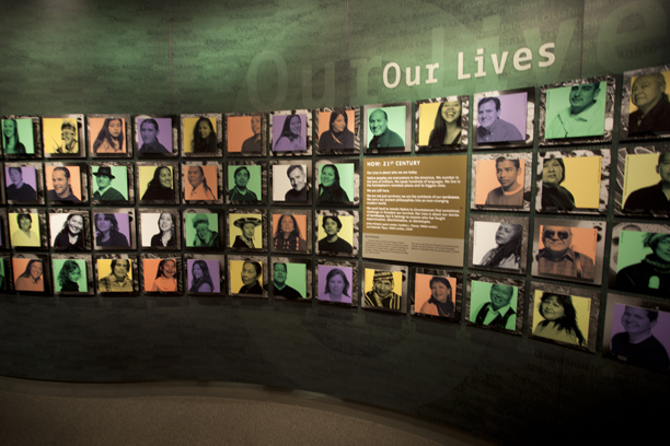
While visiting the Smithsonian National Museum of the American Indian last fall, I was impressed by a photo montage in one of the galleries.
This is a section of the wall in the museum where hundreds of lovely portraits are presented. These are all processed by a method we used to call “fake duotone.” There is nothing fake about how nice it looks.
The montage uses a photo technique we used to called “fake duotone” printing. It’s also known as a “tinted photo” technique. The word “fake” causes on to think that there is something unprofessional about the process. Why fake?
In the days when we did this – and the last time I did anything like this was about 1973 – it was fake. We printed a black and white photo on one press unit, and then we printed a rectangle of color that superimposed the photo on another unit (or perhaps we did it in the reverse order). When I first did this we had only a two-unit press, so the process of making “tinted” photos was pretty impressive stuff.
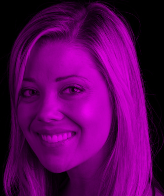
Though perhaps a bit brash in this color, this example of my friend and former student Lindsey Hahn shows the basic technique.
I suppose that it was also done because we were not experts at making duotones, so the tinting did the trick. It inserted a spot color into an otherwise monochromatic job, and it made the photos look impressive and “colorful.” Too bad we didn’t have a color scanner and a four-color press to play for keeps in this game.
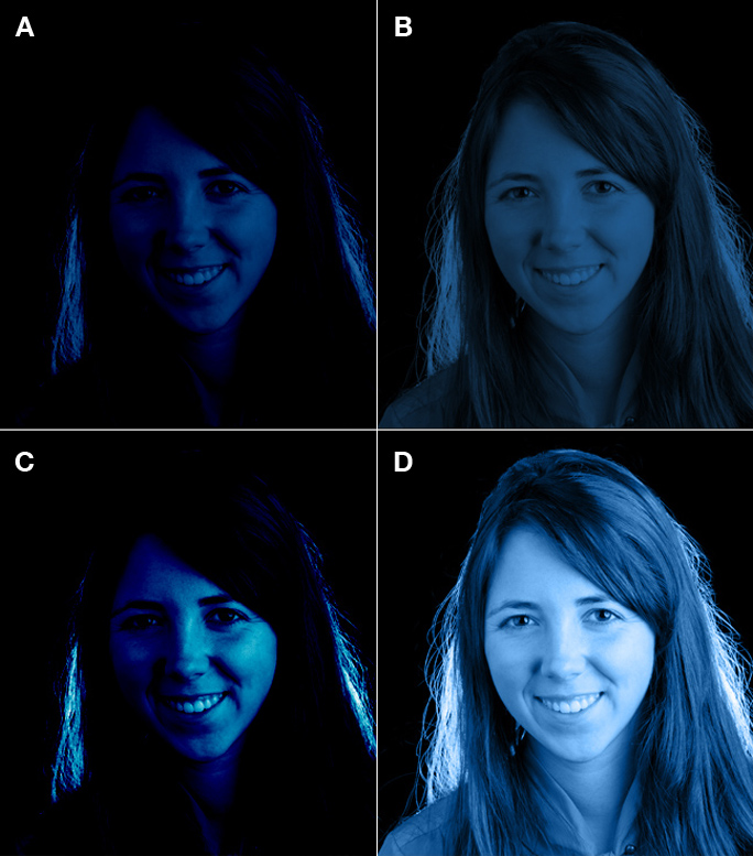
Sometimes Multiply doesn’t work. In this set I have used four of Photoshop’s Mode settings for the overlay of blue: A. Line Burn, B. Multiply, C. Color Burn, D. Color. Obviously, Color works best for this portrait of my friend Rosie Bubb.
In the Museum in Washington, the wall display is done using a modern version of the same technique, and the images are lovely. I wondered, as I looked at the array of handsome portraits, if this was done easily in Adobe Photoshop, or if this required some skill or knowledge that I did not possess. I waited until after dinner that evening to try it, and I was pleased that I could quite easily reproduce a similar looking image.
But, as is often the case with such things, it’s no simple task to get an image to look nice using just one technique. I figured out several ways to accomplish the same, or approximately the same kind of image, but my technique didn’t work equally well on every image I tested.
To get these images, one needs a grayscale photo as the base image. To make useful grayscale images from color, I use the Black and White Adjustment Layer in Photoshop, as its sliders allow me to control the conversion of colors to monochrome with exceptional accuracy and translation quality.
This is a good starting point, and when I like the grayscale image, I flatten it – leaving the image in RGB color. From there, creating the tinted image is relatively simple. I create a new Layer, and fill it with a bright color from the Swatches palette. The new Layer begins as an opaque overlay on top of the grayscale image (so you see nothing but color).
Here is another image of Rosie with the highlight on her left cheek left as the photo was taken (perfectly exposed, but bright).
…and here is the same image with its highlight dampened a bit, bringing its tonality to a more flat appearance. I did this before applying the color overlay, and it’s more in keeping with the look of the images in the museum in Washington. Color Mode was used the same in both images.
By changing the Mode of the new layer to Multiply, the color of that layer darkens the grayscale image below it, and the Opacity slider allows me to control the degree to which the overlay color shows through. I slide that control left and right until it’s a pleasing image.
On some images this doesn’t produce as nice an image as I want, so I try the Color Mode instead. This works well on people with dark hair, or against a dark background.
These tinted images is that they are intolerant of bright highlights, and I have found that I must tone-down the image to reduce the brightest highlights before I convert to grayscale, and then, after I my tint overlay, they look much better because they don’t have too bright a color tint in the highlights. To do that, I return to the original camera raw image, an reduce the Exposure, or increase the Fill Light to make a considerably flatter original. Then I apply the color tint, and the results are much better.
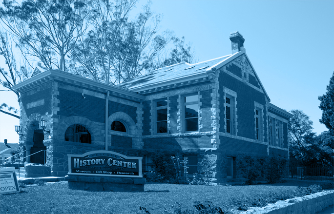
I also tried the technique on an inanimate object, the local History Center (and former Carnegie Library) in San Luis Obispo. Here again, the Color Mode works best to keep the tones bright while maintaining nice blacks.
I am presuming here that I would print these on an ink-jet printer, which has an amazing gamut of colors and which can print pretty much anything I want. If instead I want to print these images as true tinted photos of a multi-color printing press, using spot color inks, then it would have to be done completely differently. For that I will write another blog, and we will dig into duotones – real duotones – and “real” fake duotones – tinted photos printed with spot colors.
Keep an eye open for that blog.
Addition to my blog on tinted photos:
Today the 100 Most Influential People in the World edition of Time Magazine arrived in my mailbox. Admire the cover images!


