This post was originally made on June 11, 2010 on my blog at What They Think. I have updated the information in it here.
When I am not teaching, I am usually sitting in my home office, the master of all I see (I can’t see very far). Out the window to my right is a lovely view of the Santa Lucia Mountains, a ridge of 1,500-foot peaks that define the edge of the city, and to the north I see those same mountains going off into the distance on their way to the Pacific Ocean, 12 miles away. I can’t see the sea, though.
Right behind me is a woman who shares my office, a graphic designer who produces a tremendous amount of printed matter. She designs books, flyers and certificates, posters, billboards, and a host of advertisements for newspapers and magazines, and she designs an annual publication of 72 pages for the Chamber of Commerce. She is also my wife.
Quite often she will say something like, “How do you get Illustrator to distort something into an odd shape?” Or, she’ll say, “How do I get the image to appear more realistic when I apply this layer in Photoshop?”
At these moments I step into a phone booth and change into my Superhero costume, then fly to her rescue. What fun!
I know that sometimes I disappoint her with my answer: “I don’t know.” Other times I have an easy answer. And, then there are the confounding times when I really don’t know and I can’t figure it out.
I am an experimenter by nature, and I love a challenge! I dissemble files and reconnect the parts, then I look into the code behind them and look for the core of the problem. Then I teach myself the solution to the problem, and pretend to have known it all along: a true superhero! (oh, wait, that’s the definition of a consultant.*)
OK, so here we are, seven paragraphs into this blog, and I haven’t reached the topic yet… where was I?
Last week my wife had a problem that had come up a year earlier, one that involved rich black in Adobe InDesign being diluted when making a PDF for print. It was the cover of the annual Visitors Guide, her largest publication of the year. On the inside and outside covers are placed files – advertisements – while the cover is editorial copy and a photo that is designed by my wife.
The back cover was submitted as a TIFF file (they didn’t get the memo) at 300 ppi, with text rasterized at that resolution, and (theoretically) ready to print. It was sent with a SWOP Profile embedded. Did I mention that it was several weeks late?
So, on the eve of the production deadline, my wife placed the TIFF on the back cover, held her breath and made a PDF of the four pages of the cover. Then, using Acrobat Professional’s Production Tools, and the Object Inspector, she determined that the color had been modified as the PDF was made.
In 2009 when this problem came up, we had text that was 100 percent black coming out as rich black on press. It was a minor disaster. My friend Dov Isaacs at Adobe helped me to understand the problem, and to define a set of procedures for avoiding the rich black problem for the other signatures of the publication. The problem last year was that the PDF files were being converted into EPS files for the RIP at the printing company, and making the EPS files was causing them to be converted to SWOP from the color space where they started (a custom profile for the press we were using). So, in a nutshell, the color management was being done twice – once as my wife made the PDF, and a second time at the printing company.
By removing the embedded ICC profiles from the PDF while making it, we locked-down the color in the files, and prevented the subsequent color conversion to be done. This I called The DeviceCMYK Adventure.
This year we didn’t get so far. The PDF with the double-managed color was still in this room when we began the process of solving the problem. Super Blognosticator to the rescue!
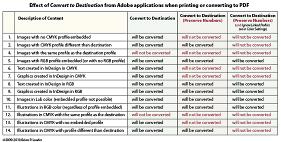
Last year when working on this problem, I made a chart of the possibilities of color management from InDesign. Those same results occur today. I consulted my chart, and sat for a few minutes pondering the options. Then I remembered that one method for solving this problem is to cheat at bit.
And, there are two methods to cheat. One is to tell InDesign to ignore the embedded ICC profile (or all the ICC profiles) in the document (the TIFF file with the SWOP profile, for example). The other is to open the TIFF file in Photoshop, then save it again, stripping the ICC profile en route (this is not the best way to do it).
The reason that this is true, is that the phrase “Convert to Destination (Preserve Numbers)” doesn’t really mean all the numbers. Adobe InDesign will in fact change all of the numbers of any CMYK file in a document except those in images with the same ICC profile as the document, as well as any CMYK image that has no ICC profile at all.
So, even though this seems illogical, it is sometimes smart to create CMYK PDF files without any embedded profiles in order to preserve their CMYK values.
I encourage prepress pros and digital photographers to embed profiles in every image – with no exceptions. Yet, it was the presence of the embedded profile that caused the colors to be re-processed in this case.
And the solution we chose was to reassign the ICC profile for the ad on the back cover, this time invoking the press profile that would be used for the rest of the document. One must be careful here not to use any default ICC profiles, because they will seldom be the correct profile, and double color management will occur.
This reassignment was done in InDesign’s Object menu, under Image Color Settings. In that palette (if it’s available) one can change the profile assigned to any image.
To get the color in the ad to stay the same – and not be reprocessed – I assigned to it the MAN Roland profile provided by the printer for this project. That would ensure that the image profile and the output profile would be the same, and would cause InDesign to really Preserve Numbers, and not change the values in the file as the PDF was made.
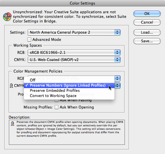
Another technique is to use Edit>Color Settings in InDesign set to Preserve Numbers (Ignore Linked Profiles) in placed CMYK images (shown below). This does the same thing with less labor.
On my second attempt, I made a PDF that was processed for CMYK for the MAN Roland press, and the color in the back cover advertisement was left untouched.
For those who want something to read on a Sunday evening, here is my chart of what happens to color in Adobe software products (InDesign and Illustrator specifically). I have shown this to both Dov Isaacs and Peter Constable at Adobe; both have reviewed its content.
I will write more on this topic, as there is another way to manage color in InDesign using the Color Settings pane. I have yet to make a chart of its behavior, but I think it may be a saner way to ensure that color in CMYK placed documents is not changed on output.
I would like to think that having an embedded profile in every image is still the smart thing to do, but my confidence in this advice is shaken for the moment.
And, for images in RGB: embed those profiles! One way or the other, you will need it later!
____
I’m writing a new book about printing processes and prepress. Click on the link below to give me your e-mail address, and I will let you know when the book is published (target date is March, 2012).


Were you able to figure out the best way to make Indesign PDFs that IngramSpark will accept? I’ve got everything ready to publish but I can’t get past the embedded ICC profile error.
If you have any suggestions, I’d greatly appreciate it!
Hi Aaron,
I don’t know IngramSpark, but I went to their web site and read their documentation. If you want to make a PDF without an embedded profile, you can create the PDF without profiles, and simultaneously convert the color to CMYK for print. I do this fairly often because it creates a PDF with “DeviceCMYK” tags in the file, which locks-down the color and prevents it from being altered by downstream processes.
From InDesign (I hope you are using InDesign), choose Adobe PDF Presets, choose “Press Quality” and then step through the menus, choosing downsampling-Bicubic 450 ppi, ZIP compression (I don’t like JPEG), and then, in the “Output” menu choose “Convert to Destination – Preserve Numbers.”
I prefer GRACoL for color management to U.S. sheet-fed printing, and I choose that for most “generic” printing in CMYK.
I’ll assume that Ingram uses a digital printing device for these books. That will be OK with GRACoL, also.
In the “Profile Inclusion Policy” menu, choose “Don’t include profiles.” That will deliver a PDF with good color management, and no embedded profiles. This will probably get past whatever is causing your problem.
And, since your file is pre-processed to CMYK with GRACoL, you will probably get a very acceptable result.
Let me know if this works.
Best wishes,
Brian P. Lawler
Hi Brian,
Yes, thank you, your comments helped. Yes, I’m using InDesign. Once I’ve learned a bit about the software, I couldn’t imagine doing a book, brochure or anything of the like in anything else.
I really appreciate it!
Best,
Aaron