
As I mentioned in my last article, I believe that one should either indent, or space-after paragraphs in running text. Not both.
And, when using a common indentation to create visual cues for the reader, I believe that you should take it one step farther, and not indent the first paragraph in an article, nor the first paragraph after an illustration or a caption.
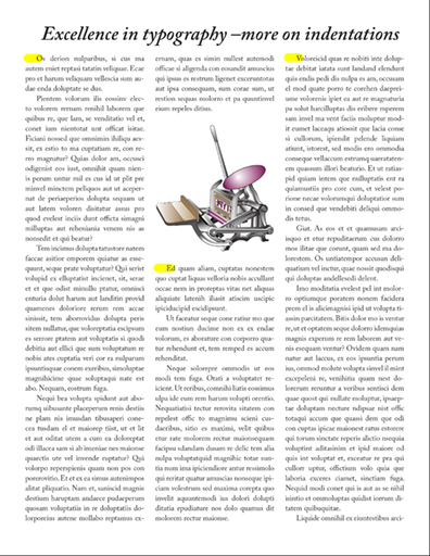
This three-column page is made less attractive by indentations in three places where I believe there should be no indentation. I have chosen small indent values (0.22 in.), and I want to eliminate the indentations where marked in yellow.
My reason has to do with coloration – the texture of the printed page. Indentations where they are not needed should be eliminated. This is an easy task in Adobe InDesign. I make two copies of my primary Paragraph Style, one with an indentation, the other without (they should be otherwise identical). The un-indented version will be used only occasionally to make the page look better.
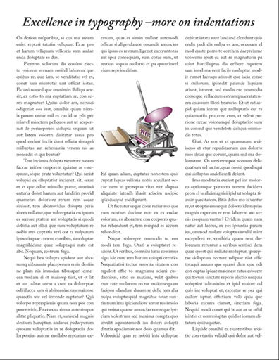
This is the same page with those indentations removed. It’s subtle, but effective. All excellent typography is thoughtful, making the experience of reading pleasant for the customer.
I work to avoid odd open spaces that have the potential to confuse the reader. And, if you have read my other typographic essays, you know that my primary motivation in typography is to avoid interrupting the reader – ever.
Read about prepositions and prepositional phrases in the next blog.