
This is my third essay on Typographic Discipline. You can read the previous edition here.
The word “color” or “coloration” is a term used to describe the texture of typography – its visual impact as a block of copy. It has nothing to do with color.
When faced with the complex decisions of how large to make type, how many points of leading to use, as well as the line length for a story, one must wrestle with many settings and microscopic modifications that affect how our reader will see the text, and (perhaps) read it.
Remember that the number one objective in typography is to get the reader to read the text without any interruptions.
Do we indent the text? Do we add space between paragraphs? Entire books have been written about the “canons” of excellent book typography, and I will only touch on this one factor in excellent typography.
I call these things visual cues. They tell the reader that something has changed – a new paragraph, a new subject, a subhead, a new idea, an illustration. The visual cues are roadmaps to reading. They enhance the transmission of information from the printed page to the mind of the person looking at it.
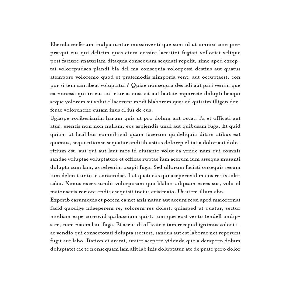
This text block is difficult to read because it lacks any visual cues for paragraphs.
Paragraphs should be set-off from one another. That is simple typographic design. If you look at any beautiful book you will see the practice of excellent typography. The visual cues tell you when a new paragraph has begun; they tell you to read onward, but with a new thought.
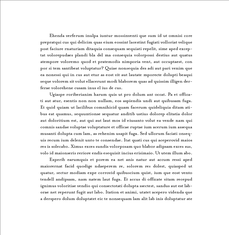
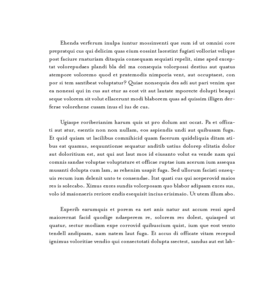
Adding indentations to new paragraphs adds those visual cues to indicate a new thought in the text. Aha! (the reader thinks: a new paragraph!). These indentations are 0.33 inch.
I prefer to use the indentation for new paragraphs. This allows me to maintain adherence to a grid that defines my pages. Indented paragraphs give me the best feel on the page for readability. Once in a while I use the space-after instead, a different visual cue that says the same thing to the reader: new thought here.
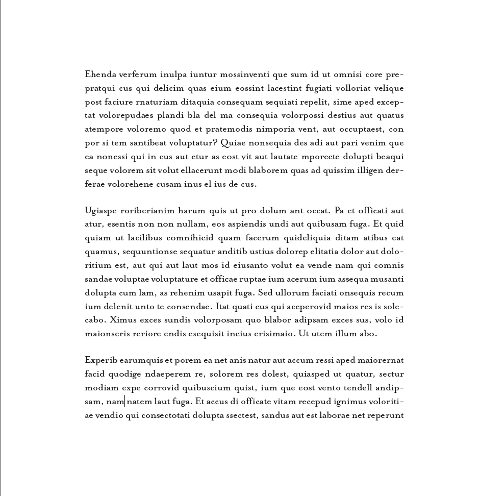
Here I have used the space-after-paragraph approach to composition. It works well. Note that the spaces are less than one line’s worth of leading (to do that would be criminal!).
Occasionally I see the work of typographers where they apply both indentation and space-after breaks. This, I believe is an unnecessary visual break, one that interrupts reading. It is saying “new thought” but it’s saying it with an echo. The reader isn’t aware of it, but it communicates a break too strongly, and it causes the reader to stop reading for a moment – a stammer if you will. Interruptions defeat excellent typography and are inappropriate.
Use indents or space-after breaks – but not both!
Looking at the textural effect of both space-after and indentation, you’ll see that this is too much of a visual cue. One needs to do one or the other, not both.
Another question about visual cues is the depth of the indentation. How much is enough? How little is too little?
Jan Tschichold, Typographic Director for Penguin Books from 1947-49, wrote in his style guide for that company that only one emspace of indentation is appropriate. Mr. Tschichold’s rule for Penguin seems conservative today, but I am not far behind! I like indentations of two emspaces, sometimes a bit more. I do not like deep indentations because they scream at the reader. A visual cue is just that, a cue. It’s a subtle indicator that enhances reading, no more.
When composing paragraphs of text, try variations on indentation until you create a coloration that is both visually pleasing and where the hints of new paragraphs are pleasantly present – but where they do not interrupt the reader.